Read all the Oblivion reviews in chronological order.
According to the director, Oblivion is “a daylight science fiction film with a kind of Twilight Zone story,” a callback to pre-Star Wars, 1970’s lonely man sci-fi set against a huge backdrop. (Read the full interview by Germain Lussier on /Film for more.) Certainly, it’s more visually-satisfying thing than intellectually-satisfying thing, but fortunately that same thing does not play out in the interfaces.

Sci: B (3 of 4) How believable are the interfaces?
One of the great strengths of the interfaces are their deep ties to the diegesis. There’s little fuidgetry, little that could be generically lifted and placed in another film. It’s what we used to call site-specific in design school and that’s a good thing for believability.
See how in Vika’s desktop the sections of interface contain things she has to monitor: Land, hydrorigs, drones, the Tet’s orbital position. Most of the interfaces in the film are this considered.
On the flip side, there are communication systems that suffer more downtime than modern systems. There’s a flight control interface that omits the weather. The Scav binoculars just don’t make sense. And the Odyssey has a bunch of problems given that’s meant to be a near-future-ish extension of what we know today.


And then…then…then there’s the narrative-shortcut trope of the oh-by-the-way faster-than-light communication system that would have meant a much more advanced (and more defended?) world for the Tet to encounter in the first place.

So, some dings.
Fi: A (4 of 4) How well do the interfaces inform the narrative of the story?
This is where Oblivion’s interfaces really shine. They’re gorgeously realized with a rich stylistic and motion language. But moreso IMHO some of the apparent “problems” with the interfaces actually tell of the deep deception by the Tet. It’s core to telling that central story, and partly told through the interfaces.
Home 49 disconnects its inhabitants from the land they’re tasked to protect. Tet’s thinking: Perfect.

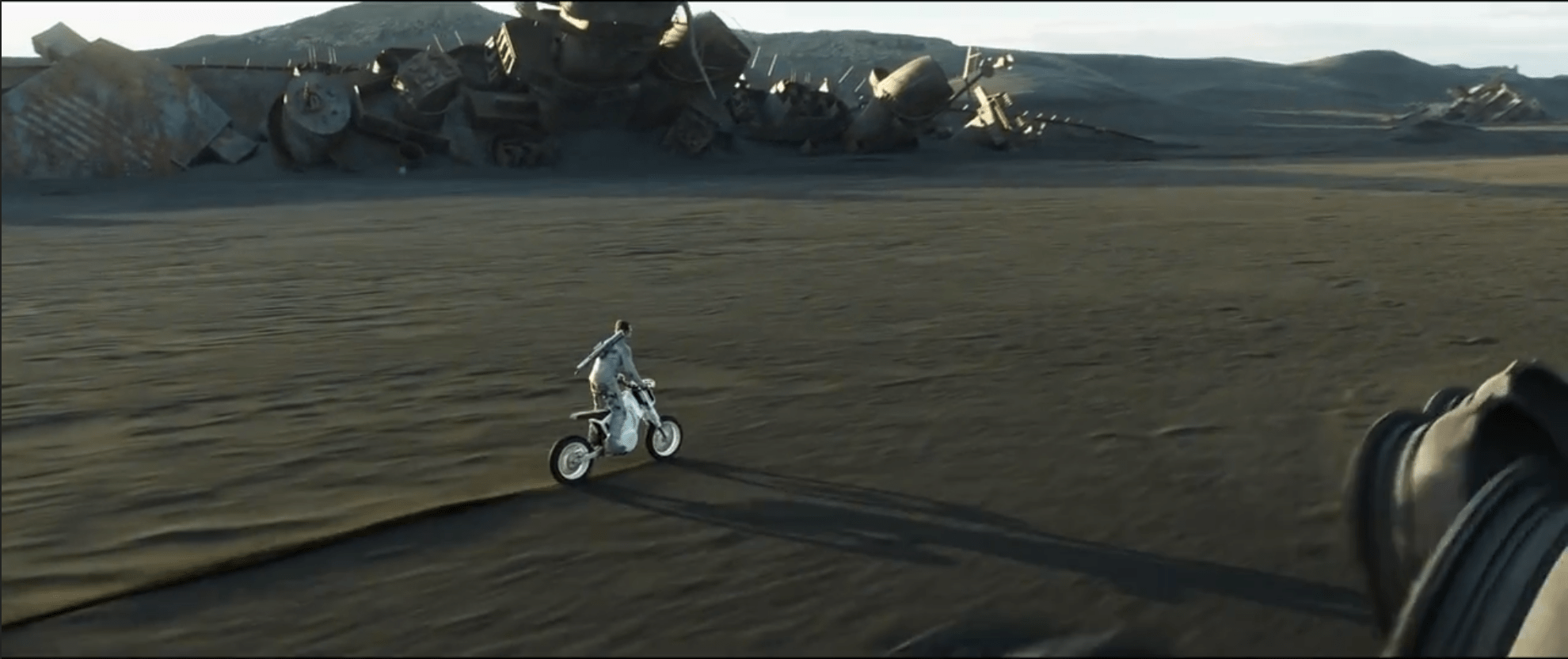
Jack’s bike doesn’t make a lot of sense in the diegesis except that it is a perfect outlet for his sense of “freedom.” Tet’s thinking: Whew. Glad he has that outlet.
Other narrative aspects of the interfaces like the drone programmer help underscore the drones as aggressive, suspect, and alien, rather than defensive human measures.


I’d add a + to that A if the drones hadn’t been designed to look evil and menacing. Had they been more Hello Kitty and less Galactic Empire, Jack might have been less suspicious.

Interfaces: B (3 of 4)
How well do the interfaces equip the characters to achieve their goals?
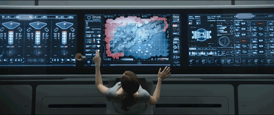
The centerpiece of the film is Vika’s desktop. It’s her command and control center workstation that enables her to manage the strategy to Jack’s tactics, and even rest her teacup as she works. The most commonly accessed bits are in easy reach, and the display-only information is turned vertically for her like a clock on the wall.

It has a few ergonomic problems, like angling its displays away from her observational sphere (just for a teacup?) It doesn’t equip her for crisis conversations like it should. Some of its interactions are inconsistent. It sometimes makes her hunt for information rather than leading her there. But, all in all, a nice dashboard for her task.
There are other interesting bits, like the situationally-shaped reticle, the breakfast table that allows for sitrep breakfasts, and well-mapped Odyssey controls that imply a bit of agentive support.


There are some usability problems throughout, or it would have fared better, but overall a good show.
Final Grade B+ (10 of 12), MUST-SEE
All told, these interfaces are rich and powerful and embody solid modern thinking about visual styling, motion design, gestural interaction, and heads-up-displays. Big props to that pro gmunk for his work (and keep an eye out for an interview with him about his work on the film soon.)
And may I send out a special shout-out to the guest bloggers for their excellent insights and write-ups: Clayton, Aleatha, Heath, and Maximilion. They did great and I’m very glad that at least four other people in the world know how much effort goes into providing these in-depth interface analyses. Let’s hope we hear from more about them on this blog in the future.
Pitch time: Learn more lessons about gestural interfaces, heads-up-displays, and other interface concepts from a vast survey of science fiction movies and television programs in the book I co-authored with Nathan Shedroff, Make It So: Interaction Design Lessons from Science Fiction.
IMDB: https://www.imdb.com/title/tt1483013/Currently streaming on: ![]()


![From Gizmag: British soldiers have tested these Black Hornet Nano UAVs [Image: © Crown copyright]](https://i0.wp.com/scifiinterfaces.com/wp-content/uploads/2015/04/image11.jpg?resize=530%2C297&ssl=1)