Odyssey Communications

A close-up of a control panel displaying a video feed of a woman speaking, with NASA logos visible in the background.

The TET is far enough away from Earth that the crew goes into suspended animation for the initial travel to it. This initial travel is either automated or controlled from Earth. After waking up, the crew speak conversationally with their mission controller Sally.

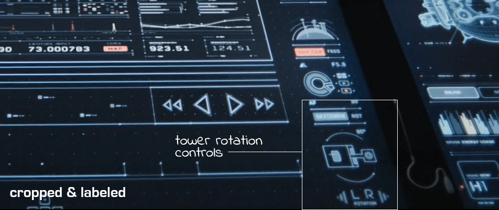
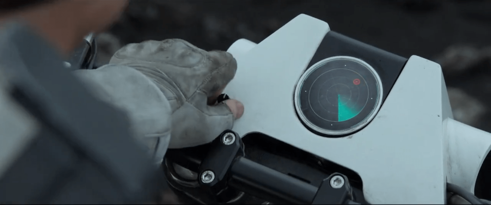
This conversation between Jack, Vika, and [actual human] Sally happens over a small 2d video communication system. The panel in the middle of the Odyssey’s control panel shows Sally and a small section of Mission Control, presumably back on Earth. Sally confirms with Jack that the readings Earth is getting from the Odyssey remotely are what is actually happening on site.

Interior view of a futuristic spaceship cockpit, featuring numerous control panels, screens, and empty pilot seats.

Soon after, mission control is able to respond immediately to Jack’s initial OMS burn and let him know that he is over-stressing the ship trying to escape the TET. Jack is then able to make adjustments (cut thrust) before the stress damages the Odyssey.

FTL Communication

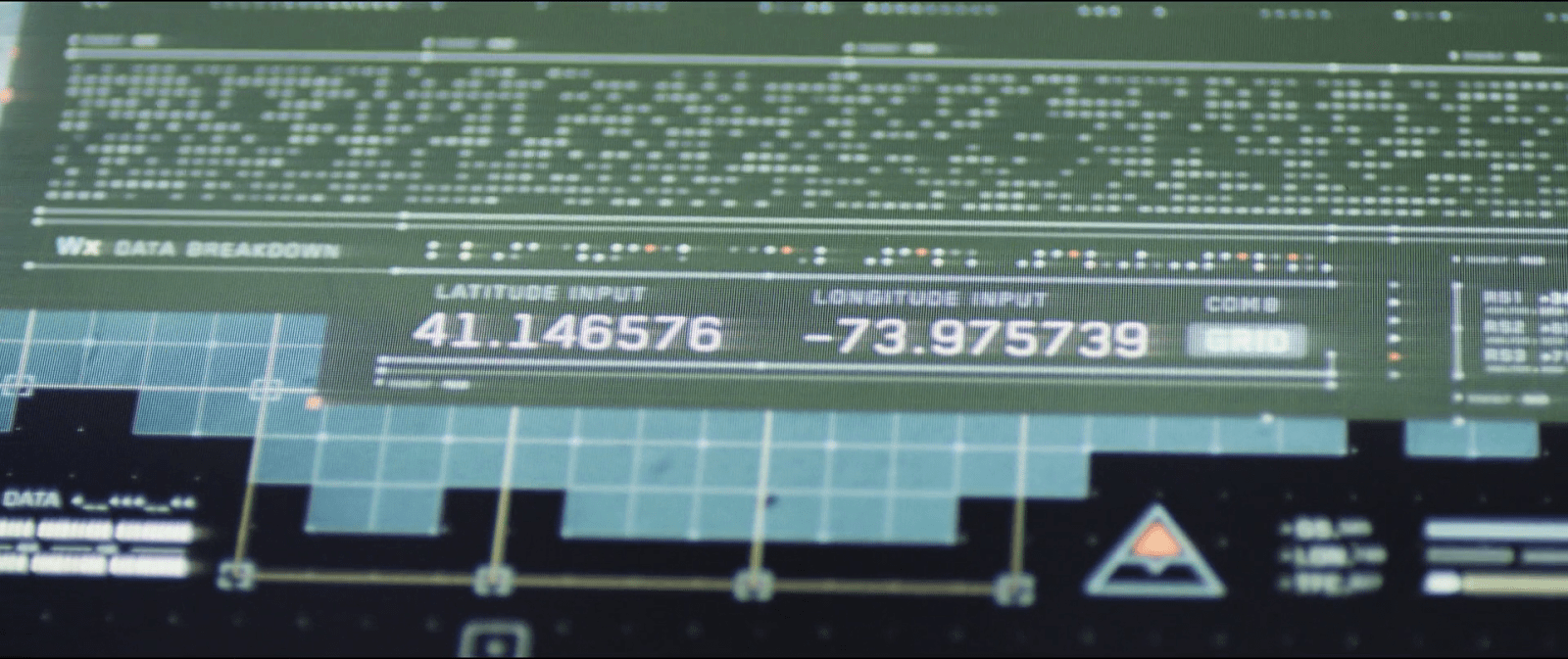
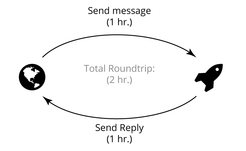
Communication between Odyssey and the Earth happens in real-time. When you look at the science of it all, this is more than a little surprising.

Vika tells Sally that the Odyssey was traveling for at least 39 days in suspended animation. We see in the same scene that the Odyssey’s engines are thrusting that whole time. Even the low thrust of an ion engine would send the Odyssey a long way out into the Solar System in 39 days.

Current communication technology in space relies on radio communication for voice and video. NASA is testing out laser-based signaling, which would provide higher bandwidth but doesn’t travel faster than the speed of light. Time lag is a constant in both technologies.

In space, real-time communication and measurable distance do not go together at all. There should be a lag, especially at the distances implied by the story.

A woman with closed eyes lying inside a pod, with a control panel displaying data in the background. The pod has a NASA logo and a Russian flag emblem.

How Far?

The engines on the Odyssey look a lot like NASA’s prototype ion engines. This would fit nicely with the compact nuclear reactor on board, which would be the perfect size for generating living power and engine power for low-thrust ion engines.

Ion engines don’t have the same thrust capacity as our current rockets, but have the advantage of constant thrust over long distances that chemical rockets can’t match. NASA’s Dawn probe has an acceleration of about 0.22m/s/s (very, very rough math). A quick run through a calculator at (http://www.cthreepo.com/lab/math1/) says that over 39 days (Odyssey’s travel time), they would go about 8 astronomical units (AUs). That is 8x the distance from the Earth to the Sun just with Dawn’s level of thrust. That is a low end calculation, and doesn’t factor in any thrust from a more traditional rocket on the Earth end, or any slingshot maneuvers to add speed.

8 AUs would be more than an hour of light speed lag. That means that the Odyssey should take almost two hours to complete a single back-and-forth of a conversation.

Communication-Time

If the compact nuclear reactor was actually able to produce thrust (unlikely, but possible), then in 39 days the Odyssey could have traveled even further.

At any distance beyond the Moon’s orbit, light-speed communication would become increasingly delayed. If the TET was even in a Mars orbit, it could take between 4 and 24 minutes for radio and video signals to go back and forth between Earth and the Odyssey. Further distances increase the lag time significantly.

This means that Humanity has…gasp…developed Faster-than-Light communications technologies by the time Oblivion occurs (and, yes, even before the TET could have provided the advanced alien tech to make it happen).

Close-up of a control panel displaying a distorted screen with horizontal lines and static.

Despite this FTL comm system, as the Odyssey approaches, the TET is able to disrupt the comm signal and cut off Earth from Odyssey. Jack looks concerned by this (as well as Sally’s order to cut his thrust), and stops trying to fight being drawn into the TET.

An unanswerable question here is: what kind of technology from the TET would be able to disrupt an FTL signal? Wouldn’t that require them to be time travelers? Wouldn’t this be a different movie, then?

Don’t Trust New Technology

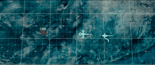
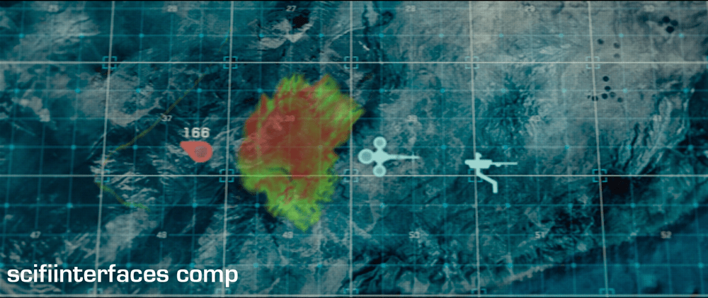
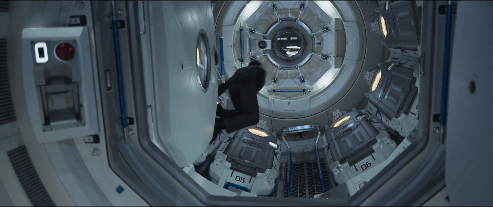
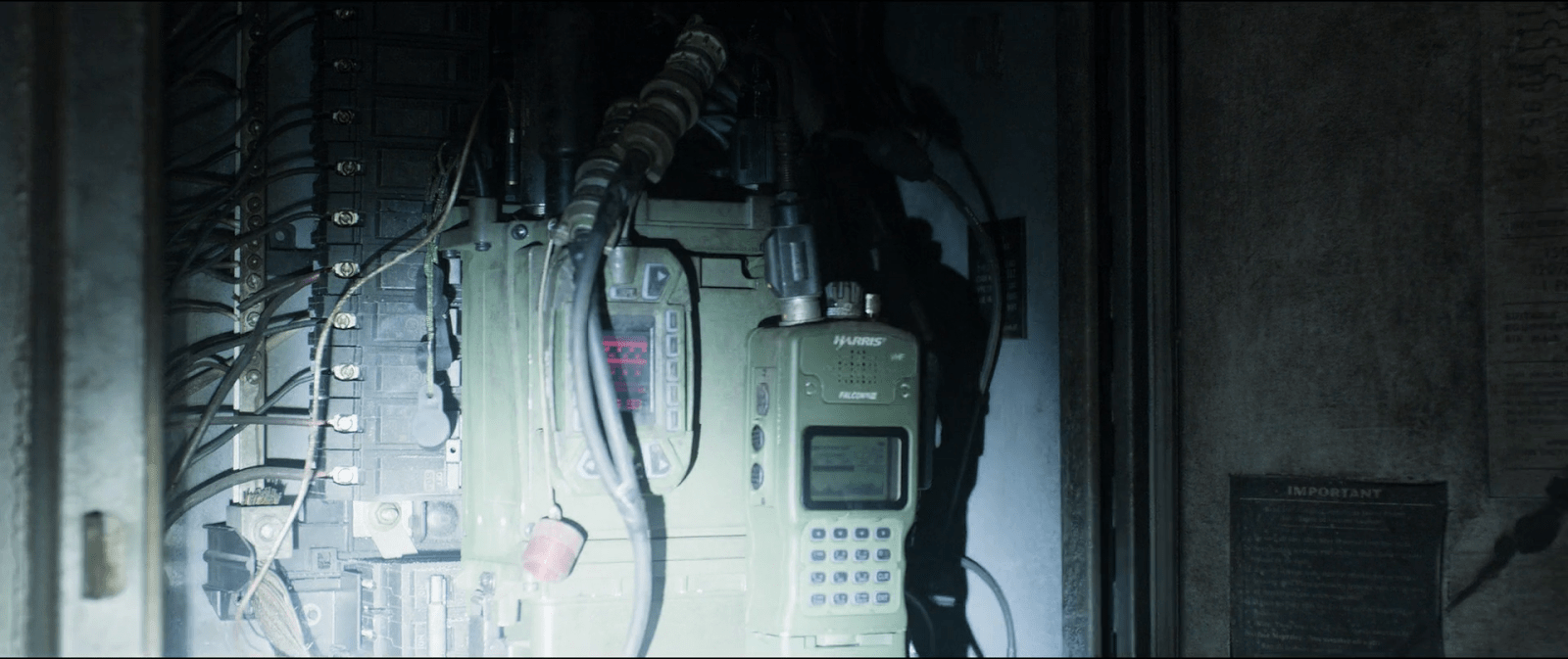
Neither Jack nor Vika interact with the communication system during the flight that we see besides talking to it. When the signal cuts out, neither of them rushes to check settings or flip switches to try and get the signal back. Instead, they go to a backup plan and focus on what they are able to do without help from Earth. The screen that held Sally’s image cuts over to a secondary information display as soon as it detects that the signal is gone.

Close-up of a digital display panel showing numerical data, indicators, and system information related to a launch control interface.

This implies two things:

  1. The crew were trained to not rely on the communication system
  2. The communications system is a ‘black box’ to Jack and Vika: it either works or it doesn’t.

Given the previous realization that the comm system is built around an FTL link, both of these make sense. It is unlikely that a single person (or even two people) would be able to understand the equipment behind a new FTL system well enough to maintain it or fix it in an emergency. Similarly, the early Astronauts of NASA weren’t expected to maintain the advanced computers (for the time) on their ships.

If the FTL system was recently invented, and rushed through testing for this mission, it also makes sense that Jack and Vika don’t rely on it. NASA now is very careful about testing equipment to make sure that they will always work, or at least work well enough that they can be constantly relied on. (see the Kepler mission http://en.wikipedia.org/wiki/Kepler_(spacecraft) for what happens when a well-tested and critical component fails).

Jack and Vika reveal their training during the emergency situation: They have no time to think, so they fall back on memorized actions. The lack of interaction with the communications system implies that there was no training around trying to make it work.

Have a Backup Plan

Designers planning to introduce new and advanced technology into important situations should always be sure they have a backup plan for when that advanced technology fails. Likewise, if a highly efficient workflow has advanced technology introduced to improve that efficiency, make sure that failures in the new technology won’t make the workflow slower than before.

Technology should assist and improve, never impede users. And if it’s valuable enough to warrant the risk, give users a backup plan.

TETVision

image05

The TETVision display is the only display Vika is shown interacting with directly—using gestures and controls—whereas the other screens on the desktop seem to be informational only. This screen is broken up into three main sections:

  1. The left side panel
  2. The main map area
  3. The right side panel

The left side panel

The communications status is at the top of the left side panel and shows Vika the status of whether the desktop is online or offline with the TET as it orbits the Earth. Directly underneath this is the video communications feed for Sally.

Beneath Sally’s video feed is the map legend section, which serves the dual purposes of providing data transfer to the TET and to the Bubbleship as well as a simple legend for the icons used on the map.

The communications controls, which are at the bottom of the left side panel, allow Vika to toggle the audio communications with Jack and with Sally.

The main map area

The largest section is the viewport where the various live feeds are displayed. The main map, which serves as a radar, as well as the remote video feeds she uses to monitor Jack are both in this section of the display.

The right side panel

The panel on the right side of the map contains the video feed controls, which allow Vika to toggle between live footage from the Bubbleship, the TET, and of course, the main map view.

Although never shown in use in the film, the bottom right of the screen houses the tower rotation controls. This unused control is the only indication the capability even exists, so it is unknown whether the tower rotates 360 degrees or whether it’s limited to set points. (More on this below.)

It has robust capabilities

image02

At one point in the movie, Vika is able to use the drones to search for bio trail signatures when Jack is abducted by the scavs.

image06

Vika is also able to detect and decode various types of signals such as the morse code message sent by Jack or the rogue signal sent out by the scavs.

image08

And, probably unbeknownst to Jack and Vika, the TETVision can be controlled remotely from the TET to allow Sally access to the data stored on the desktop—as shown at one point in the movie, when Sally pulls up a past bio trail signature to send drones after Jack and the scavs.

It’s missing a critical layer of data

image03

At the beginning of the film, as Jack heads toward the downed drone 166, he suddenly encounters a dangerous lightning storm and nearly plunges to his death when the Bubbleship loses power. His signature disappears from the TETVision map, but from Vika’s perspective there is no indication as to what could have happened — or that there was any danger to begin with.

image01

Since the weather is unstable and constantly changing, it would have been better to include a weather overlay so that Vika could have notified Jack of the storm—allowing him to fly around it instead of straight into it.

It’s got some useless bits

image09

The tower rotation controls are never shown in use in the film, so it’s not clear what benefit rotating the tower would serve. The main purpose of their mission is to ensure the hydro-rigs are secure and functioning properly, not getting an optimal view.

image04

The tower is almost completely surrounded by windows as it is. And since the tower windows already face the hydro-rigs, what would be the benefit of changing vantage points?

It seems that the space could be used for something more beneficial to Vika such as bike, hydro-rig and drone cam feeds. This would provide Vika with more eyes on the ground, allowing her the additional support to keep Jack safe and monitor scav activity.

From an clustering standpoint, it would also fall in line logically with the other feed controls on the right side panel.

And some unnecessary visual feedback

image07

Towards the end of the movie, Sally is trying to find Jack and the scavs. She accesses Vika’s desktop remotely in order to pull up the bio trail records. Although no one is around to see the information, the TETVision displays the process as it happens. Of course, this is necessary for the narrative to progress, but in a real-life situation Sally would only need to see the data on her side—not from the desktop in Tower 49. If they’ve managed interstellar travel, cloning, terraforming, and cognitive reprogramming of alien species, they’re not likely still using VNC. This type of interaction should simply run in the background and not be visible on screen.

Better: Provide useful visuals

When a drone picks up a bio trail signal, a visual of a DNA sequence is displayed. Since the analysis is being conducted by Sally on the TET, it seems that this information isn’t really useful to Vika at all.

image00

From Vika’s point of view it seems like the actual trail would be more important, so why not show a drone cam feed complete with the HUD overlay? She could instantly gain more information by seeing that there are two bio trails—proving that Jack has been captured by the scavs and taken to another location.

Sleep Pod—Wake Up Countdown

On each of the sleep pods in which the Odyssey crew sleep, there is a display for monitoring the health of the sleeper. It includes some biometric charts, measurements, a body location indicator, and a countdown timer. This post focuses on that timer.

To show the remaining time of until waking Julia, the pod’s display prompts a countdown that shows hours, minutes and seconds. It shows in red the final seconds while also beeping for every second. It pops-up over the monitoring interface.

image03
Julia’s timer reaches 0:00:01.

The thing with pop-ups

We all know how it goes with pop-ups—pop-ups are bad and you should feel bad for using them. Well, in this case it could actually be not that bad.

The viewer

Although the sleep pod display’s main function is to show biometric data of the sleeper, the system prompts a popup to show the remaining time until the sleeper wakes up. And while the display has some degree of redundancy to show the data—i.e. heart rate in graphics and numbers— the design of the countdown brings two downsides for the viewer.

  1. Position: it’s placed right in the middle of the screen.
  2. Size: it’s roughly a quarter of the whole size of the display

Between the two, it partially covers both the pulse graphics and the numbers, which can be vital, i.e. life threatening—information of use to the viewer.

The sleeper

At the same time the display has another user, the sleeper. Since she can’t get back or respond in any way, this display is her only way of communication. As such, the device ought to react at least as well as a person would. So while normally a pop-up should only be used to show important data that the user really must know, this case is different. The pop up is not blindly blocking information, it’s reflecting the user’s priorities at that moment. And it’s for this reason that the timer bears that much visual importance on the screen.

But the display is also a touchscreen, which you can tell from the buttons in the timer. So in case the viewer really needs to see the entire display, it would require putting the timer in a separate mode. But that would require him switch back and forth between modes to get all the data.

image01
When the countdown finishes, the pod slides open. Julia slowly begins to recover consciousness, open her eyes and sits to take a look around the outside.

Rome wasn’t built in 99 hours.

The countdown timer shows the amount of hours, minutes and seconds until the sleeper wakes, counting backwards. We just get to see the timer —and hear it beeping— only when the sleep time is ending, so it’s likely a feature to notify any close witness that the pod is about to open.

But what if the sleeper’s biometrics start to get bad? Well, the timer does leave enough room on the screen to leave the bulk of the biometrics data. The device also has a warning for when the sleeper is in CRITICAL condition, but we don’t get to see any in-between modes. It could be helpful if the timer offered some sound cue when the sleeper has some minor issue as well, even if it isn’t as bad. Even something as simple as changing the tone of the beep could do the trick.

Did you notice that the timer has two digits to display hours? That means it can display 99 hours of remaining time. That’s a long time. I’m guessing that the display doesn’t show the countdown with that much time in advance. But in that case, when does it show the timer? If the timer looks to give a hint when a sleeper is about to wake up, you don’t really need to know the amount of hours left. A few minutes’ advance notice is enough.

Kind-of setting the timer.

Although the crew of the Odyssey could probably handle the delta sleep from the onboard computer, the display also offers some functions to control that time. It has three buttons that control the timer:

  • a START button
  • a RESET button
  • a CLEAR button

The timer has two small half-circles both at the top and bottom of the clock. There is a play button. The timer needs to have a way to enter a given duration, and from the mapping of those symbols I’m guessing they could work as adding and subtracting buttons —you know, press the top button to add an hour, press the bottom button to reduce an hour. But at the same time the buttons don’t have any labels to convey that—they lack either a plus symbol on the top or a minus symbol on the bottom. For what it’s worth, the only label they offer is the time magnitude of any pair of digits—hours, minutes and seconds—on the circles at the bottom. So yeah, I’m close to calling these fuidgets.

The text buttons need some consideration as well. The first two are pretty straightforward if we envision the scenario where the clock timer can be set to any given time. In that case START will start the clock and RESET will put it back to zero, as with any common timer. The odd bit is that there is still a START button while the clock is ticking. In many common timers that same button has two modes that switch according to the state of the timer: starting it when it’s paused and pausing it when it it’s playing. But the missing pause mode or button could have a purpose, perhaps waking the sleeper requires a gradual biological process that can’t be stop once it has began.

image02

There are other problems with the third one, the CLEAR button. Although the label is somewhat misleading, the button probably acts as a way to close the pop-up of the countdown, removing it from the screen. But the real issue is what happens after that. If the user press CLEAR and the pop-up closes, there is no way of knowing if the timer keeps running in the background or if it resets back to zero. This is a major problem.

Anyhow, even if the timer did run in the background it doesn’t have much of a point in this case. I mean, there was no one around to check on Julia while she was in sleep.

A little ramble on Industrial Design

Another interesting aspect of the design of the pods is the way they open. Instead of opening or sliding the cover to one side, as more common doors and hatches, the cover of the pods is divided in the middle like a double-leaf bascule drawbridge. These covers on the pod have a hinge both at the top and bottom, so they turn outside and up of the pod when opening.

Jack releases Julia from the sleep pod.

Although it may seem like an overly complicated design, it really shows its advantages when you set it in context. On the Odyssey the sleep pods are placed side by side, alongside the walls of a tube like compartment. There, the area around the center has hatches that lead to other compartments.

image00

Within a space of those characteristics, a cover that opens or slides to the side would bring some problems. As the cover slides, when opening a pod you would be blocking the one next to it. To improve that, you could have a cover that opens up from the top or the bottom. With that you could have more than one pod closing and opening at the same time, but it also comes with drawbacks. Given the length of the pods those doors will probably cover much of the transit area around the compartments of the ship, becoming an obstacle for the movement of the crew.

This is a solution for both problems. The divided doors give plenty of space for the crew to pass through, and as the doors open up they also give room to opening or closing the pods next to each other at the same time.

Homing Beacon

image04

After following a beacon signal, Jack makes his way through an abandoned building, tracking the source. At one point he stops by a box on the wall, as he sees a couple of cables coming out from the inside of it, and cautiously opens it.

The repeater

I can’t talk much about interactions on this one given that he does not do much with it. But I guess readers might be interested to know about the actual prop used in the movie, so after zooming in on a screen capture and a bit of help from Google I found the actual radio.

image05
When Jack opens the box he finds the repeater device inside. He realizes that it’s connected to the building structure, using it as an antenna, and over their audio connection asks Vika to decrypt the signal.

The desktop interface

Although this sequence centers around the transmission from the repeater, most of the interactions take place on Vika’s desktop interface. A modal window on the display shows her two slightly different waveforms that overlap one another. But it’s not clear at all why the display shows two signals instead of just one, let aside what the second signal means.

After Jack identifies it as a repeater and asks her to decrypt the signal, Vika touches a DECODE button on her screen. With a flourish of orange and white, the display changes to reveal a new panel of information, providing a LATITUDE INPUT and LONGITUDE INPUT, which eventually resolve to 41.146576 -73.975739. (Which, for the curious, resolves to Stelfer Trading Company in Fairfield, Connecticut here on Earth. Hi, M. Stelfer!) Vika says, “It’s a set of coordinates. Grid 17. It’s a goddamn homing beacon.”

DECODE_15FPS
At the control tower Vika was already tracking the signal through her desktop interface. As she hears Jack’s request, she presses the decrypt button at the top of the signal window to start the process.

When you look at the display, the decrypt button is already there for her to press. So either the computer already knows there is an encryption going on, or the user can press the decrypt button at any time, regardless of whether the signal is encrypted or not. In both cases, it’s bad interaction design.

An issue of agentive tech

If the computer already knows that the signal is encrypted, why doesn’t it tell her that? It should automatically handle the decryption, alert her that it was decrypted, and show the lat/long results on the screen. If it’s wrong, she can dismiss it. But let’s not rely on her consultation of a stoic guru just to find out. (It doesn’t even make sense from the TET’s perspective.) In this way you simplify the interface—as you no longer need a “decrypt” button—and help Vika and Jack with their goals more effectively.

Needs more states

From the sequence you can tell that the decrypt button has only two states , OFF and ON. To improve the interface, we’d want to have a few more states, indicating CONFIDENCE, PROCESSING, and of course if it’s wrong, the opportunity to DISMISS. Each of these would need specific designing for microinteractions, but these two states aren’t enough.

What if those weren’t coordinates?

When Vika presses the decrypt button we can see it expands the bottom part of the window, adding some encryption-related info. And way at the very bottom the interface there are a couple of labels that read LONGITUDE INPUT and LATITUDE INPUT. Not the best name though since it’s easy to mistake these for the coordinates of the signal source rather than the message itself. The numbers there start to change as the computer seems to be decoding the signal from the repeater, and making the correction on the data on real time.

But the strange bit are those same coordinate inputs. It seems as if the computer already knows—before it finishes decrypting—that the signal is transmitting a set of longitude and latitude coordinates. I mean, what if the encrypted data wasn’t coordinates at all…say, an entry code to some scav station? It’s possible that there is some metadata in the signal that conveys this information, but if that was immediately available, again, the system should have told them.

Finally, there is no feedback whatsoever about the time needed to complete the decryption. It doesn’t do much harm here as it’s pretty fast, but I’m guessing that more complex transmissions might pass the threshold of attention it would become an issue.

What is out there?

This is the first thing Jacks asks once he knows about the encrypted coordinates. And the interface designers thought about that one too, and place a small button next to the coordinate labels. That button leads to another window with the map display but not only that, if you look closely you can see that the button label also changes. While at first it reads MAP, after a few seconds the labels changes to GRID followed later by the number 17. And it keeps looping between those last two.

image03
image07
image01

The changing labels are a way to add more info on the same screen real estate. If Vika happens to know the surroundings of sector 17 she could have told Jack there was nothing there without even looking at the map. In the next sequence we see Vika scrolling around the map view—hopefully it opened right at those coordinates, but even if she’s scrolling around to see if there’s anything of interest there, I’ll note that the location does not have a drop pin to let her re-orient.

Losing the signal

Just as Jack is cutting one of the wires from the repeater to shut down the transmission we get a view of the desktop interface again. The modal window that Vika was using to track and decode the signal suddenly closes. This is a nice use of affordances, as the animation itself shows Vika that the signal was interrupted from the source. A more common trope is a big “no signal” label, so this is nice to see.

image06
After Vika finishes the decryption of the coordinates from the signal, Jacks takes his pliers to cut the wires going from the repeater to the building structure to shut down the transmission.
image02
Jacks decides to shut down the transmission from the repeater. As he does so, the desktop closes the window that Vika was using to track the signal, emphasizing the action with a short sound warning.

The only issue I can see is that in some cases Vika would end up opening the modal window again immediately if she was in the middle of work. The computer should stores the signal in memory and switch automatically from LIVE FEED to CACHE so she could continue.

Mostly useable

So the desktop interface definitely has its issues, but at the same time some few well considered details. The main challenge is its withholding the encryption from Vika. It shouldn’t. On the other hand, the interfaces have some clever information design, such as the space-saving labels and the animation which embodies the facts about the signal.

Drone Programmer

A close-up of a hand wearing a glove holding a futuristic device with a screen displaying a holographic globe and various data interfaces.

One notable hybrid interface device, with both physical and digital aspects, is the Drone Programmer. It is used to encode key tasks or functions into the drone. Note that it is seen only briefly—so we’re going off very little information. It facilitates a crucial low-level reprogramming of Drone 172.

This device is a handheld item, grasped on the left, approximately 3 times as wide as it is tall. Several physical buttons are present, but are unused in the film: aside from grasping, all interaction is done through use of a small touchscreen with enough sensitivity to capture fingertip taps on very small elements.

Jack uses the Programmer while the drone is disabled. When he pulls the cord out of the drone, the drone restarts and immediately begins to try and move/understand its surroundings.

A person stands facing a large, futuristic robotic head with multiple cameras and sensors, while two armed figures are positioned nearby in a dimly lit environment.
When Drone 172 is released from the Programmer cable, it is in a docile and inert state…
A person standing in front of a large, futuristic robotic machine with glowing lights and mechanical arms, set in a dimly lit environment.
…but it quickly becomes aware, its failsafes shut down and its onboard programming taking over.

From this we understand that drones are controlled via internal software; this is the only time we see them programmed or their behavior otherwise influenced by a human. This reprogramming requires an external device wired into the drone in direct physical proximity, which suggests an otherwise high level of autonomy for each drone.

(Narrative implications) Following Orders

The Drone Programmer, and the way it interacts with Drone 172, suggests useful information about the Drones’ default states—namely, that their default state is autonomous, aggressive, and proactive, depending upon their orders and programming.

Drone 172 does not attack at this stage, and we have seen through Jack’s eyes on the screen that this is due to an overriding primary objective, implanted directly into the Drone’s firmware / low level programming: Rendezvous with the Tet.

Low Level Controller: Handle With Care

A gloved hand holding a futuristic device with a digital screen displaying various readings and graphs.

Its suggestion of a provisional or failsafe role is reinforced by warning text above the display, (legible at high resolution,) reflective of its power: “Electric Hazard Do Not Touch Terminals on Both Lines at Same Time: Lead Ends May Be Energized…

Between this and the sparks ignited when the cable is detached from the Drone, one gets the sense of a device somewhere between a terminal and a jumper cable. Potent, hazardous, direct.

A close-up image of a hand holding a wire while interacting with the interior of a mechanical object.
A close-up of a male astronaut in a futuristic suit, focused on a mechanical device above him, set in a dimly lit environment with sparks and steam.

Jack is clearly at ease with the Programmer and its usage from repair sessions at home and in the field. This ease suggests either that his training (or memory replacement) is thorough, or that such low level work is needed frequently enough to be quite familiar.

The latter explanation, along with the Programmer’s nature as a physical device requiring direct proximity, would reinforce the interpretation that Tet places a remarkable amount of trust in instances of the human Maintenance team, and that the equipment in question is nearly symbiotic with the Team(s) in its need for frequent recovery.

Thus through this one seemingly incidental device, and its low level role in the chain of command, we can deduce that the combination of Drones and Team(s) is much more effective than either could be individually. Jack was reprogrammed by his time spent in curious wandering, crossed with the opportunity presented by the book quotation mentioned as a trigger. In the case of Jack, the book and its couplet is the low-level reprogramming device, shocking in its directness.

Dialogue within the film reinforces the analogy directly: We learn during this sequence that the first invasion phase entailed many instances of a short-lived (non-learning) Jack as soldier. We also learn that phase two is this symbiotic maintenance arrangement between human and machine. When it is suggested that Drone 172 is the weapon, Jack corrects that it is he himself—its user and maintainer—who is the weapon. Without his role as user and maintainer, the machine would ultimately be a neutralized mechanical husk.

Lessons:

  1. Low level interfaces suggest fundamental programming and activity.
    (NOTE: Compare to interfaces such as the Nostromo Self Destruct pulls in Alien, etc.)
  2. Use of low level interfaces suggests familiarity and/or “grace under pressure”, as well as systemic trust in the user.
  3. Low level interfaces suggest a deep symbiosis between the user and the machine, to the point of interdependence.
    (NOTE: Compare to failsafe systems and manual overrides in aeronautics and (a few realistic moments in) space films such as Sunshine. In an alternate universe, I have the time to cover/analyse Sunshine to uncover this very dynamic…)
  4. Bonus Lesson (Oblivion-centric): By analogy, in highly technological or post-apocalyptic settings, books are, for humans, a low level interface, forcing the user to slow down and absorb sometimes startling, unexpected, or course-changing information.

The Drone

A spherical robot with the number 166 in a dark, smoky environment, hovering above burning debris.

Each drone is a semi-autonomous flying robot armed with large cannons, heavy armor, and a wide array of sensor systems. When in flight mode, the weapon arms retract. The arms extend when the drone senses a threat.

A figure stands amidst debris, lifting a large spherical object that emits bright beams of light in a dark environment.

Each drone is identical in make and temperament, distinguishable only by large white numbers on its “face”. The armored shell is about a meter in diameter (just smaller than Jack). Internal power is supplied by a small battery-like device that contains enough energy to start a nuclear explosion inside of a sky-scraper-sized hydrogen distiller. It is not obvious whether the weapons are energy or projectile-based.

The HUD

The Drone Interface is a HUD that shows the drone’s vision and secondary information about its decision making process. The HUD appears on all video from the Drone’s primary camera. Labels appear in legible human English.

Video feeds from the drone can be in one of several modes that vary according to what kind of searching the drone is doing. We never see the drone use more than one mode at once. These modes include visual spectrum, thermal imaging, and a special ‘tracking’ mode used to follow Jack’s bio signature.

Occasionally, we also see the Drone’s primary objective on the HUD. These include an overlay on the main view that says “TERMINATE” or “CLEAR”.

A digital overlay displaying targeting data and identifiers, with a focus on the word 'TERMINATE', set against an orange background.

In English, the HUD displays what look to be GPS (or similar) coordinates at the top, the Drone’s number (i.e. 185), and the letters A1-XX. The second ‘X’ is greyed out, and this area remains constant between Drones regardless of what mode they are in or what their current mission is.

Additional information covers the left and right sides of the Drone’s vision. All information on the HUD changes in real time, and most appears to be status information about the drone itself or its connection to the Home Station and the Tet.

Physical Feedback

For nearby techs (or enemies), the Drones have a simple voice (tonal) language to describe queries, anger, and acknowledgement of commands. This is similar to R2-D2 from Star Wars, or to pets, like dogs and cats.

A futuristic robotic sphere with the number 166 displayed on its front, equipped with mechanical arms and a single red eye, set against a dimly lit background.

If people or Maintenance Techs are close enough to see details on the drone, the drones’ iris dilates when the drone enters an aggressive mode, then contracts when the drone determines that there is no further threat.

Post-Mission Review

As an overlay on the video feed, this looks like an attempt to more fully immerse the maintenance team in the (artificial) story that the Tet is trying to perpetuate. We never see Vika watch directly through a drone’s eye, but she accesses similar information very easily from the Tet and the Bubbleship.

The most useful situation for this kind of HUD overlay is a post-mission review of a Drone’s activity. Post-mission, the HUD would allow the team to understand how the Drone was making decisions. Given that the Drones appear to be low-level Artificial Intelligence, this would be useful for getting into the Drone’s mind. Jack knows that the drones are temperamental from his encounter at the downed NASA ship, and he would want to make sure that he understands them.

Given how quickly the drone makes decisions, there would not be enough time for Vika to notice that a Drone had made a decision (based on its HUD), then countermand that order. The drone appears to have just enough reaction time for Jack to announce himself before being eliminated.

Futuristic user interface displaying data analysis and terrain information, with orange tones and digital readouts.

If the numbers at the top do conform to the Drone’s current position on the ground, it is surprising that it doesn’t also show the altitude of the drone. The Drone’s position in 3d space would be far more useful to a team trying to understand what the Drone was up to after a mission. It is likely that this is an attempt to keep information from the maintenance team to correspond better to Vika’s 2d command console, and the Tet likely knows exactly where each drone is.

If the maintenance team is infrequently accessing the Drone HUD, more labeling of information on the active status of the Drones would make the data more useful on quick viewing. Right now, the maintenance team needs to constantly remember what each area means, and what each icon represents. The different data formats are good clues, but more labeling would make everything instantly clear and allow the team to focus on the situation instead of deciphering the interface.

At the same time, the wealth of information related to the Drone’s operational status means that a review session using freeze-frames could allow a Team to deduce any functional reasons for an unexpected or catastrophic action on the Drone’s part. Thus the suggestion is reinforced that this HUD is meant for post-operation analysis and not in-the-moment error correction.

There is a potential clue (or Tet hand-tip) for the Team here: Even a catastrophic failure that resulted in the termination of Jack is acceptable enough for Tet not to emphasize in-the-moment error correction as an option for the Team. Tet knows it has plenty of Maintenance Team members in queue. The Maintenance Team does not.

Deceptive, Effectively

The Drone HUD provides useful information to the Maintenance Team for post-mission review. This HUD also works well as a way to make the maintenance team think it has control and understanding over the drone. This deception effectively keeps critical information firmly in the hands of the Tet.

For the Maintenance Team, this deception doesn’t affect their job. What does affect their job is the lack of labels on the data. Better labeling and a more efficient use of space around the edges would make the maintenance team’s life much easier without releasing any extra information from the Tet’s hands.

Perhaps the abundance of information on the display is meant to suggest to the Maintenance Team that other humans will deal with or are dealing with that overabundance in some other setting. If so, these would be impressive lengths for Tet to go to in its serial deception of each instance of the team.

It is worth noting that Oblivion marks one of relatively few cases where an internally-facing HUD with human-readable data can be rationalized as part of the story, rather than simply material for the viewing audience.

Lessons:

  1. Clearly label Information
  2. Speak in a language your users understand
  3. Don’t use up space with unnecessary information

Contact!

image04

Jack lands in a ruined stadium to do some repairs on a fallen drone. After he’s done, the drone takes a while to reboot, so while he waits, Jack’s mind drifts to the stadium and the memories he has of it.

Present information as it might be shared

Vika was in comms with Jack when she notices the alarm signal from the desktop interface. Her screen displays an all-caps red overlay reading ALERT, and a diamond overlaying the unidentified object careening toward him. She yells, “Contact! Left contact!” at Jack.

image02

As Jack hears Vika’s warning, he turns to look drawing his pistol reflexively as he crouches. While the weapon is loading he notices that the cause of the warning was just a small, not-so-hostile dog.

Although Vika yells about something coming from the left side, by looking at the screen you can kind of tell that it’s more to his back—his 6 or 7 o’ clock—than left. We’re seeing it with time to spare here, and the satellite image is very low-res, so we can cut her some slack. But given all the sensors at its command, the interface would ideally which way Jack is facing and which way the threat approaches, so she can convey correct and useful information quickly.

“Contact, at your 6, Jack!”

That’s much more precise and actionable for Jack.

image00

Don’t cover information

It might be useful to put the ALERT overlay somewhere other than on top of Jack, since it might obscure some useful information. Perhaps the “chrome” of the interface could turn red? Not as instantly readable for the audience, but if we’re designing for Vika…

Provide specifics

Another issue is that neither the satellite image nor the interface help Vika to identify what ends up being just a dog. Even when Jack manages to stay cool through the little scare jump, adding at least some information about the object would go a long way to make Vika and the situation less tense.

Jack’s encounter with the TET gives clear evidence that the TET has sophisticated computer vision, so the interface could help Vika a bit by “guessing” what any questionable object might be. It doesn’t need to be exact (and it probably couldn’t be with that kind of video feed) but the computer could give its educated guess just by analyzing the context, shape, and motion compared against things in the database. So instead of telling there is an 87% chance of being a dog or a 76% chance of being a fox, the interface could just predict unknown animal (see below).

recomp

Share off-screen information

Fast viewers saw the unknown object before the warning. During a split of a second while the object is entering the screen, it remains blue. So the computer does keep track of any movement, even if it’s not a threat. In that case the issue is that the computer seems to be tracking movement far beyond the visible area of the screen but it doesn’t let Vika know something’s coming from off-screen. The display doesn’t need to zoom out to reach the contact—that could distract Vika from following Jack—but at least it could show some kind of signal pointing at the incoming contact.

What of multiple contacts?

I’m cautious to talk about what ifs, since most of it is just guesswork—but bear with me. On the sequence the interface keeps track of just one contact, but how it would behave if there were more than one? If the computer does track of contacts beyond the camera display Vika is watching, then just marking them is not enough. If Vika needs to inform Jack on the number of contacts she’s getting on the screen, then you need some sort of overview. Pointing at the direction of the contact is useful, but it does mean you have to sweep all the screen to know how many of them are. But that can be easily fixed by adding a list of all the current contacts.

Show trending

Pausing the film a bit and looking closely, it seems that the only difference between all-is-fine and contact! with the dog is about a meter long. And what is more, by the time the interface triggers the warning the dog is really close to Jack. If that was feral dog and it was to attack him, the warning to Jack would come very late.

In such mission-critical monitoring, it’s not enough to show changes of state. Change the state subtly to indicate as things are trending—as in, this dog is likely to continue its intercept course and getting closer.

We got this

So to wrap up, the interface does a well enough job, but it could certainly benefit from some design changes. The issues are ones that any designer might have to face when working with a monitoring interface, so worth summarizing.

  • Share all the information that is at hand
  • Give the user the information in the form they might pass it along
  • Assign an easy-to-distinguish hierarchy: information, suspicion, warning
  • Provide best-guesses as to the nature of problems with as much specificity as you can
  • Provide unobtrusive but clear signals about the mode
  • Anticipate and show trending dangers

Bike interfaces

There is one display on the bike to discuss, some audio features, and a whole lot of things missing.

image00

The bike display is a small screen near the front of the handlebars that displays a limited set of information to Jack as he’s riding.  It is seen used as a radar system.  The display is circular, with main content in the middle, a turquoise sweep, and a turquoise ring just inside the bezel. We never see Jack touch the screen, but we do see him work a small, unlabeled knob at the bottom left of the bike’s plates.  It is not obvious what this knob does, but Jack does fiddle with it.

While riding, the bike beeps loud enough for Jack to be able to listen to and understand changes in the screen’s status.  At slower speed and at a stop, the beeping is quieter, as if the bike adjusted the sound level to shout over the wind-noise at speed.  On screen, pulsing red dots representing targets.  After he stops, Jack removes his goggles to look at the screen, but we see him occasionally glance down at the screen while riding with goggles on.  It appears like the radar is legible in either case.

After most of the bike-related events in Oblivion, Jack gets the bike back when it has been ridden.  At one point we see an alternate display that shows large letters that says “Fuel Low”.  At that point the turquoise ring has only a sliver of thickness left.

There are several things that riders of modern motorcycles would expect to be included in a dashboard display, such as a speedometer and temperature gauge. But, we see neither an indication of speed nor some sense of whether the engine is getting too hot.  Similarly, we see no indication of running lights. Where are these things? How are they not needed?

image01

Basically useable…

Yes, the bike’s display shows very basic information that Jack needs for short range exploration and riding.  Jack is able to tell by the loud beeps which direction he should be going, and whether he’s on the right track.  These tones appear to change based on distance to target (hot/cold), with the screen acting as the directional finder.  He only needs to glance down at the display to confirm what the audio feedback is telling him and get a map view of the terrain.

…But is it enough?

This bike would not be road legal today, as it has only the most basic information Jack needs to go exploring: Where to head, and how much fuel he has left. There’s a lot missing.

The most obvious missing piece is the distance to go.  The beacon shows up on orbital scans, so Vika should have an approximate location and distance to go off of.  Jack would then know how long it would take to get there, and whether he had enough fuel for the trip.

He’s also missing a good terrain view in front of him.  On a bike, he isn’t able to traverse just anywhere.  A map and terrain display would let him plan out a route that the bike could handle, instead of guessing and hoping he doesn’t run into a sheer cliff.

Given that Jack is exploring far away from civilization, medical help, the Bubbleship, or even some kind of storage area for first aid or food would be useful.  A bike like this should also have some sort of safety gear.  Jack appears to dislike things like helmets or bulky armor, so the bike should have some indication of built-in safety systems like a deployable, wrap-around airbag.

Given the presence of Scavs, the bike should also have some kind of anti-theft mechanism on it. A lock that only allows Jack to operate the bike, or automatic locking of the wheels would make it difficult for the Scavs to steal it and use the TET technology inside.  Instead, we see that the bike is stolen after Jack descends into the cave, leaving Jack stranded.

To improve the wayfinding, the TET, Vika, or Jack could plot a general course that is relatively safe, fuel efficient, and on the way to the target for the bike.  The bike could then use Jack’s already-present communications system to guide Jack along the route using purely auditory feedback and artificial surround sound (or real surround sound if the earbud is advanced enough).

Why Waste Jack?

Jack is probably expensive in time and material to create, and giving him some protection would save the TET resources.  Even if the TET didn’t care about its crews, it should care about valuable technology that can be used against it.

Aside from the safety factor, which is probably due to the TET’s underlying lack of care about individual Jacks, Jack’s bike is able to navigate him where he needs to go and get him back.  The bike’s radar works even at full speed to point Jack in the right direction thanks to noise-adjusted audio feedback.  Only the addition of some simple anti-theft devices would make the bike more effective for both Jack and the TET.

The bike is not a good example for real-world bikes of the future, but does help set Oblivion in a world where the “employer” doesn’t care about the “employee” beyond their basic ability to get the job done.

Jack’s Bike

image03

Jack’s Bike is a compact, moto-cross-like motorcycle. It’s stored folded up in a rear cargo area of the Bubbleship when not in use. To get it ready to ride Jack:

  1. Unlocks the cargo pod from a button on his wrist
  2. Pulls it out of the Bubbleship
  3. Unfolds its components (which lock automatically into place)
  4. Rides off.

When Jack mounts the bike it automatically powers on and is ready to ride.

image01

The bike is heavy, as shown by Jack’s straining to lift it out as well as the heavy sound it makes when he drops it on the ground. It is very solid, and no parts shift even when dropped from lifting height.

Purpose?

image02

There is no obvious reason for Jack to use a bike instead of the Bubbleship. The bike does contain a small radar system, but such functionality could be easily integrated into the Bubbleship. Otherwise the Bubbleship is faster, more comfortable, has longer range, ignores the problems presented by difficult terrain, and has a better connection to the rest of Jack’s support network. So there’s no obvious functional advantage.

It makes more sense that this bike is a release for Jack’s exploratory personality. We see several times that Jack goes and does something brash or dangerous, simply to do something different and make his day more interesting. It’s part of who he is and how he engages with the world.

If so, then Jack simply likes taking the bike out for a ride. He is happy when he takes it out of the Bubbleship, and he does several unnecessary jumps on the bike just for fun. Even though the Bubbleship could have found the signal quicker and easier than the Bike, the bike was a more entertaining way to spend the day. We also see that, when things get serious, Jack quickly calls for Drone backup and is happy to see the Bubbleship waiting for him at the surface.

Let’s presume the TET saw these behaviors (or lost several early Jacks to boredom when this option wasn’t available), and created the bike to make him more happy and effective.

Delight Your Users

image00

So here’s an interesting lesson: The most efficient tool for the job might not always be the most effective. A user’s experiential needs are just as important as their need to get the job done, and considering those needs may lead to a design that is satisfyingly fun.

That can be hard for designers who are focused on improving efficiency, and can be even more difficult for product teams. But if you can figure it out, it’s worth it.

After all, you don’t want to have to keep replacing your Jacks.

A Deadly Pattern

The Drones’ primary task is to patrol the surface for threats, then eliminate those threats. The drones are always on guard, responding swiftly and violently against anything they do perceive as a threat.

An explosion in a dimly lit library with debris scattered around and a hovering robotic device amidst the chaos.

During his day-to-day maintenance, Jack often encounters active drones. Initially, the drones always regard him as a threat, and offer him a brief window of time speak his name and tech number (for example, “Jack, Tech 49”) to authenticate. The drone then compares this speech against some database, shown on their HUD as a zoomed-in image of Jack’s mouth and a vocal frequency.

vlcsnap-2015-02-03-22h07m47s249

Occasionally, we see that Jack’s identification doesn’t immediately work. In those cases, he’s given a second chance by the drone to confirm his identity.

A man with a glowing headband appears concerned, reaching out with his hand, in a dimly lit environment.

Although never shown, it is almost certain that failing to properly identify himself would get Jack immediately killed. We never see any backup mechanism, and when Jack’s response doesn’t immediately work, we see him get very worried. He knows what happens when the drone detects a threat.

Zero Error Tolerance

This pattern is deadly because it offers very little tolerance for error. The Drone does show some desire to give Jack a second chance on his vocal pattern, but it is unclear how many total chances he gets.

On a website, if I enter my password wrong too many times it will lock me out. With this system, the wrong password too many times will get Jack killed.

There are many situations where Jack may not be able to immediately respond:

  • Falling off his bike and knocking himself out
  • Focus on repairing a drone, when a second drone swoops in to check the situation out
  • Severe shock after breaking a limb
  • etc…

As we see in the crashed shuttle scene, the Drones have no hesitation in killing unconscious targets. This means that Jack has a strong chance of being killed by his Drone protector in some of the situations where he needs help the most.

A futuristic robotic sphere with the number 166 displayed on its surface, emitting flames and smoke from its underside.

A more effective method could be a passive recognition system. We already know that the drone can remotely detect Jack’s biosignature, and that the Tet has full access to the Drone’s HUD feed.

The Drone then could be automatically set to not attack Jack unless the Tet gives a very specific override. Or, alternatively, the Drone could be hard-wired to never attack Jack at all (though this would complicate the movie’s plot). In any situation where it looks like the Drone might attack anyways, the remote software Vika uses could act as a secondary switch, providing a backup confirmation message.

That said, we must acknowledge that this system excels at is keeping Jack nervous and afraid of active drones.  While they help him, he knows that they can turn on him at any moment.  This serves the TET by keeping Jack cowed, obedient, and always looking over his shoulder.

Ethical Ramifications

The Drones are built as autonomous sentries, able to protect extraordinarily expensive infrastructure against attack. They need to be able to eliminate that threat, quickly and efficiently. Current militaries are facing the exact same issues. Even though they have pledged (for now) to not build autonomous kill systems, modern military planners may find value in having a robot perform a drudging, dangerous task like patrolling remote infrastructure.

The question asked best in Oblivion is “What should constitute a threat?

A desolate landscape with wreckage and flames, suggesting a recent disaster or battle scene.

Drones fire mercilessly on unarmed civilians and armed enemy militia, but do not attack armed friendly soldiers (Jack). This already implies some level of advanced threat analysis, even if we abhor the choices the Drone makes.

The Future

Military Planners will need to answer the same question: How does the algorithm determine a threat? With human labor becoming more and more expensive both monetarily and emotionally, the push for autonomous drone systems will become even stronger for future conflicts.

There is still enough time to research and test potential concepts before we have to make a decision on autonomous drones.

Interaction Design Lessons:

  1. Don’t threaten civilians and non-combatants.
  2. Give clear feedback of limits and consequences if a deadly pattern is about to be activated.
  3. Give users a second chance.