The Iron Man HUD is an impossible thing

In the prior post we looked at the HUD display from Tony’s point of view. In this post we dive deeper into the 2nd-person view, which turns out to be not what it seems.

The HUD itself displays a number of core capabilities across the Iron Man movies prior to its appearance in The Avengers. Cataloguing these capabilities lets us understand (or backworld) how he interacts with the HUD, equipping us to look for its common patterns and possible conflicts. In the first-person view, we saw it looked almost entirely like a rich agentive display, but with little interaction. But then there’s this gorgeous 2nd-person view.

IronMan1_HUD00
IronMan1_HUD07

When in the first film Tony first puts the faceplate on and says to JARVIS, “Engage heads-up display”… …we see things from a narrative-conceit, 2nd-person perspective, as if the helmet were huge and we are inside the cavernous space with him, seeing only Tony’s face and the augmented reality interface elements. You might be thinking, “Of course it’s a narrative conceit. It’s not real. It’s in a movie.” But what I mean by that is that even in the diegesis, the Marvel Cinematic World, this is not something that could be seen. Let’s move through the reasons why.

Not a mini-TARDIS

First, it looks like we’re in some TARDIS-like space where the helmet extends so far we can fit in it, or a camera can, about a meter from his face. But of course the helmet isn’t huge on the inside. Tony hasn’t broken those laws of physics. The helmet is helmet-sized on the inside.

Not a volumetric projection

HUD_composit

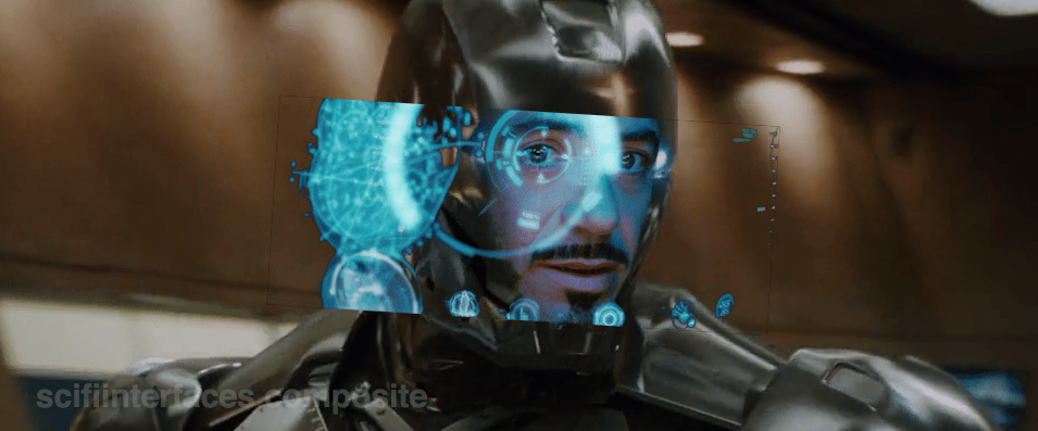
Then there’s the issue of the huge display. It looks like a volumetric projection, like what R2-D2 can project, but that can’t be true, either. The projection would extend way beyond the boundaries of the helmet-sized helmet. Which as you can see below, is a non-starter. So it’s not a volumetric projection.

So, retinal projection

Then what is the display technology? Given the size constraints, retinal projection makes the most sense, but if we could make the helmet go invisible, it would look like Tony was having diffuse LASIK, or maybe playing The Game from Star Trek: The Next Generation.

STTNG The Game-02
Let’s face it, this is not the worst thing you’ve caught me doing.

Representation of the projections?

So, OK, fine. Maybe what we see is what’s being projected, the separate stereoscopic images onto individual retinas. Nope. Then we would see two similar, slightly offset images, like in older anaglyph stereoscopy, but more confusing, because there wouldn’t be a color difference, just double vision.

i_am_iron_man____in_3d_by_homerjk85-d57gs7u
Let’s pray that poor Tony doesn’t have to wear anaglyph glasses in there.
(Props to Deviantartist homerjk85 for the awesome conversion.)

Nope.

So what we are left with is that we are not seeing anything in the real world of the diegesis. This 2° view is strictly a narrative conceit: A projection of what Tony’s brain puts together from the split views of the stereographic projection into a cohesive whole, i.e. retinally-projected augmentation of his eyesight. It’s a testament to the talent of the filmmakers that this HUD, as narratively constructed as it is, just works. We think it’s something real. We instantly get it. But…

The damned multilayering

IronMan_HUDMultilayer
1280px-Parallax_Example.svg
layeringproblems

But even that notion—that this HUD is what Tony experiences, perceptually—is troubled by the multilayering in the HUD. Information in the HUD is typically displayed across multiple layers. See the three squares in the left side of this screen shot for an example. So many problems with this. If this is meant to be what he perceives, then we immediately have trouble with parallax. Parallax is the way that objects shift against background objects when seen from two different viewpoints, like, say, Tony’s two eyes. If Tony perceives these layers through both eyes, i.e. stereoscopically, as an actual set of three layers floating in front of his face, then those graphics shift around depending on which eye JARVIS is optimizing for. One eye might see it beautifully, but then the other eye is wholly confounded. In the worst possible situation, neither eye is really satisfied. See the Wikipedia article on parallax as parallaxed for a meta-example. If on the other hand it’s just one eye that’s seeing these layers, then the layering is utterly pointless, because a single eye has no depth perception and therefore these would just appear as a single layer. It would have no benefit for Tony and only be there for our gee-whizification.

Our choices are: Terrible or Pointless

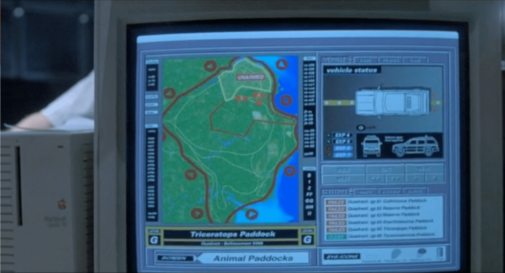
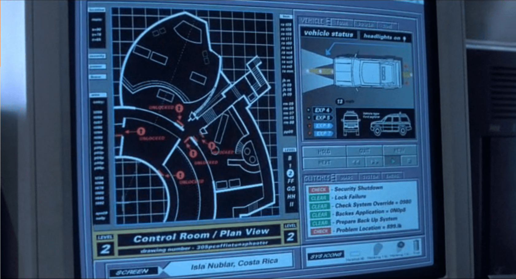
So, it’s either a terrible, confusing display for Tony (which I can’t imagine, given how genius of a technologist he is meant to be), or this view is not even a representation of what Tony sees, but a strictly narrative construction. And we can’t say for sure which it is because this multilayering is never seen in the first-person views. In those screens it’s been reasonably cleaned up to be intelligible. Note the difference between the car views below in the first- and second-person shots.

IronMan1_HUD11
Layers include end views and a side view.
IronMan1_HUD10
Only the side view is shown, the end views are absent.

Then, the damned head movement

Note also that in the 2nd-person view, Tony is very expressive, moving his head around a lot in response to the HUD. But looking at him from the outside, Iron Man’s head doesn’t swivel around except to look at things in the real world. Is the interface requiring him to move his head or is he just a drama queen? If it requires him, that’s terrible. That would move his head away from important things in the real world to focus on something in this virtual world? If he’s a drama queen, fine, nothing to do about that and glad that JARVIS can accomodate. In any case, when we see the him in the helmet outside the TARDIS-HUD, he is not swiveling his head apropos of nothing, which reinforces the notion that this is strictly a cinematic conceit. (Hat tip to Jonathan Korman for sharing this observation with me.)

So…

So ultimately what I’m saying here is this is an impossible thing, and for being impossible, we should not just freak out about how cool it is and declare it the necessary and good future. It has major problems, even as gorgeous and exciting as it is. Hey, no surprise, nobody has forgotten that it’s a movie, but recognize that what you thought was just maybe exaggerated was in fact a bold-faced impossibility.

Next up in the Iron HUD series: Iron Man forces us to get clear about some terms.

Security Alert

The security alert occurs in two parts. The first is a paddock alert that starts on a single terminal but gets copied to the big shared screen. The second is a security monitor for the visitor center in which the control room sits.  Both of these live as part of the larger Jurassic Park.exe, alongside the Explorer Status panel, and take the place of the tour map on the screen automatically.

Paddock Monitor

After Nedry disables security, the central system fires an alert as each of the perimeter fence systems go down.  Each section of the fence blinks red, with a large “UNARMED” on top of the section.  After blinking, the fence line disappears. To the right is the screen for monitoring vehicles.

image01
image03

As soon as the system starts detecting the disabled fences, it starts projecting the fence security diagram onto the main screen at the front of the Control Room for everyone to see, but with a status bar on the right reading “SECURITY, PADDOCKS, TRACKING, and VIDEO.”

image00

Visitor Center

The system has a second screen showing security measures in the visitor center itself.  It focuses on the security doors between public and private areas (dining, halls, the genetics lab, and the cryostorage).

image02

In both cases, these security screens appear on the same computer showing the vehicle status.  It replaces the island map.  This isn’t a separate program, but is instead a replacement window, as shown by the identical data in the columns to the left and right of the map view.

Don’t Break Existing Mental Models

Throughout the security panels, there isn’t any consistency in color labeling.  On the fences, red is good.  On visitor center map, red is bad.  On the glitches panel, red means that it should be looked at, but might not be bad.

First, accessibility standards say that color shouldn’t be the only indicator of status.  Thankfully for this interface and its inconsistency, it at least has labeling. But that means that an operator needs to either memorize the entire panel before they can be proficient at it, or read each label every time.

Second, color standardization could be done with a little more creative background colors.  Picking more neutral backgrounds—for example, the island on the fence map doesn’t need to be bright green, and could either be desaturated or a basic light grey—would allow the status colors to show up better and have more readable text.

Third, while the status indicators are labeled, the labels are written in system language instead of user language.  “Clear” and “Check” can be understood with some work, but aren’t natural status labels in day-to-day society.

Keep Indicators

When the fences deactivate, they disappear off the screen.  While this does show that they’re disabled, it removes the control room crew’s ability to quickly see what they can fix and where it is.  Unless a room full of experts is looking at the screen, they won’t know where the T-Rex fence is and where to send work crews.  Keeping the fences on the screen in a ‘disabled’ or ‘broken’ state would indicate the same information, while still providing direction.

The visitor center screen almost gets this right by changing the color, changing the label, and showing the door as open on the panel.  Practically, this is what’s happening (the ‘Raptors can get through any door they want), but realistically some of those doors are actually closed.

In the case of the doors, it would make more sense to have the status change, but only have the door open if the system actually detects a door opening in the building.

Show the ’Raptors

This is the most critical screen in the park during an emergency, but it isn’t showing a critical status: The Velociraptor Pen.

Arnold has to roll over to the command console computer and type in a manual status request to learn that the raptor pen fences are still active.  Given how important this status is to everyone in the park, it should be on the main map in some form or another.

Additionally, the system could show the status of secondary systems in a side pane:

  • Tour status
  • Camera feeds
  • Where dinosaurs are
  • What secondary equipment status is

When things start to go wrong on the island, this interface should provide guidance to the control room crew on what they need to do and what they need to fix (even if, in this case, the answer is “Everything”).

Organizing information, mapping status across screens, and providing lists of what needs to be fixed would give an understandable checklist to the park staff on what they should be doing.

Genetics Program

image01

According to Hammond, the geneticists in the lab and the software they’re using is “The Real Deal”.

It is a piece of software intended to view and manipulate dino DNA into a format that (presumably) can be turned into viable dinosaur embryos.  The screen is tilted away from us during viewing, and we aren’t able to see the extensive menu and labeling system on the left hand side of the desktop.

Behind it are more traditional microscopes, lab machines, and centrifugal separators.

Visible on the screen is a large pane with a 2D rendering of a 3d object that is the DNA that is being manipulated.  It is a roughly helical shape, with the green stripes corresponding to the protein structure, and various colored dots representing the information proteins in between.

JurassicPark_Genetics02

A technician manipulates the orientation of the protein strand.  We only see him holding his hands to move the object around, we see no gestures that correlate to actual changes to the protein structure. It seems like direct manipulation, but reorienting isolated DNA in space is not really the work of a genetics lab. How do they connect the dinosaur DNA that they find with Amphibian DNA that is needed to fill the holes? Can’t we see that?

image00

Incomplete

Maybe it’s asking too much for the movie to show an in-depth interface for actual genetic modification, considering the complexity of such a feat. Even if we did ask it, we don’t see any evidence of a useful interface here. I don’t even want to go into the analysis of this, except to say that there isn’t any representation to analyze for either how appropriate or how abysmal this interface is. It’s just a disposable gee-whiz won’t-the-future be cool moment.

Iron Man HUD: 1st person view

In the prior post we catalogued the functions in the Iron HUD. Today we examine the 1st-person display.

When we first see the HUD, Tony is donning the Iron Man mask. Tony asks, JARVIS, “You there?” To which JARVIS replies, “At your service sir.” Tony tells him to “Engage the heads-up display”, and we see the HUD initialize. It is a dizzying mixture of blue wireframe motion graphics. Some imply system functions, such as the reticle that pinpoints Tony’s eye. Most are small dashboard-like gauges that remain small and in Tony’s peripheral vision while the information is not needed, and become larger and more central when needed. These features are catalogued in another post, but we learn about them through two points-of-view:a first-person view, which shows us what Tony’s sees as if we were there, donning the mask in his stead, and second-person view, which shows us Tony’s face overlaid against a dark background with floating graphics.

This post is about that first-person view. Specifically it’s about the visual design and the four awarenesses it displays.

Avengers-missile-fetching04

In the Augmented Reality chapter of Make It So, I identified four types of awareness seen in the survey for Augmented Reality displays:

  1. Sensor display
  2. Location awareness
  3. Context awareness
  4. Goal awareness

The Iron Man HUD illustrates all four and is a useful framework for describing and critiquing the 1st-person view.

Sensor display

When looking through the HUD “ourselves,” we can see that the HUD provides some airplane-like heads up instruments: Across the top is a horizontal compass with a thin white line for a needle. Below and to its left is a speed indicator, presented in terms of MACH. On the left side of the screen is a two-part altimeter with overlays indicating public, commercial, military, and aerospace layers of atmosphere, with a small blue tick mark indicating Tony’s current altitude.

There are just-in-time status indicators like that cyan text box on the right with its randomized rule line. The content within is all N -8 W -97 RNG EL, so, hard to tell what it means, but Tony’s a maker working with a prototype. It’s no surprise he takes some shortcuts in the interface since it’s not a commercial device. But we should note that it would reduce his cognitive load to not have to remember what those cryptic letters meant.

IronMan1_HUD08
You can just see the tops of these gauges at the bottom of this screen.

The exact sensor shown depends on the context and goal at hand.

Periphery and attention

A quick sidenote about peripheral vision and the detail of these gauges. Looking at them, it’s notable that they are small and quite detailed. That makes sense when he’s looking right at them, but when he’s not, given the amount of big, swirling graphics he“s got vying for his attention in the main display, the more those little gauges have to compete. And when it comes to your peripheral vision, localized detail and motion is not enough, owing to the limits of our foveal extent. (Props to @pixelio for the heads-up on this one.)

You see, your brain tricks you into thinking that you can see really well across your entire field of vision. In fact, you can only see really well across a few dozen degrees of that perceptual sphere, corresponding to the tiny area at the back of your eye called the fovea where all the really good photoreceptors concentrate. As your eyes dart around the scene before you, your brain puts all the snippets of detailed information together so it feels like a cohesive, well-detailed whole, but it’s ultimately just a hack. Take a look at this demonstration of the effect.

Screen Shot 2015-07-20 at 23.49.56
This only works if you view it live.

So, having those teeny little guages dancing around as a signal of troubles ahead won’t really get Tony’s attention. He could develop habits of glancing at these things, but that’s a weak strategy, since this data is so mission-critical. If he misses it and forgets to check the gauges, he’s Iron Toast. Fortunately, JARVIS is once again our deus ex machina (in so many senses) because he is able to track where Tony is looking, and if he’s not looking at the wiggling gauge, JARVIS can choose to escalate the signal: Hide the air traffic data temporarily and show the problem in the main screen. Here, as in other mission critical systems, attention management is crisis management. Now, for those of us working with pre-JARVIS tech, it’s rare today for a system to be able to

  • Track perceptual details of its users
  • Monitor a model of the user’s attention
  • Make the right call amongst competing priorities to escalate the right one

But if you could, it would be the smart and humane way to handle it.

Location Awareness

As Tony prepares for his first flight, JARVIS gives him a bit of x-ray vision, displaying a wireframe view of the Santa Monica coastline with live air traffic control icons of aircraft in the vicinity. The overhead map updates of course in real time.

IronMan1_HUD17
If my Google Earth sleuthing is right, his view means he lives in the Malibu RV Park and this view is due East.

Context Awareness

Very quickly after we meet the HUD it shows its object recognition capabilities. As Tony sweeps his glance across his garage, complex reticles jump to each car. Split-seconds afterwards, the car’’s outline is overlaid and some adjunct information about it is presented.

IronMan1_HUD10

This holds true as he’s in flight as well. When Tony passes by the Santa Monica pier, not only is the Pacific Wheel identified (as the Santa Monica Ferriswheel), but the interface shows him a Wikipedia-esque article for the thing as well.

IronMan1_HUD19

IronMan1_HUD21

While JARVIS might be tapping into location databases for both the car and the ferris wheel recognition, it’s more than that. In one scene we see him getting information on the Iron Patriot as it rockets away, and its location wouldn’t be on any real-time record for him to access.

Optical zoom

Too much detail

While this level of object detail is deeply impressive, it’s about as useful as reading Wikipedia pages hard-printed to transparencies while driving. The text is too small, too multilayered, and just pointless considering that JARVIS can tell him whatever he needs to know without even asking. Maybe he could indulge in pop-up pamphlets if he was on a long-haul flight from, say, Europe back home to the Malibu RV Park (see above), but wouldn’t Tony rather watch a movie while on Autopilot instead?

Goal awareness

Of course JARVIS is aware of Tony’s goals, and provides graphics customized to the task, whether that task is navigating flight through complex obstacle courses…

3D wayfinding

…taking down a bad guy with the next hit…

Suggested target points

…saving innocent bystanders who are freefalling from a plane…

Biometric analysis, target acquisition

…or instantly analyzing problems in an observed (and complicated) piece of machinery…

3D schematics of observed machinery with damage highlights

…JARVIS is there with the graphics to help illustrate, if not solve, the problem at hand. Most impressively, perhaps, is JARVIS’ ability to juggle all of these graphics and modes seamlessly to present just the right thing at the right time in real time. Tony never asks for a particular display, it just happens. If you needed no other proof of its strong artificial intelligence, this would be it.

Next up in the Iron HUD series: Compare and contrast the 2nd-person view.

Explorer Surveillance

The Control Room of Jurassic Park has a basic video/audio feed to the Tour Explorers that a controller (or, in this case, John Hammond) can use to talk to the tour participants.  He is able to switch to different cameras using the number keys on the keyboard attached to the monitor. The cameras themselves appear to be fixed in place.

JurassicPark_FordSurveillance01

We never see the cameras themselves in the Explorers, but we do see Malcolm tap on one of the cameras during the tour while Hammond is watching it’s feed, so they are visible to the riders.

Hammond occasionally speaks through his audio link, and can hear a constant audio feed from the Explorers. He has some kind of mute button (he says a couple disparaging comments that the other characters don’t appear to hear), but the feed from the Explorers is real-time. It isn’t obvious how he switches between the different Explorers’ audio feeds, or whether he hears both Explorers simultaneously.

Deadly-stupid limitations

Each Explorer can hold a limited number of passengers, but it’s clear that Hammond wanted larger groups of people on a single tour together. Whether this was because of monetary concerns and wanting to pack more tours on the same rail, or because he didn’t want large families to be left out is less clear. Jurassic Park doesn’t have any trouble handling two Explorers.

What it does struggle with is the clear delineation between who is in Explorer 1, and who is in Explorer 2. Despite the audio and video feeds going back and forth between the Explorers and the control center, the passengers have no way to talk to someone in the other Explorers.

This leads directly to Malcolm’s injury and Gennaro’s death at the T-Rex pen.

On a good tour, these same systems would allow one Explorers to talk to the other. If someone saw a dinosaur, but the other Explorers didn’t, the first group could point it out.

Give the tour guide context

It isn’t clear either what the day-to-day job of the tour guide would be. Hammond clearly enjoys talking about his park, but the pre-recorded voice seems to be giving most of the “tour” information to the passengers.

JurassicPark_FordSurveillance02

What might be more useful is giving the tour guide access to the monitoring maps and exterior cameras so that he/she can answer questions that can’t be easily answered by pre-recorded systems: “Hey, what’s that triceratops doing to that other triceratops?”

If the tour guide sees a dinosaur that the passengers don’t, or if the dinosaur is doing something odd that the passengers are wondering about, it would be a great point for the tour guide to jump in and add more context. More exterior camera views would improve their ability to do that job.

Privacy

Theme parks are notorious for their lack of privacy. Hammond has a chance to challenge that expectation here with his focus on high-end tours. Although it doesn’t look possible now, the cameras don’t need to be on constantly, and could at least have a clear indication of when someone was watching. Maybe a ringlight around the lens?

Additionally, the Explorers could give the passengers a way to turn off the video and audio feeds. This imposes a security risk, but would give the tours a more primeval and isolated feel. It might not be as bluntly educational, but the improvement in atmosphere might make up for it.

Expectations

Overall, this system acts exactly like someone would expect a basic security and surveillance system to act.  It has basic controls, always-on CCTV, and the ability for the control room to control what’s happening. The improvements mentioned above could upgrade this system from a basic monitor into a valuable addition to the Jurassic Park experience.

Iron Man HUD: Just the functions

In the last post we went over the Iron HUD components. There is a great deal to say about the interactions and interface, but let’s just take a moment to recount everything that the HUD does over the Iron Man movies and The Avengers. Keep in mind that just as there are many iterations of the suit, there can be many iterations of the HUD, but since it’s largely display software controlled by JARVIS, the functions can very easily move between exosuits.

Gauges

Along the bottom of the HUD are some small gauges, which, though they change iconography across the properties, are consistently present.

IronMan1_HUD07

For the most part they persist as tiny icons and thereby hard to read, but when the suit reboots in a high-altitude freefall, we get to see giant versions of them, and can read that they are:

IronMan1_HUD13
Tony can, at a glance or request, summon more detail for any of the gauges.
IronMan1_HUD12
Even different visualizations of similar information.

Object Recognition

In the 1st-person view we see that the HUD has a separate map in the lower-left, and object recognition/awareness,

IronMan1_HUD10
IronMan1_HUD11
In the 2nd-person view, we see even more layers of information about the identified objects, floating closer to tony’s point of view.

Situational

Most of the HUD functions we see, though, are situational, brought up for Tony’s attention when JARVIS believes they are needed, or when Tony requests them. Following are screenshots that illustrate a moment when the situational function appeared. 

Iron Man

Iron Man 2

Iron Man 3

The Avengers

Some of these illustrate why I argue that JARVIS is the superhero, and Tony just the onboard manager, but rather than reverse engineering any particular function, for this post it is enough to document them and note that only the optical zoom seems to be an interactive function. This raises questions of how he initiated the mode and how he escapes the mode, but since we don’t see the mechanisms of control, it’s entirely arguable that JARVIS is just  being his usual helpful self again.

Next up in the Iron HUD series: Let’s dive deeper into the first-person view.

Night Vision Goggles

Genarro: “Are they heavy?”
Excited Kid: “Yeah!”
Genarro: “Then they’re expensive, put them back”
Excited Kid: [nope]

Screenshot-(248)

The Night Vision Goggles are large binoculars that are sized to fit on an adult head.  They are stored in a padded case in the Tour Jeep’s trunk.  When activated, a single red light illuminated in the “forehead” of the device, and four green lights appear on the rim of each lens. The green lights rotate around the lens as the user zooms the binoculars in and out. On a styling point, the goggles are painted in a very traditional and very adorable green and yellow striped dinosaur pattern.

Tim holds the goggles up as he plays with them, and it looks like they are too large for his head (although we don’t see him adjust the head support at all, so he might not have known they were adjustable).  He adjusts the zoom using two hidden controls—one on each side.  It isn’t obvious how these work. It could be that…

  • There are no controls, and it automatically focuses on the thing in the center of the view or on the thing moving.
  • One side zooms in, and the other zooms out.
  • Both controls have a zoom in/zoom out ability.
  • Each side control powers its own lens.
  • Admittedly, the last option is the least likely.

Unfortunately the movie just doesn’t give us enough information, leaving it as an exercise for us to consider.

Screenshot (241)

Dr. Grant, Timmy is hogging the tech

Note that there aren’t enough goggles in the Jeep for everyone.  During a tour this might set up a competition for the goggles.  Considering how much a ticket to the island is implied to cost, the passengers in the Jeep would likely be unhappy at this constraint.

Better here would be some kind of HUD for the entire Jeep, with a thermal overlay or night-vision projection of what’s around the Jeep.

Alternatively, if cost is indeed an issue to Hammond, the TV screen could be used to show camera feeds of the pen and dinosaurs inside.

Hopefully A Prototype

The lights on the front show what’s happening internally, and give feedback that the goggles are doing something to people watching.  As we learn soon after this scene, dinosaurs are also very sensitive to light and motion.  Especially the T-Rex.

These night vision goggles would work best in darkness, where it would add to the tour to see a dinosaur behaving (relatively) naturally.  If the dinosaurs on the tour are very sensitive to light, then the motion on the front of the goggles would actually be counter to the goals person using the goggles.

So let’s presume these were a prototype, and why they were in the trunk and not mentioned by Hammond at the start of the tour.

Overall

The goggles look easy to use, but appear to need refinement from field experience.  A key point will be how the passengers react to having enough of them, and whether they serve the tourists in experiencing the park as intended.

Ford Explorer Status

image00

One computer in the control room is dedicated to showing the status of the Jeeps out on tour, and where they currently are on the island.

Next to the vehicle outline, we see the words “Vehicle Type: Ford Explorer” (thank you, product placement) along with “EXP” 4–7.  EXP 4 & 5 look unselected, but have green dots next to them, while EXP 6 & 7 look selected with red dots next to them.  No characters interact with this screen. Mr. Arnold does tap on it with a pen (to make a point though, not to interact with it).

On the right hand side of the screen also see a top-down view of the car with the electric track shown underneath, and little red arrows pointing forward.  Below the graphic are the words “13 mph”.  The most visible and obvious indicator on the screen is the headlights.  A large “Headlights On” indicator is at the top of the screen, with highlighted cones coming out of the Jeep where the headlights are on the car.

Jumbled Hierarchy

It is very difficult to tell from this page what the most important systems on the tour are.  The most space and visual weight is given to the car itself and its headlights, but we never see any data on the actual car itself. Did Hammond’s deal with Ford include constant advertising to his handful of tour monitors?

When Drs. Grant and Sattler leave the jeep to walk out into the park, we only see two doors open; but all four doors show as open on the main projector status display in the control room.

Probably an editing error, but with Nedry programming things, who can say?
They can remote control the steering wheel and pedals, but not the locks?Probably an editing error, but with Nedry programming things, who can say?
image01
Probably an editing error, but with Nedry programming things, who can say?

At best, the system is attempting to display a binary indicator (doors open/doors closed) based on limited data.  At worst, the system is unreliable and can’t be trusted to deliver even basic status information correctly.

We also see several buttons that are labeled like they should be active, such as “Hold”, “Quit”, “New”, and “Next”.  What could this mean?

  • Erroneous labels indicating action where there is none
  • Disabled buttons because they aren’t appropriate for where the Jeeps are right now
  • Something that could be active in the future when more coding is done.

Ideally, these are indicating normal actions that aren’t available right now.  The control team would still need to be trained on why they’re disabled and when they’re active, which puts an unnecessary burden on their memory. That information should be apparent in any interface on which lives depend.

Missing Information

Many systems appear to be missing from this display, or are indicated in a way that is too cryptic to easily identify:

  • Self driving features?
  • Basic diagnostic info, like oil temp and tire pressure?
  • What event is playing in the Jeep?

It could also be improved with information that the system can surely collect.  Trend information would be the most useful:

  • How efficiently is the Jeep moving?
  • Is it breaking down?
  • What kind of baseline is the tour establishing?
  • Has it been accelerating or decelerating? At what rate?

While you’re an unethical capitalist, there is even information that could be used to track the effectiveness of the park, by tracking the affective states of the passengers in the car:

  • Heartrate
  • Motion within the car (direction, proximity to windows)
  • Breath rate
  • Skin temperature
  • Conversation (and valence): words, pace, and pitch

At their least offensive, this data would be anonymously aggregated and analyzed by location to understand where the experience can be improved. Where is the tour the most boring? Most exciting? Where are the passengers most likely to view dinosaurs (and should have their attentions keyed)? You could also use the information in real time to know when there is likely a problem that needs the attentions of a remote operator.

Finally, if you have cameras on the vehicles, you have another data collection channel such that the system could compare views of the road and paddocks, compare to prior images, and know when there are plants that need trimming away from the rail, or when deformations appear in the walls and need attention from maintenance teams. Heck, you could turn those sensors into an upsell opportunity. Charge a few extra bucks, and friends and family back home can go on the live tour with you, or you could sell a 360° video back to the riders as a souvenir. Dinobucks to be made, here, people.

The Map

One of the few pieces that is straight-forward here is the map.  We see a dot for where the tour is, the number and type of vehicles on the tour, and location information.  For a single tour, this would probably work well.

It would be a nightmare with more than one tour out in the field at a time.

With more than a handful of vehicles out on the island with the current information density, the display would quickly be overwhelmed with numbers overlapping each other and changing constantly making it impossible to read.  The large vehicles too might overlap more important information, like the terrain or possible problem areas on the tracks.

Color contrast is an issue here too: green on green would be very difficult to see for anyone without perfect color vision.  If the color was the only thing to change on a change in status from good to bad, the color green is also an issue because of how many other colors it conflicts with.  Accessibility would be improved by choosing a color like blue, or adding an outline to the dot.

_Map
scifiinterfaces comp.

Better would be to have a basic icon for each tour on the map, and a basic color/label combination next to the icon to show a “nominal” status.  The icon could also be an indicator of how many vehicles were in the tour.

If something happened, the icon status could change to a different color, and the label would change to the new status. Icons would make that information more glanceable. Additional info would flow onto the screen for just that tour.

This would provide a clear indicator of which tour on the map to pay attention to, and what was broken about it.

Overall

I would hope that this wasn’t a screen that I would have to look at day-in, day out.  The entire future control crew of Jurassic Park was lucky they weren’t forced to deal with this. But, with a few tweaks to the map and a complete reorganization of the information on the Jeep Status screen, it might become usable.

Iron Man HUD: A Breakdown

So this is going to take a few posts. You see, the next interface that appears in The Avengers is a video conference between Tony Stark in his Iron Man supersuit and his partner in romance and business, Pepper Potts, about switching Stark Tower from the electrical grid to their independent power source. Here’s what a still from the scene looks like.

Avengers-Iron-Man-Videoconferencing01

So on the surface of this scene, it’s a communications interface.

But that chat exists inside of an interface with a conceptual and interaction framework that has been laid down since the original Iron Man movie in 2008, and built upon with each sequel, one in 2010 and one in 2013. (With rumors aplenty for a fourth one…sometime.)

So to review the video chat, I first have to talk about the whole interface, and that has about 6 hours of prologue occurring across 4 years of cinema informing it. So let’s start, as I do with almost every interface, simply by describing it and its components.

Exosuit

The Iron Man is the name of the series of superpowered exosuits designed by Tony Stark. They range from the Mark I, a comparatively crude suit of armor to escape imprisonment by terrorists, through the Mark XLVI, the armor seen in The Avengers: Age of Ultron. The suit acts as defense against nearly every type of weapon known. It has repulsor beams built into the palms and in later models the arc reactor mounted in the chest that can be used to deliver concussive force. It allows the wearer to fly. Offensive weaponry varies between models, but has included a high powered laser system, and auto-targeting minigun pod and missiles. The suit can act semi-autonomously or via remote control. One of the models in The Avengers has parts that are seen to self-propel to Tony, targeting a beacon bracelet he wears, and self-assemble around him very quickly.

Marks1and43

Immersive display

Though Tony’s head is completely covered, he has a virtual reality display within his helmet. It is a full-field-of-vision, very high-resolution, full-color display that provides stereoscopic imaging. It allows Tony to see the world around him as if he were not wearing the helmet, augment the view with goal-, person-, location-, and object-sensitive awareness.

The display varies a great deal, changing to the needs of the situation. But five icons persistently in the lower part of the display seem to be: suit status, targeting and optics, radar, artificial horizon, and map.

An interpretive view of Tony’s experience, from Iron Man (2008).
An first-person view from within the HUD, Iron Man (2008).

There is much to critique about the readability of the complex layering and translucency, the limits of human perception, and the necessarily- (and strictly-) interpretive nature of what we as audience see, but let me save those three points for a later post. For now it’s enough to log the features as aspects of the system.

Head NUI

Though Tony could use his hands to interact with an interface projected into the augmented reality view around him, his hands are often occupied in controlling flight or in combat. For this reason the means of input are head gesture, eye gesture, and voice input. A bit more on each follows.

Elements within the HUD such as reticles around his eyes follow and track his head gestures. Other elements stay locked in place. The HUD can track his gaze perfectly, allowing him to designate targets for his weapons with a fixation. Using this perfect eye tracking, Tony can also speak about something he is looking at, either in the real world or in the interface, and the system understands exactly what he’s talking about.

In fact, Tony is able to speak fully natural language commands, and indeed, carry out full-Turing conversations with the suit because of the presence of…

Strong artificial intelligence: JARVIS

An on-board artificial intelligence known as JARVIS handles any information task Tony asks of it, and monitors the surroundings and anticipates informational needs. There is strong evidence that most of the functions of the suit are handled by JARVIS behind the scenes. The crucialness of the artificial intelligence to the function of the suit cannot be overstated. It’s difficult to imagine how most of the suit could function as it does without an artificial intelligence behind the scenes facilitating results and even guiding Tony. With this in mind it is instructive to reframe the AI as the thing being named the Iron Man, with Tony Stark being an onboard manager, or, more charitably, a command-and-control center. Who quips.

Next up in the Iron HUD series: Lets review the functions of the suit.

Avengers-Iron-Man-Videoconferencing02