
Read all the Star Trek: Section 31 posts in chronological order.
With the fascist-billionaire media-capture tactic underway in the United States, entertainment that smells at all “woke” to them is being summarily lined up against a brick wall and shot. Star Trek is not immune, and with Paramount’s takeover by asshat-in-chief David Ellison, every Star Trek property has been canceled and their sets dismantled. The episodes for Season 2 of Starfleet Academy and Season 5 of Star Trek: Strange New Worlds have already been shot, so they will probably be released. But that will be it. I would not be surprised if every single Star Trek fan canceled their Paramount subscriptions and found other ways to watch those final episodes. It would be just desserts.

Given all of that, I don’t expect we’ll see a Section 31: Party on Turkana IV sequel anytime soon. This may be the one and only Section 31 movie we get until this ugly fascist phase is behind us. If you’re a US American, you’re registered to vote, right?
If this is the last Star Trek show we see for a while, it’s not a bad one to have as a bookend. I mean, it’s not perfect. (Did no one realize that even if San got back to the Mirror Universe, he’s not biometrically authorized to use the MacGuffin? Like, the last third of the movie could have just been our characters chatting over drinks in Baraam, collectively shrugging.) But the interfaces are worth celebrating, and that’s what this report card is all about.
Sci: F (3 of 4) How believable are the interfaces?
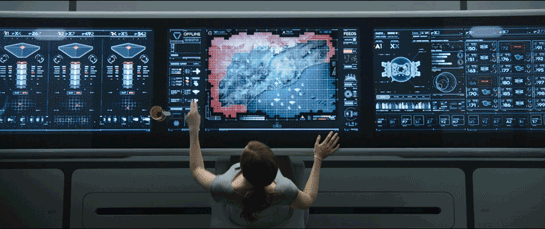
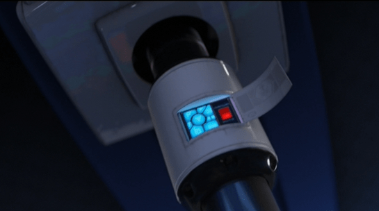
With the exception of the Godsend, they are completely believable, given the novum stack of the 24th century Star Trek world. The mission briefer’s issues are largely social, not technological. The phase pod makes sense and is a pretty good wearable measured against the criteria. Fuzz’ interfaces—the displays and the programmable-matter lever he pulls—are largely what they should be. The Federation interfaces look like they come from the same place, as do the scow’s, and the Terran ones.


And let me be clear—if you have to make one interface that doesn’t model efficacious design, a weapon of mass destruction would be it. I’m very glad that one isn’t believable.
Fi: D (4 of 4) How well do the interfaces inform the narrative of the story?
Here’s where the Godsend should shine and does, being the MacGuffin that drives the action and even amps up the tension of the climax. The phase pods help us understand what’s happening throughout a fight that happens between worlds. Fuzz’ interfaces sell us on how a being of such tiny scale can be a part of—and betray—a human-sized team. The high contrast, saturated-red-on-black interfaces distinguish the Terran environs from Section 31’s and the scows. The Droom doll (described in Best Robots) tells us some deep things about a culture we never meet, all in just a few seconds.


Interfaces: F (3 of 4) How well do the interfaces equip the characters to achieve their goals?
Georgiou wants to nab and keep the mysterious suitcase, and the phase pods help her easily meet and fight San whatever plane he’s on. We only see one of Fuzz’ interactions, but it’s perfectly designed for his need. And his whole plan depended on agents he could control at a distance. Despite not knowing the language, Quasi is able to pilot the scow, use it to delay San’s passage through the portal, and drop a bomb on a ship in hot pursuit.


Final Grade B+ (10 of 12), Must See.
Star Trek is a cultural force. In the 60 years since the original series aired, it’s become a cultural touchstone around the world. Its warp drive will fire up again, sometime. We’ve already seen it crop up under different guises across the years, and it was still on air.


It means too much to too many people to have some hoarding-class religious-political extremists ground it forever. They think they are burying it, but they are planting a Phylosian seed.

And nice work, team Section 31.
IMDB: https://www.imdb.com/title/tt9603060/Currently streaming on: ![]()
![]()
![]()
![]()
![]()
![]()
Last up: Wrapping up the Friztes 2026


