St. God’s: Unscannable Panic

During Joe’s consultation with Dr. Lexus, all the clues he has been stumbling past finally begin to sink in. When Dr. Lexus asks him to pay the bill, and—thinking Joe is mentally challenged—instructs him to put his tattoo up to the OmniBro payment system, he realizes that Joe has no barcode on his wrist.

Idiocracy_treatment01

The doctor is absolutely terrified of this. He can barely conceive it. “Why come you don’t have a tattoo?” [sic] “You’re not unscannable, are you‽…You’re unscannable!!” In a panic he reaches out to his treatment panel and smashes the lower-left hand icon, shouting, “UNSCANNABLE!!” This causes a klaxon to sound and red beacon light to blink. Joe realizes he can’t stay and flees.

The panel

Dr. Lexus has a 3×4 mini-panel similar to Biggiez’ intake interface. It gets only a blurry half a second of screen time, but through the annoying power of screengrab, I can see that they’re a subset of the graphics from the intake interface.

Lexus-panel.png
Artists’ janky interpretation

Too bad. It was an opportunity for more hilarity, perhaps something similar to Dr. Lexus’ moronic ramblings. Think buttons for Kick Ass, Sound like a Dick, and Fucked Up. (Serious props to Jason Long for pulling these lines off so hilariously.) But let’s instead talk about mashing buttons.

Avoiding accidental activation

We want to ensure that a doctor only presses this high-cost button deliberately, but it still has to be easy to press. The classic CTRL-ALT-DELETE key chord is an example of deliberateness. It was designed to be very difficult to press accidentally. A gas station shut-off emergency shut off is an example of an emergency button that is easy to find and press.

Dr. Lexus’ panic button is the opposite of this: A high-cost button that looks like and sits adjacent to all these other presumably low-cost buttons, and even sits in one of the easiest-to-hit areas, requiring some of the least precision. The risk of accidental activation seems very high. Don’t do this.

Idiocracy_treatment07

On the other hand, it’s possible that the keyboard is aware of Dr. Lexus’ emotional state, either from lots of context cues, or the strength of his mashing, or the fact that he’s touching four buttons at once.

Affective input

Smashing is its own kind of input—it’s different than the deliberate key presses of ordinary use. It means that either the user is in some intense emotional state (angry, panicked, or…a joyful toddler, maybe?) or not actually trying to provide input, just manipulating the interface (say, picking up the keyboard to move it.) These are events which designers can consider and design for. A real world example is the mobile version of Google Maps, shake it and it presumes that you are angry and asks you for feedback.

So it’s possible—if you want to give interfaces in the Idiocracy more credit than is justifiable given the idiocracy—that the panel is detecting the fast, hard, mashing of multiple keys, and registering that as a distress call. Long-time readers may recall Zorg mashing his desktop keypad in a panic as he chokes on a cherry pit in The Fifth Element. Perhaps this interface can sit alongside it as a possible opposite.

Triple your resistance to the Idiocracy (today)

Straight from DSCC: The last FEC deadline before Election Day is in just two days. That means the final decisions are being made right now about where to allocate resources for the last weeks before November’s elections.

It also means that the final ad buys of the midterm elections are being made—and we need to make sure sane candidates have the resources they need to get their message out. Enter the DSCC.

dscc_facebook_share2.png

They have a $300,000 goal, and only have until Wednesday at midnight to hit it. If you make a donation, it will be TRIPLE-MATCHED to give candidates what they need to flip the Senate and put some necessary counterbalance to the insanity coming from the executive branch.

Jasper’s Music Player

ChildrenofMen-player03

After Jasper tells a white lie to Theo, Miriam, and Kee to get them to escape the advancing gang of Fishes, he returns indoors. To set a mood, he picks up a remote control and presses a button on it while pointing it at a display.

ChildrenofMen-player02

He watches a small transparent square that rests atop some things in a nook. (It’s that decimeter-square, purplish thing on the left of the image, just under the lampshade.) The display initially shows an album queue, with thumbnails of the album covers and two bright words, unreadably small. In response to his button press, the thumbnail for Franco Battiato’s album FLEURs slides from the right to the left. A full song list for the album appears beneath the thumbnail. Then track two, the cover of Ruby Tuesday, begins to play. A small thumbnail to the right of the album cover appears, featuring some white text on a dark background and a cycling, animated border. Theo puts the remote control down, picks up the Quietus box, and walks over to Janice. *sniff*

This small bit of speculative consumer electronics gets around 17 seconds of screen time, but we see enough to consider the design. 

Persistent display

One very nice thing about it is that it is persistently visible. As Marshall McLuhan famously noted, we are simply not equipped with earlids. This means that when music is playing in a space, you can’t really just turn away from it to stop listening. You’ll still hear it. In UX parlance, sound is non-modal.

Yet with digital music players, the visual displays that tell you about what’s being played, or the related interfaces that help you know what you can do with the music are often hidden behind modes. Want to know what that song you can’t stop hearing is? Find your device, wake it up, enter a password, find the app, and even then you may have to root around to find the software to find what you’re looking for.

But a persistent object means that non-modal sound is accompanied by (mostly) non-modal visuals. This little box is always somewhere, glowing, and telling you what’s playing, what just played, and what’s next.

Remote control

Finding the remote is a different problem, of course, and if your household is like my household, it is a thing which seems to want to be lost. To keep that non-modality of sound matched by the controls, it would be better to have the device or the environment know when Jasper is looking at the display, and enable loose gestural or voice controls to control it.

Imagine the scene if he grabs the Quietus box, looks up to the display, and says, “Play…” then pause while he considers his options, and says “…‘Ruby Tuesday’…the Battiato one.” We would have known that his selection has deep personal meaning. If Cuarón wanted to convey that this moment has been planned for a while, Jasper could even have said, “Play her goodbye song.”

Visual layout

The visual design of the display is, like most of the technology, meant to be a peripheral thing, accepting attention but not asking for it. In this sense it works. The text is so small the audience is not tempted to read it. The thumbnails are so small it is only if you already knew the music that it would refresh your memory. But if this was a real product meant to live in the home, I would redesign the display to be usable at the 3–6 meter distance, which would require vastly reducing the number of elements, increasing their size, and perhaps overlaying text on image.

ChildrenofMen-player03

Flight Recorder

image04

Jack flies the airship most of the way to the TET when he decides to listen the recordings of the Odyssey. He presses the play button on the recorder, it makes a beep and an electronic voice says, “Flight recorder playback for the Odyssey mission, 3 May 2017.” Then the playback starts.

First, real flight recorders

Before starting the analysis of the black box in Oblivion I thought it could be helpful to do some research on real-word black boxes. That way I had a reference point, something to compare this to. Oddly enough, there is a lot of information on the internet about the required recording and survival aspects of the device, but not much about means to find it after a crash. Beacons and transmitters are mentioned, but not many requirements to facilitate a person actually spotting it. Anyway, after that research I came up with a list of requirements for the device. It must…

  • Survive extreme temperature, pressure, and water conditions.
  • Record both ship and crew´s data on the flight.
  • Be easy to find in a crash site.
  • Provide quick access to the stored data.

You can think of modern flight recorders as big and tough hard drives that make digital recordings of both ship data and cockpit voice. Most modern commercial jets use a “quick access recorder” that stores data in a removable memory that can be plugged in to a common computer. And some recorders can also have an USB or Ethernet port for quick access, too. But often the device is damaged by the crash, and the full data needs to be accessed with special equipment.

So it’s against these requirements that we can analyze the real-world design of the flight recorder.

And really, this thing is like a Christmas tree of attention getting lights and sounds in comparison.

Great: Commanding attention

I have to give it to them here, they did a really good job. Aside from the normal design patterns for black boxes, the flight recorder in the movie provides other ways to find the device. The flashing white light can be easily spotted in the dark —and also on the day if bright enough. Even more, flashing is one of the most attention-getting signals that there are, neurologically speaking. And it can be instantly associated with an electronic device, while a fixed flight could be taken as a reflection on some debris.

Irregular flashing is even more powerful: A pattern that is semi random (or stochastic in the literature), with some flashes slightly offset from the main pattern. That difference in the flashing is even more attention getting that a regular one. This too would be really helpful in a crash site where you have an important amount of flashes going on as well: police cars, ambulances and fire cars. In that situation, the randomness of the flashing can help in distinguishing the device from the surroundings.

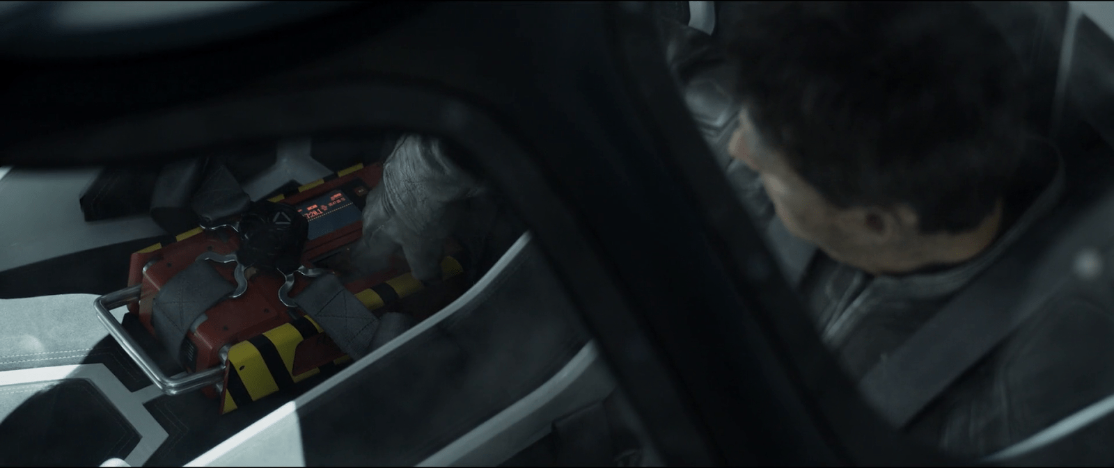
Julia was wandering through the Odyssey´s wreckage when she heard a soft and repeating sound. She pulled out some wreckage to find the flight recorder. These sound signals help her to locate the device more precisely when at close distance, even when it´s covered by debris if the sound is strong enough.

Oblivion-Flight-Recorder-Beacon

She takes it out to give it a look, and it´s here when we see the device.

image03

When Julia finds the recorder, she knows that she and Jack need to carry it back to the Tower to better examine it. And as the recorder is kind of heavy, Julia folds out an small handler and uses it to lift up the recorder.

Great: Even better than a flash memory

The recorder in the movie also provides a way to instantly access the voice recordings of the crew. It uses a display and several buttons in a way that is similar to a music player, and building on a known mental model means that anyone looking for the device is going to be able to use it.

Assistive tools for the emergency mode

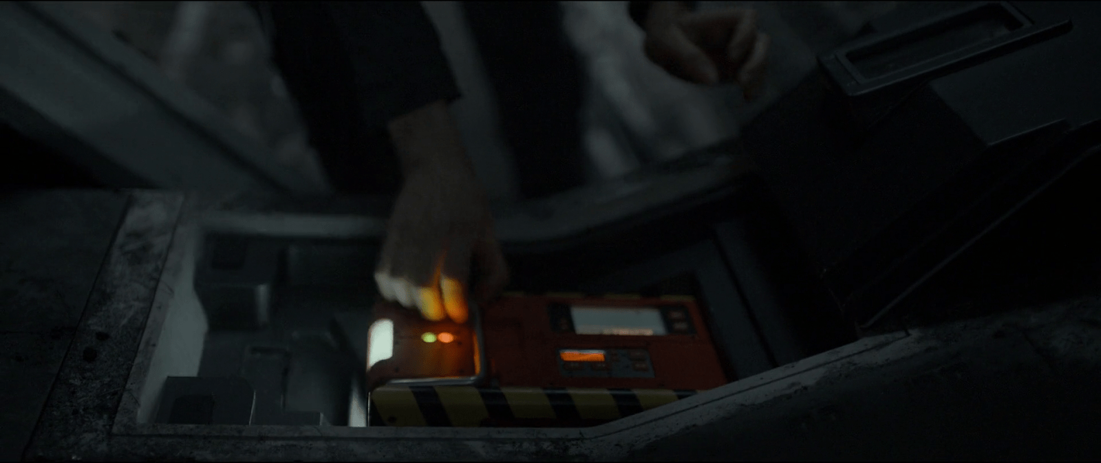
The recorder in the movie also seems to have two different modes or settings, an “emergency” mode when it has to be found and another mode to play the recordings. As with real flight recorders, the emergency mode could be activated by internal sensors. These could detect the crash via a sudden and/or significant change in velocity, for example. But it ought to have a manual control of some sort to return to normal mode.

When Julia finds the recorder, the device was beeping and using a light as beacon. It also had two status LEDs turned on and the small display was showing a graph curve in red. In contrast, when Jack is hearing the playbacks, the recorder doesn´t show any of those functions. Both the beeping, the lights, and the small screen display are all turned off, and the graph isn´t showing anymore.

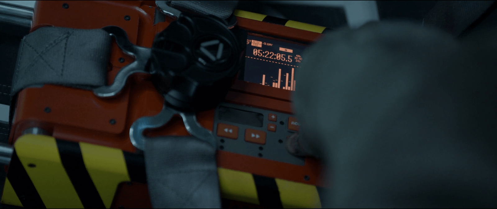
What is that red graph supposed to mean anyway?

It´s not very clear what the purpose of the small screen display is. What is it meant to communicate? Additionally the display is oddly placed next to the controls of the recorder, which implies a mapping that doesn’t really seem logical. But mapping is not the only issue, because when the recorder is actually playing, this display is always off.

Given that It´s only on when Julia finds the recorder and the device is capable of playing the recordings by itself, it might be a way to tell the amount of battery life of the device. Although even then, a graph is something that shows change through time. When you need to know the energy levels at one specific moment, using a common battery indicator, or even a depletion bar would work better.

So maybe the graph is telling us that the device has some way of recharging itself. In that case, the graph could be showing charge and discharge cycles—or energy consumption rates—and by association also telling about some problem with the charging system. Even assuming this is the case, it´s odd that the display is always off during playback so it probably has some control to turn it on and off.

A screen dedicated to sound.

The recorder uses another, bigger display to show a number that indicates some time value, like recording or playback time. The bottom half of the display shows a spectrum analyzer of the recording playing at the moment, but when the recorder is not working this part of the display remains empty. During the movie we see that the recorder plays only sound, i.e. the voice recordings during the mission.

This screen offers some visualization but showing the spectrum analysis of the playback seems like a secondary feature. You know, given that it´s not necessary to actually hear the playback. But the display has a MODE button, so maybe the recorder can also record video to take advantage of the full size of the screen. In that case maybe the crew of the Odyssey just chose to only record audio, be it for privacy or to save storage space for the rest of the mission.

image01

Jack was already in space and closing in to the Tet. And as he has to maintain his cover until he gets inside the Tet with the bomb, he stops the recording of the Odyssey.

After getting permission to dock in the Tet, Jack the returns to the playback. But the recording suddenly stops when the command module of the Odyssey got inside the Tet, then there´s only static and an—end of recording—message.

After getting permission to dock in the Tet, Jack the returns to the playback. But the recording suddenly stops when the command module of the Odyssey got inside the Tet, then there´s only static and an—end of recording—message.

But again, we never actually see the recorder playing video. And the display has a low resolution, monochrome screen—like some early PDAs. So making sense of any video playing from there would definitely be a challenge.

New You Selector

LogansRun154

In addition to easy sex and drugs, citizens of Dome City who are either unhappy or even just bored with the way they look can stop by one of the New You salons for a fast, easy cosmetic alternation.

LogansRun157
NewYou2rs

At the salon we get a glimpse of an interface a woman is using to select new facial features. She sits glancing down at a small screen on which she sees an image of her own face. A row of five unlabeled, gray buttons are mounted on the lower bevel of the screen. A black circle to the right of the screen seems to be a camera. She hears a soft male voice advising, “I recommend a more detailed study of our projections. There are new suggestions for your consideration.

She presses the fourth button, and the strip of image that includes her chin slides to the right, replaced with another strip of image with the chin changed. Immediately afterwards, the middle strip of the image slides left, replaced with different cheekbones.

In another scene, she considers a different shape of cheekbones by pressing the second button.

So. Yeah. Terrible.

  • The first is poor mapping of buttons to the areas of the face. It would make much more sense, if the design was constrained to such buttons, to place them vertically along the side of the screen such that each button was near to the facial feature it will change.
  • Labels would help as well, so she wouldn’t have to try buttons out to know what they do (though mapping would help that.)
  • Another problem is mapping of controls to functions. In one scene, one button press changes two options. Why aren’t these individual controls?
  • Additionally, if the patron is comparing options, having the serial presentation places a burden on her short term memory. Did she like the apple cheeks or the modest ones better? If she is making her decision based on her current face, it would be better to compare the options in questions side-by-side.
  • A frontal view isn’t the only way her new face would be seen. Why does she have to infer the 3D shape of the new face from the front view? She should be able to turn it to any arbitrary angle, or major viewing angles at once, or watch videos of her moving through life in shifting light and angle conditions, all with her new face on.
  • How many options for each component are there? A quick internet search showed, for noses, types show anything between 6 and 70. It’s not clear, and this might change how she makes her decision. If it’s 70, wouldn’t some subcategories or a wizard help her narrow down options?
  • Recovery. If she accidentally presses the wrong button, how does she go back? With no labeling and an odd number of buttons to consider, it’s unclear in the best case and she’s forced to cycle through them all in the worst.
  • The reason for the transition is unclear. Why not a jump cut? (Other than making sure the audience notices it.) Or a fade? Or some other transition.
  • Why isn’t it more goal-focused? What is her goal in changing her face? Like, can she elect to look more like a perticular person? Or what she thinks her current object of affection will like? (Psychologically quite dystopian.) Or have her face follow current face fashion trends? Or point out the parts of herself that she doesn’t like? Or randomize it, and just “try something new?”

OK I guess for both showing how easy cosmetic surgery is in the future, and how surface Dome City’s residents’ concepts of beauty are, this is OK. But for actual usability, a useless mess.

The breach

The breach is not well-handled by the systems around the control room. Not only do the lights not have a local backup power source, but the screens on the background display Big Labels saying unhelpful things like, “ESCAPE ALERT – UNKNOWN SECURITY BREACH.” If you were designing a system specifically to control nightmare monsters to sacrifice helpless victims, I think the first thing your risk officer should work out is a system that can recognize and withstand when one of those two things (monsters or victims) was out of place. The least you could do is provide users with extremely clear status messages about them.

Sitterson and Truman scan the video monitors for Dana and Marty.

Escape hatch

After the breach, we see one more interface for the stage managers: an old escape route. Even though Control is world-critical, its designers imagined that things could go haywire. Presuming that other scenarios are going fine, if all hope is lost in this one, the stage managers have a way out of the control room. We only get a few glimpses of this interface, but it looks to be a computer-controlled security access lock whose 8-bit graphics imply that it was implemented in the early 1990s, around the time when Microsoft Windows 3.1 was the dominant computing paradigm.

Sitterson desperately enters his PID.

After working desperately a bit, Sitterson is able to get the system to a screen that asks for his PID. He uses a rubber-key keypad below the screen to enter it, and is told “SECURITY OVERRIDE GRANTED.” In this way he is able to open the trap door and escape the monsters swarming the control room.

Especially given the amount of stress that a user is likely to be under while using this interface, and the infrequency with which it must be used, it seems absolutely cruel to secure the door by a memorized identification number. Unless that PID is used frequently enough to become habit, it’s unlikely to be remembered when the user is trying to escape death. Better is to use the ID cards already seen in the film in combination with some biometric scan like retina or finger print.

The “Resources”

There is a system in place to manage the “resources,” the nightmare creatures available to be chosen by the victims for their sacrifice. This management includes letting them out to the surface, putting them back in place safely, and containment throughout the intervening year between sacrifices.

Dana and Marty experience the cages from the perspective of a monster

The one interface element that we do see in use is the one that Dana and Marty use to release the imprisoned nightmare monsters throughout the complex. It is a single kill-switch button labeled “SYSTEM PURGE”, located on a panel in the security booth that overlooks the main elevator bank. While hiding from approaching security forces, Dana notices the switch beneath the monitoring screens. She flips a protective switch cover to enable it, sees a confirming amber light, and then slams down on the kill switch. Moments later, the first of several waves of nightmare monsters are released through the elevator doors into the complex.

Dana slams the System Purge kill switch.

From a story viewpoint, this is an awesome moment where the story becomes utter chaos and the workforce of jaded sacrificers get their horrible, horrible come-uppance. But from a design standpoint, it’s utter nonsense. Imagine a nuclear power plant where the kill switch, which is accessible through an unlocked door and labeled clearly for any saboteur to read, dumps live fuel rods and heavy water onto the heads of the plant operators. Or a zoo where the animals-are-furious-and-hungry switch dumps the animals right onto the grounds. A system like Control, with global reach and resources, would find some other space into which this murderous tsunami can be vented, and ensure proper security around the activation mechanism. Still, this makes for hilarious chaos and the “happy” ending, so as audience members we’re glad Control messed up on its design strategy.

Marty had already been shown to be able to hack Control’s electronics upstairs, so I suspect the narrative decision about the purge switch was made to give Dana some additional agency in this part of the story, and add some punch to the onset of the final act, so we’ll count that as a minor quibble, too.