TETVision

image05

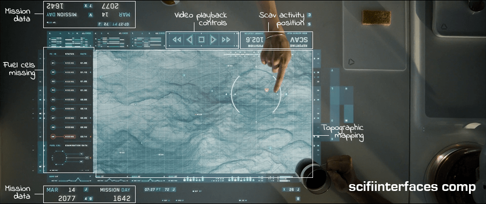
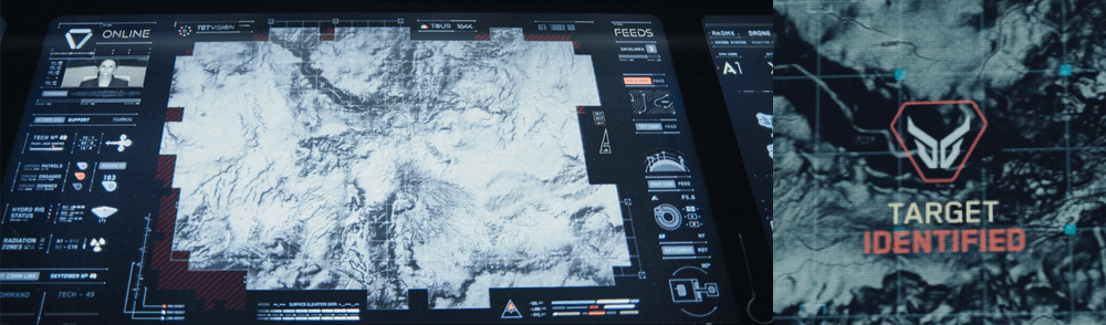
The TETVision display is the only display Vika is shown interacting with directlyβ€”using gestures and controlsβ€”whereas the other screens on the desktop seem to be informational only. This screen is broken up into three main sections:

  1. The left side panel
  2. The main map area
  3. The right side panel

The left side panel

The communications status is at the top of the left side panel and shows Vika the status of whether the desktop is online or offline with the TET as it orbits the Earth. Directly underneath this is the video communications feed for Sally.

Beneath Sally’s video feed is the map legend section, which serves the dual purposes of providing data transfer to the TET and to the Bubbleship as well as a simple legend for the icons used on the map.

The communications controls, which are at the bottom of the left side panel, allow Vika to toggle the audio communications with Jack and with Sally.

The main map area

The largest section is the viewport where the various live feeds are displayed. The main map, which serves as a radar, as well as the remote video feeds she uses to monitor Jack are both in this section of the display.

The right side panel

The panel on the right side of the map contains the video feed controls, which allow Vika to toggle between live footage from the Bubbleship, the TET, and of course, the main map view.

Although never shown in use in the film, the bottom right of the screen houses the tower rotation controls. This unused control is the only indication the capability even exists, so it is unknown whether the tower rotates 360 degrees or whether it’s limited to set points. (More on this below.)

It has robust capabilities

image02

At one point in the movie, Vika is able to use the drones to search for bio trail signatures when Jack is abducted by the scavs.

image06

Vika is also able to detect and decode various types of signals such as the morse code message sent by Jack or the rogue signal sent out by the scavs.

image08

And, probably unbeknownst to Jack and Vika, the TETVision can be controlled remotely from the TET to allow Sally access to the data stored on the desktopβ€”as shown at one point in the movie, when Sally pulls up a past bio trail signature to send drones after Jack and the scavs.

It’s missing a critical layer of data

image03

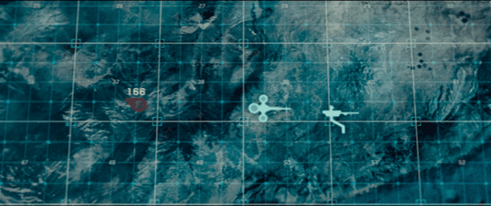
At the beginning of the film, as Jack heads toward the downed drone 166, he suddenly encounters a dangerous lightning storm and nearly plunges to his death when the Bubbleship loses power. His signature disappears from the TETVision map, but from Vika’s perspective there is no indication as to what could have happened β€” or that there was any danger to begin with.

image01

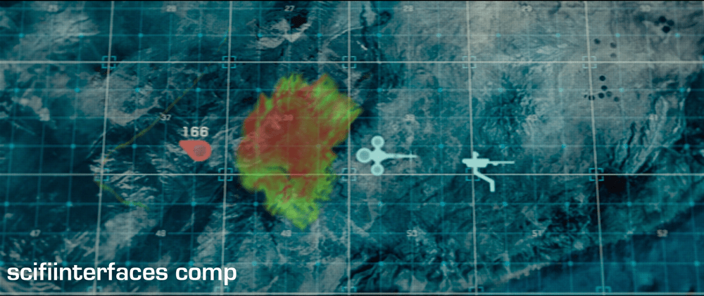
Since the weather is unstable and constantly changing, it would have been better to include a weather overlay so that Vika could have notified Jack of the stormβ€”allowing him to fly around it instead of straight into it.

It’s got some useless bits

image09

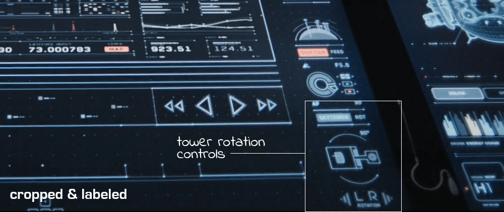
The tower rotation controls are never shown in use in the film, so it’s not clear what benefit rotating the tower would serve. The main purpose of their mission is to ensure the hydro-rigs are secure and functioning properly, not getting an optimal view.

image04

The tower is almost completely surrounded by windows as it is. And since the tower windows already face the hydro-rigs, what would be the benefit of changing vantage points?

It seems that the space could be used for something more beneficial to Vika such as bike, hydro-rig and drone cam feeds. This would provide Vika with more eyes on the ground, allowing her the additional support to keep Jack safe and monitor scav activity.

From an clustering standpoint, it would also fall in line logically with the other feed controls on the right side panel.

And some unnecessary visual feedback

image07

Towards the end of the movie, Sally is trying to find Jack and the scavs. She accesses Vika’s desktop remotely in order to pull up the bio trail records. Although no one is around to see the information, the TETVision displays the process as it happens. Of course, this is necessary for the narrative to progress, but in a real-life situation Sally would only need to see the data on her sideβ€”not from the desktop in Tower 49. If they’ve managed interstellar travel, cloning, terraforming, and cognitive reprogramming of alien species, they’re not likely still using VNC. This type of interaction should simply run in the background and not be visible on screen.

Better: Provide useful visuals

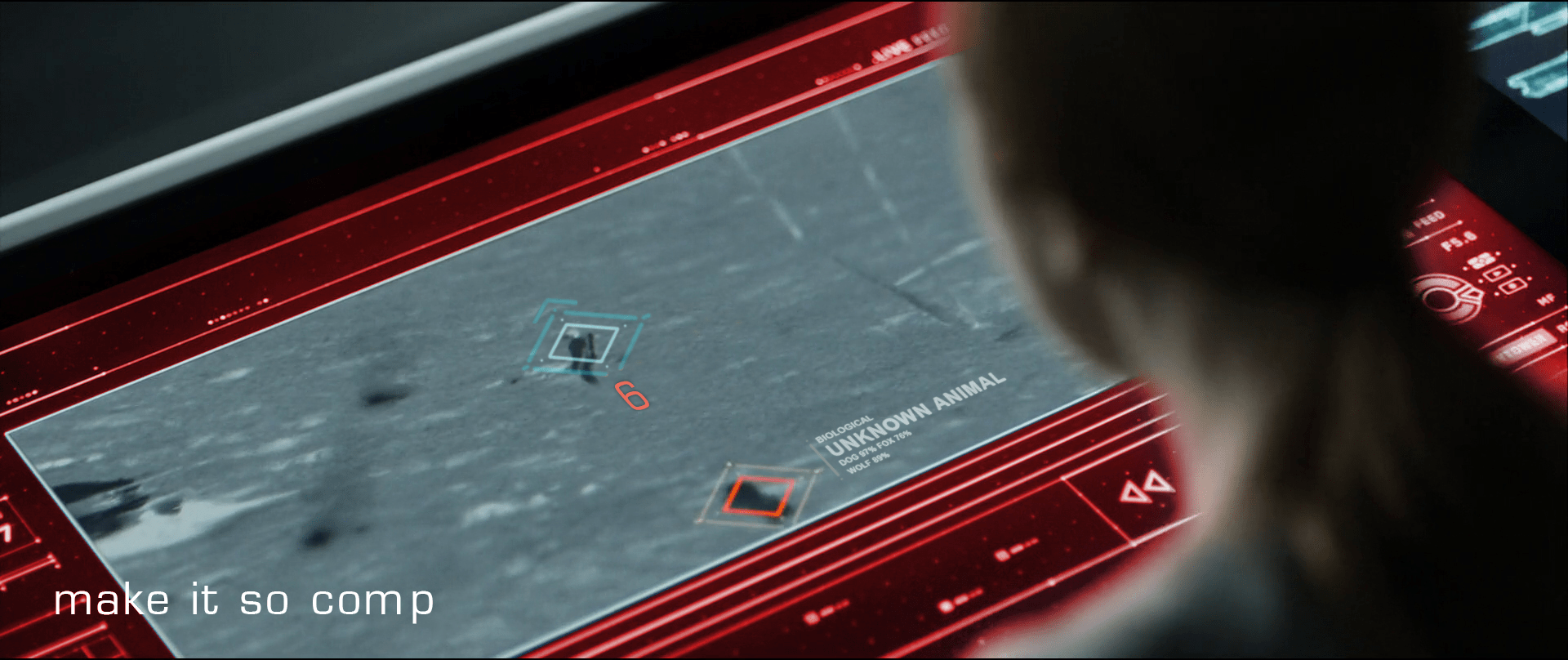
When a drone picks up a bio trail signal, a visual of a DNA sequence is displayed. Since the analysis is being conducted by Sally on the TET, it seems that this information isn’t really useful to Vika at all.

image00

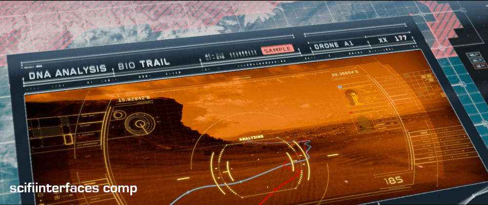
From Vika’s point of view it seems like the actual trail would be more important, so why not show a drone cam feed complete with the HUD overlay? She could instantly gain more information by seeing that there are two bio trailsβ€”proving that Jack has been captured by the scavs and taken to another location.

Sleep Podβ€”Wake Up Countdown

On each of the sleep pods in which the Odyssey crew sleep, there is a display for monitoring the health of the sleeper. It includes some biometric charts, measurements, a body location indicator, and a countdown timer. This post focuses on that timer.

To show the remaining time of until waking Julia, the pod’s display prompts a countdown that shows hours, minutes and seconds. It shows in red the final seconds while also beeping for every second. It pops-up over the monitoring interface.

image03
Julia’s timer reaches 0:00:01.

The thing with pop-ups

We all know how it goes with pop-upsβ€”pop-ups are bad and you should feel bad for using them. Well, in this case it could actually be not that bad.

The viewer

Although the sleep pod display’s main function is to show biometric data of the sleeper, the system prompts a popup to show the remaining time until the sleeper wakes up. And while the display has some degree of redundancy to show the dataβ€”i.e. heart rate in graphics and numbersβ€” the design of the countdown brings two downsides for the viewer.

  1. Position: it’s placed right in the middle of the screen.
  2. Size:Β it’s roughly a quarter of the whole size of the display

Between the two, it partially covers both the pulse graphics and the numbers, which can be vital, i.e. life threateningβ€”information of use to the viewer.

The sleeper

At the same time the display has another user, the sleeper. Since she can’t get back or respond in any way, this display is her only way of communication. As such, the device ought to react at least as well as a person would. So while normally a pop-up should only be used to show important data that the user really must know, this case is different. The pop up is not blindly blocking information, it’s reflecting the user’s priorities at that moment. And it’s for this reason that the timer bears that much visual importance on the screen.

But the display is also a touchscreen, which you can tell from the buttons in the timer. So in case the viewer really needs to see the entire display, it would require putting the timer in a separate mode. But that would require him switch back and forth between modes to get all the data.

image01
When the countdown finishes, the pod slides open. Julia slowly begins to recover consciousness, open her eyes and sits to take a look around the outside.

Rome wasn’t built in 99 hours.

The countdown timer shows the amount of hours, minutes and seconds until the sleeper wakes, counting backwards. We just get to see the timer β€”and hear it beepingβ€” only when the sleep time is ending, so it’s likely a feature to notify any close witness that the pod is about to open.

But what if the sleeper’s biometrics start to get bad? Well, the timer does leave enough room on the screen to leave the bulk of the biometrics data. The device also has a warning for when the sleeper is in CRITICAL condition, but we don’t get to see any in-between modes. It could be helpful if the timer offered some sound cue when the sleeper has some minor issue as well, even if it isn’t as bad. Even something as simple as changing the tone of the beep could do the trick.

Did you notice that the timer has two digits to display hours? That means it can display 99 hours of remaining time. That’s a long time. I’m guessing that the display doesn’t show the countdown with that much time in advance. But in that case, when does it show the timer? If the timer looks to give a hint when a sleeper is about to wake up, you don’t really need to know the amount of hours left. A few minutes’ advance notice is enough.

Kind-of setting the timer.

Although the crew of the Odyssey could probably handle the delta sleep from the onboard computer, the display also offers some functions to control that time. It has three buttons that control the timer:

  • a START button
  • a RESET button
  • a CLEAR button

The timer has two small half-circles both at the top and bottom of the clock. There is a play button. The timer needs to have a way to enter a given duration, and from the mapping of those symbols I’m guessing they could work as adding and subtracting buttons β€”you know, press the top button to add an hour, press the bottom button to reduce an hour. But at the same time the buttons don’t have any labels to convey thatβ€”they lack either a plus symbol on the top or a minus symbol on the bottom. For what it’s worth, the only label they offer is the time magnitude of any pair of digitsβ€”hours, minutes and secondsβ€”on the circles at the bottom. So yeah, I’m close to calling these fuidgets.

The text buttons need some consideration as well. The first two are pretty straightforward if we envision the scenario where the clock timer can be set to any given time. In that case START will start the clock and RESET will put it back to zero, as with any common timer. The odd bit is that there is still a START button while the clock is ticking. In many common timers that same button has two modes that switch according to the state of the timer: starting it when it’s paused and pausing it when it it’s playing. But the missing pause mode or button could have a purpose, perhaps waking the sleeper requires a gradual biological process that can’t be stop once it has began.

image02

There are other problems with the third one, the CLEAR button. Although the label is somewhat misleading, the button probably acts as a way to close the pop-up of the countdown, removing it from the screen. But the real issue is what happens after that. If the user press CLEAR and the pop-up closes, there is no way of knowing if the timer keeps running in the background or if it resets back to zero. This is a major problem.

Anyhow, even if the timer did run in the background it doesn’t have much of a point in this case. I mean, there was no one around to check on Julia while she was in sleep.

A little ramble on Industrial Design

Another interesting aspect of the design of the pods is the way they open. Instead of opening or sliding the cover to one side, as more common doors and hatches, the cover of the pods is divided in the middle like a double-leaf bascule drawbridge. These covers on the pod have a hinge both at the top and bottom, so they turn outside and up of the pod when opening.

Jack releases Julia from the sleep pod.

Although it may seem like an overly complicated design, it really shows its advantages when you set it in context. On the Odyssey the sleep pods are placed side by side, alongside the walls of a tube like compartment. There, the area around the center has hatches that lead to other compartments.

image00

Within a space of those characteristics, a cover that opens or slides to the side would bring some problems. As the cover slides, when opening a pod you would be blocking the one next to it. To improve that, you could have a cover that opens up from the top or the bottom. With that you could have more than one pod closing and opening at the same time, but it also comes with drawbacks. Given the length of the pods those doors will probably cover much of the transit area around the compartments of the ship, becoming an obstacle for the movement of the crew.

This is a solution for both problems. The divided doors give plenty of space for the crew to pass through, and as the doors open up they also give room to opening or closing the pods next to each other at the same time.

Contact!

image04

Jack lands in a ruined stadium to do some repairs on a fallen drone. After he’s done, the drone takes a while to reboot, so while he waits, Jack’s mind drifts to the stadium and the memories he has of it.

Present information as it might be shared

Vika was in comms with Jack when she notices the alarm signal from the desktop interface. Her screen displays an all-caps red overlay reading ALERT, and a diamond overlaying the unidentified object careening toward him. She yells, β€œContact! Left contact!” at Jack.

image02

As Jack hears Vika’s warning, he turns to look drawing his pistol reflexively as he crouches. While the weapon is loading he notices that the cause of the warning was just a small, not-so-hostile dog.

Although Vika yells about something coming from the left side, by looking at the screen you can kind of tell that it’s more to his backβ€”his 6 or 7 o’ clockβ€”than left. We’re seeing it with time to spare here, and the satellite image is very low-res, so we can cut her some slack. But given all the sensors at its command, the interface would ideally which way Jack is facing and which way the threat approaches, so she can convey correct and useful information quickly.

β€œContact, at your 6, Jack!”

That’s much more precise and actionable for Jack.

image00

Don’t cover information

It might be useful to put the ALERT overlay somewhere other than on top of Jack, since it might obscure some useful information. Perhaps the β€œchrome” of the interface could turn red? Not as instantly readable for the audience, but if we’re designing for Vika…

Provide specifics

Another issue is that neither the satellite image nor the interface help Vika to identify what ends up being just a dog. Even when Jack manages to stay cool through the little scare jump, adding at least some information about the object would go a long way to make Vika and the situation less tense.

Jack’s encounter with the TET gives clear evidence that the TET has sophisticated computer vision, so the interface could help Vika a bit by β€œguessing” what any questionable object might be. It doesn’t need to be exact (and it probably couldn’t be with that kind of video feed) but the computer could give its educated guess just by analyzing the context, shape, and motion compared against things in the database. So instead of telling there is an 87% chance of being a dog or a 76% chance of being a fox, the interface could just predict unknown animal (see below).

recomp

Share off-screen information

Fast viewers saw the unknown object before the warning. During a split of a second while the object is entering the screen, it remains blue. So the computer does keep track of any movement, even if it’s not a threat. In that case the issue is that the computer seems to be tracking movement far beyond the visible area of the screen but it doesn’t let Vika know something’s coming from off-screen. The display doesn’t need to zoom out to reach the contactβ€”that could distract Vika from following Jackβ€”but at least it could show some kind of signal pointing at the incoming contact.

What of multiple contacts?

I’m cautious to talk about what ifs, since most of it is just guessworkβ€”but bear with me. On the sequence the interface keeps track of just one contact, but how it would behave if there were more than one? If the computer does track of contacts beyond the camera display Vika is watching, then just marking them is not enough. If Vika needs to inform Jack on the number of contacts she’s getting on the screen, then you need some sort of overview. Pointing at the direction of the contact is useful, but it does mean you have to sweep all the screen to know how many of them are. But that can be easily fixed by adding a list of all the current contacts.

Show trending

Pausing the film a bit and looking closely, it seems that the only difference between all-is-fine and contact! with the dog is about a meter long. And what is more, by the time the interface triggers the warning the dog is really close to Jack. If that was feral dog and it was to attack him, the warning to Jack would come very late.

In such mission-critical monitoring, it’s not enough to show changes of state. Change the state subtly to indicate as things are trendingβ€”as in, this dog is likely to continue its intercept course and getting closer.

We got this

So to wrap up, the interface does a well enough job, but it could certainly benefit from some design changes. The issues are ones that any designer might have to face when working with a monitoring interface, so worth summarizing.

  • Share all the information that is at hand
  • Give the user the information in the form they might pass it along
  • Assign anΒ easy-to-distinguishΒ hierarchy: information, suspicion,Β warning
  • ProvideΒ best-guessesΒ as to the nature of problems with as much specificity as you can
  • Provide unobtrusive but clear signals about the mode
  • Anticipate and show trending dangers

Drone Status Feed

Oblivion-Desktop-Overview-002
Oblivion-Desktop-DroneMonitor-001


As Vika is looking at the radar and verifying visuals on the dispatched drones with Jack, the symbols for drones 166 and 172 begin flashing red. An alert begins sounding, indicating that the two drones are down.

Oblivion-Desktop-DroneCoordinates

Vika wants to send Jack to drone 166 first. To do this she sends Jack the drone coordinates by pressing and holding the drone symbol for 166 at which time data coordinates are displayed. She then drags the data coordinates with one finger to the Bubbleship symbol and releases. The coordinates immediately display on Jack’s HUD as a target area showing the direction he needs to go.

Simple interactions

Overall, the sequence of interactions for this type of situation is pretty simple and well thought out. Sending coordinates is as simple as:

  1. Tap and hold on the symbol of the target (in this case the drone) using one finger
  2. A summary of coordinates data is displayed around the touchpoint (drone symbol)
  3. Drag data over to the symbol of the receiver (in this case the Bubbleship)

Then on Jack’s side, the position of the coordinates target on his HUD adjusts as he flies toward the drone. Can’t really get much simpler than that.

However…

When Vika initially powers up the desktop, the drone status feed already shows drones 166 and 172 down. This is fine, except the alert sound and blinking icons on the TETVision don’t occur until Jack has already reached the hydro-rigs. This is quite a significant time lag between the drone status feed and the TETVision feed. It would be understandable if there was a slight delay in the alert sound upon startup. An immediate alert sound would likely mean there is something wrong with the TETVision system itself. That said, the TETVision drone icons should at the very least already be blinking red on load.

Monitoring drone 166

Oblivion-Desktop-DroneMonitor-005

As Jack is repairing drone 166, Vika watches the drone status feed on her desktop. The drone status feed is a dedicated screen to the right of the TETVision feed.

Oblivion-Desktop-DroneMonitor-000

It is divided into two main sections, the drone diagnostic matrix to the left and the drone deployment table to the right.

The dispatched drone table lists all drones currently working the security perimeter and lists an overview of information including drone ID, a diagram and operational status. The drone diagnostic matrix shows data such as fuel status and drone positioning along the perimeter as well as a larger detailed diagram of the selected drone.

Oblivion-Desktop-DroneMonitor

By looking at the live diagnostics diagram, Vika is able to immediately tell Jack that the central core is off alignment. As soon as Jack finishes repairing the central core, the diagram updates that the core is back in alignment and an alert sound pings.

How does the feed know which drone to focus on?

Since there is no direct interaction with this monitor shown in the film, it is assumed to be an informational display. So, how does the feed know which drone to focus on for diagnostics?

One possibility could be that Jack transmits data from the ground through his mobile drone programmer handset, which is covered in another post. However, a great opportunity for an example of agentive tech would be that when Vika sends the drone coordinates to the Bubbleship, the drone status feed automatically focuses on that one for diagnostics.

Clear messaging in real-time…almost

Overall, the messaging for drone status feed is clear and simple. As seen in the drone deployment table, the dataset for operational drones includes the drone ID number and a rotating view of the drone schematic. If the drone is down, the ID number fades and the drone schematic is replaced with a flashing red message stating that the drone is offline. Yet, when the drone is repaired, the display immediately updates to show that everything is operational again.

This is one of the basic fundamentals of good user interface design. Don’t let the UI get in the way and distract the user.

Keep it simple.

Bubbleship Comms

image01

Jack communicates with Vika via the HUD in the Bubbleship, and a small earbud that provides two-way audio.

He talks normally to Vika, who responds in kind. There is no visible confirmation of his connection to Vika, and no obvious way for him to send information back other than the sound of his voice.

As shown during the lightning strike sequence, Jack’s earbud is connected directly to the Bubbleship. All of his audio and telemetry requires the Bubbleship to connect with Vika’s control tower. When the Bubbleship’s power goes out, Jack’s communication is cut too.

Eye in the Sky

Vika has complete control over the communications in the Bubbleship. She is able to see Jack’s video, hear his audio, and send him mission updates whenever she so chooses. Jack only has control over his connection to Vika by going places where the direct comms can’t reach.

Given the post apocalyptic wasteland they inhabit and the strength of other systems Jack uses, Jack should always have a communication link back to Vika. Current infrastructure, like the Drones or the TET when it is overhead, should act as a repeater system for Jack’s earbud.

A handful of orbiting drones and a satellite radio phone attached to Jack’s belt could easily provide near 100% uptime in communications and give a backup to systems like the Bubbleship. Judging by Jack’s reaction during the lightning strike, power failures in the Bubbleship happen often enough for him to have a routine for them.

Jack should also have an easy way to pause or mute communications. When he is in a stressful situation, he may not want the distraction of audio. The audio might also leak from the earphone in quiet places, leaving him vulnerable to Scav ambush.

Any two-way communication system should have equal control for equal parties.

Electronic Shielding

Ideally, comm failures should never happen in the first place. Modern aircraft are well shielded against lightning strikes, and do not fall from the sky (a Guardian post indicates that each commercial aircraft is hit, on average, once per year). The Bubbleship should be at least as well shielded as a modern commercial aircraft, and be able to maintain contact with its control tower during routine thunderstorms.

image00

Advances in technology should not forget basic safety techniques from the generation of technology it is replacing.

Breakfast Sand Table

A woman in a modern kitchen holding a piece of food while looking at a countertop, with a man in a black shirt leaning on the counter beside her, both engaged in conversation.

While eating breakfast, Vika views the overnight surveillance via a touchscreen interface that is inset into the top of a white table.

Which touch tech?

Anyone interested in the touch technology should take note: Vika places her coffee cup and breakfast plate directly on the surface, which indicates that it utilizes capacitive touch technology with a glass top. Placing dishes on a resistive touchscreen, which is made of layers of plastic and glass would have interfered with the interactions and would be less durable as a tabletop.

Jack joins her at the table and leans on the surface with his hand and later with his forearm, which supports the idea that the area surrounding the viewport is not touch-enabled. If it were, it would need to incorporate palm-rejection technology in order for his arm to not interfere with Vika’s interactions.

The interface components

Oblivion-Desktop-Sandtable-001

The main viewing area is a hybrid of satellite imagery and topographic mapping, surrounded in the interface by surveillance data and video playback controls. A message next to the video playback controls reports the current location of the scav activity.

To the left of the map is a list of fuel cells that have been stolen by the scavs along with the dates they went missing. The last one on the list is flashing red to draw their attentionβ€”a new one has gone missing.

Some elements, such as the current date and number of days into the mission face out at the top and the bottom to allow both Vika and Jack to view the data from either side.

A hand points at a futuristic digital map displayed on a transparent screen, showing a detailed terrain with lines and contours, alongside various mission data indicators and a date label.

The interface is responsive to touch gestures. Vika circles an area on the map and the icon indicating unusual activity turns red. She taps the icon and a video feed begins playing. Jack zooms in on the video feed by using a five-finger multi-touch β€œspread” gesture.

Why is the vital information facing Jack when Vika is the one using the interface?

It’s interesting to note that the the most vital information such as the list of missing drones, video playback and the topographic shaded relief are seen from Jack’s view. This causes Vika to have to process the information and videos upside-downβ€”even though the playback controls face her.

This can be particularly problematic with the topographic shaded relief. Shaded relief simulates the shadow cast by the sun on the surface. Viewing this relief upside-down can cause a perception illusion that results in confusion on what is a crater and what is a hill.

Better: Lenticular display

A better solution would be to utilize a lenticular interactive display. Lenticular displays are made by placing a transparent film containing tiny ridges over an image that is made up of two or more images sectioned into bands and displayed in alternating lines. The ridges in the film cause the eye to focus on one set of lines in order to come out with a cohesive image.

Then, as in the illustration below, Vika would only see the view illustrated by the white lines and Jack would only see the view illustrated by the black lines.

Diagram illustrating the concept of lenticular film and interlaced images with labeled sections showcasing different views.

Utilizing a lenticular display would solve the issue of the shaded relief perception illusion and allow Jack and Vika to each read the information and watch the video from their own perspective at the same time.

The thing that gets a little tricky about utilizing a lenticular display for this solution is the fact that it is a touch screen. The elements that are being interacted with need to be in the same position for both Jack and Vika in order for the computer to know what is being manipulated. This can be solved by flipping the individual elements such as the shaded relief on the topography and the activity icons, words, etc., while keeping them in the same location on the interface.

Smart video recording and playback

So, how did the TET know where to start the video recording and playback? Given that the other interfaces in the film have the capability to detect motion, it is likely that the video recording was automatically triggered by the scavs when they moved in to attack the drone.

Unfortunately, there is no screentime granted to the use of the actual video playback controls, but assuming they are as smart as the rest of the interfaces in the film, it is safe to expect these controls to be more useful than simply sequencing through the scenes. The interface would probably allow Vika to scrub through a grid of thumbnails to quickly find any scenes of interest.

Why circle and tap to play?

The activity alert icon on the map was static white until Vika circled an area surrounding it. Only then did it start flashing red. Other interfaces on Vika’s main desktop provide immediate feedback with an audible alert and a flashing red symbol. Why would this one require the extra effort of circling the area? It would seem simpler to flash red from the beginning and allow Vika to immediately tap on the symbol for video playback.

It is possible that she is circling the area that she wants the TET feed to focus on, but if the TET has the capability to detect the activity to begin with, it should automatically know where to focus.

Another possibility is that she is used to getting multiple alerts every morning and the circle gesture could be for playing all of the surveillance videos at the same time instead of having to tap on each one to play. If that is the case, then she may be using the circle gesture through muscle memory since people tend to use repetitive gestures without thinking about it even if there is a simpler gesture available. If a gesture isn’t used very often, users tend to forget about it.

Overall, this is a nice system that effectively allows Jack and Vika to get a quick overview of the events of the previous night and gives them a heads-up as to what is in store for them that day.

Oblivion (2013): Overview

Release date: 19 April 2013, United States

Oblivion-title-01

As with all overviews, ALL THE SPOILERS ahead. Some movies warrant just a few paragraphs, but it turns out this is a rather complicated plot.

Oblivion opens 50 years after an alien invasion, during which a great many things happened.

  • Aliens called β€œScavs” hammeredΒ the moon into huge clustered fragments
  • (In turn) Doing massive ecological damage to the Earth
  • The humans retaliated with nuclear weapons
  • TheΒ Earth became contaminated with radiation
  • Most of humanity had to leave the planet to colonizeΒ Titan
  • Massive hydro-rigsΒ were set up in the oceans that convert seawater into energy
  • Semi-autonomous flying robots called drones patrolΒ and defend the hydro-rigsΒ from theΒ remaining Scavs, who attempt to destroy the drones and hydro-rigs
  • A massive tetrahedral spaceship called the Tet was put inΒ orbit around the earth to serve as command and control for pairs of humans who live as a couple and work as a team in their section to monitor and protect both the hydro-rigsΒ and the drones
  • One member of theseΒ teams stays in their sky home, called the Tower, to monitor activity and relay information to and from the Tet
  • The other member of these teams, the Tech, operates a β€œbubbleship” to patrolΒ the sector to which they are assigned

One team, Victoria and Jack, are two weeks away from retirement when they are awoken one night by a massive explosion. It is one of their hydro-rigs, sabotaged by Scavs in their section. While investigating the wreckage, they detect a strange radio signal. Jack traces it to its source, discovering a repeater in the ruined Empire State Building broadcasting a set of coordinates off-planet. Later he spies a vessel landing at the broadcast coordinates. He visits the crashed vessel to find it is part of a pre-war human spacecraft, the sleeping pod of the Odyssey. Within are hibernation chambers, but only one crewmember is alive. Jack recovers it as drones show up to destroy them. At the Tower, Jack and Victoria revive its occupant, Julia. The next morning Julia travels with Jack back to the crash site to fetch the flight recorder, but both are taken captive by Scavs.

In captivity Jack learns the horrible truth…

  • The Scavs are actuallyΒ the only humans left after the war
  • The Tet, drones, and hydro-rigsΒ are the alien technology
  • Jack and Victoria are the toolsΒ of the aliens defending their tech from the rest of humanity
  • ScavsΒ remote-controlled the Odyssey to crash in order to scavenge its nuclear fuelΒ for a bomb to be delivered to the Tet in a captured Drone

Victoria, unaware, sends drones to save Jack, forcing the Scavs to release Jack and Julia. The leader Beech encourages Jack to visit the forbidden radiation zones to confirm the truth. Julie further reveals…

  • The OdysseyΒ was originally en route to Titan when it was intercepted by the alien Tet
  • Jack and Victoria were once part of the Odyssey crew as well
  • Jack and Julia wereΒ husband and wife

Through a remote-controlled bubbleship camera, Victoria observes them kissing and this drives her to betray Jack and Julie to the Tet. The Tet activates a Drone and sends it to kill them all, but it only kills Victoria before Julia destroys it. Traveling to another sector, Jack sees a clone of himself appear in a similar bubbleship, to service a Drone. They fight and the clone is killed, and Julia is wounded in the melee. Jack gets into the clone’s bubbleship and travels to its Tower, where he meets a Victoria clone, and he realizes that the planet must be populated by huge numbers of these clones. He fetches a medkit and returns to Julia. He takes her to recover in a log cabin in a lush valley he has been keeping secret from Victoria for a long time. After she heals, he returns to the Scavs, and helps them reprogram their captured Drone, but the Scav enclave is largely destroyed by other drones sent by the Tet.

They load the bomb into a hibernation chamber, appear to seal Julia inside, load it onto a bubbleship, and fly to the Tet. En route he plays the flight recording from the Odyssey to learn…

  • When the Odyssey originally approached the Tet, Victoria and JackΒ were pilot and copilot
  • When they were caught in the Tet’s tractor beam, they ejected the sleeping pod with the remainder of the crew to protect them

Finally, in the bowels of the Tet, he…

  • Sees the clone vats where more Jacks and Victorias are being grown
  • Faces the horrible alien intelligence
  • AwakensΒ the person in the hibernation chamber, whichβ€”surpriseβ€”isΒ Beech, not Julia
  • Explodes the bomb, destroying the Tet
vlcsnap-2015-01-01-21h49m33s39

Back on Earth, Julia is awakes in a different hibernation chamber at the lush log cabin, as part of Jack’s duplicitous plan to save her. She gives birth to a daughter, and three years later is found by one of the Jack clones, accompanied by a group of the surviving Scavs.

IMDB: https://www.imdb.com/title/tt1483013/Currently streaming on:

Rescue Shuttle

shuttle01

After the ambush on Planet P, Ibanez pilots the shuttle that rescues survivors and…and Diz. We have a shot of theΒ display that appears on the dashboard between the pilot and copilot.Β Tiny blue columns of textΒ too small to read thatΒ spill onto the left. One big column of tiny green text that wipes on and flashes. Seizure-inducing yellow dots spazzing around on red grids. A blue circle on the right is probably Planet P or a radar, but the graphic…spinning about its center so quick you cannot follow.Β There’s not…I can’t…how is this supposed to…I’m just going to call it:Β fuigetry.

Red Phone

After the gravitic distortion is discovered, Barcalow flips a toggle switch upwards with his thumb. As Ibanez confirms that “Gravity is 225 and rising,” the light on the bridge turns red, and Barcalow turns to a monitor.

The monitor (seen above) features a video window in the top center. Along the left side of the screen 11 random numbers report the COMM STATS INTERSHIP. Along the right side of the screen 11 other random numbers report the COMM STATS INTRASHIP. Beneath the video some purple bars slide in and out from a central column of red rectangles. One of these rectangles is bright yellow. Beneath that a section reports SCANNING FREQUENCIES as 21 three-character strings, some of which are highlighted as red. At the bottom of the screen blue and yellow-green smears race back and forth across a rectangle. Everything is in Starship Troopers‘ signature saturated colors and a block font like Microgramma or Eurostile.

These details are almost immediately obscured, as Deladier looks up from her laptop (looking presciently like a modern Macbook Air with its aluminum casing) to look at the video monitor to demand a “Report,” and the video grows larger to fill the screen.

StarshipTroopers-RedPhone 04

StarshipTroopers-RedPhone 07

Here the snarky description must pause for some analysis.

Analysis

The red alert mechanism is actually pretty good. Both the placement of its switch at shoulder level and the fact that it must be flipped up help prevent against accidental activation. The fact that it’s a toggle switch means it can be undone with ease if necessary. The red light immediately provides feedback to everyone on the bridge (and throughout the ship?) that the system has gone into a red alert. No other action is necessary to alert the person who needs to be informed, i.e. the Captain. The only other improvement might be a klaxon warning to alert others who are sleeping, but it’s entirely possible that very thing is happening elsewhere on the ship, and the bridge is spared that distraction. So full marks.

The user interface on the monitor seems pretty crappy though. If someone is meant to monitor COMM STATS—intership or intraship—I cannot imagine how a column of undifferentiated numbers helps. A waveform would be more useful to track activity across a spectrum. Something. Anything other than a stack of numbers that are hard to read and interpret.

The SCANNING FREQUENCIES is similarly useless. Sure, it’s clear that the ship’s systems are scanning those frequencies, but the three-character strings require crew to memorize what those mean. If those frequencies are defined—as you imagine they must be to be at all useful as static variables—then you can remove the cognitive weight of having to memorize the differences between JL5 and LQ7 by giving them actual names, and only displaying the ones that have activity on them, and what that activity means. Does someone need to listen in? Shouldn’t that task be apparent? And why would that need to be shown generally to the bridge, rather than to a communications officer? And I’m not sure what those purple squiggles mean. It’s nice that they’re animated I guess, but if they’re meant to help the user monitor some variable, they’re too limited. Like the sickbay display on the original Star Trek, knowing the current state is likely not as useful as knowing how the information is trending over time. (See page 261 for more details on this.) So trendlines would be better here. The little sweeping candy colored smears are actually okay, though, presuming that it’s showing that the system is successfully sweeping all frequencies for additional signal. Perhaps a bit distracting, but easy to habituate.

It’s nice that the video screen fills the screen to match the needs of the communicators. But as with so many other sci-fi video calls, no effort is made to explain where the camera is on this thing. Somehow they can just look at the eyes of the other person on the monitor, and it works. This feels natural to the actors, looks natural to the audience, and would be natural in real life, but until we can figure out how to embed a camera within a screen, this can’t work this way, and we’re stuck with the gaze monitoring problem raised in the Volumetric Projection chapter of the book with the Darth Vader example.

So, all in all, this interface is mostly terrible until it becomes just a videophone. And even then there are questions.

Snarky description continues

Picking up the description where I left off, after the Captain demands a report, Barcalow tells her quickly “Captain, we’re in the path of an unidentified object heading toward us at high speed.” Ibanez then looks down at her monitor at the gravity well animation, to remark that the “Profile suggests an asteroid, ma’am.” You know, just before looking out the window.

STARSHIP_TROOPERS_asteroid

Honestly, that’s one of the funniest two-second sequences in the whole movie.

Wearable Control Panels

As I said in the first post of this topic, exosuits and environmental suits are out of the definition of wearable computers. But there is one item commonly found on them that can count as wearable, and that’s the forearm control panels. In the survey these appear in three flavors.

Just Buttons

Fairly late in sci-fi they acknowledged the need for environmental suits, and acknowledged the need for controls on them. The first wearable control panel belongs to the original series of Star Trek, “The Naked Time” S01E04. The sparkly orange suits have a white cuff with a red and a black button. In the opening scene we see Mr. Spock press the red button to communicate with the Enterprise.

This control panel is crap. The buttons are huge momentary buttons that exist without a billet, and would be extremely easy to press accidentally. The cuff is quite loose, meaning Spock or the redshirt have to fumble around to locate it each time. Weeeeaak.

Star Trek (1966)

TOS_orangesuit

Some of these problems were solved when another WCP appeared 3 decades later in the the Next Generation movie First Contact.

Star Trek First Contact (1996)

ST1C-4arm

This panel is at least anchored, and located in places that could be located fairly easily via proprioception. It seems to have a facing that acts as a billet, and so might be tough to accidentally activate. It’s counter to its wearer’s social goals, though, since it glows. The colored buttons help to distinguish it when you’re looking at it, but it sure makes it tough to sneak around in darkness. Also, no labels? No labels seems to be a thing with WCPs since even Pixar thought it wasn’t necessary.

The Incredibles (2004)

Admittedly, this WCP belonged to a villain who had no interest in others’ use of it. So that’s at least diegetically excusable.

TheIncredibles_327

Hey, Labels, that’d be greeeeeat

Zipping back to the late 1960s, Kubrick’s 2001 nailed most everything. Sartorial, easy to access and use (look, labels! color differentiation! clustering!), social enough for an environmental suit, billeted, and the inputs are nice and discrete, even though as momentary buttons they don’t announce their state. Better would have been toggle buttons.

2001: A Space Odyssey (1968)

2001-spacesuit-021

Also, what the heck does the “IBM” button do, call a customer service representative from space? Embarrassing. What’s next, a huge Mercedez-Benz logo on the chest plate? Actually, no, it’s a Compaq logo.

A monitor on the forearm

The last category of WCP in the survey is seen in Mission to Mars, and it’s a full-color monitor on the forearm.

Mission to Mars

M2Mars-242

This is problematic for general use and fine for this particular application. These are scientists conducting a near-future trip to Mars, and so having access to rich data is quite important. They’re not facing dangerous Borg-like things, so they don’t need to worry about the light. I’d be a bit worried about the giant buttons that stick out on every edge that seem to be begging to be bumped. Also I question whether those particular buttons and that particular screen layout are wise choices, but that’s for the formal M2M review. A touchscreen might be possible. You might think that would be easy to accidentally activate, but not if it could only be activated by the fingertips in the exosuit’s gloves.

Wearableness

This isn’t an exhaustive list of every wearable control panel from the survey, but a fair enough recounting to point out some things about them as wearable objects.

  • The forearm is a fitting place for controls and information. Wristwatches have taken advantage of this for…some time. πŸ˜›
  • Socially, it’s kind of awkward to have an array of buttons on your clothing. Unless it’s an exosuit, in which case knock yourself out.
  • If you’re meant to be sneaking around, lit buttons are counterindicated. As are extruded switch surfaces that can be glancingly activated.
  • The fitness of the inputs and outputs depend on the particular application, but don’t drop the understandability (read: labels) simply for the sake of fashion. (I’m looking at you, Roddenberry.)