As part of the FritzesBest Interfaces award for 2026, I am reviewing the interfaces in Star Trek:Section 31. This post is about the mission briefer.
When HQ needs a team to get moving, they send a mission briefer. (n.b. Ths is my term. They don’t mention it by name in the movie.) This little faceted matte-black pod is the size of an orange with one flat side. Rest it on a surface, and when an authorized person long-touches the top, it spins open like a lotus flower. A lens rises up and emits a holographic video projection above it with mission information. The projection has a highly pixelated translucent appearance. The movie begins with the decontextualized briefing for the pre-Georgiou team, and ends with the final team standing around a table in Baraam, receiving a briefing for a mission that will take them to Turkana IV. (!)
One excellent design aspect is that there’s no indication from the outside what it is or how to use it. Ordinarily of course we designers work hard to make sure use is clear to the novice user, but in this case obscurity is security. No rando off the street should be able to figure out how to open the top secret clearance container. This aspect might be even better if it looked and functioned like some other mundane object, so that said rando wouldn’t even suspect it was worth investigating. But that introduces other risks and complications, and for an object that is not quite plot-critical, would require too much screen time to explain.
Otherwise I have some minor questions about the device. Each of these can be dismissed as “well, it’s really high tech, you see”. Sophisticated tech is a plausible explanation, but that’s the unsatisfying “a wizard did it” answer that doesn’t help us with design lessons.
Shouldn’t it have strong multifactor authentication?
I suspect all briefings contain highly-sensitive information. And sure, we can give it the benefit of the doubt that mere contact provides a biometric signature “something she is.” We should see some indication that she provides one of the other two: Something she knows like a password or something she has like a combadge. (I’m not a security expert, but I believe holding the briefer itself might count as “something she has” but it’s a prohibitively weak authentication factor since it’s coupled to the content.)
Isn’t orientation a problem?
This one’s tiny, but how does the projection get oriented (yaw in this case, since pitch and roll are handled by the surface)? Sahar seems to fuss about its placement on the table, but the device looks the same from all angles, so I’m not sure that what he was doing was orientation. In the end scene, the projection is just of a person talking, so the orientation is not critical. It might be awkward for a projected person to be facing directly away from the listener, but not significantly hinder the information. But in the opening sequence, there is text and maps and lots of 2D information, which would be made significantly difficult to interpret if it was backwards or off-facing.
It seems silly to comp up pinpoint lights, but here we are.
Of course, it could have built-in tech that finds where the team is around it, and calculates the optimal display yaw. If we had half a second after the long-touch of tiny glowing bits around the base that demonstrated it finding them and thereby the optimal orientation, it would telegraph this feature. (See above.)
Is everyone supposed to be able to see it?
The team is watching the mission briefing in the lower right. As is anyone else at the bar, I guess.
As you can see in the wide-angle shot, the team is just watching the brief with the briefing agent in the nightclub of Baraam. It draws attention. Can’t anyone just glance that way, record it, and sell the information to the highest bidder in the underworld network? That can’t be secure. If it was just projecting into the team’s eyes, ears, or brains, that might be secure, but the film would need to change that wide-angle shot to indicate that. Projection beams or something. Somehow it should signal how this isn’t just broadcast for any eavesdropper to pick up.
What if the team has questions?
I’ve never seen this in a mission briefing in present-day spy thrillers, but there’s an opportunity here since we’re dealing with very advanced technology. If the briefer has a knowledge base, then the team should be able to ask questions of it. Clarifications or additional detail. If it was driven by something like a large language model, rather than a recording, then it could be interactive, and there could be a question and answer session at the end, and serve as a just-in-time reference during the mission, too. (c.f. related concepts in the real-time interplanetary chat post.)
Again, these are nit picks, as it hits the narrative beat just fine. It’s a prerecorded message that plays and tells them what they need to know. (And Jamie Lee Curtis!) Anything else would be gravy.
The Fritzes award honors the best interfaces in a full-length motion picture in the past year. Interfaces play a special role in our movie-going experience, and are a craft all their own that does not otherwise receive focused recognition. In this post we round-up all the big labels across the survey.
I wrote about the Big Label in 2012 in the Visual Interfaces chapter of Make It So…
…and here we are 12 years later cataloging more. It’s understandable why: It’s familiar, it conveys critical plot information in a fraction of a second. It’s inexpensive because it’s fast to design with not a lot of moving parts. It’s not quite an interface, since it’s just output, but there were enough this year to catch my eye. So, uh, here they are.
As in previous years, in preparation for awarding the Fritzes, I watched as many sci-fi movies as I could find across 2024. One thing that stuck out to me was the number of heads-up displays (HUDs) across these movies. There were a lot to them. So in advance of the awards, lets look and compare these. (Note the movies included here are not necessarily nominees for a Fritz award.)
I usually introduce the plot of every movie before I talk about it. This provides some context to understanding the interface. However, that will happen in the final Fritzes post. I’m going to skip that here. Still, it’s only fair to say there will be some spoilers as I describe these.
If you read Chapter 8 of Make It So: Interaction Lessons from Science Fiction, you’ll recall that I’d identified four categories of augmentation.
Sensor displays
Location awareness
Context awareness (objects, people)
Goal awareness
These four categories are presented in increasing level of sophistication. Let’s use these to investigate and compare five primary examples from 2024, in order of their functional sophistication.
Dune 2
Lady Margot Fenring looks through augmented opera glasses at Feyd-Rautha in the arena. Dune 2 (2024).
True to the minimalism that permeates much of the interfaces film, the AR of this device has a rounded-rectangle frame from which hangs a measure of angular degrees to the right. There are a few ticks across the center of this screen (not visible in this particular screen shot). There is a row of blue characters across the bottom center. I can’t read Harkonnen, and though the characters change, I can’t quite decipher what most of them mean. But it does seem the leftmost character indicates azimuth and the rightmost character angular altitude of the glasses. Given the authoritarian nature of this House, it would make sense to have some augmentation naming the royal figures in view, but I think it’s a sensor display, which leaves the user with a lot of work to figure out how to use that information.
You might think this indicates some failing of the writer’s or FUI designers’ imagination. However, an important part of the history of Dune is a catastrophic conflict known as the Butlerian Jihad. This conflict involved devastating, large-scale wars against intelligent machines. As a result, machines with any degree of intelligence are considered sacrilege. So it’s not an oversight, but as a result, we can’t look to this as a model for how we might handle more sophisticated augmentations.
Alien: Romulus
Tyler teaches Rain how to operate a weapon aboard the Renaissance. Alien: Romulus (2024)
A little past halfway through the movie, the protagonists finally get their hands on some weapons. In a fan-service scene similar to one between Ripley and Hicks from Aliens (1986), Tyler shows Rain how to hold an FAA44 pulse rifle. He also teaches her how to operate it. The “AA” stands for “aiming assist”, a kind of object awareness. (Tyler asserts this is what the colonial marines used, which kind of retroactively saps their badassery, but let’s move on.) Tyler taps a small display on the user-facing rear sight, and a white-on-red display illuminates. It shows a low-res video of motion happening before it. A square reticle with crosshairs shows where the weapon will hit. A label at the top indicates distance. A radar sweep at the bottom indicates movement in 360° plan view, a sensor display.
When Rain pulls the trigger halfway, the weapon quickly swings to aim at the target. There is no indication of how it would differentiate between multiple targets. It’s also unclear how Rain told it that the object in the crosshairs earlier is what she wants it to track now. Or how she might identify a friendly to avoid. Red is a smart choice for low-light situations as red is known to not interfere with night vision. Also it’s elegantly free of flourishes and fuigetry.
I’m not sure the halfway-trigger is the right activation mechanism. Yes, it allows the shooter to maintain a proper hold and remain ready with the weapon, and allows them not have to look at the display to gain its assistance, but also requires them to be in a calm, stable circumstance that allows for fine motor control. Does this mean that in very urgent, chaotic situations, users are just left to their own devices? Seems questionable.
Alien: Romulus is beholden to the handful of movies in the franchise that preceded it. Part of the challenge for its designers is to stay recognizably a part of the body of work that was established in 1979 while offering us something new. This weapon HUD stays visually simple, like the interfaces from the original two movies. It narratively explains how a civilian colonist with no weapons training can successfully defend herself against a full-frontal assault by a dozen of this universe’s most aggressive and effective killers. However, it leaves enough unexplained that it doesn’t really serve as a useful model.
The Wild Robot
Roz examines an abandoned egg she finds. The Wild Robot (2024)
HUD displays of artificially intelligent robots are always difficult to analyze. It’s hard to determine what’s an augmentation, here loosely defined as an overlay on some datastream created for a user’s benefit but explicitly not by that user. It opposes a visualization of the AI’s own thoughts as they are happening. I’d much rather analyze these as augmentation provided for Roz, but it just doesn’t hold up to scrutiny that way. What we see in this film are visualizations of Roz’ thoughts.
Fresh after booting up, Roz searches for a “customer,” and kind of finds one in a crab. The Wild Robot (2024).Roz estimates the height of the wave in terms of her own height and feels urgency.In language-learning mode, small word bubbles appear near speakers, and a progress bar hints that Roz is near completion.
In the HUD, there is an unchanging frame around the outside. Static cyan circuit lines extend to the edge. (In the main image above, the screen-green is an anomaly.) A sphere rotates in the upper left unconnected to anything. A hexagonal grid on the left has some hexes which illuminate and blink unconnected to anything. The grid moves unrelated to anything. These are fuigetry and neither conveys information nor provides utility.
Inside that frame, we see Roz’ visualized thinking across many scenes.
Locus of attention—Many times we see a reticle indicating where she’s focused, oftentimes with additional callout details written in robot-script.
“Customer” recognition—(pictured) Since it happens early in the film, you might think this is a goofy error. The potential customer she has recognized is a crab. But later in the film, Roz learns the language common to the animals of the island. All the animals display a human-like intelligence, so it’s completely within the realm of possibility that this blue little crustacean could be her customer. Though why that customer needed a volumetric wireframe augmentation is very unclear.
X-ray vision—While looking around for a customer, she happens upon an egg. The edge detection indicates her attention. Then she performs scans that reveal the growing chick inside and a vital signs display.
Damage report—After being attacked by a bear, Roz does an internal damage check and she notes the damage on screen.
Escape alert—(pictured) When a big wave approaches the shore on which she is standing, Roz estimates the height of the wave to be five time her height. Her panic expresses itself in a red tint around the outside edge.
Project management—Roz adopts Brightbill and undertakes the mission to mother him—specifically to teach him to eat, swim, and fly. As she successfully teaches him each of these things, she checks it off by updating one of three graphics that represent the topics.
Language acquisition—(pictured) Of all the AR in this movie, this scene frustrates me the most. There is a sequence in which Roz goes torpid to focus on learning the animal language. Her eyes are open the entire time she captures samples and analyzes them. The AR shows word bubbles associated with individual animal utterances. At first those bubbles are filled with cyan-colored robo-ese script. Over the course of processing a year’s worth of samples, individual characters are slowly replaced in the utterances with bold, green, Latin characters. This display kind of conveys the story beat of “she’s figuring out the language), but befits cryptography much more than acquisition of a new language.
If these were augmented reality, I’d have a lot of questions about why it wasn’t helping her more than it does. It might seem odd to think an AI might have another AI helping it, but humans have loads of systems that operate without explicit conscious thought, like preattentive processing, all the functions of our autonomic nervous system, sensory filtering, and recall, just to name a few. So I can imagine it would be a fine model for AI-supporting-AI.
Since it’s not augmented reality, it doesn’t really act as a model for real world designs except perhaps for its visual styling.
Borderlands
Claptrap is a little one-wheel robot that accompanies Lilith though her adventures on and around Pandora. We see things through his POV several times.
Claptrap sizes up Lilith from afar. Borderlands (2024).
When Claptrap first sees Lilith, it’s from his HUD. Like Roz’ POV display in The Wild Robot, the outside edge of this view has a fixed set of lines and greebles that don’t change, not even for a sensor display. I wish those lines had some relationship to his viewport, but that’s just a round lens and the lines are vaguely like the edges of a gear.
Scrolling up from the bottom left is an impressive set of textual data. It shows that a DNA match has been made (remotely‽ What kind of resolution is Claptrap’s CCD?) and some data about Lilith from what I presume is a criminal justice data feed: Name and brief physical description. It’s person awareness.
Below that are readouts for programmed directive and possible directive tasks. They’re funny if you know the character. Tasks include “Supply a never-ending stream of hilarious jokes and one-liners to lighten the mood in tense situations” and “Distract enemies during combat. Prepare the Claptrap dance of confusion!” I also really like the last one “Take the bullets while others focus on being heroic.” It both foreshadows a later scene and touches on the problem raised with Dr. Strange’s Cloak of Levitation: How do our assistants let us be heroes?
At the bottom is the label “HYPERION 09 U1.2” which I think might be location awareness? The suffix changes once they get near the vault. Hyperion a faction in the game. Not certain what it means in this context.
When driving in a chase sequence, his HUD gives him a warning about a column he should avoid. It’s not a great signal. It draws his attention but then essentially says “Good luck with that.” He has to figure out what object it refers to. (The motion tracking, admittedly, is a big clue.) But the label is not under the icon. It’s at the bottom left. If this were for a human, it would add a saccade to what needs to be a near-instantaneous feedback loop. Shouldn’t it be an outline or color overlay to make it wildly clear what and where the obstacle is? And maybe some augmentation on how to avoid it, like an arrow pointing right? As we see in a later scene (below) the HUD does have object detection and object highlighting. There it’s used to find a plot-critical clue. It’s just oddly not used here, you know, when the passengers’ lives are at risk.
When the group goes underground in search of the key to the Vault, Claptrap finds himself face to face with a gang of Psychos. The augmentation includes little animated red icons above the Psychos. Big Red Text summarizes “DANGER LEVEL: HIGH” across the middle, so you might think it’s demonstrating goal and context awareness. But Claptrap happens to be nigh-invulnerable, as we see moments later when he takes a thousand Psycho bullets without a scratch. In context, there’s no real danger. So,…holup. Who’s this interface for, then? Is it really aware of context?
When they visit Lilith’s childhood home, Claptrap finds a scrap of paper with a plot-critical drawing on it. The HUD shows a green outline around the paper. Text in the lower right tracks a “GARBAGE CATALOG” of objects in view with comments, “A PSYCHO WOULDN’T TOUCH THAT”, “LIFE-CHOICE QUESTIONING TRASH”, “VAULT HUNTER THROWBACK TRASH”. This interface gives a bit of comedy and leads to the Big Clue, but raises questions about consistency. It seems the HUDs in this film are narrativist.
In the movie, there are other HUDs like this one, for the Crimson Lance villains. They fly their hover-vehicles using them, but we don’t nearly get enough time to tease the parts apart.
Atlas
The HUD in Atlas happens when the titular character Atlas is strapped into an ARC9 mech suit, which has its own AGI named Smith. Some of the augmentations are communications between Smith and Atlas, but most are augmentations of the view before her. The viewport from the pilot’s seat is wide and the augmentations appear there.
Atlas asks Smith to display the user manuals. Atlas (2024)
On the way to evil android Harlan’s base, we see the frame of the HUD has azimuth and altitude indicators near the edge. There are a few functionless flourishes, like arcs at the left and right edges. Later we see object and person recognition (in this case, an android terrorist, Casca Decius). When Smith confirms they are hostile, the square reticles go from cyan to red, demonstrating context awareness.
Over the course of the movie Atlas has resisted Smith’s call to “sync” with him. At Harlan’s base, she is separated from the ARC9 unit for a while. But once she admits her past connection to Harlan, she and Smith become fully synched. She is reunited with the ARC9 unit and its features fully unlock.
As they tear through the base to stop the launch of some humanity-destroying warheads, they meet resistance from Harlan’s android army. This time the HUD wholly color codes the scene, making it extremely clear where the combatants are amongst the architecture.
Overlays indicate the highest priority combatants that, I suppose, might impede progress. A dashed arrow stretches through the scene indicating the route they must take to get to their goal. It focuses Atlas on their goal and obstacles, helping her decision-making around prioritization. It’s got rich goal awareness and works hard to proactively assist its user.
Despite being contrasting colors, they are well-controlled to not vibrate. You might think that the luminance of the combatants and architecture might be flipped, but the ARC9 is bulletproof, so there’s no real danger from the gunfire. (Contrast Claptrap’s fake danger warning, above.) Saving humanity is the higher priority. So the brightest (yellow) means “do this”, the second brightest (cyan) means “through this” and darkest (red) means “there will be some nuisances en route.” The luminescence is where it should be.
In the climactic fight with Harlan, the HUD even displays a predictive augmentation, illustrating where the fast-moving villain is likely to be when Atlas’ attacks land. This crucial augmentation helps her defeat the villain and save the day. I don’t think I’ve seen predictive augmentation outside of video games before.
If I was giving out an award for best HUD of 2024, Atlas would get it. It is the most fully-imagined HUD assistance across the year, and consistently, engagingly styled. If you are involved with modern design or the design of sci-fi interfaces, I highly recommend you check it out.
Stay tuned for the full Fritz awards, coming later this year.
Our next 3D file browsing system is from the 1994 film Disclosure. Thanks to site reader Patrick H Lauke for the suggestion.
Like Jurassic Park, Disclosure is based on a Michael Crichton novel, although this time without any dinosaurs. (Would-be scriptwriters should compare the relative success of these two films when planning a study program.) The plot of the film is corporate infighting within Digicom, manufacturer of high tech CD-ROM drives—it was the 1990s—and also virtual reality systems. Tom Sanders, executive in charge of the CD-ROM production line, is being set up to take the blame for manufacturing failures that are really the fault of cost-cutting measures by rival executive Meredith Johnson.
The Corridor: Hardware Interface
The virtual reality system is introduced at about 40 minutes, using the narrative device of a product demonstration within the company to explain to the attendees what it does. The scene is nicely done, conveying all the important points we need to know in two minutes. (To be clear, some of the images used here come from a later scene in the film, but it’s the same system in both.)
The process of entangling yourself with the necessary hardware and software is quite distinct from interacting with the VR itself, so let’s discuss these separately, starting with the physical interface.
Tom wearing VR headset and one glove, being scanned. Disclosure (1994)
In Disclosure the virtual reality user wears a headset and one glove, all connected by cables to the computer system. Like most virtual reality systems, the headset is responsible for visual display, audio, and head movement tracking; the glove for hand movement and gesture tracking.
There are two “laser scanners” on the walls. These are the planar blue lights, which scan the user’s body at startup. After that they track body motion, although since the user still has to wear a glove, the scanners presumably just track approximate body movement and orientation without fine detail.
Lastly, the user stands on a concave hexagonal plate covered in embedded white balls, which allows the user to “walk” on the spot.
Closeup of user standing on curved surface of white balls. Disclosure (1994)
Searching for Evidence
The scene we’re most interested in takes place later in the film, the evening before a vital presentation which will determine Tom’s future. He needs to search the company computer files for evidence against Meredith, but discovers that his normal account has been blocked from access. He knows though that the virtual reality demonstrator is on display in a nearby hotel suite, and also knows about the demonstrator having unlimited access. He sneaks into the hotel suite to use The Corridor. Tom is under a certain amount of time pressure because a couple of company VIPs and their guests are downstairs in the hotel and might return at any time.
The first step for Tom is to launch the virtual reality system. This is done from an Indy workstation, using the regular Unix command line.
The command line to start the virtual reality system. Disclosure (1994)
Next he moves over to the VR space itself. He puts on the glove but not the headset, presses a key on the keyboard (of the VR computer, not the workstation), and stands still for a moment while he is scanned from top to bottom.
Real world Tom, wearing one VR glove, waits while the scanners map his body. Disclosure (1994)
On the left is the Indy workstation used to start the VR system. In the middle is the external monitor which will, in a moment, show the third person view of the VR user as seen earlier during the product demonstration.
Now that Tom has been scanned into the system, he puts on the headset and enters the virtual space.
The Corridor: Virtual Interface
“The Corridor,” as you’ve no doubt guessed, is a three dimensional file browsing program. It is so named because the user will walk down a corridor in a virtual building, the walls lined with “file cabinets” containing the actual computer files.
Three important aspects of The Corridor were mentioned during the product demonstration earlier in the film. They’ll help structure our tour of this interface, so let’s review them now, as they all come up in our discussion of the interfaces.
There is a voice-activated help system, which will summon a virtual “Angel” assistant.
Since the computers themselves are part of a multi-user network with shared storage, there can be more than one user “inside” The Corridor at a time. Users who do not have access to the virtual reality system will appear as wireframe body shapes with a 2D photo where the head should be.
There are no access controls and so the virtual reality user, despite being a guest or demo account, has unlimited access to all the company files. This is spectacularly bad design, but necessary for the plot.
With those bits of system exposition complete, now we can switch to Tom’s own first person view of the virtual reality environment.
Virtual world Tom watches his hands rezzing up, right hand with glove. Disclosure (1994)
There isn’t a real background yet, just abstract streaks. The avatar hands are rezzing up, and note that the right hand wearing the glove has a different appearance to the left. This mimics the real world, so eases the transition for the user.
Overlaid on the virtual reality view is a Digicom label at the bottom and four corner brackets which are never explained, although they do resemble those used in cameras to indicate the preferred viewing area.
To the left is a small axis indicator, the three green lines labeled X, Y, and Z. These show up in many 3D applications because, silly though it sounds, it is easy in a 3D computer environment to lose track of directions or even which way is up. A common fix for the user being unable to see anything is just to turn 180 degrees around.
We then switch to a third person view of Tom’s avatar in the virtual world.
Tom is fully rezzed up, within cloud of visual static. Disclosure (1994)
This is an almost photographic-quality image. To remind the viewers that this is in the virtual world rather than real, the avatar follows the visual convention described in chapter 4 of Make It So for volumetric projections, with scan lines and occasional flickers. An interesting choice is that the avatar also wears a “headset”, but it is translucent so we can see the face.
Now that he’s in the virtual reality, Tom has one more action needed to enter The Corridor. He pushes a big button floating before him in space.
Tom presses one button on a floating control panel. Disclosure (1994)
This seems unnecessary, but we can assume that in the future of this platform, there will be more programs to choose from.
The Corridor rezzes up, the streaks assembling into wireframe components which then slide together as the surfaces are shaded. Tom doesn’t have to wait for the process to complete before he starts walking, which suggests that this is a Level Of Detail (LOD) implementation where parts of the building are not rendered in detail until the user is close enough for it to be worth doing.
Tom enters The Corridor. Nearby floor and walls are fully rendered, the more distant section is not complete. Disclosure (1994)
The architecture is classical, rendered with the slightly artificial-looking computer shading that is common in 3D computer environments because it needs much less computation than trying for full photorealism.
Instead of a corridor this is an entire multistory building. It is large and empty, and as Tom is walking bits of architecture reshape themselves, rather like the interior of Hogwarts in Harry Potter.
Although there are paintings on some of the walls, there aren’t any signs, labels, or even room numbers. Tom has to wander around looking for the files, at one point nearly “falling” off the edge of the floor down an internal air well. Finally he steps into one archway room entrance and file cabinets appear in the walls.
Tom enters a room full of cabinets. Disclosure (1994)
Unlike the classical architecture around him, these cabinets are very modern looking with glowing blue light lines. Tom has found what he is looking for, so now begins to manipulate files rather than browsing.
Virtual Filing Cabinets
The four nearest cabinets according to the titles above are
Communications
Operations
System Control
Research Data.
There are ten file drawers in each. The drawers are unmarked, but labels only appear when the user looks directly at it, so Tom has to move his head to centre each drawer in turn to find the one he wants.
Tom looks at one particular drawer to make the title appear. Disclosure (1994)
The fourth drawer Tom looks at is labeled “Malaysia”. He touches it with the gloved hand and it slides out from the wall.
Tom withdraws his hand as the drawer slides open. Disclosure (1994)
Inside are five “folders” which, again, are opened by touching. The folder slides up, and then three sheets, each looking like a printed document, slide up and fan out.
Axis indicator on left, pointing down. One document sliding up from a folder. Disclosure (1994)
Note the tilted axis indicator at the left. The Y axis, representing a line extending upwards from the top of Tom’s head, is now leaning towards the horizontal because Tom is looking down at the file drawer. In the shot below, both the folder and then the individual documents are moving up so Tom’s gaze is now back to more or less level.
Close up of three “pages” within a virtual document. Disclosure (1994)
At this point the film cuts away from Tom. Rival executive Meredith, having been foiled in her first attempt at discrediting Tom, has decided to cover her tracks by deleting all the incriminating files. Meredith enters her office and logs on to her Indy workstation. She is using a Command Line Interface (CLI) shell, not the standard SGI Unix shell but a custom Digicom program that also has a graphical menu. (Since it isn’t three dimensional it isn’t interesting enough to show here.)
Tom uses the gloved hand to push the sheets one by one to the side after scanning the content.
Tom scrolling through the pages of one folder by swiping with two fingers. Disclosure (1994)
Quick note: This is harder than it looks in virtual reality. In a 2D GUI moving the mouse over an interface element is obvious. In three dimensions the user also has to move their hand forwards or backwards to get their hand (or finger) in the right place, and unless there is some kind of haptic feedback it isn’t obvious to the user that they’ve made contact.
Tom now receives a nasty surprise.
The shot below shows Tom’s photorealistic avatar at the left, standing in front of the open file cabinet. The green shape on the right is the avatar of Meredith who is logged in to a regular workstation. Without the laser scanners and cameras her avatar is a generic wireframe female humanoid with a face photograph stuck on top. This is excellent design, making The Corridor usable across a range of different hardware capabilities.
Tom sees the Meredith avatar appear. Disclosure (1994)
Why does The Corridor system place her avatar here? A multiuser computer system, or even just a networked file server, obviously has to know who is logged on. Unix systems in general and command line shells also track which directory the user is “in”, the current working directory. Meredith is using her CLI interface to delete files in a particular directory so The Corridor can position her avatar in the corresponding virtual reality location. Or rather, the avatar glides into position rather than suddenly popping into existence: Tom is only surprised because the documents blocked his virtual view.
Quick note: While this is plausible, there are technical complications. Command line users often open more than one shell at a time in different directories. In such a case, what would The Corridor do? Duplicate the wireframe avatar in each location? In the real world we can’t be in more than one place at a time, would doing so contradict the virtual reality metaphor?
There is an asymmetry here in that Tom knows Meredith is “in the system” but not vice versa. Meredith could in theory use CLI commands to find out who else is logged on and whether anyone was running The Corridor, but she would need to actively seek out that information and has no reason to do so. It didn’t occur to Tom either, but he doesn’t need to think about it, the virtual reality environment conveys more information about the system by default.
We briefly cut away to Meredith confirming her CLI delete command. Tom sees this as the file drawer lid emitting beams of light which rotate down. These beams first erase the floating sheets, then the folders in the drawer. The drawer itself now has a red “DELETED” label and slides back into the wall.
Tom watches Meredith deleting the files in an open drawer. Disclosure (1994)
Tom steps further into the room. The same red labels appear on the other file drawers even though they are currently closed.
Tom watches Meredith deleting other, unopened, drawers. Disclosure (1994)
Talking to an Angel
Tom now switches to using the system voice interface, saying “Angel I need help” to bring up the virtual reality assistant. Like everything else we’ve seen in this VR system the “angel” rezzes up from a point cloud, although much more quickly than the architecture: people who need help tend to be more impatient and less interested in pausing to admire special effects.
The voice assistant as it appears within VR. Disclosure (1994)
Just in case the user is now looking in the wrong direction the angel also announces “Help is here” in a very natural sounding voice.
The angel is rendered with white robe, halo, harp, and rapidly beating wings. This is horribly clichéd, but a help system needs to be reassuring in appearance as well as function. An angel appearing as a winged flying serpent or wheel of fire would be more original and authentic (yes, really: Biblically Accurate Angels) but users fleeing in terror would seriously impact the customer satisfaction scores.
Now Tom has a short but interesting conversation with the angel, beginning with a question:
Tom
Is there any way to stop these files from being deleted?
Angel
I’m sorry, you are not level five.
Tom
Angel, you’re supposed to protect the files!
Angel
Access control is restricted to level five.
Tom has made the mistake, as described in chapter 9 Anthropomorphism of the book, of ascribing more agency to this software program than it actually has. He thinks he is engaged in a conversational interface (chapter 6 Sonic Interfaces) with a fully autonomous system, which should therefore be interested in and care about the wellbeing of the entire system. Which it doesn’t, because this is just a limited-command voice interface to a guide.
Even though this is obviously scripted, rather than a genuine error I think this raises an interesting question for real world interface designers: do users expect that an interface with higher visual quality/fidelity will be more realistic in other aspects as well? If a voice interface assistant has a simple polyhedron with no attempt at photorealism (say, like Bit in Tron) or with zoomorphism (say, like the search bear in Until the End of the World) will users adjust their expectations for speech recognition downwards? I’m not aware of any research that might answer this question. Readers?
Despite Tom’s frustration, the angel has given an excellent answer – for a guide. A very simple help program would have recited the command(s) that could be used to protect files against deletion. Which would have frustrated Tom even more when he tried to use one and got some kind of permission denied error. This program has checked whether the user can actually use commands before responding.
This does contradict the earlier VR demonstration where we were told that the user had unlimited access. I would explain this as being “unlimited read access, not write”, but the presenter didn’t think it worthwhile to go into such detail for the mostly non-technical audience.
Tom is now aware that he is under even more time pressure as the Meredith avatar is still moving around the room. Realising his mistake, he uses the voice interface as a query language.
“Show me all communications with Malaysia.” “Telephone or video?” “Video.”
This brings up a more conventional looking GUI window because not everything in virtual reality needs to be three-dimensional. It’s always tempting for a 3D programmer to re-implement everything, but it’s also possible to embed 2D GUI applications into a virtual world.
Tom looks at a conventional 2D display of file icons inside VR. Disclosure (1994)
The window shows a thumbnail icon for each recorded video conference call. This isn’t very helpful, so Tom again decides that a voice query will be much faster than looking at each one in turn.
“Show me, uh, the last transmission involving Meredith.”
There’s a short 2D transition effect swapping the thumbnail icon display for the video call itself, which starts playing at just the right point for plot purposes.
Tom watches a previously recorded video call made by Meredith (right). Disclosure (1994)
While Tom is watching and listening, Meredith is still typing commands. The camera orbits around behind the video conference call window so we can see the Meredith avatar approach, which also shows us that this window is slightly three dimensional, the content floating a short distance in front of the frame. The film then cuts away briefly to show Meredith confirming her “kill all” command. The video conference recordings are deleted, including the one Tom is watching.
Tom is informed that Meredith (seen here in the background as a wireframe avatar) is deleting the video call. Disclosure (1994)
This is also the moment when the downstairs VIPs return to the hotel suite, so the scene ends with Tom managing to sneak out without being detected.
Virtual reality has saved the day for Tom. The documents and video conference calls have been deleted by Meredith, but he knows that they once existed and has a colleague retrieve the files he needs from the backup tapes. (Which is good writing: the majority of companies shown in film and TV never seem to have backups for files, no matter how vital.) Meredith doesn’t know that he knows, so he has the upper hand to expose her plot.
Analysis
How believable is the interface?
I won’t spend much time on the hardware, since our focus is on file browsing in three dimensions. From top to bottom, the virtual reality system starts as believable and becomes less so.
Hardware
The headset and glove look like real VR equipment, believable in 1994 and still so today. Having only one glove is unusual, and makes impossible some of the common gesture actions described in chapter 5 of Make It So, which require both hands.
The “laser scanners” that create the 3D geometry and texture maps for the 3D avatar and perform real time body tracking would more likely be cameras, but that would not sound as cool.
And lastly the walking platform apparently requires our user to stand on large marbles or ball bearings and stay balanced while wearing a headset. Uh…maybe…no. Apologetics fails me. To me it looks like it would be uncomfortable to walk on, almost like deterrent paving.
Software
The Corridor, unlike the 3D file browser used in Jurassic Park, is a special effect created for the film. It was a mostly-plausible, near future system in 1994, except for the photorealistic avatar. Usually this site doesn’t discuss historical context (the “new criticism” stance), but I think in this case it helps to explain how this interface would have appeared to audiences almost two decades ago.
I’ll start with the 3D graphics of the virtual building. My initial impression was that The Corridor could have been created as an interactive program in 1994, but that was my memory compressing the decade. During the 1990s 3D computer graphics, both interactive and CGI, improved at a phenomenal rate. The virtual building would not have been interactive in 1994, was possible on the most powerful systems six years later in 2000, and looks rather old-fashioned compared to what the game consoles of the 21st C can achieve.
For the voice interface I made the opposite mistake. Voice interfaces on phones and home computing appliances have become common in the second decade of the 21st C, but in reality are much older. Apple Macintosh computers in 1994 had text-to-speech synthesis with natural sounding voices and limited vocabulary voice command recognition. (And without needing an Internet connection!) So the voice interface in the scene is believable.
The multi-user aspects of The Corridor were possible in 1994. The wireframe avatars for users not in virtual reality are unflattering or perhaps creepy, but not technically difficult. As a first iteration of a prototype system it’s a good attempt to span a range of hardware capabilities.
The virtual reality avatar, though, is not believable for the 1990s and would be difficult today. Photographs of the body, made during the startup scan, could be used as a texture map for the VR avatar. But live video of the face would be much more difficult, especially when the face is partly obscured by a headset.
How well does the interface inform the narrative of the story?
The virtual reality system in itself is useful to the overall narrative because it makes the Digicom company seem high tech. Even in 1994 CD-ROM drives weren’t very interesting.
The Corridor is essential to the tension of the scene where Tom uses it to find the files, because otherwise the scene would be much shorter and really boring. If we ignore the virtual reality these are the interface actions:
Tom reads an email.
Meredith deletes the folder containing those emails.
Tom finds a folder full of recorded video calls.
Tom watches one recorded video call.
Meredith deletes the folder containing the video calls.
Imagine how this would have looked if both were using a conventional 2D GUI, such as the Macintosh Finder or MS Windows Explorer. Double click, press and drag, double click…done.
The Corridor slows down Tom’s actions and makes them far more visible and understandable. Thanks to the virtual reality avatar we don’t have to watch an actor push a mouse around. We see him moving and swiping, be surprised and react; and the voice interface adds extra emotion and some useful exposition. It also helps with the plot, giving Tom awareness of what Meredith is doing without having to actively spy on her, or look at some kind of logs or recordings later on.
Meredith, though, can’t use the VR system because then she’d be aware of Tom as well. Using a conventional workstation visually distinguishes and separates Meredith from Tom in the scene.
So overall, though the “action” is pretty mundane, it’s crucial to the plot, and the VR interface helps make this interesting and more engaging.
How well does the interface equip the character to achieve their goals?
As described in the film itself, The Corridor is a prototype for demonstrating virtual reality. As a file browser it’s awful, but since Tom has lost all his normal privileges this is the only system available, and he does manage to eventually find the files he needs.
At the start of the scene, Tom spends quite some time wandering around a vast multi-storey building without a map, room numbers, or even coordinates overlaid on his virtual view. Which seems rather pointless because all the files are in one room anyway. As previously discussed for Johnny Mnemonic, walking or flying everywhere in your file system seems like a good idea at first, but often becomes tedious over time. Many actual and some fictional 3D worlds give users the ability to teleport directly to any desired location.
Then the file drawers in each cabinet have no labels either, so Tom has to look carefully at each one in turn. There is so much more the interface could be doing to help him with his task, and even help the users of the VR demo learn and explore its technology as well.
Contrast this with Meredith, who uses her command line interface and 2D GUI to go through files like a chainsaw.
Tom becomes much more efficient with the voice interface. Which is just as well, because if he hadn’t, Meredith would have deleted the video conference recordings while he was still staring at virtual filing cabinets. However neither the voice interface nor the corresponding file display need three dimensional graphics.
There is hope for version 2.0 of The Corridor, even restricting ourselves to 1994 capabilities. The first and most obvious is to copy 2D GUI file browsers, or the 3D file browser from Jurassic Park, and show the corresponding text name next to each graphical file or folder object. The voice interface is so good that it should be turned on by default without requiring the angel. And finally add some kind of map overlay with a you are here moving dot, like the maps that players in 3D games such as Doom could display with a keystroke.
Film making challenge: VR on screen
Virtual reality (or augmented reality systems such as Hololens) provide a better viewing experience for 3D graphics by creating the illusion of real three dimensional space rather than a 2D monitor. But it is always a first person view and unlike conventional 2D monitors nobody else can usually see what the VR user is seeing without a deliberate mirroring/debugging display. This is an important difference from other advanced or speculative technologies that film makers might choose to include. Showing a character wielding a laser pistol instead of a revolver or driving a hover car instead of a wheeled car hardly changes how to stage a scene, but VR does.
So, how can we show virtual reality in film?
There’s the first-person view corresponding to what the virtual reality user is seeing themselves. (Well, half of what they see since it’s not stereographic, but it’s cinema VR, so close enough.) This is like watching a screencast of someone else playing a first person computer game, the original active experience of the user becoming passive viewing by the audience. Most people can imagine themselves in the driving seat of a car and thus make sense of the turns and changes of speed in a first person car chase, but the film audience probably won’t be familiar with the VR system depicted and will therefore have trouble understanding what is happening. There’s also the problem that viewing someone else’s first-person view, shifting and changing in response to their movements rather than your own, can make people disoriented or nauseated.
A third-person view is better for showing the audience the character and the context in which they act. But not the diegetic real-world third-person view, which would be the character wearing a geeky headset and poking at invisible objects. As seen in Disclosure, the third person view should be within the virtual reality.
But in doing that, now there is a new problem: the avatar in virtual reality representing the real character. If the avatar is too simple the audience may not identify it with the real world character and it will be difficult to show body language and emotion. More realistic CGI avatars are increasingly expensive and risk falling into the Uncanny Valley. Since these films are science fiction rather than factual, the easy solution is to declare that virtual reality has achieved the goal of being entirely photorealistic and just film real actors and sets. Adding the occasional ripple or blur to the real world footage to remind the audience that it’s meant to be virtual reality, again as seen in Disclosure, is relatively cheap and quick. So, solving all these problems results in the cinematic trope we can call Extradiegetic Avatars, which are third-person, highly-lifelike “renderings” of characters, with a telltale Hologram Projection Imperfection for audience readability, that may or may not be possible within the world of the film itself.
Our first example is a single scene from Jurassic Park, set entirely in the control room of Isla Nublar. Apologies in advance for repeating some material already covered by the book and website, but it is necessary to focus on the aspects that are of interest to this study.
Drs. Sattler and Grant enter the control room along with Lex and Tim. Jurassic Park (1993)
The eponymous Jurassic Park is heavily automated, with the entire park designed to be controlled from the computer systems in this room. Villainous computer system designer Nedry took advantage of this to shut down systems across the entire park, releasing all the dinosaurs, to cover his industrial espionage. Most of the park staff had already been evacuated due to a storm warning, and the small team of core technical staff who remained have, by this point in the film, all been killed by dinosaurs. (Including Nedry—who, had he been given time for extrospection, would probably have rethought those aspects of his plan concerning the release of carnivorous dinosaurs.)
Four of the survivors have gathered in the control room after managing to restore the power, but must still restart the various computer systems. They have discovered that the computer control extends down to door locks, which are consequently not working and have suddenly become the number one priority due to the velociraptors trying to break in.
Our interface user is Lex, a teenage visitor, being given an advance tour of the park before its official opening. The others are Dr Grant, paleontologist; Dr Sattler, paleobotanist; and Lex’s younger brother Tim, dinosaur enthusiast. As a self -described computer hacker Lex is easily the best person qualified to work with the computers as everyone else in the room only has expertise in subjects more than sixty-six million years old.
Lex sitting before the computer and looking at the /usr directory in the 3D file browser. Jurassic Park (1993)
The computers were all rebooted when the power came back on but the programs that control Jurassic Park did not automatically restart. Dr. Sattler spent a moment in front of the computer with Lex, but all she seemed to do is deactivate the screen saver. It’s up to Lex to find and start whatever program runs the security systems for the control room.
Backworlding aside: Unix-savvy viewers might be wondering why these control programs, since they are critical to the park functionality, don’t automatically start when the computer is rebooted. I hazard that perhaps normally they would, but Nedry turned this off to ensure that no-one could undo his sabotage before he got back. The file system of the computer is rendered as a tree, with directory names (/usr in the image above) shown as text labels, the contents of each directory shown as LEGO-like blocks, and lines linking directories to subdirectories.
The park directory, and two levels of subdirectories in the distance. Jurassic Park (1993)
Most of the information is drawn on a flat two-dimensional plane. The third dimension is used to present information about the number of, and perhaps sizes, of the files in each directory. Note in the image above that the different directories below the foremost park block have different sized heights and areas.
Rendering this plane in perspective, rather than as a conventional 2D window, means that areas closest to the viewpoint can be seen in detail, but there is still some information given about the directories further away. In the image above, the subdirectory of park on the right is clearly smaller than the others, even though we can’t make out the actual name, and also has a number of larger subdirectories.
Up close we can see that each file can have its own icon on top, presumably representing the type of file.
Individual blue files within one directory, and subdirectories beyond. Jurassic Park (1993)
The viewpoint stays at a constant height above the ground plane. Moving around is done with the mouse, using it as a game-style directional controller when the mouse button is held down rather than as an absolute pointing device. It is almost “walking” rather than “flying” but there is a slight banking effect when Lex changes direction.
Closeup of Lex’s hand on the mouse, pressing the left mouse button. Jurassic Park (1993)
Here Lex has browsed through the hierarchy and discovered a promising file. She selects it, but we don’t see how, and a spotlight or sunbeam indicates the selection.
The “Visitors Center” icon highlighted by a beam from above. Jurassic Park (1993)
This is the last of the 3D interactions. The 3D file browser is just a file browser, not an entire operating system or virtual environment, so opening a file or program will open a new interface.
Tagged: 3D, 3D rendering, blue, cathode ray tube, color, comparison, constant movement, control room, cyan, desk, direct manipulation, disambiguation, finger press, flight control, flying, green, icon, interaction design, light, lighting, map, missing information, motion cue, navigating, pink, point to select, projection rays, selection, sense making, stress, up is more
When Lex runs this program (again, we don’t see how) it is in fact the security system controller for the visitor centre, including the control room. This has a conventional 2D GUI interface and she immediately switches everything on.
The 2D GUI. Security window in green on left, boot progress screen in blue on right. Jurassic Park (1993)
Success! Well, it would be if the control room did not also have very large windows which are apparently not velociraptor-proof. But the subsequent events, and interfaces, are not our concern.
Analysis
This isn’t a report card, since those are given to complete films or properties, not individual interfaces. But we can ask the same questions.
How believable is the interface?
In this case, very believable. The 3D file browser seen in the film is a real program that was shipped with the computers used in the film. It was created by the manufacturer Silicon Graphics as a demonstration of 3D capabilities, not as an effect just for this film.
How well does the interface inform the narrative of the story?
It supports the narrative, but isn’t essential — there’s plenty of drama and tension due to the velociraptors at the door, and the scene would probably still work if the camera only showed Lex, not the interface. The major contribution of using the 3D file browser is to keep the technology of Jurassic Park seemingly a little more advanced than normal for the time. Apart from dinosaurs, both the book and the film try not to introduce obviously science fictional elements. A 2D file browser (they did exist for Unix computers at the time, including the SGI computers shown in the film) would have been recognisable but boring. The 3D file browser looks advanced while still being understandable.
How well does the interface equip the characters to achieve their goals?
The most interesting question, to which the answer is that it works very well. One problem, visible in the film, is that because the labels are rendered on the 2D ground plane, users have to navigate close to a file or a folder to read its name. Rotating the names to vertical and to always face the user (“billboarding”) would have made them recognisable from further away.
Both at the time of the film and today some computer people will argue that Lex can’t be a real computer hacker because she doesn’t use the command line interface. Graphical user interfaces are considered demeaning. I disagree. Lex is in a situation familiar to many system administrators, having to restore computer functionality after an unexpected power loss. (Although the velociraptors at the door are a little more hostile than your typical user demanding to know when the system will be back up.) Earlier in the film we saw Ray Arnold, one of the technical staff, trying to restore the system and he was using the command line interface.
Ray Arnold sitting before SGI computer, typing into blue command line window. Jurassic Park (1993)
So why does Lex use the 3D file browser? Because, unlike Ray Arnold, she doesn’t know which programs to run. Rebooting the computers is not enough. The various programs that control Jurassic Park are all custom pieces of software developed by Nedry, and nothing we’ve seen indicates that he would have been considerate enough to write a user guide or reference manual or even descriptive file names. Everyone who might have known which programs do what is either dead or off the island.
Lex needs an interface that lets her quickly search through hundreds or even thousands of files without being able to specify precise search criteria. For a problem involving recognition, “you’ll know it when you see it”, a graphical user interface is superior to a command line.
Film making challenge: diegetic computers
Writing for SciFiInterfaces can be quite educational. Chris asked me to write about the “diegetic” aspects of rendering 3D graphics in film, and I agreed to do so without actually knowing what that meant. Fortunately for me it isn’t complicated. Diegetic images or sounds belong to what we see in the scene itself, for instance characters and their dialog or hearing the music a violinist who is on-screen is playing; while non-diegetic are those that are clearly artefacts of watching a film, such as subtitles, voice overs, or the creepy violin music that is playing as a character explores a haunted house—we don’t imagine there is some violinist in there with them.
So, SciFiinterfaces.com focuses on the diegetic computer interfaces used by characters within the film or TV show itself. We’ve just been discussing the 3D file browser in Jurassic Park. Which, since it was a real interactive program, just meant pointing a camera at the actor and the computer screen, right?
It’s not that easy. Our human eyes and brain do an enormous amount of interpolation and interpretation of what we actually see. There’s the persistence of vision effect that allows us to watch a film in a cinema and see it as fluid motion, even though for a significant percentage of the time we’re actually looking at a blank wall while the projector shutter is closed. Cameras, whether film or digital, take discrete snapshots and are not so easily fooled, leading to various odd effects. One example that’s been known since the early days of filmmaking is that at certain speeds spoked wheels can appear to be rotating far more slowly than expected, or even to be rotating backwards.
Jurassic Park was made in the days when television sets and computer monitors used Cathode Ray Tube (CRT) technology. A CRT cannot display an entire frame at once, instead starting at the top left and drawing pixels line by line (“scan lines”) to the bottom. Just as the top line of pixels fades out, the new frame begins. At 50 or 60 frames a second we see only continuous moving images thanks to our persistence of vision; but a camera, usually running at 24 frames a second, will capture a dark line moving slowly down the screen and the images themselves will flicker. This was a common sight in TV news reports and sometimes in films of the time, when computer monitors were in the background. Here’s a shot from the 1995 film The Net where the new frames have been half-drawn:
View from above of computer expo. The two stacked monitors center right are not genlocked, showing crawl lines. The Net (1995)
One technique that avoids this is to film the computer interface in isolation and composite the graphics into the footage afterwards. This is very easy in the 21st century with all digital processing but Jurassic Park was made in the days of optical compositing, which is more expensive and limits the number of images that can be combined before losing picture quality.
So to shoot CRT monitors with their graphics live, the camera shutter opening must be synchronised to the start of each frame. In TV studios and film sets this is done with genlocking, connecting all the monitors and cameras via cables to a single electronic timing signal. This was apparently the technique used in Jurassic Park, with impressive results. In one control room scene the camera pans across at least eight different monitors, and none of them are flickering.
The transition from Beijing to the Newark copyshop is more involved. After he travels around a bit, he realizes he needs to be looking back in Newark. He “rewinds” using a pull gesture and sees the copyshop’s pyramid. First there is a predominantly blue window that unfolds as if it were paper.
And then the copyshop initial window expands. Like the Beijing hotel, this is a floor plan view, but unlike the hotel it stays two dimensional. It appears that cyberspace works like the current world wide web, with individual servers for each location that can choose what appearance to present to visitors.
Johnny again selects data records, but not with a voice command. The first transition is a window that not only expands but spins as it does so, and makes a strange jump at the end from the centre to the upper left.
Once again Johnny uses the two-handed expansion gesture to see the table view of the records.
Johnny searches again, but either because there are so few records or because they’re in English, he doesn’t use voice commands. Instead he just runs his fingers over the cells, which highlight as he does so. Again this would be familiar to a current day spreadsheet user.
The contents of the cell are, once more, not useful. Johnny dismisses the copyshop with a sweeping arm gesture which slides the “window” off the right of the screen.
Aside: At normal viewing speed, it looks like the window disappears and, as would be the case in a 1995 or current day desktop system, reveals the previously-displayed windows underneath. Stepping through frame by frame shows that actually it reveals an identical copy of the sliding content! Graphics programmers have always tried hard to avoid such visual glitches, but sometimes they slip into production code anyway.
Next
At this point in the plot, Johnny hasn’t found the images he so desperately needs. He thinks for a moment, and decides to contact the owner of a local bulletin board. Unknown to him, he has also been located by the Pharmakom tracker. Shinji and the Yakuza are on the way, and Shinji orders “initiate the virus.”
Marty Sr. answers a call from a shady business colleague shortly after coming home. He takes the call in the den on the large video screen there. As he approaches the screen, he sees a crop of a Renoir painting, Dance at La Moulin de la Galette, with a blinking legend INCOMING CALL along the bottom. When he answers it, the Renoir shrinks to a corner of the screen, revealing the live video feed with his correspondent. During the conversation, the Renoir disappears, and text appears near the bottom of the screen providing reminders about the speaker. This appears automatically, with no prompting from Marty Sr.
Needles, Douglas J. Occupation: Sys Operations Age: 47 Birthday: August 6, 1968 Address: 88 Oriole Rd, A6t Wife: Lauren Anne Children: Roberta, 23 Amy, 20 Food Prefence: Steak, Mex Food Dislike: Fish, Tuna Drinks: Scotch, Beer Hobbies: Avid Basketball Fan Sports: Jogging, Slamball, Tennis Politics: None
This is an augmented reality teleconference, as mentioned in Chapter 8 of Make It So: Interaction Design Lessons from Science Fiction. See more information in that chapter. In short, it’s a particularly good example of one type of augmentation that is very useful for people having to interact with networks of people much larger than Dunbar’s number equips us for. Unfortunately, the information appears in a distracting scroll across the bottom, and is not particularly pertinent to the conversation, so could benefit from a bit of context awareness or static high-resolution display to be really useful.
When the conversation is done, the screen fades to black, and an animated AT&T logo appears as a female voice offers Thank you for using AT&T. Afterwards, another odd crop of a famous impressionist artwork appears on screen. (1887-88 Self-Portrait with Grey Felt Hatby Van Gogh, if you’re curious.) This must be a preference set by the McFlys.
During the conversation, Needles convinces Marty Sr. to front some money for a shady deal. To provide the money, he grabs his briefcase and presses one of several lit buttons on its surface. A thin reader raises from the surface on mechanized accordion arms. The slot glows white, and Marty inserts his ID card into the recess and yanks it to the right. Marty presses another button and the reader retracts.
Though pretty cool, this portable authenticator seems multimodal, the two objects are both of the same type, i.e. something he possesses, and so is only marginally more secure than unimodal systems.
Almost instantly, Marty is caught in the act and fired by his boss over the same video phone. To bring home the news, Fujitsu-san presses some button off screen and large letters YOU’RE FIRED appear overlaid on the screen, animating repeatedly for emphasis. Simultaneously, he sends Marty faxes, which Marty receives numerous times in the faxes in his suitcases and others which are installed all over the house, including the in the closet where Jennifer is hiding.
I’m not sure what would lead Needles or Marty(2015) to engage in something illegal that is obviously and instantly discoverable by authorities, but that is not a matter of interaction design.
The first computer interface we see in the film occurs at 3:55. It’s an interface for housing and monitoring the tesseract, a cube that is described in the film as “an energy source” that S.H.I.E.L.D. plans to use to “harness energy from space.” We join the cube after it has unexpectedly and erratically begun to throw off low levels of gamma radiation.
The harnessing interface consists of a housing, a dais at the end of a runway, and a monitoring screen.
Fury walks past the dais they erected just because.
The housing & dais
The harness consists of a large circular housing that holds the cube and exposes one face of it towards a long runway that ends in a dais. Diegetically this is meant to be read more as engineering than interface, but it does raise questions. For instance, if they didn’t already know it was going to teleport someone here, why was there a dais there at all, at that exact distance, with stairs leading up to it? How’s that harnessing energy? Wouldn’t you expect a battery at the far end? If they did expect a person as it seems they did, then the whole destroying swaths of New York City thing might have been avoided if the runway had ended instead in the Hulk-holding cage that we see later in the film. So…you know…a considerable flaw in their unknown-passenger teleportation landing strip design. Anyhoo, the housing is also notable for keeping part of the cube visible to users near it, and holding it at a particular orientation, which plays into the other component of the harness—the monitor.
The monitor
In the underground laboratory, an (unnamed?) technician warns lead scientist Selvig that, “it’s spiking again,” and the camera pans down to this monitoring interface.
Header
The header is a static barcode followed by the initialism J.D.E.M. along with its full name, the Joint Dark Energy Mission. (Sounds super cool and sci-fi, right? Turns out it is a real program between NASA and the US DOE.) Another label across the top identifies the screen as LEVEL 5 and that it belongs to PROJECT PEGASUS and NASA.
3D map
A main display shows a 3D wireframe of the tesseract, with color-coded nebula-like shapes within the cube. The wireframe (and most of the text on screen) are a bright cyan, with internal features progressing in color from the cyan through white to a blood red, all the way to lens flares near the most active areas in the cube. The color choices make for a quick read of what is “cool” and what is “hot,” so are effective for being immediate, but if the lens flares are designed into the system to indicate peakness, it’s a bad choice for obscuring other data in the display.
Note that the wireframe of the cube is also rotating slightly, which is very helpful for a user to more fully understand 3D information from a 2D screen. It might be even better mapping with less cognitive load if the display was a volumetric projection. (VPs exist within the Marvel Cinematic Universe (MCU), but so far I believe we’ve only ever seen them in Tony Stark’s possession so perhaps he has not released it to the outside world.) Hopefully in its rotation on this monitor it does not rotate in 360°, as the regularness of the cube would make it difficult to understand where an internal anomaly might exist in the real thing. Hopefully the wireframe only wavers back and forth within a few degrees, and is oriented in roughly the same way an observer glancing at the real thing would see it in the housing, to allow for instant mapping of problem areas.
Warning
Just to the left of the 3D map is a data monitoring panel. Its top label blinks a red WARNING CRITICAL ENERGY LEVELS and a percentage readout. The panel also features a key whose colors match those of the map. (As it should.) Hopefully a microinteraction allows a user to touch any part of the map, freeze the rotation, and get the percentage details of the touched point. A detail box wavers its vertical position along the key to provide a user a quick assessment of its value, and also contains a percentage readout for precision. Judging by the position of the box and the readout, it looks like the 100% mark is about halfway up the screen. Hopefully the upper part of the scale is logarithmic to accommodate massive surges in values.
Additional elements of the display include several scrolling waveforms and text boxes with inscrutable data and labels. It’s easy to imagine these as useful (say total energy values for specific electromagnetic frequencies) but they’re difficult to read, so difficult to formally evaluate.
All told, a nice display (per some assumptions) for monitoring what’s happening with the cube.
Now if only they had applied that solid design thinking to that dais vs. cage problem.
The heavily-mulleted Togusa is heading to a company car when he sees two suspicious cars in the parking basement. After sizing them up for a moment, he gets into his car and without doing anything else, says,
"Security, whose official vehicles are parked in the basement garage?"
It seems the cabin of the car is equipped to continuously monitor for sound, and either an agent from security is always waiting, listening at the other end, or by addressing a particular department by name, a voice recognition system instantly routs him to an operator in that department, who is able to immediately respond:
"They belong to Chief Nakamura of the treaties bureau and a Dr. Willis."
"Give me the video record of their entering the building."
In response, a panel automatically flips out of the dashboard to reveal a monitor, where he can watch the the security footage. He watches it, and says,
"Replay, infrared view"
After watching the replay, he says,
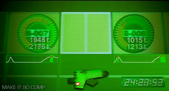
"Send me the pressure sensor records for basement garage spaces B-7 and 8."
The screen then does several things at once. It shows a login screen, for which his username is already supplied. He mentally supplies his password. Next a menu appears on a green background with five options: NET-WORK [sic], OPTICAL, PRESSURE, THERMO, and SOUND. "PRESSURE" highlights twice with two beeps. Then after a screen-green 3D rendering of Section 9 headquarters builds, the camera zooms around the building and through floorplans to the parking lot to focus on the spaces, labeled appropriately. Togusa watches as pea green bars on radial dials bounce clockwise, twice, with a few seconds between.
The login
Sci-fi logins often fail for basic multifactor authentication, and at first it appears that this screen only has two parts: a username and password. But given that Togusa connects to the system first vocally and then mentally, it’s likely that one of these other channels supplies a third level of authentication. Also it seems odd to have him supply a set of characters as the mental input. Requiring Togusa to think a certain concept might make more sense, like a mental captcha.
The zoom
Given that seconds can make a life-or-death difference and that the stakes at Section 9 are so high, the time that the system spends zooming a camera around the building all the way to the locations is a waste. It should be faster. It does provide context to the information, but it doesn’t have to be distributed in time. Remove the meaningless and unlabeled dial in the lower right to gain real estate, and replace it with a small version of the map that highlights the area of detail. Since Togusa requested this information, the system should jump here immediately and let him zoom out for more detail only if he wants it or if the system wants him to see suspect information.
The radial graphs
The radial graphs imply some maximum to the data, and that Nakamura’s contingent hits some 75% of it. What happens if the pressure exceeds 37 ticks? Does the floor break? (If so, it should have sent off structural warning alarms at the gate independently of the security question.) But presumably Section 9 is made of stronger stuff than this, and so a different style of diagram is called for. Perhaps remove the dial entirely and just leave the parking spot labels and the weight. Admittedly, the radial dial is unusual and might be there for consistency with other, unseen parts of the system.
Moreover, Togusa is interested in several things: how the data has changed over time, when it surpassed an expected maximum, and by how much. This diagram only addresses one of them, and requires Togusa to notice and remember it himself. A better diagram would trace this pressure reading across time, highlighting the moments when it passed a threshold. (This parallels the issues of medical monitoring highlighted in the book, Chapter 12, Medicine.)
Even better would be to show this data over time alongside or overlaid with any of the other feeds, like a video feed, such that Togusa doesn’t have to make correlations between different feeds in his head. (I’d have added it to the comp but didn’t have source video from the movie.)
The ultimately crappy Section No9 security system
Aside from all these details of the interface and interaction design, I have to marvel at the broader failings of the system. This is meant to be the same bleeding-edge bureau that creates cyborgs and transfers consciousnesses between them? If the security system is recording all of this information, why is it not being analyzed continuously, automatically? We can presume that object recognition is common in the world from a later scene in which a spider tank is able to track Kunasagi. So as the security system was humming along, recording everything, it should have also been analyzing that data, noting the discrepancy between of the number of people it counted in any of the video feeds, the number of people it counted passing through the door, and the unusual weight of these "two" people. It should have sent a warning to security at the gate of the garage, not relied on the happenstance of Togusa’s hunch and good timing.
This points to a larger problem that Hollywood has with technology being part of its stories. It needs heroes to be smart and heroic, and having them simply respond to warnings passed along by smart system can seem pointedly unheroic. But as technology gets smarter and more agentive, these kinds of discrepancies are going to break believability and get embarassing.
The garbage collector who is inadvertently working for Ghost Hacker takes a break during his work to access the network by public terminal. The terminal is a small device, about a third of a meter across, mounted on a pole about a meter high and surrounded by translucent casing to protect it from the elements and keep the screen private. Parts are painted red to make it identifiable in the visual chaos of the alleyway.
After pressing a series of buttons and hearing corresponding DTMF, or Touch-Tones, he inserts a card into a horizontal slot labeled “DATA” in illuminated green letters. The card is translucent with printed circuitry and a few buttons. The motorized card reader pulls the card in, and then slides it horizontally along a wide slot while an illuminated green label flashes that it is INSPECTING the card. When it is halfway along this horizontal track, a label on the left illuminates COMPRESS.
On a multilayer, high-resolution LCD screen above, graphics announce that it is trying to CONNECT and then providing ACCESS, running a section of the “cracking software” that the garbage collector wishes to run. After he is done with ACCESS, he removes the card and gets back to work.
From a certain perspective, there’s nothing wrong with this interaction. He’s able to enter some anonymous information up front, and then process the instructions on the card. It’s pretty ergonomic for a public device. It provides him prompts and feedback of process and status. He manages its affordances and though the language is cryptic to us, he seems to have no problem.
Where the terminal fails is that it gives him no idea that it’s doing something more than he realizes, and that something more is quite a bit more illegal than he’s willing to risk. Had it given him some visualization of what was being undertaken, he might have stopped immediately, or at least have returned to his “friend” to ask what was going on. Of course the Ghost Hacker is, as his name says, a powerful hacker, and might have been able to override the visualization. But with no output, even novice hackers could dupe the unknowing because they are uninformed.