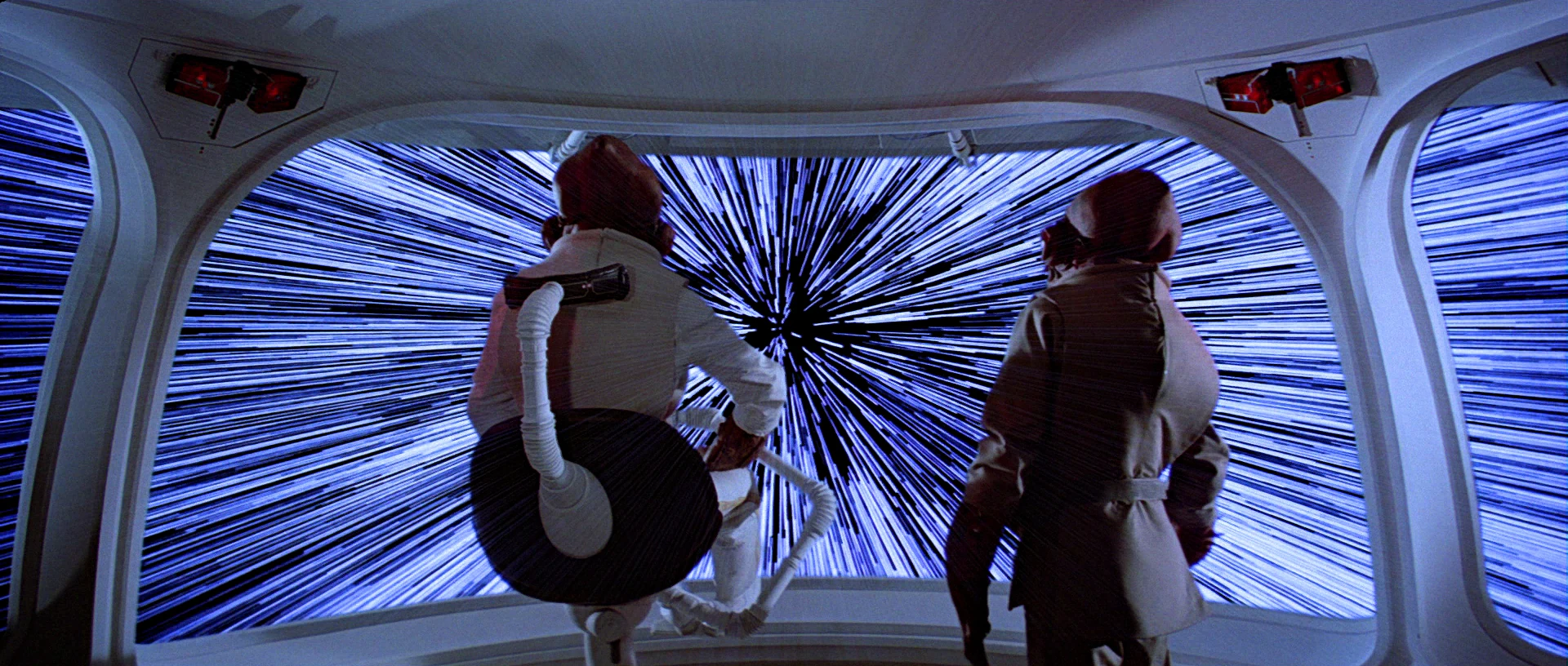
FTL – A Quick Overview


Faster than light travel (FTL) is a(n as-yet) fictional trope that is used to allow stories to happen on scales larger than a single solar system.  Nothing we’ve found so far indicates that faster than light travel is possible, let alone practical, but it makes things like Star Wars, Star Trek, and Battlestar Galactica possible as stories.

As noted on TV Tropes, there are three broad ‘favorites’ when it comes to FTL:

  • “Warp” Drives: the ship distorts space around it to go really fast, so it stays in this universe but breaks the laws of physics in ways we haven’t figured out how to yet. Star Trek has made this a household word.
  • “Jump” Drives: the ship finds itself in a special point in space, does some math, pushes a button, and appears instantly at its destination.  This is the kind that the Galactica uses.
  • “Hyperdrives”: the ship somehow breaks out of our current universe into a place where the ‘speed of light’ is faster.  Star Wars and Hitchhikers Guide to the Galaxy prefer this type of FTL.

Overall, the actual mechanics don’t effect the story, but it’s an interesting topic in and of itself.  For as much information as you could possibly want, the fantastic website Atomic Rockets has a large page on it: http://www.projectrho.com/public_html/rocket/fasterlight.php

Grade Board

When students want to know the results of their tests, they do so by a public interface. A large, tiled screen is mounted to a recessed section of wall in a courtyard. The display is divided into a grid of five columns and three rows. Each cell contains one student’s results for one test, as a percentage. One cell displays an ad for military service. Another provides a reminder for the upcoming sports game. Four keyboards are situated below the screens at waist level.

StarshipT_026

To find her score, Carmen approaches one of the keyboards and enters some identifying data. In response, the column above the screen displays her score and moves the data in the other cells up. There is no way to learn of one’s test scores privately. This hits Johnny particularly hard when he checks his scores to find he has earned 35% on his Math Final, a failing grade.

Worse, his friend Carl is able to walk up to the keyboard and with a few key presses, interrupt every other student looking at the grades, and fill the entire screen with Johnny’s score for all to see, with the failing number blinking red and white, ridiculing him before his peers. After a reprimand from Johnny, Carl returns the display to normal with the press of a button.

StarshipT_025

STARSHIP_TROOPERS_grade

Is ANSI the right input?

The keyboard would be a pain to keep clean, and you’d figure that a student ID would be a unique-and-memorable enough token. Does an entire ANSI keyboard need to be there? Wouldn’t a number pad be enough? But why a manual input at all? Nowadays you’d expect some near-field communication, or biometric token, which would obviate the keyboard entirely.

Are publicizing grades OK?

So there are input and interaction improvements to be made, for sure. But there’s more important issues to talk about here. Yes, students can accomplish one task with the interface well enough: Checking grades. But what about the giant, public output?

It’s fullfilling one of the dystopian goals of the fascist society in which the story takes place, which is that might makes right. Carl is a bully (even if Jonny’s friend) and in the culture of Starship Troopers, if he wants to increase Johnny’s public humiliation, why not? Johnny needs to study harder, take it on the chin, or make Carl stop. In this regard, the interface satisfies both the students’ task and the culture’s…um…values.

I originally wanted to counter that with a strong statement that, “But that’s not us.” After all, modern federal privacy laws in the United States forbid this public display as a violation of students’ privacy. (See FERPA laws.) But apparently not everyone believes this. A look on debate.org (at the time of writing) shows that opinion is perfectly split on the topic. I could lay out my thoughts on which side is better for learning, but it’s really beyond the scope of this blog to build a case for either side of Lakoff’s Moral Politics.

Screen cap from debate.org

You’re Doing More Than You Think You’re Doing

But it’s worth noting the scope of these issues at hand. This seems at first to be an interface just about checking grades, but when you look at the ecosystem in which it operates, it actually illustrates and reinforce a culture’s core virtues. The interface is sometimes not just the interface. Its designers are more than flowchart monkeys.

FedPaint

Fedpaint_big

Students in Starship Troopers academy have access to desktop computing environments during class, including a drawing and animation program called “Fedpaint,” that had a number of very forward-looking features.

The screen is housed in a metal bezel that is attached to the desk, and can be left flat or angled slightly per the user’s preference. A few hardware buttons sit in a row at the bottom of the bezel. (Quick industrial design aside: Those buttons belong at the top of the bezel.) The input device is a stylus. (Styli had been in use in personal digital assistants for over a decade when the film came out, I don’t think they had been sold as the primary input for a PC.) When we first see Johnny using the computer, he is ignoring his citizenship lesson and using Fedpaint instead.

StarshipT_013

The main part of the interface is a canvas. Running along the left and bottom edges are a complex tool palette and color picker that is vaguely reminiscent of Windows 3.0 WIMP applications. It’s easy to tell which category and tool is selected. (What color is selected is unclear.) I’d even say that most of the icons, while a little ham-handed and completely lacking labels, convey what they would do pretty clearly. The tools also seem to be clustered logically with categories across the top left, tools in the middle left, a color palette in the lower left corner, and file operations across the bottom. That’s some reasonable and reasonably convincing layout design for a movie interface. Nowadays a designer might argue to hide the menus when not in use to maximize the canvas real estate, but the most common OS paradigm at the time was Windows 97, and the most advanced paint program, i.e. Photoshop, looked like this. (Major thanks to Hongkiat for keeping their museum of Photoshop interfaces.)

Using the stylus, Johnny sketches a flirty animation for Carmen. He draws each of their profiles in white lines. He then adds some flat color and animates the profiles (not shown onscreen) such that the faces get closer, their eyes close, and their mouths open in readiness of a kiss. He then sends it to her.

On her desk she receives a notification. (We don’t get to see it. Was she already in the program? Did the notification jump her there?) Carmen grabs her stylus and responds by adding to the animation. She sends the file back to him. He opens it and it plays automatically. In her version of the animation, the profiles approach as before, but as they near for a kiss, the female profile blows a bubble gum bubble that gets so large it pops and covers the face of the male.


StarshipT_019

What’s nice about this interface is that the narrative seems to have driven some innovation in its design. It’s half gee-whiz-circa-1997 of course but half character development as it tells us that Johnny likes Cameron, and Cameron is a bit playfully stand-offish in response. To make this work well narratively, communication of the animation back and forth had to be seamless, and that seems to be the reason we see the communication tools built right into the interface. If ever there was a case for why scenario-driven design for personas works, this is it.

What’s frustrating is that they skipped over the hard part. How does Johnny apply the color? A paint bucket tool is a reasonable guess, but it’s also error prone. How did he specify the number of frames and their speed? How did he ensure that the motion felt relatively smooth and communicative? Anyone who’s worked with an animation program knows that these aren’t trivial matters, and Starship Troopers took the narrative route. Probably best for the story, but less for my analysis purposes.

Still, the stylus-driven direct manipulation, the unique layout, and easy, social sharing were big innovations for the time. I don’t know that there’s much to learn from this today, since our OS metaphors have advanced enough to make this seem quaint at best, and social integration is now the norm. But credit where it’s due, this interface was ahead of its time.