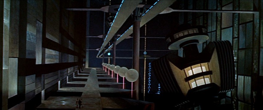
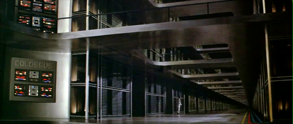
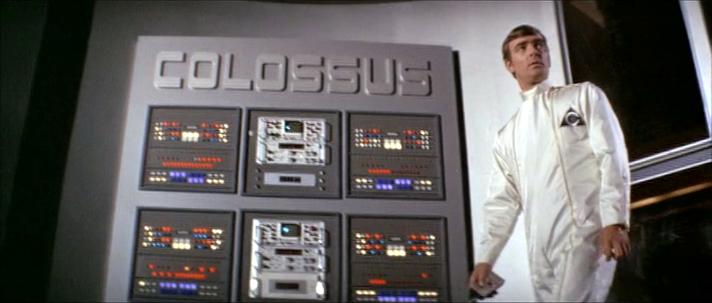
As Colossus: The Forbin Project opens, we are treated to an establishing montage of 1970’s circuit boards (with resistors), whirring doodads, punched tape, ticking Nixie tube numerals, beeping lights, and jerking control data tapes. Then a human hand breaks into frame, and twiddles a few buttons as an oscilloscope draws lines creepily like an ECG cardiac cycle. This hand belongs to Charles Forbin, who walks alone in this massive underground compound, making sure final preparations are in order. The matte paintings make this space seem vast, inviting comparisons to the Krell technopolis from Forbidden Planet.
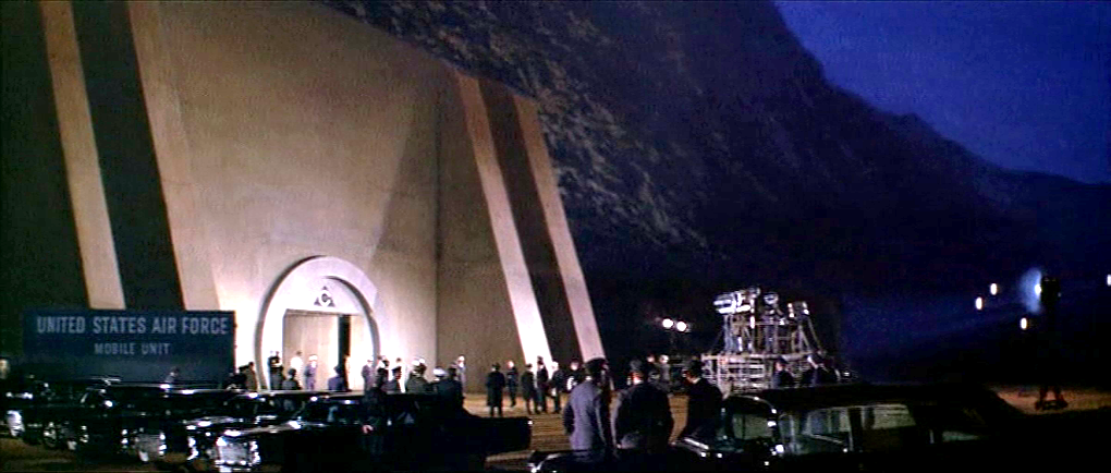
Forbin pulls out a remote control and presses something on its surface to illuminate rows and rows of lights. He walks across a drawbridge over a moat. Once on the far side, he uses the remote control to close the massive door, withdraw the bridge and seal the compound.
The remote control is about the size of a smartphone, with a long antenna extending out the top. Etched type across the top reads “COLOSSUS COMPUTER SYSTEMS.” A row of buttons is labeled A–E. Large red capital letters warn DANGER RADIATION above a safety cover. The cover has an arrow pointing right. Another row of five buttons is labeled SLIDING WALLS and numbered 1–5. A final row of three buttons is labeled RAMPS and numbered 1–3.
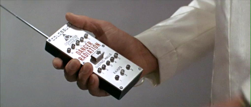
Forbin flips open the safety cover. He presses the red button underneath, and a blood-red light floods the bottom of the moat and turns blue-white hot, while a theremin-y whistle tells you this is no place a person should go. Forbin flips the cover back into place and walks out the sealed compound to the reporters and colleagues who await him.
I can’t help but ask one non-tech narrative question: Why is Forbin turning lights on when he is about to abandon the compound? It might be that the illumination is a side-effect of the power systems, but it looks like he’s turning on the lights just before leaving and locking the house. Does he want to fool people into thinking there’s someone home? Maybe it should be going from fully-lit to an eerie, red low-light kinda vibe.
The Remote Control
The layout is really messy. Some rows are crowded and others have way too much space. (Honestly, it looks like the director demanded there be moar buttins make tecc! and forced the prop designer to add the A–E.) The crowding makes it tough to immediately know what labels go with what controls. Are A–E the radiation bits, and the safety cover control sliding walls? Bounding boxes or white space or some alternate layout would make the connections clear.
You might be tempted to put all of the controls in strict chronological order, but the gamma shielding is the most dangerous thing, and having it in the center helps prevent accidental activation, so it belongs there. And otherwise, it is in chronological order.
The labeling is inconsistent. Sure, maybe A–E the five computer systems that comprise Colossus. Sliding walls and ramps are well labeled, but there’s no indication about what it is that causes the dangerous radiation. It should say something like “Gamma shielding: DANGER RADIATION.” It’s tiny, but I also think the little arrow is a bad graphic for showing which way the safety cover flips open. Existing designs show that the industrial design can signal this same information with easier-to-understand affordances. And since this gamma radiation is an immediate threat to life and health, how about foregoing the red lettering in favor of symbols that are more immediately recognizable by non-English speakers and illiterate people. The IAEA hadn’t invented its new sign yet, but the visual concepts were certainly around at the time, so let’s build on that. Also, why doesn’t the door to the compound come with the same radiation warning? Or any warning?
The buttons are a crap choice of control as well. They don’t show what the status of the remotely controlled thing is. So if Charles accidentally presses a button, and, say, raises a sliding wall that’s out of sight, how would he know? Labeled rocker switches help signal the state and would be a better choice.

But really, why would these things be controlled remotely? It be more secure to have two-handed momentary buttons on the walls, which would mean that a person would be there to visually verify that the wall was slid or the ramp retracted or whatever it is national security needed them to be.
There’s also the narrative question about why this remote control doesn’t come up later in the film when Unity is getting out of control. Couldn’t they have used this to open the fortification and go unplug the thing?
So all told, not a great bit of design, for either interaction or narrative, with lots of improvement for both.
Locking yourselves out and throwing away the key
At first glance, it seems weird that there should be interfaces in a compound that is meant to be uninhabited for most of its use. But this is the first launch of a new system, and these interfaces may be there in anticipation of the possibility that they would have to return inside after a failure. We can apologize these into believability.
But that doesn’t excuse the larger strategic question. Yes, we need defense systems to be secure. But that doesn’t mean sealing the processing and power systems for an untested AI away from all human access. The Control Problem is hard enough without humans actively limiting their own options. Which raises a narrative question: Why wasn’t there a segment of the film where the military is besieging this compound? Did Unity point a nuke at its own crunchy center? If not, siege! If so, well, maybe you can trick it into bombing itself. But I digress.

Whether Unity should have had its plug pulled is the big philosophical question this movie does not want to ask, but I’ll save that for the big wrap up at the end.
Discover more from Sci-fi interfaces
Subscribe to get the latest posts sent to your email.
Hell yeah, 1970 science fiction! This is rocking. Also the captions are just soo tasty. Keep up the good work. I’d forgotten this film thanks for reminding me.