Glossary: Facing, Off-facing, Lengthwise, and Edgewise

As part of the ongoing review of the Iron Man HUD, I noticed a small feature in the Iron Man 3 UI 2nd-person UI that—in order to critique—I have to discuss some new concepts and introduce some new terms. The feature itself is genuinely small and almost not worth posting about, but the terms are interesting, so bear with me.

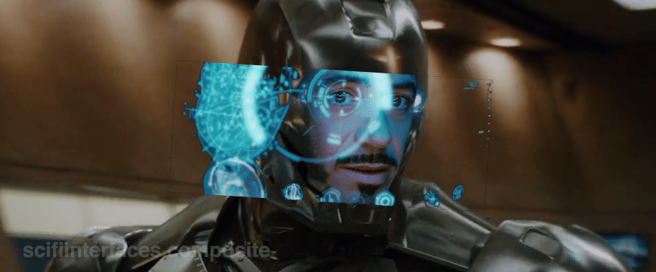
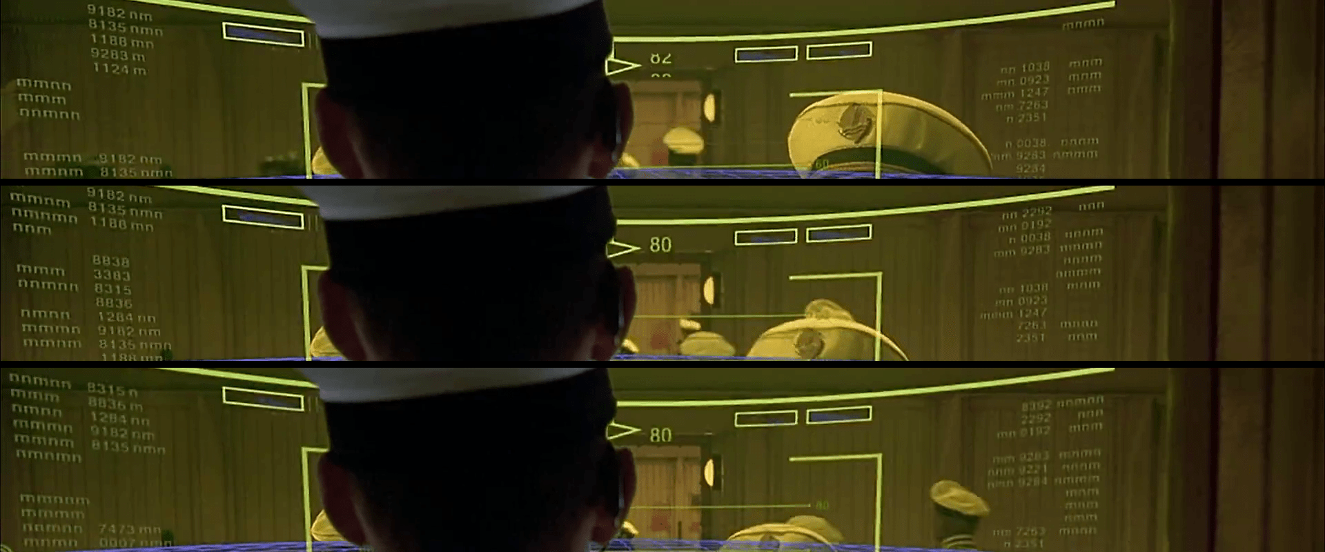
Most of the time JARVIS animates the HUD, the UI elements sit on an invisible sphere that surrounds his head. (And in the case of stacked elements, on concentric invisible spheres.) The window of Pepper in the following screenshot illustrates this pretty clearly. It is a rectangular video feed, but appears slightly bowed to us, being on this sphere near the periphery of this 2nd-person view.

IronMan3_HUD68
…And Pepper Potts is up next with her op-ed about the Civil Mommy Wars. Stay tuned.

Having elements slide around on the surface of this perceptual sphere is usable for Tony, since it means the elements are always facing him and thereby optimally viewable. “PEPPER POTTS,” for example, is as readable as if it was printed on a book perpendicular to his line of sight. (This notion is a bit confounded by the problems of parallax I wrote about in an earlier post, but since that seems unresolvable until Wim Wouters implements this exact HUD on Oculus Rift, let’s bypass it to focus on the new thing.)

So if it’s visually optimal to have 2D UI elements plastered to the surface of this perceptual sphere, how do we describe that suboptimal state where these same elements are not perpendicular to the line of sight, but angled away? I’m partly asking for a friend named Tony Stark because that’s some of what we see in Iron Man 3, both in 1st- and 2nd-person views. These examples aren’t egregious.

IronMan3_HUD44
The Iron Patriot debut album cover graphic is only slightly angled and so easy to read. Similarly, the altimeter thingy on the left is still wholly readable.
IronMan3_HUD64
The weird L-protractor in the corner might have some 3D use we’re just not seeing at this particular moment.

As I mentioned in the opening paragraph, these things aren’t terrible in and of themselves, but as a UI pattern could get bad as people misunderstand and overuse it, so we need a way to talk about it. To be precise, we need a way to talk about the degree of tilt away from a plane perpendicular to the line of sight. except “degree of tilt away from a plane perpendicular to the line of sight” is waaay too long.

To find this term, I did some asking around on social media. At first, lots of folks jumped to anatomical terms of location like sagittal or caudal, but should you be similarly tempted, note that these terms are fixed per the body. A UI element that is coronal in front of the face, and perfectly readable there, is utterly unreadable near the ear. A facing element would be readable in both places, and a whatever-the-antonym-is element similarly unreadable as it slid from the nose around the side. 

BodyPlanes

Eventually I got some nice adjectives that describe the particular tilt away from the line of sight. I was most happy with industrial designer ‏Abhinav Dapke’s suggestion of “lengthwise” for a tilt away from line-of-sight, since it’s a word we have already and very descriptive. It also implies another existing word for yawed-against line-of-sight, and that’s “edgewise.” (Roll along line-of-sight can be handled simply as rotation, for you completionists.)

But for the single variable that we can discuss as an antonym to facing, my crowdsourcing turned up nothing, and so I’m going to coin the ungainly adjectives off-facing and off-faced. Each is short, decryptable, not currently defined as something else, and obviously connected to its source concept, so works for many reasons.

off-facing.png


With these we now we can speak of those elements that are off-faced in Iron Man and similar bubble HUDs, and do a Invasion of the Body Snatchers-esque pointing and screeching when it’s too extreme.

Note that this only applies to 2D UI elements that are meant to be read. The overwhelming majority of things we see in the physical world are not oriented to our line of sight and that poses little problem. Even in the Iron Man HUD we see plenty of objects that are off-faced but rightly so, since as augmentations they bear orientation to the world, not the viewer.

IronMan3_HUD63

One of the main reasons I went to such trouble to come up with these terms is that I think the Iron Man HUD is one of the most forward-provoking sci-fi interfaces in the survey. It ought to be the Minority Report Precrime Scrubber of it’s day. I suspect it will become more and more influential, and so having these new terms are likely to become more useful and necessary as sci-fi keeps on keepin’ on.

Next up in the Iron HUD series: We discuss how JARVIS is straight-up lying to Tony Stark.

The Iron Man HUD is an impossible thing

In the prior post we looked at the HUD display from Tony’s point of view. In this post we dive deeper into the 2nd-person view, which turns out to be not what it seems.

The HUD itself displays a number of core capabilities across the Iron Man movies prior to its appearance in The Avengers. Cataloguing these capabilities lets us understand (or backworld) how he interacts with the HUD, equipping us to look for its common patterns and possible conflicts. In the first-person view, we saw it looked almost entirely like a rich agentive display, but with little interaction. But then there’s this gorgeous 2nd-person view.

IronMan1_HUD00
IronMan1_HUD07

When in the first film Tony first puts the faceplate on and says to JARVIS, “Engage heads-up display”… …we see things from a narrative-conceit, 2nd-person perspective, as if the helmet were huge and we are inside the cavernous space with him, seeing only Tony’s face and the augmented reality interface elements. You might be thinking, “Of course it’s a narrative conceit. It’s not real. It’s in a movie.” But what I mean by that is that even in the diegesis, the Marvel Cinematic World, this is not something that could be seen. Let’s move through the reasons why.

Not a mini-TARDIS

First, it looks like we’re in some TARDIS-like space where the helmet extends so far we can fit in it, or a camera can, about a meter from his face. But of course the helmet isn’t huge on the inside. Tony hasn’t broken those laws of physics. The helmet is helmet-sized on the inside.

Not a volumetric projection

HUD_composit

Then there’s the issue of the huge display. It looks like a volumetric projection, like what R2-D2 can project, but that can’t be true, either. The projection would extend way beyond the boundaries of the helmet-sized helmet. Which as you can see below, is a non-starter. So it’s not a volumetric projection.

So, retinal projection

Then what is the display technology? Given the size constraints, retinal projection makes the most sense, but if we could make the helmet go invisible, it would look like Tony was having diffuse LASIK, or maybe playing The Game from Star Trek: The Next Generation.

STTNG The Game-02
Let’s face it, this is not the worst thing you’ve caught me doing.

Representation of the projections?

So, OK, fine. Maybe what we see is what’s being projected, the separate stereoscopic images onto individual retinas. Nope. Then we would see two similar, slightly offset images, like in older anaglyph stereoscopy, but more confusing, because there wouldn’t be a color difference, just double vision.

i_am_iron_man____in_3d_by_homerjk85-d57gs7u
Let’s pray that poor Tony doesn’t have to wear anaglyph glasses in there.
(Props to Deviantartist homerjk85 for the awesome conversion.)

Nope.

So what we are left with is that we are not seeing anything in the real world of the diegesis. This 2° view is strictly a narrative conceit: A projection of what Tony’s brain puts together from the split views of the stereographic projection into a cohesive whole, i.e. retinally-projected augmentation of his eyesight. It’s a testament to the talent of the filmmakers that this HUD, as narratively constructed as it is, just works. We think it’s something real. We instantly get it. But…

The damned multilayering

IronMan_HUDMultilayer
1280px-Parallax_Example.svg
layeringproblems

But even that notion—that this HUD is what Tony experiences, perceptually—is troubled by the multilayering in the HUD. Information in the HUD is typically displayed across multiple layers. See the three squares in the left side of this screen shot for an example. So many problems with this. If this is meant to be what he perceives, then we immediately have trouble with parallax. Parallax is the way that objects shift against background objects when seen from two different viewpoints, like, say, Tony’s two eyes. If Tony perceives these layers through both eyes, i.e. stereoscopically, as an actual set of three layers floating in front of his face, then those graphics shift around depending on which eye JARVIS is optimizing for. One eye might see it beautifully, but then the other eye is wholly confounded. In the worst possible situation, neither eye is really satisfied. See the Wikipedia article on parallax as parallaxed for a meta-example. If on the other hand it’s just one eye that’s seeing these layers, then the layering is utterly pointless, because a single eye has no depth perception and therefore these would just appear as a single layer. It would have no benefit for Tony and only be there for our gee-whizification.

Our choices are: Terrible or Pointless

So, it’s either a terrible, confusing display for Tony (which I can’t imagine, given how genius of a technologist he is meant to be), or this view is not even a representation of what Tony sees, but a strictly narrative construction. And we can’t say for sure which it is because this multilayering is never seen in the first-person views. In those screens it’s been reasonably cleaned up to be intelligible. Note the difference between the car views below in the first- and second-person shots.

IronMan1_HUD11
Layers include end views and a side view.
IronMan1_HUD10
Only the side view is shown, the end views are absent.

Then, the damned head movement

Note also that in the 2nd-person view, Tony is very expressive, moving his head around a lot in response to the HUD. But looking at him from the outside, Iron Man’s head doesn’t swivel around except to look at things in the real world. Is the interface requiring him to move his head or is he just a drama queen? If it requires him, that’s terrible. That would move his head away from important things in the real world to focus on something in this virtual world? If he’s a drama queen, fine, nothing to do about that and glad that JARVIS can accomodate. In any case, when we see the him in the helmet outside the TARDIS-HUD, he is not swiveling his head apropos of nothing, which reinforces the notion that this is strictly a cinematic conceit. (Hat tip to Jonathan Korman for sharing this observation with me.)

So…

So ultimately what I’m saying here is this is an impossible thing, and for being impossible, we should not just freak out about how cool it is and declare it the necessary and good future. It has major problems, even as gorgeous and exciting as it is. Hey, no surprise, nobody has forgotten that it’s a movie, but recognize that what you thought was just maybe exaggerated was in fact a bold-faced impossibility.

Next up in the Iron HUD series: Iron Man forces us to get clear about some terms.

Iron Man HUD: 1st person view

In the prior post we catalogued the functions in the Iron HUD. Today we examine the 1st-person display.

When we first see the HUD, Tony is donning the Iron Man mask. Tony asks, JARVIS, “You there?” To which JARVIS replies, “At your service sir.” Tony tells him to “Engage the heads-up display”, and we see the HUD initialize. It is a dizzying mixture of blue wireframe motion graphics. Some imply system functions, such as the reticle that pinpoints Tony’s eye. Most are small dashboard-like gauges that remain small and in Tony’s peripheral vision while the information is not needed, and become larger and more central when needed. These features are catalogued in another post, but we learn about them through two points-of-view:a first-person view, which shows us what Tony’s sees as if we were there, donning the mask in his stead, and second-person view, which shows us Tony’s face overlaid against a dark background with floating graphics.

This post is about that first-person view. Specifically it’s about the visual design and the four awarenesses it displays.

Avengers-missile-fetching04

In the Augmented Reality chapter of Make It So, I identified four types of awareness seen in the survey for Augmented Reality displays:

  1. Sensor display
  2. Location awareness
  3. Context awareness
  4. Goal awareness

The Iron Man HUD illustrates all four and is a useful framework for describing and critiquing the 1st-person view.

Sensor display

When looking through the HUD “ourselves,” we can see that the HUD provides some airplane-like heads up instruments: Across the top is a horizontal compass with a thin white line for a needle. Below and to its left is a speed indicator, presented in terms of MACH. On the left side of the screen is a two-part altimeter with overlays indicating public, commercial, military, and aerospace layers of atmosphere, with a small blue tick mark indicating Tony’s current altitude.

There are just-in-time status indicators like that cyan text box on the right with its randomized rule line. The content within is all N -8 W -97 RNG EL, so, hard to tell what it means, but Tony’s a maker working with a prototype. It’s no surprise he takes some shortcuts in the interface since it’s not a commercial device. But we should note that it would reduce his cognitive load to not have to remember what those cryptic letters meant.

IronMan1_HUD08
You can just see the tops of these gauges at the bottom of this screen.

The exact sensor shown depends on the context and goal at hand.

Periphery and attention

A quick sidenote about peripheral vision and the detail of these gauges. Looking at them, it’s notable that they are small and quite detailed. That makes sense when he’s looking right at them, but when he’s not, given the amount of big, swirling graphics he“s got vying for his attention in the main display, the more those little gauges have to compete. And when it comes to your peripheral vision, localized detail and motion is not enough, owing to the limits of our foveal extent. (Props to @pixelio for the heads-up on this one.)

You see, your brain tricks you into thinking that you can see really well across your entire field of vision. In fact, you can only see really well across a few dozen degrees of that perceptual sphere, corresponding to the tiny area at the back of your eye called the fovea where all the really good photoreceptors concentrate. As your eyes dart around the scene before you, your brain puts all the snippets of detailed information together so it feels like a cohesive, well-detailed whole, but it’s ultimately just a hack. Take a look at this demonstration of the effect.

Screen Shot 2015-07-20 at 23.49.56
This only works if you view it live.

So, having those teeny little guages dancing around as a signal of troubles ahead won’t really get Tony’s attention. He could develop habits of glancing at these things, but that’s a weak strategy, since this data is so mission-critical. If he misses it and forgets to check the gauges, he’s Iron Toast. Fortunately, JARVIS is once again our deus ex machina (in so many senses) because he is able to track where Tony is looking, and if he’s not looking at the wiggling gauge, JARVIS can choose to escalate the signal: Hide the air traffic data temporarily and show the problem in the main screen. Here, as in other mission critical systems, attention management is crisis management. Now, for those of us working with pre-JARVIS tech, it’s rare today for a system to be able to

  • Track perceptual details of its users
  • Monitor a model of the user’s attention
  • Make the right call amongst competing priorities to escalate the right one

But if you could, it would be the smart and humane way to handle it.

Location Awareness

As Tony prepares for his first flight, JARVIS gives him a bit of x-ray vision, displaying a wireframe view of the Santa Monica coastline with live air traffic control icons of aircraft in the vicinity. The overhead map updates of course in real time.

IronMan1_HUD17
If my Google Earth sleuthing is right, his view means he lives in the Malibu RV Park and this view is due East.

Context Awareness

Very quickly after we meet the HUD it shows its object recognition capabilities. As Tony sweeps his glance across his garage, complex reticles jump to each car. Split-seconds afterwards, the car’’s outline is overlaid and some adjunct information about it is presented.

IronMan1_HUD10

This holds true as he’s in flight as well. When Tony passes by the Santa Monica pier, not only is the Pacific Wheel identified (as the Santa Monica Ferriswheel), but the interface shows him a Wikipedia-esque article for the thing as well.

IronMan1_HUD19

IronMan1_HUD21

While JARVIS might be tapping into location databases for both the car and the ferris wheel recognition, it’s more than that. In one scene we see him getting information on the Iron Patriot as it rockets away, and its location wouldn’t be on any real-time record for him to access.

Optical zoom

Too much detail

While this level of object detail is deeply impressive, it’s about as useful as reading Wikipedia pages hard-printed to transparencies while driving. The text is too small, too multilayered, and just pointless considering that JARVIS can tell him whatever he needs to know without even asking. Maybe he could indulge in pop-up pamphlets if he was on a long-haul flight from, say, Europe back home to the Malibu RV Park (see above), but wouldn’t Tony rather watch a movie while on Autopilot instead?

Goal awareness

Of course JARVIS is aware of Tony’s goals, and provides graphics customized to the task, whether that task is navigating flight through complex obstacle courses…

3D wayfinding

…taking down a bad guy with the next hit…

Suggested target points

…saving innocent bystanders who are freefalling from a plane…

Biometric analysis, target acquisition

…or instantly analyzing problems in an observed (and complicated) piece of machinery…

3D schematics of observed machinery with damage highlights

…JARVIS is there with the graphics to help illustrate, if not solve, the problem at hand. Most impressively, perhaps, is JARVIS’ ability to juggle all of these graphics and modes seamlessly to present just the right thing at the right time in real time. Tony never asks for a particular display, it just happens. If you needed no other proof of its strong artificial intelligence, this would be it.

Next up in the Iron HUD series: Compare and contrast the 2nd-person view.

Iron Man HUD: Just the functions

In the last post we went over the Iron HUD components. There is a great deal to say about the interactions and interface, but let’s just take a moment to recount everything that the HUD does over the Iron Man movies and The Avengers. Keep in mind that just as there are many iterations of the suit, there can be many iterations of the HUD, but since it’s largely display software controlled by JARVIS, the functions can very easily move between exosuits.

Gauges

Along the bottom of the HUD are some small gauges, which, though they change iconography across the properties, are consistently present.

IronMan1_HUD07

For the most part they persist as tiny icons and thereby hard to read, but when the suit reboots in a high-altitude freefall, we get to see giant versions of them, and can read that they are:

IronMan1_HUD13
Tony can, at a glance or request, summon more detail for any of the gauges.
IronMan1_HUD12
Even different visualizations of similar information.

Object Recognition

In the 1st-person view we see that the HUD has a separate map in the lower-left, and object recognition/awareness,

IronMan1_HUD10
IronMan1_HUD11
In the 2nd-person view, we see even more layers of information about the identified objects, floating closer to tony’s point of view.

Situational

Most of the HUD functions we see, though, are situational, brought up for Tony’s attention when JARVIS believes they are needed, or when Tony requests them. Following are screenshots that illustrate a moment when the situational function appeared. 

Iron Man

Iron Man 2

Iron Man 3

The Avengers

Some of these illustrate why I argue that JARVIS is the superhero, and Tony just the onboard manager, but rather than reverse engineering any particular function, for this post it is enough to document them and note that only the optical zoom seems to be an interactive function. This raises questions of how he initiated the mode and how he escapes the mode, but since we don’t see the mechanisms of control, it’s entirely arguable that JARVIS is just  being his usual helpful self again.

Next up in the Iron HUD series: Let’s dive deeper into the first-person view.

Scav Reticle

The last Scav tech (and the last review of tech in the nerdsourced reviews of Oblivion) is a short one. During the drone assault on the Scav compound, we get a glimpse of the reticle used by the rebel Sykes as he tries to target a weak spot in a drone’s backside.
Scav reticle

The reticle has a lot of problems, given Sykes’ task. The data on the periphery is too small to be readable. There are some distracting lines from the augmentation boxes which, if they’re just pointing to static points along the hairline, should be removed. The grid doesn’t seem to serve much purpose. There aren’t good differentiations among the ticks to be able to quickly subitize subtensions. (Read: tell how wide a thing is compared to the tick marks.) (You know, like with a ruler.)

ruler

The reticle certainly looks sci-fi, but real-world utility seems low.

The nicest and most surprising thing though is that the bullseye is the right shape and size of the thing he’s targeting. Whatever that circle thing is on the drone (a thermal exhaust port, which seem to be ubiquitously weak in spherical tech) this reticle seems to be custom-shaped to help target it. This may be giving it a lot of credit, but in a bit of apologetics, what if it had a lot of goal awareness, and adjusted the bullseye to match the thing he was targeting? Could it take on a tire shape to disable a car? Or a patella shape to help incapacitate a human attacker? That would be a very useful reticle feature.

The Drone

A spherical robot with the number 166 in a dark, smoky environment, hovering above burning debris.

Each drone is a semi-autonomous flying robot armed with large cannons, heavy armor, and a wide array of sensor systems. When in flight mode, the weapon arms retract. The arms extend when the drone senses a threat.

A figure stands amidst debris, lifting a large spherical object that emits bright beams of light in a dark environment.

Each drone is identical in make and temperament, distinguishable only by large white numbers on its “face”. The armored shell is about a meter in diameter (just smaller than Jack). Internal power is supplied by a small battery-like device that contains enough energy to start a nuclear explosion inside of a sky-scraper-sized hydrogen distiller. It is not obvious whether the weapons are energy or projectile-based.

The HUD

The Drone Interface is a HUD that shows the drone’s vision and secondary information about its decision making process. The HUD appears on all video from the Drone’s primary camera. Labels appear in legible human English.

Video feeds from the drone can be in one of several modes that vary according to what kind of searching the drone is doing. We never see the drone use more than one mode at once. These modes include visual spectrum, thermal imaging, and a special ‘tracking’ mode used to follow Jack’s bio signature.

Occasionally, we also see the Drone’s primary objective on the HUD. These include an overlay on the main view that says “TERMINATE” or “CLEAR”.

A digital overlay displaying targeting data and identifiers, with a focus on the word 'TERMINATE', set against an orange background.

In English, the HUD displays what look to be GPS (or similar) coordinates at the top, the Drone’s number (i.e. 185), and the letters A1-XX. The second ‘X’ is greyed out, and this area remains constant between Drones regardless of what mode they are in or what their current mission is.

Additional information covers the left and right sides of the Drone’s vision. All information on the HUD changes in real time, and most appears to be status information about the drone itself or its connection to the Home Station and the Tet.

Physical Feedback

For nearby techs (or enemies), the Drones have a simple voice (tonal) language to describe queries, anger, and acknowledgement of commands. This is similar to R2-D2 from Star Wars, or to pets, like dogs and cats.

A futuristic robotic sphere with the number 166 displayed on its front, equipped with mechanical arms and a single red eye, set against a dimly lit background.

If people or Maintenance Techs are close enough to see details on the drone, the drones’ iris dilates when the drone enters an aggressive mode, then contracts when the drone determines that there is no further threat.

Post-Mission Review

As an overlay on the video feed, this looks like an attempt to more fully immerse the maintenance team in the (artificial) story that the Tet is trying to perpetuate. We never see Vika watch directly through a drone’s eye, but she accesses similar information very easily from the Tet and the Bubbleship.

The most useful situation for this kind of HUD overlay is a post-mission review of a Drone’s activity. Post-mission, the HUD would allow the team to understand how the Drone was making decisions. Given that the Drones appear to be low-level Artificial Intelligence, this would be useful for getting into the Drone’s mind. Jack knows that the drones are temperamental from his encounter at the downed NASA ship, and he would want to make sure that he understands them.

Given how quickly the drone makes decisions, there would not be enough time for Vika to notice that a Drone had made a decision (based on its HUD), then countermand that order. The drone appears to have just enough reaction time for Jack to announce himself before being eliminated.

Futuristic user interface displaying data analysis and terrain information, with orange tones and digital readouts.

If the numbers at the top do conform to the Drone’s current position on the ground, it is surprising that it doesn’t also show the altitude of the drone. The Drone’s position in 3d space would be far more useful to a team trying to understand what the Drone was up to after a mission. It is likely that this is an attempt to keep information from the maintenance team to correspond better to Vika’s 2d command console, and the Tet likely knows exactly where each drone is.

If the maintenance team is infrequently accessing the Drone HUD, more labeling of information on the active status of the Drones would make the data more useful on quick viewing. Right now, the maintenance team needs to constantly remember what each area means, and what each icon represents. The different data formats are good clues, but more labeling would make everything instantly clear and allow the team to focus on the situation instead of deciphering the interface.

At the same time, the wealth of information related to the Drone’s operational status means that a review session using freeze-frames could allow a Team to deduce any functional reasons for an unexpected or catastrophic action on the Drone’s part. Thus the suggestion is reinforced that this HUD is meant for post-operation analysis and not in-the-moment error correction.

There is a potential clue (or Tet hand-tip) for the Team here: Even a catastrophic failure that resulted in the termination of Jack is acceptable enough for Tet not to emphasize in-the-moment error correction as an option for the Team. Tet knows it has plenty of Maintenance Team members in queue. The Maintenance Team does not.

Deceptive, Effectively

The Drone HUD provides useful information to the Maintenance Team for post-mission review. This HUD also works well as a way to make the maintenance team think it has control and understanding over the drone. This deception effectively keeps critical information firmly in the hands of the Tet.

For the Maintenance Team, this deception doesn’t affect their job. What does affect their job is the lack of labels on the data. Better labeling and a more efficient use of space around the edges would make the maintenance team’s life much easier without releasing any extra information from the Tet’s hands.

Perhaps the abundance of information on the display is meant to suggest to the Maintenance Team that other humans will deal with or are dealing with that overabundance in some other setting. If so, these would be impressive lengths for Tet to go to in its serial deception of each instance of the team.

It is worth noting that Oblivion marks one of relatively few cases where an internally-facing HUD with human-readable data can be rationalized as part of the story, rather than simply material for the viewing audience.

Lessons:

  1. Clearly label Information
  2. Speak in a language your users understand
  3. Don’t use up space with unnecessary information

The Bubbleship Cockpit

image01

Jack’s main vehicle in the post-war Earth is the Bubbleship craft. It is a two seat combination of helicopter and light jet. The center joystick controls most flight controls, while a left-hand throttle takes the place of a helicopter’s thrust selector. A series of switches above Jack’s seat provide basic power and start-up commands to the Bubbleship’s systems.

image05

Jack first provides voice authentication to the Bubbleship (the same code used to confirm his identity to the Drones), then he moves to activate the switches above his head.

image06

The switches are large, all move the same direction for startup, and are labeled. Two of the controls are color coded red, and Jack switches the red control last. We never see the round knobs in use. They could be circuit breakers for the major systems. All are positioned nicely to prevent accidental use. Overall, it is setup almost exactly like a modern-day helicopter, with two distinct additions: Cockpit-wide HUD, and Swivel Controls. While not technical, the cockpit also has a little Elvis bobblehead—whose name is Bob—that keeps Jack company.

image02

The main HUD provides standard information that Jack needs to pilot, even in zero visibility. It displays thrust output of his engines, an artificial horizon, altitude, and other indicators (shown in the above image and labeled in the image below).

image04

The HUD is displayed on the front glass, and is tied to the Bubbleship’s main power. When the power goes out, the HUD goes out. It is not wired to a separate backup circuit. Fortunately, Jack has a physical gimbal that remains operational even when the power is out.

image03

Another major addition is the swivel seating. Using a dedicated control on his joystick, Jack can move his seat around to get a better view as he is flying, without redirecting the Bubbleship in that direction.

image07

It is not clear based on the evidence shown whether Jack has set seat positions (one click per a certain degree of rotation), or whether he is able to hold down the control and rotate the seat based on the click duration. Jack is very familiar with this interface and piloting scheme. Even in an emergency situation when the Bubbleship’s power goes out and he loses control, Jack does not panic and goes through his emergency checklist. We see later that the Bubbleship does have an eject system (a large red handle in the top of the command pod), that detaches the entire passenger compartment and deploys a parachute. Jack decides that he does not need this rescue system and can pilot his way to safety.

Click-to-swivel

We see that Jack is often the only person in the Bubbleship, and that he often uses the seat swivel to get a better view of what he needs to survey. Piloting is a high-concentration activity, with a large amount of muscle memory training. A pilot can be expected to know how his (or her) craft will react to specific inputs at specific times. Moving around the seat allows Jack a better view of his surroundings, but could interrupt the muscle memory he uses for his daily piloting and emergency maneuvering. Given the muscle memory requirement, Jack is probably able to control the swivel based on a number of clicks, not a duration. Specific swivel points has several advantages:

  • The pilot can memorize control relationships for each swivel spot
  • Jack can click the position he wants, then forget about that control while he continues piloting
  • Less cognitive load to learn and operate
  • Automatic Swivel

Click-to-swivel has advantages, but it is not the most advantageous control scheme for the level of technology shown. We know that Jack has destinations in mind when he is traveling, or Vika has given him a waypoint. We also know that the Drones have a low level intelligence capable of free flight and complicated maneuvers. Jack could easily activate an autopilot mode (straight and level, emergency maneuvers, return to base, go to the secret cabin), then he could ‘free swivel’. This free swivel movement would be based on his eyes and head movement, with the seat merely following where Jack wants to look. Otherwise, the Bubbleship could follow his head movements for regular flight inputs, augmented by the control stick inputs.

image00

The Bubbleship would need some intelligence then to know the difference between when Jack actually wants to go somewhere, and when he is merely looking at his dashboard. Artificial intelligence is a given here. A good method would be focus tracking. When the Bubbleship tracks Jack’s focal point, it would know whether he’s looking at a spot on the horizon, or whether he’s looking at a point inside the cockpit. It would also be an effective way to focus the Bubbleship’s weapons pod for convergence—the guns would always meet at the point Jack was focused on, instead of firing wildly based on his joystick inputs.

Highly Refined

Modern day flight controls are highly refined tools with a well practiced group of users and a solid history of training programs. It makes sense to pull from this history when designing for a new flight machine, especially when its controls map so well to modern day equipment. The largest improvements can come from automation, especially when there is a solidly tested machine intelligence able to augment pilot intentions (see: the Drone, to be published later). By taking away the monotonous tasks from the pilot, and allowing them to focus on the difficult decisions, a machine can make the pilot’s life easier and safer.

Helmsman’s HUD

TheFifthElement-helmsman-001

Aboard the Fhloston Paradise luxury liner, we are treated to a quick view of the ship’’s wheel. The helmsman stands before the wheel, in the middle of a ceiling-mounted translucent yellow cylinder that drops just below shoulder level. This surface acts as heads-up display that is visible only from the inside.

TheFifthElement-helmsman-002

The content of the display is a 3-D, featureless, blue graticule with an overlay featuring target brackets, various numeric data strangely labeled with various numbers of ““m””s and “n”s, and a green, faint outline of a railing, as if the helmsman was looking out from a Lawnmower Man interpretation of an Age of Sail wheelbridge. At the top of the display are three yellow-outline rectangles with no content. In the center-top of his view is a compass readout, with a rolling counter display that appears to show bearing.

In practice, the Captain calmly gives an order to a barker, who confirms with a, “Yes, sir” before walking to the edge of the cylinder and shouting the same order, “HELM ONE OH EIGHT!” To confirm that he heard the message, the helmsman repeats the order back and turns the wheel. The helmsman wears a headset that amplifies his spoken confirmation back to everyone on the bridge.

Sometimes a Human is the Best Interface

The Captain doesn’t want to shout or wear a headset. He’s a gentleman. But if the helmsman is going to be trapped in the yellow cone of silence, there must be an intermediary to convey the commands and ensure that they’re carried out. Even if technology could solve it better, I have the sense that navies are places where traditions are carried on for the sake of tradition, so the human aspect of this interaction doesn’t bother me too much. It does add a layer of intermediation where data can go wrong, but the barker and the helmsman each repeat the command loudly, so the Captain can hear and error-check that way.

Long live the HUD

On the plus side, showing the graticule grants a sense of speed and (kind-of) bearing that would be much more difficult to do on the surface on all-water planet like Fhloston Paradise. So that’s nice.

But that information would be even more useful if it was backed up by some other contextual information like the clouds, the position of the sun, or, say, anything else on the surface of the planet toward which they might be barreling. A simple highly-transparent live feed of a camera from somewhere would have been more useful.

helmsman

And of course I can’t let the silly nonsense data on the edges just go. Shipmen love their sea-salted jargon, but they also love effectiveness, and there is no sense to labeling one variable “nm” and the next “nmn,” much less a whole screen of them. They would be difficult to distinguish at the very least. Certainly there’s no use to having two variables labeled just “m” with no other contextualizers. Even if it was better labeled, presenting this information as an undifferentiated wall of data isn’t helpful. Better would be to turn some of these into differentiable graphics that help the helmsman see the information and not have to read it. In any case, the arbitrary blinking on and off of data just needs to stop. It’s a pointless distraction unless there is some monitoring data that is trending poorly and needs attention.

Sometimes an AI is the Best (Secret) Interface

Finally, if you obsess over editing details (and you are reading this blog…) you’ll note that the bearing indicator at the top begins to change before the helmsman moves the wheel. It even moves before the helmsman repeats the order. It even begins before the the barker shouts the orders. (Reminiscent of the chem department flub from Cabin I covered earlier.) It looks like the HUD designers wanted movement and mistimed it before the events in the scene.

But we don’t have to leave it there. We’ve already noted that seamen love standing on tradition. What if this whole interface was vestigial? If the ship has a low-level AI that listens to the captain, it wouldn’t need to wait for any of the subsequent human processes: the barker, the helmsman repeat, or the wheel turning. Each of these acts to confirm the command, but the ship can go from the first order when it has a high degree of confidence. This would also excuse the nmnmmnonsense we see on the HUD. The display might have degraded to displaying noise, but no one needs to fix it because the ship runs just fine without it.

Thinking that the Fhloston Paradise might have been a bioship only makes its destruction from a Zorg Mangalore Zorg bomb only makes its destruction much more tragic, but also more heroic as it died saving the people it had been programmed to serve all along.

tellherkorben

Prometheus’ Flight instrument panels

There are a great many interfaces seen on the bridge of the Prometheus, and like most flight instrument panels in sci-fi, they are largely about storytelling and less about use.

Prometheus-100

The captain of the Prometheus is also a pilot, and has a captain’s chair with a heads-up display. This HUD has with real-time wireframe displays of the spaceship in plan view, presumably for glanceable damage feedback.

Prometheus-028

He also can stand afore at a waist-high panel that overlooks the ship’s view ports. This panel has a main screen in the center, grouped arrays of backlit keys to either side, a few blinking components, and an array of red and blue lit buttons above. We only see Captain Janek touch this panel once, and do not see the effects.

Prometheus-097

Navigator Chance’s instrument panel below consists of four 4:3 displays with inscrutable moving graphs and charts, one very wide display showing a topographic scan of terrain, one dim panel, two backlit reticles, and a handful of lit switches and buttons. Yellow lines surround most dials and group clusters of controls. When Chance “switches to manual”, he flips the lit switches from right to left (nicely accomplishable with a single wave of the hand) and the switches lights light up to confirm the change of state. This state would also be visible from a distance, useful for all crew within line of sight. Presumably, this is a dangerous state for the ship to be in, though, so some greater emphasis might be warranted: either a blinking warning, or a audio feedback, or possibly both.

Prometheus-094Prometheus-102

Captain Janek has a joystick control for manual landing control. It has a line of light at the top rear-facing part, but its purpose is not apparent. The degree of differentiation in the controls is great, and they seem to be clustered well.

Prometheus-104

A few contextless flight screens are shown. One for the scientist known only as Ford features 3D charts, views of spinning spaceships, and other inscrutable graphs, all of which are moving.

Prometheus-095

A contextless view shows the points of metal detected overlaid on a live view from the ship.

Prometheus-101

There is a weather screen as well that shows air density. Nearby there’s a push control, which Chance presses and keeps held down when he says, “Boss, we’ve got an incoming storm front. Silica and lots of static. This is not good.” Thought we never see the control, it’s curious how such a thing could work. Would it be an entire-ship intercom, or did Chance somehow specify Janek as a recipient with a single button?

Prometheus-078

Later we see Chance press a single button that illuminates red, after which the screens nearby change to read “COLLISION IMMINENT,” and an all-ship prerecorded announcement begins to repeat its evacuation countdown.

Prometheus-309

This is single button is perhaps the most egregious of the flight controls. As Janek says to Shaw late in the film, “This is not a warship.” If that’s the case, why would Chance have a single control that automatically knows to turn all screens red with the Big Label and provide a countdown? And why should the crew ever have to turn this switch on? Isn’t a collision one of the most serious things that could happen to the ship? Shouldn’t it be hard to, you know, turn off?