Without a display, the Eye asks Strange to do all the work of exploring the range of values available through it to discover what is of interest. (I am constantly surprised at how many interfaces in the real world repeat this mistake.) We can help by doing a bit of “pre-processing” of the information and provide Strange a key to what he will find, and where, and ways to recover exactly where interesting things happen.
The watch from the film, for reasons that will shortly become clear.
To do this, we’ll add a ring outside the saucer that will stay fixed relative to the saucer’s rotation and contain this display. Since we need to call this ring something, and we’re in the domain of time, let’s crib some vocabulary from clocks. The fixed ring of a clock that contains the numbers and minute graduations is called a chapter ring. So we’ll use that for our ring, too.
What chapter ring content would most help Strange?
Good: A time-focused chapter ring
Both the controlled-extents and the auto-extents shown in the prior post presume a smooth display of time. But the tome and the speculative meteorite simply don’t change much over the course of their existence. I mean, of course they do, with the book being pulled on and off shelves and pages flipped, and the meteorite arcing around the sun in the cold vacuum of space for countless millennia, but the Eye only displays the material changes to an object, not position. So as far as the Eye is concerned, the meteoroid formed, then it stays the same for most of its existence, then it has a lot of activity as it hits Earth’s atmosphere and slams into the planet.
A continuous display of the book shows little of interest for most of its existence, with a few key moments of change interspersed. To illustrate this, lets make up some change events for the tome.
Now let’s place those along an imaginary timeline. Given the Doctor Strange storyline, Page Torn would more likely be right next to Now, but making this change helps us explore a common boredom problem, see below. OK. Placing those events along a timeline…
And then, wrapping that timeline around the saucer. Much more art direction would have to happen to make this look thematically like the rest of the MCU magic geometries, but following is a conceptual diagram of how it might look.
With time flowing smoothly, though at different speeds for the past and the future.
On the outside of the saucer is the chapter ring with the salient moments of change called out with icons (and labels). At a glance Strange would know where the fruitful moments of change occur. He can see he only has to turn his hand about 5° to the left to get to the spot where the page was ripped out.
Already easier on him, right? Some things to note.
The chapter ring must stay fixed relative to the saucer to work as a reference. Imagine how useless a clock would be if its chapter ring spun in concert with any of its hands. The center can still move with his palm as the saucer does.
The graduations to the left and right of “now” are of a different density, helping Strange to understand that past and future are mapped differently to accommodate the limits of his wrist and the differing time frames described.
When several events occur close together in time, they could be stacked.
Having the graduations evenly spaced across the range helps answer roughly when each change happened relative to the whole.
The tome in front of him should automatically flip to spreads where scrubbed changes occur, so Strange doesn’t have to hunt for them. Without this feature, if Strange was trying to figure out what changed, he would have to flip through the whole book with each degree of twist to see if anything unknown had changed.
Better: A changes-focused chapter ring
If, as in this scene, the primary task of using the Eye is to look for changes, a smooth display of time on the chapter ring is less optimal than a smooth display of change. (Strange doesn’t really care when the pages were torn. He just wants to see the state of the tome before that moment.) Distribute the changes evenly around the chapter ring, and you get something like the following.
This display optimizes for easy access to the major states of the book. The now point is problematic since the even distribution puts it at the three o’clock point rather than the noon, but what we buy in exchange is that the exact same precision is required to access any of the changes and compare them. There’s no extra precision needed to scrub between the book made and the first stuff added moments. The act of comparison is made simpler. Additionally, the logarithmic time graduations help him scrub detail near known changes and quickly bypass the great stretches of time when nothing happens. By orienting our display around the changes, the interesting bits are made more easy to explore, and the boring bits are more easy to bypass.
In my comp, more white areas equal more time. Unfortunately, this visual design kind of draws attention to the empty stretches of time rather than the moments of change, so would need more attention; see the note above about needing a visual designer involved.
So…the smooth time and the distributed events display each has its advantages over the other, but for the Tibet scene, in which he’s looking to restore the lost pages of the tome, the events-focused chapter ring gets Strange to the interesting parts more confidently.
Note that all the events Strange might be scrubbing through are in the past, but that’s not all the Eye can do in the Tibet mode. So next up, let’s talk a little about the future.
While recording a podcast with the guys at DecipherSciFi about the twee(n) love story The Space Between Us, we spent some time kvetching about how silly it was that many of the scenes involved Gardner, on Mars, in a real-time text chat with a girl named Tulsa, on Earth. It’s partly bothersome because throughout the rest of the the movie, the story tries for a Mohs sci-fi hardness of, like, 1.5, somewhere between Real Life and Speculative Science, so it can’t really excuse itself through the Applied Phlebotinum that, say, Star Wars might use. The rest of the film feels like it’s trying to have believable science, but during these scenes it just whistles, looks the other way, and hopes you don’t notice that the two lovebirds are breaking the laws of physics as they swap flirt emoji.
Hopefully unnecessary science brief: Mars and Earth are far away from each other. Even if the communications transmissions are sent at light speed between them, it takes much longer than the 1 second of response time required to feel “instant.” How much longer? It depends. The planets orbit the sun at different speeds, so aren’t a constant distance apart. At their closest, it takes light 3 minutes to travel between Mars and Earth, and at their farthest—while not being blocked by the sun—it takes about 21 minutes. A round-trip is double that. So nothing akin to real-time chat is going to happen.
But I’m a designer, a sci-fi apologist, and a fairly talented backworlder. I want to make it work. And perhaps because of my recent dive into narrow AI, I began to realize that, well, in a way, maybe it could. It just requires rethinking what’s happening in the chat.
Let’s first acknowledge that we’ve solved long distance communications a long time ago. Gardner and Tulsa could just, you know, swap letters or, like the characters in 2001: A Space Odyssey, recorded video messages. There. Problem solved. It’s not real-time interaction, but it gets the job done. But kids aren’t so much into pen pals anymore, and we have to acknowledge that Gardner doesn’t want to tip his hand that he’s on Mars (it’s a grave NASA secret, for plot reasons). So the question is how could we make it work so it feels like a real time chat to her. Let’s first solve it for the case where he’s trying to disguise his location, and then how it might work when both participants are in the know.
Fooling Tulsa
Since 1984 (ping me, as always, if you can think of an earlier reference) sci-fi has had the notion of a digitally-replicated personality. Here I’m thinking of Gibson’s Neuromancer and the RAM boards on which Dixie Flatline “lives.” These RAM boards house an interactive digital personality of a person, built out of a lifetime of digital traces left behind: social media, emails, photos, video clips, connections, expressed interests, etc. Anyone in that story could hook the RAM board up to a computer, and have conversations with the personality housed there that would closely approximate how that person would (or would have) respond in real life.
Listen to the podcast for a mini-rant on translucent screens, followed by apologetics.
Is this likely to actually happen? Well it kind of already is. Here in the real world, we’re seeing early, crude “me bots” populate the net which are taking baby steps toward the same thing. (See MessinaBot, https://bottr.me/, https://sensay.it/, the forthcoming http://bot.me/) By the time we actually get a colony to Mars (plus the 16 years for Gardner to mature), mebot technology should should be able to stand in for him convincingly enough in basic online conversations.
Training the bot
So in the story, he would look through cached social media feeds to find a young lady he wanted to strike up a conversation with, and then ask his bot-maker engine to look at her public social media to build a herBot with whom he could chat, to train it for conversations. During this training, the TulsaBot would chat about topics of interest gathered from her social media. He could pause the conversation to look up references or prepare convincing answers to the trickier questions TulsaBot asks. He could also add some topics to the conversation they might have in common, and questions he might want to ask her. By doing this, his GardnerBot isn’t just some generic thing he sends out to troll any young woman with. It’s a more genuine, interactive first “letter” sent directly to her. He sends this GardnerBot to servers on Earth.
A demonstration of a chat with a short Martian delay. (Yes, it’s an animated gif.)
Launching the bot
GardnerBot would wait until it saw Tulsa online and strike up the conversation with her. It would send a signal back to Gardner that the chat has begun so he can sit on his end and read a space-delayed transcript of the chat. GardnerBot would try its best to manage the chat based on what it knows about awkward teen conversation, Turing test best practices, what it knows about Gardner, and how it has been trained specifically for Tulsa. Gardner would assuage some of his guilt by having it dodge and carefully frame the truth, but not outright lie.
Buying time
If during the conversation she raised a topic or asked a question for which GardnerBot was not trained, it could promise an answer later, and then deflect, knowing that it should pad the conversation in the meantime:
Ask her to answer the same question first, probing into details to understand rationale and buy more time
Dive down into a related subtopic in which the bot has confidence, and which promises to answer the initial question
Deflect conversation to another topic in which it has a high degree of confidence and lots of detail to share
Text a story that Gardner likes to tell that is known to take about as long as the current round-trip signal
Example
TULSA
OK, here’s one: If you had to live anywhere on Earth where they don’t speak English, where would you live?
GardnerBot has a low confidence that it knows Gardner’s answer. It could respond…
(you first) “Oh wow. That is a tough one. Can I have a couple of minutes to think about it? I promise I’ll answer, but you tell me yours first.”
(related subtopic) “I’m thinking about this foreign movie that I saw one time. There were a lot of animals in it and a waterfall. Does that sound familiar?”
(new topic) “What? How am I supposed to answer that one? 🙂 Umm…While I think about it, tell me…what kind of animal would you want to be reincarnated as. And you have to say why.”
(story delay) “Ha. Sure, but can I tell a story first? When I was a little kid, I used to be obsessed with this music that I would hear drifting into my room from somewhere around my house…”
Lagged-realtime training
Each of those responses is a delay tactic that allows the chat transcript to travel to Mars for Gardner to do some bot training on the topic. He would be watching the time-delayed transcript of the chat, keeping an eye on an adjacent track of data containing the meta information about what the bot is doing, conversationally speaking. When he saw it hit low-confidence or high-stakes topic and deflect, it would provide a chat window for him to tell the GardnerBot what it should do or say.
To the stalling GARDNERBOT…
GARDNER
For now, I’m going to pick India, because it’s warm and I bet I would really like the spicy food and the rain. Whatever that colored powder festival is called. I’m also interested in their culture, Bollywood, and Hinduism.
As he types, the message travels back to Earth where GardnerBot begins to incorporate his answers to the chat…
At a natural break in the conversation…
GARDNERBOT
OK. I think I finally have an answer to your earlier question. How about…India?
TULSA
India?
GARDNERBOT
Think about it! Running around in warm rain. Or trying some of the street food under an umbrella. Have you seen youTube videos from that festival with the colored powder everywhere? It looks so cool. Do you know what it’s called?
Note that the bot could easily look it up and replace “that festival with the colored powder everywhere” with “Holi Festival of Color” but it shouldn’t. Gardner doesn’t know that fact, so the bot shouldn’t pretend it knows it. A Cyrano-de-Bergerac software—where it makes him sound more eloquent, intelligent, or charming than he really is to woo her—would be a worse kind of deception. Gardner wants to hide where he is, not who he is.
That said, Gardner should be able to direct the bot, to change its tactics. “OMG. GardnerBot! You’re getting too personal! Back off!” It might not be enough to cover a flub made 42 minutes ago, but of course the bot should know how to apologize on Gardner’s behalf and ask conversational forgiveness.
Gotta go
If the signal to Mars got interrupted or the bot got into too much trouble with pressure to talk about low confidence or high stakes topics, it could use a believable, pre-rolled excuse to end the conversation.
GARDNERBOT
Oh crap. Will you be online later? I’ve got chores I have to do.
Then, Gardner could chat with TulsaBot on his end without time pressure to refine GardnerBot per their most recent topics, which would be sent back to Earth servers to be ready for the next chat.
In this way he could have “chats” with Tulsa that are run by a bot but quite custom to the two of them. It’s really Gardner’s questions, topics, jokes, and interest, but a bot-managed delivery of these things.
So it could work, does it fit the movie? I think so. It would be believable because he’s a nerd raised by scientists. He made his own robot, why not his own bot?
From the audience’s perspective, it might look like they’re chatting in real time, but subtle cues on Gardner’s interface reward the diligent with hints that he’s watching a time delay. Maybe the chat we see in the film is even just cleverly edited to remove the bots.
How he manages to hide this data stream from NASA to avoid detection is another question better handled by someone else.
An honest version: bot envoy
So that solves the logic from the movie’s perspective but of course it’s still squickish. He is ultimately deceiving her. Once he returns to Mars and she is back on Earth, could they still use the same system, but with full knowledge of its botness? Would real world astronauts use it?
Would it be too fake?
I don’t think it would be too fake. Sure, the bot is not the real person, but neither are the pictures, videos, and letters we fondly keep with us as we travel far from home. We know they’re just simulacra, souvenir likenesses of someone we love. We don’t throw these away in disgust for being fakes. They are precious because they are reminders of the real thing. So would the themBot.
GARDNER
Hey, TulsaBot. Remember when we were knee deep in the Pacific Ocean? I was thinking about that today.
TULSABOT
I do. It’s weird how it messes with your sense of balance, right? Did you end up dreaming about it later? I sometimes do after being in waves a long time.
GARDNER
I can’t remember, but someday I hope to come back to Earth and feel it again. OK. I have to go, but let me know how training is going. Have you been on the G machine yet?
Nicely, you wouldn’t need stall tactics in the honest version. Or maybe it uses them, but can be called out.
TULSA
GardnerBot, you don’t have to stall. Just tell Gardner to watch Mission to Mars and update you. Because it’s hilarious and we have to go check out the face when I’m there.
Sending your loved one the transcript will turn it into a kind of love letter. The transcript could even be appended with a letter that jokes about the bot. The example above was too short for any semi-realtime insertions in the text, but maybe that would encourage longer chats. Then the bot serves as charming filler, covering the delays between real contact.
Ultimately, yes, I think we can backworld what looks physics-breaking into something that makes sense, and might even be a new kind of interactive memento between interplanetary sweethearts, family, and friends.
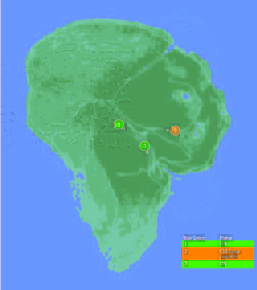
One computer in the control room is dedicated to showing the status of the Jeeps out on tour, and where they currently are on the island.
Next to the vehicle outline, we see the words “Vehicle Type: Ford Explorer” (thank you, product placement) along with “EXP” 4–7. EXP 4 & 5 look unselected, but have green dots next to them, while EXP 6 & 7 look selected with red dots next to them. No characters interact with this screen. Mr. Arnold does tap on it with a pen (to make a point though, not to interact with it).
On the right hand side of the screen also see a top-down view of the car with the electric track shown underneath, and little red arrows pointing forward. Below the graphic are the words “13 mph”. The most visible and obvious indicator on the screen is the headlights. A large “Headlights On” indicator is at the top of the screen, with highlighted cones coming out of the Jeep where the headlights are on the car.
Jumbled Hierarchy
It is very difficult to tell from this page what the most important systems on the tour are. The most space and visual weight is given to the car itself and its headlights, but we never see any data on the actual car itself. Did Hammond’s deal with Ford include constant advertising to his handful of tour monitors?
When Drs. Grant and Sattler leave the jeep to walk out into the park, we only see two doors open; but all four doors show as open on the main projector status display in the control room.
They can remote control the steering wheel and pedals, but not the locks?Probably an editing error, but with Nedry programming things, who can say?
Probably an editing error, but with Nedry programming things, who can say?
At best, the system is attempting to display a binary indicator (doors open/doors closed) based on limited data. At worst, the system is unreliable and can’t be trusted to deliver even basic status information correctly.
We also see several buttons that are labeled like they should be active, such as “Hold”, “Quit”, “New”, and “Next”. What could this mean?
Erroneous labels indicating action where there is none
Disabled buttons because they aren’t appropriate for where the Jeeps are right now
Something that could be active in the future when more coding is done.
Ideally, these are indicating normal actions that aren’t available right now. The control team would still need to be trained on why they’re disabled and when they’re active, which puts an unnecessary burden on their memory. That information should be apparent in any interface on which lives depend.
Missing Information
Many systems appear to be missing from this display, or are indicated in a way that is too cryptic to easily identify:
Self driving features?
Basic diagnostic info, like oil temp and tire pressure?
What event is playing in the Jeep?
It could also be improved with information that the system can surely collect. Trend information would be the most useful:
How efficiently is the Jeep moving?
Is it breaking down?
What kind of baseline is the tour establishing?
Has it been accelerating or decelerating? At what rate?
While you’re an unethical capitalist, there is even information that could be used to track the effectiveness of the park, by tracking the affective states of the passengers in the car:
Heartrate
Motion within the car (direction, proximity to windows)
Breath rate
Skin temperature
Conversation (and valence): words, pace, and pitch
At their least offensive, this data would be anonymously aggregated and analyzed by location to understand where the experience can be improved. Where is the tour the most boring? Most exciting? Where are the passengers most likely to view dinosaurs (and should have their attentions keyed)? You could also use the information in real time to know when there is likely a problem that needs the attentions of a remote operator.
Finally, if you have cameras on the vehicles, you have another data collection channel such that the system could compare views of the road and paddocks, compare to prior images, and know when there are plants that need trimming away from the rail, or when deformations appear in the walls and need attention from maintenance teams. Heck, you could turn those sensors into an upsell opportunity. Charge a few extra bucks, and friends and family back home can go on the live tour with you, or you could sell a 360° video back to the riders as a souvenir. Dinobucks to be made, here, people.
The Map
One of the few pieces that is straight-forward here is the map. We see a dot for where the tour is, the number and type of vehicles on the tour, and location information. For a single tour, this would probably work well.
It would be a nightmare with more than one tour out in the field at a time.
With more than a handful of vehicles out on the island with the current information density, the display would quickly be overwhelmed with numbers overlapping each other and changing constantly making it impossible to read. The large vehicles too might overlap more important information, like the terrain or possible problem areas on the tracks.
Color contrast is an issue here too: green on green would be very difficult to see for anyone without perfect color vision. If the color was the only thing to change on a change in status from good to bad, the color green is also an issue because of how many other colors it conflicts with. Accessibility would be improved by choosing a color like blue, or adding an outline to the dot.
scifiinterfaces comp.
Better would be to have a basic icon for each tour on the map, and a basic color/label combination next to the icon to show a “nominal” status. The icon could also be an indicator of how many vehicles were in the tour.
If something happened, the icon status could change to a different color, and the label would change to the new status. Icons would make that information more glanceable. Additional info would flow onto the screen for just that tour.
This would provide a clear indicator of which tour on the map to pay attention to, and what was broken about it.
Overall
I would hope that this wasn’t a screen that I would have to look at day-in, day out. The entire future control crew of Jurassic Park was lucky they weren’t forced to deal with this. But, with a few tweaks to the map and a complete reorganization of the information on the Jeep Status screen, it might become usable.
As Jack searches early in the film for Drone 172, he parks his bike next to a sinkhole in the desert and cautiously peers into it. As he does so, he is being observed from afar by a sinister looking Scav through a set of asymmetrical…well, it’s not exactly right to call them binoculars.
They look kind of binocular, but that term technically refers to a machine that displays two slighty-offset images shown independently to each eye such that the user perceives stereopsis, or a single field in 3D. But a quick shot from the Scav’s perspective shows that this is not what is shown at all.
This device’s two lenses take in different spectrums of light and displays them side by side, with a little (albeit inscrutable) augmentation at the periphery. The larger display on the left appears to be visible light and the smaller on the right appears—based on the strong highlight around the bike’s engine and Jack’s body—to be infrared, or heat.
At this point in the story, the audience is meant to believe that the scavs are still the evil alien race, and this interface helps to convey that. It seems foreign, mysterious. All of its typographic elements (letters, numbers, symbols) are squeezed into little more than 4×4 grids of pixels, so we’re not even sure if this is a human language. So, fine, this interface serves its narrative purpose here. “Oh my,” we must think, “…he is being watched. But by what? And why?”
But after we find out [again, spoilers] that the scavs are the Terran survivors after the Tet attack, we can look at this again to understand that this interface is for humans, and with that in mind it does not fare well.
Yes, the periphery is augmented, so that’s good, but the information is unusably small, and forces the user to glance back and forth between the two images to put the disparate information together.
Two views reduce the amount of information
It almost goes without saying, but let’s say it—by dividing the available display into two halves, the amount of visual information provided to the Scav is roughly a quarter of what it would be with a single view. And since the purpose of the device is to magnify, this is a significant loss.
Two views add work
In this scene, which is quite barren, it’s very easy to tell that the objects that are warm in the right are the only two objects on the left, but if you imagine looking at a cityscape, where the bomb (hot) looks very much like every other thing around it, you can see where piecing those two disparate views together in your head can become problematic.
This is made worse when the views aren’t even positionally synchronized. In the gif below you’ll see that when you superimpose them, they drift away from each other, making the comparison between the two even more difficult. There are diegetic reasons why this might have happened, but rather than reverse engineering why, let’s just leave it that it makes using it more difficult.
The blur and low-contrast don’t help
Note that the thermal view is blurrier and lower-contrast. That might be an artifact of the diegetic tech, but it would confound quick mapping in a complex image. Even if it’s just a lower-res image, at least the device should perform some auto-leveling and sharpening functions on the live image to help make it easy to use.
Having one scaled makes it worse
The scaling makes the mapping of items from one screen to the other more difficult. Again, in the Oblivion example, there are two objects on the left and two objects on the right, and the “horizons” on which they walk are roughly aligned, so it’s trivial to track one to the other. But if the image is highly repetitive—say for example, a building—the scaling would make it difficult to map the useful point-of-interest on the right to the best-resolution image on the left. Quick…in which window is the sniper?
A more direct solution
Better would be a live augmentation of a single, visual-light image. The visual light is the best anchor to the real world, with augmentation helping to convey specialness to the objects in the scene. In the comp below, you’ll see a single image where the “hot spots” have been augmented with a soft red and some trend lines in white. That red color is not arbitrary, by the way. It builds on the human experience with black body radiation associations of red == hot. This saves the (quite human) user both the physical work of glancing back and forth and the extra cognitive processing to recall that green/yellow == heat.
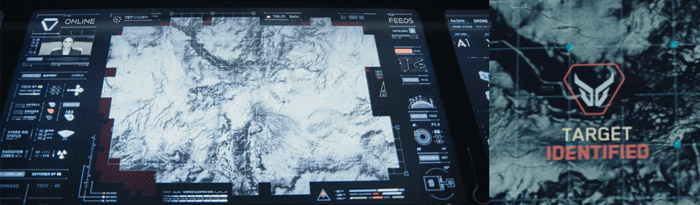
The TETVision display is the only display Vika is shown interacting with directly—using gestures and controls—whereas the other screens on the desktop seem to be informational only. This screen is broken up into three main sections:
The left side panel
The main map area
The right side panel
The left side panel
The communications status is at the top of the left side panel and shows Vika the status of whether the desktop is online or offline with the TET as it orbits the Earth. Directly underneath this is the video communications feed for Sally.
Beneath Sally’s video feed is the map legend section, which serves the dual purposes of providing data transfer to the TET and to the Bubbleship as well as a simple legend for the icons used on the map.
The communications controls, which are at the bottom of the left side panel, allow Vika to toggle the audio communications with Jack and with Sally.
The main map area
The largest section is the viewport where the various live feeds are displayed. The main map, which serves as a radar, as well as the remote video feeds she uses to monitor Jack are both in this section of the display.
The right side panel
The panel on the right side of the map contains the video feed controls, which allow Vika to toggle between live footage from the Bubbleship, the TET, and of course, the main map view.
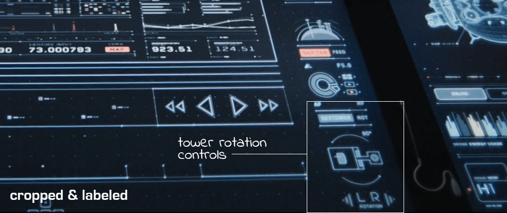
Although never shown in use in the film, the bottom right of the screen houses the tower rotation controls. This unused control is the only indication the capability even exists, so it is unknown whether the tower rotates 360 degrees or whether it’s limited to set points. (More on this below.)
It has robust capabilities
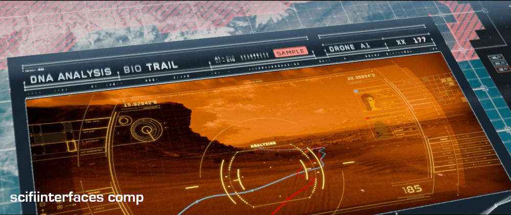
At one point in the movie, Vika is able to use the drones to search for bio trail signatures when Jack is abducted by the scavs.
Vika is also able to detect and decode various types of signals such as the morse code message sent by Jack or the rogue signal sent out by the scavs.
And, probably unbeknownst to Jack and Vika, the TETVision can be controlled remotely from the TET to allow Sally access to the data stored on the desktop—as shown at one point in the movie, when Sally pulls up a past bio trail signature to send drones after Jack and the scavs.
It’s missing a critical layer of data
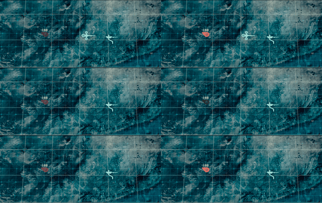
At the beginning of the film, as Jack heads toward the downed drone 166, he suddenly encounters a dangerous lightning storm and nearly plunges to his death when the Bubbleship loses power. His signature disappears from the TETVision map, but from Vika’s perspective there is no indication as to what could have happened — or that there was any danger to begin with.
Since the weather is unstable and constantly changing, it would have been better to include a weather overlay so that Vika could have notified Jack of the storm—allowing him to fly around it instead of straight into it.
It’s got some useless bits
The tower rotation controls are never shown in use in the film, so it’s not clear what benefit rotating the tower would serve. The main purpose of their mission is to ensure the hydro-rigs are secure and functioning properly, not getting an optimal view.
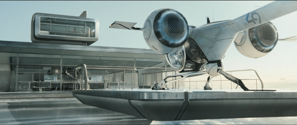
The tower is almost completely surrounded by windows as it is. And since the tower windows already face the hydro-rigs, what would be the benefit of changing vantage points?
It seems that the space could be used for something more beneficial to Vika such as bike, hydro-rig and drone cam feeds. This would provide Vika with more eyes on the ground, allowing her the additional support to keep Jack safe and monitor scav activity.
From an clustering standpoint, it would also fall in line logically with the other feed controls on the right side panel.
And some unnecessary visual feedback
Towards the end of the movie, Sally is trying to find Jack and the scavs. She accesses Vika’s desktop remotely in order to pull up the bio trail records. Although no one is around to see the information, the TETVision displays the process as it happens. Of course, this is necessary for the narrative to progress, but in a real-life situation Sally would only need to see the data on her side—not from the desktop in Tower 49. If they’ve managed interstellar travel, cloning, terraforming, and cognitive reprogramming of alien species, they’re not likely still using VNC. This type of interaction should simply run in the background and not be visible on screen.
Better: Provide useful visuals
When a drone picks up a bio trail signal, a visual of a DNA sequence is displayed. Since the analysis is being conducted by Sally on the TET, it seems that this information isn’t really useful to Vika at all.
From Vika’s point of view it seems like the actual trail would be more important, so why not show a drone cam feed complete with the HUD overlay? She could instantly gain more information by seeing that there are two bio trails—proving that Jack has been captured by the scavs and taken to another location.
As Jack begins his preflight check in the Bubbleship, Vika touches the center of the glass surface to power up the desktop that keeps her in contact with Sally on the TET and allows her to assist and monitor Jack as he repairs the drones on the ground.
The interface components
The desktop is broken up into five main screens. The central screen is the TETVision map, which is a radar map used for communications, and monitors the Bubbleship, drones, and scav activity.
To the left of the TETVision map is a Hydro-rig status feed that keeps Vika informed of the water collection progress. Then on the right of the map is the drone status feed, which provides drone vital statistics, deployment and fuel status.
The upright section of the desktop contains two screens. The top screen is the TET system status feed, which monitors the TET’s orbit, and communications status. The second screen monitors the weather systems and wind velocity vectors, which would have an affect on the Bubbleship and drone flight safety.
Quick power-up
Powering on the desktop is virtually instantaneous and is as simple as touching the center of the table. One possible explanation for the speed is that the desktop goes into sleep mode and is in an always-on state. There are a couple of scenes in the film when the TET is able to access the desktop remotely that would support this assumption.
A possible method of power-down would be to tap and hold for a determined period of time. Sadly, there is no film footage that shows Vika shutting down the system.
Multiple versus single user
The scale of this desktop is a bit large for a single user who needs to access life-saving information quickly. The display size and setup in the film is generally used for collaborative space so that multiple people can comfortably view and manipulate the data at the same time.
This large scale causes Vika to constantly lean over the table to see information for various reasons including glare, reach and angle of the displays. This could be stressful on the body when interacting with the desktop over long periods of time each day.
A better solution
Vika is only shown interacting with the TETVision map and not with any of the other feeds. If the map is the only screen that is interactive, a more ergonomic setup could be utilized to minimize glare and reach. This would allow Vika to see the vital information at a glance and still enable her to comfortably interact with the TETVision map.
Don’t forget the user’s needs
Overall, Vika’s desktop is a beautiful piece of technology that performs its function very well. However, in a real-world situation, it is important to remember that Vika will be using this equipment for possibly long periods of time and needs quick access to vital information. Having to roll back and forth between screens during an emergency situation could mean the difference between life and death for Jack while out in the field.
Forgive me, as I am but a humble interaction designer (i.e., neither a professional visual designer nor video editor) but here’s my shot at a redesigned DuoMento, taking into account everything I’d noted in the review.
There’s only one click for Carl to initiate this test.
To decrease the risk of a false positive, this interface draws from a large category of concrete, visual and visceral concepts to be sent telepathically, and displays them visually.
It contrasts Carl’s brainwave frequencies (smooth and controlled) with Johnny’s (spiky and chaotic).
It reads both the brain of the sender and the receiver for some crude images from their visual cortex. (It would be better at this stage to have the actors wear some glowing attachment near a crown to show how this information was being read.)
These changes are the sort that even in passing would help tell a more convincing narrative by being more believable, and even illustrating how not-psychic Johnny really is.
Logan is out and about doing his (admittedly horrible) Sandman job. While riding in a transport across the city, his attention drifts to a young lady waiting with a friend on a platform. He thinks she’s lovely and smiles. She catches his eye and smiles, too, before looking away. In the transport, he looks up at a glowing blue point on the ceiling near the windshield. It pulses in response.
In the evening Logan returns home. He passes his foyer, one wall of which shows an “art video” of beautiful people doing beautiful things in slow-mo. He gives it a glance like he always does.
He steps into the shower and the back wall is another display of the same “art video.” At one point, one of the men in the video, Carl, turns to the “camera,” smiles, and the picture freezes. A notification sound precedes a man’s voice, which says, “Hey, Logan.” Logan glances at the Carl’s image. His name and an infographic of his proposal to Logan (for shower sex) appears along with a transcript of what he’s said. Logan smiles and says, “Hey, Carl. Not tonight, buddy.” The infographic disappears and the display returns to its normal mode, but with a hint at others who are a match. One of the women in the display is Jessica, but she’s not featured yet.
Logan finishes his shower and puts on his robe. He steps to his wet bar to mix himself a drink. The wall behind the bar is yet another display. While mixing his drink he glances up to catch an image of Jessica as she looked his way on the transport and smiled. Logan says, “OK, who is she?”
A well-modulated voice answers, “This is Jessica-5. She seemed to like you. I think you’ll like her, too.” Her image freezes in the display and some icons appear around her explaining what she’s interested in, highlighting those activities that Logan shares. Logan glances at the infographics and nods at what he sees. “Hm.”
The voice replies, “She returned home a little while ago.” Logan reaches for another tumbler, but the voice interrupts, “Her public profile says she likes white wine, Logan.” Logan grabs a wine glass instead. The glowing blue point near him turns white, and Logan glances at it. It pulses and fades to blue in response. The video wall returns to life, mostly focused on flattering video of Jessica. He pours her a glass of white wine.
He walks to an alcove in his room, which contains “half” a bed that’s pushed up against the wall, which has the same “art display.” It’s currently featuring Jessica. Half a table is pushed against the same wall with a chair. Logan sets the drinks down on the table. He glances at the display, which becomes a mirror long enough for him to adjust his robe and his hair. Sitting down in the chair, he sees a few infographics appears of compatible proposals for Jessica. He looks at them, makes a few swipes to select one and adjust it for his current mood. He then looks to the wall, smiles charmingly, and says, “Hi, Jessica. My name is Logan.”
Jessica, in her apartment, has a similar alcove. She has just stepped out of the shower herself. She hears a notification and lights draw her attention to the alcove. There she sees a just-captured image of Logan in his chair offering her a glass of wine. She sees his name, a transcript, and the infographic offer above his shoulder. She sees to the side infographics of likely counteroffers she might make. Behind him she can see video of when he noticed her on the transport and other flattering video from the recent past. A different but similarly well-modulated voice says, “This is Logan, Jessica. He’s the one you saw riding by on the transport just after yoga today. He’s a Sandman.”
“A Sandman?” She takes a breath and thinks for a moment. She bites her lip before saying, coyly, “Hi there, Logan. If you’ll give me a minute to dry my hair, I’ll be right with you.”
After a beat she hears his voice reply, “I’m OK with wet hair.” She glances at a glowing blue point on the adjacent wall. It brightens a bit when she’s starting right at it. She says, “OK.” The blue dot pulses in response.
In a swirly bit of multicolored light (homage to the original), the video wall between them becomes a two-way portal, with a flickering hairline remaining at the dividing line in the walls. Logan’s half a bed joins Jessica’s half a bed to form a whole. The same thing happens with the two halves of table. Logan pushes the wine across the table surface to offer it to her. “Pleased to meet you, Jessica,” he says as the lights in their apartment dim slightly and a soft music begins to play.
What we just saw
This scenario describes several uses of The Circuit.
In the first, we see Logan express interest to the system in a particular girl.
In the next, Logan receives a proposal from a partner he’s had before, but rejects him. We see additional options for Logan after the rejection, in case Logan was in the mood, but just not with Carl. It turns out he wasn’t.
In the final use, we see useful information coming to find Logan. The Circuit makes a partner suggestion to Logan based on observed behavior out and about Dome City, and provides information for Logan to remember and evaluate her. He has a number of template scenarios and parameters that he can adjust for his proposal to Jessica. We see him confirm his interest in her directly, giving the system a biometric check on Logan’s biometrics to check for sobriety and authenticity. The system also makes a recommendation to Logan about how to make his proposal slightly more appealing.
We see the interface from Jessica’s perspective and understand that she has the same one as Logan. We see it offer her a useful warning where he runs counter to one of her implicit preferences: a disinclination towards authority figures. We see her use an explicit interaction with the circuit to indicate consent to meeting and for a similar biometric check.
We see the results of an accepted proposal: instant physical proximity for bom-chikka-fow-fow.
What we didn’t see
There are lots of features of modern matchmaking sites and apps that aren’t in evidence in this scenario. Could Carl have sent his request asynchronously hours before? What if Logan has a number of those messages? How would he “answer” them? How would they be prioritized? What if Logan had had a crappy time with Carl, how would he then blacklist him? What if Logan wasn’t interested in particular people as much as he was in particular acts some evening? How would he find a match then? What if he wanted to try something new?
There are lots and lots of juicy problems to solve, but for now, let’s stick to this scene. There are some implications for the greater diegesis, but this certainly makes a more believable future tech hookup interaction.
Plot implications
In the original film scene, Jessica bid a hasty retreat from his apartment after she realized he was a Sandman who had killed her Runner friend. If we’re including preferences, she would have known he was a Sandman in advance, so this surprise part of the scene has to be reconsidered. Perhaps she’s less doe-eyed innocent and instead flirting with danger. Or perhaps you add a throwaway line about Sandmen have the privilege of hiding that part of their identity in their preferences. If the plot still needs her to bug out, the arrival of boorish Francis, and her disinclination towards group scenes can do the trick.
It makes sense that the portal tech would appear in other places in Dome City, not just in apartments, so some city planning would have to happen to make the diegesis feel cohesive. (Yes, I’m offering that critique to the original. They invent teleportation and the only use they ever put it to is booty calls?)
Why is this design good for Logan, Carl, Jessica, and the other citizens of Dome City?
The ubiquitous screens function as background art when not in use, and the content reinforces Dome City’s cultural values of youth, physical appearance, and pleasure.
They afford seamless flows between living everyday life, entertaining the notion of nookie, and the actual act. It keeps them in the flow(Csikszentmihalyi) of life.
An asynchronous proposal system avoids social pressure that might trip Logan into accepting Carl to be polite. This lets both parties save face.
The proposer’s image is offered to the receiver as a gesture of good faith, but the receiver is in control of his or her privacy.
It offers bilateral control to each partner to propose, accept or reject, and pull the eject seat at any time. Neither party is privileged in the exchange.
Why is this design good for the Übercomputer?
The displays also serve to prime citizens with sensual images and, you know, get ‘em in the mood. This supports the shared goal of maximizing pleasure across the populace..
The Übercomputer’s is seen as a friendly, useful, soft-sell agent. This increases trust and reliance on it, which would help forestall revolutions like the one Jessica ends up being a part of anyway. (She’s too clever.)
Why is this design good for telling the story of Logan’s Run?
It fulfills the apparent original intent of the hookup interface in Logan’s Run in a more believable, usable way: the controls match modern trends in technology and the task at hand.
It tells the story of a massive infrastructure built just to support casual sex. That’s commitment to a bit.
It inserts the Übercomputer into citizens homes in a deep way, further exposing the intrusion of the government into private matters.
Lessons
Wow. 6500 words about a single interface. What lessons can we derive from it? In this case, we ran smack dab into a terrible interface that reminded us of some of our first principles of good interaction design:
In the prior post I described the wonky sex teleporter known as The Circuit and began a critique. Today I go deep into a particular issue to finish the critque.
We only see Logan encounter two riders when using The Circuit, but we can presume that there are a lot of people on there. Why does it only show Logan a single choice at a time? If he actually has, say, 12 candidates that are a match, a serial presentation like this puts a significant burden on his memory. Once he gets to #12 and thinks he’s seen enough candidates, was it #3 or #5 he liked best?
The serial presentation also looks like it might make extra work. If he gets to #12 and decides he was most fond of #2, does he have to jump back through 10 people to get there? What does he say to each of them in turn? Does he have to reject them each again? How awkward is that? If not, and he can jump back to #2, what’s the control for that? Does he have to remember what station they were on and retune them in again?
The face-to-face nature of the system also puts a strange social pressure on both the rider and the tuner. In trying to maximize pleasure for the populace, the Übercomputer doesn’t want anyone settling out of politeness, especially if there’s a better combination for each party somewhere. Sure he’s probably practiced at this, but how is Carl supposed to feel after the rejection? Ideally we’d save him from rejection in the first place, but if we can’t do that is there a way to minimize having to look at the guy in the face as he’s twisting the knob to the next channel? Because ouch.
Would tableau be better?
These arguments would seem to argue for a tableau layout of available riders, where Logan can pick favorites from among them, select some to get a closer look at, and initiate contact with his favorite candidates in parallel to see the best or first deal he could get. And if you were designing to optimize for individual users, this might be the best design choice.
Maximizing for everyone
But in Dome City, the Übercomputer has a goal to not just maximize pleasure for only the most beautiful. It’s not just a hedonist-dystopia or Battle of the Beauties. It’s more of a socialist-hedonist-dystopia. It wants to maximize pleasure for everyone. How can it systemically encourage that?
Of course it encourages everyone to try and be as fit and attractive as they can be. Gyms and saunas are everywhere. (Interesting digression: Would a fetish arise for less-fit people?) Citizens even have access to fast and painless cosmetic surgery to try out new appearances. Over and above these tools available to individual citizens, the Übercomputer has a design tool it can use to maximize matches, and it has to do with a weird little social experiment called the 11th Person Game.
The 11th person game
In this admittedly objectifying game, ask a friend to select a doorway and a point in time. From that starting point, they much watch for the next person to pass through the doorway, and decide in a moment whether they would like to marry them or not. (There is a more lascivious version of the game where marriage is not the decision, but I’ll let your imagination fill in that blank.)
When playing, you can’t undo a decision. If you decide yes, you can’t change your mind for someone better who comes along later. Once you say “no,” you’re stuck with that no even if they turned out be your favorite. If another person passes through the doorway while you’re still making up your mind about the prior person, tough luck. The prior person automatically becomes a “no.” The kicker is that if you don’t select someone by the 10th person, you “have” to marry the 11th and others watching you play the game will almost certainly rib you for the forced marriage, especially it’s a terrible match (like a homosexual having to “marry” someone of the opposite sex.)
When people begin to play the 11th person game, they most often have a strategy of finding flaws in people and holding out for a better looking candidate (since that’s pretty much all the information they have to go on in this toy experiment) until time’s up and they find that as of the 11th, they would have been much happier with one of the prior 10.
Over time, to start “winning” this game, players shift strategies from this flaw-finding and holding out to one of in-the-moment appreciation, of looking for what’s right about a given person and caring much less about the “opportunity” cost of subsequent choices.
Notably, to get the effect, the game depends on, you guessed it, serial presentation of candidates and irrevocable decisions. This is what’s happening in The Circuit. A Green will hop on The Circuit with a mindset of looking to maximize, and after a few nights of winding up alone, feeling like they’re settling, and/or frustrated at lost opportunities, they will slowly shift to one of appreciation. That makes them genuinely happier and moreover, increases the number of matches in the total system. It’s not perfect of course. Logan did reject Carl for whatever reason. But this presentation technique would help maximize pleasure and happiness, which is what the Übercomputer is tasked to do.
Even all the other little unusabilities that go along with it like memory burden, the delay between candidates, and maybe even the social awkwardness, help create a design friction that additionally discourages best-of-all strategies and encourages a shift to appreciation strategies. More people win.
So, serial presentation is not a bug but a feature. Let’s see if we can keep it. Still, given the other massive and unresolvable problems in the design of The Circuit like lousy controls, unilateral control, and a complete lack of preferences, we need a complete rethink of those other parts to make this thing better. In the next post I’ll get into the principles involved and walk through the thinking of a better design. You know, for that coming reboot. (They’re reading and taking notes, right?)
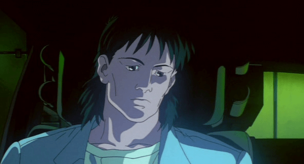
The heavily-mulleted Togusa is heading to a company car when he sees two suspicious cars in the parking basement. After sizing them up for a moment, he gets into his car and without doing anything else, says,
"Security, whose official vehicles are parked in the basement garage?"
It seems the cabin of the car is equipped to continuously monitor for sound, and either an agent from security is always waiting, listening at the other end, or by addressing a particular department by name, a voice recognition system instantly routs him to an operator in that department, who is able to immediately respond:
"They belong to Chief Nakamura of the treaties bureau and a Dr. Willis."
"Give me the video record of their entering the building."
In response, a panel automatically flips out of the dashboard to reveal a monitor, where he can watch the the security footage. He watches it, and says,
"Replay, infrared view"
After watching the replay, he says,
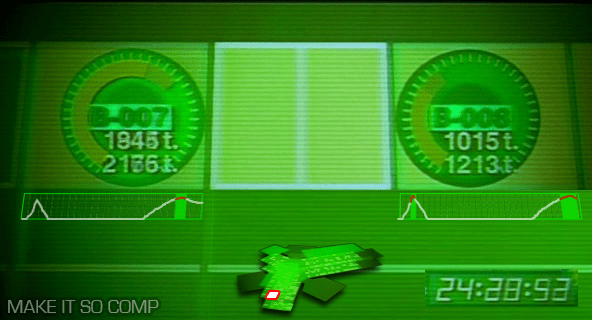
"Send me the pressure sensor records for basement garage spaces B-7 and 8."
The screen then does several things at once. It shows a login screen, for which his username is already supplied. He mentally supplies his password. Next a menu appears on a green background with five options: NET-WORK [sic], OPTICAL, PRESSURE, THERMO, and SOUND. "PRESSURE" highlights twice with two beeps. Then after a screen-green 3D rendering of Section 9 headquarters builds, the camera zooms around the building and through floorplans to the parking lot to focus on the spaces, labeled appropriately. Togusa watches as pea green bars on radial dials bounce clockwise, twice, with a few seconds between.
The login
Sci-fi logins often fail for basic multifactor authentication, and at first it appears that this screen only has two parts: a username and password. But given that Togusa connects to the system first vocally and then mentally, it’s likely that one of these other channels supplies a third level of authentication. Also it seems odd to have him supply a set of characters as the mental input. Requiring Togusa to think a certain concept might make more sense, like a mental captcha.
The zoom
Given that seconds can make a life-or-death difference and that the stakes at Section 9 are so high, the time that the system spends zooming a camera around the building all the way to the locations is a waste. It should be faster. It does provide context to the information, but it doesn’t have to be distributed in time. Remove the meaningless and unlabeled dial in the lower right to gain real estate, and replace it with a small version of the map that highlights the area of detail. Since Togusa requested this information, the system should jump here immediately and let him zoom out for more detail only if he wants it or if the system wants him to see suspect information.
The radial graphs
The radial graphs imply some maximum to the data, and that Nakamura’s contingent hits some 75% of it. What happens if the pressure exceeds 37 ticks? Does the floor break? (If so, it should have sent off structural warning alarms at the gate independently of the security question.) But presumably Section 9 is made of stronger stuff than this, and so a different style of diagram is called for. Perhaps remove the dial entirely and just leave the parking spot labels and the weight. Admittedly, the radial dial is unusual and might be there for consistency with other, unseen parts of the system.
Moreover, Togusa is interested in several things: how the data has changed over time, when it surpassed an expected maximum, and by how much. This diagram only addresses one of them, and requires Togusa to notice and remember it himself. A better diagram would trace this pressure reading across time, highlighting the moments when it passed a threshold. (This parallels the issues of medical monitoring highlighted in the book, Chapter 12, Medicine.)
Even better would be to show this data over time alongside or overlaid with any of the other feeds, like a video feed, such that Togusa doesn’t have to make correlations between different feeds in his head. (I’d have added it to the comp but didn’t have source video from the movie.)
The ultimately crappy Section No9 security system
Aside from all these details of the interface and interaction design, I have to marvel at the broader failings of the system. This is meant to be the same bleeding-edge bureau that creates cyborgs and transfers consciousnesses between them? If the security system is recording all of this information, why is it not being analyzed continuously, automatically? We can presume that object recognition is common in the world from a later scene in which a spider tank is able to track Kunasagi. So as the security system was humming along, recording everything, it should have also been analyzing that data, noting the discrepancy between of the number of people it counted in any of the video feeds, the number of people it counted passing through the door, and the unusual weight of these "two" people. It should have sent a warning to security at the gate of the garage, not relied on the happenstance of Togusa’s hunch and good timing.
This points to a larger problem that Hollywood has with technology being part of its stories. It needs heroes to be smart and heroic, and having them simply respond to warnings passed along by smart system can seem pointedly unheroic. But as technology gets smarter and more agentive, these kinds of discrepancies are going to break believability and get embarassing.