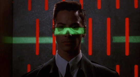
Syd’s dash display

childrenofmen-028

If Jasper’s car is aftermarket, Syd’s built-in display seems to be more consumer-savvy. It is a blue electroluminescent flat display built into the dashboard. It has more glanceable information with a cleaner information hierarchy. It has no dangerous keyboard entry. All we see of the display in these few glimpses is the speedometer, but even that’s enough to illustrate these differences.

Brain Scanning

The second half of the film is all about retrieving the data from Johnny’s implant without the full set of access codes. Johnny needs to get the data downloaded soon or he will die from the “synaptic seepage” caused by squeezing 320G of data into a system with 160G capacity. The bad guys would prefer to remove his head and cryogenically freeze it, allowing them to take their time over retrieval.

1 of 3: Spider’s Scanners

The implant cable interface won’t allow access to the data without the codes. To bypass this protection requires three increasingly complicated brain scanners, two of them medical systems and the final a LoTek hacking device. Although the implant stores data, not human memories, all of these brain scanners work in the same way as the Non-invasive, “Reading from the brain” interfaces described in Chapter 7 of Make It So.

The first system is owned by Spider, a Newark body modification
specialist. Johnny sits in a chair, with an open metal framework
surrounding his head. There’s a bright strobing light, switching on
and off several times a second.

jm-20-spider-scan-a

Nearby a monitor shows a large rotating image of his head and skull, and three smaller images on the left labelled as Scans 1 to 3.

jm-20-spider-scan-b

The largest image resembles a current-day MRI or CT display. It is being drawn on a regular flat 2D display rather than as a 3D holographic type projection, so does not qualify as a volumetric projection even though a current day computer graphics programmer might call it such. The topmost Scan 1 is the head viewed from above in the same rendering style. Scan 2 in the middle shows a bright spot around the implant, and Scan 3 shows a circuit board, presumably the implant itself. The background is is blue, which so far has been common but not as predominant as it is in other science fiction interfaces. Chris suggests  this is because blue LEDs were not common in 1995, so the physical lights we see are red and green and likewise the onscreen graphics use many bright colors.

jm-20-spider-scan-c

Occasionally a purple bar slides across the main image. It perhaps represents some kind of processing update, but since the image is already rotating, that seems superfluous. At one point the color of the main image changes to red, with a matching red sliding bar, but we don’t know why. All the smaller images rotate or flash regularly, with faint ticking sounds as they do.

From this system, Spider is able to tell Johnny that there is a problem with his implant and it must be painful. (Understandably, Johnny is not impressed with this less than helpful diagnosis.) Unlike either the scanner at Newark Airport or the LoTek binoculars, there are no obvious messages or indicators providing this information. But this is a specialised piece of medical technology rather than a public access system, so presumably Spider has sufficient expertise to interpret the displays without needing large popup text.

2 of 3: Hospital Scanner

Spider takes Johnny to a hospital for a more thorough scan. Here the first step is attaching a black flexible strip with various cables around his head. His implant cable is also connected.

jm-21-hospital-scan-b

There isn’t a clear shot of the entire system, but behind Johnny is a CRT monitor and to his left, our right, is a bank of displays that look like electronic oscilloscopes. Since embedded body electronics are common in the world of Johnny Mnemonic, that is probably exactly what they are intended to be. Spider adjusts some controls on these.

jm-21-hospital-scan-c

The oscilloscopes show no text, just green lines and shapes. The CRT behind Johnny is now showing the same head image that we saw at the end of the previous scan.

jm-21-hospital-scan-d

In front of the oscilloscopes is a PC keyboard from the 1990s. In 2021 this will look even older, but this entire hospital is portrayed as a shoestring operation relying on donations and salvage. Spider types on the keyboard, and the CRT changes to show a lot of scrolling text.

jm-21-hospital-scan-e

This is enough for Spider to announce that the “data” is the cure for NAS, the world wide epidemic disease that Jane is showing symptoms of. Again it’s not clear how he can determine this, as the data is still protected by the access codes. Perhaps the scrolling text is unencrypted metadata in the implant that is more easily retrieved. Given the apparent hazardous life of a mnemonic courier, it would make sense to attach the equivalent of a sticky label to the implant, briefly describing the contents and who they should be delivered to.

(This is also the point where one has to ask why this valuable data is encrypted and protected to begin with. Using a mnemonic courier for distribution makes sense, to avoid content filters on the Internet. But now the data is here in Newark, with the intended recipients, so why is it so hard to get at? The best answer I can think of is that the scientists wanted to ensure that the mnemonic courier couldn’t keep the data for themselves and sell it to the highest bidder.)

The third of the three brain interfaces warrants its own post, coming up next. 

Airport Security

After fleeing the Yakuza in the hotel, Johnny arrives in the Free City of Newark, and has to go through immigration control. This process appears to be entirely automated, starting with an electronic passport reader.

jm-9-customs-b

After that there is a security scanner, which is reminiscent of HAL from the film 2001: A Space Odyssey.

jm-9-customs-f

The green light runs over Johnny from top to bottom.

jm-9-customs-c

Looking at the picture, we can see that this green light is somehow making Johnny’s skeleton visible. It would be possible, by having an X-ray imaging system running at the same time and then re-projecting the X-ray image back onto the body, but why? Since there don’t appear to be any actual human beings on duty, I can only suggest that it is meant to look intimidating and impressive to encourage obedience. In the film Johnny appears to be alone and cannot see this himself, but it would be much more common for there to be multiple passengers, so each could watch the others being scanned.

There is also a screen showing another scan, a blurry body image, and text appearing on the right side. A voice repeats the text content. For the first time we see a blue background, the most common color for futuristic film interfaces.

jm-9-customs-d

The scanner detects Johnny’s implant, but whatever secrecy measures are present cause the system to decide that it is a registered dyslexia aid. The popup alert below includes the registration issuer and a domain name, so perhaps this is online verification over the Internet. Presumably Johnny can see this screen himself, if he cares.

jm-9-customs-e

The voiceover helpfully informs Johnny that there is “synaptic seepage”, and he should seek medical attention within 24 hours. This shows quite high level decision making by the system and an offer of assistance. Johnny says “thanks” in reply, an anthropomorphic response to this seemingly intelligent machine.

However, there seems to be a more detailed explanation in smaller text on the right of the display, and this isn’t announced. It’s not clear in this scene whether Johnny can see this display or not, but even if he could it would be difficult to read. Perhaps this is a legacy system from the days when airport security had actual staff.

Next

At this point Johnny leaves the airport, riding in a taxi from the airport. It is a good time for the first review of a group of related interfaces, which will be the next series of posts.

Hotel Remote

The Internet 2021 shot that begins the film ends in a hotel suite, where it wakes up lead character Johnny. This is where we see the first real interface in the film. It’s also where this discussion gets more complicated.

A note on my review strategy

As a 3D graphics enthusiast, I’d be happy just to analyze the cyberspace scenes, but when you write for Sci Fi Interfaces, there is a strict rule that every interface in a film must be subjected to inspection. And there are a lot of interfaces in Johnny Mnemonic. (Curse your exhaustive standards, Chris!)

A purely chronological approach which would spend too much time looking at trees and not enough at the forest. So I’ll be jumping back and forth a bit, starting with the gadgets and interfaces that appear only once, then moving on to the recurring elements, variations on a style or idea that are repeated during the film.

Description

The wakeup call arrives in the hotel room as a voice announcement—a sensible if obvious choice for someone who is asleep—and also as text on a wall screen, giving the date, time, and temperature. The voice is artificial sounding but pleasant rather than grating, letting you know that it’s a computer and not some hotel employee who let himself in. The wall display functions as both a passive television and an interactive computer monitor. Johnny picks up a small remote control to silence the wake up call.

jm-2-check-email-a

This remote is a small black box like most current-day equivalents, but with a glowing red light at one end. At the time of writing blue lights and indicators are popular for consumer electronics, apparently following the preference set by science fiction films and noted in Make It So. Johnny Mnemonic is an outlier in using red lights, as we’ll see more of these as the film progresses. Here the glow might be some kind of infrared or laser beam that sends a signal, or it might simply indicate the right way to orient the control in the hand for the controls to make sense.

First thing every morning: Messages

After silencing the alarm, Johnny, like so many of us today, checks his email. (In 1995 doing so before even getting out of bed might have been intended to show his detachment from humanity. Today, it seems perfectly natural!) He uses the remote to switch the display to the hotel “Message Centre”. We see his thumb move around, so the remote must have multiple buttons, but can’t tell whether this is a simple arrow keypad or something more complicated.

jm-2-check-email-b-adjusted

The message centre of the New Darwin Inn system both displays the text message visually and also speaks it aloud in the same synthesized voice that woke him up. Voiceovers are common in films so the audience doesn’t have to try to read the cinema screen, but in this case it would be genuinely useful. Guests could start doing something else without needing to pay full attention to the display.

Is it necessary for Johnny to explicitly switch to the Message Center? The system could have displayed this message automatically after the wakeup call, or shown the 2021 equivalent of his InBox.  On the other hand, this is a giant, clearly visible screen and Johnny was not alone in the suite. Johnny, and other guests, might wish to keep their communications private.

As Johnny has no messages, he uses the remote to switch the display to a TV channel.

The hotel room “phone” call

Next he uses the remote to make a phone call. He starts by using the remote to dial the number, which appears on the display. We can’t see whether he is typing numbers directly, or using arrow keys and an Enter or OK button to navigate around the onscreen keypad. It’s certainly convenient for guests to be able to make a call without getting out of bed, but a voice recognition interface might be even easier. We’ll see a phone system that accepts voice commands later on, so perhaps using the remote is just a preference.

jm-3-phone-hotel-a-adjusted

What is the strange blue window to the right of the keypad? It’s there because all phone calls in 2021 are in fact video calls. The equivalent to a busy waiting tone in this world is a video splash screen. These can be customized by the recipient, here showing the company name, Dataflow.

jm-3-phone-hotel-b-adjusted

And finally both parties can see and hear each other. Note  also the graphical reverse, stop, and play buttons at the bottom right of the keypad. These imply some sort of recording capability, but we never see them used.

jm-3-phone-hotel-c-adjusted

Next

I’ll discuss the 2021 phone system in more detail later on, so for now we just need to know that this phone call is the setup that sends Johnny to Beijing for his next, and hopefully last, job.

Viper Launch Control

image02

The Galactica’s fighter launch catapults are each controlled by a ‘shooter’ in an armored viewing pane.  There is one ‘shooter’ for every two catapults.  To launch a Viper, he has a board with a series of large twist-handles, a status display, and a single button.  We can also see several communication devices:

  • Ear-mounted mic and speaker
  • Board mounted mic
  • Phone system in the background

These could relate to one of several lines of communication each:

  • The Viper pilot
  • Any crew inside the launch pod
  • Crew just outside the launch pod
  • CIC (for strategic status updates)
  • Other launch controllers at other stations
  • Engineering teams
  • ‘On call’ rooms for replacement operators

image05

Each row on the launch display appears to conform to some value coming off of the Viper or the Galactica’s magnetic catapults.  The ‘shooter’ calls off Starbuck’s launch three times due to some value he sees on his status board (fluctuating engine power right before launch).

We do not see any other data inputs.  Something like a series of cameras on a closed circuit could show him an exterior view of the entire Viper, providing additional information to the sensors.

When Starbuck is ready to launch on the fourth try, the ‘shooter’ twists the central knob and, at the same time and with the same hand, pushes down a green button.  The moment the ‘shooter’ hits the button, Starbuck’s Viper is launched into space.

image04

There are other twist knobs across the entire board, but these do not appear to conform directly to the act of launching the Viper, and they do not act like the central knob.  They appear instead to be switches, where turning them from one position to another locks them in place.

There is no obvious explanation for the number of twist knobs, but each one might conform to an electrical channel to the catapult, or some part of the earlier launch sequence.

Manual Everything

Nothing in the launch control interprets anything for the ‘shooter’.  He is given information, then expected to interpret it himself.  From what we see, this information is basic enough to not cause a problem and allow him to quickly make a decision.

Without networking the launch system together so that it can poll its own information and make its own decisions, there is little that can improve the status indicators. (And networking is made impossible in this show because of Cylon hackers.) The board is easily visible from the shooter chair, each row conforms directly to information coming in from the Viper, and the relate directly to the task at hand.

The most dangerous task the shooter does is actually decide to launch the Viper into space.  If either the Galactica or the Viper isn’t ready for that action, it could cause major damage to the Viper and the launch systems.

A two-step control for this is the best method, and the system now requires two distinct motions (a twist-and-hold, then a separate and distinct *click*).  This is effective at confirming that the shooter actually wants to send the Viper into space.

To improve this control, the twist and button could be moved far enough apart (reference, under “Two-Hand Controls” ) that it requires two hands to operate the control.  That way, there is no doubt that the shooter intends to activate the catapult.

If the controls are separated like that, it would take some amount of effort to make sure the two controls are visually connected across the board, either through color, or size, or layout.  Right now, that would be complicated by the similarity in the final twist control, and the other handles that do different jobs.

Changing these controls to large switches or differently shaped handles would make the catapult controls less confusing to use.


Colonial One

image04

Colonial One is a luxury passenger liner in commercial service until the war with the Cylons breaks out.  The captain and co-pilot are not military pilots, and most passengers are dignitaries or VIPs visiting the Galactica for the unveiling of it as a museum.

Compared to military cockpits and the CIC aboard the Galactica, Colonial One’s cockpit has simple controls and an unsophisticated space-borne sensor system.  Also unlike the Galactica or the Raptors, no one on Colonial One calls their space-borne sensor system the “Dradis”.  At the center of each control console is a large gimbal-based horizon indicator.

image07The sensors show a simple 2-d representation of local space, with nearby contacts indicated as white dots.  There is no differentiation between ‘enemy’ and ‘friendly’ contacts.  Likewise, the image of a Cylon missile (shown above) is the same indicator as other ships.  There is no clear explanation of what the small white dots on the background of the image are, or what the lines indicate.

When the Cylon fighters show up, the crew has some unknown way besides this screen of knowing the Cylons have just jumped into contact range, and that they have launched missiles at Colonial One.  How the crew determines this isn’t shown, but both the crew and Apollo are confident that the assessment is correct.

image05

When Laura Rosilyn tells the crew to send a message on a specific frequency before the missile attack, the crew uses the same keypad to send alpha-numeric signals over a radio/faster-than-light (FTL) link as to enter information into their flight computers.  The FTL link appears to connect every planet in the Colonies together in real time: we don’t get any sense of delay between the attacks happening and the entire civilization reacting to it in real time.

The largest usability concern here is Mode Switching, and making it clear whether the crew is entering information into the ship or into the radio.  Given that we see the crew interact most with the ship itself, the following procedure would make the most sense:

  1. Entering information into the ship is the primary ‘mode’
  2. An explicit command to switch over to the radio link.
  3. Crew enters the given information into the link
  4. On ‘enter’, the interface flips back over to entering information into the ship.

With a larger budget, the Dradis is a better system (at least with the improvements installed)

Other Systems

A large amount of space inside the cockpit is given over to communication controls and a receiver station.  At the receiver station, Colonial One has a small printer attached to an automatic collector that prints off broadcast messages.  The function and placement of the printer appears similar to weather printers on modern passenger jets.

image06

The cockpit is very utilitarian, and the controls look well used.  These are robust systems and look like they have been in place for a while.  Despite the luxury associated with the passenger compartment, the crew have been granted no special luxuries or obvious assisting equipment to make their job more comfortable.

If we look at a current (or, up until very recently current) pattern: the Space Shuttle has a very similar layout.  It is intended to also enter the atmosphere, which Colonial One is shown with the equipment to do, and maintains a 2.5D movement concept.  Given that it’s a commercial ship with direct paths to follow, Colonial One does not need the complicated controls – that are shown to be very difficult to master – that are present on ships like the Viper.

Overall, a solid pattern

In-universe, this ship was not designed for combat, and is woefully unprepared for it when it arrives.  The sensor system and the controls appear specialized for the job of ferrying high-paying customers from one planet to another through friendly space.  Other ships also have the same level of manual controls and physical switches in the cockpit, though it is impossible to tell whether this is because Colonial One was built in the same era as the Galactica, or whether the builders wanted extra reliability in the controls than ‘modern’ electronics provided.

As long as the pilots are as well trained as current-day commercial pilots, the banks of controls would provide solid spatial grouping and muscle memory.  There might be some room to shrink the number of controls or group them better, but we lack the context to dig into that particular issue.

One minor fix would be the possibility of mode errors for the keypad.  It is not obvious when the crew changes from “I want to enter information into Colonial One to change operating parameters” and “I want to send a message to someone else”.  A clear way to indicate that the keyboard is sending information to the ship, compared to sending information to the radio system, would clear up the possibility of a mode-switch error.  Common options could be:

  • A large switch close by that changed the color of the lights
  • A bi-directional light with labels on which mode it’s in
  • or distinct separation between the Pilot’s keyboard and the Co-pilot’s keyboard

Of the three, a clear distinction between pilot’s keyboard and co-pilot’s keyboard would be the most secure; provided that there was a switch in case of emergency.

The Colonial One copies many interface patterns from modern airliners.  Since the airline industry has one of the best and most sophisticated UI design in practice right now, there are very few obvious recommendations to make, and credit should be given for how realistic it looks.

Captain’s Board

image06

The Captain’s Board is a double hexagon table at the very center of the CIC.  This board serves as a combination of podium and status dashboard for the ship’s Captain.  Often, the ship’s XO or other senior officers will move forward and use a grease pen or replacement transparency sheet to update information on the board.

image05For example, after jumping from their initial position to the fleet supply base in the nebula, Colonel Tigh replaces the map on the ‘left’ side of the board with a new map of the location that the Galactica had just jumped to.  This implies that the Galactica has a cache of maps in the CIC of various parts of the galaxy, or can quickly print them on the fly.

After getting hit by a Cylon fighter’s nuclear missile, Tigh focuses on a central section of the board with a grease pen to mark the parts of the Galactica suffering damage or decompression. The center section of the board has a schematic, top-down view of the Galactica.

During the initial fighting, Lt. Gaeda is called forward to plot the location of Galactica’s combat squadrons on the board.  This hand-drawn method is explicitly used, even when the Dradis system is shown to be functioning.

image07

The transparency sheets are labeled with both a region and a sector: in this case, “Caprica Region, SECT OEL”.  More text fills the bottom of the label: “Battlestar Galactica Starchart…”

Several panels of physical keys and low-resolution displays ring the board, but we never see any characters interacting with them.  They do not appear to change during major events or during shifts in the ship status.

The best use of these small displays would be to access reference data with a quick search or wikipedia-style database.  Given what we see in the show, it is likely that it was just intended as fuigetry.


Old School

Charts and maps are an old interface that has been well developed over the course of human history.  Modern ships still use paper charts and maps to track their current location as a backup to GPS.

Given the Galactica’s mission to stay active even in the face of complete technological superiority of the opponent, a map-based backup to the Dradis makes sense in spite of the lack of detailed information it might need to provide.  It is best as, and should be, a worst-case backup.  

Here, the issue becomes the 3-dimensional space that the Galactica inhabits.  The maps do an excellent job of showing relationships in a two dimensional plane, but don’t represent the ‘above’ and ‘below’ at all.  

In those situations, perhaps something like a large fish tank metaphor might work better, but wouldn’t allow for quick plotting of distance and measurements by hand.  Instead, perhaps something more like the Pin Table from the 2000 X-Men movie that could be operated by hand:

image01

It would provide a shake-resistant, physical, no-electricity needed 3-D map of the surrounding area.  Markups could be easily accomplished with a sticky-note-like flag that could attach to the pins.

FTL – Engine Analysis

Desktop_2014_06_20_17_25_34_414

The FTL Jump process on the Galactica has several safeguards, all appropriate for a ship of that size and an action of that danger (late in the series, we see that an inappropriate jump can cause major damage to nearby objects).  Only senior officers can start the process, multiple teams all sign off on the calculations, and dedicated computers are used for potentially damaging computations.

Even the actual ‘jump’ requires a two stage process with an extremely secure key and button combination.  It is doubtful that Lt. Gaeta’s key could be used on any other ship aside from the Galactica.

The process is so effective, and the crew is so well trained at it, that even after two decades of never actually using the FTL system, the Galactica is able to make a pinpoint jump under extreme duress (the beginning of human extinction).

Difficult Confirmation

image02

The one apparent failure in this system is the confirmation process after the FTL jump.  Lt. Gaeta has to run all the way across the CIC and personally check a small screen with less than obvious information.

Of the many problems with the nav’s confirmation screen, three stand out:

  • It is a 2d representation of 3d space, without any clear references to how information has been compacted
  • There are no ‘local zero’ showing the system’s plane or relative inclination of orbits
  • No labels on data

Even the most basic orbital navigation system has a bit more information about Apogee, Perigee, relative orbit, and a gimbal reading. Compare to this chart from the Kerbal Space Program:

image03

(from http://blog.asgaard.co.uk/t/gaming and Kerbal Space Program)

The Galactica would need at least this much information to effectively confirm their location.  For Lt. Gaeta, this isn’t a problem because of his extensive training and knowledge of the Galactica.  

But the Galactica is a warship and would be expected to experience casualties during combat.  Other navigation officers and crew may not be as experienced or have the same training as Lt. Gaeta.  In a situation where he is incapacitated and it falls to a less experienced member of the crew, an effective visual display of location and vector is vital.

Simplicity isn’t always perfect

This is an example of where a bit more information in the right places can make an interface more legible and understandable.  Some information here looks useless, but may be necessary for the Galactica’s navigation crew.  With the extra information, this display could become useful for crew other than Lt. Gaeta.

CIC

image06

The Battlestar Galactica’s Combat Information Center, or CIC, is a medical-theater-like room that acts as the military nerve center and brain of the Galactica.  It is located near the center of the ship, is heavily armored and protected by armed guards, and has a staff of between 35-50 people.

The two highest ranking officers on the ship, Commander Adama and Colonel Tigh, typically stand at the center of the auditorium around the Command Board.  This position lets them hear status reports from around the room, and issue orders to the entire ship.

image05

Various pods of workstations provide seating for the rest of the staff.  These stations are grouped by function.  We see Navigation crew sitting near other navigation crew, weapons officers near other combat functions, communications near the center, and engineering given a special area up top.

image07

Phone kiosks are placed throughout the CIC, with two high profile kiosks on the Command Board.  Large display boards and the central Dradis Console provide information to the entire crew of the CIC.


Organized Chaos

The CIC is dealing with a lot of information from all over the ship and trying to relate it to the lead officers who are making decisions.  There is a lot of activity related to this information overload, but the design of the CIC has organized it into a reasonably effective flow.

Teams communicate with each other, then that decision flows forward to lead officers, who relate it to Admiral Adama.
image03

Orders flow in the opposite direction.

Admiral Adama can very quickly shout out an order from the center of the CIC and have his lead officers hear it all around him.  It can also act as a failsafe: other officers can also hear the same order and act as a confirmation step.  From there, the officers can organize their teams to distribute more detailed orders to the entire ship.

Large screens show information that the entire CIC needs to know, while smaller screens display information for specific crew or groups.

Overall, the stadium-like construction of the CIC works well for the low tech approach that the Galactica takes after.  Without introducing automation and intelligent computer networks onto the bridge, there is little that could be done to improve the workflow.

Stark Tower monitoring

Since Tony disconnected the power transmission lines, Pepper has been monitoring Stark Tower in its new, off-the-power-grid state. To do this she studies a volumetric dashboard display that floats above glowing shelves on a desktop.

Avengers-Reactor-output03

Volumetric elements

The display features some volumetric elements, all rendered as wireframes in the familiar Pepper’s Ghost (I know, I know) visual style: translucent, edge-lit planes. A large component to her right shows Stark Tower, with red lines highlighting the power traveling from the large arc reactor in the basement through the core of the building.

The center of the screen has a similarly-rendered close up of the arc reactor. A cutaway shows a pulsing ring of red-tinged energy flowing through its main torus.

This component makes a good deal of sense, showing her the physical thing she’s meant to be monitoring but not in a photographic way, but a way that helps her quickly locate any problems in space. The torus cutaway is a little strange, since if she’s meant to be monitoring it, she should monitor the whole thing, not just a quarter of it that has been cut away.

Flat elements

The remaining elements in the display appear on a flat plane.

To her upper left a spectrum analysis shows bars all near the middle, and the status is confirmed with a label as REACTOR OUTPUT NORMAL. Notably the bars are bright cyan at their top and fade to darker near their bases, drawing attention to the total arc. There few bands that are lower or higher than others are immediately visible from the contrast. That’s good visual design for attention management.

Avengers-Reactor-output02

In the top center is a ring chart with three bands of colors: slate gray, cyan, and dark red. A large percentage read out in the center hovers around 90%. To her upper right are three other ring charts with the same color scheme. Above the three rings is a live trend line chart in red with a separate line in white (Target? Trend line?). A tiny side view of Stark Tower stands to the left of the three rings and trend line. The purpose of these are unclear as the labels are too small to read, but it seems strange to have the physical representation here. If the rings or trend lines are related to the physical tower, how they are related is unclear. If they are unrelated, having the rendering present there is misleading.

In a band across the middle are some tiny text blocks spitting out lines of data and auto scrolling. There are more of these, so for ease of reference, let’s call them teletype boxes. They look too small and move too fast to convey much meaning, as such things often do.

The lower left of the screen has a dim white section labeled MAGNETIC CONTAINMENT. It contains a 3D cuboid with a wildly undulating surface. As this shape doesn’t match anything else in the display, nor is it visually connected, its utility is unclear. If she is meant to track some variable other than undulationness, I can’t see how this would help. Also in this panel are some sliders wildly sliding back and forth, and some more teletype boxes.

In the lower center part of the screen is an overhead-view wireframe of the reactor that does not change in this segment, as well as a dim white box that appears to contain a static formula.

Avengers-Reactor-output01

This display is not fit to Pepper’s task

Sadly, Gwen Paltrow looks a little wall-eyed here, so it’s hard to tell where exactly where she’s looking to determine as she says that “Levels are holding steady.” Her gaze appears roughly above the large ring chart, so let’s presume she’s looking there. If she is actually meant to be monitoring a set of levels to determine if they’re fluctuating or not, the ring chart and percentage are the wrong display types. These are valuable for showing a state that doesn’t change very often, i.e. where change over time is not of concern.

Sure, she might be able to suss out the steadiness of the variables by focusing on the percentage and the ring chart elements to see if they’re currently wobbling, but that requires her to keep her focus there to observe what’s happening with those pixels. That puts an unnecessary burden on her attention and short term memory. What if she has to glance away for a few seconds, and in those seconds, levels begin to wobble unsteadily? Sure, an alert could sound, but when she looks back she’ll have no idea what has happened while her attention was elsewhere. Humane interfaces remove unnecessary burdens from their users, and this display should do the same.

Use line charts and sparklines to show change over time

For any variable that is meant to be monitored for changes over time—like the scripted steadiness of levels—the line chart or sparkline is much more fit to task. Each plots variables over time, so even if a user glances away for a bit, it’s not a problem, she can look back and quickly suss out what’s been happening. The thing she’s looking at should look more like a ECG than a page out of an annual report.