As I rule I don’t review lethal weapons on scifiinterfaces.com. The Panther Glove Guns appear to be remote-bludgeoning beams, so this kind of sneaks by. Also, I’ll confess in advance that there’s not a lot that affords critique.
We first see the glove guns in the 3D printer output with the kimoyo beads for Agent Ross and the Dora Milaje outfit for Nakia. They are thick weapons that fit over Shuri’s hands and wrists. I imagine they would be very useful to block blades and even disarm an opponent in melee combat, but we don’t see them in use this way.
The next time we see them, Shuri is activating them. (Though we don’t see how) The panther heads thrust forward, their mouths open wide, and the “neck” glows a hot blue. When the door before her opens, she immediately raises them at the guards (who are loyal to usurper Killmonger) and fires.
A light-blue beam shoots out of the mouths of the weapons, knocking the guards off the platform. Interestingly, one guard is lifted up and thrown to his 4-o-clock. The other is lifted up and thrown to his 7-o-clock. It’s not clear how Shuri instructs the weapons to have different and particular knock-down effects. But we’ve seen all over Black Panther that brain-computer interfaces (BCI) are a thing, so it’s diegetically possible she’s simply imagining where she wants them to be thrown, and then pulling a trigger or clenching her fist around a rod or just thinking “BAM!” to activate. The force-bolt strikes them right where they need to so that, like a billiard ball, they get knocked in the desired direction. As with all(?) brain-computer interfaces, there is not an interaction to critique.
After she dispatches the two guards, still wearing the gloves, she throws a control bead onto the Talon. The scene is fast and blurry, but it’s unclear how she holds and releases the bead from the glove. Was it in the panther’s jaw the whole time? Could be another BCI, of course. She just thought about where she wanted it, flung her arm, and let the AI decide when to release it for perfect targeting. The Talon is large and she doesn’t seem to need a great deal of accuracy with the bead, but for more precise operations, the AI targeting would make more sense than, say, letting the panther heads disintegrate on command so she would have freedom of her hands.
Later, after Killmonger dispatches the Dora Milaje, Shuri and Nakia confront him by themselves. Nakia gets in a few good hits, but is thrown from the walkway. Shuri throws some more bolts his way though he doesn’t appear to even notice. I note that the panther gloves would be very difficult to aim since there’s no continuous beam providing feedback, and she doesn’t have a gun sight to help her. So, again—and I’m sorry because it feels like cheating—I have to fall back to an AI assist here. Otherwise it doesn’t make sense.
Then Shuri switches from one blast at a time to a continuous beam. It seems to be working, as Killmonger kneels from the onslaught.
This is working! How can I eff it up?
But then for some reason she—with a projectile weapon that is actively subduing the enemy and keeping her safe at a distance—decides to close ranks, allowing Killmonger to knock the glove guns with a spear tip, thereby free himself, and destroy the gloves with a clutch of his Panther claws. I mean, I get she was furious, but I expected better tactics from the chief nerd of Wakanda. Thereafter, they spark when she tries to fire them. So ends this print of the Panther Guns.
As with all combat gear, it looks cool for it to glow, but we don’t want coolness to help an enemy target the weapon. So if it was possible to suppress the glow, that would be advisable. It might be glowing just for the intimidation factor, but for a projectile weapon that seems strange.
The panther head shapes remind an opponent that she is royalty (note no other Wakandan combatants have ranged weapons) and fighting in Bast’s name, which I suppose if you’re in the business of theocratic warfare is fine, I guess.
It’s worked so well in the past. More on this aspect later.
So, if you buy the brain-computer interface interpretation, AI targeting assist, and theocratic design, these are fine, with the cinegenic exception of the attention-drawing glow.
Black History Matters
Each post in the Black Panther review is followed by actions that you can take to support black lives.
When The Watchmen series opened with the Tulsa Race Massacre, many people were shocked to learn that this event was not fiction, reminding us just how much of black history is erased and whitewashed for the comfort of white supremacy (and fuck that). Today marks the beginning of Black History Month, and it’s a good opportunity to look back and (re)learn of the heroic figures and stories of both terror and triumph that fill black struggles to have their citizenship and lives fully recognized.
Library of Congress, American National Red Cross Photograph Collection
There are lots of events across the month. The African American History Month site is a collaboration of several government organizations (and it feels so much safer to share such a thing now that the explicitly racist administration is out of office and facing a second impeachment):
The Library of Congress
National Archives and Records Administration
National Endowment for the Humanities
National Gallery of Art
National Park Service
Smithsonian Institution and United States Holocaust Memorial Museum
Today we can take a moment to remember and honor the Greensboro Four.
On this day, February 1, 1960: Through careful planning and enlisting the help of a local white businessman named Ralph Johns, four Black college students—Ezell A. Blair, Jr., Franklin E. McCain, Joseph A. McNeil, David L. Richmond—sat down at a segregated lunch counter at Woolworth’s in Greensboro, North Carolina, and politely asked for service. Their request was refused. When asked to leave, they remained in their seats.
Police arrived on the scene, but were unable to take action due to the lack of provocation. By that time, Ralph Johns had already alerted the local media, who had arrived in full force to cover the events on television. The Greensboro Four stayed put until the store closed, then returned the next day with more students from local colleges.
Their passive resistance and peaceful sit-down demand helped ignite a youth-led movement to challenge racial inequality throughout the South.
A last bit of amazing news to share today is that Black Lives Matter has been nominated for the Nobel Peace Prize! The movement was co-founded by Alicia Garza, Patrisse Cullors and Opal Tometi in response to the acquittal of Trayvon Martin’s murderer, got a major boost with the outrage following and has grown to a global movement working to improve the lives of the entire black diaspora. May it win!
When Agent Ross is shot in the back during Klaue’s escape from the Busan field office, T’Challa stuffs a kimoyo bead into the wound to staunch the bleeding, but the wounds are still serious enough that the team must bring him back to Wakanda for healing. They float him to Shuri’s lab on a hover-stretcher.
Here Shuri gets to say the juicy line, “Great. Another white boy for us to fix. This is going to be fun.”Sorry about the blurry screen shot, but this is the most complete view of the bay.
The hover-stretcher gets locked into place inside a bay. The bay is a small room in the center of Shuri’s lab, open on two sides. The walls are covered in a gray pattern suggesting a honeycomb. A bas-relief volumetric projection displays some medical information about the patient like vital signs and a subtle fundus image of the optic nerve.
Shuri holds her hand flat and raises it above the patient’s chest. A volumetric display of 9 of his thoracic vertebrae rises up in response. One of the vertebrae is highlighted in a bright red. A section of the wall display displays the same information in 2D, cyan with orange highlights. That display section slides out from the wall to draw observer’s attentions. Hexagonal tiles flip behind the display for some reason, but produce no change in the display.
Shuri reaches her hands up to the volumetric vertebrae, pinches her forefingers and thumbs together, and pull them apart. In response, the space between the vertebrae expands, allowing her to see the top and bottom of the body of the vertebra.
She then turns to the wall display, and reading something there, tells the others that he’ll live. Her attention is pulled away with the arrival of Wakabe, bringing news of Killmonger. We do not see her initiate a treatment in the scene. We have to presume that she did it between cuts. (There would have to be a LOT of confidence in an AI’s ability to diagnose and determine treatment before they would let Griot do that without human input.)
We’ll look more closely at the hover-stretcher display in a moment, but for now let’s pause and talk about the displays and the interaction of this beat.
A lab is not a recovery room
This doesn’t feel like a smart environment to hold a patient. We can bypass a lot of the usual hospital concerns of sterilization (it’s a clean room) or readily-available equipment (since they are surrounded by programmable vibranium dust controlled by an AGI) or even risk of contamination (something something AI). I’m mostly thinking about the patient having an environment that promotes healing: Natural light, quiet or soothing music, plants, furnishing, and serene interiors. Having him there certainly means that Shuri’s team can keep an eye on him, and provide some noise that may act as a stimulus, but don’t they have actual hospital rooms in Wakanda?
Why does she need to lift it?
The VP starts in his chest, but why? If it had started out as a “translucent skin” illusion, like we saw in Lost in Space (1998, see below), then that might make sense. She would want to lift it to see it in isolation from the distracting details of the body. But it doesn’t start this way, it starts embedded within him?!
The “translucent skin” display from Lost in Space (1998)
It’s a good idea to have a representation close to the referent, to make for easy comparison between them. But to start the VP within his opaque chest just doesn’t make sense.
This is probably the wrong gesture
In the gestural interfaces chapter of Make It So, I described a pidgin that has been emerging in sci-fi which consisted of 7 “words.” The last of these is “Pinch and Spread to Scale.” Now, there is nothing sacred about this gestural language, but it has echoes in the real world as well. For one example, Google’s VR painting app Tilt Brush uses “spread to scale.” So as an increasingly common norm, it should only be violated with good reason. In Black Panther, Shuri uses spread to mean “spread these out,” even though she starts the gesture near the center of the display and pulls out at a 45° angle. This speaks much more to scaling than to spreading. It’s a mismatch and I can’t see a good reason for it. Even if it’s “what works for her,” gestural idiolects hinder communities of practice, and so should be avoided.
Better would have been pinching on one end of the spine and hooking her other index finger to spread it apart without scaling. The pinch is quite literal for “hold” and the hook quite literal for “pull.” This would let scale be scale, and “hook-pull” to mean “spread components along an axis.”
If we were stuck with the footage of Shuri doing the scale gesture, then it would have made more sense to scale the display, and fade the white vertebrae away so she could focus on the enlarged, damaged one. She could then turn it with her hand to any arbitrary orientation to examine it.
An object highlight is insufficient
It’s quite helpful for an interface that can detect anomalies to help focus a user’s attention there. The red highlight for the damaged vertebrae certainly helps draw attention. Where’s the problem? Ah, yes. There’s the problem. But it’s more helpful for the healthcare worker to know the nature of the damage, what the diagnosis is, to monitor the performance of the related systems, and to know how the intervention is going. (I covered these in the medical interfaces chapter of Make It So, if you want to read more.) So yes, we can see which vertebra is damaged, but what is the nature of that damage? A slipped disc should look different than a bone spur, which should look different than one that’s been cracked or shattered from a bullet. The thing-red display helps for an instant read in the scene, but fails on close inspection and would be insufficient in the real world.
This is not directly relevant to the critique, but interesting that spinal VPs have been around since 1992. Star Trek: The Next Generation, “Ethics” (Season 5, Episode 16).
Put critical information near the user’s locus of attention
Why does Shuri have to turn and look at the wall display at all? Why not augment the volumetric projection with the data that she needs? You might worry that it could obscure the patient (and thereby hinder direct observations) but with an AGI running the show, it could easily position those elements to not occlude her view.
Compare this display, which puts a waveform directly adjacent to the brain VP. Firefly, “Ariel” (Episode 9, 2002).
Note that Shuri is not the only person in the room interested in knowing the state of things, so a wall display isn’t bad, but it shouldn’t be the only augmentation.
Lastly, why does she need to tell the others that Ross will live? if there was signifcant risk of his death, there should be unavoidable environmental signals. Klaxons or medical alerts. So unless we are to believe T’Challa has never encountered a single medical emergency before (even in media), this is a strange thing for her to have to say. Of course we understand she’s really telling us in the audience that we don’t need to wonder about this plot development any more, but it would be better, diegetically, if she had confirmed the time-to-heal, like, “He should be fine in a few hours.”
Alternatively, it would be hilarious turnabout if the AI Griot had simply not been “trained” on data that included white people, and “could not see him,” which is why she had to manually manage the diagnosis and intervention, but that would have massive impact on the remote piloting and other scenes, so isn’t worth it. Probably.
Thoughts toward a redesign
So, all told, this interface and interaction could be much better fit-to-purpose. Clarify the gestural language. Lose the pointless flipping hexagons. Simplify the wall display for observers to show vitals, diagnosis and intervention, as well as progress toward the goal. Augment the physician’s projection with detailed, contextual data. And though I didn’t mention it above, of course the bone isn’t the only thing damaged, so show some of the other damaged tissues, and some flowing, glowing patterns to show where healing is being done along with a predicted time-to-completion.
Stretcher display
Later, when Ross is fully healed and wakes up, we see a shot of of the med table from above. Lots of cyan and orange, and *typography shudder* stacked type. Orange outlines seem to indicate controls, tough they bear symbols rather than full labels, which we know is better for learnability and infrequent reuse. (Linguist nerds: Yes, Wakandan is alphabetic rather than logographic.)
These feel mostly like FUIgetry, with the exception of a subtle respiration monitor on Ross’ left. But it shows current state rather than tracked over time, so still isn’t as helpful as it could be.
Then when Ross lifts his head, the hexagons begin to flip over, disabling the display. What? Does this thing only work when the patient’s head is in the exact right space? What happens when they’re coughing, or convulsing? Wouldn’t a healthcare worker still be interested in the last-recorded state of things? This “instant-off” makes no sense. Better would have been just to let the displays fade to a gray to indicate that it is no longer live data, and to have delayed the fade until he’s actually sitting up.
All told, the Wakandan medical interfaces are the worst of the ones seen in the film. Lovely, and good for quick narrative hit, but bad models for real-world design, or even close inspection within the world of Wakanda.
MLK Day Matters
Each post in the Black Panther review is followed by actions that you can take to support black lives.
Today is Martin Luther King Day. Normally there would be huge gatherings and public speeches about his legacy and the current state of civil rights. But the pandemic is still raging, and with the Capitol in Washington, D.C. having seen just last week an armed insurrection by supporters of outgoing and pouty loser Donald Trump, (in case that WP article hasn’t been moved yet, here’s the post under its watered-down title) worries about additional racist terrorism and violence.
So today we celebrate virtually, by staying at home, re-experiening his speeches and letters, and listening to the words of black leaders and prominent thinkers all around us, reminding us of the arc of the moral universe, and all the work it takes to bend it toward justice.
As we reflect on the contributions of Dr. King, let us build on his legacy by securing the promise of justice for all.
By ensuring our voices were heard in the streets and at the ballot box, we renewed our fight to make the dream a reality. But the work continues. #MLKDay
— The Martin Luther King, Jr. Center (@TheKingCenter) January 18, 2021
With the Biden team taking the reins on Wednesday, and Kamala Harris as our first female Vice President of color, things are looking brighter than they have in 4 long, terrible years. But Trump would have gotten nowhere if there hadn’t been a voting block and party willing to indulge his racist fascism. There’s still much more to do to dismantle systemic racism in the country and around the world. Let’s read, reflect, and use whatever platforms and resources we are privileged to have, act.
Like so much of the tech in Black Panther, this wearable battle gear is quite subtle, but critical to the scene, and much more than it seems at first. When Okoye and Nakia are chasing Klaue through the streets of Busan, South Korea, she realizes she would be better positioned on top of their car than within it.
She holds one of her spears out of the window, stabs it into the roof, and uses it to pull herself out on top of the swerving, speeding car. Once there, she places her feet into position, and the moment the sole of her foot touches the roof, it glows cyan for a moment.
She then holds onto the stuck spear to stabilize herself, rears back with her other spear, and throws it forward through the rear-window and windshield of some minions’ car, where it sticks in the road before them. Their car strikes the spear and get crushed. It’s a kickass moment in a film of kickass moments. But by all means let’s talk about the footwear.
Now, it’s not explicit, the effect the shoe has in the world of the story. But we can guess, given the context, that we are meant to believe the shoes grip the car roof, giving her a firm enough anchor to stay on top of the car and not tumble off when it swerves.
She can’t just be stuck
I have never thrown a javelin or a hyper-technological vibranium spear. But Mike Barber, PhD scholar in Biomechanics at Victoria University and Australian Institute of Sport, wrote this article about the mechanics of javelin throwing, and it seems that achieving throwing force is not just by sheer strength of the rotator cuff. Rather, the thrower builds force across their entire body and whips the momentum around their shoulder joint.
Ilgar Jafarov, CC BY-SA 4.0, via Wikimedia Commons
Okoye is a world-class warrior, but doesn’t have superpowers, so…while I understand she does not want the car to yank itself from underneath her with a swerve, it seems that being anchored in place, like some Wakandan air tube dancer, will not help her with her mighty spear throwing. She needs to move.
It can’t just be manual
Imagine being on a mechanical bull jerking side to side—being stuck might help you stay upright. But imagine it jerking forward suddenly, and you’d wind up on your butt. If it jerked backwards, you’d be thrown forward, and it might be much worse. All are possibilities in the car chase scenario.
If those jerking motions happened to Okoye faster than she could react and release her shoes, it could be disastrous. So it can’t be a thing she needs to manually control. Which means it needs to some blend of manual, agentive, and assistant. Autonomic, maybe, to borrow the term from physiology?
So…
To really be of help, it has to…
monitor the car’s motion
monitor her center of balance
monitor her intentions
predict the future motions of the cars
handle all the cybernetics math (in the Norbert Wiener sense, not the sci-fi sense)
know when it should just hold her feet in place, and when it should signal for her to take action
know what action she should ideally take, so it knows what to nudge her to do
These are no mean feats, especially in real-time. So, I don’t see any explanation except…
An A.I. did it.
AGI is in the Wakandan arsenal (c.f. Griot helping Ross), so this is credible given the diegesis, but I did not expect to find it in shoes.
An interesting design question is how it might deliver warning signals about predicted motions. Is it tangible, like vibration? Or a mild electrical buzz? Or a writing-to-the-brain urge to move? The movie gives us no clues, but if you’re up for a design challenge, give it a speculative design pass.
Wearable heuristics
As part of my 2014 series about wearable technologies in sci-fi, I identified a set of heuristics we can use to evaluate such things. A quick check against those show that they fare well. The shoes are quite sartorial, and look like shoes so are social as well. As a brain interface, it is supremely easy to access and use. Two of the heuristics raise questions though.
Wearables must be designed so they are difficult to accidentally activate. It would have been very inconvenient for Okoye to find herself stuck to the surface of Wakanda while trying to chase Killmonger later in the film, for example. It would be safer to ensure deliberateness with some mode-confirming physical gesture, but there’s no evidence of it in the movie.
Wearables should have apposite I/O. The soles glow. Okoye doesn’t need that information. I’d say in a combat situation it’s genuinely bad design to require her to look down to confirm any modes of the shoes. They’re worn. She will immediately feel whether her shoes are fixed in place. While I can’t name exactly how an enemy might use the knowledge about whether she is stuck in place or not, but on general principle, the less information we give to the enemy, the safer you’ll be. So if this was real-world, we would seek to eliminate the glow. That said, we know that undetectable interactions are not cinegenic in the slightest, so for the film this is a nice “throwaway” addition to the cache of amazing Wakandan technology.
Black Georgia Matters and Today is the Day
Each post in the Black Panther review is followed by actions that you can take to support black lives.
Today is the last day in the Georgia runoff elections. It’s hard to overstate how important this is. If Ossoff and Warnock win, the future of the country has a much better likelihood of taking Black Lives Matter (and lots of other issues) more seriously. Actual progress might be made. Without it, the obstructionist and increasingly-frankly-racist Republican party (and Moscow Mitch) will hold much of the Biden-Harris administration back. If you know of any Georgians, please check with them today to see if they voted in the runoff election. If not—and they’re going to vote Democrat—see what encouragement and help you can give them.
If their absentee ballot has not been registered, they can go to the polls and tell the workers there that they want to cancel their absentee ballot and vote in person. Help them know their poll at My Voter Page: https://www.mvp.sos.ga.gov/MVP/mvp.do
I presume my readership are adults. I honestly cannot imagine this site has much to offer the 3-to-8-year-old. That said, if you are less than 8.8 years old, be aware that reading this will land you FIRMLY on the naughty list. Leave before it’s too late. Oooh, look! Here’s something interesting for you.
For those who celebrate Yule (and the very hybridized version of the holiday that I’ll call Santa-Christmas to distinguish it from Jesus-Christmas or Horus-Christmas), it’s that one time of year where we watch holiday movies. Santa features in no small number of them, working against the odds to save Christmas and Christmas spirit from something that threatens it. Santa accomplishes all that he does by dint of holiday magic, but increasingly, he has magic-powered technology to help him. These technologies are different for each movie in which they appear, with different sci-fi interfaces, which raises the question: Who did it better?
Unraveling this stands to be even more complicated than usual sci-fi fare.
These shows are largely aimed at young children, who haven’t developed the critical thinking skills to doubt the core premise, so the makers don’t have much pressure to present wholly-believable worlds. The makers also enjoy putting in some jokes for adults that are non-diegetic and confound analysis.
Despite the fact that these magical technologies are speculative just as in sci-fi, makers cannot presume that their audience are sci-fi fans who are familiar with those tropes. And things can’t seem too technical.
The sci in this fi is magical, which allows makers to do all-sorts of hand-wavey things about how it’s doing what it’s doing.
Many of the choices are whimsical and serve to reinforce core tenets of the Santa Claus mythos rather than any particular story or worldbuilding purpose.
But complicated-ness has rarely cowed this blog’s investigations before, why let a little thing like holiday magic do it now?
Ho-Ho-hubris!
A Primer on Santa
I have readers from all over the world. If you’re from a place that does not celebrate the Jolly Old Elf, a primer should help. And if you’re from a non-USA country, your Saint Nick mythos will be similar but not the same one that these movies are based on, so a clarification should help. To that end, here’s what I would consider the core of it.
Santa Claus is a magical, jolly, heavyset old man with white hair, mustache, and beard who lives at the North Pole with his wife Ms. Claus. The two are almost always caucasian. He can alternately be called Kris Kringle, Saint Nick, Father Christmas, or Klaus. The Clark Moore poem calls him a “jolly old elf.” He is aware of the behavior of children, and tallies their good and bad behavior over the year, ultimately landing them on the “naughty” or “nice” list. Santa brings the nice ones presents. (The naughty ones are canonically supposed to get coal in their stockings though in all my years I have never heard of any kids actually getting coal in lieu of presents.) Children also hang special stockings, often on a mantle, to be filled with treats or smaller presents. Adults encourage children to be good in the fall to ensure they get presents. As December approaches, Children write letters to Santa telling him what presents they hope for. Santa and his elves read the letters and make all the requested toys by hand in a workshop. Then the evening of 24 DEC, he puts all the toys in a large sack, and loads it into a sleigh led by 8 flying reindeer. Most of the time there is a ninth reindeer up front with a glowing red nose named Rudolph. He dresses in a warm red suit fringed with white fur, big black boots, thick black belt, and a stocking hat with a furry ball at the end. Over the evening, as children sleep, he delivers the presents to their homes, where he places them beneath the Christmas tree for them to discover in the morning. Families often leave out cookies and milk for Santa to snack on, and sometimes carrots for the reindeer. Santa often tries to avoid detection for reasons that are diegetically vague.
There is no single source of truth for this mythos, though the current core text might be the 1823 C.E. poem, “A Visit from St. Nicholas” by Clement Clarke Moore. Visually, Santa’s modern look is often traced back to the depictions by Civil War cartoonist Thomas Nast, which the Coca-Cola Corporation built upon for their holiday advertisements in 1931.
Both these illustrations are by Nast.
There are all sorts of cultural conversations to have about the normalizing a magical panopticon, what effect hiding the actual supply chain has, and asking for what does perpetuating this myth train children; but for now let’s stick to evaluating the interfaces in terms of Santa’s goals.
Santa’s goals
Given all of the above, we can say that the following are Santa’s goals.
Sort kids by behavior as naughty or nice
Many tellings have him observing actions directly
Manage the lists of names, usually on separate lists
Manage letters
Reading letters
Sending toy requests to the workshop
Storing letters
Make presents
Travel to kids’ homes
Find the most-efficient way there
Control the reindeer
Maintain air safety
Avoid air obstacles
Find a way inside and to the tree
Enjoy the cookies / milk
Deliver all presents before sunrise
For each child:
Know whether they are naughty or nice
If nice, match the right toy to the child
Stage presents beneath the tree
Avoid being seen
We’ll use these goals to contextualize the Santa interfaces against.
This is the Worst Santa, but the image is illustrative of the weather challenges.
Typical Challenges
Nearly every story tells of Santa working with other characters to save Christmas. (The metaphor that we have to work together to make Christmas happen is appreciated.) The challenges in the stories can be almost anything, but often include…
Inclement weather (usually winter, but Santa is a global phenomenon)
Air safety
Air obstacles (Planes, helicopters, skyscrapers)
Ingress/egress into homes
Home security systems / guard dogs
The Contenders
Imdb.com lists 847 films tagged with the keyword “santa claus,” which is far too much to review. So I looked through “best of” lists (two are linked below) and watched those films for interfaces. There weren’t many. I even had to blend CGI and live action shows, which I’m normally hesitant to do. As always, if you know of any additional shows that should be considered, please mention it in the comments.
After reviewing these films, the ones with Santa interfaces came down to four, presented below in chronological order.
The Santa Clause (1994)
This movie deals with the lead character, Scott Calvin, inadvertently taking on the “job” of Santa Clause. (If you’ve read Anthony’s Incarnations of Immortality series, this plot will feel quite familiar.)
The sleigh he inherits has a number of displays that are largely unexplained, but little Charlie figures out that the center console includes a hot chocolate and cookie dispenser. There is also a radar, and far away from it, push buttons for fog, planes, rain, and lightning. There are several controls with Christmas bell icons associated with them, but the meaning of these are unclear.
Santa’s hat in this story has headphones and the ball has a microphone for communicating with elves back in the workshop.
This is the oldest of the candidates. Its interfaces are quite sterile and “tacked on” compared to the others, but was novel for its time.
This movie tells the story of Santa’s n’er do well brother Fred, who has to work in the workshop for one season to work off bail money. While there he winds up helping forestall foreclosure from an underhanded supernatural efficiency expert, and un-estranging himself from his family. A really nice bit in this critically-panned film is that Fred helps Santa understand that there are no bad kids, just kids in bad circumstances.
Fred is taken to the North Pole in a sled with switches that are very reminiscent of the ones in The Santa Clause. A funny touch is the “fasten your seatbelt” sign like you might see in a commercial airliner. The use of Lombardic Capitals font is a very nice touch given that much of modern Western Santa Claus myth (and really, many of our traditions) come from Germany.
The workshop has an extensive pneumatic tube system for getting letters to the right craftself.
This chamber is where Santa is able to keep an eye on children. (Seriously panopticony. They have no idea they’re being surveilled.) Merely by reading the name and address of a child a volumetric display appears within the giant snowglobe. The naughtiest children’s names are displayed on a digital split-flap display, including their greatest offenses. (The nicest are as well, but we don’t get a close up of it.)
The final tally is put into a large book that one of the elves manages from the sleigh while Santa does the actual gift-distribution. The text in the book looks like it was printed from a computer.
In this telling, the Santa job is passed down patrilineally. The oldest Santa, GrandSanta, is retired. The dad, Malcolm, is the current-acting Santa one, and he has two sons. One is Steve, a by-the-numbers type into military efficiency and modern technology. The other son, Arthur, is an awkward fellow who has a semi-disposable job responding to letters. Malcolm currently pilots a massive mile-wide spaceship from which ninja elves do the gift distribution. They have a lot of tech to help them do their job. The plot involves Arthur working with Grandsanta using his old Sleigh to get a last forgotten gift to a young girl before the sun rises.
To help manage loud pets in the home who might wake up sleeping people, this gun has a dial for common pets that delivers a treat to distract them.
Elves have face scanners which determine each kids’ naughty/nice percentage. The elf then enters this into a stocking-filling gun, which affects the contents in some unseen way. A sweet touch is when one elf scans a kid who is read as quite naughty, the elf scans his own face to get a nice reading instead.
The S-1 is the name of the spaceship sleigh at the beginning (at the end it is renamed after Grandsanta’s sleigh). Its bridge is loaded with controls, volumetric displays, and even a Little Tree air freshener. It has a cloaking display on its underside which is strikingly similar to the MCUS.H.I.E.L.D. helicarrier cloaking. (And this came out the year before The Avengers, I’m just sayin’.)
The north pole houses the command-and-control center, which Steve manages. Thousands of elves manage workstations here, and there is a huge shared display for focusing and informing the team at once when necessary. Smaller displays help elf teams manage certain geographies. Its interfaces fall to comedy and trope, mostly, but are germane to the story beats
One of the crisis scenarios that this system helps manage is for a “waker,” a child who has awoken and is at risk of spying Santa.
Grandsanta’s outmoded sleigh is named Eve. Its technology is much more from the early 20th century, with switches and dials, buttons and levers. It’s a bit janky and overly complex, but gets the job done.
One notable control on S-1 is this trackball with dark representations of the continents. It appears to be a destination selector, but we do not see it in use. It is remarkable because it is very similar to one of the main interface components in the next candidate movie, The Christmas Chronicles.
The Christmas Chronicles follows two kids who stowaway on Santa’s sleigh on Christmas Eve. His surprise when they reveal themselves causes him to lose his magical hat and wreck his sleigh. They help him recover the items, finish his deliveries, and (well, of course) save Christmas just in time.
Santa’s sleight enables him to teleport to any place on earth. The main control is a trackball location selector. Once he spins it and confirms that the city readout looks correct, he can press the “GO” button for a portal to open in the air just ahead of the sleigh. After traveling in a aurora borealis realm filled with famous landmarks for a bit, another portal appears. They pass through this and appear at the selected location. A small magnifying glass above the selection point helps with precision.
Santa wears a watch that measures not time, but Christmas spirit, which ranges from 0 to 100. In the bottom half, chapter rings and a magnifying window seem designed to show the date, with 12 and 31 sequential numbers, respectively. It’s not clear why it shows mid May. A hemisphere in the middle of the face looks like it’s almost a globe, which might be a nice way to display and change time zone, but that may be wishful thinking on my part.
Santa also has a tracking device for finding his sack of toys. (Apparently this has happened enough time to warrant such a thing.) It is an intricate filligree over a cool green and blue glass. A light within blinks faster the closer the sphere is to the sack.
Since he must finish delivering toys before Christmas morning, the dashboard has a countdown clock with Nixie tube numbers showing hours, minutes, and milliseconds. They ordinary glow a cyan, but when time runs out, they turn red and blink.
This Santa also manages his list in a large book with lovely handwritten calligraphy. The kids whose gifts remain undelivered glow golden to draw his attention.
The hard problem here is that there is a lot of apples-to-oranges comparisons to do. Even though the mythos seems pretty locked down, each movie takes liberties with one or two aspects. As a result not all these Santas are created equally. Calvin’s elves know he is completely new to his job and will need support. Christmas Chronicles Santa has perfect memory, magical abilities, and handles nearly all the delivery duties himself, unless he’s enacting a clever scheme to impart Christmas wisdom. Arthur Christmas has intergenerational technology and Santas who may not be magic at all, but fully know their duty from their youths but rely on a huge army of shock troop elves to make things happen. So it’s hard to name just one. But absent a point-by-point detailed analysis, there are two that really stand out to me.
The weathered surface of this camouflage button is delightful (Arthur Christmas).
Coverage of goals
Arthur Christmas movie has, by far, the most interfaces of any of the candidates, and more coverage of the Santa-family’s goals. Managing noisy pets? Check? Dealing with wakers? Check. Navigating the globe? Check. As far as thinking through speculative technology that assists its Santa, this film has the most.
Keeping the holiday spirit
I’ll confess, though, that extradiegetically, one of the purposes of annual holidays is to mark the passage of time. By trying to adhere to traditions as much as we can, time and our memory is marked by those things that we cannot control (like, say, a pandemic keeping everyone at home and hanging with friends and family virtually). So for my money, the thoroughly modern interfaces that flood Arthur Christmas don’t work that well. They’re so modern they’re not…Christmassy. Grandsanta’s sleigh Eve points to an older tradition, but it’s also clearly framed as outdated in the context of the story.
Gorgeous steampunkish binocular HUD from The Christmas Chronicles 2, which was not otherwise included in this post.
Compare this to The Christmas Chronicles, with its gorgeous steampunk-y interfaces that combine a sense of magic and mechanics. These are things that a centuries-old Santa would have built and use. They feel rooted in tradition while still helping Santa accomplish as many of his goals as he needs (in the context of his Christmas adventure for the stowaway kids). These interfaces evoke a sense of wonder, add significantly to the worldbuilding, and which I’d rather have as a model for magical interfaces in the real world.
Of course it’s a personal call, given the differences, but The Christmas Chronicles wins in my book.
Ho, Ho, HEH.
For those that celebrate Santa-Christmas, I hope it’s a happy one, given the strange, strange state of the world. May you be on the nice list.
Back to Blade Runner. I mean, the pandemic is still pandemicking, but maybe this will be a nice distraction while you shelter in place. Because you’re smart, sheltering in place as much as you can, and not injecting disinfectants. And, like so many other technologies in this film, this will take a while to deconstruct, critique, and reimagine.
Description
Doing his detective work, Deckard retrieves a set of snapshots from Leon’s hotel room, and he brings them home. Something in the one pictured above catches his eye, and he wants to investigate it in greater detail. He takes the photograph and inserts it in a black device he keeps in his living room.
Note: I’ll try and describe this interaction in text, but it is much easier to conceptualize after viewing it. Owing to copyright restrictions, I cannot upload this length of video with the original audio, so I have added pre-rendered closed captions to it, below. All dialogue in the clip is Deckard.
Deckard does digital forensics, looking for a lead.
He inserts the snapshot into a horizontal slit and turns the machine on. A thin, horizontal orange line glows on the left side of the front panel. A series of seemingly random-length orange lines begin to chase one another in a single-row space that stretches across the remainder of the panel and continue to do so throughout Deckard’s use of it. (Imagine a news ticker, running backwards, where the “headlines” are glowing amber lines.) This seems useless and an absolutely pointless distraction for Deckard, putting high-contrast motion in his peripheral vision, which fights for attention with the actual, interesting content down below.
If this is distracting you from reading, YOU SEE MY POINT.
After a second, the screen reveals a blue grid, behind which the scan of the snapshot appears. He stares at the image in the grid for a moment, and speaks a set of instructions, “Enhance 224 to 176.”
In response, three data points appear overlaying the image at the bottom of the screen. Each has a two-letter label and a four-digit number, e.g. “ZM 0000 NS 0000 EW 0000.” The NS and EW—presumably North-South and East-West coordinates, respectively—immediately update to read, “ZM 0000 NS 0197 EW 0334.” After updating the numbers, the screen displays a crosshairs, which target a single rectangle in the grid.
A new rectangle then zooms in from the edges to match the targeted rectangle, as the ZM number—presumably zoom, or magnification—increases. When the animated rectangle reaches the targeted rectangle, its outline blinks yellow a few times. Then the contents of the rectangle are enlarged to fill the screen, in a series of steps which are punctuated with sounds similar to a mechanical camera aperture. The enlargement is perfectly resolved. The overlay disappears until the next set of spoken commands. The system response between Deckard’s issuing the command and the device’s showing the final enlarged image is about 11 seconds.
Deckard studies the new image for awhile before issuing another command. This time he says, “Enhance.” The image enlarges in similar clacking steps until he tells it, “Stop.”
Other instructions he is heard to give include “move in, pull out, track right, center in, pull back, center, and pan right.” Some include discrete instructions, such as, “Track 45 right” while others are relative commands that the system obeys until told to stop, such as “Go right.”
Using such commands he isolates part of the image that reveals an important clue, and he speaks the instruction, “Give me a hard copy right there.” The machine prints the image, which Deckard uses to help find the replicant pictured.
This image helps lead him to Zhora.
I’d like to point out one bit of sophistication before the critique. Deckard can issue a command with or without a parameter, and the inspector knows what to do. For example, “Track 45 right” and “Track right.” Without the parameter, it will just do the thing repeatedly until told to stop. That helps Deckard issue the same basic command when he knows exactly where he wants to look and when doesn’t know what exactly what he’s looking for. That’s a nice feature of the language design.
But still, asking him to provide step-by-step instructions in this clunky way feels like some high-tech Big Trak. (I tried to find a reference that was as old as the film.) And that’s not all…
Some critiques, as it is
Can I go back and mention that amber distracto-light? Because it’s distracting. And pointless. I’m not mad. I’m just disappointed.
It sure would be nice if any of the numbers on screen made sense, and had any bearing with the numbers Deckard speaks, at any time during the interaction. For instance, the initial zoom (I checked in Photoshop) is around 304%, which is neither the 224 or 176 that Deckard speaks.
It might be that each square has a number, and he simply has to name the two squares at the extents of the zoom he wants, letting the machine find the extents, but where is the labeling? Did he have to memorize an address for each pixel? How does that work at arbitrary levels of zoom?
And if he’s memorized it, why show the overlay at all?
Why the seizure-inducing flashing in the transition sequences? Sure, I get that lots of technologies have unfortunate effects when constrained by mechanics, but this is digital.
Why is the printed picture so unlike the still image where he asks for a hard copy?
Gaze at the reflection in Ford’s hazel, hazel eyes, and it’s clear he’s playing Missile Command, rather than paying attention to this interface at all. (OK, that’s the filmmaker’s issue, not a part of the interface, but still, come on.)
The photo inspector: My interface is up HERE, Rick.
How might it be improved for 1982?
So if 1982 Ridley Scott was telling me in post that we couldn’t reshoot Harrison Ford, and we had to make it just work with what we had, here’s what I’d do…
Squash the grid so the cells match the 4:3 ratio of the NTSC screen. Overlay the address of each cell, while highlighting column and row identifiers at the edges. Have the first cell’s outline illuminate as he speaks it, and have the outline expand to encompass the second named cell. Then zoom, removing the cell labels during the transition. When at anything other than full view, display a map across four cells that shows the zoom visually in the context of the whole.
Rendered in glorious 4:3 NTSC dimensions.
With this interface, the structure of the existing conversation makes more sense. When Deckard said, “Enhance 203 to 608” the thing would zoom in on the mirror, and the small map would confirm.
The numbers wouldn’t match up, but it’s pretty obvious from the final cut that Scott didn’t care about that (or, more charitably, ran out of time). Anyway I would be doing this under protest, because I would argue this interaction needs to be fixed in the script.
How might it be improved for 2020?
What’s really nifty about this technology is that it’s not just a photograph. Look close in the scene, and Deckard isn’t just doing CSI Enhance! commands (or, to be less mocking, AI upscaling). He’s using the photo inspector to look around corners and at objects that are reconstructed from the smallest reflections. So we can think of the interaction like he’s controlling a drone through a 3D still life, looking for a lead to help him further the case.
With that in mind, let’s talk about the display.
Display
To redesign it, we have to decide at a foundational level how we think this works, because it will color what the display looks like. Is this all data that’s captured from some crazy 3D camera and available in the image? Or is it being inferred from details in the 2 dimensional image? Let’s call the first the 3D capture, and the second the 3D inference.
If we decide this is a 3-D capture, then all the data that he observes through the machine has the same degree of confidence. If, however, we decide this is a 3D inferrer, Deckard needs to treat the inferred data with more skepticism than the data the camera directly captured. The 3-D inferrer is the harder problem, and raises some issues that we must deal with in modern AI, so let’s just say that’s the way this speculative technology works.
The first thing the display should do it make it clear what is observed and what is inferred. How you do this is partly a matter of visual design and style, but partly a matter of diegetic logic. The first pass would be to render everything in the camera frustum photo-realistically, and then render everything outside of that in a way that signals its confidence level. The comp below illustrates one way this might be done.
Modification of a pair of images found on Evermotion
In the comp, Deckard has turned the “drone” from the “actual photo,” seen off to the right, toward the inferred space on the left. The monochrome color treatment provides that first high-confidence signal.
In the scene, the primary inference would come from reading the reflections in the disco ball overhead lamp, maybe augmented with plans for the apartment that could be found online, or maybe purchase receipts for appliances, etc. Everything it can reconstruct from the reflection and high-confidence sources has solid black lines, a second-level signal.
The smaller knickknacks that are out of the reflection of the disco ball, and implied from other, less reflective surfaces, are rendered without the black lines and blurred. This provides a signal that the algorithm has a very low confidence in its inference.
This is just one (not very visually interesting) way to handle it, but should illustrate that, to be believable, the photo inspector shouldn’t have a single rendering style outside the frustum. It would need something akin to these levels to help Deckard instantly recognize how much he should trust what he’s seeing.
Flat screen or volumetric projection?
Modern CGI loves big volumetric projections. (e.g. it was the central novum of last year’s Fritz winner, Spider-Man: Far From Home.) And it would be a wonderful juxtaposition to see Deckard in a holodeck-like recreation of Leon’s apartment, with all the visual treatments described above.
But…
Also seriously who wants a lamp embedded in a headrest?
…that would kind of spoil the mood of the scene. This isn’t just about Deckard’s finding a clue, we also see a little about who he is and what his life is like. We see the smoky apartment. We see the drab couch. We see the stack of old detective machines. We see the neon lights and annoying advertising lights swinging back and forth across his windows. Immersing him in a big volumetric projection would lose all this atmospheric stuff, and so I’d recommend keeping it either a small contained VP, like we saw in Minority Report, or just keep it a small flat screen.
OK, so we have an idea about how the display would (and shouldn’t) look, let’s move on to talk about the inputs.
Inputs
To talk about inputs, then, we have to return to a favorite topic of mine, and that is the level of agency we want for the interaction. In short, we need to decide how much work the machine is doing. Is the machine just a manual tool that Deckard has to manipulate to get it to do anything? Or does it actively assist him? Or, lastly, can it even do the job while his attention is on something else—that is, can it act as an agent on his behalf? Sophisticated tools can be a blend of these modes, but for now, let’s look at them individually.
Manual Tool
This is how the photo inspector works in Blade Runner. It can do things, but Deckard has to tell it exactly what to do. But we can still improve it in this mode.
We could give him well-mapped physical controls, like a remote control for this conceptual drone. Flight controls wind up being a recurring topic on this blog (and even came up already in the Blade Runner reviews with the Spinners) so I could go on about how best to do that, but I think that a handheld controller would ruin the feel of this scene, like Deckard was sitting down to play a video game rather than do off-hours detective work.
Special edition made possible by our sponsor, Tom Nook. (I hope we can pay this loan back.)
Similarly, we could talk about a gestural interface, using some of the synecdochic techniques we’ve seen before in Ghost in the Shell. But again, this would spoil the feel of the scene, having him look more like John Anderton in front of a tiny-TV version of Minority Report’s famous crime scrubber.
One of the things that gives this scene its emotional texture is that Deckard is drinking a glass of whiskey while doing his detective homework. It shows how low he feels. Throwing one back is clearly part of his evening routine, so much a habit that he does it despite being preoccupied about Leon’s case. How can we keep him on the couch, with his hand on the lead crystal whiskey glass, and still investigating the photo? Can he use it to investigate the photo?
Here I recommend a bit of ad-hoc tangible user interface. I first backworlded this for The Star Wars Holiday Special, but I think it could work here, too. Imagine that the photo inspector has a high-resolution camera on it, and the interface allows Deckard to declare any object that he wants as a control object. After the declaration, the camera tracks the object against a surface, using the changes to that object to control the virtual camera.
In the scene, Deckard can declare the whiskey glass as his control object, and the arm of his couch as the control surface. Of course the virtual space he’s in is bigger than the couch arm, but it could work like a mouse and a mousepad. He can just pick it up and set it back down again to extend motion.
This scheme takes into account all movement except vertical lift and drop. This could be a gesture or a spoken command (see below).
Going with this interaction model means Deckard can use the whiskey glass, allowing the scene to keep its texture and feel. He can still drink and get his detective on.
Tipping the virtual drone to the right.
Assistant Tool
Indirect manipulation is helpful for when Deckard doesn’t know what he’s looking for. He can look around, and get close to things to inspect them. But when he knows what he’s looking for, he shouldn’t have to go find it. He should be able to just ask for it, and have the photo inspector show it to him. This requires that we presume some AI. And even though Blade Runner clearly includes General AI, let’s presume that that kind of AI has to be housed in a human-like replicant, and can’t be squeezed into this device. Instead, let’s just extend the capabilities of Narrow AI.
Some of this will be navigational and specific, “Zoom to that mirror in the background,” for instance, or, “Reset the orientation.” Some will more abstract and content-specific, e.g. “Head to the kitchen” or “Get close to that red thing.” If it had gaze detection, he could even indicate a location by looking at it. “Get close to that red thing there,” for example, while looking at the red thing. Given the 3D inferrer nature of this speculative device, he might also want to trace the provenance of an inference, as in, “How do we know this chair is here?” This implies natural language generation as well as understanding.
There’s nothing from stopping him using the same general commands heard in the movie, but I doubt anyone would want to use those when they have commands like this and the object-on-hand controller available.
Ideally Deckard would have some general search capabilities as well, to ask questions and test ideas. “Where were these things purchased?” or subsequently, “Is there video footage from the stores where he purchased them?” or even, “What does that look like to you?” (The correct answer would be, “Well that looks like the mirror from the Arnolfini portrait, Ridley…I mean…Rick*”) It can do pattern recognition and provide as much extra information as it has access to, just like Google Lens or IBM Watson image recognition does.
*Left: The convex mirror in Leon’s 21st century apartment. Right: The convex mirror in Arnolfini’s 15th century apartment
Finally, he should be able to ask after simple facts to see if the inspector knows or can find it. For example, “How many people are in the scene?”
All of this still requires that Deckard initiate the action, and we can augment it further with a little agentive thinking.
Agentive Tool
To think in terms of agents is to ask, “What can the system do for the user, but not requiring the user’s attention?” (I wrote a book about it if you want to know more.) Here, the AI should be working alongside Deckard. Not just building the inferences and cataloguing observations, but doing anomaly detection on the whole scene as it goes. Some of it is going to be pointless, like “Be aware the butter knife is from IKEA, while the rest of the flatware is Christofle Lagerfeld. Something’s not right, here.” But some of it Deckard will find useful. It would probably be up to Deckard to review summaries and decide which were worth further investigation.
It should also be able to help him with his goals. For example, the police had Zhora’s picture on file. (And her portrait even rotates in the dossier we see at the beginning, so it knows what she looks like in 3D for very sophisticated pattern matching.) The moment the agent—while it was reverse ray tracing the scene and reconstructing the inferred space—detects any faces, it should run the face through a most wanted list, and specifically Deckard’s case files. It shouldn’t wait for him to find it. That again poses some challenges to the script. How do we keep Deckard the hero when the tech can and should have found Zhora seconds after being shown the image? It’s a new challenge for writers, but it’s becoming increasingly important for believability.
Though I’ve never figured out why she has a snake tattoo here (and it seems really important to the plot) but then when Deckard finally meets her, it has disappeared.
Scene
Interior. Deckard’s apartment. Night.
Deckard grabs a bottle of whiskey, a glass, and the photo from Leon’s apartment. He sits on his couch and places the photo on the coffee table.
Deckard
Photo inspector.
The machine on top of a cluttered end table comes to life.
Deckard
Let’s look at this.
He points to the photo. A thin line of light sweeps across the image. The scanned image appears on the screen, pulled in a bit from the edges. A label reads, “Extending scene,” and we see wireframe representations of the apartment outside the frame begin to take shape. A small list of anomalies begins to appear to the left. Deckard pours a few fingers of whiskey into the glass. He takes a drink before putting the glass on the arm of his couch. Small projected graphics appear on the arm facing the inspector.
Deckard
OK. Anyone hiding? Moving?
Photo inspector
No and no.
Deckard
Zoom to that arm and pin to the face.
He turns the glass on the couch arm counterclockwise, and the “drone” revolves around to show Leon’s face, with the shadowy parts rendered in blue.
Deckard
What’s the confidence?
Photo inspector
95.
On the side of the screen the inspector overlays Leon’s police profile.
Deckard
Unpin.
Deckard lifts his glass to take a drink. He moves from the couch to the floor to stare more intently and places his drink on the coffee table.
Deckard
New surface.
He turns the glass clockwise. The camera turns and he sees into a bedroom.
Deckard
How do we have this much inference?
Photo inspector
The convex mirror in the hall…
Deckard
Wait. Is that a foot? You said no one was hiding.
Photo inspector
The individual is not hiding. They appear to be sleeping.
Deckard rolls his eyes.
Deckard
Zoom to the face and pin.
The view zooms to the face, but the camera is level with her chin, making it hard to make out the face. Deckard tips the glass forward and the camera rises up to focus on a blue, wireframed face.
Deckard
That look like Zhora to you?
The inspector overlays her police file.
Photo inspector
63% of it does.
Deckard
Why didn’t you say so?
Photo inspector
My threshold is set to 66%.
Deckard
Give me a hard copy right there.
He raises his glass and finishes his drink.
This scene keeps the texture and tone of the original, and camps on the limitations of Narrow AI to let Deckard be the hero. And doesn’t have him programming a virtual Big Trak.
So the first Fritzes are now a thing. Before I went off on that awesome tangent, where were we? Oh that’s right. I was reviewing Blade Runner as part of a series on AI in sci-fi. I was just about to get to Spinners. Now vehicles are complicated things as they are, much less when they are navigating proper 3D space. Additionally, the police force is, ostensibly, a public service, which complicates things even further. So this will get lengthy. Still, I think I can get this down to eight or so subtopics.
In the distant future of 2019⸮, flying cars, called “spinners,” are a reality. They’re largely for the wealthy and powerful (including law enforcement). The main protagonist, Deckard, is only ever a passenger in a few over the course of the film. His partner Gaff flies one, though, so we have enough usage to review.
Opening the skies to automobile-like traffic poses challenges, especially when those skies are as full of lightning bolts, ever-present massive flares, distracting building-sized video advertisements, and of course, other spinners.
Piloting controls
To pilot the spinner, Gaff keeps his hands on each handle of a split yoke. Within easy reach of his fingers are a few unlabeled buttons and small lights. Once we see him reach with his right thumb to press one of the buttons, but we don’t see any result, so it’s not clear what these buttons do. It’s nice that they don’t require him to take his hands off the controls. (This might seem like a prescient concept, but WP tells me the first non-horn wheel-mounted controls date back as far back as 1966.)
It is contextualizing to note the mode of agency here. That is, the controls are manual, with no AI offering assistance or acting as an agent. (The AI is in the passenger’s seat, lol fight me.) It appears to be up to Gaff to observe conditions, monitor displays, perform wayfinding, and keep the spinner on track.
Note that we never see what his feet are doing and never see him doing other things with his hands other than putting on a headset before lift-off. There are lots of other controls to the pilot’s left and in the console between seats, but we never see them in use. So, you know, approach with caution. There are a lot of unknowns here.
The Traditional Chinese characters on the window read “No entry,” for citizens outside the spinner, passing by when it is on the ground. (Hat tips for the translation to Mischa Park-Doob and Frank Chung.)
The spinner is more like a VTOL aircraft or helicopter than a spaceship. That is, it is constantly in the presence of planetary gravity and must overcome the constant resistance of air. So the standards I established in the piloting controls post are of only limited use to us here.
So let’s look at how helicopter controls work. The FAA Helicopter Flying Handbook tells us that a pilot has controls for…
The vertical velocity, up or down. (Controlled by the angle of the control stick called the collective. The collective is to the left of the pilot’s hip when they are seated.)
The thrust. (Controlled by the twistgrip on the collective.)
Movement forward, rearward, left, and right. (Controlled with the stick in front of the pilot, called the cyclic.)
Yaw of the vehicle. (Controlled with the pair of antitorque pedals at the pilot’s feet.)
Since we don’t see Gaff when the spinner is moving up and down, let’s presume that the thing he’s gripping is like a Y-shaped cyclic, with lots of little additional controls around the handles. Then, if we presume he has a collective somewhere out of sight to his left and antitorque pedals at his feet, this interface meets modern helicopter standards for control. From the outside, those appear to be well mapped (collective up = helicopter up, cyclic right = helicopter right). Twist for thrust is a little weird, but it’s a standard and certainly learnable, as I recall from my motorcycling days. So let’s say it’s complete and convincing. Is it the best it could be? I’m not enough of an aeronautical engineer (read: not at all) to imagine better options, so let’s move along. I might have more to say if it was agentive.
Dashboard
There are two large screens in the dashboard. The one directly in front of Gaff shows a stylized depiction of the 3D surfaces around him as cyan highlights on a navy blue background. Approaching red shapes describe a pill-shaped tunnel-in-the-sky display. These have been tested since 1981 and found to provide higher tracking performance to ideal paths in manual flight, lower cognitive workload, and enhanced situational awareness. (https://arc.aiaa.org/doi/abs/10.2514/3.56119) So, this is believable and well done. I’m not sure that Gaff could readily use the 3D background to effectively understand the 3D terrain, but it is tertiary, after the real world and the tunnel display.
I have to say that it’s a frustrating anti-trope to run into again, but it must be said: If the spinner knows where the ship should be, and general artificial intelligence exists in this diegesis, why exactly are humans doing the piloting? Shouldn’t the spinner fly itself? But back to the interfaces…
Above the tunnel-in-the-sky display is a cyan 7-segment LED scroll display. In the gif above it displays “MAXIMUM SPEED” and later it provides some wayfinding text. I’m not sure how many different types of information it is meant to cycle through, but it sure would be a pain to wait for vital information to appear, and distracting to have to control it to get to the one you wanted.
There is also a vertical screen in the middle of the console listing cyan labels ALT, VEL, and PTCH. These match to altitude, velocity, and pitch variables, reinforcing the helicopter model. The yellow numbers below these labels change in the scene very slowly, and—remarkably for a four-second interface from 1982—do not appear to change randomly. That’s awesome.
But then, there’s a paragraph of cyan text in the middle of the screen that appears over the course of the scene, letter by letter. This animation calls unnecessary attention to itself. There are also smaller, thin screens in the pilot’s door that also continually scroll that same teeny tiny cyan text. I’m not sure WTF all this text is supposed to be, since it would be horribly distracting to a pilot. There are also a few rows of white LEDs with cylon-eye displays traveling back and forth. They are distracting, but at least they’re regular, and might be habituate-able and act as some sort of ambient display. Anyway, if we were building this thing for real, we’d want to eliminate these.
Lastly, at the bottom of the center screen are some unlabeled bar charts depicting some variables that appear to be wiggling randomly. So, like, only the top fifth of this screen can be lauded. The rest is fuigetry. *sigh* It’s hard to escape.
Wayfinding
To help navigate the 3D space, pilots have a number of tools. First, there are windows where you expect windows to be in a car, and there are also glass panels under their feet. The movie doesn’t make a big deal out of it, but it’s clear in the scene where the spinner lifts off from the street level. These transparent panes surround pilots and passengers and allow them to track visual cues for landmarks and to identify collision threats.
It’s reflecting some neon on the street below.
The tunnel-in-the-sky display above is the most obvious wayfinding tool. Somehow Gaff has entered a destination, and the tunnel guides him where it needs to go. Since this entails a safe path through the air, it’s the most important display. Other bits of information (like the ALT, VEL, and PTCH in the center screen) should be oriented around it. This would make them glanceable, allowing Gaff glance to check them and quickly return his eyes to the windshield. In fact, we have to admit that a heads up display would allow Gaff to keep his attention where it needs to be rather than splitting it between the real world and these dashboard displays. Modern vehicle drivers are used to this split attention, and can manage it well enough. But I suspect that a HUD would be better.
It’s also at this point that you begin to wonder if these are the scout ships we see in Close Encounters.
There is also that crawling LED display above the tunnel-in-the-sky screen. In one scene it shows “SECTOR FOUR (4)…QUAD-” (we don’t get to see the end of this phrase) but it implies that one of the bits of information this scroll provides is a reminder of the name of the neighborhood you’re currently in. That really only helps if you’re way off course, and seems too low a fidelity for actual wayfinding assistance, but presuming the tunnel-in-the-sky is helping provide the rest of the wayfinding, this information is of secondary importance.
A special note about takeoff: ENVIRON CTR
The display sequence infamous for appearing in both Alien and Blade Runner happens as Gaff lifts off in a spinner early in the film. White all-cap letters label this blue screen “ENVIRON CTR,” above a grid of square characters. Then two 8-digit sequences “drop” down the center of the square grid: 92886599 | 95654085. Once they drop 3 rows, the background turns red, the grid disappears to be replaced by a big blinking label PURGE. Characters at the bottom read “24556 DR 5”, and don’t change.
After the spinner lifts off the display shows a complex diagram of a circle-within-a-circle, illustrating the increasing elevation from the ground below. The delightful worldbuilding thing about the sequence is that it is inscrutable, and legible only by a trained driver, yet gets full focus on screen. There’s not really enough information about the speculative engineering or functional constraints of the spinner to say why these screens would be necessary or useful. I have a suspicion that a live camera view would be more useful than the circle-within-a-circle view, but gosh, it sure is cool. Here’s the shot from Alien, by the way, for easy comparison.
Since people seem to be all over this one now, let me also interject that Alien is also connected to Firefly, since Mal’s anti-aircraft HUD in the pilot had a Weyland-Yutani logo. Chew on that trivia, Internet.
Intercar communication
Of special note is a scene just before his call to Sebastian’s apartment. Deckard is sitting in his parked vehicle in a call with Bryant. A police spinner glides by and we hear an announcement over his loudspeaker, directed to Deckard’s vehicle saying, “This sector’s closed to ground traffic. What are you doing here?” From inside his vehicle, Deckard looks towards his video phone in the console (we never see if there is video, but he’s looking in that direction rather than out the window) and without touching a thing, responds defensively, “I’m working. What are you doing?” The policeman’s reply comes through the videophone’s speakers, “Arresting you, that’s what I’m doing.”
Note that Deckard did not have to answer the call or even put Bryant on hold. We don’t know what the police officer did on their end, but this interaction implies that the police can make an instant, intrusive audio connection with vehicles it finds suspicious. It’s so seamless it will slip by you if you don’t know to look for it, but it paints quite a picture of intercar communication. Can you imagine if our cars automatically shared an audio space with the cars around it?
External interfaces
Another aspect of the car is that it is an interface not just for the people using the car, but for the citizens observing or near the spinner as it goes about its business. There are a number of features that helps it act as an interface to the public.
Police exist as a social service, and the 995 repeated around the outside helps remind citizens of the number they can call in case of an emergency.
Modern patrol cars have beacons and sirens to tell other drivers to get out of the way when they are on urgent business. Police spinners are gravid with beacons, having 12 of them visible from the front alone. (See below.) As the spinner is taking off, yellow and blue beacons circle as a warning. This would be of no help to a blind person nearby, but the vehicle does make some incidental noise that serves as an audible warning.
The rich light strip makes sense because it has such a greater range of movement than ground-based cars, and needs more attention grabbing power. Another nice touch is that, since the spinner can be above people, there are also beacons on the chassis.
Upshot: Spinners do well
So, all in all, the spinner fares quite well on close inspection. It builds on known models of piloting, shows mostly-relevant data, uses known best practices for assistance, and has a lot of well-considered surface features for citizens.
Now if only I could figure out why they’re called spinners.
The characters in Johnny Mnemonic make quite a few video phone calls throughout the film, enough to be grouped in their own section on interfaces.
The first thing a modern viewer will note is that only one of the phones resembles a current day handheld mobile. This looks very strange today and it’s hard to imagine why we would ever give up our beloved iPhones and Androids. I’ll just observe that accurately predicting the future is difficult (and not really the point) and move on.
More interesting is the variety of phones used. In films from the 1950s to the 1990s, everyone uses a desk phone with a handset. (For younger readers: that is the piece you picked up and held next to your ear and mouth. There’s probably one in your parents’ house.) The only changes were the gradual replacement of rotary dials by keypads, and some cordless handsets. In 21st century films everyone uses a small sleek handheld box. But in Johnny Mnemonic every phone call uses a different interface.
New Darwin
First is the phone call Johnny makes from the New Darwin hotel.
As previously discussed, Johnny is lying in bed using a remote control to select numbers on the onscreen keypad. He is facing a large wall mounted TV/display screen, with what looks like a camera at the top. The camera is realistic but unusual: as Chapter 10 of Make It So notes, films very rarely show the cameras used in visual communication.
Taxi
The second phone call takes place in Newark, as Johnny rides in a taxi from the airport. Since this is a moving vehicle rather than a room, it shows that wireless videophones also exist. We don’t see how the call is made, just the conversation. Johnny is looking at and speaking into a small screen in front of his seat.
Quick aside: The blue lines at the bottom of the screen are a street map, with the glowing dot being the taxi. While it’s not the focus of this particular interface, it’s interesting that this map seems to be fixed with the indicator moving sideways. Aircraft and now car navigators use a moving map with the indicator moving up for forward. But this is for the passenger rather than the driver so doesn’t need to be particularly useful. And it’s blue, so must be advanced.
At the other end is Ralphie, who is using a desk screen with a keyboard.
We get to see things from Ralphie’s end. His keyboard only has ten keys in two rows of five. Ralphie touches the middle key in the bottom row to end the call.
Is this a dedicated phone rather than a computer? The only full-sized keyboards we see in Johnny Mnemonic are part of systems implied to be outdated or salvaged. Perhaps by 2021 voice recognition is good enough to handle most input. Or perhaps by 2021 status indicators have changed and once again nobody who considers themselves important would have a QWERTY keyboard on their desk, leaving others to do the more “menial” typing.
Shinji’s mobile
There is a cyberspace sequence (discussed in a separate post) during which there is a conversation between a Pharmakom tracker and Shinji, the leader of the Yakuza searching for Johnny, who is in en route by car. Shinji’s phone seems to be just like a current day mobile, if perhaps a little smaller than we’re used to.
Takahashi’s desk phone
Takahashi, head of Pharmakom in Newark, has a desktop screen too. This is a general purpose computer which at various times displays video of his daughter and a corporate database entry about Anna, the Pharmakom founder.
There is no keyboard, but later we will see that the desk surface has hand gesture tracking capability. Here the screen displays an onscreen video phone window and numeric keypad, similar to what we saw in the New Darwin sequence, but Takahashi doesn’t use that interface. Instead he just says “Get me Karl” and the phone dials the recipient automatically.
Takahashi doesn’t prefix his command with a control phrase such as“Siri” or “Computer” which would imply that the computer is always listening. For an executive with a private office this would be reasonable: who else could he be addressing? A second possibility is that the computer does voice recognition and would not respond to commands from anyone else.
Street Preacher’s Phone
As before, the recipient has chosen to show a video splash screen on connection instead of a live video feed.
“Karl” is more commonly known as Street Preacher and works within a church of sorts. We don’t know whether this is genuine religion belief on his part or a cover operation. His phone system is built into a large book, which I thought was intended to be a Bible but Chris identifies as a 16th century ecclesiastical history. There are no controls visible, but we see Karl “pick up” by opening the book so perhaps he “hangs up” by closing it again. Otherwise it could be operated purely by voice.
Public phone
Earlier in the film, Johnny picked up an “Infobahn 3000” handset with built in phone keypad.
His next phone call is from a public phone booth. On screen we see the now familiar videophone keypad. (Apparently this time in cyan, although it’s a very minor color shift.). To the right of the screen are physical buttons, some of which are labelled “start” “stop” and “pause” so perhaps duplicate the onscreen controls. Johnny begins by borrowing Jane’s phone card and swiping it through the payment slot.
The red Infobahn handset is connected to Jane’s card by a cable, although we don’t see Johnny doing this. Johnny types on the handset keypad rather than using the onscreen controls, presumably doing some hacking through the interface.
At first sight it seems unlikely that the phone system could be hacked through an EFTPOS card reader. However there is a long and unhappy history of programmers leaving backdoors and unused functionality in products, often excused with “Well, nobody else knows about it”, which are then exploited. Payment cards themselves often have embedded integrated circuits. This particular hack is not completely implausible.
When the Pharmakom splash screen appears, Johnny types again on the handset. He is manipulating the internal company phone system to gain access to a number that normally would not be available to the public.
The new number connects Johnny to a surprised corporate type who wants to know how Johnny got through.
We’ll learn later on that this gentleman is not at all who he seems to be. For now, note that Johnny talks and listens directly to the screen and speakers in the phone booth, not the handset he is holding.
Spider phone
Just before his brain is scanned by Spider, Johnny tries to make another call. This time he uses a typical 1990s computer CRT display and keyboard. He wears a conventional looking earpiece and microphone, and there is a small camera mounted on top of the display. He types the number on the keyboard and reaches a Pharmakom receptionist, but Johnny is interrupted.
Van call
The last phone call is made by Johnny to Pharmakom again. This time he is in Spider’s van, which doesn’t have a built in phone like the taxi we saw earlier. He uses the handset for audio and a small portable screen for video. There must be a wireless transmitter and receiver somewhere, but it isn’t obvious.
Johnny doesn’t realise that he is actually talking to Takahashi, the head of Pharmakom, through a puppet avatar, which I’ll talk about in the next post.
The Battlestar Galactica is a twisting and interlocking series of large hallways that provide walking access to all parts of the ship. The hallways are poorly labeled, and are almost impossible for someone without experience to navigate. Seriously, look at these images and see if you can tell where you are, or where you’re supposed to head to find…well, anything.
Billy (a young political assistant steeped in modern technology) finds this out after losing the rest of his tour group.
The hallways lack even the most basic signage that we expect in our commercial towers and office buildings. We see no indication of what deck a given corridor is on, what bulkhead a certain intersection is located at, or any obvious markings on doorways.
We do see small, cryptic alphanumerics near door handles:
Based off of current day examples, the alphanumeric would mark the bulkhead the door was at, the level it was on, and which section it was in. This would let anyone who knew the system figure out where they were on the ship.
Labeling doors like this led to Billy accidentally entering a bathroom without any clue what was behind the door.
Effective Wayfinding
People moving through labyrinthian spaces need to know two things from their environment: Where they are, how to get wherever they are going. Presumably, the Galactica has such a cryptic system because it was an active warship and didn’t want an enemy boarding team to find a “This way to the CIC!” sign.
With its transition to a museum, the Galactica should have had more effective signage added. In her introduction, Laura Roslin said she wanted to put in a fully networked system of digital signage, but this would likely be overkill for the situation.
Given its purpose as a warship, the Galactica should have been built with major corridors, minor corridors, and maintenance access. Good signage could direct people to the major corridors from anywhere in the ship, and then only the major corridors would need specific signage to get visitors to other sections of the ship. Supplemental signage could provide direct line navigation to interesting points such as the CIC.
Cryptic labeling is fine for a highly trained workforce, but is inadequate for the majority of visiting users.
After Pepper tosses off the sexy bon mot “Work hard!” and leaves Tony to his Avengers initiative homework, Tony stands before the wall-high translucent displays projected around his room.
Amongst the videos, diagrams, metadata, and charts of the Tesseract panel, one item catches his attention. It’s the 3D depiction of the object, the tesseract itself, one of the Infinity Stones from the MCU. It is a cube rendered in a white wireframe, glowing cyan amidst the flat objects otherwise filling the display. It has an intense, cold-blue glow at its center. Small facing circles surround the eight corners, from which thin cyan rule lines extend a couple of decimeters and connect to small, facing, inscrutable floating-point numbers and glyphs.
Wanting to look closer at it, he reaches up and places fingers along the edge as if it were a material object, and swipes it away from the display. It rests in his hand as if it was a real thing. He studies it for a minute and flicks his thumb forward to quickly switch the orientation 90° around the Y axis.
Then he has an Important Thought and the camera cuts to Agent Coulson and Steve Rogers flying to the helicarrier.
So regular readers of this blog (or you know, fans of blockbuster sci-fi movies in general) may have a Spidey-sense that this feels somehow familiar as an interface. Where else do we see a character grabbing an object from a volumetric projection to study it? That’s right, that seminal insult-to-scientists-and-audiences alike, Prometheus. When David encounters the Alien Astrometrics VP, he grabs the wee earth from that display to nuzzle it for a little bit. Follow the link if you want that full backstory. Or you can just look and imagine it, because the interaction is largely the same: See display, grab glowing component of the VP and manipulate it.
Two anecdotes are not yet a pattern, but I’m glad to see this particular interaction again. I’m going to call it grabby holograms (capitulating a bit on adherence to the more academic term volumetric projection.) We grow up having bodies and moving about in a 3D world, so the desire to grab and turn objects to understand them is quite natural. It does require that we stop thinking of displays as untouchable, uninterruptable movies and more like toy boxes, and it seems like more and more writers are catching on to this idea.
More graphics or more information?
Additionally, the fact that this object is the one 3D object in its display is a nice affordance that it can be grabbed. I’m not sure whether he can pull the frame containing the JOINT DARK ENERGY MISSION video to study it on the couch, but I’m fairly certain I knew that the tesseract was grabbable before Tony reached out.
On the other hand, I do wonder what Tony could have learned by looking at the VP cube so intently. There’s no information there. It’s just a pattern on the sides. The glow doesn’t change. The little glyph sticks attached to the edges are fuigets. He might be remembering something he once saw or read, but he didn’t need to flick it like he did for any new information. Maybe he has flicked a VP tesseract in the past?
Augmented “reality”
Rather, I would have liked to have seen those glyph sticks display some useful information, perhaps acting as leaders that connected the VP to related data in the main display. One corner’s line could lead to the Zero Point Extraction chart. Another to the lovely orange waveform display. This way Tony could hold the cube and glance at its related information. These are all augmented reality additions.
Augmented VP
Or, even better, could he do some things that are possible with VPs that aren’t possible with AR. He should be able to scale it to be quite large or small. Create arbitrary sections, or plan views. Maybe fan out depictions of all objects in the SHIELD database that are similarly glowy, stone-like, or that remind him of infinity. Maybe…there’s…a…connection…there! Or better yet, have a copy of JARVIS study the data to find correlations and likely connections to consider. We’ve seen these genuine VP interactions plenty of places (including Tony’s own workshop), so they’re part of the diegesis.
In any case, this simple setup works nicely, in which interaction with a cool media helps underscore the gravity of the situation, the height of the stakes. Note to selves: The imperturbable Tony Stark is perturbed. Shit is going to get real.
Since Tony disconnected the power transmission lines, Pepper has been monitoring Stark Tower in its new, off-the-power-grid state. To do this she studies a volumetric dashboard display that floats above glowing shelves on a desktop.
Volumetric elements
The display features some volumetric elements, all rendered as wireframes in the familiar Pepper’s Ghost (I know, I know) visual style: translucent, edge-lit planes. A large component to her right shows Stark Tower, with red lines highlighting the power traveling from the large arc reactor in the basement through the core of the building.
The center of the screen has a similarly-rendered close up of the arc reactor. A cutaway shows a pulsing ring of red-tinged energy flowing through its main torus.
This component makes a good deal of sense, showing her the physical thing she’s meant to be monitoring but not in a photographic way, but a way that helps her quickly locate any problems in space. The torus cutaway is a little strange, since if she’s meant to be monitoring it, she should monitor the whole thing, not just a quarter of it that has been cut away.
Flat elements
The remaining elements in the display appear on a flat plane.
To her upper left a spectrum analysis shows bars all near the middle, and the status is confirmed with a label as REACTOR OUTPUT NORMAL. Notably the bars are bright cyan at their top and fade to darker near their bases, drawing attention to the total arc. There few bands that are lower or higher than others are immediately visible from the contrast. That’s good visual design for attention management.
In the top center is a ring chart with three bands of colors: slate gray, cyan, and dark red. A large percentage read out in the center hovers around 90%. To her upper right are three other ring charts with the same color scheme. Above the three rings is a live trend line chart in red with a separate line in white (Target? Trend line?). A tiny side view of Stark Tower stands to the left of the three rings and trend line. The purpose of these are unclear as the labels are too small to read, but it seems strange to have the physical representation here. If the rings or trend lines are related to the physical tower, how they are related is unclear. If they are unrelated, having the rendering present there is misleading.
In a band across the middle are some tiny text blocks spitting out lines of data and auto scrolling. There are more of these, so for ease of reference, let’s call them teletype boxes. They look too small and move too fast to convey much meaning, as such things often do.
The lower left of the screen has a dim white section labeled MAGNETIC CONTAINMENT. It contains a 3D cuboid with a wildly undulating surface. As this shape doesn’t match anything else in the display, nor is it visually connected, its utility is unclear. If she is meant to track some variable other than undulationness, I can’t see how this would help. Also in this panel are some sliders wildly sliding back and forth, and some more teletype boxes.
In the lower center part of the screen is an overhead-view wireframe of the reactor that does not change in this segment, as well as a dim white box that appears to contain a static formula.
This display is not fit to Pepper’s task
Sadly, Gwen Paltrow looks a little wall-eyed here, so it’s hard to tell where exactly where she’s looking to determine as she says that “Levels are holding steady.” Her gaze appears roughly above the large ring chart, so let’s presume she’s looking there. If she is actually meant to be monitoring a set of levels to determine if they’re fluctuating or not, the ring chart and percentage are the wrong display types. These are valuable for showing a state that doesn’t change very often, i.e. where change over time is not of concern.
Sure, she might be able to suss out the steadiness of the variables by focusing on the percentage and the ring chart elements to see if they’re currently wobbling, but that requires her to keep her focus there to observe what’s happening with those pixels. That puts an unnecessary burden on her attention and short term memory. What if she has to glance away for a few seconds, and in those seconds, levels begin to wobble unsteadily? Sure, an alert could sound, but when she looks back she’ll have no idea what has happened while her attention was elsewhere. Humane interfaces remove unnecessary burdens from their users, and this display should do the same.
Use line charts and sparklines to show change over time
For any variable that is meant to be monitored for changes over time—like the scripted steadiness of levels—theline chartorsparkline is much more fit to task. Each plots variables over time, so even if a user glances away for a bit, it’s not a problem, she can look back and quickly suss out what’s been happening. The thing she’s looking at should look more like a ECG than a page out of an annual report.


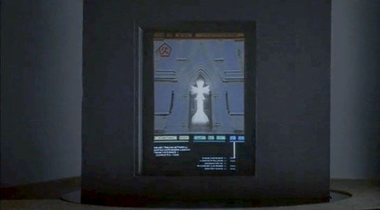


 Two anecdotes are not yet a pattern, but I’m glad to see this particular interaction again. I’m going to call it grabby holograms (capitulating a bit on adherence to the more academic term volumetric projection.) We grow up having bodies and moving about in a 3D world, so the desire to grab and turn objects to understand them is quite natural. It does require that we stop thinking of displays as untouchable, uninterruptable movies and more like toy boxes, and it seems like more and more writers are catching on to this idea.
 In any case, this simple setup works nicely, in which interaction with a cool media helps underscore the gravity of the situation, the height of the stakes. Note to selves: The imperturbable Tony Stark is perturbed. Shit is going to get real.

