The Iron Man HUD is an impossible thing

In the prior post we looked at the HUD display from Tony’s point of view. In this post we dive deeper into the 2nd-person view, which turns out to be not what it seems.

The HUD itself displays a number of core capabilities across the Iron Man movies prior to its appearance in The Avengers. Cataloguing these capabilities lets us understand (or backworld) how he interacts with the HUD, equipping us to look for its common patterns and possible conflicts. In the first-person view, we saw it looked almost entirely like a rich agentive display, but with little interaction. But then there’s this gorgeous 2nd-person view.

IronMan1_HUD00
IronMan1_HUD07

When in the first film Tony first puts the faceplate on and says to JARVIS, “Engage heads-up display”… …we see things from a narrative-conceit, 2nd-person perspective, as if the helmet were huge and we are inside the cavernous space with him, seeing only Tony’s face and the augmented reality interface elements. You might be thinking, “Of course it’s a narrative conceit. It’s not real. It’s in a movie.” But what I mean by that is that even in the diegesis, the Marvel Cinematic World, this is not something that could be seen. Let’s move through the reasons why.

Not a mini-TARDIS

First, it looks like we’re in some TARDIS-like space where the helmet extends so far we can fit in it, or a camera can, about a meter from his face. But of course the helmet isn’t huge on the inside. Tony hasn’t broken those laws of physics. The helmet is helmet-sized on the inside.

Not a volumetric projection
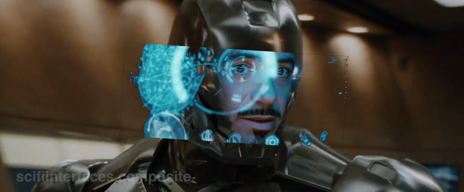
HUD_composit

Then there’s the issue of the huge display. It looks like a volumetric projection, like what R2-D2 can project, but that can’t be true, either. The projection would extend way beyond the boundaries of the helmet-sized helmet. Which as you can see below, is a non-starter. So it’s not a volumetric projection.

So, retinal projection

Then what is the display technology? Given the size constraints, retinal projection makes the most sense, but if we could make the helmet go invisible, it would look like Tony was having diffuse LASIK, or maybe playing The Game from Star Trek: The Next Generation.

STTNG The Game-02
Let’s face it, this is not the worst thing you’ve caught me doing.

Representation of the projections?

So, OK, fine. Maybe what we see is what’s being projected, the separate stereoscopic images onto individual retinas. Nope. Then we would see two similar, slightly offset images, like in older anaglyph stereoscopy, but more confusing, because there wouldn’t be a color difference, just double vision.

i_am_iron_man____in_3d_by_homerjk85-d57gs7u
Let’s pray that poor Tony doesn’t have to wear anaglyph glasses in there.
(Props to Deviantartist homerjk85 for the awesome conversion.)

Nope.

So what we are left with is that we are not seeing anything in the real world of the diegesis. This 2° view is strictly a narrative conceit: A projection of what Tony’s brain puts together from the split views of the stereographic projection into a cohesive whole, i.e. retinally-projected augmentation of his eyesight. It’s a testament to the talent of the filmmakers that this HUD, as narratively constructed as it is, just works. We think it’s something real. We instantly get it. But…

The damned multilayering

IronMan_HUDMultilayer
1280px-Parallax_Example.svg
layeringproblems

But even that notion—that this HUD is what Tony experiences, perceptually—is troubled by the multilayering in the HUD. Information in the HUD is typically displayed across multiple layers. See the three squares in the left side of this screen shot for an example. So many problems with this. If this is meant to be what he perceives, then we immediately have trouble with parallax. Parallax is the way that objects shift against background objects when seen from two different viewpoints, like, say, Tony’s two eyes. If Tony perceives these layers through both eyes, i.e. stereoscopically, as an actual set of three layers floating in front of his face, then those graphics shift around depending on which eye JARVIS is optimizing for. One eye might see it beautifully, but then the other eye is wholly confounded. In the worst possible situation, neither eye is really satisfied. See the Wikipedia article on parallax as parallaxed for a meta-example. If on the other hand it’s just one eye that’s seeing these layers, then the layering is utterly pointless, because a single eye has no depth perception and therefore these would just appear as a single layer. It would have no benefit for Tony and only be there for our gee-whizification.

Our choices are: Terrible or Pointless

So, it’s either a terrible, confusing display for Tony (which I can’t imagine, given how genius of a technologist he is meant to be), or this view is not even a representation of what Tony sees, but a strictly narrative construction. And we can’t say for sure which it is because this multilayering is never seen in the first-person views. In those screens it’s been reasonably cleaned up to be intelligible. Note the difference between the car views below in the first- and second-person shots.

IronMan1_HUD11
Layers include end views and a side view.
IronMan1_HUD10
Only the side view is shown, the end views are absent.

Then, the damned head movement

Note also that in the 2nd-person view, Tony is very expressive, moving his head around a lot in response to the HUD. But looking at him from the outside, Iron Man’s head doesn’t swivel around except to look at things in the real world. Is the interface requiring him to move his head or is he just a drama queen? If it requires him, that’s terrible. That would move his head away from important things in the real world to focus on something in this virtual world? If he’s a drama queen, fine, nothing to do about that and glad that JARVIS can accomodate. In any case, when we see the him in the helmet outside the TARDIS-HUD, he is not swiveling his head apropos of nothing, which reinforces the notion that this is strictly a cinematic conceit. (Hat tip to Jonathan Korman for sharing this observation with me.)

So…

So ultimately what I’m saying here is this is an impossible thing, and for being impossible, we should not just freak out about how cool it is and declare it the necessary and good future. It has major problems, even as gorgeous and exciting as it is. Hey, no surprise, nobody has forgotten that it’s a movie, but recognize that what you thought was just maybe exaggerated was in fact a bold-faced impossibility.

Next up in the Iron HUD series: Iron Man forces us to get clear about some terms.

Iron Man HUD: 1st person view

In the prior post we catalogued the functions in the Iron HUD. Today we examine the 1st-person display.

When we first see the HUD, Tony is donning the Iron Man mask. Tony asks, JARVIS, “You there?” To which JARVIS replies, “At your service sir.” Tony tells him to “Engage the heads-up display”, and we see the HUD initialize. It is a dizzying mixture of blue wireframe motion graphics. Some imply system functions, such as the reticle that pinpoints Tony’s eye. Most are small dashboard-like gauges that remain small and in Tony’s peripheral vision while the information is not needed, and become larger and more central when needed. These features are catalogued in another post, but we learn about them through two points-of-view:a first-person view, which shows us what Tony’s sees as if we were there, donning the mask in his stead, and second-person view, which shows us Tony’s face overlaid against a dark background with floating graphics.

This post is about that first-person view. Specifically it’s about the visual design and the four awarenesses it displays.

Avengers-missile-fetching04

In the Augmented Reality chapter of Make It So, I identified four types of awareness seen in the survey for Augmented Reality displays:

  1. Sensor display
  2. Location awareness
  3. Context awareness
  4. Goal awareness

The Iron Man HUD illustrates all four and is a useful framework for describing and critiquing the 1st-person view.

Sensor display

When looking through the HUD “ourselves,” we can see that the HUD provides some airplane-like heads up instruments: Across the top is a horizontal compass with a thin white line for a needle. Below and to its left is a speed indicator, presented in terms of MACH. On the left side of the screen is a two-part altimeter with overlays indicating public, commercial, military, and aerospace layers of atmosphere, with a small blue tick mark indicating Tony’s current altitude.

There are just-in-time status indicators like that cyan text box on the right with its randomized rule line. The content within is all N -8 W -97 RNG EL, so, hard to tell what it means, but Tony’s a maker working with a prototype. It’s no surprise he takes some shortcuts in the interface since it’s not a commercial device. But we should note that it would reduce his cognitive load to not have to remember what those cryptic letters meant.

IronMan1_HUD08
You can just see the tops of these gauges at the bottom of this screen.

The exact sensor shown depends on the context and goal at hand.

Periphery and attention

A quick sidenote about peripheral vision and the detail of these gauges. Looking at them, it’s notable that they are small and quite detailed. That makes sense when he’s looking right at them, but when he’s not, given the amount of big, swirling graphics he“s got vying for his attention in the main display, the more those little gauges have to compete. And when it comes to your peripheral vision, localized detail and motion is not enough, owing to the limits of our foveal extent. (Props to @pixelio for the heads-up on this one.)

You see, your brain tricks you into thinking that you can see really well across your entire field of vision. In fact, you can only see really well across a few dozen degrees of that perceptual sphere, corresponding to the tiny area at the back of your eye called the fovea where all the really good photoreceptors concentrate. As your eyes dart around the scene before you, your brain puts all the snippets of detailed information together so it feels like a cohesive, well-detailed whole, but it’s ultimately just a hack. Take a look at this demonstration of the effect.

Screen Shot 2015-07-20 at 23.49.56
This only works if you view it live.

So, having those teeny little guages dancing around as a signal of troubles ahead won’t really get Tony’s attention. He could develop habits of glancing at these things, but that’s a weak strategy, since this data is so mission-critical. If he misses it and forgets to check the gauges, he’s Iron Toast. Fortunately, JARVIS is once again our deus ex machina (in so many senses) because he is able to track where Tony is looking, and if he’s not looking at the wiggling gauge, JARVIS can choose to escalate the signal: Hide the air traffic data temporarily and show the problem in the main screen. Here, as in other mission critical systems, attention management is crisis management. Now, for those of us working with pre-JARVIS tech, it’s rare today for a system to be able to

  • Track perceptual details of its users
  • Monitor a model of the user’s attention
  • Make the right call amongst competing priorities to escalate the right one

But if you could, it would be the smart and humane way to handle it.

Location Awareness

As Tony prepares for his first flight, JARVIS gives him a bit of x-ray vision, displaying a wireframe view of the Santa Monica coastline with live air traffic control icons of aircraft in the vicinity. The overhead map updates of course in real time.

IronMan1_HUD17
If my Google Earth sleuthing is right, his view means he lives in the Malibu RV Park and this view is due East.

Context Awareness

Very quickly after we meet the HUD it shows its object recognition capabilities. As Tony sweeps his glance across his garage, complex reticles jump to each car. Split-seconds afterwards, the car’’s outline is overlaid and some adjunct information about it is presented.

IronMan1_HUD10

This holds true as he’s in flight as well. When Tony passes by the Santa Monica pier, not only is the Pacific Wheel identified (as the Santa Monica Ferriswheel), but the interface shows him a Wikipedia-esque article for the thing as well.

IronMan1_HUD19

IronMan1_HUD21

While JARVIS might be tapping into location databases for both the car and the ferris wheel recognition, it’s more than that. In one scene we see him getting information on the Iron Patriot as it rockets away, and its location wouldn’t be on any real-time record for him to access.

Optical zoom

Too much detail

While this level of object detail is deeply impressive, it’s about as useful as reading Wikipedia pages hard-printed to transparencies while driving. The text is too small, too multilayered, and just pointless considering that JARVIS can tell him whatever he needs to know without even asking. Maybe he could indulge in pop-up pamphlets if he was on a long-haul flight from, say, Europe back home to the Malibu RV Park (see above), but wouldn’t Tony rather watch a movie while on Autopilot instead?

Goal awareness

Of course JARVIS is aware of Tony’s goals, and provides graphics customized to the task, whether that task is navigating flight through complex obstacle courses…

3D wayfinding

…taking down a bad guy with the next hit…

Suggested target points

…saving innocent bystanders who are freefalling from a plane…

Biometric analysis, target acquisition

…or instantly analyzing problems in an observed (and complicated) piece of machinery…

3D schematics of observed machinery with damage highlights

…JARVIS is there with the graphics to help illustrate, if not solve, the problem at hand. Most impressively, perhaps, is JARVIS’ ability to juggle all of these graphics and modes seamlessly to present just the right thing at the right time in real time. Tony never asks for a particular display, it just happens. If you needed no other proof of its strong artificial intelligence, this would be it.

Next up in the Iron HUD series: Compare and contrast the 2nd-person view.

Iron Man HUD: Just the functions

In the last post we went over the Iron HUD components. There is a great deal to say about the interactions and interface, but let’s just take a moment to recount everything that the HUD does over the Iron Man movies and The Avengers. Keep in mind that just as there are many iterations of the suit, there can be many iterations of the HUD, but since it’s largely display software controlled by JARVIS, the functions can very easily move between exosuits.

Gauges

Along the bottom of the HUD are some small gauges, which, though they change iconography across the properties, are consistently present.

IronMan1_HUD07

For the most part they persist as tiny icons and thereby hard to read, but when the suit reboots in a high-altitude freefall, we get to see giant versions of them, and can read that they are:

IronMan1_HUD13
Tony can, at a glance or request, summon more detail for any of the gauges.
IronMan1_HUD12
Even different visualizations of similar information.

Object Recognition

In the 1st-person view we see that the HUD has a separate map in the lower-left, and object recognition/awareness,

IronMan1_HUD10
IronMan1_HUD11
In the 2nd-person view, we see even more layers of information about the identified objects, floating closer to tony’s point of view.

Situational

Most of the HUD functions we see, though, are situational, brought up for Tony’s attention when JARVIS believes they are needed, or when Tony requests them. Following are screenshots that illustrate a moment when the situational function appeared. 

Iron Man

Iron Man 2

Iron Man 3

The Avengers

Some of these illustrate why I argue that JARVIS is the superhero, and Tony just the onboard manager, but rather than reverse engineering any particular function, for this post it is enough to document them and note that only the optical zoom seems to be an interactive function. This raises questions of how he initiated the mode and how he escapes the mode, but since we don’t see the mechanisms of control, it’s entirely arguable that JARVIS is just  being his usual helpful self again.

Next up in the Iron HUD series: Let’s dive deeper into the first-person view.

J.D.E.M. LEVEL 5

The first computer interface we see in the film occurs at 3:55. It’s an interface for housing and monitoring the tesseract, a cube that is described in the film as “an energy source” that S.H.I.E.L.D. plans to use to “harness energy from space.” We join the cube after it has unexpectedly and erratically begun to throw off low levels of gamma radiation.

The harnessing interface consists of a housing, a dais at the end of a runway, and a monitoring screen.

Avengers-cubemonitoring-07
Fury walks past the dais they erected just because.

The housing & dais

The harness consists of a large circular housing that holds the cube and exposes one face of it towards a long runway that ends in a dais. Diegetically this is meant to be read more as engineering than interface, but it does raise questions. For instance, if they didn’t already know it was going to teleport someone here, why was there a dais there at all, at that exact distance, with stairs leading up to it? How’s that harnessing energy? Wouldn’t you expect a battery at the far end? If they did expect a person as it seems they did, then the whole destroying swaths of New York City thing might have been avoided if the runway had ended instead in the Hulk-holding cage that we see later in the film. So…you know…a considerable flaw in their unknown-passenger teleportation landing strip design. Anyhoo, the housing is also notable for keeping part of the cube visible to users near it, and holding it at a particular orientation, which plays into the other component of the harness—the monitor.

Avengers-cubemonitoring-03

The monitor

In the underground laboratory, an (unnamed?) technician warns lead scientist Selvig that, “it’s spiking again,” and the camera pans down to this monitoring interface.

JDEM

Header

The header is a static barcode followed by the initialism J.D.E.M. along with its full name, the Joint Dark Energy Mission. (Sounds super cool and sci-fi, right? Turns out it is a real program between NASA and the US DOE.) Another label across the top identifies the screen as LEVEL 5 and that it belongs to PROJECT PEGASUS and NASA.

3D map

A main display shows a 3D wireframe of the tesseract, with color-coded nebula-like shapes within the cube. The wireframe (and most of the text on screen) are a bright cyan, with internal features progressing in color from the cyan through white to a blood red, all the way to lens flares near the most active areas in the cube. The color choices make for a quick read of what is “cool” and what is “hot,” so are effective for being immediate, but if the lens flares are designed into the system to indicate peakness, it’s a bad choice for obscuring other data in the display.

Note that the wireframe of the cube is also rotating slightly, which is  very helpful for a user to more fully understand 3D information from a 2D screen. It might be even better mapping with less cognitive load if the display was a volumetric projection. (VPs exist within the Marvel Cinematic Universe (MCU), but so far I believe we’ve only ever seen them in Tony Stark’s possession so perhaps he has not released it to the outside world.) Hopefully in its rotation on this monitor it does not rotate in 360°, as the regularness of the cube would make it difficult to understand where an internal anomaly might exist in the real thing. Hopefully the wireframe only wavers back and forth within a few degrees, and is oriented in roughly the same way an observer glancing at the real thing would see it in the housing, to allow for instant mapping of problem areas.

Avengers-cubemonitoring-01

Warning

Just to the left of the 3D map is a data monitoring panel. Its top label blinks a red WARNING CRITICAL ENERGY LEVELS and a percentage readout. The panel also features a key whose colors match those of the map. (As it should.) Hopefully a microinteraction allows a user to touch any part of the map, freeze the rotation, and get the percentage details of the touched point. A detail box wavers its vertical position along the key to provide a user a quick assessment of its value, and also contains a percentage readout for precision. Judging by the position of the box and the readout, it looks like the 100% mark is about halfway up the screen. Hopefully the upper part of the scale is logarithmic to accommodate massive surges in values.

Additional elements of the display include several scrolling waveforms and text boxes with inscrutable data and labels. It’s easy to imagine these as useful (say total energy values for specific electromagnetic frequencies) but they’re difficult to read, so difficult to formally evaluate.

All told, a nice display (per some assumptions) for monitoring what’s happening with the cube.

Now if only they had applied that solid design thinking to that dais vs. cage problem.

Avengers-cubemonitoring-04

Sleep Pod—Wake Up Countdown

On each of the sleep pods in which the Odyssey crew sleep, there is a display for monitoring the health of the sleeper. It includes some biometric charts, measurements, a body location indicator, and a countdown timer. This post focuses on that timer.

To show the remaining time of until waking Julia, the pod’s display prompts a countdown that shows hours, minutes and seconds. It shows in red the final seconds while also beeping for every second. It pops-up over the monitoring interface.

image03
Julia’s timer reaches 0:00:01.

The thing with pop-ups

We all know how it goes with pop-ups—pop-ups are bad and you should feel bad for using them. Well, in this case it could actually be not that bad.

The viewer

Although the sleep pod display’s main function is to show biometric data of the sleeper, the system prompts a popup to show the remaining time until the sleeper wakes up. And while the display has some degree of redundancy to show the data—i.e. heart rate in graphics and numbers— the design of the countdown brings two downsides for the viewer.

  1. Position: it’s placed right in the middle of the screen.
  2. Size: it’s roughly a quarter of the whole size of the display

Between the two, it partially covers both the pulse graphics and the numbers, which can be vital, i.e. life threatening—information of use to the viewer.

The sleeper

At the same time the display has another user, the sleeper. Since she can’t get back or respond in any way, this display is her only way of communication. As such, the device ought to react at least as well as a person would. So while normally a pop-up should only be used to show important data that the user really must know, this case is different. The pop up is not blindly blocking information, it’s reflecting the user’s priorities at that moment. And it’s for this reason that the timer bears that much visual importance on the screen.

But the display is also a touchscreen, which you can tell from the buttons in the timer. So in case the viewer really needs to see the entire display, it would require putting the timer in a separate mode. But that would require him switch back and forth between modes to get all the data.

image01
When the countdown finishes, the pod slides open. Julia slowly begins to recover consciousness, open her eyes and sits to take a look around the outside.

Rome wasn’t built in 99 hours.

The countdown timer shows the amount of hours, minutes and seconds until the sleeper wakes, counting backwards. We just get to see the timer —and hear it beeping— only when the sleep time is ending, so it’s likely a feature to notify any close witness that the pod is about to open.

But what if the sleeper’s biometrics start to get bad? Well, the timer does leave enough room on the screen to leave the bulk of the biometrics data. The device also has a warning for when the sleeper is in CRITICAL condition, but we don’t get to see any in-between modes. It could be helpful if the timer offered some sound cue when the sleeper has some minor issue as well, even if it isn’t as bad. Even something as simple as changing the tone of the beep could do the trick.

Did you notice that the timer has two digits to display hours? That means it can display 99 hours of remaining time. That’s a long time. I’m guessing that the display doesn’t show the countdown with that much time in advance. But in that case, when does it show the timer? If the timer looks to give a hint when a sleeper is about to wake up, you don’t really need to know the amount of hours left. A few minutes’ advance notice is enough.

Kind-of setting the timer.

Although the crew of the Odyssey could probably handle the delta sleep from the onboard computer, the display also offers some functions to control that time. It has three buttons that control the timer:

  • a START button
  • a RESET button
  • a CLEAR button

The timer has two small half-circles both at the top and bottom of the clock. There is a play button. The timer needs to have a way to enter a given duration, and from the mapping of those symbols I’m guessing they could work as adding and subtracting buttons —you know, press the top button to add an hour, press the bottom button to reduce an hour. But at the same time the buttons don’t have any labels to convey that—they lack either a plus symbol on the top or a minus symbol on the bottom. For what it’s worth, the only label they offer is the time magnitude of any pair of digits—hours, minutes and seconds—on the circles at the bottom. So yeah, I’m close to calling these fuidgets.

The text buttons need some consideration as well. The first two are pretty straightforward if we envision the scenario where the clock timer can be set to any given time. In that case START will start the clock and RESET will put it back to zero, as with any common timer. The odd bit is that there is still a START button while the clock is ticking. In many common timers that same button has two modes that switch according to the state of the timer: starting it when it’s paused and pausing it when it it’s playing. But the missing pause mode or button could have a purpose, perhaps waking the sleeper requires a gradual biological process that can’t be stop once it has began.

image02

There are other problems with the third one, the CLEAR button. Although the label is somewhat misleading, the button probably acts as a way to close the pop-up of the countdown, removing it from the screen. But the real issue is what happens after that. If the user press CLEAR and the pop-up closes, there is no way of knowing if the timer keeps running in the background or if it resets back to zero. This is a major problem.

Anyhow, even if the timer did run in the background it doesn’t have much of a point in this case. I mean, there was no one around to check on Julia while she was in sleep.

A little ramble on Industrial Design

Another interesting aspect of the design of the pods is the way they open. Instead of opening or sliding the cover to one side, as more common doors and hatches, the cover of the pods is divided in the middle like a double-leaf bascule drawbridge. These covers on the pod have a hinge both at the top and bottom, so they turn outside and up of the pod when opening.

Jack releases Julia from the sleep pod.

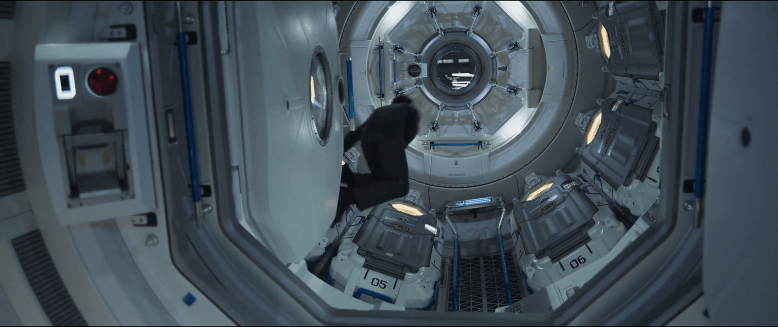
Although it may seem like an overly complicated design, it really shows its advantages when you set it in context. On the Odyssey the sleep pods are placed side by side, alongside the walls of a tube like compartment. There, the area around the center has hatches that lead to other compartments.

image00

Within a space of those characteristics, a cover that opens or slides to the side would bring some problems. As the cover slides, when opening a pod you would be blocking the one next to it. To improve that, you could have a cover that opens up from the top or the bottom. With that you could have more than one pod closing and opening at the same time, but it also comes with drawbacks. Given the length of the pods those doors will probably cover much of the transit area around the compartments of the ship, becoming an obstacle for the movement of the crew.

This is a solution for both problems. The divided doors give plenty of space for the crew to pass through, and as the doors open up they also give room to opening or closing the pods next to each other at the same time.
Otto’s Manual Control

WallE-Otto02

WallE-Otto06

When it refused to give up authority, the Captain wrested control of the Axiom from the artificial intelligence autopilot, Otto. Otto’s body is the helm wheel of the ship and fights back against the Captain. Otto wants to fulfil BNL’s orders to keep the ship in space. As they fight, the Captain dislodges a cover panel for Otto’s off-switch. When the captain sees the switch, he immediately realizes that he can regain control of the ship by deactivating Otto. After fighting his way to the switch and flipping it, Otto deactivates and reverts to a manual control interface for the ship.

The panel of buttons showing Otto’s current status next to the on/off switch deactivates half its lights when the Captain switches over to manual. The dimmed icons are indicating which systems are now offline. Effortlessly, the captain then returns the ship to its proper flight path with a quick turn of the controls.

One interesting note is the similarity between Otto’s stalk control keypad, and the keypad on the Eve Pod. Both have the circular button in the middle, with blue buttons in a semi-radial pattern around it. Given the Eve Pod’s interface, this should also be a series of start-up buttons or option commands. The main difference here is that they are all lit, where the Eve Pod’s buttons were dim until hit. Since every other interface on the Axiom glows when in use, it looks like all of Otto’s commands and autopilot options are active when the Captain deactivates him.

A hint of practicality…

The panel is in a place that is accessible and would be easily located by service crew or trained operators. Given that the Axiom is a spaceship, the systems on board are probably heavily regulated and redundant. However, the panel isn’t easily visible thanks to specific decisions by BNL. This system makes sense for a company that doesn’t think people need or want to deal with this kind of thing on their own.

Once the panel is open, the operator has a clear view of which systems are on, and which are off. The major downside to this keypad (like the Eve Pod) is that the coding of the information is obscure. These cryptic buttons would only be understandable for a highly trained operator/programmer/setup technician for the system. Given the current state of the Axiom, unless the crew were to check the autopilot manual, it is likely that no one on board the ship knows what those buttons mean anymore.

WallE-Otto03

Thankfully, the most important button is in clear English. We know English is important to BNL because it is the language of the ship and the language seen being taught to the new children on board. Anyone who had an issue with the autopilot system and could locate the button, would know which button press would turn Otto off (as we then see the Captain immediately do).

Considering that Buy-N-Large’s mission is to create robots to fill humans’ every need, saving them from every tedious or unenjoyable job (garbage collecting, long-distance transportation, complex integrated systems, sports), it was both interesting and reassuring to see that there are manual over-rides on their mission-critical equipment.

…But hidden

The opposite situation could get a little tricky though. If the ship was in manual mode, with the door closed, and no qualified or trained personnel on the bridge, it would be incredibly difficult for them to figure out how to physically turn the ship back to auto-pilot. A hidden emergency control is useless in an emergency.

Hopefully, considering the heavy use of voice recognition on the ship, there is a way for the ship to recognize an emergency situation and quickly take control. We know this is possible because we see the ship completely take over and run through a Code Green procedure to analyze whether Eve had actually returned a plant from Earth. In that instance, the ship only required a short, confused grunt from the Captain to initiate a very complex procedure.

Security isn’t an issue here because we already know that the Axiom screens visitors to the bridge (the Gatekeeper). By tracking who is entering the bridge using the Axiom’s current systems, the ship would know who is and isn’t allowed to activate certain commands. The Gatekeeper would either already have this information coded in, or be able to activate it when he allowed people into the bridge.

For very critical emergencies, a system that could recognize a spoken ‘off’ command from senior staff or trained technicians on the Axiom would be ideal.

Anti-interaction as Standard Operating Procedure

WallE-Otto05

The hidden door, and the obscure hard-wired off button continue the mission of Buy-N-Large: to encourage citizens to give up control for comfort, and make it difficult to undo that decision. Seeing as how the citizens are more than happy to give up that control at first, it looks like profitable assumption for Buy-N-Large, at least in the short term. In the long term we can take comfort that the human spirit–aided by an adorable little robot–will prevail.

So for BNL’s goals, this interface is fairly well designed. But for the real world, you would want some sort of graceful degradation that would enable qualified people to easily take control in an emergency. Even the most highly trained technicians appreciate clearly labeled controls and overrides so that they can deal directly with the problem at hand rather than fighting with the interface.

The answer does not program

LogansRun224

Logan’s life is changed when he surrenders an ankh found on a particular runner. Instead being asked to identify, the central computer merely stays quiet a long while as it scans the objects. Then its lights shut off, and Logan has a discussion with the computer he has never had before.

The computer asks him to “approach and identify.” The computer gives him, by name, explicit instructions to sit facing the screen. Lights below the seat illuminate. He identifies in this chair by positioning his lifeclock in a recess in the chair’s arm, and a light above him illuminates. Then a conversation ensues between Logan and the computer.

LogansRun113

The computer communicates through a combination of voice and screen, on which it shows blue text and occasional illustrative shapes. The computer’s voice is emotionless and soothing. For the most part it speaks in complete sentences. In contrast, Logan’s responses are stilted and constrained, saying “negative” instead of “no,” and prefacing all questions with the word, “Question,” as in, “Question: What is it?”

On the one hand it’s linguistically sophisticated

Speech recognition and generation would not have a commercially released product for four years after the release of Logan’s Run, but there is an odd inconsistency here even for those unfamiliar with the actual constraints of the technology. The computer is sophisticated enough to generate speech with demonstrative pronouns, referring to the picture of the ankh as “this object” and the label as “that is the name of the object.” It can even communicate with pragmatic meaning. When Logan says,

“Question: Nobody reached renewal,”

…and receives nothing but silence, the computer doesn’t object to the fact that his question is not a question. It infers the most reasonable interpretation, as we see when Logan is cut off during his following objection by the computer’s saying,…

“The question has been answered.”

Despite these linguistic sophistications, it cannot parse anything but the most awkwardly structured inputs? Sadly, this is just an introduction to the silliness that is this interface.

Logan undergoes procedure “033-03,” in which his lifeclock is artificially set to blinking. He is then instructed to become a runner himself and discover where “sanctuary” is. After his adventure in the outside performing the assignment he was forced to accept, he is brought in as a prisoner. The computer traps him in a ring of bars demanding to know the location of sanctuary. Logan reports (correctly) that Santuary doesn’t exist.

LogansRun206
LogansRun205
hologram

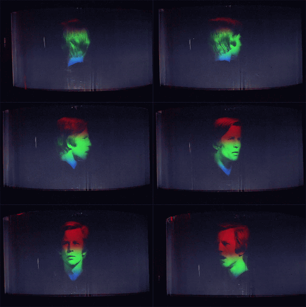
On the other hand, it explodes

This freaks the computer out. Seriously. Now, the crazy thing is that the computer actually understands Logan’s answer, because it comments on it. It says, “Unacceptable. The answer does not program [sic].” That means that it’s not a data-type error, as if it got the wrong kind of input. No, the thing heard what Logan was saying. It’s just unsatisfied, and the programmer decided that the best response to dissatisfaction was to engage the heretofore unused red and green pixels in the display, randomly delete letters from the text—and explode. That’s right. He decided that in addition to the Dissatisfaction() subroutine calling the FreakOut(Seriously) subroutine, the FreakOut(Seriously) subroutine in its turn calls Explode(Yourself), Release(The Prisoner), and the WhileYoureAtItRuinAllStructuralIntegrityoftheSurroundingArcitecture() subroutines.

LogansRun221

Frankly, if this is the kind of coding that this entire society was built upon, this whole social collapse thing was less deep social commentary and really just a matter of technical debt.

LogansRun223
LogansRun225
LogansRun226
LogansRun227

Technical. Debt.

Gravity (?) Scan

FifthE-UFT001

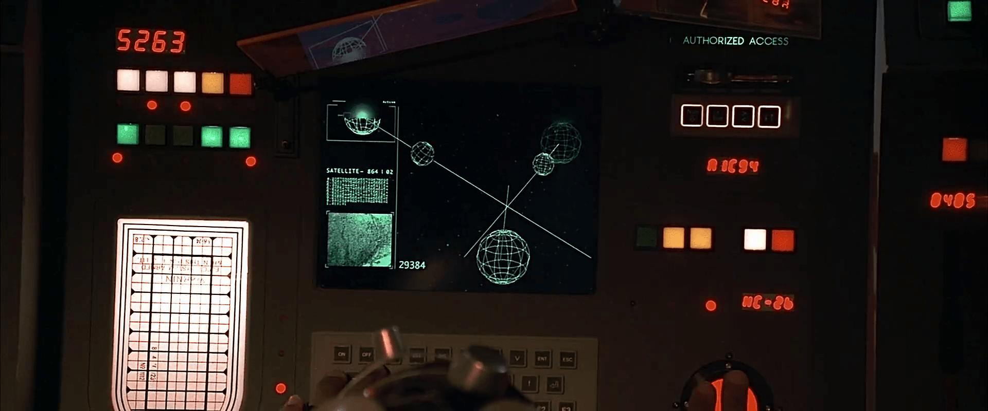
The first bit of human technology we see belongs to the Federation of Territories, as a spaceship engages the planet-sized object that is the Ultimate Evil. The interfaces are the screen-based systems that bridge crew use to scan the object and report back to General Staedert so he can make tactical decisions.

FifthE-UFT006

We see very few input mechanisms and very little interaction with the system. The screen includes a large image on the right hand side of the display and smaller detailed bits of information on the left. Inputs include

  • Rows of backlit modal pushbuttons adjacent to red LEDs
  • A few red 7-segment displays
  • An underlit trackball
  • A keyboard
  • An analog, underlit, grease-pencil plotting board.
    (Nine Inch Nails fans may be pleased to find that initialism written near the top.)

The operator of the first of these screens touches one of the pushbuttons to no results. He then scrolls the trackball downward, which scrolls the green text in the middle-left part of the screen as the graphics in the main section resolve from wireframes to photographic renderings of three stars, three planets, and the evil planet in the foreground, in blue.

FifthE-UFT008 FifthE-UFT014 FifthE-UFT010

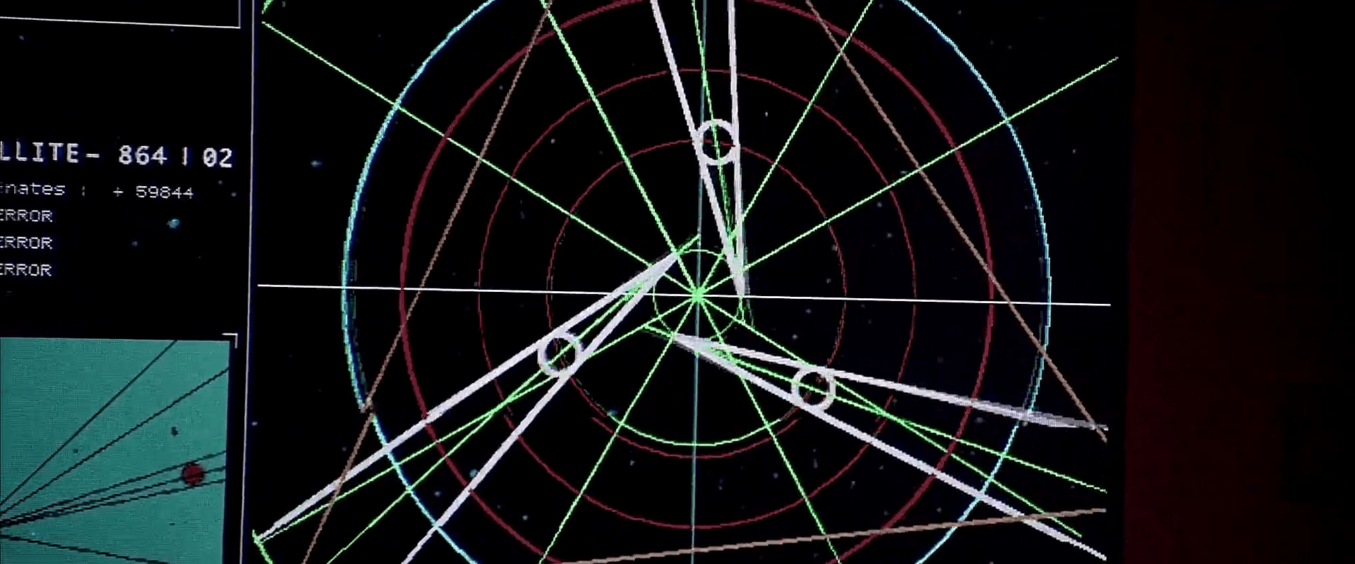
The main challenge with the system is what the heck is being visualized? Professor Pacoli says in the beginning of the film that, “When the three planets are in eclipse, the black hole, like a door, is open.” This must refer to an unusual, trinary star system. But if that’s the case, the perspective is all wrong on screen.

Plus, the main sphere in the foreground is the evil planet, but it is resolved to a blue-tinted circle before the evil planet actually appears. So is it a measure of gravity and event horizons of the “black hole?” Then why are the others photo-real?

Where is the big red gas giant planet that the ship is currently orbiting? And where is the ship? As we know from racing game interfaces and first-person shooters, having an avatar representation of yourself is useful for orientation, and that’s missing.

And finally, why does the operator need to memorize what “Code 487” is? That places a burden on his memory that would be better used for other, more human-value things. This is something of a throw-away interface, meant only to show the high-tech nature of the Federated Territories and for an alternate view for the movie’s editor to show, but even still it presents a lot of problems.

Alien Astrometrics

Prometheus-222

When David is exploring the ancient alien navigation interfaces, he surveys a panel, and presses three buttons whose bulbous tops have the appearance of soft-boiled eggs. As he presses them in order, electronic clucks echo in in the cavern. After a beat, one of the eggs flickers, and glows from an internal light. He presses this one, and a seat glides out for a user to sit in. He does so, and a glowing pollen volumetric projection of several aliens appears. The one before David takes a seat in the chair, which repositions itself in the semicircular indentation of the large circular table.

Prometheus-204

The material selection of the egg buttons could not be a better example of affordance. The part that’s meant to be touched looks soft and pliable, smooth and cool to the touch. The part that’s not meant to be touched looks rough, like immovable stone. At a glance, it’s clear what is interactive and what isn’t. Among the egg buttons there are some variations in orientation, size, and even surface texture. It is the bumpy-surfaced one that draws David’s attention to touch first that ultimately activates the seat.

The VP alien picks up and blows a few notes on a simple flute, which brings that seat’s interface fully to life. The eggs glow green and emit green glowing plasma arcs between certain of them. David is able to place his hand in the path of one of the arcs and change its shape as the plasma steers around him, but it does not appear to affect the display. The arcs themselves appear to be a status display, but not a control.

After the alien manipulates these controls for a bit, a massive, cyan volumetric projection appears and fills the chamber. It depicts a fluid node network mapped to the outside of a sphere. Other node network clouds appear floating everywhere in the room along with objects that look like old Bohr models of atoms, but with galaxies at their center. Within the sphere three-dimensional astronomical charts appear. Additionally huge rings appear and surround the main sphere, rotating slowly. After a few inputs from the VP alien at the interface, the whole display reconfigures, putting one of the small orbiting Bohr models at the center, illuminating emerald green lines that point to it and a faint sphere of emerald green lines that surround it. The total effect of this display is beautiful and spectacular, even for David, who is an unfeeling replicant cyborg.

Prometheus-226

At the center of the display, David observes that the green-highlighted sphere is the planet Earth. He reaches out towards it, and it falls to his hand. When it is within reach, he plucks it from its orbit, at which point the green highlights disappear with an electronic glitch sound. He marvels at it for a bit, turning it in his hands, looking at Africa. Then after he opens his hands, the VP Earth gently returns to its rightful position in the display, where it is once again highlighted with emerald, volumetric graphics.

Prometheus-229

Finally, in a blinding flash, the display suddenly quits, leaving David back in the darkness of the abandoned room, with the exception of the small Earth display, which is floating over a small pyramid-shaped protrusion before flickering away.

After the Earth fades, david notices the stasis chambers around the outside of the room. He realizes that what he has just seen (and interacted with) is a memory from one of the aliens still present.

Prometheus-238

Prometheus-239

Hilarious and insightful Youtube poster CinemaSins asks in the video “Everything Wrong with Prometheus in 4 minutes or Less,” “How the f*ck is he holding the memory of a hologram?” Fair question, but not unanswerable. The critique only stands if you presume that the display must be passive and must play uninterrupted like a television show or movie. But it certainly doesn’t have to be that way.

Imagine if this is less like a YouTube video, and more like a playback through a game engine like a holodeck StarCraft. Of course it’s entirely possible to pause the action in the middle of playback and investigate parts of the display, before pressing play again and letting it resume its course. But that playback is a live system. It would be possible to run it afresh from the paused point with changed parameters as well. This sort of interrupt-and-play model would be a fantastic learning tool for sensemaking of 4D information. Want to pause playback of the signing of the Magna Carta and pick up the document to read it? That’s a “learning moment” and one that a system should take advantage of. I’d be surprised if—once such a display were possible—it wouldn’t be the norm.

Starmetheus

The only thing I see that’s missing in the scene is a clear signal about the different state of the playback:

  1. As it happened
  2. Paused for investigation
  3. Playing with new parameters (if it was actually available)

David moves from 1 to 2, but the only change of state is the appearance and disappearance of the green highlight VP graphics around the Earth. This is a signal that could easily be missed, and wasn’t present at the start of the display. Better would be some global change, like a global shift in color to indicate the different state. A separate signal might compare As it Happened with the results of Playing with new parameters, but that’s a speculative requirement of a speculative technology. Best to put it down for now and return to what this interface is: One of the most rich, lovely, and promising examples of sensemaking interactions seen on screen. (See what I did there?)

For more about how VP might be more than a passive playback, see the lesson in Chapter 4 of Make It So, page 84, VP Systems Should Interpret, Not Just Report.

Gene Sequence Comparison

Genetic tester

Prometheus-178

Shaw sits at this device speaking instructions aloud as she peers through a microscope. We do not see if the instructions are being manually handled by Ford, or whether the system is responding to her voice input. Ford issues the command “compare it to the gene sample,” the nearby screen displays DNA gel electrophoresis results for the exploding alien sample and a human sample. When Ford says, “overlay,” the results slide on top of each other. A few beats after some screen text and a computerized voice informs them that the system is PROCESSING, (repeated twice) it confirms a DNA MATCH with other screen text read by the same computerized voice.


Prometheus-181

Playback box

When Halloway visits Shaw in her quarters, she uses a small, translucent glass cuboid to show him the comparison. To activate it, she drags a finger quickly across the long, wide surface. That surface illuminates with the data from the genetic tester, including the animation. The emerald green colors of the original have been replaced by cyan, the red has been replaced by magenta, and some of the contextualizing GUI has been omitted, but it is otherwise the same graphic. Other than this activation gesture, no other interactivity is seen with this device.

Prometheus-197

There’s a bit of a mismatch between the gesture she uses for input and the output on the screen. She swipes, but the information fades up. It would be a tighter mapping for Shaw if a swipe on its surface resulted in the information’s sliding in at the same speed, or at least faded up as if she was operating a brightness control. If the fade up was the best transition narratively, another gesture such as a tap might be a better fit for input. Still, the iOS standard for unlocking is to swipe right, so this decision might have been made on the basis of the audience’s familiarity with that interaction.