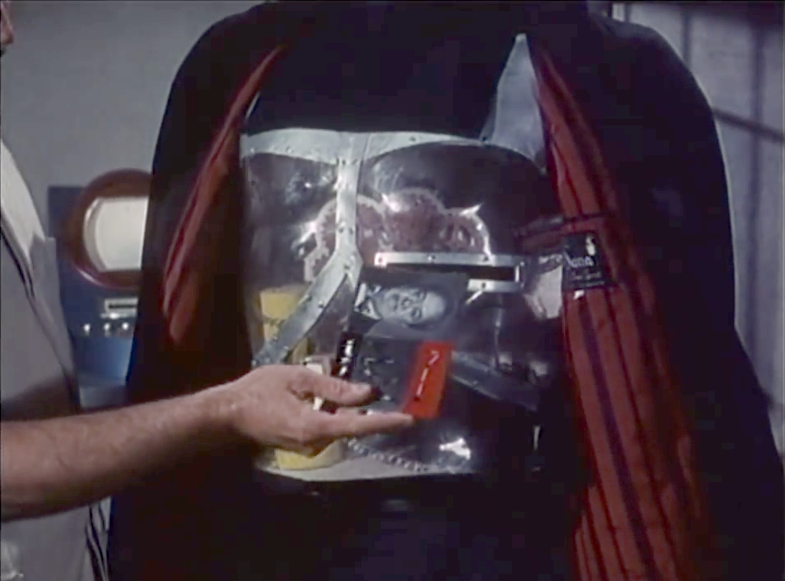
To provide the Victim Cards to the Robot Asesino, Orlak inserts it into an open slot in the robot’s chest, which then illuminates, confirming that the instructions have been received.
There is, I must admit, a sort of lovely, morbid poetry to a cardiogram being inserted into a slot where the robot heart would be to give the robot instructions to end the beating of the human heart described in the cardiogram. And we don’t see a lot of poetry in sci-fi interface designs. So, props for that.
The illumination is a nice bit of feedback, but I think it could convey the information in more useful and cinegenic ways.
In this new scenario…
Orlak has the robot pull back its coat
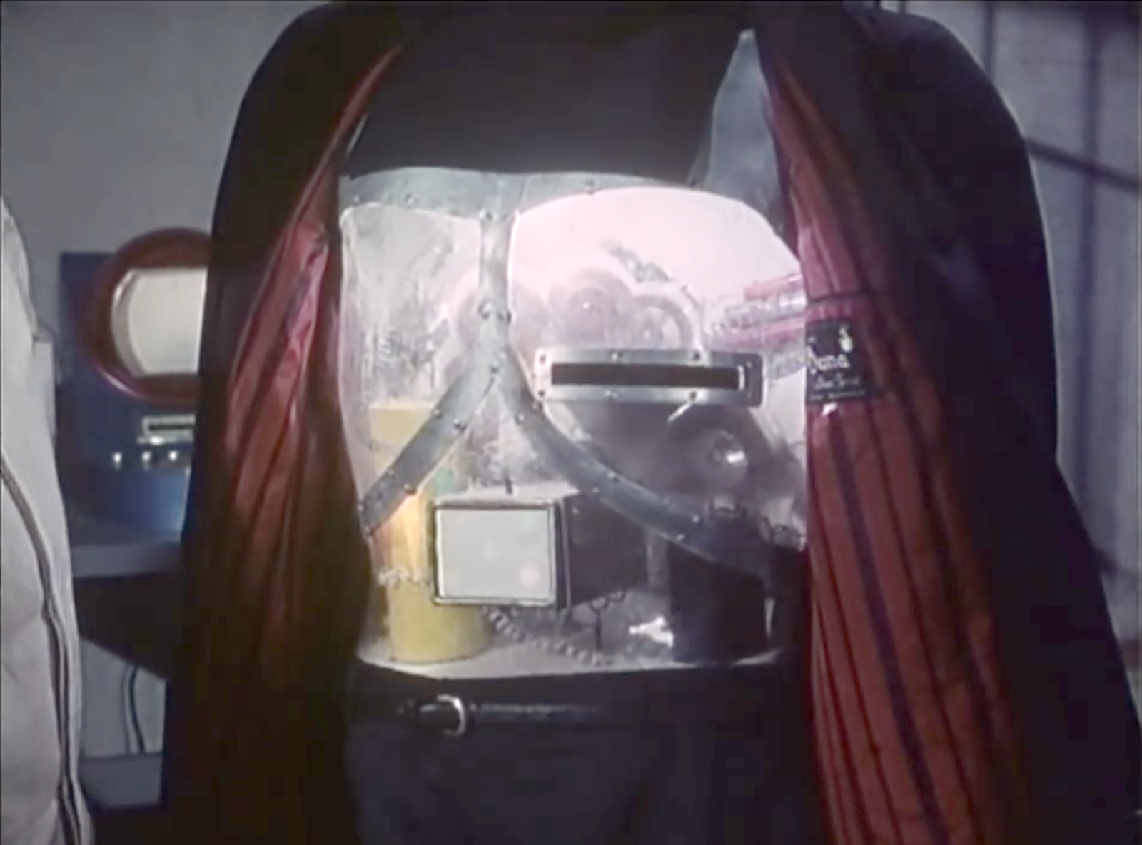
The chamfered slot is illuminated, signaling “card goes here.”
As Orlak inserts the target card, the slot light dims as the chest-cavity light brightens, signaling “I have the card.”
After a moment, the chest-cavity light turns blood red, signaling confirmation of the victim and the new dastardly mission.
When the robot returns to Orlak after completing a mission, the red light would dim as the slot light illuminates again, signaling that it is ready for its next mission.
These changes improve the interface by first drawing the user’s locus of attention exactly where it needs to go, and then distinguishing the internal system states as they happen. It would also work for the audience, who understands by association that red means danger.
The shape of the slot is pretty good for its base usability. It has clear affordances with its placement, orientation, and metallic lining. There’s plenty of room to insert the target card. It might benefit from a fillet or chamfer for the slot, to help avoid accidentally crumpling the paper cards when they are aimed poorly.
In addition to the tactical questions of illumination and shape of the slot, I have a few strategic questions.
There is no authorization in evidence. Can just anyone specify a target? Why doesn’t Gaby use her luchadora powers to Spin-A-Roonie a target card with Orlak’s face on it and let the robot save the day? Maybe the robot has a whitelist of heartbeats, and would fight to resist anyone else, but that’s just me making stuff up.
Also I’m not sure why the card stays in the robot. That leaves a discoverable paper trail of its crimes, perfect for a Scooby to hand over to the federales. Maybe the robot has some incinerator or shredder inside? If not, it would be better from Orlak’s perspective to design it as an insert-and-hold slot, which would in turn require a redesign of the card to have some obvious spot to hold it, and a bump-in on the slot to make way for fingers. Then he could remove the incriminating evidence and destroy it himself and not worry whether the robot’s paper shredder was working or not.
Another problem is that, since the robot doesn’t talk, it would be difficult to find out who its current target is at any given time. Since anyone can supply a target, Orlak can’t just rely on his memory to be certain. If the card was going to stay inside, it would be better to have it displayed so it’s easy to check.
How would Orlak cancel a target?
It is unclear how Orlak specifies whether the target is to be kidnapped or killed even though some are kidnapped and some are killed.
It’s also unclear about how Orlak might rescind or change an order once given.
It is also unclear how the assassin finds its target. Does it have internal maps with addresses? Or does it have unbelievably good hearing that can listen to every sound nearby, isolate the particular heartbeat in question, and just head in that direction, destroying any walls it encounters? Or can it reasonably navigate human cities and interiors to maintain its disguise? Because that would be some amazing technology for 1969. This last is admittedly not an interface question, but a backworlding question for believability.
So there’s a lot missing from the interface.
It’s the robot assassin designer’s job to not just tick a box to tell themselves that they have provided feedback, but to push through the scenarios of use to understand in detail how to convey to the evil scientist what’s happening with his murderous intent.
The last interface in The Star Wars Holiday Special is one of the handful of ritual interfaces we see in the scifiinterfaces survey. After Saun Dann leaves, the Wookiee family solemnly proceeds to a shelf in the living room. One by one they retrieve hand-sized transparent orbs with a few lights glowing inside of each. They gather together in the center of the living room, and a watery light floods them from stage right while the rest of the house lights dim. They hold the orbs up, with heads tilted reverently. Then they go blurry before refocusing again, and now they’re wearing blood red robes and floating in a sea of stars.
Then we cut to a long procession of Wookiees walking single file across an invisible space bridge into a glowing ball of space light, which explodes in sparkles at no particular time, and to which no one in the procession reacts in any way.
Break for commercial.
Lights up, and dozens of blood robed Wookiees are gathered in a dark space at the foot of a great, uplit tree called The Tree of Life. Stars occasionally, but not consistently, appear behind the tree. Fog hugs the floor and covers randomly distributed strings of fairy lights. Everyone carries the glowing orbs. They greet newcomers arriving from the star bridge with moans and bows (n.b. sloppy seiritsu form). Then C3PO and R2D2 appear from behind the Tree and walk out onto an elevated platform to greet Chewbacca (who seems to be some sort of spiritual leader in addition to being a Rebel Leader) with a “Happy Life Day!” An unholy chorus of Wookiee howls emerges from the gathered crowd. C3PO turns to the audience and says, “Happy Life Day, everyone!” C3PO expresses his and R2’s Pinnochio Syndrome to the crowd, though no one asked. Then Leia, Luke, and Han arrive.
Leia speaks (in English) explaining to the Wookiee gathered there the meaning of their own, dearest holiday. She then sings the Life Day Carol. (Again, in English.) No Wookiee has the biological morphology to participate, so they just watch. As a public service, I have transcribed these lyrics. Posthumus props to Carrie Fisher for delivering this with complete earnestness.
Life Day Carol
Sung by Princess Leia
We celebrate a day of peace A day of har-moh-neeeee A day of joy we all can share Together joyously [thx to scifihugh for this line] A day that takes us through the darkness A day that leads into light A day that makes us want to celebrate The light
[Horn section gets exuberant]
A day that brings the promise That one day we’ll be free To live To laugh To dream To grow To trust To know To be
Once the song is done, the Wookiees gather to file up a ramp and past the humans, greeting them each in turn with nods and exit back over the star bridge.
Then Chewbacca has a sudden dissociative fugue episode, where he relives moments from his recent past. (I’m going to sidestep the troubling but wholly possible implication that he has PTSD from his experiences with the Rebellion.) When he finally recovers, his family is back in their living room, staring at their glowing orbs, which sit in a basket in the center of the dining room table. The robes are gone. They are gathered for a family meal of fruit. (Since Mala’s actual cooking would probably not go down well.) They gather hands and bow their heads reverently in a deeply disturbing, ethnocentric gesture. Fade to black.
Analysis
The design of ritual is a fascination of mine. So if there’s ever a sci-fi movie showing of The Star Wars Holiday Special, that should be one topic for the hangout afterward. What does it purport to mean? Why do non-Wookiees get the starring role? Why the robes? What’s with the unsettling self-centeredness of having essentially North-American Christian rites?
But in this house we talk interface, and that means those orbs.
Physical Interface
The orbs’ physical interface is fit to task. Because they’re spherical, they can’t be easily set on a surface and put “out of mind.” (Kind of like a drinking horn, but no one gets inebriated in the Star Wars diegesis.) The orbs must be held and cared for, which is a nice way to get participants into a reverent mood. It also means that at least one hand is dedicated to holding it throughout the ceremony, which might put participants into a bit of active meditation, to free the body so the mind can focus and contemplate: Life and Days.
Visual design
The transparency and little lights within are also nice. Like the fairy lights common to many winter celebrations, they engage a sense of wonder and spectacle. Like holding fireflies, or stars in the palm of your hand. They speak a bit to the Pareto Principle, related to the notion that life is rare, precious, and valuable. The transparency also brings the color and motion of the surrounding environment into attention as well, speaking of the connectedness of all things.
Turning them on
I presume this is automatic, i.e. the lights illuminate just ahead the datetime of the ritual. They either have a calendar or some technology in the home automatically broadcasts the signal to come on. They could even slowly warm up as the ritual approached to help with a sense of anticipation. This automation would make them seem more natural, like a blossoming flower or budding fruit. You know, life.
Activation: Go there
If part of the celebration of Life Day is about togetherness, well then having the activation require literally gathering the family together with the spheres in hand is pretty on point. There’s even feedback for the family that they’re close enough together when the orbs signal the family’s Hue lights to dim and turn on the watery-reflection projection.
Note it also has to have some pretty sophisticated contextual awareness. Note that it only started once all four Wookiees were close together. Recall that Chewie almost didn’t make it home for Life Day. Would they have just been unable to participate without him? Doubtful. More likely they somehow know, like a Nest Thermostat, who’s home and waits for all of them to be in proximity to kick things off.
Note also that it did not start when they were in their storage basket, but only when they’re held up in the living room. So it also has some precise location awareness, to.
Sidenote: Where is there?
Where is the Tree of Life and how does the orb help them get there?
Literal
The Tree of Life is real, on Kazook/Kashyyyk and the orbs provide a trippy means of teleportation to this site. This would mean the Wookiees have access to teleportation tech that they don’t use in any other way—like, say, in their struggle against the Empire. So, this seems unlikely.
Virtual
Since it’s not literal, and I can’t imagine the whole thing being some sort of metaphor, the other possibility is that the tree is virtual. This would help explain why there are only a few dozen Wookiees around this single sacred tree on its high holy day: It’s not bound by actual physical constraints. This raises a whole host of other questions, such as how does it project the perceptual data into the Wookiee’s senses that they’re robed, and walking the star bridge, and at the tree?
So…pretty nice
All told, the orbs design helps reinforce the themes of Life Day, cheesy and creepy as they are.
You know, when The Star Wars Holiday Special came out, this “technology” was pure fancy. But that now we have cheap, ultrabright LEDs, tiny processors, WIFI chips, identity servers, all sorts of sensors, and Hue lights. If anyone wanted to build working models of these as an homage to an obscure sci-fi interface, it’s entirely possible now.
In one of the story threads, Matt uses an interface as part of his day job at Smartelligence to wrangle an AI that is the cloned a mind of a client named Greta. Matt has three tasks in this role.
He has to explain to her that she is an artificial intelligence clone of a real world person’s mind. This is psychologically traumatic, as she has decades of memories as if she were a real person with a real body and full autonomy in the world.
He has to explain how she will do her job: Her responsibilities and tools.
He has to “break” her will and coerce her to faithfully serve her master—who is the the real-world Greta. (The idea is that since virtual Greta is an exact copy, she understands real Greta’s preferences and can perform personal assistant duties flawlessly.)
The AI is housed in a small egg-shaped device with a single blue light camera lens. The combination of the AI and the egg-shaped device is called “The Cookie.” Why it is not called The Egg is a mystery left for the reader, though I hope it is not just for the “Cookie Monster” joke dropped late in the episode.
Communication in & out
The blue light illuminates when the AI’s attention is on a person in the environment. She can hear through a microphone embedded in the device. She can speak only with someone who is wearing a paired headset. Matt wears one during training. Without a paired headset, the AI cannot directly communicate with the outside world, only control other technologies in the house.
There is a fully immersive way for Matt to participate in the virtual world that will be discussed in the Mind Crimes post.
To keep any chat threads focused, subsequent posts will discuss separately:
It’s going to be a dark few posts. Sorry about that. This is Black Mirror, after all. On the upside, Jon Hamm have us two delightful reaction gifs across these scenes. I shall share them anon.
If Jasper’s car is aftermarket, Syd’s built-in display seems to be more consumer-savvy. It is a blue electroluminescent flat display built into the dashboard. It has more glanceable information with a cleaner information hierarchy. It has no dangerous keyboard entry. All we see of the display in these few glimpses is the speedometer, but even that’s enough to illustrate these differences.
Johnny leaves the airport by taxi, ending up in a disreputable part of town. During his ride we see another video phone call with a different interface, and the first brief appearance of some high tech binoculars. I’ll return to these later, for the moment skipping ahead to the last of the relatively simple and single-use physical gadgets.
Johnny finds the people he is supposed to meet in a deserted building but, as events are not proceeding as planned, he attaches another black box with glowing red status light to the outside of the door as he enters. Although it looks like the motion detector we saw earlier, this is a bomb.
This is indeed a very bad neighbourhood of Newark. Inside are the same Yakuza from Beijing, who plan to remove Johnny’s head. There is a brief fight, which ends when Johnny uses his watch to detonate the bomb. It isn’t clear whether he pushes or rotates some control, but it is a single quick action.
This demonstrates an interesting difference between interface design for the physical world and for software systems. Inside a computer, actions are just flipping bits in storage and thus easy to undo. Even supposedly destructive actions such as erasing files can often be reversed. In the real world, the effects of, for example, explosions tend to be much more permanent.
We generally don’t want destructive actions to be too easy to perform, from guns and other things that go boom to formatting computer disks.
A widely used solution in the real world is the safety catch, as with guns, or arming switch, seen in countless thriller films with nuclear weapons. Another example are the two-hand safety switches used in high voltage electrical distribution panels. Activation of these requires two individual actions, separated in time and at least a short distance in space. Some systems, both real and in film, go even further and have covers on the arming switches, so even just preparing for activation requires two separate physical actions.
While the bomb is on his belt, Johnny doesn’t have to worry about accidentally pressing the “explode” button on his watch because the bomb is not active. Only after he has armed it and placed on the door can the watch activate the bomb, so he can take his time and verify whether or not it is necessary before doing so. And when it is active, he can do so very quickly even though he is in the middle of a fight.
But safety catches and arming switches introduce modes to an interaction, which have a bad reputation in interface design. Had the watch-bomb designers followed most conventional GUI design guidelines, there would be no arming switch on the bomb. Instead the watch would have popped up a “Do you really want to explode the bomb (Y/N)?” dialog, possibly with a short delay to ensure Johnny thought about his decision before answering. He would have been decapitated.
Compare to LoTek
Later on in the film we see an example of a poorly designed system without a safety catch. The LoTeks in their bridge home have a defensive “bug dropper”, so called because it drops ancient Volkswagens from a great height.
The bug dropper can be activated by pushing just a single handle. Because there is no safety switch, a guard accidentally drops a flaming VW Beetle onto the lead characters, nearly killing them.
Conclusion
From the description above it would seem that safety catches are the obvious solution. But of course it’s more complicated than that. Consider what would have happened if Johnny had met friends instead of enemies and settled down for a conversation. Thirty minutes later they’ve agreed on another meeting, and Johnny taps his watch to bring up the reminders app. Oops!
Should the bomb have disarmed itself after a given time period? If it did, how would Johnny be notified of this?
Most of us do not design interfaces for lethal hardware and life or death situations. There are however an increasing number of drones and other physical devices which are now remotely controlled from phone or tablet apps rather than dedicated hardware controllers as in the past. The “Internet of Things” will bring even more real world actions under computer interface control. In the future, we will most likely see more of these safety catches and arming switches in computer interfaces, and we need to figure out how to use them properly.
Once Johnny has installed his motion detector on the door, the brain upload can begin.
3. Building it
Johnny starts by opening his briefcase and removing various components, which he connects together into the complete upload system. Some of the parts are disguised, and the whole sequence is similar to an assassin in a thriller film assembling a gun out of harmless looking pieces.
It looks strange today to see a computer system with so many external devices connected by cables. We’ve become accustomed to one piece computing devices with integrated functionality, and keyboards, mice, cameras, printers, and headphones that connect wirelessly.
Cables and other connections are not always considered as interfaces, but “all parts of a thing which enable its use” is the definition according to Chris. In the early to mid 1990s most computer user were well aware of the potential for confusion and frustration in such interfaces. A personal computer could have connections to monitor, keyboard, mouse, modem, CD drive, and joystick – and every single device would use a different type of cable. USB, while not perfect, is one of the greatest ever improvements in user interfaces.
Why not go wireless? Wireless devices remove the need for a physical connection, but this means that anyone, not just you, could potentially connect. So instead of worrying about whether we have the right kind of cable, we now worry about the right kind of Bluetooth pairing and WiFi encryption password scheme. Mobile wireless devices also need their own batteries, which have to be charged. So wireless may seem visually cleaner, but comes with its own set of problems.
As of early 2016 we have two new standards, Lightning and USB-C, that are orientation-independent (only fifty years after audio cables), high bandwidth, and able to transmit power to peripherals as well. Perhaps by 2021 cables will have made a comeback as the usual way to connect devices.
2. Explaining it
Johnny explains the process to the scientists. He needs them to begin the upload by pushing a button, helpfully labelled “start”, on the gadget that resembles an optical disk drive. There’s a big red button as well, which is not explained but would make an excellent “cancel” button.
It would be simpler if Johnny just did this himself. But we will shortly discover that the upload process is apparently very painful. If Johnny had his hands near the system, he might involuntarily push another button or disturb a cable. So for them, having a single, easily differentiated button to press minimizes their chance of messing it up.
1. Making codes
He also sticks a small black disk on the hotel room’s silver remote control. The small disk is evidently is a wireless controller or camera of some kind. The scientists must watch the upload progress counter, and as it approaches the end, use this modified remote to grab three frames from the TV display, which will become the “access code” for the data. (More on this below.)
None of the buttons on this remote have markings or labels, but neither Johnny nor the scientist who will be using it are bothered. Perhaps this hotel chain tries to please every possible guest by not favouring any particular language? But even in that case, I’d expect there to be some kind of symbols on the buttons and a multilingual manual to explain the meaning of each. Maybe Johnny spends so much time in hotel suites that he has memorised the button layout?
Short of a mind reading remote that can translate any button press into “what the user intended”, I have to admit this is a terrible interface.
(There is a label on the black disk, but I have no idea what it means or even which script that is. Anyone?)
0. Go go go
Johnny plugs in his implant, puts on a headset with more cables, and bites down on a mouthguard. He’s ready.
The scientist pushes the start button and the upload begins. Johnny sees the data stream in his headset as a flood of graphics and text.
Why does he need the headset when there is a direct cable connection to the implant? The movie doesn’t make it explicit. It could be related to the images used as the access code. (More on this below.) Perhaps the images need to be processed by the recipient’s own optic nerve system for more reliable storage?
Still, in the spirit of apologetics we should try to find a better explanation than “an opportunity for 1995 cutting edge computer generated graphics.” Perhaps it is a very flashy progress indicator? Older computer systems had blinking lights on disk drives to indicate activity, copied on some of today’s USB sticks. Current-day file upload or download GUIs have progress bars. As processing and graphics capabilities increase, it will be possible for software to display thumbnails or previews of the actual data being transferred without slowing down.
Unfortunately there is an argument against this, which is that the obvious upload progress indicator is a numeric display counting gigabytes down to zero, and it makes a fast chirping sound as a sonic indicator as well. The counter shows the data flowing at gigabytes per second, the entire upload lasting about a minute. There’s also the problem that it’s not Johnny who is interested in knowing whether the upload is scientific data rather than, say, a video collection; but the scientists, and they can’t see it.
As the counter drops below one hundred, the scientist points the remote with black disk at the TV display, currently showing a cartoon, and presses the middle button. The image from the TV appears overlaid on the data stream to Johnny. This is a little odd, because Johnny assured the scientists that he wouldn’t know what the access codes were himself. Maybe these brief flashes are not enough time for him to remember these particular images among the gigabytes of visual content. But the way they’re shown to us, I’ll bet you can remember them when they come up again later in the plot.
Two more images are grabbed before the counter stops. When the upload finishes, the three images are printed out. (In the original film this is shown upside down, so I have rotated the image.)
Tagged:
So what are the images for? The script isn’t clear. I suggest that the images are being used as the equivalents of very large random numbers for whatever cryptography scheme protects the data against unauthorised access. Some current day systems use the timing of key presses and mouse movements as a source of randomness because humans simply can’t move their fingers with microsecond precision. Here, the human element makes it impossible to predict exactly which frame is chosen.
Humans also find images much easier to recognise than hundred digit numbers. Anyone who has seen the printout will be able to say whether a particular image is part of the access code or not with a high degree of confidence. In computer systems today, Secure Shell, or ssh, is a widely used encrypted terminal program for secure access to servers. Recent versions of ssh have a ‘randomart’ capability which shows a small ASCII icon generated from the current cryptographic key to everyone who logs on. If this ASCII icon appears different, this alerts everyone that the server key has been changed.
There’s one potential usability problem with the whole “pick three random images” mechanism. The last frame was grabbed when the counter was very close to zero. What would have happened if he had been too slow and missed altogether? Wouldn’t it be more reliable to have the upload system automatically grab the images rather than rely on a human? Chris suggests that maybe it secretly did grab three images that could have used without human input, but privileged the human input since it was more reliably random.
Quick aside: You may be asking, if images would be so wonderful, why aren’t we using them in this way already? It’s because our current security systems need not just very large random numbers, but very large random numbers with particular mathematical properties such as being prime. But let’s cut Johnny Mnemonic some slack, saying that by 2021 we may have new algorithms.
OK, back to the plot.
-1. Sharing the codes
The access codes are to be faxed from Beijing to Newark, although this gets interrupted by the Yakuza intruders. This is yet another device with unmarked buttons.
This device makes the same beeps and screeches as a 1990s analog fax machine. Since we’ll later learn that all the fax messages and phone calls are stored digitally in cyberspace, this must be a skeuomorphism, the old familiar audio tones now serving just as progress indicators.
As with other audio output, the tones allow the user to know that the transmission is proceeding and when it ends without having to pay full attention to the device. On the other hand, there is potential for confusion here as the digital upload is (presumably) much faster. Most current day computer systems could upload three photos, even in high resolution, well before the sequence of tones would complete. Users would most likely wait longer than actually necessary before moving on to their next task.
-2. Washing up
During the upload Johnny clenches his fists and bites his mouthguard. When the upload finishes, he retreats to the bathroom in considerable pain. At one point blood flows from his nose, and he swipes his hand over the tap to wash it down the drain. The bathroom announces that the water temperature is 17 degrees. We’ll come back to this later.
As Make It So emphasises in the chapter on brain interfaces, there is nothing in our current knowledge to suggest that writing or reading memories to or from a human brain would be painful. On the other hand, we know that information in the brain isthe shape of the neurons in the brain. Who knows what side effects will happen as those neurons are disconnected and reconnected as they need to be? We don’t know, so can’t really say whether it would hurt or not.
-3. Escaping the Yakuza
As mentioned in a prior post, while he is in the bathroom, the motion detector Johnny installed on the hotel door isn’t very effective and the Yakuza break in, kill everyone else, and acquire the second of the three access code images. Johnny escapes with the first image and flies to Newark, North America.
In Beijing, Johnny steps into a hotel lift and pulls a small package out his pocket. He unwraps it to reveal the “Pemex MemDoubler”.
Johnny extends the cable from the device and plugs it into the implant in his head. The socket glows red once the connection is made.
Analysis: The jack
The jack looks like an audio plug, and like most audio plugs is round and has no coronal-orientation requirement. It also has a bulbous rather than pointed tip. Both of these are good design, as Johnny can’t see the socket directly and while accidentally poking yourself with a headphone style point is unlikely to be harmful, it would certainly be irritating.
The socket’s glow would be a useful indicator that the thing is working, but Johnny can’t see it! Probably these sockets and jacks are produced and used for other devices as well, as red status lights are common in this world.
There are easier and more convenient fictional brain plug interfaces, such as the neck plugs previously discussed on this website for Ghost In The Shell. But Johnny doesn’t want his implant to be too obvious, so this not so convenient plug may be a deliberate choice. Perhaps he tells inquisitive people that it’s for his Walkman.
Analysis: The device
The product name got a few chuckles from audiences in the 1990s, as the name is similar to a common classic Macintosh extension at the time, the Connectix RAM Doubler. This applied in-memory lossless data compression techniques to allow more or larger programs to run within the existing RAM.
The MemDoubler is apparently a software or firmware updater, modifying Johnny’s implant to use brain tissue twice as efficiently as before. It has voice output, again a slightly artificial sounding but not unpleasant voice. This announces that Johnny’s current capacity is 80 gigabytes. As the update is applied, a glowing progress bar gradually fills until the voice announces the new capacity of 160G.
(Going from 80G to 160G seems quaint today. But we should remember that the value of a mnemonic courier is secrecy, not quantity.)
Why does the MemDoubler need voice output? For such a simple task, the progress bar and a three digit numeric counter would seem adequate. But if there are complications—which for something wired into the brain might have an all too literal meaning for “fatal error”—a voice announcement would be able to include much more detail about the problem, or even alert bystanders if Johnny is rendered unconscious by the problem. (Given how current software installers operate, Johnny is fortunate that the MemDoubler did not insist on reciting the entire end user license agreement and warranty before the update could start.) Maybe the visual should be the default (to respect his professional need for secrecy), and the voice announcement adopted in an alert mode.
It’s also interesting that Johnny installs this immediately before he needs it, in the lift that is taking him to the hotel room where he will receive the data to be stored. Suppose someone else had been in the lift with him? In this world of routine body implants doubling your memory is probably not a crime, but at the time of writing diabetics will inject themselves in private even though that is harmless and necessary. Perhaps body-connected technology will be common enough in 2021 that public operation is considered normal, just as we have become accustomed to mobile phone conversations being carried out in public.
After Pepper tosses off the sexy bon mot “Work hard!” and leaves Tony to his Avengers initiative homework, Tony stands before the wall-high translucent displays projected around his room.
Amongst the videos, diagrams, metadata, and charts of the Tesseract panel, one item catches his attention. It’s the 3D depiction of the object, the tesseract itself, one of the Infinity Stones from the MCU. It is a cube rendered in a white wireframe, glowing cyan amidst the flat objects otherwise filling the display. It has an intense, cold-blue glow at its center. Small facing circles surround the eight corners, from which thin cyan rule lines extend a couple of decimeters and connect to small, facing, inscrutable floating-point numbers and glyphs.
Wanting to look closer at it, he reaches up and places fingers along the edge as if it were a material object, and swipes it away from the display. It rests in his hand as if it was a real thing. He studies it for a minute and flicks his thumb forward to quickly switch the orientation 90° around the Y axis.
Then he has an Important Thought and the camera cuts to Agent Coulson and Steve Rogers flying to the helicarrier.
So regular readers of this blog (or you know, fans of blockbuster sci-fi movies in general) may have a Spidey-sense that this feels somehow familiar as an interface. Where else do we see a character grabbing an object from a volumetric projection to study it? That’s right, that seminal insult-to-scientists-and-audiences alike, Prometheus. When David encounters the Alien Astrometrics VP, he grabs the wee earth from that display to nuzzle it for a little bit. Follow the link if you want that full backstory. Or you can just look and imagine it, because the interaction is largely the same: See display, grab glowing component of the VP and manipulate it.
Two anecdotes are not yet a pattern, but I’m glad to see this particular interaction again. I’m going to call it grabby holograms (capitulating a bit on adherence to the more academic term volumetric projection.) We grow up having bodies and moving about in a 3D world, so the desire to grab and turn objects to understand them is quite natural. It does require that we stop thinking of displays as untouchable, uninterruptable movies and more like toy boxes, and it seems like more and more writers are catching on to this idea.
More graphics or more information?
Additionally, the fact that this object is the one 3D object in its display is a nice affordance that it can be grabbed. I’m not sure whether he can pull the frame containing the JOINT DARK ENERGY MISSION video to study it on the couch, but I’m fairly certain I knew that the tesseract was grabbable before Tony reached out.
On the other hand, I do wonder what Tony could have learned by looking at the VP cube so intently. There’s no information there. It’s just a pattern on the sides. The glow doesn’t change. The little glyph sticks attached to the edges are fuigets. He might be remembering something he once saw or read, but he didn’t need to flick it like he did for any new information. Maybe he has flicked a VP tesseract in the past?
Augmented “reality”
Rather, I would have liked to have seen those glyph sticks display some useful information, perhaps acting as leaders that connected the VP to related data in the main display. One corner’s line could lead to the Zero Point Extraction chart. Another to the lovely orange waveform display. This way Tony could hold the cube and glance at its related information. These are all augmented reality additions.
Augmented VP
Or, even better, could he do some things that are possible with VPs that aren’t possible with AR. He should be able to scale it to be quite large or small. Create arbitrary sections, or plan views. Maybe fan out depictions of all objects in the SHIELD database that are similarly glowy, stone-like, or that remind him of infinity. Maybe…there’s…a…connection…there! Or better yet, have a copy of JARVIS study the data to find correlations and likely connections to consider. We’ve seen these genuine VP interactions plenty of places (including Tony’s own workshop), so they’re part of the diegesis.
In any case, this simple setup works nicely, in which interaction with a cool media helps underscore the gravity of the situation, the height of the stakes. Note to selves: The imperturbable Tony Stark is perturbed. Shit is going to get real.
Dr. Brown gives Marty some 21st century clothes in order to blend in. The first of these items are shoes. Marty is surprised to see no laces. To activate them, he pushes his foot into the shoe. When his heel makes contact, the main strap constricts to hold his heel in place. Then the laces constrict to hold the ball of the heel down. Finally, the tongue of the shoe and the Nike logo glow.
Yep. Perfect. The activation is natural to the act of putting on the device. The glow acts as a status indicator and symbol. No wonder everyone wanted them.
When driving in the sky along with other flying cars that fill the skies in 2015, Doc follows a proscribed path in the sky called a skyway. Lanes are distinguished by floating lightposts, which the pilot keeps to his left. It all seems a little chaosy, but so does driving in Mumbai to the outsider, and it works if you know how. The other brilliance of the skyway is that suddenly flying cars make some sense systemically. Before this, I certainly thought of flying cars as personal helicopters, taking you from point to point. But of course that becomes an air traffic control nightmare. Much better to adapt a known system that puts the onus of control to the operators.
Less successful are the road signs.
Road signs
Road signs are large 7-segment green LED marquees, the largest of which displays the exit, and smaller scrolling lines above and below include other information like current time, weather, and traffic times. One reminds us that its end destinations include Phoenix, Boston, and London. Certainly a major improvement would be to lose the 7-segments and replace it with something more resolved for legibility.
Other signs around the city alert fliers to the skyway conditions, including weather and wind direction. This is fairly useful for someone to know whether it’s a good time to get into their car, but would also be useful for drivers to hand in hand while on the road. Still the LED display is pretty crappy typography compared to what we’re used to today.
In contrast the Hill Valley sign is lovely partially because it’s fixed and fully resolved typography.


 Two anecdotes are not yet a pattern, but I’m glad to see this particular interaction again. I’m going to call it grabby holograms (capitulating a bit on adherence to the more academic term volumetric projection.) We grow up having bodies and moving about in a 3D world, so the desire to grab and turn objects to understand them is quite natural. It does require that we stop thinking of displays as untouchable, uninterruptable movies and more like toy boxes, and it seems like more and more writers are catching on to this idea.
 In any case, this simple setup works nicely, in which interaction with a cool media helps underscore the gravity of the situation, the height of the stakes. Note to selves: The imperturbable Tony Stark is perturbed. Shit is going to get real.
 Dr. Brown gives Marty some 21st century clothes in order to blend in. The first of these items are shoes. Marty is surprised to see no laces. To activate them, he pushes his foot into the shoe. When his heel makes contact, the main strap constricts to hold his heel in place. Then the laces constrict to hold the ball of the heel down. Finally, the tongue of the shoe and the Nike logo glow.


