Disclosure (1994)

Our next 3D file browsing system is from the 1994 film Disclosure. Thanks to site reader Patrick H Lauke for the suggestion.

Like Jurassic Park, Disclosure is based on a Michael Crichton novel, although this time without any dinosaurs. (Would-be scriptwriters should compare the relative success of these two films when planning a study program.) The plot of the film is corporate infighting within Digicom, manufacturer of high tech CD-ROM drives—it was the 1990s—and also virtual reality systems. Tom Sanders, executive in charge of the CD-ROM production line, is being set up to take the blame for manufacturing failures that are really the fault of cost-cutting measures by rival executive Meredith Johnson.

The Corridor: Hardware Interface

The virtual reality system is introduced at about 40 minutes, using the narrative device of a product demonstration within the company to explain to the attendees what it does. The scene is nicely done, conveying all the important points we need to know in two minutes. (To be clear, some of the images used here come from a later scene in the film, but it’s the same system in both.)

The process of entangling yourself with the necessary hardware and software is quite distinct from interacting with the VR itself, so let’s discuss these separately, starting with the physical interface.

Tom wearing VR headset and one glove, being scanned. Disclosure (1994)

In Disclosure the virtual reality user wears a headset and one glove, all connected by cables to the computer system. Like most virtual reality systems, the headset is responsible for visual display, audio, and head movement tracking; the glove for hand movement and gesture tracking. 

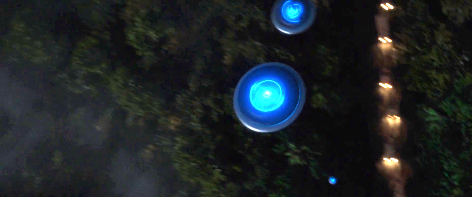
There are two “laser scanners” on the walls. These are the planar blue lights, which scan the user’s body at startup. After that they track body motion, although since the user still has to wear a glove, the scanners presumably just track approximate body movement and orientation without fine detail.

Lastly, the user stands on a concave hexagonal plate covered in embedded white balls, which allows the user to “walk” on the spot.

Closeup of user standing on curved surface of white balls. Disclosure (1994)

Searching for Evidence

The scene we’re most interested in takes place later in the film, the evening before a vital presentation which will determine Tom’s future. He needs to search the company computer files for evidence against Meredith, but discovers that his normal account has been blocked from access.   He knows though that the virtual reality demonstrator is on display in a nearby hotel suite, and also knows about the demonstrator having unlimited access. He sneaks into the hotel suite to use The Corridor. Tom is under a certain amount of time pressure because a couple of company VIPs and their guests are downstairs in the hotel and might return at any time.

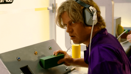
The first step for Tom is to launch the virtual reality system. This is done from an Indy workstation, using the regular Unix command line.

The command line to start the virtual reality system. Disclosure (1994)

Next he moves over to the VR space itself. He puts on the glove but not the headset, presses a key on the keyboard (of the VR computer, not the workstation), and stands still for a moment while he is scanned from top to bottom.

Real world Tom, wearing one VR glove, waits while the scanners map his body. Disclosure (1994)

On the left is the Indy workstation used to start the VR system. In the middle is the external monitor which will, in a moment, show the third person view of the VR user as seen earlier during the product demonstration.

Now that Tom has been scanned into the system, he puts on the headset and enters the virtual space.

The Corridor: Virtual Interface

“The Corridor,” as you’ve no doubt guessed, is a three dimensional file browsing program. It is so named because the user will walk down a corridor in a virtual building, the walls lined with “file cabinets” containing the actual computer files.

Three important aspects of The Corridor were mentioned during the product demonstration earlier in the film. They’ll help structure our tour of this interface, so let’s review them now, as they all come up in our discussion of the interfaces.

  1. There is a voice-activated help system, which will summon a virtual “Angel” assistant.
  2. Since the computers themselves are part of a multi-user network with shared storage, there can be more than one user “inside” The Corridor at a time.
    Users who do not have access to the virtual reality system will appear as wireframe body shapes with a 2D photo where the head should be.
  3. There are no access controls and so the virtual reality user, despite being a guest or demo account, has unlimited access to all the company files. This is spectacularly bad design, but necessary for the plot.

With those bits of system exposition complete, now we can switch to Tom’s own first person view of the virtual reality environment.

Virtual world Tom watches his hands rezzing up, right hand with glove. Disclosure (1994)

There isn’t a real background yet, just abstract streaks. The avatar hands are rezzing up, and note that the right hand wearing the glove has a different appearance to the left. This mimics the real world, so eases the transition for the user.

Overlaid on the virtual reality view is a Digicom label at the bottom and four corner brackets which are never explained, although they do resemble those used in cameras to indicate the preferred viewing area.

To the left is a small axis indicator, the three green lines labeled X, Y, and Z. These show up in many 3D applications because, silly though it sounds, it is easy in a 3D computer environment to lose track of directions or even which way is up. A common fix for the user being unable to see anything is just to turn 180 degrees around.

We then switch to a third person view of Tom’s avatar in the virtual world.

Tom is fully rezzed up, within cloud of visual static. Disclosure (1994)

This is an almost photographic-quality image. To remind the viewers that this is in the virtual world rather than real, the avatar follows the visual convention described in chapter 4 of Make It So for volumetric projections, with scan lines and occasional flickers. An interesting choice is that the avatar also wears a “headset”, but it is translucent so we can see the face.

Now that he’s in the virtual reality, Tom has one more action needed to enter The Corridor. He pushes a big button floating before him in space.

Tom presses one button on a floating control panel. Disclosure (1994)

This seems unnecessary, but we can assume that in the future of this platform, there will be more programs to choose from.

The Corridor rezzes up, the streaks assembling into wireframe components which then slide together as the surfaces are shaded. Tom doesn’t have to wait for the process to complete before he starts walking, which suggests that this is a Level Of Detail (LOD) implementation where parts of the building are not rendered in detail until the user is close enough for it to be worth doing.

Tom enters The Corridor. Nearby floor and walls are fully rendered, the more distant section is not complete. Disclosure (1994)

The architecture is classical, rendered with the slightly artificial-looking computer shading that is common in 3D computer environments because it needs much less computation than trying for full photorealism.

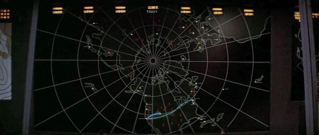
Instead of a corridor this is an entire multistory building. It is large and empty, and as Tom is walking bits of architecture reshape themselves, rather like the interior of Hogwarts in Harry Potter.

Although there are paintings on some of the walls, there aren’t any signs, labels, or even room numbers. Tom has to wander around looking for the files, at one point nearly “falling” off the edge of the floor down an internal air well. Finally he steps into one archway room entrance and file cabinets appear in the walls.

Tom enters a room full of cabinets. Disclosure (1994)

Unlike the classical architecture around him, these cabinets are very modern looking with glowing blue light lines. Tom has found what he is looking for, so now begins to manipulate files rather than browsing.

Virtual Filing Cabinets

The four nearest cabinets according to the titles above are

  1. Communications
  2. Operations
  3. System Control
  4. Research Data.

There are ten file drawers in each. The drawers are unmarked, but labels only appear when the user looks directly at it, so Tom has to move his head to centre each drawer in turn to find the one he wants.

Tom looks at one particular drawer to make the title appear. Disclosure (1994)

The fourth drawer Tom looks at is labeled “Malaysia”. He touches it with the gloved hand and it slides out from the wall.

Tom withdraws his hand as the drawer slides open. Disclosure (1994)

Inside are five “folders” which, again, are opened by touching. The folder slides up, and then three sheets, each looking like a printed document, slide up and fan out.

Axis indicator on left, pointing down. One document sliding up from a folder. Disclosure (1994)

Note the tilted axis indicator at the left. The Y axis, representing a line extending upwards from the top of Tom’s head, is now leaning towards the horizontal because Tom is looking down at the file drawer. In the shot below, both the folder and then the individual documents are moving up so Tom’s gaze is now back to more or less level.

Close up of three “pages” within a virtual document. Disclosure (1994)

At this point the film cuts away from Tom. Rival executive Meredith, having been foiled in her first attempt at discrediting Tom, has decided to cover her tracks by deleting all the incriminating files. Meredith enters her office and logs on to her Indy workstation. She is using a Command Line Interface (CLI) shell, not the standard SGI Unix shell but a custom Digicom program that also has a graphical menu. (Since it isn’t three dimensional it isn’t interesting enough to show here.)

Tom uses the gloved hand to push the sheets one by one to the side after scanning the content.

Tom scrolling through the pages of one folder by swiping with two fingers. Disclosure (1994)

Quick note: This is harder than it looks in virtual reality. In a 2D GUI moving the mouse over an interface element is obvious. In three dimensions the user also has to move their hand forwards or backwards to get their hand (or finger) in the right place, and unless there is some kind of haptic feedback it isn’t obvious to the user that they’ve made contact.

Tom now receives a nasty surprise.

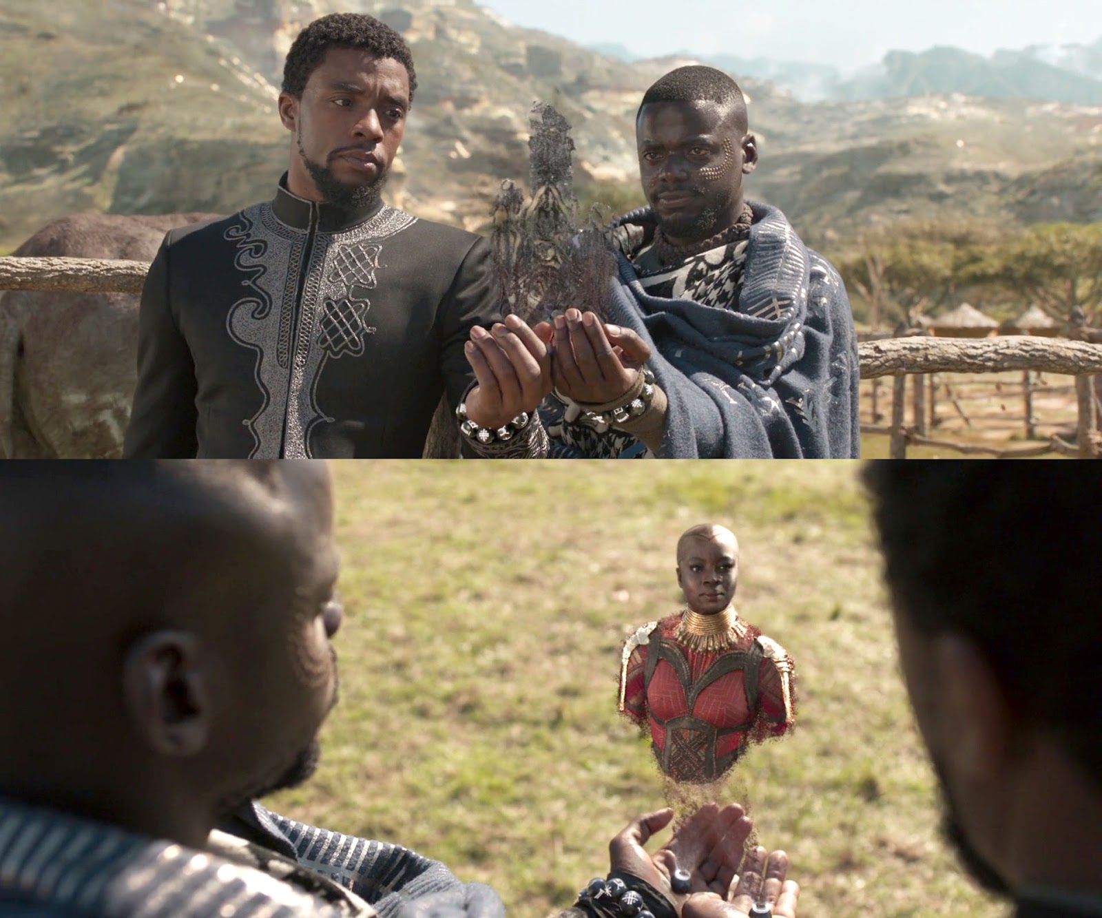
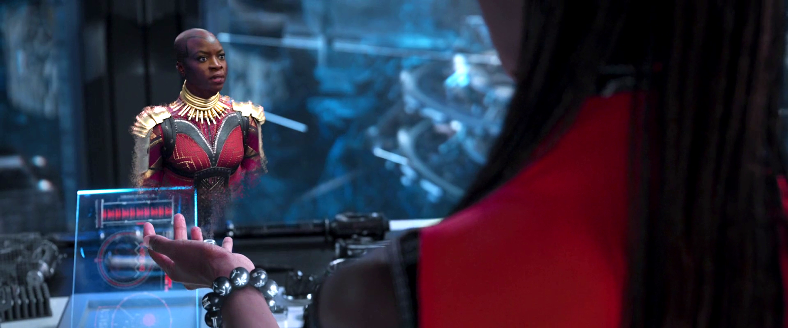
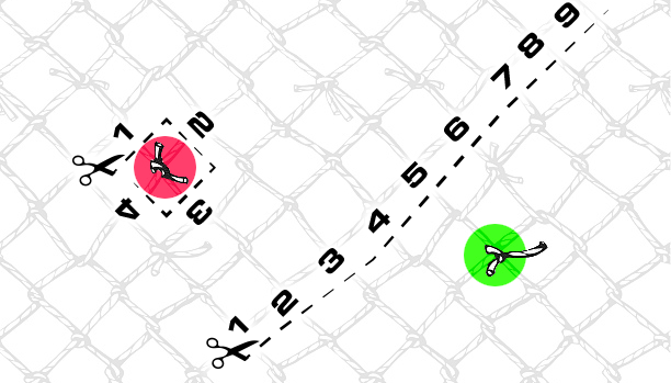
The shot below shows Tom’s photorealistic avatar at the left, standing in front of the open file cabinet. The green shape on the right is the avatar of Meredith who is logged in to a regular workstation. Without the laser scanners and cameras her avatar is a generic wireframe female humanoid with a face photograph stuck on top. This is excellent design, making The Corridor usable across a range of different hardware capabilities.

Tom sees the Meredith avatar appear. Disclosure (1994)

Why does The Corridor system place her avatar here? A multiuser computer system, or even just a networked file server,  obviously has to know who is logged on. Unix systems in general and command line shells also track which directory the user is “in”, the current working directory. Meredith is using her CLI interface to delete files in a particular directory so The Corridor can position her avatar in the corresponding virtual reality location. Or rather, the avatar glides into position rather than suddenly popping into existence: Tom is only surprised because the documents blocked his virtual view.

Quick note: While this is plausible, there are technical complications. Command line users often open more than one shell at a time in different directories. In such a case, what would The Corridor do? Duplicate the wireframe avatar in each location? In the real world we can’t be in more than one place at a time, would doing so contradict the virtual reality metaphor?

There is an asymmetry here in that Tom knows Meredith is “in the system” but not vice versa. Meredith could in theory use CLI commands to find out who else is logged on and whether anyone was running The Corridor, but she would need to actively seek out that information and has no reason to do so. It didn’t occur to Tom either, but he doesn’t need to think about it,  the virtual reality environment conveys more information about the system by default.

We briefly cut away to Meredith confirming her CLI delete command. Tom sees this as the file drawer lid emitting beams of light which rotate down. These beams first erase the floating sheets, then the folders in the drawer. The drawer itself now has a red “DELETED” label and slides back into the wall.

Tom watches Meredith deleting the files in an open drawer. Disclosure (1994)

Tom steps further into the room. The same red labels appear on the other file drawers even though they are currently closed.

Tom watches Meredith deleting other, unopened, drawers. Disclosure (1994)

Talking to an Angel

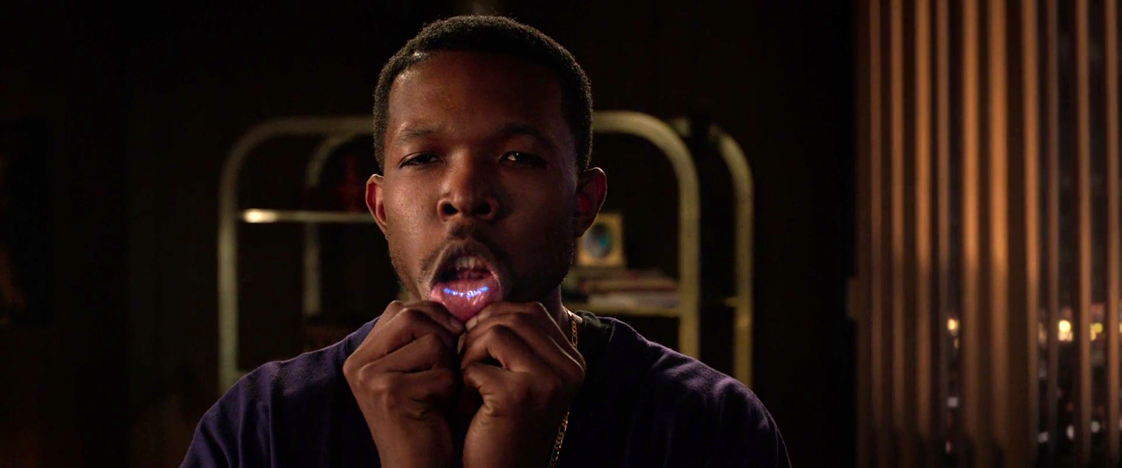
Tom now switches to using the system voice interface, saying “Angel I need help” to bring up the virtual reality assistant. Like everything else we’ve seen in this VR system the “angel” rezzes up from a point cloud, although much more quickly than the architecture: people who need help tend to be more impatient and less interested in pausing to admire special effects.

The voice assistant as it appears within VR. Disclosure (1994)

Just in case the user is now looking in the wrong direction the angel also announces “Help is here” in a very natural sounding voice.

The angel is rendered with white robe, halo, harp, and rapidly beating wings. This is horribly clichéd, but a help system needs to be reassuring in appearance as well as function. An angel appearing as a winged flying serpent or wheel of fire would be more original and authentic (yes, really: ​​Biblically Accurate Angels) but users fleeing in terror would seriously impact the customer satisfaction scores.

Now Tom has a short but interesting conversation with the angel, beginning with a question:

  • Tom
  • Is there any way to stop these files from being deleted?
  • Angel
  • I’m sorry, you are not level five.
  • Tom
  • Angel, you’re supposed to protect the files!
  • Angel
  • Access control is restricted to level five.

Tom has made the mistake, as described in chapter 9 Anthropomorphism of the book, of ascribing more agency to this software program than it actually has. He thinks he is engaged in a conversational interface (chapter 6 Sonic Interfaces) with a fully autonomous system, which should therefore be interested in and care about the wellbeing of the entire system. Which it doesn’t, because this is just a limited-command voice interface to a guide.

Even though this is obviously scripted, rather than a genuine error I think this raises an interesting question for real world interface designers: do users expect that an interface with higher visual quality/fidelity will be more realistic in other aspects as well? If a voice interface assistant has a simple polyhedron with no attempt at photorealism (say, like Bit in Tron) or with zoomorphism (say, like the search bear in Until the End of the World) will users adjust their expectations for speech recognition downwards? I’m not aware of any research that might answer this question. Readers?

Despite Tom’s frustration, the angel has given an excellent answer – for a guide. A very simple help program would have recited the command(s) that could be used to protect files against deletion. Which would have frustrated Tom even more when he tried to use one and got some kind of permission denied error. This program has checked whether the user can actually use commands before responding.

This does contradict the earlier VR demonstration where we were told that the user had unlimited access. I would explain this as being “unlimited read access, not write”, but the presenter didn’t think it worthwhile to go into such detail for the mostly non-technical audience.

Tom is now aware that he is under even more time pressure as the Meredith avatar is still moving around the room. Realising his mistake, he uses the voice interface as a query language.

“Show me all communications with Malaysia.”
“Telephone or video?”
“Video.”

This brings up a more conventional looking GUI window because not everything in virtual reality needs to be three-dimensional. It’s always tempting for a 3D programmer to re-implement everything, but it’s also possible to embed 2D GUI applications into a virtual world.

Tom looks at a conventional 2D display of file icons inside VR. Disclosure (1994)

The window shows a thumbnail icon for each recorded video conference call. This isn’t very helpful, so Tom again decides that a voice query will be much faster than looking at each one in turn.

“Show me, uh, the last transmission involving Meredith.”

There’s a short 2D transition effect swapping the thumbnail icon display for the video call itself, which starts playing at just the right point for plot purposes.

Tom watches a previously recorded video call made by Meredith (right). Disclosure (1994)

While Tom is watching and listening, Meredith is still typing commands. The camera orbits around behind the video conference call window so we can see the Meredith avatar approach, which also shows us that this window is slightly three dimensional, the content floating a short distance in front of the frame. The film then cuts away briefly to show Meredith confirming her “kill all” command. The video conference recordings are deleted, including the one Tom is watching.

Tom is informed that Meredith (seen here in the background as a wireframe avatar) is deleting the video call. Disclosure (1994)

This is also the moment when the downstairs VIPs return to the hotel suite, so the scene ends with Tom managing to sneak out without being detected.

Virtual reality has saved the day for Tom. The documents and video conference calls have been deleted by Meredith, but he knows that they once existed and has a colleague retrieve the files he needs from the backup tapes. (Which is good writing: the majority of companies shown in film and TV never seem to have backups for files, no matter how vital.) Meredith doesn’t know that he knows, so he has the upper hand to expose her plot.

Analysis

How believable is the interface?

I won’t spend much time on the hardware, since our focus is on file browsing in three dimensions. From top to bottom, the virtual reality system starts as believable and becomes less so.

Hardware

The headset and glove look like real VR equipment, believable in 1994 and still so today. Having only one glove is unusual, and makes impossible some of the common gesture actions described in chapter 5 of Make It So, which require both hands.

The “laser scanners” that create the 3D geometry and texture maps for the 3D avatar and perform real time body tracking would more likely be cameras, but that would not sound as cool.

And lastly the walking platform apparently requires our user to stand on large marbles or ball bearings and stay balanced while wearing a headset. Uh…maybe…no. Apologetics fails me. To me it looks like it would be uncomfortable to walk on, almost like deterrent paving.

Software

The Corridor, unlike the 3D file browser used in Jurassic Park, is a special effect created for the film. It was a mostly-plausible, near future system in 1994, except for the photorealistic avatar. Usually this site doesn’t discuss historical context (the  “new criticism” stance), but I think in this case it helps to explain how this interface would have appeared to audiences almost two decades ago.

I’ll start with the 3D graphics of the virtual building. My initial impression was that The Corridor could have been created as an interactive program in 1994, but that was my memory compressing the decade. During the 1990s 3D computer graphics, both interactive and CGI, improved at a phenomenal rate. The virtual building would not have been interactive in 1994, was possible on the most powerful systems six years later in 2000, and looks rather old-fashioned compared to what the game consoles of the 21st C can achieve.

For the voice interface I made the opposite mistake. Voice interfaces on phones and home computing appliances have become common in the second decade of the 21st C, but in reality are much older. Apple Macintosh computers in 1994 had text-to-speech synthesis with natural sounding voices and limited vocabulary voice command recognition. (And without needing an Internet connection!) So the voice interface in the scene is believable.

The multi-user aspects of The Corridor were possible in 1994. The wireframe avatars for users not in virtual reality are unflattering or perhaps creepy, but not technically difficult. As a first iteration of a prototype system it’s a good attempt to span a range of hardware capabilities.

The virtual reality avatar, though, is not believable for the 1990s and would be difficult today. Photographs of the body, made during the startup scan, could be used as a texture map for the VR avatar. But live video of the face would be much more difficult, especially when the face is partly obscured by a headset.

How well does the interface inform the narrative of the story?

The virtual reality system in itself is useful to the overall narrative because it makes the Digicom company seem high tech. Even in 1994 CD-ROM drives weren’t very interesting.

The Corridor is essential to the tension of the scene where Tom uses it to find the files, because otherwise the scene would be much shorter and really boring. If we ignore the virtual reality these are the interface actions:

  • Tom reads an email.
  • Meredith deletes the folder containing those emails.
  • Tom finds a folder full of recorded video calls.
  • Tom watches one recorded video call.
  • Meredith deletes the folder containing the video calls.

Imagine how this would have looked if both were using a conventional 2D GUI, such as the Macintosh Finder or MS Windows Explorer. Double click, press and drag, double click…done.

The Corridor slows down Tom’s actions and makes them far more visible and understandable. Thanks to the virtual reality avatar we don’t have to watch an actor push a mouse around. We see him moving and swiping, be surprised and react; and the voice interface adds extra emotion and some useful exposition. It also helps with the plot, giving Tom awareness of what Meredith is doing without having to actively spy on her, or look at some kind of logs or recordings later on.

Meredith, though, can’t use the VR system because then she’d be aware of Tom as well. Using a conventional workstation visually distinguishes and separates Meredith from Tom in the scene.

So overall, though the “action” is pretty mundane, it’s crucial to the plot, and the VR interface helps make this interesting and more engaging.

How well does the interface equip the character to achieve their goals?

As described in the film itself, The Corridor is a prototype for demonstrating virtual reality. As a file browser it’s awful, but since Tom has lost all his normal privileges this is the only system available, and he does manage to eventually find the files he needs.

At the start of the scene, Tom spends quite some time wandering around a vast multi-storey building without a map, room numbers, or even coordinates overlaid on his virtual view. Which seems rather pointless because all the files are in one room anyway. As previously discussed for Johnny Mnemonic, walking or flying everywhere in your file system seems like a good idea at first, but often becomes tedious over time. Many actual and some fictional 3D worlds give users the ability to teleport directly to any desired location.

Then the file drawers in each cabinet have no labels either, so Tom has to look carefully at each one in turn. There is so much more the interface could be doing to help him with his task, and even help the users of the VR demo learn and explore its technology as well.

Contrast this with Meredith, who uses her command line interface and 2D GUI to go through files like a chainsaw.

Tom becomes much more efficient with the voice interface. Which is just as well, because if he hadn’t, Meredith would have deleted the video conference recordings while he was still staring at virtual filing cabinets. However neither the voice interface nor the corresponding file display need three dimensional graphics.

There is hope for version 2.0 of The Corridor, even restricting ourselves to 1994 capabilities. The first and most obvious is to copy 2D GUI file browsers, or the 3D file browser from Jurassic Park, and show the corresponding text name next to each graphical file or folder object. The voice interface is so good that it should be turned on by default without requiring the angel. And finally add some kind of map overlay with a you are here moving dot, like the maps that players in 3D games such as Doom could display with a keystroke.

Film making challenge: VR on screen

Virtual reality (or augmented reality systems such as Hololens) provide a better viewing experience for 3D graphics by creating the illusion of real three dimensional space rather than a 2D monitor. But it is always a first person view and unlike conventional 2D monitors nobody else can usually see what the VR user is seeing without a deliberate mirroring/debugging display. This is an important difference from other advanced or speculative technologies that film makers might choose to include. Showing a character wielding a laser pistol instead of a revolver or driving a hover car instead of a wheeled car hardly changes how to stage a scene, but VR does.

So, how can we show virtual reality in film?

There’s the first-person view corresponding to what the virtual reality user is seeing themselves. (Well, half of what they see since it’s not stereographic, but it’s cinema VR, so close enough.) This is like watching a screencast of someone else playing a first person computer game, the original active experience of the user becoming passive viewing by the audience. Most people can imagine themselves in the driving seat of a car and thus make sense of the turns and changes of speed in a first person car chase, but the film audience probably won’t be familiar with the VR system depicted and will therefore have trouble understanding what is happening. There’s also the problem that viewing someone else’s first-person view, shifting and changing in response to their movements rather than your own, can make people disoriented or nauseated.

A third-person view is better for showing the audience the character and the context in which they act. But not the diegetic real-world third-person view, which would be the character wearing a geeky headset and poking at invisible objects. As seen in Disclosure, the third person view should be within the virtual reality.

But in doing that, now there is a new problem: the avatar in virtual reality representing the real character. If the avatar is too simple the audience may not identify it with the real world character and it will be difficult to show body language and emotion. More realistic CGI avatars are increasingly expensive and risk falling into the Uncanny Valley. Since these films are science fiction rather than factual, the easy solution is to declare that virtual reality has achieved the goal of being entirely photorealistic and just film real actors and sets. Adding the occasional ripple or blur to the real world footage to remind the audience that it’s meant to be virtual reality, again as seen in Disclosure, is relatively cheap and quick.
So, solving all these problems results in the cinematic trope we can call Extradiegetic Avatars, which are third-person, highly-lifelike “renderings” of characters, with a telltale Hologram Projection Imperfection for audience readability, that may or may not be possible within the world of the film itself.

Jurassic Park (1993)

Our first example is a single scene from Jurassic Park, set entirely in the control room of Isla Nublar. Apologies in advance for repeating some material already covered by the book and website, but it is necessary to focus on the aspects that are of interest to this study.

Drs. Sattler and Grant enter the control room along with Lex and Tim. Jurassic Park (1993)

The eponymous Jurassic Park is heavily automated, with the entire park designed to be controlled from the computer systems in this room. Villainous computer system designer Nedry took advantage of this to shut down systems across the entire park, releasing all the dinosaurs, to cover his industrial espionage. Most of the park staff had already been evacuated due to a storm warning, and the small team of core technical staff who remained have, by this point in the film, all been killed by dinosaurs. (Including Nedry—who, had he been given time for extrospection, would probably have rethought those aspects of his plan concerning the release of carnivorous dinosaurs.)

Four of the survivors have gathered in the control room after managing to restore the power, but must still restart the various computer systems. They have discovered that the computer control extends down to door locks, which are consequently not working and have suddenly become the number one priority due to the velociraptors trying to break in.

Our interface user is Lex, a teenage visitor, being given an advance tour of the park before its official opening. The others are Dr Grant, paleontologist; Dr Sattler, paleobotanist; and Lex’s younger brother Tim, dinosaur enthusiast. As a self -described computer hacker Lex is easily the best person qualified to work with the computers as everyone else in the room only has expertise in subjects more than sixty-six million years old.

Lex sitting before the computer and looking at the /usr directory in the 3D file browser. Jurassic Park (1993)

The computers were all rebooted when the power came back on but the programs that control Jurassic Park did not automatically restart. Dr. Sattler spent a moment in front of the computer with Lex, but all she seemed to do is deactivate the screen saver. It’s up to Lex to find and start whatever program runs the security systems for the control room.

Backworlding aside: Unix-savvy viewers might be wondering why these control programs, since they are critical to the park functionality, don’t automatically start when the computer is rebooted. I hazard that perhaps normally they would, but Nedry turned this off to ensure that no-one could undo his sabotage before he got back.
The file system of the computer is rendered as a tree, with directory names (/usr in the image above) shown as text labels, the contents of each directory shown as LEGO-like blocks, and lines linking directories to subdirectories.

The park directory, and two levels of subdirectories in the distance. Jurassic Park (1993)

Most of the information is drawn on a flat two-dimensional plane. The third dimension is used to present information about the number of, and perhaps sizes, of the files in each directory. Note in the image above that the different directories below the foremost park block have different sized heights and areas.

Rendering this plane in perspective, rather than as a conventional 2D window, means that areas closest to the viewpoint can be seen in detail, but there is still some information given about the directories further away. In the image above, the subdirectory of park on the right is clearly smaller than the others, even though we can’t make out the actual name, and also has a number of larger subdirectories.

Up close we can see that each file can have its own icon on top, presumably representing the type of file.

Individual blue files within one directory, and subdirectories beyond. Jurassic Park (1993)

The viewpoint stays at a constant height above the ground plane. Moving around is done with the mouse, using it as a game-style directional controller when the mouse button is held down rather than as an absolute pointing device. It is almost “walking” rather than “flying” but there is a slight banking effect when Lex changes direction.

Closeup of Lex’s hand on the mouse, pressing the left mouse button. Jurassic Park (1993)

Here Lex has browsed through the hierarchy and discovered a promising file. She selects it, but we don’t see how, and a spotlight or sunbeam indicates the selection.

The “Visitors Center” icon highlighted by a beam from above. Jurassic Park (1993)

This is the last of the 3D interactions. The 3D file browser is just a file browser, not an entire operating system or virtual environment, so opening a file or program will open a new interface.

Tagged: 3D, 3D rendering, blue, cathode ray tube, color, comparison, constant movement, control room, cyan, desk, direct manipulation, disambiguation, finger press, flight control, flying, green, icon, interaction design, light, lighting, map, missing information, motion cue, navigating, pink, point to select, projection rays, selection, sense making, stress, up is more

When Lex runs this program (again, we don’t see how) it is in fact the security system controller for the visitor centre, including the control room. This has a conventional 2D GUI interface and she immediately switches everything on.

The 2D GUI. Security window in green on left, boot progress screen in blue on right. Jurassic Park (1993)

Success! Well, it would be if the control room did not also have very large windows which are apparently not velociraptor-proof. But the subsequent events, and interfaces, are not our concern.

Analysis

This isn’t a report card, since those are given to complete films or properties, not individual interfaces. But we can ask the same questions.

How believable is the interface?

In this case, very believable. The 3D file browser seen in the film is a real program that was shipped with the computers used in the film. It was created by the manufacturer Silicon Graphics as a demonstration of 3D capabilities, not as an effect just for this film.

How well does the interface inform the narrative of the story?

It supports the narrative, but isn’t essential — there’s plenty of drama and tension due to the velociraptors at the door, and the scene would probably still work if the camera only showed Lex, not the interface. The major contribution of using the 3D file browser is to keep the technology of Jurassic Park seemingly a little more advanced than normal for the time. Apart from dinosaurs, both the book and the film try not to introduce obviously science fictional elements. A 2D file browser (they did exist for Unix computers at the time, including the SGI computers shown in the film) would have been recognisable but boring. The 3D file browser looks advanced while still being understandable.

How well does the interface equip the characters to achieve their goals?

The most interesting question, to which the answer is that it works very well. One problem, visible in the film, is that because the labels are rendered on the 2D ground plane, users have to navigate close to a file or a folder to read its name. Rotating the names to vertical and to always face the user (“billboarding”) would have made them recognisable from further away.

Both at the time of the film and today some computer people will argue that Lex can’t be a real computer hacker because she doesn’t use the command line interface. Graphical user interfaces are considered demeaning. I disagree.
Lex is in a situation familiar to many system administrators, having to restore computer functionality after an unexpected power loss. (Although the velociraptors at the door are a little more hostile than your typical user demanding to know when the system will be back up.) Earlier in the film we saw Ray Arnold, one of the technical staff, trying to restore the system and he was using the command line interface.

Ray Arnold sitting before SGI computer, typing into blue command line window. Jurassic Park (1993)

So why does Lex use the 3D file browser? Because, unlike Ray Arnold, she doesn’t know which programs to run. Rebooting the computers is not enough. The various programs that control Jurassic Park are all custom pieces of software developed by Nedry, and nothing we’ve seen indicates that he would have been considerate enough to write a user guide or reference manual or even descriptive file names. Everyone who might have known which programs do what is either dead or off the island.

Lex needs an interface that lets her quickly search through hundreds or even thousands of files without being able to specify precise search criteria. For a problem involving recognition, “you’ll know it when you see it”, a graphical user interface is superior to a command line.

Film making challenge: diegetic computers

Writing for SciFiInterfaces can be quite educational. Chris asked me to write about the “diegetic” aspects of rendering 3D graphics in film, and I agreed to do so without actually knowing what that meant. Fortunately for me it isn’t complicated. Diegetic images or sounds belong to what we see in the scene itself, for instance characters and their dialog or hearing the music a violinist who is on-screen is playing; while non-diegetic are those that are clearly artefacts of watching a film, such as subtitles, voice overs, or the creepy violin music that is playing as a character explores a haunted house—we don’t imagine there is some violinist in there with them.

So, SciFiinterfaces.com focuses on the diegetic computer interfaces used by characters within the film or TV show itself. We’ve just been discussing the 3D file browser in Jurassic Park. Which, since it was a real interactive program, just meant pointing a camera at the actor and the computer screen, right?

It’s not that easy. Our human eyes and brain do an enormous amount of interpolation and interpretation of what we actually see. There’s the persistence of vision effect that allows us to watch a film in a cinema and see it as fluid motion, even though for a significant percentage of the time we’re actually looking at a blank wall while the projector shutter is closed. Cameras, whether film or digital, take discrete snapshots and are not so easily fooled, leading to various odd effects. One example that’s been known since the early days of filmmaking is that at certain speeds spoked wheels can appear to be rotating far more slowly than expected, or even to be rotating backwards.

Jurassic Park was made in the days when television sets and computer monitors used Cathode Ray Tube (CRT) technology. A CRT cannot display an entire frame at once, instead starting at the top left and drawing pixels line by line (“scan lines”) to the bottom. Just as the top line of pixels fades out, the new frame begins. At 50 or 60 frames a second we see only continuous moving images thanks to our persistence of vision; but a camera, usually running at 24 frames a second, will capture a dark line moving slowly down the screen and the images themselves will flicker. This was a common sight in TV news reports and sometimes in films of the time, when computer monitors were in the background. Here’s a shot from the 1995 film The Net where the new frames have been half-drawn:

View from above of computer expo. The two stacked monitors center right are not genlocked, showing crawl lines. The Net (1995)

One technique that avoids this is to film the computer interface in isolation and composite the graphics into the footage afterwards. This is very easy in the 21st century with all digital processing but Jurassic Park was made in the days of optical compositing, which is more expensive and limits the number of images that can be combined before losing picture quality.

So to shoot CRT monitors with their graphics live, the camera shutter opening must be synchronised to the start of each frame. In TV studios and film sets this is done with genlocking, connecting all the monitors and cameras via cables to a single electronic timing signal. This was apparently the technique used in Jurassic Park, with impressive results. In one control room scene the camera pans across at least eight different monitors, and none of them are flickering.

Sci-fi Spacesuits: Biological needs

Spacesuits must support the biological functioning of the astronaut. There are probably damned fine psychological reasons to not show astronauts their own biometric data while on stressful extravehicular missions, but there is the issue of comfort. Even if temperature, pressure, humidity, and oxygen levels are kept within safe ranges by automatic features of the suit, there is still a need for comfort and control inside of that range. If the suit is to be warn a long time, there must be some accommodation for food, water, urination, and defecation. Additionally, the medical and psychological status of the wearer should be monitored to warn of stress states and emergencies.

Unfortunately, the survey doesn’t reveal any interfaces being used to control temperature, pressure, or oxygen levels. There are some for low oxygen level warnings and testing conditions outside the suit, but these are more outputs than interfaces where interactions take place.

There are also no nods to toilet necessities, though in fairness Hollywood eschews this topic a lot.

The one example of sustenance seen in the survey appears in Sunshine, we see Captain Kaneda take a sip from his drinking tube while performing a dangerous repair of the solar shields. This is the only food or drink seen in the survey, and it is a simple mechanical interface, held in place by material strength in such a way that he needs only to tilt his head to take a drink.

Similarly, in Sunshine, when Capa and Kaneda perform EVA to repair broken solar shields, Cassie tells Capa to relax because he is using up too much oxygen. We see a brief view of her bank of screens that include his biometrics.

Remote monitoring of people in spacesuits is common enough to be a trope, but has been discussed already in the Medical chapter in Make It So, for more on biometrics in sci-fi.

Crowe’s medical monitor in Aliens (1986).

There are some non-interface biological signals for observers. In the movie Alien, as the landing party investigates the xenomorph eggs, we can see that the suit outgases something like steam—slower than exhalations, but regular. Though not presented as such, the suit certainly confirms for any onlooker that the wearer is breathing and the suit functioning.

Given that sci-fi technology glows, it is no surprise to see that lots and lots of spacesuits have glowing bits on the exterior. Though nothing yet in the survey tells us what these lights might be for, it stands to reason that one purpose might be as a simple and immediate line-of-sight status indicator. When things are glowing steadily, it means the life support functions are working smoothly. A blinking red alert on the surface of a spacesuit could draw attention to the individual with the problem, and make finding them easier.

Emergency deployment

One nifty thing that sci-fi can do (but we can’t yet in the real world) is deploy biology-protecting tech at the touch of a button. We see this in the Marvel Cinematic Universe with Starlord’s helmet.

If such tech was available, you’d imagine that it would have some smart sensors to know when it must automatically deploy (sudden loss of oxygen or dangerous impurities in the air), but we don’t see it. But given this speculative tech, one can imagine it working for a whole spacesuit and not just a helmet. It might speed up scenes like this.

What do we see in the real world?

Are there real-world controls that sci-fi is missing? Let’s turn to NASA’s space suits to compare.

The Primary Life-Support System (PLSS) is the complex spacesuit subsystem that provides the life support to the astronaut, and biomedical telemetry back to control. Its main components are the closed-loop oxygen-ventilation system for cycling and recycling oxygen, the moisture (sweat and breath) removal system, and the feedwater system for cooling.

The only “biology” controls that the spacewalker has for these systems are a few on the Display and Control Module (DCM) on the front of the suit. They are the cooling control valve, the oxygen actuator slider, and the fan switch. Only the first is explicitly to control comfort. Other systems, such as pressure, are designed to maintain ideal conditions automatically. Other controls are used for contingency systems for when the automatic systems fail.

Hey, isn’t the text on this thing backwards? Yes, because astronauts can’t look down from inside their helmets, and must view these controls via a wrist mirror. More on this later.

The suit is insulated thoroughly enough that the astronaut’s own body heats the interior, even in complete shade. Because the astronaut’s body constantly adds heat, the suit must be cooled. To do this, the suit cycles water through a Liquid Cooling and Ventilation Garment, which has a fine network of tubes held closely to the astronaut’s skin. Water flows through these tubes and past a sublimator that cools the water with exposure to space. The astronaut can increase or decrease the speed of this flow and thereby the amount to which his body is cooled, by the cooling control valve, a recessed radial valve with fixed positions between 0 (the hottest) and 10 (the coolest), located on the front of the Display Control Module.

The spacewalker does not have EVA access to her biometric data. Sensors measure oxygen consumption and electrocardiograph data and broadcast it to the Mission Control surgeon, who monitors it on her behalf. So whatever the reason is, if it’s good enough for NASA, it’s good enough for the movies.


Back to sci-fi

So, we do see temperature and pressure controls on suits in the real world, which underscores their absence in sci-fi. But, if there hasn’t been any narrative or plot reason for such things to appear in a story, we should not expect them.

Vibranium-based Cape Shields

Editor’s Note: Today’s guest post is penned by Lonny Brooks. Be sure and read his introduction post if you missed it when it was published.

The Black Panther film represents one of the most ubiquitous statements of Afrofuturist fashion and fashionable digital wearables to celebrate the Africana and Black imagination. The wearable criteria under Director Ryan Cooglar’s lead and that of the formidable talent of costume designer Ruth E. Carter took into account African tribal symbolism. The adinkra symbol, for “cooperation,” emblazoned across W’Kabi’s (played by Daniel Kaluuya) blanket embodies the role of the Border tribe where they lived in a small village tucked into the mountainous borderlands of Wakanda, disguised as farmers and hunters.

Beautiful interaction

Chris’ blog looks at the interactions with speculative technology, and here the interactions are marvelously subtle. They do not have buttons or levers, which might give away their true nature. To activate them, a user does what would come naturally, which is to hold the fabric before them, like a shield. (There might be a mental command as well, but of course we can’t perceive that.) The shield-like gesture activates the shield technology. It’s quick. It fits the material of the technology. You barely even have to be trained to use it. We never see the use case for when a wearer is incapacitated and can’t lift the cape into position, but there’s enough evidence in the rest of the film to expect it might act like Dr. Strange’s cape and activate its shield automatically.

But, for me, the Capes are more powerful not as models of interaction, but for what they symbolize.

The Dual Role of the Capes

The role of the Border Tribe is to create the illusion of agrarian ruggedness as a deception for outsiders that only tells of a placid, developing nation rather than the secret technologically advanced splendor of Wakanda’s lands. The Border Tribe is the keeper of Wakanda’s cloaking technology that hides the vast utopian advancement of Wakandan advantage. 

The Border Tribe’s role is built into the fabric of their illustrious and enviably fashionable capes. The adinkra symbol of cooperation embedded into the cape reveals, by the final scenes of the Black Panther film, how the Border Tribe defenders wield their capes into a force field wall of energy to repel enemies. 

Ironically we only see them at their most effective when Wakanda is undergoing a civil war between those loyal to Kilmonger who is determined to avenge his father’s murder and his own erasure from Wakandan collective memory, and those supporting King T’Challa. Whereas each Black Panther King has selected to keep Wakanda’s presence hidden literally under the cooperative shields of the Border Tribe, Kilmonger—an Oakland native and a potential heir to Wakandan monarchy—was orphaned and left in the U.S. 

If this sounds familiar, consider the film as a grand allusion to the millions of Africans kidnapped and ripped from their tribal lineages and taken across the Atlantic as slaves. Their cultural heritage was purposefully erased, languages and tribal customs, memories lost to the colonial thirst for their unpaid and forced labor. 

Kilmonger represents the Black Diaspora, former descendants of African homelands similarly deprived of their birthrights. Kilmonger wants the Black Diaspora to rise up in global rebellion with the assistance of Wakandan technical superiority. In opposition, King T’Challa aspires for a less vengeful solution. He wantsWakanda to come out to the world, and lead by example. We can empathize with both. T’Challa’s plan is fueled by virtue. Kilmonger’s is fueled by justice—redeploy these shields to protect Black people against the onslaught of ongoing police and state violence. 

W. E. B. Du Bois in 1918
(image in the public domain)

Double Consciousness and the Big Metaphor

The cape shields powered by the precious secret meteorite called Vibranium embodies what the scholar W.E.B. Dubois referred to as a double consciousness, where members of the Black Diaspora inhabit two selves.

  1. Their own identity as individuals
  2. The external perception of themselves as a members of an oppressed people incessantly facing potential erasure and brutality.

The cape shields and their cloaking technology cover the secret utopic algorithms that power Wakanda, while playing on the petty stereotypes of African nations as less-advanced collectives. 

The final battle scene symbolizes this grand debate—between Kilmonger’s claims on Wakanda and assertion of Africana power, and King T’Challa’s more cooperative and, indeed, compliant approach working with the CIA. Recall that in its subterfuge and cloaking tactics, the CIA has undermined and toppled numerous freely-elected African and Latin American governments for decades. In this final showdown, we see W’Kabi’s cloaked soldiers run down the hill towards King T’Challa and stop to raise their shields cooperatively into defensive formation to prevent King T’Challa’s advance. King T’Challa jumps over the shields and the force of his movement causes the soldier’s shields to bounce away while simultaneously revealing their potent energy. 

The flowing blue capes of the Border Tribe are deceptively enticing, while holding the key to Wakanda’s survival as metaphors for cloaking their entire civilization from being attacked, plundered, and erased. Wakanda and these capes represent an alternative history: What if African peoples had not experienced colonization or undergone the brutal Middle Passage to the Americas? What if the prosperous Black Greenwood neighborhood of Tulsa, Oklahoma had developed cape shield technology to defend themselves against a genocidal white mob in 1921? Or if the Black Panther Party had harnessed the power of invisible cloaking technology as part of their black beret ensemble? 

Gallery Images: World Building with the Afrofuturist Podcast—Afro-Rithms From The Future game, Neuehouse, Hollywood, May 22, 2019 [Co-Game Designers, Eli Kosminsky and Lonny Avi Brooks, Afro-Rithms Librarian; Co-Game Designer and Seer Ahmed Best]

In the forecasting imagination game, Afro-Rithms From The Future, and the game event we played in 2019 in Los Angeles based on the future universe we created, we generated the question:

What would be an article of fashion that would give you more Black Feminist leadership and more social justice?

One participant responded with: “I was thinking of the notion of the invisibility cloak but also to have it be reversed. It could make you invisible and also more visible, amplifying what you normally” have as strengths and recognizing their value. Or as another player, states “what about a bodysuit that protects you from any kind of harm” or as the game facilitator adds “how about a bodysuit that repels emotional damage?!” In our final analysis, the cape shields have steadfastly protected Wakanda against the emotional trauma of colonization and partial erasure.

In this way the cape shields guard against emotional damage as well. Imagine how it might feel to wear a fashionable cloak that displays images of your ancestral, ethnic, and gender memories reminding you of your inherent lovability as multi-dimensional human being—and that can technologically protect you and those you love as well.


Black Lives Matter

Chris: Each post in the Black Panther review is followed by actions that support black lives. 

To thank Lonny for his guest post, I offered to donate money in his name to the charity of his choice. He has selected Museum of Children’s Arts in Oakland. The mission of MOCHA is to ensure that the arts are a fundamental part of our community and to create opportunities for all children to experience the arts to develop creativity, promote a sense of belonging, and to realize their potential. 

And, since it’s important to show the receipts, the receipt:

Thank you, Lonny, for helping to celebrate Black Panther and your continued excellent work in speculative futures and Afrofuturism. Wakanda forever!

Panther Glove Guns

As I rule I don’t review lethal weapons on scifiinterfaces.com. The Panther Glove Guns appear to be remote-bludgeoning beams, so this kind of sneaks by. Also, I’ll confess in advance that there’s not a lot that affords critique.

We first see the glove guns in the 3D printer output with the kimoyo beads for Agent Ross and the Dora Milaje outfit for Nakia. They are thick weapons that fit over Shuri’s hands and wrists. I imagine they would be very useful to block blades and even disarm an opponent in melee combat, but we don’t see them in use this way.

The next time we see them, Shuri is activating them. (Though we don’t see how) The panther heads thrust forward, their mouths open wide, and the “neck” glows a hot blue. When the door before her opens, she immediately raises them at the guards (who are loyal to usurper Killmonger) and fires.

A light-blue beam shoots out of the mouths of the weapons, knocking the guards off the platform. Interestingly, one guard is lifted up and thrown to his 4-o-clock. The other is lifted up and thrown to his 7-o-clock. It’s not clear how Shuri instructs the weapons to have different and particular knock-down effects. But we’ve seen all over Black Panther that brain-computer interfaces (BCI) are a thing, so it’s diegetically possible she’s simply imagining where she wants them to be thrown, and then pulling a trigger or clenching her fist around a rod or just thinking “BAM!” to activate. The force-bolt strikes them right where they need to so that, like a billiard ball, they get knocked in the desired direction. As with all(?) brain-computer interfaces, there is not an interaction to critique.

After she dispatches the two guards, still wearing the gloves, she throws a control bead onto the Talon. The scene is fast and blurry, but it’s unclear how she holds and releases the bead from the glove. Was it in the panther’s jaw the whole time? Could be another BCI, of course. She just thought about where she wanted it, flung her arm, and let the AI decide when to release it for perfect targeting. The Talon is large and she doesn’t seem to need a great deal of accuracy with the bead, but for more precise operations, the AI targeting would make more sense than, say, letting the panther heads disintegrate on command so she would have freedom of her hands. 

Later, after Killmonger dispatches the Dora Milaje, Shuri and Nakia confront him by themselves. Nakia gets in a few good hits, but is thrown from the walkway. Shuri throws some more bolts his way though he doesn’t appear to even notice. I note that the panther gloves would be very difficult to aim since there’s no continuous beam providing feedback, and she doesn’t have a gun sight to help her. So, again—and I’m sorry because it feels like cheating—I have to fall back to an AI assist here. Otherwise it doesn’t make sense. 

Then Shuri switches from one blast at a time to a continuous beam. It seems to be working, as Killmonger kneels from the onslaught.

This is working! How can I eff it up?

But then for some reason she—with a projectile weapon that is actively subduing the enemy and keeping her safe at a distance—decides to close ranks, allowing Killmonger to knock the glove guns with a spear tip, thereby free himself, and destroy the gloves with a clutch of his Panther claws. I mean, I get she was furious, but I expected better tactics from the chief nerd of Wakanda. Thereafter, they spark when she tries to fire them. So ends this print of the Panther Guns.

As with all combat gear, it looks cool for it to glow, but we don’t want coolness to help an enemy target the weapon. So if it was possible to suppress the glow, that would be advisable. It might be glowing just for the intimidation factor, but for a projectile weapon that seems strange.

The panther head shapes remind an opponent that she is royalty (note no other Wakandan combatants have ranged weapons) and fighting in Bast’s name, which I suppose if you’re in the business of theocratic warfare is fine, I guess.

It’s worked so well in the past. More on this aspect later.

So, if you buy the brain-computer interface interpretation, AI targeting assist, and theocratic design, these are fine, with the cinegenic exception of the attention-drawing glow.


Black History Matters

Each post in the Black Panther review is followed by actions that you can take to support black lives.

When The Watchmen series opened with the Tulsa Race Massacre, many people were shocked to learn that this event was not fiction, reminding us just how much of black history is erased and whitewashed for the comfort of white supremacy (and fuck that). Today marks the beginning of Black History Month, and it’s a good opportunity to look back and (re)learn of the heroic figures and stories of both terror and triumph that fill black struggles to have their citizenship and lives fully recognized.

Library of Congress, American National Red Cross Photograph Collection

There are lots of events across the month. The African American History Month site is a collaboration of several government organizations (and it feels so much safer to share such a thing now that the explicitly racist administration is out of office and facing a second impeachment):

  • The Library of Congress
  • National Archives and Records Administration
  • National Endowment for the Humanities
  • National Gallery of Art
  • National Park Service
  • Smithsonian Institution and United States Holocaust Memorial Museum

The site, https://www.africanamericanhistorymonth.gov/, has a number of resources, including images, video, and calendar of events for you.

Today we can take a moment to remember and honor the Greensboro Four.

On this day, February 1, 1960: Through careful planning and enlisting the help of a local white businessman named Ralph Johns, four Black college students—Ezell A. Blair, Jr., Franklin E. McCain, Joseph A. McNeil, David L. Richmond—sat down at a segregated lunch counter at Woolworth’s in Greensboro, North Carolina, and politely asked for service. Their request was refused. When asked to leave, they remained in their seats.

Police arrived on the scene, but were unable to take action due to the lack of provocation. By that time, Ralph Johns had already alerted the local media, who had arrived in full force to cover the events on television. The Greensboro Four stayed put until the store closed, then returned the next day with more students from local colleges.

Their passive resistance and peaceful sit-down demand helped ignite a youth-led movement to challenge racial inequality throughout the South.

A last bit of amazing news to share today is that Black Lives Matter has been nominated for the Nobel Peace Prize! The movement was co-founded by Alicia Garza, Patrisse Cullors and Opal Tometi in response to the acquittal of Trayvon Martin’s murderer, got a major boost with the outrage following and has grown to a global movement working to improve the lives of the entire black diaspora. May it win!

Kimoyo Beads

One of the ubiquitous technologies seen in Black Panther is the kimoyo bead. They’re liberally scattered all over the movie like tasty, high-tech croutons. These marble-sized beads are made of vibranium and are more core to Wakandan’s lives than cell phones are to ours. Let’s review the 6 uses seen in the film.

1. Contact-EMP bombs

We first see kimoyo beads when Okoye equips T’Challa with a handful to drop on the kidnapper caravan in the Sambisa forest. As he leaps from the Royal Talon, he flings these, which flatten as they fall, and guide themselves to land on the hoods of the caravan. There they emit an electromagnetic pulse that stops the vehicles in their tracks. It is a nice interaction that does not require much precision or attention from T’Challa.

2. Comms

Wakandans wear bracelets made of 11 kimoyo beads around their wrists. If they pull the comms bead and place it in the palm, it can project very lifelike volumetric displays as part of realtime communication. It is unclear why the bead can’t just stay on the wrist and project at an angle to be facing the user’s line of sight, as it does when Okoye presents to tribal leaders (below.)

We see a fascinating interaction when T’Challa and W’Kabi receive a call at the same time, and put their bracelets together to create a conference call with Okoye.

The scaled-down version of the projection introduces many of the gaze matching problems identified in the book. Similarly to those scenes in Star Wars, we don’t see the conversation from the other side. Is Okoye looking up at giant heads of T’Challa and W’Kabi? Unlikely. Wakanda is advanced enough to manage gaze correction in such displays.

Let me take a moment to appreciate how clever this interaction is from a movie maker’s perspective. It’s easy to imagine each of them holding their own bead separately and talking to individual instances of Okoye’s projection. (Imagine being in a room with a friend and both of you are on a group call with a third party.) But in the scene, she turns to address both T’Challa and W’Kabi. Since the system is doing body-and-face gaze correction, the two VP displays would look slightly different, possibly confusing the audience into thinking these were two separate people on the call. Wakandans would be used to understanding these nuances, but us poor non-Wakandan’s are not.

Identical Okoyes ensures (at least) one of the displays is looking at something weird. It’s confusing.
This is confusing.
Having gaze correction so both Okoyes are looking at T’Challa when she’s talking to him makes it look like there are two different characters. It’s confusing.
This is also confusing.

The shared-display interaction helps bypass these problems and make the technology immediately understandable and seamless.

Later Shuri also speaks with Okoye via communication bead. During this conversation, Shuri removes another bead, and tosses it into a display to show an image and dossier of Killmonger. Given that she’s in her lab, it’s unclear why this gesture is necessary rather than, say, just looking toward a display and thinking, “Show me,” letting the AI Griot interpret from the context what to display.

A final communication happens immediately after as Shuri summons T’Challa to the the lab to learn about Killmonger. In this screenshot, it’s clear that the symbol for the comms bead is an asterisk or star, which mimics the projection rats of the display, and so has some nice semantics to help users learning which symbols do what.

3. Presentation

 In one scene, Okoye gives the tribe rulers a sitrep using her kimoyo beads as a projector. Here she is showing the stolen Wakandan artifact. Readers of the book will note the appearance of projection rays that are standard sci-fi signals that what is seen is a display. A lovely detail in the scene is how Okoye uses a finger on her free hand to change the “slide” to display Klawe. (It’s hard to see the exact gesture, but looks like she presses the projection bead.) We know from other scenes in the movie that the beads are operated by thought-command. But that would not prevent a user from including gestures as part of the brain pattern that triggers an event, and would make a nice second-channel confirmation as discussed in UX of Speculative Brain-Computer Inputs post.

4. Remote piloting

When T’Challa tours Shuri’s lab, she introduces him to remote access kimoyo beads. They are a little bigger than regular beads and have a flared, articulated base. (Why they can’t just morph mid-air like the ones we see in the kidnapper scene?) These play out in the following scene when the strike team needs to commandeer a car to chase Klawe’s Karavan. Oyoke tosses one on the hood on a parked car, its base glows purple, and thereafter Shuri hops into a vibranium-shaped simulacrum of the car in her lab, and remotely operates it.

A quick note: I know that the purple glow is there for the benefit of the audience, but it certainly draws attention to itself, which it might not want to do in the real world.

In the climactic battle of the tribes with Killmonger, Shuri prints a new bracelet and remote control bead for Agent Ross. She places the bracelet on him to enable him to remote pilot the Royal Talon. It goes by very quickly, and the scene is lit quite sparsely, but the moment she puts it on him, you can see that the beads are held together magnetically.

5. Eavesdropping

When Agent Ross is interrogating the captured Klawe, we get a half-second shot to let us know that a kimoyo bead has been placed on his shoulder, allowing T’Challa, Okoye, and Nakia to eavesdrop on the conversation. The output is deliveredby a flattened bone-conducting speaker bead behind their left hears.

6. Healing

Later in the scene, when Killmonger’s bomb grievously wounds Agent Ross in his spine, T’Challa places one of Nakia’s kimoyo beads onto the wound, stabilizing Ross long enough to ferry him to Wakanda where Shuri can fully tend to him. The wound conveniently happens to be kimoyo-bead sized, but I expect that given its shape-shifting powers, it could morph to form a second-skin over larger wounds.


I wondered if kimoyo beads were just given to Wakandan royalty, but it’s made clear in the scene where T’Challa and Nakia walk through the streets of Birnin Zana that every citizen has a bracelet. There is no direct evidence in the film, but given the pro-social-ness throughout, I want to believe that all citizens have free access to the beads, equipping each of them to participate equitably in the culture.

So, most of the interaction is handled through thought-command with gestural augmentation. This means that most of our usual concerns of affordances and constraints are moot. The one thing that bears some comment is the fact that there are multiple beads on the bracelet with different capabilities. How does a user know which bead does what?

As long as the beads can do their job in place on the wrist, I don’t think it matters. As long as all of the beads are reading the user’s thoughts, only the one that can respond need respond. The others can disregard the input. In the real world you’d need to make sure that one thought isn’t interpretable as multiple things, a problem discussed on my team at IBM as disambiguation. Or if they are you must design an interaction where the user can help disambiguate the input, or tell the system which meaning they intend. We never this edge case in Black Panther. 

It seems that some of the beads have specialized functions that cannot be performed by another, each has several symbols engraved into it, the indentions of which glow white for easy identification. The glow is not persistent across all uses, so it must be either context-aware and/or a setting that users can think to change. But even when not lit, the symbols are clear, and clearly distinguishable, so once the user learns the symbols, the labeling should help.


Black Votes Matter

Today is an important day in the United States. It’s election day 2020. Among one of the most important days in U.S. politics, ever. Among Trump’s litany of outrageous lies across his presidency is this whopper: “I have done more for Black Americans than anybody, except for the possible exception of Abraham Lincoln.” (Pause for your spit take and cleaning your screen.)

As infuriating and insulting as this statement is emotionally (like, fuck you for adding “possible” in there, like it’s somehow possible that you’ve done more than freed our black citizens from slavery, you maggot-brained, racist, malignant narccicist) let’s let the Brookings institute break down why, if you believe Black Lives Matter, you need to get out there and vote blue all the way down the ticket.

https://www.cnn.com/2020/11/02/us/ocoee-massacre-100th-anniversary-trnd/index.html

You should read that whole article, but some highlights/reminders

  • Trump ended racial sensitivity training, and put a ban on trainings that utilize critical race theory
  • Hate crimes increased over 200% in places where Trump held a campaign rally in 2016
  • He dismissed the Black Lives Matters movement, said there were “fine people” among white supremacist groups, and rather than condemning the (racist, not gay) Proud Boys, told them to “stand by.”
  • Not a single one of his 53 confirmed appeals court judges circuit justices is black.
  • The criminal mishandling of the COVID-19 pandemic has killed twice as many black Americans as it has white Americans. (Don’t forget he fired the pandemic response team.)

If you are reading this on election day, and have not already done so, please go vote blue. Know that if you are in line even when the polls officially closed, they have to stay open for the entire line to vote. If you have voted, please help others in need. More information is below.

If you are reading this just after election day, we have every evidence that Trump is going to try and declare the election rigged if he loses (please, please let it be when he loses to a massive blue waver). You can help set the expectation among your circle of friends, family, and work colleagues that we won’t know the final results today. We won’t know it tomorrow. We may have a better picture at the end of the week, but it will more likely take until late November to count everyone’s vote, and possibly until mid December to certify everyone’s vote.

And that’s what we do in a liberal democracy. We count everyone’s vote, however long that takes. To demand it in one day during a pandemic is worse than a toddler throwing a “I want it now” tantrum. And we are so very sick of having a toddler in this position.

By Christian Bloom

Wakandan tattoo

When I saw King Tchalla’s brother pull his lip down to reveal his glowing blue, vibranium-powered Wakandan tattoo, the body modification evoked for me the palpable rush of ancestral memories and spiritual longing for a Black utopia, an uncolonized land and body that Black American spirituals have envisioned (what scholars call sonic utopias.) 

The lip tattoo is a brilliant bit of worldbuilding. The Wakandan diaspora is, at this point in the movie, a sort of secret society. Having a glowing tattoo shows that the mark is genuine (one presumes it could only be produced with vibranium and therefore not easily forged). Placing it inside the lip means it is ordinarily concealed, and, because of the natural interface of the body, it is easy to reveal. Lastly, it must be a painful spot to tattoo, so shows by way of inference how badass the Wakandan culture is. But it’s more than good worldbuilding to me.

The Black Panther film tattoo electrifies my imagination because it combines both chemical augmentation and amplifies the African identity of being a Wakandan in this story. I think the film could have had even more backstory around the tattoo as a right of passage and development of it in the film. Is it embedded at birth? Or is there a coming of age ceremony associated with it? It would have been cool to see the lip tattoo as a smart tattoo with powers to communicate with other devices and even as a communication device to speak or subvocalize thoughts and desires.

How can we imagine the Wakandan tattoo for the future? I co-designed Afro-Rithms From The Future, an imagination game for creating a dynamic, engaging, and safe space for a community to imagine possible worlds using ordinary objects as inspirations to rethink existing organizational, institutional, and societal relationships. In our launch of the game at the Afrofutures Festival last year at the foresight consultancy Institute For The Future, the winner by declaration was Reina Robinson, a woman who imagined a tattoo that represented one’s history and could be scanned to receive reparation funds to redress and heal the trauma of slavery. 

Doreen Garner is a tattoo artist in Brooklyn who acknowledges that tattooing is “a violent act,” but reframes it in her work as an act of healing. She guides her client-patients through this process. Garner began the Black Panther Tattoo Project in January 2019 on MLK Day. She views the Black Panther tattoo as reclaiming pride as solidarity through a shared image. It represents Black pride and “unapologetic energy that we all need to be expressing right now.” Tattooing is a meditative exercise for her as she makes “a lot of the same marks,” and fills in the same spaces for her Black Panther Tattoo project clientele. When folx are at a concert, party, or panel—and recognize their shared image—they can link up to share their experiences. 

What if this were a smart tattoo where you could hear the tattoo as sound? Right now, the tech outfit Skin Motion can make your tattoo hearable “by pointing the camera on a mobile device at the tattoo,” where you’ll be able to hear the tattoo playback an audio recording. 

Garner, speaking as a Black female tattoo artist, exhorts future artists, “don’t be held back” by thinking that it is a white, male-dominated profession. “White people did not invent tattooing as a practice, because it belongs to us.” They are not the masters. There are many masters of tattooing across cultures.

One example: Yoruba tribal marks. (Apologies for the shitpic.)

The Wakandan tattoo as an ancestral marker reflects a centuries-old tradition in African culture. In Black Panther we see the tattoo as a bold, embedded pillar of Wakandan unity, powerfully inviting us to imagine how tattoos may evolve in the future.

Black Futures Matter

Each post in the Black Panther review is followed by actions that you can take to support Black lives. For this post, support the Black Speculative Arts Movement (BSAM): Sign up for their updates. The organization sends email notifications about special launches, network actions, programs, and partnerships. Being connected to the network is one way to stay unified and support BSAM work. Look out for the launch of the California BSAM regional hub network soon. Listen to the Afrofuturist Podcast with host Ahmed Best as well where Black Futures Matter.  

Upcoming BSAM event

On Aug. 17, join BSAM’s Look For Us in the Whirlwind event as it celebrates the Pan-African legacy of Marcus Garvey.

A Virtual Global Gathering of Afrofuturists and Pan-Afrikanists

This event is a global Pan-African virtual gathering to honour Marcus M. Garvey Jr.’s legacy. It will feature a keynote from Dr. Julius W. Garvey, the youngest son of Marcus and Amy Jacques Garvey.

Spinners (flying cars)

So the first Fritzes are now a thing. Before I went off on that awesome tangent, where were we? Oh that’s right. I was reviewing Blade Runner as part of a series on AI in sci-fi. I was just about to get to Spinners. Now vehicles are complicated things as they are, much less when they are navigating proper 3D space. Additionally, the police force is, ostensibly, a public service, which complicates things even further. So this will get lengthy. Still, I think I can get this down to eight or so subtopics.

In the distant future of 2019, flying cars, called “spinners,” are a reality. They’re largely for the wealthy and powerful (including law enforcement). The main protagonist, Deckard, is only ever a passenger in a few over the course of the film. His partner Gaff flies one, though, so we have enough usage to review.

Opening the skies to automobile-like traffic poses challenges, especially when those skies are as full of lightning bolts, ever-present massive flares, distracting building-sized video advertisements, and of course, other spinners.

Piloting controls

To pilot the spinner, Gaff keeps his hands on each handle of a split yoke. Within easy reach of his fingers are a few unlabeled buttons and small lights. Once we see him reach with his right thumb to press one of the buttons, but we don’t see any result, so it’s not clear what these buttons do. It’s nice that they don’t require him to take his hands off the controls. (This might seem like a prescient concept, but WP tells me the first non-horn wheel-mounted controls date back as far back as 1966.)

It is contextualizing to note the mode of agency here. That is, the controls are manual, with no AI offering assistance or acting as an agent. (The AI is in the passenger’s seat, lol fight me.) It appears to be up to Gaff to observe conditions, monitor displays, perform wayfinding, and keep the spinner on track.

Note that we never see what his feet are doing and never see him doing other things with his hands other than putting on a headset before lift-off. There are lots of other controls to the pilot’s left and in the console between seats, but we never see them in use. So, you know, approach with caution. There are a lot of unknowns here.

The Traditional Chinese characters on the window read “No entry,” for citizens outside the spinner, passing by when it is on the ground. (Hat tips for the translation to Mischa Park-Doob and Frank Chung.)

The spinner is more like a VTOL aircraft or helicopter than a spaceship. That is, it is constantly in the presence of planetary gravity and must overcome the constant resistance of air. So the standards I established in the piloting controls post are of only limited use to us here.

So let’s look at how helicopter controls work. The FAA Helicopter Flying Handbook tells us that a pilot has controls for…

  1. The vertical velocity, up or down. (Controlled by the angle of the control stick called the collective. The collective is to the left of the pilot’s hip when they are seated.)
  2. The thrust. (Controlled by the twistgrip on the collective.)
  3. Movement forward, rearward, left, and right. (Controlled with the stick in front of the pilot, called the cyclic.)
  4. Yaw of the vehicle. (Controlled with the pair of antitorque pedals at the pilot’s feet.)

Since we don’t see Gaff when the spinner is moving up and down, let’s presume that the thing he’s gripping is like a Y-shaped cyclic, with lots of little additional controls around the handles. Then, if we presume he has a collective somewhere out of sight to his left and antitorque pedals at his feet, this interface meets modern helicopter standards for control. From the outside, those appear to be well mapped (collective up = helicopter up, cyclic right = helicopter right). Twist for thrust is a little weird, but it’s a standard and certainly learnable, as I recall from my motorcycling days. So let’s say it’s complete and convincing. Is it the best it could be? I’m not enough of an aeronautical engineer (read: not at all) to imagine better options, so let’s move along. I might have more to say if it was agentive.

Dashboard

There are two large screens in the dashboard. The one directly in front of Gaff shows a stylized depiction of the 3D surfaces around him as cyan highlights on a navy blue background. Approaching red shapes describe a pill-shaped tunnel-in-the-sky display. These have been tested since 1981 and found to provide higher tracking performance to ideal paths in manual flight, lower cognitive workload, and enhanced situational awareness. (https://arc.aiaa.org/doi/abs/10.2514/3.56119) So, this is believable and well done. I’m not sure that Gaff could readily use the 3D background to effectively understand the 3D terrain, but it is tertiary, after the real world and the tunnel display.

I have to say that it’s a frustrating anti-trope to run into again, but it must be said: If the spinner knows where the ship should be, and general artificial intelligence exists in this diegesis, why exactly are humans doing the piloting? Shouldn’t the spinner fly itself? But back to the interfaces…

Above the tunnel-in-the-sky display is a cyan 7-segment LED scroll display. In the gif above it displays “MAXIMUM SPEED” and later it provides some wayfinding text. I’m not sure how many different types of information it is meant to cycle through, but it sure would be a pain to wait for vital information to appear, and distracting to have to control it to get to the one you wanted.

There is also a vertical screen in the middle of the console listing cyan labels ALT, VEL, and PTCH. These match to altitude, velocity, and pitch variables, reinforcing the helicopter model. The yellow numbers below these labels change in the scene very slowly, and—remarkably for a four-second interface from 1982—do not appear to change randomly. That’s awesome.

But then, there’s a paragraph of cyan text in the middle of the screen that appears over the course of the scene, letter by letter. This animation calls unnecessary attention to itself. There are also smaller, thin screens in the pilot’s door that also continually scroll that same teeny tiny cyan text. I’m not sure WTF all this text is supposed to be, since it would be horribly distracting to a pilot. There are also a few rows of white LEDs with cylon-eye displays traveling back and forth. They are distracting, but at least they’re regular, and might be habituate-able and act as some sort of ambient display. Anyway, if we were building this thing for real, we’d want to eliminate these.

Lastly, at the bottom of the center screen are some unlabeled bar charts depicting some variables that appear to be wiggling randomly. So, like, only the top fifth of this screen can be lauded. The rest is fuigetry. *sigh* It’s hard to escape.

Wayfinding

To help navigate the 3D space, pilots have a number of tools. First, there are windows where you expect windows to be in a car, and there are also glass panels under their feet. The movie doesn’t make a big deal out of it, but it’s clear in the scene where the spinner lifts off from the street level. These transparent panes surround pilots and passengers and allow them to track visual cues for landmarks and to identify collision threats.

It’s reflecting some neon on the street below.

The tunnel-in-the-sky display above is the most obvious wayfinding tool. Somehow Gaff has entered a destination, and the tunnel guides him where it needs to go. Since this entails a safe path through the air, it’s the most important display. Other bits of information (like the ALT, VEL, and PTCH in the center screen) should be oriented around it. This would make them glanceable, allowing Gaff glance to check them and quickly return his eyes to the windshield. In fact, we have to admit that a heads up display would allow Gaff to keep his attention where it needs to be rather than splitting it between the real world and these dashboard displays. Modern vehicle drivers are used to this split attention, and can manage it well enough. But I suspect that a HUD would be better.

It’s also at this point that you begin to wonder if these are the scout ships we see in Close Encounters.

There is also that crawling LED display above the tunnel-in-the-sky screen. In one scene it shows “SECTOR FOUR (4)…QUAD-” (we don’t get to see the end of this phrase) but it implies that one of the bits of information this scroll provides is a reminder of the name of the neighborhood you’re currently in. That really only helps if you’re way off course, and seems too low a fidelity for actual wayfinding assistance, but presuming the tunnel-in-the-sky is helping provide the rest of the wayfinding, this information is of secondary importance.

A special note about takeoff: ENVIRON CTR

The display sequence infamous for appearing in both Alien and Blade Runner happens as Gaff lifts off in a spinner early in the film. White all-cap letters label this blue screen “ENVIRON CTR,” above a grid of square characters. Then two 8-digit sequences “drop” down the center of the square grid: 92886599 | 95654085. Once they drop 3 rows, the background turns red, the grid disappears to be replaced by a big blinking label PURGE. Characters at the bottom read “24556 DR 5”, and don’t change.

After the spinner lifts off the display shows a complex diagram of a circle-within-a-circle, illustrating the increasing elevation from the ground below. The delightful worldbuilding thing about the sequence is that it is inscrutable, and legible only by a trained driver, yet gets full focus on screen. There’s not really enough information about the speculative engineering or functional constraints of the spinner to say why these screens would be necessary or useful. I have a suspicion that a live camera view would be more useful than the circle-within-a-circle view, but gosh, it sure is cool. Here’s the shot from Alien, by the way, for easy comparison.

Since people seem to be all over this one now, let me also interject that Alien is also connected to Firefly, since Mal’s anti-aircraft HUD in the pilot had a Weyland-Yutani logo. Chew on that trivia, Internet.

Intercar communication

Of special note is a scene just before his call to Sebastian’s apartment. Deckard is sitting in his parked vehicle in a call with Bryant. A police spinner glides by and we hear an announcement over his loudspeaker, directed to Deckard’s vehicle saying, “This sector’s closed to ground traffic. What are you doing here?” From inside his vehicle, Deckard looks towards his video phone in the console (we never see if there is video, but he’s looking in that direction rather than out the window) and without touching a thing, responds defensively, “I’m working. What are you doing?” The policeman’s reply comes through the videophone’s speakers, “Arresting you, that’s what I’m doing.”

Note that Deckard did not have to answer the call or even put Bryant on hold. We don’t know what the police officer did on their end, but this interaction implies that the police can make an instant, intrusive audio connection with vehicles it finds suspicious. It’s so seamless it will slip by you if you don’t know to look for it, but it paints quite a picture of intercar communication. Can you imagine if our cars automatically shared an audio space with the cars around it?

External interfaces

Another aspect of the car is that it is an interface not just for the people using the car, but for the citizens observing or near the spinner as it goes about its business. There are a number of features that helps it act as an interface to the public. 

Police exist as a social service, and the 995 repeated around the outside helps remind citizens of the number they can call in case of an emergency. 

Modern patrol cars have beacons and sirens to tell other drivers to get out of the way when they are on urgent business. Police spinners are gravid with beacons, having 12 of them visible from the front alone. (See below.) As the spinner is taking off, yellow and blue beacons circle as a warning. This would be of no help to a blind person nearby, but the vehicle does make some incidental noise that serves as an audible warning.

The rich light strip makes sense because it has such a greater range of movement than ground-based cars, and needs more attention grabbing power. Another nice touch is that, since the spinner can be above people, there are also beacons on the chassis.

Upshot: Spinners do well

So, all in all, the spinner fares quite well on close inspection. It builds on known models of piloting, shows mostly-relevant data, uses known best practices for assistance, and has a lot of well-considered surface features for citizens.

Now if only I could figure out why they’re called spinners.

Routing Board

When the two AIs Colossus and Guardian are disconnected from communicating with each other, they try and ignore the spirit of the human intervention and reconnect on their own. We see the humans monitoring Colossus’ progress in this task on big board in the U.S. situation room. It shows a translucent projection map of the globe with white dots representing data centers and red icons representing missiles. Beneath it, glowing arced lines illustrate the connection routes Colossus is currently testing. When it finds that a current segment is ineffective, that line goes dark, and another segment extending from the same node illuminates.

For a smaller file size, the animated gif has been stilled between state changes, but the timing is as close as possible to what is seen in the film.

Forbin explains to the President, “It’s trying to find an alternate route.”

A first in sci-fi: Routing display 🏆

First, props to Colossus: The Forbin Project for being the first show in the survey to display something like a routing board, that is, a network of nodes through which connections are visible, variable, and important to stakeholders.

Paul Baran and Donald Davies had published their notion of a network that could, in real-time, route information dynamically around partial destruction of the network in the early 1960s, and this packet switching had been established as part of ARPAnet in the late 1960s, so Colossus was visualizing cutting edge tech of the time.

This may even be the first depiction of a routing display in all of screen sci-fi or even cinema, though I don’t have a historical perspective on other genres, like the spy genre, which is another place you might expect to see something like this. As always, if you know of an earlier one, let me know so I can keep this record up to date and honest.

A nice bit: curvy lines

Should the lines be straight or curvy? From Colossus’ point of view, the network is a simple graph. Straight lines between its nodes would suffice. But from the humans’ point of view, the literal shape of the transmission lines are important, in case they need to scramble teams to a location to manually cut the lines. Presuming these arcs mean that (and not just the way neon in a prop could bend), then the arcs are the right display. So this is good.

But, it breaks some world logic

The board presents some challenges with the logic of what’s happening in the story. If Colossus exists as a node in a network, and its managers want to cut it off from communication along that network, where is the most efficient place to “cut” communications? It is not at many points along the network. It is at the source.

Imagine painting one knot in a fishing net red and another one green. If you were trying to ensure that none of the strings that touch the red knot could trace a line to the green one, do you trim a bunch of strings in the middle, or do you cut the few that connect directly to the knot? Presuming that it’s as easy to cut any one segment as any other, the fewer number of cuts, the better. In this case that means more secure.

The network in Colossus looks to be about 40 nodes, so it’s less complicated than the fishing net. Still, it raises the question, what did the computer scientists in Colossus do to sever communications? Three lines disappear after they cut communications, but even if they disabled those lines, the rest of the network still exists. The display just makes no sense.

Before, happy / After, I will cut a Prez

Per the logic above, they would cut it off at its source. But the board shows it reaching out across the globe. You might think maybe they just cut Guardian off, leaving Colossus to flail around the network, but that’s not explicitly said in the communications between the Americans and the Russians, and the U.S. President is genuinely concerned about the AIs at this point, not trying to pull one over on the “pinkos.” So there’s not a satisfying answer.

It’s true that at this point in the story, the humans are still letting Colossus do its primary job, so it may be looking at every alternate communication network to which it has access: telephony, radio, television, and telegraph. It would be ringing every “phone” it thought Guardian might pick up, and leaving messages behind for possible asynchronous communications. I wish a script doctor had added in a line or three to clarify this.

  • FORBIN
  • We’ve cut off its direct lines to Guardian. Now it’s trying to find an indirect line. We’re confident there isn’t one, but the trouble will come when Colossus realizes it, too.

Too slow

Another thing that seems troubling is the slow speed of the shifting route. The segments stay illuminated for nearly a full second at a time. Even with 1960s copper undersea cables and switches, electronic signals should not take that long. Telephony around the world was switched from manual to automatic switching by the 1930s, so it’s not like it’s waiting on a human operating a switchboard.

You’re too slow!

Even if it was just scribbling its phone number on each network node and the words “CALL ME” in computerese, it should go much faster than this. Cinematically, you can’t go too fast or the sense of anticipation and wonder is lost, but it would be better to have it zooming through a much more complicated network to buy time. It should feel just a little too fast to focus on—frenetic, even.

This screen gets 15 seconds of screen time, and if you showed one new node per frame, that’s only 360 states you need to account for, a paltry sum compared to the number of possible paths it could test across a 38 node graph between two points.

Plus the speed would help underscore the frightening intelligence and capabilities of the thing. And yes I understand that that is a lot easier said than done nowadays with digital tools than with this analog prop.

Realistic-looking search strategies

Again, I know this was a neon, analog prop, but let’s just note that it’s not testing the network in anything that looks like a computery way. It even retraces some routes. A brute force algorithm would just test every possibility sequentially. In larger networks there are pathfinding algorithms that are optimized in different ways to find routes faster, but they don’t look like this. They look more like what you see in the video below. (Hat tip to YouTuber gray utopia.)

This would need a lot of art direction and the aforementioned speed, but it would be more believable than what we see.

What’s the right projection?

Is this the right projection to use? Of course the most accurate representation of the earth is a globe, but it has many challenges in presenting a phenomenon that could happen anywhere in the world. Not the least of these is that it occludes about half of itself, a problem that is not well-solved by making it transparent. So, a projection it must be. There are many, many ways to transform a spherical surface into a 2D image, so the question becomes which projection and why.

The map uses what looks like a hand-drawn version of Peirce quincuncial projection. (But n.b. none of the projection types I compared against it matched exactly, which is why I say it was hand-drawn.) Also those longitude and latitude lines don’t make any sense; though again, a prop. I like that it’s a non standard projection because screw Mercator, but still, why Peirce? Why at this angle?

Also, why place time zone clocks across the top as if they corresponded to the map in some meaningful way? Move those clocks.

I have no idea why the Peirce map would be the right choice here, when its principle virtue is that it can be tessellated. That’s kind of interesting if you’re scrolling and can’t dynamically re-project the coastlines. But I am pretty sure the Colossus map does not scroll. And if the map is meant to act as a quick visual reference, having it dynamic means time is wasted when users look to the map and have to orient themselves.

If this map was only for tracking issues relating to Colossus, it should be an azimuthal map, but not over the north pole. The center should be the Colossus complex in Colorado. That might be right for a monitoring map in the Colossus Programming Office. This map is over the north pole, which certainly highlights the fact that the core concern of this system is the Cold War tensions between Moscow and D.C. But when you consider that, it points out another failing. 

Later in the film the map tracks missiles (not with projected paths, sadly, but with Mattel Classic Football style yellow rectangles). But missiles could conceivably come from places not on this map. What is this office to do with a ballistic-missile submarine off of the Baja peninsula, for example? Just wait until it makes its way on screen? That’s a failure. Which takes us to the crop.

Crop

The map isn’t just about missiles. Colossus can look anywhere on the planet to test network connections. (Even nowadays, near-earth orbit and outer space.) Unless the entire network was contained just within the area described on the map, it’s excluding potentially vital information. If Colossus routed itself through through Mexico, South Africa, and Uzbekistan before finally reconnecting to Guardian, users would be flat out of luck using that map to determine the leak route. And I’m pretty sure they had a functioning telephone network in Mexico, South Africa, and the Balkan countries in the 1960s.

This needs a complete picture

SInce the missiles and networks with which Colossus is concerned are potentially global, this should be a global map. Here I will offer my usual fanboy shout-outs to the Dymaxion and Pacific-focused Waterman projection for showing connectedness and physical flow, but there would be no shame in showing the complete Peirce quincuncial. Just show the whole thing.

Maybe fill in some of the Pacific “wasted space” with a globe depiction turned to points of interest, or some other fuigetry. Which gives us a new comp something like this.

I created this proof of concept manually. With more time, I would comp it up in Processing or Python and it would be even more convincing. (And might have reached London.)

All told, this display was probably eye-opening for its original audience. Golly jeepers! This thing can draw upon resources around the globe! It has intent, and a method! And they must have cool technological maps in D.C.! But from our modern-day vantage point, it has a lot to learn. If they ever remake the film, this would be a juicy thing to fully redesign.

IQ Testing

When Joe is processed after his arrest, he is taken to a general IQ testing facility. He sits in a chair wearing headphones. A recorded voice asks, “If you have one bucket that holds two gallons, and another bucket that holds five gallons, how many buckets do you have?” Into a microphone he says, incredulous that this is a question, “Two?” The recorded voice says, “Thank you!”

IDIOCRACY-IQ11

Joe looks to his left to see another subject is trying to put a square blue peg into the middle round hole of a panel and of course failing. Joe looks to his right, to see another subject with a triangular green peg in hand that he’s trying to put into the round middle hole in his interface. Small colored bulbs above each hole are unlit, but they match the colors of the matching blocks, so let’s presume they illuminate when the correct peg is inserted. When you look closely, it’s also apparent that the blocks are tethered to the panel so they’re not lost, and each peg is tethered directly below its matching hole. So there are lots and lots of cues that would let a subject figure it out. And yet, they are not. The subject to Joe’s right even eyes Joe suspiciously and turns his body to cover his test so Joe won’t try and crib…uh…“answers.”

Idiocracy_iq03

Comedy

The comedy in the scene comes from how rudimentary these challenges are. Most toddlers could complete the shape test. Even if you couldn’t figure out the shapes, you could match the colors, i.e. the blue object goes in the hole under the blue bulb. Most preschoolers could answer the spoken challenge. It underscores the stupidity of this world that generalized IQ tests for adults test below grade school levels.

IQ Testing

Since Binet invented the first one in 1904, IQ testing has a long, and problematic past (racism and using it to justify eugenic arguments, just for instance) but it can have a rational goal: How do we measure the intelligence of a set of people (students in a classroom, or applicants to intelligence jobs) for strategic decisions about aptitude, assistance, and improvement? But intelligence is a very slippery concept, and complicated to study much less test. The good news in this case is that the citizens of Idiocracy don’t have very sophisticated intellects, so very basic tests of intelligence should suffice.

Some nice things

So, that said, the shape test has some nice aspects. The panel is angled so the holes are visible and targetable, without being so vertical it’s easy to drop the pegs while manipulating them. The panel is plenty thick for durability and cleaning. The speech-to-text tech seems to work perfectly, unlike the errors and bad design that riddle most technologies in Idiocracy.

Idiocracy_iq02

A garden path match

There’s an interesting question of affordances in the device. You can see in the image above that the yellow round block fits just fine in the square hole. Ordinarily, a designer would want to prevent errors like this by, say, increasing the diameter of the round peg (and its hole) so that it couldn’t be inserted into the square hole. That version of the test would just test the time it took by even trial-and-error to match pegs to their matching holes, then you could rank subjects by time-to-completion. But by allowing the round peg to fit in the square hole, you complicate the test with a “garden path” branch where some subjects can get lost in what he thinks is a successful subtask. This makes it harder to compare subjects fairly, because another subject might not have wandered down this path and paid an unfair price in their time-to-complete.

Another complication is that this test has so many different clues. Do they notice the tethers? Do subjects notice the colored bulbs? (What about color blind subjects?) Having it test cognitive skills as well as fine-motor manipulation skills as well as perception skills seems quite complicated and less likely to enable fair comparisons. 

We must always scrutinize IQ tests because people put so much stock in them and it can be very much to an individual’s detriment. Designers of these tests ought to instrument them carefully for passive and active feedback about when the test itself is proving to be problematic.

Challenging the “superintelligent?”

A larger failing of the test is that it doesn’t challenge Joe at all. All his results would tell him is that he’s much much more intelligent than these tests are built for. Fair enough, there’s nothing in the world of Idiocracy which would indicate a need to test for superintelligence among the population, but this test had to be built by someone(s), generations ago. Could they not even have the test work on someone as smart as themselves? That’s all it would need to test Joe. But we live in a world that should be quite cautious about the emergence of a superintelligence. It would be comforting to imagine that we could test for that. Maybe we should include the Millennium Problems at the end of every test. Just in case.

GOPad.png

Another Idiot Test

As “luck” would have it, Trump tweeted an IQ test just this morning. (I don’t want to link to it to directly add any fuel to his fire, but you can Google it easily.) It’s an outrageous political video ad. As you watch it:

  • Do you believe that a single anecdote about a troubled, psychotic individual is generalizable to everyone with brown skin? Or even to everyone with brown skin who is not American and seeking legal asylum in the U.S.?
  • Do you ignore the evidence of the past decades (and the last week) that show it’s conservative white males who are much more of a problem? (Noting that vox is a liberal-leaning publication, but look at the article’s citations.)
  • Can you tell that the war drums under the ad are there only to make you feel scared, appealing to your emotions with cinematic tricks?
  • Do you uncritically fall for implicature and the slippery slope fallacy?

If the answers to all these are yes, well, sorry. You’ve failed an IQ test put to you by one of the most blatantly racist political ads since WIllie Horton. (Not many ads warrant a deathbed statement of regret, but that one did.) Maybe it’s best you take the rest of the week off treating yourself. Leave town. Take a road trip somewhere. Eat some ice cream.

For the rest of you, congratulations on passing the test. We have 5 days until the election. Kick the racist bastards and the bastards enabling the racist bastards out.