Alien Stasis Chambers

The alien stasis chambers have recessed, backlit touch controls. The shape of each looks like a letterform. (Perhaps in Proto-Indo-European language that David was studying at the start of the film?) David is able to run his fingers along and tap these character shapes in particular sequences to awaken the alien sleeping within.

vlcsnap-00003

The writing/controls take up quite a bit of room, on both the left and right sides of the chamber near the occupant’s head. It might seem a strange decision to have controls placed this way, since a single user might have to walk around the chamber to perform tasks. But a comparison of the left and right side shows that the controls are identical, and so are actually purposefully redundant. This way it doesn’t matter which side of the chamber a caretaker was on, he could still operate the controls. Two caretakers might have challenges “walking over” each other’s commands, especially with the missing feedback (see below).

Prometheus-295

Having the writing/controls spread over such a large area does seem error prone. In fact in the image above, you can see that David’s left hand is resting with two fingers “accidentally” in the controls. (His other hand was doing the button pressing.) Of course this could be written off as “the technology is not made for us, it’s made for an alien race,” but the movie insists these aliens and humans share matching DNA, so apart from being larger in stature, they’re not all that different.

Two things seem missing in the interface. The first is simple feedback. When David touches the buttons, they do not provide any signal that his touch has been received. If he didn’t apply enough pressure to register his touch, he wouldn’t have any feedback to know that until an error occurred. The touch walls had this feedback, so it seems oddly missing here.

The second thing missing is some status indicator for the occupant. Unless that information is available on wearable displays, having it hidden forces a caretaker to go elsewhere for the information or rely solely on observation, which seems far beneath the technological capabilities seen so far in the complex. See the Monitoring section in Chapter 12 of Make it So for other examples of medical monitoring.

Alien head sterilizer

Prometheus-158

In the lab, Shaw and Ford investigate the alien head from the complex. They first seek to sterilize it. Though we don’t see how the process is initiated, after it is, a “dumb waiter” raises the head from some storage space to a glass-walled chamber where it is sprayed with some white mist. A screen displays an animation of waves passing along the surface of the head.

When the mist clears, a screen reads “SAMPLE STERILE. NO CONTAGION PRESENT,” which Ford dutifully repeats even though Shaw has a screen that says the exact same thing. Obscure metrics and graphs fill the edges of the screen.

Prometheus-156

It might have been tempting for the designers to simply supply the analysis, i.e., “no contagion,” but by providing the data from which the analysis derives, the scientists can check and verify the data for themselves, so the combination is well considered.

There are several problems with this sterilization system.

The text of the analysis reads well and unambiguously, but the graphics would be more informative if they indicated their values within clear ranges. As they are, they push the burden of understanding the context of the values onto the scientists’ memories. If this was a very commonplace activity, this might not be much of an issue.

More importantly are the problems with the industrial design. First, this device seems surprisingly head-sized. Wouldn’t a crewmember be the most likely thing they’d have to sterilize? Shouldn’t it be bigger? But moreover, this device is in the wrong place on the ship. If it was infected with an alien pathogen, sterilizing it here is already too late. The pathogen has already spread everywhere between the airlock, the storage space, and on the hands of whoever had to move it between. It would be better if possibly unsterile material could be loaded into a decontamination system outside the ship, and then only once sterilized then pass through to the interior.

Topography “Pups”

The “pups,” as low-grade sociopath and geologist Fifield calls them, are a set of spheres that float around and spatially map the surface contours of a given space in real-time.

Prometheus-202

To activate them, Fifield twists their hemispheres 90 degrees along their equator, and they begin to glow red along two red rings.

When held up for a few seconds, they rise to the vertical center of the space they are in, and begin to fly in different directions, shining laser in a coronal ring as they go.

Prometheus-118

In this way they scan the space and report what they detect of the internal topography back to the ship, where it is reconstructed in 3D in real time. The resulting volumetric map features not just the topography, but icons (yellow rotating diamonds with last initials above them) to represent the locations of individual scientists and of course the pups themselves.

Prometheus-188

The pups continue forward along the axis of a space until they find a door, at which they will wait until they are let inside. How they recognize doors in alien architecture is a mystery. But they must, or the first simple dead-end or burrow would render it inert.

The pups are simple, and for that they’re pretty cool. Activation by twist-and-lift is easy through the constraints of the environment suits, easy to remember, and quick to execute, but deliberate enough not to be performed accidentally. Unfortunately we never see how they are retreived, but it raises some interesting interaction design challenges.

Remote Monitoring

The Prometheus spacesuits feature an outward-facing camera on the chest, which broadcasts its feed back to the ship, where the video it overlaid with the current wearer’s name, and inscrutable iconographic and numerical data along the periphery. The suit also has biometric sensors, continuously sending it’s wearer’s vital signs back to the ship. On the monitoring screen, a waveform in the lower left appears is similar to a EKG, but is far too smooth and regular to be an actual one. It is more like an EKG icon. We only see it change shape or position along its bounding box once, to register that Weyland has died, when it turns to a flat line. This supports its being iconic rather than literal.

Prometheus-109

In addition to the iconic EKG, a red selection rectangle regularly changes across a list in the upper left hand corner of the monitor screens. One of three cyan numbers near the top occasionally changes. Otherwise the peripheral data on these monitoring screens does not change throughout the movie, making it difficult to evaluate its suitability.

The monitoring panel on Prometheus features five of the monitoring feeds gathered on a single translucent screen. One of these feeds has the main focus, being placed in the center and scaled to double the size of the other monitors. How the monitoring crewperson selects which feed to act as the main focus is not apparent.

Prometheus-110

Vickers has a large, curved, wall-sized display on which she’s able to view David’s feed at one point, so these video feeds can be piped to anyone with authority.

Prometheus-203

David is able to turn off the suit camera at one point, which Vickers back on the Prometheus is unable to override. This does not make sense for a standard-issue suit supplied by Weyland, but it is conceivable that David has a special suit or has modified the one provided to him during transit to LV-223.

Neuro-Visor

The second interface David has to monitor those in hypersleep is the Neuro-Visor, a helmet that lets him perceive their dreams. The helmet is round, solid, and white. The visor itself is yellow and back-lit. The yellow is the same greenish-yellow underneath the hypersleep beds and clearly establishes the connection between the devices to a new user. When we see David’s view from inside the visor, it is a cinematic, fully-immersive 3D projection of events in her dreams, that is presented in the “spot elevations” style that is predominant throughout the film (more on this display technique later).

Later in the movie we see David using this same helmet to communicate with Weyland who is in a hypersleep chamber, but Weyland is somehow conscious enough to have a back-and-forth dialogue with David. We don’t see either David’s for Weyland’s perspective in the scene.

David communicated with Weyland.

As an interface, the helmet seems straightforward. He has one Neuro-Visor for all the hypersleep chambers, and to pair the device to a particular one, he simply touches the surface of the chamber near the hyper sleeper’s head. Cyan interface elements on that translucent interface confirm the touch and presumably allow some degree of control of the visuals. To turn the Neuro-Visor off, he simply removes it from his head. These are simple and intuitive gestures that makes the Neuro-Visor one of the best and most elegantly designed interfaces in the movie.

HYP.SL

The android David tends to the ship and the hypersleping crew during the two-year journey.

The first part of the interface for checking in on the crew is a cyan-blue touch screen labeled “HYP.SL” in the upper left hand corner. The bulk of this screen is taken up with three bands of waveforms. A “pulse” of magnification flows across the moving waveforms from left to right every second or so, but its meaning is unclear. Each waveform appears to show a great deal of data, being two dozen or so similar waveforms overlaid onto a single graph. (Careful observers will note that these bear a striking resemblance to the green plasma-arc alien interface seen later in the film, and so their appearance may have been driven stylistically.)

HYP.SL

To the right of each waveform is a medium-sized number (in Eurostile) indicating the current state of the index. They are color-coded for easy differentiation. In contrast, the lines making up the waveform are undifferentiated, so it’s hard to tell if the graph shows multiple data points plotted to a single graph, or a single datapoint across multiple times. Whatever the case, the more complex graph would make identifying a recent trend more complicated. If it’s useful to summarize the information with a single number on the right, it would be good to show what’s happening to that single number across the length of the graph. Otherwise, you’re pushing that trendspotting off to the user’s short term memory and risking missing opportunities for preventative measures.

Another, small diagram in the lower left is a force-directed, circular edge bundling diagram, but as this and the other controls on the screen are inscrutable, we cannot evaluate their usefulness in context.

After observing the screen for a few seconds, David touches the middle of the screen, a wave of distortion spreads from his finger for a half a second, and we hear a “fuzz” sound. The purpose of the touch is unclear. Since it makes no discernable change in the interface, it could be what I’ve called one free interaction, but this seems unlikely since such cinematic attention was given to it. My only other guess is to register David’s presence there like a guard tour patrol system or watchclock that ensures he’s doing his rounds.

The breach

The breach is not well-handled by the systems around the control room. Not only do the lights not have a local backup power source, but the screens on the background display Big Labels saying unhelpful things like, “ESCAPE ALERT – UNKNOWN SECURITY BREACH.” If you were designing a system specifically to control nightmare monsters to sacrifice helpless victims, I think the first thing your risk officer should work out is a system that can recognize and withstand when one of those two things (monsters or victims) was out of place. The least you could do is provide users with extremely clear status messages about them.

Sitterson and Truman scan the video monitors for Dana and Marty.

Escape hatch

After the breach, we see one more interface for the stage managers: an old escape route. Even though Control is world-critical, its designers imagined that things could go haywire. Presuming that other scenarios are going fine, if all hope is lost in this one, the stage managers have a way out of the control room. We only get a few glimpses of this interface, but it looks to be a computer-controlled security access lock whose 8-bit graphics imply that it was implemented in the early 1990s, around the time when Microsoft Windows 3.1 was the dominant computing paradigm.

Sitterson desperately enters his PID.

After working desperately a bit, Sitterson is able to get the system to a screen that asks for his PID. He uses a rubber-key keypad below the screen to enter it, and is told “SECURITY OVERRIDE GRANTED.” In this way he is able to open the trap door and escape the monsters swarming the control room.

Especially given the amount of stress that a user is likely to be under while using this interface, and the infrequency with which it must be used, it seems absolutely cruel to secure the door by a memorized identification number. Unless that PID is used frequently enough to become habit, it’s unlikely to be remembered when the user is trying to escape death. Better is to use the ID cards already seen in the film in combination with some biometric scan like retina or finger print.

The “Resources”

There is a system in place to manage the “resources,” the nightmare creatures available to be chosen by the victims for their sacrifice. This management includes letting them out to the surface, putting them back in place safely, and containment throughout the intervening year between sacrifices.

Dana and Marty experience the cages from the perspective of a monster

The one interface element that we do see in use is the one that Dana and Marty use to release the imprisoned nightmare monsters throughout the complex. It is a single kill-switch button labeled “SYSTEM PURGE”, located on a panel in the security booth that overlooks the main elevator bank. While hiding from approaching security forces, Dana notices the switch beneath the monitoring screens. She flips a protective switch cover to enable it, sees a confirming amber light, and then slams down on the kill switch. Moments later, the first of several waves of nightmare monsters are released through the elevator doors into the complex.

Dana slams the System Purge kill switch.

From a story viewpoint, this is an awesome moment where the story becomes utter chaos and the workforce of jaded sacrificers get their horrible, horrible come-uppance. But from a design standpoint, it’s utter nonsense. Imagine a nuclear power plant where the kill switch, which is accessible through an unlocked door and labeled clearly for any saboteur to read, dumps live fuel rods and heavy water onto the heads of the plant operators. Or a zoo where the animals-are-furious-and-hungry switch dumps the animals right onto the grounds. A system like Control, with global reach and resources, would find some other space into which this murderous tsunami can be vented, and ensure proper security around the activation mechanism. Still, this makes for hilarious chaos and the “happy” ending, so as audience members we’re glad Control messed up on its design strategy.

Marty had already been shown to be able to hack Control’s electronics upstairs, so I suspect the narrative decision about the purge switch was made to give Dana some additional agency in this part of the story, and add some punch to the onset of the final act, so we’ll count that as a minor quibble, too.

A disaster-avoidance service

The key system in The Cabin in the Woods is a public service, and all technological components can be understood as part of this service. It is, of course, not a typical consumer service for several reasons. Like the CIA, FBI, and CDC, the people who most benefit from this service—humanity at large—are aware of it barely, if at all. These protective services only work by forestalling a negative event like a terrorist action or plague. Unlike these real-world threats, if Control fails in their duties, there is no crisis management as a next step. There’s only the world ending. Additionally, it is not typical in that it is an ancient service that has built itself up over ages around a mystical core.

So who are the users of the service? The victims are not. They are intentionally kept in the dark, and it is seen as a crisis when Marty learns the truth.

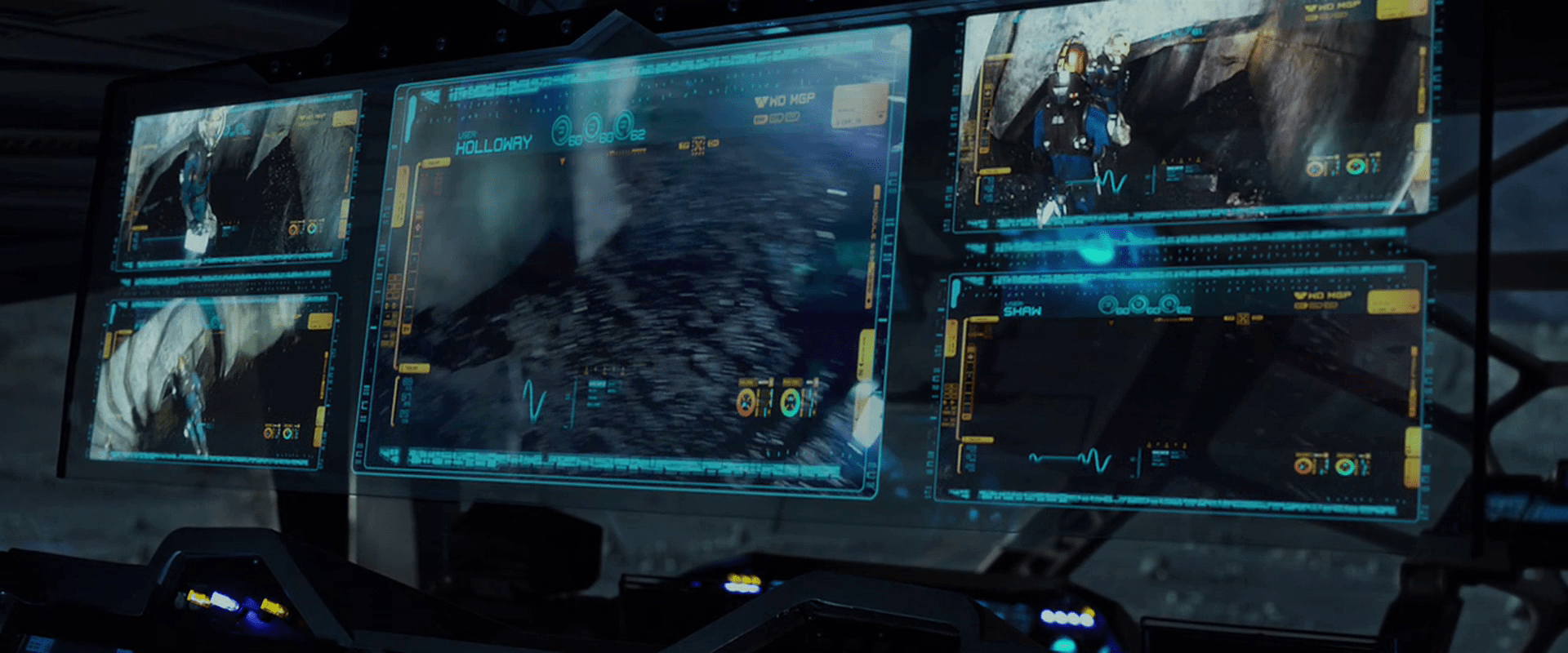
Given that interaction design requires awareness of the service in question, as well as inputs and outputs to steer variables towards a goal, it stands that the organization in the complex are the primary users. Even more particularly it is Sitterson and Hadley, the two “stage managers” in charge of the control room for the event, who are the real users. Understanding their goals we can begin an analysis. Fittingly, it’s complex:

  • Forestall the end of the world…
  • by causing the (non-Virgin) victims to suffer and die before Dana (who represents the Virgin archetype)…
  • at the hand of a Horrible Monster selected by the victims themselves…
  • marking each successful sacrifice with a blood ritual…
  • while keeping the victims unaware of the behind-the-scenes truth.

Sitterson and Hadley dance in the control room.

Part of a larger network with similar goals

This operation is not the only one operating at the same time. There are at least six other operations, working with their particular archetypes and rituals around the world: Berlin, Kyoto, Rangoon, Stockholm, Buenos Aires, and Madrid.

To monitor these other scenarios, there are two banks of CRT monitors high up on the back wall, each monitor dedicated to a different scenario. Notably, these are out of the stage manager’s line of attention when their focus is on their own.

The CRT monitors display other scenarios around the world.

The digital screens on the main console are much more malleable, however, and can be switched to display any of the analog video feeds if any special attention needs to be paid to it.

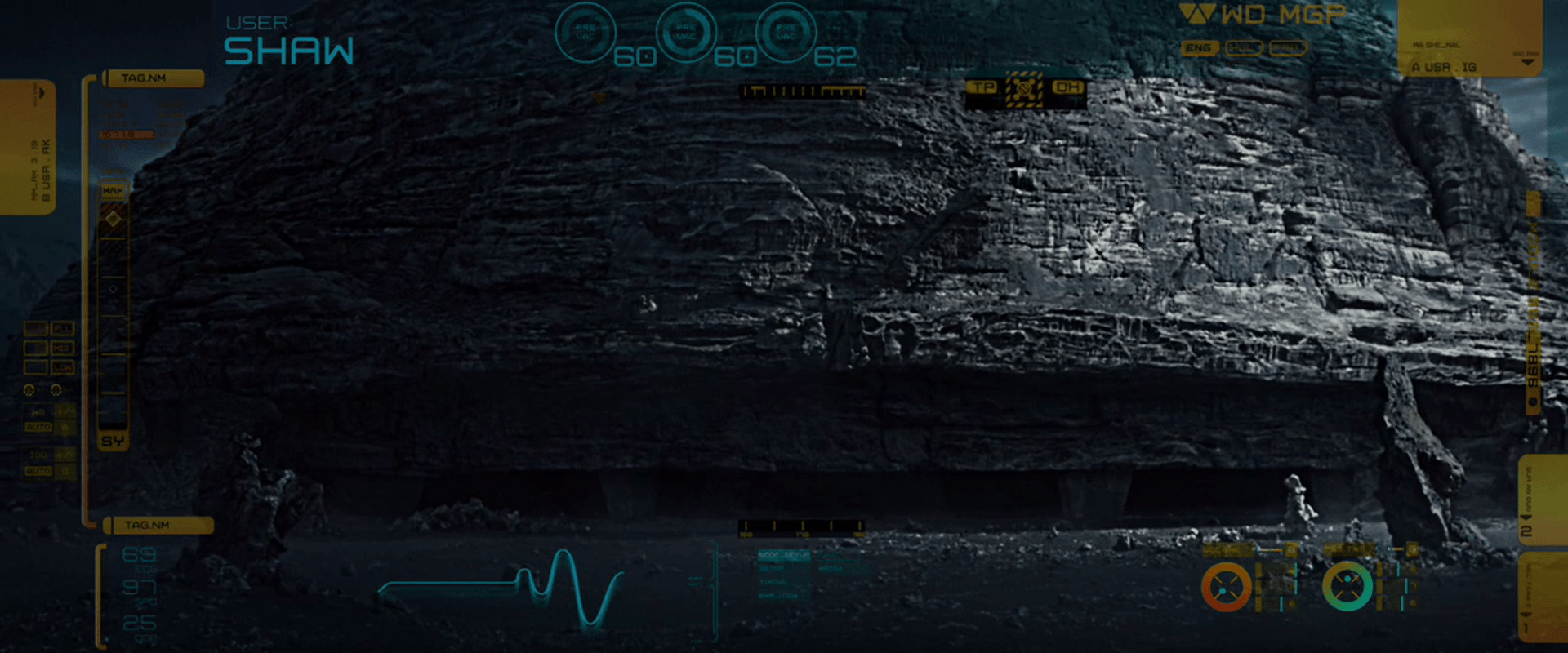
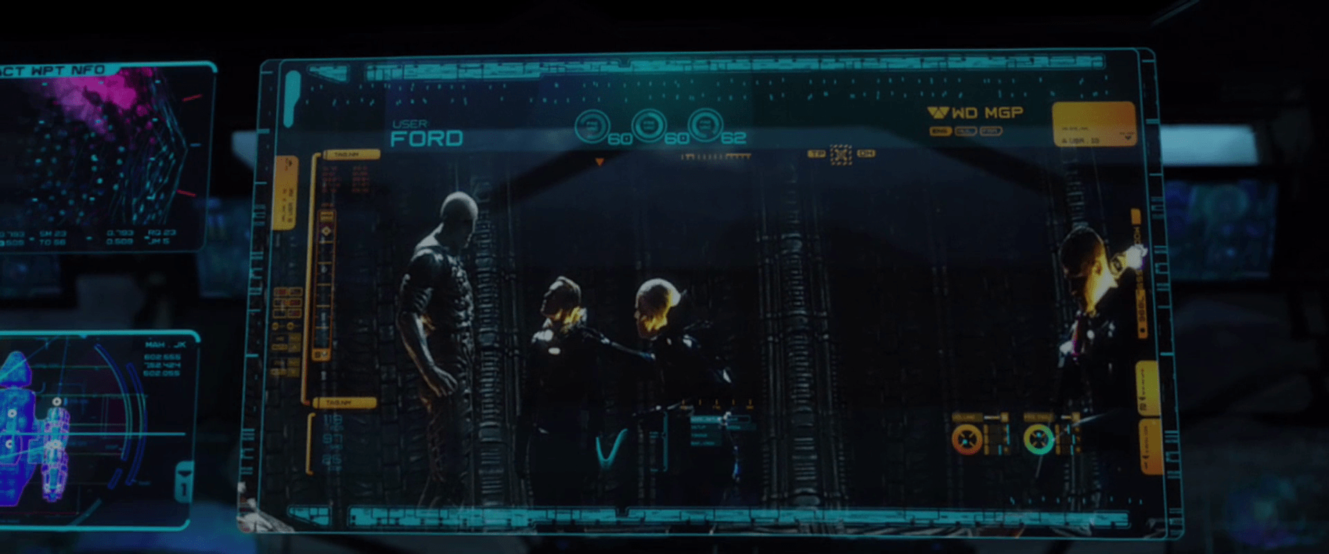
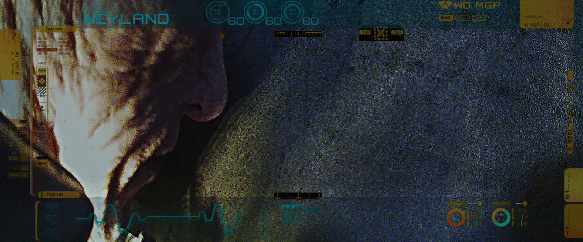
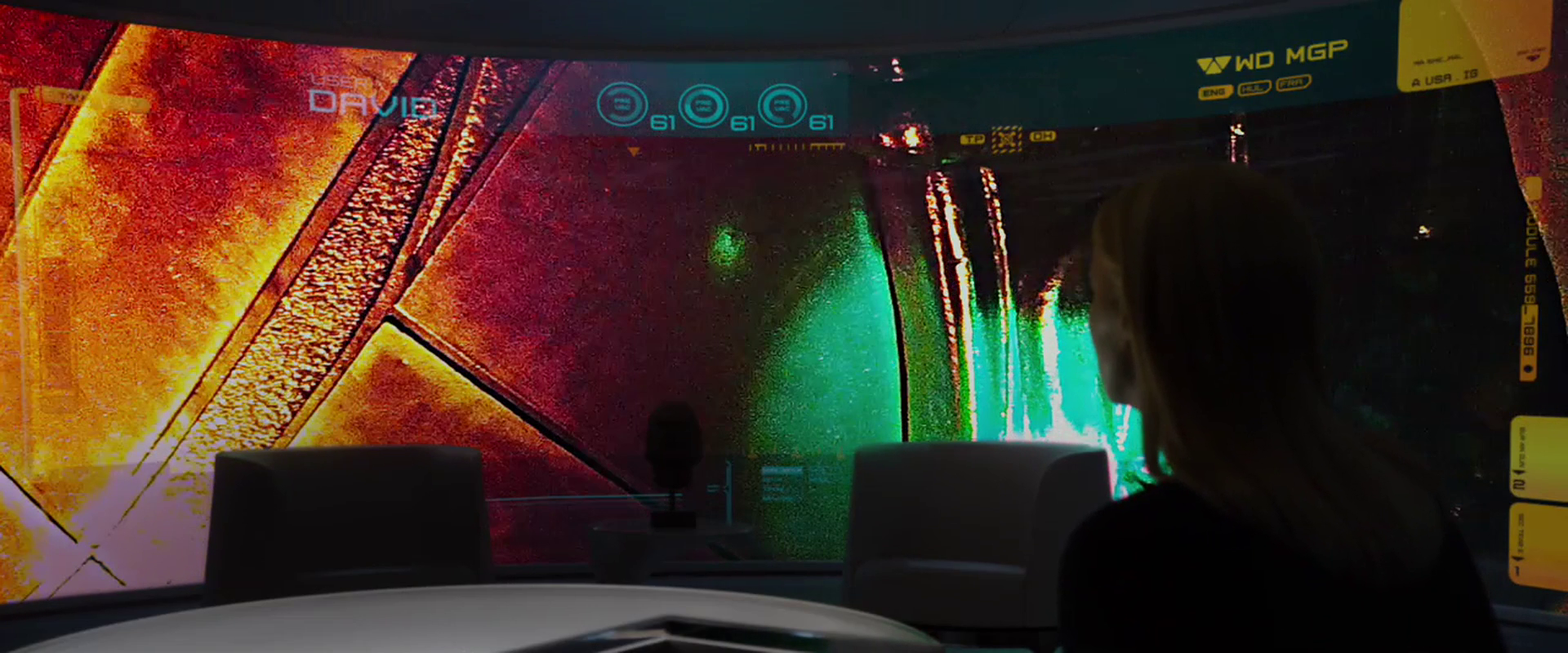
The amount of information that the stage managers need about any particular scenario is simple: What’s the current state of an ongoing scenario, and whether it has succeeded or failed for a concluded one. We don’t see any scenario succeed in this movie, so we can’t evaluate that output signal. Instead, they all fail. When they fail, a final image is displayed on the CRT with a blinking red legend “FAIL” superimposed across it, so it’s clear when you look at the screen (and catch it in the “on” part of the blink) what it’s status is.

Sitterson watches the Kyoto scenario fail.

Hadley sees that other scenarios have all failed.

One critique of this simple pass-fail signal is that it is an important signal that might be entirely missed, if the stage managers’ attentions were riveted forward, to problems in their own scenario. Another design option would be to alert Sitterson and Hadley to the moment of change with a signal in their peripheral attention, like a flash or a brief buzz. But signaling a change of state might not be enough. The new state, i.e. 4 of 7 failed, ought to be persistent in their field of vision as they continue their work, if the signal is considered an important motivator.

The design of alternate, persistent signals depend on rules we do not have access to. Are more successful scenarios somehow better? Or is it a simple OR-chain, with just one success meaning success overall? Presuming it’s the latter, strips of lighting around the big screens could become increasingly bright red, for instance, or a seven-sided figure mounted around the control room could have wedges turn red when those scenarios failed. Such environmental signals would allow the information to be glanceable, and remind the stage managers of the increasing importance of their own scenario. These signals could turn green at the first success as well, letting them know that the pressure is off and that what remains of their own scenario is to be run as a drill.

There is a Prisoner’s Dilemma argument to be made that stage managers should not have the information about the other scenarios at all, in order to keep each operation running at peak efficiency, but this would not have served the narrative as well.

The Cabin in the Woods: Overview

Release Date: 15 April 2012, USA

Five teenagers take a road trip on a long weekend to spend time at a cabin in the woods, only to stumble upon creepy and mysterious objects in the basement. Reading Latin found in an old diary, they unwittingly reanimate a family of pain-worshipping zombies, who immediately begin to assault and kill the teens one by one. Marty, one of the teens, escapes death and leads the only other survivor, Dana, into a hidden underground complex he has found. There they learn that their road trip experience has been engineered behind the scenes—and that they have been constantly and subtly manipulated—by an unnamed organization that annually perform this rite, causing archetypal victims to suffer and act as sacrifices that keep ancient evil beings, called the Old Ones, asleep. By releasing containment mechanisms that cage nightmarish monsters, Dana and Marty create gory chaos, allowing them to make their way to the heart of the complex, where they must choose to die for the world, or with it.

IMDB: https://www.imdb.com/title/tt1259521/Currently streaming on:

“Safety” “engineering” in the land of Metropolis

You know, sometimes you get the inkling that the bad guys just want to fail. Joh, the alleged brains of Metropolis, seemed to take a special delight in having his engineers develop machines that would ultimately doom his precious upper class.

A laborer fails to monitor the temperature of the M-machine.

So you’’re one of those engineers, mopping your brow and staring at whatever the Metropolis version of AutoCAD is, and you have this problem. When the machine gets too hot and close to failing, you need to vent some of that deadly, deadly steam somewhere to buy your guys some time to try and fix things before lots of people die and your civilization comes crashing down. OK. So, where to put that vent? Well, you consider putting it somewhere safe. Nonsense. Let’’s instead turn that pipe this other way, and aim it like a cannon directly at the guys who might fix the problem. Be sure and jot a note at the bottom of your drawing that this will piss a lof of the dead guy’s’ friends off so they’’ll revolt against you.

Machine-Maria disables a safety switch.

But OK, I hear you cry, these things are complicated, and perhaps that steam thing was just an oversight. People get busy and maybe it was rushed into production. How then do you explain the presence of a single, large, and easy-to-pull switch, the sole purpose of which is to immediately overheat and explode the one machine that’’s keeping the working class and their children from being crushed under a wave of water? That’s not a slip-up. Somebody had to put that there, and somebody else had to approve it. Not to name dystopian names, but we’’re looking at you, Joh Fredersen. Maybe that’s the great secret under Metropolis: Joh is the unsung good guy of this tale. The one guy who could mastermind the takedown of the terrible, oligarchical mess, all from the inside, and using his goofy do-gooder son as a pawn.