To restore the power that Nedry foolishly shut down (and thereby regain a technological advantage over the dinosaurs), Dr. Sattler must head into the utility bunker that routes power to different parts of the park.
Once she is there Hammond, back in the Visitors Center, communicates to her via two-way radio that operating it is a two part process: Manually providing a charge to the main panel, and then closing each of the breakers.
The Main Panel
To restore a charge to the main panel, she manually cranks a paddle (like a kinetic-powered watch, radio, or flashlight), then firmly pushes a green button labeled “Push to Close”. We hear a heavy click inside the panel as the switch flips something, and then the lights on the Breaker Panel list light up green.
Now that she has built up a charge in the circuit, she has to turn on each of the breakers one by one.
The Breakers
Each individual circuit has a dedicated button to open/close it. Each is switched with a simple illuminated button protected by a heavy, clear pushbutton cover that has to be opened manually.
Green indicates that the circuit has tripped, and power is not flowing to that part of the park. Red means that the circuit is closed and live. Slowly, one by one, Dr. Sattler flips the cover and presses the red button for each part of the breaker panel. These switches are clearly labeled as HERBIVORE FEEDING COMPOUND, or VISITORS CNTR.
As she flips each circuit on, red lights behind the label turn on.
The Circuit Breakers
The pushbutton covers do a good job of protecting against inadvertent flips, but could be made better by having hinges that close them automatically. It is unlikely that someone would accidentally push one of the buttons, but the high-risk nature of the panel begs for more protection. Spring hinges would also make closing the panel up after service quicker.
A second consideration is an emergency scenario: there is no obvious way to flip all the circuits off at once, or turn them all back on quickly. Here, all that extra time is super dramatic since it happens to save Dr. Grant and the kids, hanging at this same moment as they are from the unpowered electrified fence. But if someone was trying to reactivate the park quickly, to say, save the visitors from being eaten, this circuit-by-circuit method takes a surprising amount of time.
Labeling & Color
The labeling here is good, but could still be better. The lights are the first thing to draw attention, but it’s actually the charging panel that needs to be tended to first. A good flowchart of how a person is supposed to use the panel would be an effective addition; as would a map showing which labeled breaker leads to which area of the park.
At first the red-and-green colors are backwards, but it turns out a longstanding standard within electrical engineering uses red to indicate “shock hazard” rather than “operating normally”, so this color coding is actually OK. But it might be more effective to only light up the breakers’ labels when power is actually flowing to them. For someone not experienced with the interface or electrical engineering conventions, having a few of the breakers active and a few flipped could be extremely confusing. Are the lit ones active? Inactive? Is power flowing to the panels with lights?
This panel would be a solid candidate for usability testing.
Once Dr. Sattler restores power to the park, Arnold needs to reboot the computer systems. To do this, he must switch off the circuits (C1–C3 in the screenshot above), and then switch off-and-on a circuit labeled “Main”.
It’s a good thing Arnold knows what he’s doing, since these switches are only labeled C1-3, and we don’t see any documentation in the camera frame. As he turns off each circuit, different parts of the computer terminals in the Control Room shut down. This implies that different computer banks are tied to the same power circuits as the systems they control.
So, since this is a major interface for the park, let’s make this bit explicit: When designing infrequently-used but mission-critical interfaces, take great care to explain use, using clear affordances and constraints so that mistakes are very, very difficult to make.
It might look like a mistake to have all the little electrical labeling to the sides, since this cover would have to be removed to get the components where this information would be of use. But that’s perfect. A user needing to remove this panel must encounter this reference information to get to those components, and so would know where to find them. This is a brilliant example of the pattern Put the Signal in the Path. Let’s hope there are similar signs on other access panels.
Wait…where are the backups?
These are the central computer terminals that run Jurassic Park, and keep visitors safe from the “attractions.” And there is no backup power.
When Arnold turns off the main circuit breaker, the computers (and servers behind them) turn off immediately. The purpose and effect of the power switch deactivates all the systems in Jurassic Park, without any kind of warning or backup system.
For something as dangerous as deadly deadly dinosaurs—raised from the 65 million-year deep grave of extinction—the system deactivation should at least trigger some kind of warning.
Tornado sirens have backup batteries in case the city power goes out. They are a solid example of a backup system that should exist, at minimum, to warn park-goers to move quickly towards shelter. A better backup system would be a duplicate server system that automatically activates all the fences in the park.
Redundant Systems
When Arnold cycles the visitor center’s power system, it also trips the breakers for all of the other power systems in the park. Primary safety systems like that should be on their own circuit. It’s ok if the fridges turn off and melt the ice cream (though it may be an inconvenience), but that same event shouldn’t also deactivate the velociraptor pen security. Especially when the ‘raptor pen is right next to the visitor center and is a known, aforementioned, deadly deadly threat.
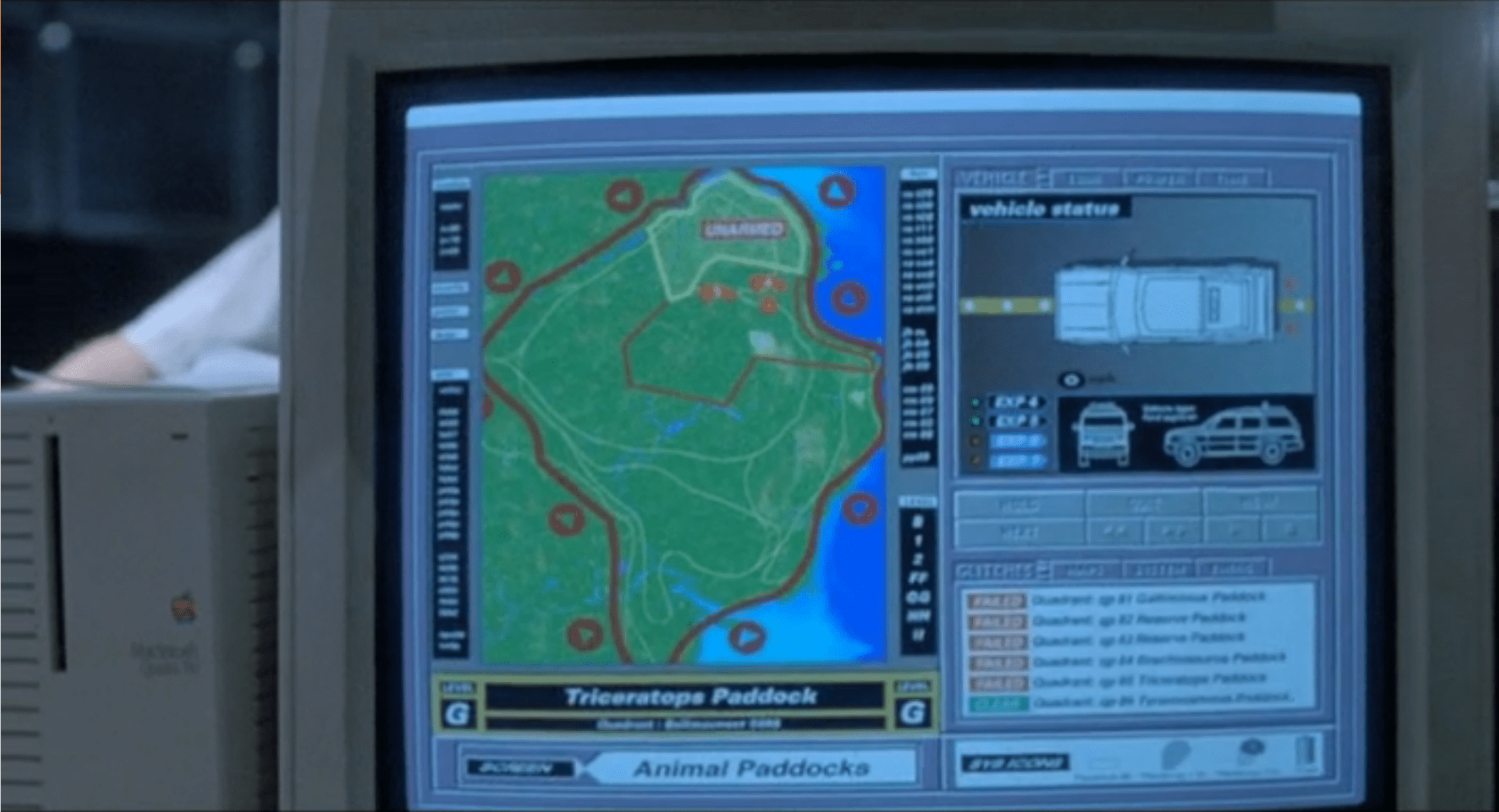
The security alert occurs in two parts. The first is a paddock alert that starts on a single terminal but gets copied to the big shared screen. The second is a security monitor for the visitor center in which the control room sits. Both of these live as part of the larger Jurassic Park.exe, alongside the Explorer Status panel, and take the place of the tour map on the screen automatically.
Paddock Monitor
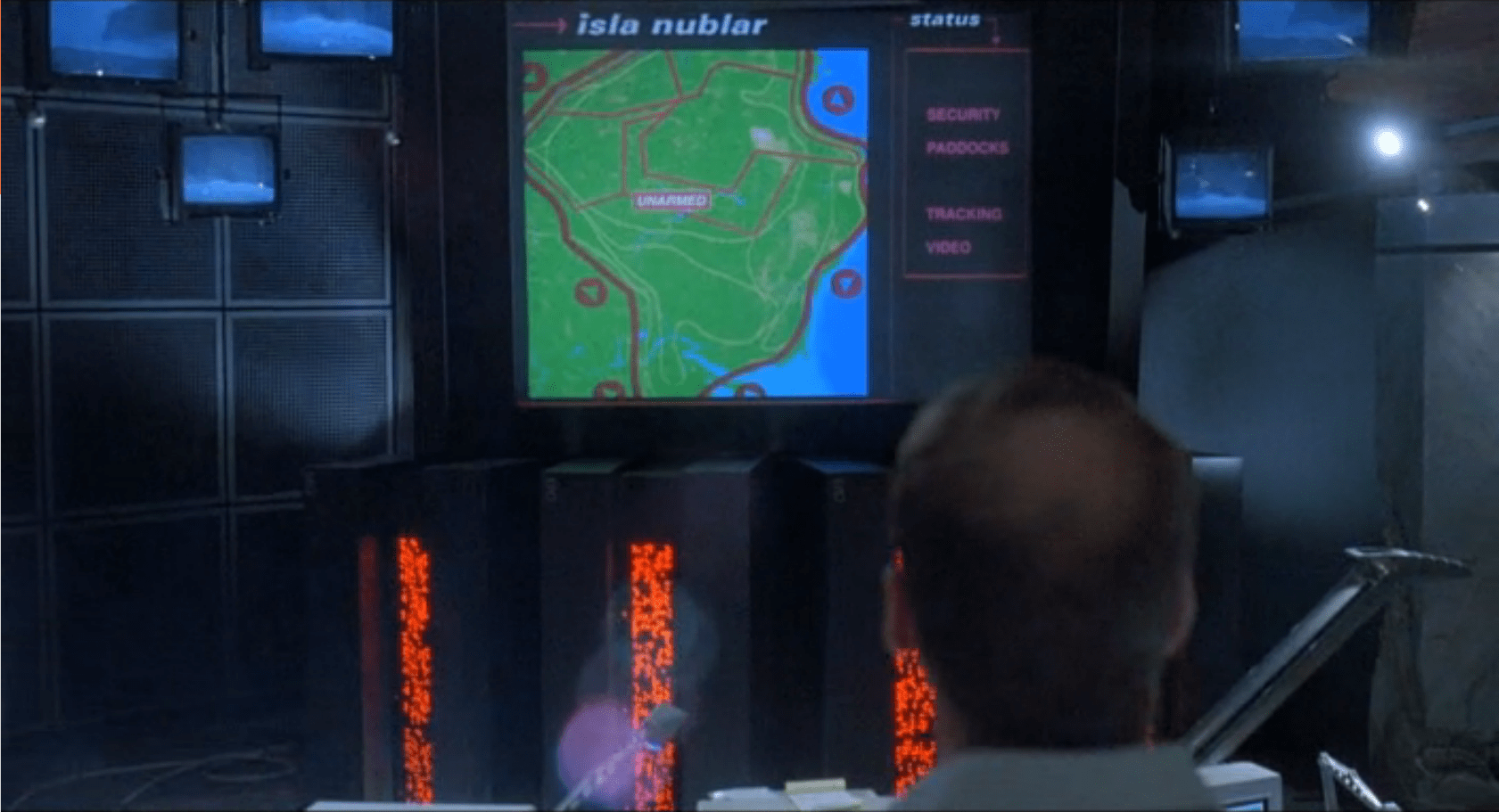
After Nedry disables security, the central system fires an alert as each of the perimeter fence systems go down. Each section of the fence blinks red, with a large “UNARMED” on top of the section. After blinking, the fence line disappears. To the right is the screen for monitoring vehicles.
As soon as the system starts detecting the disabled fences, it starts projecting the fence security diagram onto the main screen at the front of the Control Room for everyone to see, but with a status bar on the right reading “SECURITY, PADDOCKS, TRACKING, and VIDEO.”
Visitor Center
The system has a second screen showing security measures in the visitor center itself. It focuses on the security doors between public and private areas (dining, halls, the genetics lab, and the cryostorage).
In both cases, these security screens appear on the same computer showing the vehicle status. It replaces the island map. This isn’t a separate program, but is instead a replacement window, as shown by the identical data in the columns to the left and right of the map view.
Don’t Break Existing Mental Models
Throughout the security panels, there isn’t any consistency in color labeling. On the fences, red is good. On visitor center map, red is bad. On the glitches panel, red means that it should be looked at, but might not be bad.
First, accessibility standards say that color shouldn’t be the only indicator of status. Thankfully for this interface and its inconsistency, it at least has labeling. But that means that an operator needs to either memorize the entire panel before they can be proficient at it, or read each label every time.
Second, color standardization could be done with a little more creative background colors. Picking more neutral backgrounds—for example, the island on the fence map doesn’t need to be bright green, and could either be desaturated or a basic light grey—would allow the status colors to show up better and have more readable text.
Third, while the status indicators are labeled, the labels are written in system language instead of user language. “Clear” and “Check” can be understood with some work, but aren’t natural status labels in day-to-day society.
Keep Indicators
When the fences deactivate, they disappear off the screen. While this does show that they’re disabled, it removes the control room crew’s ability to quickly see what they can fix and where it is. Unless a room full of experts is looking at the screen, they won’t know where the T-Rex fence is and where to send work crews. Keeping the fences on the screen in a ‘disabled’ or ‘broken’ state would indicate the same information, while still providing direction.
The visitor center screen almost gets this right by changing the color, changing the label, and showing the door as open on the panel. Practically, this is what’s happening (the ‘Raptors can get through any door they want), but realistically some of those doors are actually closed.
In the case of the doors, it would make more sense to have the status change, but only have the door open if the system actually detects a door opening in the building.
Show the ’Raptors
This is the most critical screen in the park during an emergency, but it isn’t showing a critical status: The Velociraptor Pen.
Arnold has to roll over to the command console computer and type in a manual status request to learn that the raptor pen fences are still active. Given how important this status is to everyone in the park, it should be on the main map in some form or another.
Additionally, the system could show the status of secondary systems in a side pane:
Tour status
Camera feeds
Where dinosaurs are
What secondary equipment status is
When things start to go wrong on the island, this interface should provide guidance to the control room crew on what they need to do and what they need to fix (even if, in this case, the answer is “Everything”).
Organizing information, mapping status across screens, and providing lists of what needs to be fixed would give an understandable checklist to the park staff on what they should be doing.
When we first see the HUD, Tony is donning the Iron Man mask. Tony asks, JARVIS, “You there?” To which JARVIS replies, “At your service sir.” Tony tells him to “Engage the heads-up display”, and we see the HUD initialize. It is a dizzying mixture of blue wireframe motion graphics. Some imply system functions, such as the reticle that pinpoints Tony’s eye. Most are small dashboard-like gauges that remain small and in Tony’s peripheral vision while the information is not needed, and become larger and more central when needed. These features are catalogued in another post, but we learn about them through two points-of-view:a first-person view, which shows us what Tony’s sees as if we were there, donning the mask in his stead, and second-person view, which shows us Tony’s face overlaid against a dark background with floating graphics.
This post is about that first-person view. Specifically it’s about the visual design and the four awarenesses it displays.
In the Augmented Reality chapter of Make It So, I identified four types of awareness seen in the survey for Augmented Reality displays:
Sensor display
Location awareness
Context awareness
Goal awareness
The Iron Man HUD illustrates all four and is a useful framework for describing and critiquing the 1st-person view.
Sensor display
When looking through the HUD “ourselves,” we can see that the HUD provides some airplane-like heads up instruments: Across the top is a horizontal compass with a thin white line for a needle. Below and to its left is a speed indicator, presented in terms of MACH. On the left side of the screen is a two-part altimeter with overlays indicating public, commercial, military, and aerospace layers of atmosphere, with a small blue tick mark indicating Tonys current altitude.
There are just-in-time status indicators like that cyan text box on the right with its randomized rule line. The content within is all N -8 W -97 RNG EL, so, hard to tell what it means, but Tony’s a maker working with a prototype. It’s no surprise he takes some shortcuts in the interface since it’s not a commercial device. But we should note that it would reduce his cognitive load to not have to remember what those cryptic letters meant.
You can just see the tops of these gauges at the bottom of this screen.
The exact sensor shown depends on the context and goal at hand.
Periphery and attention
A quick sidenote about peripheral vision and the detail of these gauges. Looking at them, it’s notable that they are small and quite detailed. That makes sense when he’s looking right at them, but when he’s not, given the amount of big, swirling graphics he“s got vying for his attention in the main display, the more those little gauges have to compete. And when it comes to your peripheral vision, localized detail and motion is not enough, owing to the limits of our foveal extent. (Props to @pixelio for the heads-up on this one.)
You see, your brain tricks you into thinking that you can see really well across your entire field of vision. In fact, you can only see really well across a few dozen degrees of that perceptual sphere, corresponding to the tiny area at the back of your eye called the fovea where all the really good photoreceptors concentrate. As your eyes dart around the scene before you, your brain puts all the snippets of detailed information together so it feels like a cohesive, well-detailed whole, but it’s ultimately just a hack. Take a look at this demonstration of the effect.
So, having those teeny little guages dancing around as a signal of troubles ahead won’t really get Tony’s attention. He could develop habits of glancing at these things, but that’s a weak strategy, since this data is so mission-critical. If he misses it and forgets to check the gauges, he’s Iron Toast. Fortunately, JARVIS is once again our deusex machina (in so many senses) because he is able to track where Tony is looking, and if he’s not looking at the wiggling gauge, JARVIS can choose to escalate the signal: Hide the air traffic data temporarily and show the problem in the main screen. Here, as in other mission critical systems, attention management is crisis management. Now, for those of us working with pre-JARVIS tech, it’s rare today for a system to be able to
Track perceptual details of its users
Monitor a model of the user’s attention
Make the right call amongst competing priorities to escalate the right one
But if you could, it would be the smart and humane way to handle it.
Location Awareness
As Tony prepares for his first flight, JARVIS gives him a bit of x-ray vision, displaying a wireframe view of the Santa Monica coastline with live air traffic control icons of aircraft in the vicinity. The overhead map updates of course in real time.
If my Google Earth sleuthing is right, his view means he lives in the Malibu RV Park and this view is due East.
Context Awareness
Very quickly after we meet the HUD it shows its object recognition capabilities. As Tony sweeps his glance across his garage, complex reticles jump to each car. Split-seconds afterwards, the car’s outline is overlaid and some adjunct information about it is presented.
This holds true as he’s in flight as well. When Tony passes by the Santa Monica pier, not only is the Pacific Wheel identified (as the Santa Monica Ferriswheel), but the interface shows him a Wikipedia-esque article for the thing as well.
While JARVIS might be tapping into location databases for both the car and the ferris wheel recognition, it’s more than that. In one scene we see him getting information on the Iron Patriot as it rockets away, and its location wouldn’t be on any real-time record for him to access.
Too much detail
While this level of object detail is deeply impressive, it’s about as useful as reading Wikipedia pages hard-printed to transparencies while driving. The text is too small, too multilayered, and just pointless considering that JARVIS can tell him whatever he needs to know without even asking. Maybe he could indulge in pop-up pamphlets if he was on a long-haul flight from, say, Europe back home to the Malibu RV Park (see above), but wouldn’t Tony rather watch a movie while on Autopilot instead?
Goal awareness
Of course JARVIS is aware of Tony’s goals, and provides graphics customized to the task, whether that task is navigating flight through complex obstacle courses…
…taking down a bad guy with the next hit…
…saving innocent bystanders who are freefalling from a plane…
…or instantly analyzing problems in an observed (and complicated) piece of machinery…
…JARVIS is there with the graphics to help illustrate, if not solve, the problem at hand. Most impressively, perhaps, is JARVIS’ ability to juggle all of these graphics and modes seamlessly to present just the right thing at the right time in real time. Tony never asks for a particular display, it just happens. If you needed no other proof of its strong artificial intelligence, this would be it.
In the last post we went over the Iron HUD components. There is a great deal to say about the interactions and interface, but let’s just take a moment to recount everything that the HUD does over the Iron Man movies and The Avengers. Keep in mind that just as there are many iterations of the suit, there can be many iterations of the HUD, but since it’s largely display software controlled by JARVIS, the functions can very easily move between exosuits.
Gauges
Along the bottom of the HUD are some small gauges, which, though they change iconography across the properties, are consistently present.
For the most part they persist as tiny icons and thereby hard to read, but when the suit reboots in a high-altitude freefall, we get to see giant versions of them, and can read that they are:
Tony can, at a glance or request, summon more detail for any of the gauges.
Even different visualizations of similar information.
Object Recognition
In the 1st-person view we see that the HUD has a separate map in the lower-left, and object recognition/awareness,
In the 2nd-person view, we see even more layers of information about the identified objects, floating closer to tony’s point of view.
Situational
Most of the HUD functions we see, though, are situational, brought up for Tony’s attention when JARVIS believes they are needed, or when Tony requests them. Following are screenshots that illustrate a moment when the situational function appeared.
Iron Man
Iron Man 2
Iron Man 3
The Avengers
Some of these illustrate why I argue that JARVIS is the superhero, and Tony just the onboard manager, but rather than reverse engineering any particular function, for this post it is enough to document them and note that only the optical zoom seems to be an interactive function. This raises questions of how he initiated the mode and how he escapes the mode, but since we don’t see the mechanisms of control, it’s entirely arguable that JARVIS is just being his usual helpful self again.
Genarro: “Are they heavy?” Excited Kid: “Yeah!” Genarro: “Then they’re expensive, put them back” Excited Kid: [nope]
The Night Vision Goggles are large binoculars that are sized to fit on an adult head. They are stored in a padded case in the Tour Jeep’s trunk. When activated, a single red light illuminated in the “forehead” of the device, and four green lights appear on the rim of each lens. The green lights rotate around the lens as the user zooms the binoculars in and out. On a styling point, the goggles are painted in a very traditional and very adorable green and yellow striped dinosaur pattern.
Tim holds the goggles up as he plays with them, and it looks like they are too large for his head (although we don’t see him adjust the head support at all, so he might not have known they were adjustable). He adjusts the zoom using two hidden controls—one on each side. It isn’t obvious how these work. It could be that…
There are no controls, and it automatically focuses on the thing in the center of the view or on the thing moving.
One side zooms in, and the other zooms out.
Both controls have a zoom in/zoom out ability.
Each side control powers its own lens.
Admittedly, the last option is the least likely.
Unfortunately the movie just doesn’t give us enough information, leaving it as an exercise for us to consider.
Dr. Grant, Timmy is hogging the tech
Note that there aren’t enough goggles in the Jeep for everyone. During a tour this might set up a competition for the goggles. Considering how much a ticket to the island is implied to cost, the passengers in the Jeep would likely be unhappy at this constraint.
Better here would be some kind of HUD for the entire Jeep, with a thermal overlay or night-vision projection of what’s around the Jeep.
Alternatively, if cost is indeed an issue to Hammond, the TV screen could be used to show camera feeds of the pen and dinosaurs inside.
Hopefully A Prototype
The lights on the front show what’s happening internally, and give feedback that the goggles are doing something to people watching. As we learn soon after this scene, dinosaurs are also very sensitive to light and motion. Especially the T-Rex.
These night vision goggles would work best in darkness, where it would add to the tour to see a dinosaur behaving (relatively) naturally. If the dinosaurs on the tour are very sensitive to light, then the motion on the front of the goggles would actually be counter to the goals person using the goggles.
So let’s presume these were a prototype, and why they were in the trunk and not mentioned by Hammond at the start of the tour.
Overall
The goggles look easy to use, but appear to need refinement from field experience. A key point will be how the passengers react to having enough of them, and whether they serve the tourists in experiencing the park as intended.
The second instantiation of videochat with the World Security Council that we see is when Fury receives their order to bomb the site of the Chitauri portal. (Here’s the first.) He takes this call on the bridge, and rather than a custom hardware setup, this is a series of windows that overlay an ominous-red map of the world in an app called CARRIER CONTROL. These windows represent a built-in chat feature for discussing this very topic. There is some fuigetry on the periphery, but our focus is on these windows and the conversation happening through them.
In this version of the chat, we are assured that it is a SECURE TRANSMISSION by a legend across the top of each, but there is not the same level of assurance as in the videoconference room. If it’s still HOTP, Fury isn’t notified of it. There’s a tiny 01_AZ in the upper right of every screen, but it never changes and is the same for each participant. (An homage to Arizona? Lighter Andrew Zink? Cameraman Arthur Zajac?) Though this is a more desperate situation, you imagine that the need for security is no less dire. Having that same cypher key would be comforting if it is in fact a policy.
Different sizes of windows in the app seem to indicate a hierarchy, since the largest window is the fellow who does most of the talking in both conferences, and it does not change as others speak. Such an automated layout would spare Fury the hassle of having to manage multiple windows, though visually these look more like individual objects he’s meant to manipulate. Poor affordances.
The only control we see is when Fury dismisses them, and to do this he just taps at the middle of the screen. The teleconference window is “push wiped” by a satellite view of New York City. Fine, he feels like punching them. But…
a) How does he actually select something in that interface without a tap?
b) A swipe would have been more meaningful, and in line with the gestural pidgin I identified in the gestural chapter of the book.
And of course, if this was the real world, you’d hope for better affordances for what can be done on this window across the board.
So though mostly effective, narratively, could use some polish.
The velociraptor pen is a concrete pit, topped with high-powered electric fences. There are two ways into the pen: a hole at the top of the pen for feeding, and a large armored door at ground level for moving ‘raptors in and out. This armored door has the first interface seen in the film, the velociraptor lock.
Velociraptors are brought from breeding grounds within the park to a secure facility in a large, heavily armored crate. Large, colored-light indicators beside the door indicate whether the armored cages are properly aligned with the door. The light itself goes from red when the cage is being moved, to yellow when the cage is properly aligned and getting close to the door, to green when the cage is properly aligned and snug against the concrete walls of the velociraptor pen. There is also a loud ‘clang’ as the light turns to green. It isn’t clear if this is an audio indicator from the pen itself, the cage hitting the concrete wall, or locks slamming into place; but if that audio cue wasn’t there, you’d want something like it since the price for getting that wrong is quite high.
The complete interface consists of four parts (kind of, read on): The lights, the door, the lock, and the safety. More on each below.
1. The Deceiving Lights
The lights are the most obvious part of the system (aside from the cage and pen). Everyone who is watching the cage also has a clear view of the lights – there is an identical set on the other side of the cage for the other half of the safety/moving crew.
2. The Door
The Velociraptor pen’s door is perfectly shaped to accept the heavily armored cage, and is equipped with a rail system to keep the cage aligned properly with the door. Though it takes eight workers to move the cage, they appear to be able to push the cage reasonably easily. When the light turns green, the workers move back to allow the gate to be manually raised on the cage, letting the caged velociraptor escape into the pen.
3. The “Lock”
Or, lack thereof…
Every indication (the lineup of the cage, the green lights, and the heavy metallic ‘clang’) gives the feeling of a secure mating between the cage and the pen. All of the workers relax, as if they’re sure they’re as safe as they can be. But you can be certain, this is a false sense of security.
As soon as the velociraptor decides to test the lock, it is able to push the cage away from the pen wall. The light near the door instantly changes from green back to red.
Narratively, this underscores some of the risks of the park, i.e. that it’s cheaply engineered despite appearances, and extra-diegetically sets the audience on edge since it’s not sure what it can trust. But, for us in the real world, given the many indications that the system was safe, it should have actually been safe.
4. The Safety
When the clever velociraptor knocks the cage back, a worker falls in and becomes an unscheduled snack. Attendant workers try to help using…
The Cattle Prods
When the gate master falls and gets snatched by the velociraptor in the cage, workers immediately rush in and start hitting her with cattle prods. There are at least six prods being used, possibly more.
Since this is the first line of backup defense, the cattleprods should have been iterated until they actually deterred the ‘raptors. Clearly, effort went into making the perimeter defenses secure against the larger dinosaurs. The same effort should have gone into making the cattle prods effective against velociraptors.
Design for Success
The Velociraptor pen door seems custom-designed for serious failure: No hard locks to keep the cage in place, horrible sight-lines, and manual controls in places that make it dangerous for workers. Even the solid feedback system only adds to the danger. It lulls the workers into thinking the system is safe.
Most, if not all, of these issues would be solved by a simple physical locking device on the cage. Something to hold the cage in place while the doors are open would maintain a secure pen and keep everyone outside safe. It would also eliminate the need for most of the support crew, who only end up getting in each other’s way.
To add to the safety, the park designers should have paid more attention to where people would be standing during the transfer process. The armed guards (theoretically there to be a second line of defense), are placed in such a way that only a few of them are able to effectively fire. Other guards on scene would have to fire past their fellow guards.
Presumably, this is why the armed guards don’t actually fire at the ‘raptor when Muldoon shouts to “Shoot her! Shooooooot her!!”
Keep the feedback…
The feedback systems of the cage are remarkably successful, for a placebo. The lights, sounds, and placement keep the workers and audience calm right up until things go horribly wrong. With the addition of Muldoon’s organizational skill and animal handling skills, the feedback system is worth taking notes on.
…but make it mean something
The velociraptor pen was designed to tell the workers what state it was in, but not to actually keep them safe. Muldoon’s precautions try to make up for the system’s failures, but only add to the problems as the workers trip over each other.
After Loki has enthralled Selvig, enthralled-Hawkeye lets Loki know that, “This place is about to blow and drop a hundred feet of rock on us.” Selvig looks to the following screen and confirms, “He’s right. The portal is collapsing in on itself.”
This is perhaps one of the most throwaway screens in the film, given the low-rez twisty graphics that could be out of Lawnmower Man, its only-vague-resemblance to the portal itself…
c.f.
…the text box of wildly scrolling and impossible to read pink code with what looks like a layer of white code hastily slapped over it, and—notably—no trendline of data that would help Selvig quickly identify this Very Important Fact. Maybe he’s such a portal whisperer that he can just see it, but why show the screens rather than show him looking up to the blue thing itself?
There might be some other data on the left of this bank of screens seen a few seconds later in the background…
…but it has more red text overlays, so I’m disinclined to give it the blurry benefit of the doubt.
Fair enough, this is there merely to establish Selvig’s enthrallment, and the scientific certainty of the stakes for the next beat. But, we see his eyes, and the certainty is evidenced by everything collapsing. We don’t need scientific assurance. If the designers were not given time to make it passable, I wish that the beat had been handled without a view of the screens rather than shaky-cam.
The first computer interface we see in the film occurs at 3:55. It’s an interface for housing and monitoring the tesseract, a cube that is described in the film as “an energy source” that S.H.I.E.L.D. plans to use to “harness energy from space.” We join the cube after it has unexpectedly and erratically begun to throw off low levels of gamma radiation.
The harnessing interface consists of a housing, a dais at the end of a runway, and a monitoring screen.
Fury walks past the dais they erected just because.
The housing & dais
The harness consists of a large circular housing that holds the cube and exposes one face of it towards a long runway that ends in a dais. Diegetically this is meant to be read more as engineering than interface, but it does raise questions. For instance, if they didn’t already know it was going to teleport someone here, why was there a dais there at all, at that exact distance, with stairs leading up to it? How’s that harnessing energy? Wouldn’t you expect a battery at the far end? If they did expect a person as it seems they did, then the whole destroying swaths of New York City thing might have been avoided if the runway had ended instead in the Hulk-holding cage that we see later in the film. So…you know…a considerable flaw in their unknown-passenger teleportation landing strip design. Anyhoo, the housing is also notable for keeping part of the cube visible to users near it, and holding it at a particular orientation, which plays into the other component of the harness—the monitor.
The monitor
In the underground laboratory, an (unnamed?) technician warns lead scientist Selvig that, “it’s spiking again,” and the camera pans down to this monitoring interface.
Header
The header is a static barcode followed by the initialism J.D.E.M. along with its full name, the Joint Dark Energy Mission. (Sounds super cool and sci-fi, right? Turns out it is a real program between NASA and the US DOE.) Another label across the top identifies the screen as LEVEL 5 and that it belongs to PROJECT PEGASUS and NASA.
3D map
A main display shows a 3D wireframe of the tesseract, with color-coded nebula-like shapes within the cube. The wireframe (and most of the text on screen) are a bright cyan, with internal features progressing in color from the cyan through white to a blood red, all the way to lens flares near the most active areas in the cube. The color choices make for a quick read of what is “cool” and what is “hot,” so are effective for being immediate, but if the lens flares are designed into the system to indicate peakness, it’s a bad choice for obscuring other data in the display.
Note that the wireframe of the cube is also rotating slightly, which is very helpful for a user to more fully understand 3D information from a 2D screen. It might be even better mapping with less cognitive load if the display was a volumetric projection. (VPs exist within the Marvel Cinematic Universe (MCU), but so far I believe we’ve only ever seen them in Tony Stark’s possession so perhaps he has not released it to the outside world.) Hopefully in its rotation on this monitor it does not rotate in 360°, as the regularness of the cube would make it difficult to understand where an internal anomaly might exist in the real thing. Hopefully the wireframe only wavers back and forth within a few degrees, and is oriented in roughly the same way an observer glancing at the real thing would see it in the housing, to allow for instant mapping of problem areas.
Warning
Just to the left of the 3D map is a data monitoring panel. Its top label blinks a red WARNING CRITICAL ENERGY LEVELS and a percentage readout. The panel also features a key whose colors match those of the map. (As it should.) Hopefully a microinteraction allows a user to touch any part of the map, freeze the rotation, and get the percentage details of the touched point. A detail box wavers its vertical position along the key to provide a user a quick assessment of its value, and also contains a percentage readout for precision. Judging by the position of the box and the readout, it looks like the 100% mark is about halfway up the screen. Hopefully the upper part of the scale is logarithmic to accommodate massive surges in values.
Additional elements of the display include several scrolling waveforms and text boxes with inscrutable data and labels. It’s easy to imagine these as useful (say total energy values for specific electromagnetic frequencies) but they’re difficult to read, so difficult to formally evaluate.
All told, a nice display (per some assumptions) for monitoring what’s happening with the cube.
Now if only they had applied that solid design thinking to that dais vs. cage problem.


