Fritzes 2024 Winners

So I missed synchronizing the Fritzes with the Oscars. By like, a lot. A lot a lot. That hype curve has come and gone. (In my defense, it’s been an intensely busy year.) I don’t think providing nominees and then waiting to reveal winners makes sense now, so I’ll just talk about them. It was another year where there weren’t a lot of noteworthy speculative interfaces, from an interaction design point of view. This is true enough that I didn’t have enough candidates to fill out my usual three categories of Believable, Narrative, and Overall. So, I’m just going to do a round-up of some of the best interfaces as I saw them, and at the end, name an absolute favorite.

The Kitchen

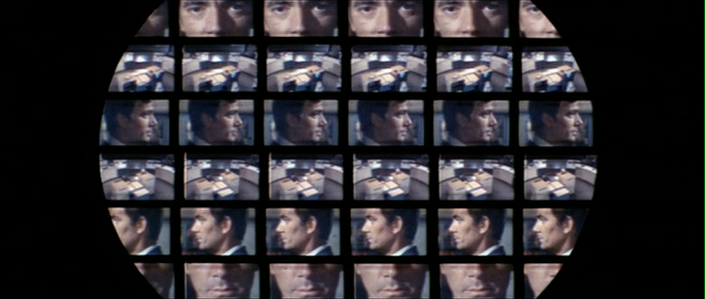
In a dystopian London, the rich have eliminated all public housing but one last block known as The Kitchen. Izi and Benji live there and are drawn together by the death of Benji’s mother, who turns out to be one of Izi’s romantic partners from the past. The film is full of technology, but the one part that really struck me was the Life After Life service where Izi works and where Benji’s mom’s funeral happens. It’s reminiscent of the Soylent Green suicide service, but much better done, better conceived. The film has a sci-fi setting, but don’t expect easy answers and Marvel-esque plot here. This film about relationships amid struggle and ends quite ambiguously.

The funerary interfaces are mostly translucent cyans with pinstripe dividing lines to organize everything. In the non-funerary the cyan is replaced with bits of saturated red. Everything funerary and non- feels as if it has the same art direction, which lends to reading the interfaces extradiegetically, but maybe that’s part of the point?

Pod Generation

This dark movie considers what happens if we gestated babies in technological wombs called pods.  The interactions with the pod are all some corporate version of intuitive, as if Apple had designed them. (Though the swipe-down to reveal is exactly backwards. Wouldn’t an eyelid or window shade metaphor be more natural? Maybe they were going for an oven metaphor, like bun in the oven? But cooking a child implications? No, it’s just wrong.)

The design is largely an exaggeration of Apple’s understated aesthetic, except for the insane, giant floral eyeball that is the AI therapist. I love how much it reads like a weirdcore titan and the characters are nonplussed, telegraphing how much the citizens of this world have normalized to inhumanity. I have to give a major ding to the iPad interface by which parents take care of their fetuses, as its art direction is a mismatch to everything else in the film and seems quite rudimentary, like a Flash app circa 1998.

Before I get to the best interfaces of the year, let’s take a moment to appreciate two trends I saw emerging in 2023. That of hyperminimalist interfaces and of interface-related comedy.

Hyperminimalist interfaces

This year I noticed that many movies are telling stories with very minimal interfaces. As in, you can barely call them designed since they’re so very minimalist. This feels like a deliberate contrast to the overwhelming spectacle that permeates, say, the MCU. They certainly reduce the thing down to just the cause and effect that are important to the story. Following are some examples that illustrate this hyperminimalism.

This could be a cost-saving tactic, but per the default New Criticism stance of this blog, we’ll take it as a design choice and note it’s trending.

Shout-out: Interface Comedy

I want to give a special shout-out to interface-related comedy over the past year.

Smoking Causes Coughing

The first comes from the French gonzo horror sci-fi Smoking Causes Coughing. In a nested story told by a barracuda that is on a grill being cooked, Tony is the harried manager of a log-processing plant whose day is ruined by her nephew’s somehow becoming stuck in an industrial wood shredder. Over the scene she attempts to reverse the motor, failing each time, partly owing to the unlabeled interface and bad documentation. It’s admittedly not sci-fi, just in a sci-fi film, and a very gory, very hilarious bit of interface humor in an schizoid film.

Guardians of the Galaxy 3

The second is Guardians of the Galaxy 3. About a fifth of the way into the movie, the team spacewalks from the Milano to the surface of Orgocorp to infiltrate it. Once on the surface, Peter, who still pines for alternate-timeline Gamora, tries to strike up a private conversation with her. The suits have a forearm interface featuring a single row of colored stay-state buttons that roughly match the colors of the spacesuits they’re wearing. Quill presses the blue one and tries in vain to rekindle the spark between him and Gamora in a private conversation. But then a minute into the conversation, Mantis cuts in…

  • Mantis
  • Peter you know this is an open line, right?
  • Peter
  • What?
  • Mantis
  • We’re listening to everything you’re saying.
  • Drax
  • And it is painful.
  • Quill
  • And you’re just telling me now‽
  • Nebula
  • We were hoping it would stop on its own.
  • Peter
  • But I switched it over to private!
  • Mantis
  • What color button did you push?
  • Peter
  • Blue! For the blue suit!
  • Drax
  • Oh no.
  • Nebula
  • Blue is the open line for everyone.
  • Mantis
  • Orange is for blue.
  • Peter
  • What‽
  • Mantis
  • Black is for orange. Yellow is for green. Green is for red. And red is for yellow.
  • Drax
  • No, yellow is for yellow. Green is for red. Red is for green.
  • Mantis
  • I don’t think so.
  • Drax
  • Try it then.
  • Mantis (screaming)
  • HELLO!
  • Peter writhes in pain
  • Mantis
  • You were right.
  • Peter
  • How the hell and I supposed to know all of that?
  • Drax
  • Seems intuitive.

The Marvels

A third comedy bit happens in The Marvels, when Kamala Khan is nerding out over Monica Rambeau’s translucent S.H.I.E.L.D. tablet. She says…

  • Khan
  • Is this the new iPad? I haven’t seen it yet.
  • Rambeau
  • I wish.
  • Khan
  • Wait, if this is all top secret information, why is it on a clear case?

Rambeau has no answer, but there are, in fact, some answers.

Anyway, I want to give a shout-out to the writers for demonstrating with these comedy bits some self-awareness and good-natured self-owning of tropes. I see you and appreciate you. You are so valid.

Best Interfaces of 2023

But my favorite interfaces of 2023 come from Spider-Man: Across the Spider-Verse. The interfaces throughout are highly stylized (so might be tough to perform the detailed analysis, which is this site’s bread-and-butter) but play the plot points perfectly.

In Across the Spider-Verse, while dealing difficulties with his home life and chasing down a new supervillain called The Spot, Miles Morales learns about The Society. The Society is a group of (thousands? Tens of thousands? of) Spider-people of every stripe and sort from across the Multiverse, whose overriding mission is to protect “canon” events in each universe that, no matter how painful, they believe are necessary to keep the fabric of reality from unraveling. It’s full of awesome interfaces.

Lyla is the general artificial intelligence that has a persistent volumetric avatar. She’s sassy and disagreeable and stylish and never runs, just teleports.

The wrist interfaces—called the Multiversal Gizmo—worn by members of The Society all present highly-contextual information with most-likely actions presented as buttons, and, as needed, volumetric alerts. Also note that Miguel’s Gizmo is longer, signaling his higher status within The Society.

Of special note is volumetric display that Spider Gwen uses to reconstruct the events at the Alchemax laboratory. The interface is so smart, telegraphs its complex functioning quickly and effectively, and describes a use that builds on conceivable but far-future applications of inference. The little dial that pops up allowing her to control time of the playback reminds me of Eye of Agamatto (though sadly I didn’t see evidence of the important speculative time-control details I’d provided in that analysis). The in-situ volumetric reconstruction reminds me of some of the speculative interfaces I’d proposed in the review of Deckard’s photo inspector from Blade Runner, and so was a big thrill to see.

All of the interfaces have style, are believable for the diegesis, and contribute to the narrative with efficiency. Congratulations to the team crafting these interfaces, and if you haven’t seen it yet, what are you waiting for? Go see it. It’s in a lot of places and the interfaces are awesome. (For full disclosure, I get no kickback from these referral links.)

The Fritzes 2022 Winners

The Fritzes award honors the best interfaces in a full-length motion picture in the past year. Interfaces play a special role in our movie-going experience, and are a craft all their own that does not otherwise receive focused recognition. Awards are given for Best Believable, Best Narrative, Audience Choice, and Best Interfaces (overall.) This blog’s readership is also polled for Audience Favorite interfaces, and this year, favorite robot. Following are the results.


Best Believable

These movies’ interfaces adhere to solid HCI principles and believable interactions. They engage us in the story world by being convincing. The nominees for Best Believable are Swan Song, Stowaway, and Needle in a Timestack.

The winner of the Best Believable award for 2022 is Swan Song.

Swan Song

Facing a terminal illness, Cameron Turner must make a terrible choice: have his wife and children suffer the grief of losing him, or sign up to be secretly swapped with a healthy clone of himself, and watch from afar as his replacement takes over his life with his unaware loved ones.

The film is full of serene augmented reality and quiet technology. It’s an Apple TV production, and very clearly inspired by Apple’s sensibilities: Slim panes of paper-white slabs that house clean-lined productivity tools, fit-to-purpose assistant wearables, and charming AI characters. Like the iPad’s appearance in The Incredibles, Swan Song’s technologies feel like a well-designed smoke-and-mirrors prototype of an AR world maybe a few years from launch.

Perhaps even more remarkably, the cloning technology that is central to the plot’s film has none of the giant helmets-with-wires that seem to be the go-to trope for such things. That’s handled almost entirely as a service with jacketed frontstage actors and tiny brain-reading dots that go on Cameron’s temples. A minimalist touch in a minimalist world that hides the horrible choices that technology asks of its citizens.


Audience Choice, too!

All of the movies nominated for other awards were presented for an Audience Choice award. Across social media, the readership was invited to vote for their favorite, and the results tallied. The winner of the Audience Choice award for 2022 is Swan Song. Congratulations for being the first film to win two Fritzes in the same year! To celebrate, here’s another screen cap from the film, showing the AR game Cameron plays with his son. Notably the team made the choice to avoid the obvious hot-signaling that almost always accompanies volumetric projections in screen sci-fi.

Best Narrative

These movies’ interfaces blow us away with wonderful visuals and the richness of their future vision. They engross us in the story world by being spectacular. The nominees for Best Narrative are The Mitchells vs The Machines, Reminiscence, and The Matrix: Resurrections.

The winner of the Best Narrative award for 2022 is The Mitchells vs The Machines.

The Mitchells vs The Machines

Katie Mitchell is getting ready to go to college for filmmaking when the world is turned upside down by a robot uprising, which is controlled by an artificial intelligence that has just been made obsolete. Katie and her odd family have to keep themselves safe from capture by the robots and ultimately save all of humanity—all while learning to love each other.

The charming thing about the triangle-heavy and candy-colored interfaces in the film are that they are almost wholly there for the robots doing their humanity-destroying job. Diegetically, they’re not meant for humans, but extradiegetically, they’re there to help tell the audience what’s happening. That’s a delicate balance to manage, and to do it while managing hilarity, lambasting Silicon Valley’s cults of personality, and providing spectacle; is what earns this film its Fritz.

Best Robot: Bubs!

There was a preponderance of interesting robots in sci-fi last year. So 2022 has a new category of Audience Choice, and that’s for Best Robot. The readership was invited to vote for their favorite from…

  • The unnamed bartender from Cosmic Sin
  • Jeff from Finch
  • Eric and Deborahbot 5000 from The Mitchells vs. The Machines
  • Bubs from Space Sweepers
  • Steve from the unsettling Settlers

The audience vote is clear: The wisecracking Bubs from Space Sweepers wins! Bubs’ emotions might have been hard to read with the hard plastic shell of a face. But pink blush lights and a display—near where the mouth would be—reinforce the tone of speech with characters like “??” and “!!” and even cartoon mouth expressions. Additionally, near the end of the movie Bubs has enough money to get a body upgrade, and selects a female-presenting humanoid body and voice, making a delightful addition to the Gendered AI finding than when AI selects a gender, it picks female. Congrats, Bubs!

Best Interfaces (best overall)

The movies nominated for Best Interfaces manage the extraordinary challenge of being believable and helping to paint a picture of the world of the story. They advance the state of the art in telling stories with speculative technology. The nominees for Best Narrative are Oxygen, Space Sweepers, and Voyagers.

The winner of the Best Interfaces award for 2022 is Oxygen.

Oxygen

A woman awakes in an airtight cryogenic chamber with no knowledge of who or where she is. In this claustrophobic space, she must work with MILO, an artificial intelligence, to manage the crisis of her dwindling oxygen supply and figure out what’s going on before it’s too late.

Nearly all of the film happens in this coffin-like space between the actress and MILO. The interface shows modes for media searches, schematic searches, general searches, media playback, communication, and health monitoring as the woman tries to work the problem and save her own life. It shows a main screen directly above her, a ring of smaller interfaces placed in a corona around her head, and it also has volumetric display capabilities. The interfaces are lovely with tightly controlled palettes, an old sci-fi standby typeface Eurostyle (or is it some derivative?), and excellent signals for managing attention and conveying urgency.

The interface is critical to the narration, its tension, and the ultimate dark reveal and resolution of the story—a remarkable feat for a sci-fi interface.


I would love to extend my direct congratulations to all the studios who produced this work, but Hollywood is complicated and makes it difficult to identify exactly whom to credit for what. So let me extend my congratulations generally to the nominees and winners for an extraordinary body of work. If you are one of these studios, or can introduce me, please let me know; I’d love to do some interviews for the blog. Here’s looking to the next year of sci-fi cinema.

Unity Vision

One of my favorite challenges in sci-fi is showing how alien an AI mind is. (It’s part of what makes Ex Machina so compelling, and the end of Her, and why Data from Star Trek: The Next Generation always read like a dopey, Pinnochio-esque narrative tool. But a full comparison is for another post.) Given that screen sci-fi is a medium of light, sound, and language, I really enjoy when filmmakers try to show how they see, hear, and process this information differently.

In Colossus: The Forbin Project, when Unity begins issuing demands, one of its first instructions is to outfit the Computer Programming Office (CPO) with wall-mounted video cameras that it can access and control. Once this network of cameras is installed, Forbin gives Unity a tour of the space, introducing it visually and spatially to a place it has only known as an abstract node network. During this tour, the audience is also introduced to Unity’s point-of-view, which includes an overlay consisting of several parts.

The first part is a white overlay of rule lines and MICR characters that cluster around the edge of the frame. These graphics do not change throughout the film, whether Unity is looking at Forbin in the CPO, carefully watching for signs of betrayal in a missile silo, or creepily keeping an “eye” on Forbin and Markham’s date for signs of deception.

In these last two screen grabs, you see the second part of the Unity POV, which is a focus indicator. This overlay appears behind the white bits; it’s a blue translucent overlay with a circular hole revealing true color. The hole shows where Unity is focusing. This indicator appears, occasionally, and can change size and position. It operates independently of the optical zoom of the camera, as we see in the below shots of Forbin’s tour.

A first augmented computer PoV? 🥇

When writing about computer PoVs before, I have cited Westworld as the first augmented one, since we see things from The Gunslinger’s infrared-vision eyes in the persistence-hunting sequences. (2001: A Space Odyssey came out the year prior to Colossus, but its computer PoV shots are not augmented.) And Westworld came out three years after Colossus, so until it is unseated, I’m going to regard this as the first augmented computer PoV in cinema. (Even the usually-encyclopedic TVtropes doesn’t list this one at the time of publishing.) It probably blew audiences’ minds as it was.

“Colossus, I am Forbin.”

And as such, we should cut it a little slack for not meeting our more literate modern standards. It was forging new territory. Even for that, it’s still pretty bad.

Real world computer vision

Though computer vision is always advancing, it’s safe to say that AI would be looking at the flat images and seeking to understand the salient bits per its goals. In the case of self-driving cars, that means finding the road, reading signs and road makers, identifying objects and plotting their trajectories in relation to the vehicle’s own trajectory in order to avoid collisions, and wayfinding to the destination, all compared against known models of signs, conveyances, laws, maps, and databases. Any of these are good fodder for sci-fi visualization.

Source: Medium article about the state of computer vision in Russia, 2017.

Unity’s concerns would be its goal of ending war, derived subgoals and plans to achieve those goals, constant scenario testing, how it is regarded by humans, identification of individuals, and the trustworthiness of those humans. There are plenty of things that could be augmented, but that would require more than we see here.

Unity Vision looks nothing like this

I don’t consider it worth detailing the specific characters in the white overlay, or backworlding some meaning in the rule lines, because the rule overlay does not change over the course of the movie. In the book Make It So: Interaction Design Lessons from Sci-fi, Chapter 8, Augmented Reality, I identified the types of awareness such overlays could show: sensor output, location awareness, context awareness, and goal awareness, but each of these requires change over time to be useful, so this static overlay seems not just pointless, but it risks covering up important details that the AI might need.

Compare the computer vision of The Terminator.

Many times you can excuse computer-PoV shots as technical legacy, that is, a debugging tool that developers built for themselves while developing the AI, and which the AI now uses for itself. In this case, it’s heavily implied that Unity provided the specifications for this system itself, so that doesn’t make sense.

The focus indicator does change over time, but it indicates focus in a way that, again, obscures other information in the visual feed and so is not in Unity’s interest. Color spaces are part of the way computers understand what they’re seeing, and there is no reason it should make it harder on itself, even if it is a super AI.

Largely extradiegetic

So, since a diegetic reading comes up empty, we have to look at this extradiegetically. That means as a tool for the audience to understand when they’re seeing through Unity’s eyes—rather than the movie’s—and via the focus indicator, what the AI is inspecting.

As such, it was probably pretty successful in the 1970s to instantly indicate computer-ness.

One reason is the typeface. The characters are derived from MICR, which stands for magnetic ink character recognition. It was established in the 1950s as a way to computerize check processing. Notably, the original font had only numerals and four control characters, no alphabetic ones.

Note also that these characters bear a style resemblance to the ones seen in the film but are not the same. Compare the 0 character here with the one in the screenshots, where that character gets a blob in the lower right stroke.

I want to give a shout-out to the film makers for not having this creeper scene focus on lascivious details, like butts or breasts. It’s a machine looking for signs of deception, and things like hands, microexpressions, and, so the song goes, kisses are more telling.

Still, MICR was a genuinely high-tech typeface of the time. The adult members of the audience would certainly have encountered the “weird” font in their personal lives while looking at checks, and likely understood its purpose, so was a good choice for 1970, even if the details were off.

Another is the inscrutability of the lines. Why are they there, in just that way? Their inscrutability is the point. Most people in audiences regard technology and computers as having arcane reasons for the way they are, and these rectilinear lines with odd greebles and nurnies invoke that same sensibility. All the whirring gizmos and bouncing bar charts of modern sci-fi interfaces exhibit the same kind of FUIgetry.

So for these reasons, while it had little to do with the substance of computer vision, its heart was in the right place to invoke computer-y-ness.

Dat Ending

At the very end of the film, though, after Unity asserts that in time humans will come to love it, Forbin staunchly says, “Never.” Then the film passes into a sequence that is hard to tell whether it’s meant to be diegetic or not.

In the first beat, the screen breaks into four different camera angles of Forbin at once. (The overlay is still there, as if this was from a single camera.)

This says more about computer vision than even the FUIgetry.

This sense of multiples continues in the second beat, as multiple shots repeat in a grid. The grid is clipped to a big circle that shrinks to a point and ends the film in a moment of blackness before credits roll.

Since it happens right before the credits, and it has no precedent in the film, I read it as not part of the movie, but a title sequence. And that sucks. I wish wish wish this had been the standard Unity-view from the start. It illustrates that Unity is not gathering its information from a single stereoscopic image, like humans and most vertebrates do, but from multiple feeds simultaneously. That’s alien. Not even insectoid, but part of how this AI senses the world.

Dr. Strange’s augmented reality surgical assistant

We’re actually done with all of the artifacts from Doctor Strange. But there’s one last kind-of interface that’s worth talking about, and that’s when Strange assists with surgery on his own body.

After being shot with a soul-arrow by the zealot, Strange is in bad shape. He needs medical attention. He recovers his sling ring and creates a portal to the emergency room where he once worked. Stumbling with the pain, he manages to find Dr. Palmer and tell her he has a cardiac tamponade. They head to the operating theater and get Strange on the table.

DoctorStrange_AR_ER_assistant-02.png

When Strange passes out, his “spirit” is ejected from his body as an astral projection. Once he realizes what’s happened, he gathers his wits and turns to observe the procedure.

DoctorStrange_AR_ER_assistant-05.png

When Dr. Palmer approaches his body with a pericardiocentesis needle, Strange manifests so she can sense him and recommends that she aim “just a little higher.” At first she is understandably scared, but once he explains what’s happening, she gets back to business, and he acts as a virtual coach.

DoctorStrange_AR_ER_assistant-08.png

In this role he points at the place she should insert the needle, and illuminates the chest cavity from within so she can kind of see the organ she’s targeting and the surrounding tissue. She asks him, “What were you stabbed with?” and he must confess, “I don’t know.”

DoctorStrange_AR_ER_assistant-11.png

Things go off the rails when the zealot who stabbed him shows up also as an astral projection and begins to fight Strange, but that’s where we can leave off the narrative and focus on everything up to this point as an interface.

Imagine with me, if you will, that this is not magic, but a kind of augmented reality available to the doctor. Strange is an unusual character in that he is both one of the world’s great surgeons and the patient in the scene, so let’s tease apart each.

An augmented reality coach

Realize that Dr. Palmer is getting assistance from one of the world’s greatest surgeons, rendered as a volumetric projection (“hologram” in vernacular). She can talk to him as if he was there to get his advice, and, I presume, even dismiss him if she believes he was wrong. Wouldn’t doctors working in new domains relish the opportunity to get advice from experts until they they have built their own mastery?

Two notes to extend this idea.

In the spirit of evidence-based medicine and big idea, we must admit that it would be better to have diagnoses and advice based on the entirety of the medical record and current, ethical best practices, not just one individual expert. But if an individual doctor prefers to have that information delivered through an avatar of a favored mentor, why not?

The second note to anyone thinking of this as a real world model for an AR assistant: I would expect a fully realized solution to include augmentations other than just a human, of course, such as ideal angles for incisions, depth meters, and life signs.

A (crude) body visualization

One of the challenges surgeons have when working with internal damage is that the body is largely opaque. They have to use visualization tools like radiographs and (very) educated guesses to diagnose and treat what’s going on inside these fleshy boxes of ours. How awesome that the AR coach can help illuminate (in both senses) the body to help Dr. Palmer perform the procedure correctly?

DoctorStrange_AR_ER_assistant-13.png

Admittedly, what we see in Doctor Strange is a crude version. This same x-ray vision appeared with more clarity and higher resolution in two other films, as cited in the Medical chapter of Make It So. In Lost in Space, the medical table projects a real-time volumetric scan of the organs inside Judy’s body into the eyes of the observers.

7809592870_cf8f3fdccf_o.jpg

In Chrysalis, Dr. Bruger sees a volumetric display of the patient on which she is teleoperating.

7809609070_b65b6fb936_o.jpg

But despite its low-resolution, I wanted to draw it out as another awesome and somewhat subtle part of the way this AR assistant helps the doctor.

A queryable patient avatar

Lastly, consider that Dr. Palmer is able to ask her patient what happened to him. Of course in the real world passed out patients aren’t able to answer questions, but of course understanding the events that led to a crisis are important. I can imagine several sci-fi ways that this information might be retrievable from the world.

  • Trace evidence on the patient’s body: High-resolution sensors throughout the operating theater could have automatically run forensic analysis on the patient the moment they entered the room to determine type of wound and likely causes, such as  microscopic detection of soot in entrance wounds.
  • Environmental sensors: If the accident happened in a place with sensors that are queryable, then the assistant could look at video footage, or listen in to microphones in the environment to help piece together what happened. Of course the notion of a queryable technological panoptican has massive privacy issues which cannot be overlooked, but if the information is available to medical professionals, it would be tragic to ignore it in genuine crises.
  • Human witnesses can provide informative narratives. Witness and first responders may be on record already. But in looking at the environmental sensors, the assistant might be able to instantly reach out to those who have not. Imagine one of these witness, shaken by the event he saw, on a commute home. His phone buzzes and it is the assistant saying, “Hello, Mr. Mackinnon. Records indicate that you were witness to a violent crime today, and your account of the event is needed for the victim, who is currently in surgery. Can you take a moment to answer some questions?”
  • Patient preferences should be automatically exposed and incorporated via the assistant as well. If the patient was a Jehovah’s Witnesses, for instance, then their desire not to have a blood transfusion should be raised in whatever form the assistant takes.

An surgical assistant could automatically query all of these sources to make a hypothesis of what happened and advise the procedure. This could be available doctor for the asking, volunteered by the assistant at a lull in more critical action, or offered by the assistant as a preventative. I suspect it’s more likely the doctor would ask the assistant than the patient, e.g. “OK, ERbot, what happened to this guy?” but if the doctor prefers, she should be able ask in the second person, as Dr. Palmer does in the scene, and the system should reply appropriately.

Sure, in this context, it’s magic, but since we can imagine how it could be done with technology, this scene gives us a very dense set of inspirational ideas for the future of surgical assistants.

High Tech Binoculars

In Johnny Mnemonic we see two different types of binoculars with augmented reality overlays and other enhancements: Yakuz-oculars, and LoTek-oculars.

Yakuz-oculars

The Yakuza are the last to be seen but also the simpler of the two. They look just like a pair of current day binoculars, but this is the view when the leader surveys the LoTek bridge.

jm-25-yakuza-binocs-adjusted

I assume that the characters here are Japanese? Anyone?

In the centre is a fixed-size green reticule. At the bottom right is what looks like the magnification factor. At the top left and bottom left are numbers, using Western digits, that change as the binoculars move. Without knowing what the labels are I can only guess that they could be azimuth and elevation angles, or distance and height to the centre of the reticule. (The latter implies some sort of rangefinder.) Continue reading

Airport Security

After fleeing the Yakuza in the hotel, Johnny arrives in the Free City of Newark, and has to go through immigration control. This process appears to be entirely automated, starting with an electronic passport reader.

jm-9-customs-b

After that there is a security scanner, which is reminiscent of HAL from the film 2001: A Space Odyssey.

jm-9-customs-f

The green light runs over Johnny from top to bottom. Continue reading

Grabby hologram

After Pepper tosses off the sexy bon mot “Work hard!” and leaves Tony to his Avengers initiative homework, Tony stands before the wall-high translucent displays projected around his room.

Amongst the videos, diagrams, metadata, and charts of the Tesseract panel, one item catches his attention. It’s the 3D depiction of the object, the tesseract itself, one of the Infinity Stones from the MCU. It is a cube rendered in a white wireframe, glowing cyan amidst the flat objects otherwise filling the display. It has an intense, cold-blue glow at its center.  Small facing circles surround the eight corners, from which thin cyan rule lines extend a couple of decimeters and connect to small, facing, inscrutable floating-point numbers and glyphs.

Avengers_PullVP-02.png

Wanting to look closer at it, he reaches up and places fingers along the edge as if it were a material object, and swipes it away from the display. It rests in his hand as if it was a real thing. He studies it for a minute and flicks his thumb forward to quickly switch the orientation 90° around the Y axis.

Then he has an Important Thought and the camera cuts to Agent Coulson and Steve Rogers flying to the helicarrier.

So regular readers of this blog (or you know, fans of blockbuster sci-fi movies in general) may have a Spidey-sense that this feels somehow familiar as an interface. Where else do we see a character grabbing an object from a volumetric projection to study it? That’s right, that seminal insult-to-scientists-and-audiences alike, Prometheus. When David encounters the Alien Astrometrics VP, he grabs the wee earth from that display to nuzzle it for a little bit. Follow the link if you want that full backstory. Or you can just look and imagine it, because the interaction is largely the same: See display, grab glowing component of the VP and manipulate it.

Prometheus-229 Two anecdotes are not yet a pattern, but I’m glad to see this particular interaction again. I’m going to call it grabby holograms (capitulating a bit on adherence to the more academic term volumetric projection.) We grow up having bodies and moving about in a 3D world, so the desire to grab and turn objects to understand them is quite natural. It does require that we stop thinking of displays as untouchable, uninterruptable movies and more like toy boxes, and it seems like more and more writers are catching on to this idea.

More graphics or more information?

Additionally,  the fact that this object is the one 3D object in its display is a nice affordance that it can be grabbed. I’m not sure whether he can pull the frame containing the JOINT DARK ENERGY MISSION video to study it on the couch, but I’m fairly certain I knew that the tesseract was grabbable before Tony reached out.

On the other hand, I do wonder what Tony could have learned by looking at the VP cube so intently. There’s no information there. It’s just a pattern on the sides. The glow doesn’t change. The little glyph sticks attached to the edges are fuigets. He might be remembering something he once saw or read, but he didn’t need to flick it like he did for any new information. Maybe he has flicked a VP tesseract in the past?

Augmented “reality”

Rather, I would have liked to have seen those glyph sticks display some useful information, perhaps acting as leaders that connected the VP to related data in the main display. One corner’s line could lead to the Zero Point Extraction chart. Another to the lovely orange waveform display. This way Tony could hold the cube and glance at its related information. These are all augmented reality additions.

Augmented VP

Or, even better, could he do some things that are possible with VPs that aren’t possible with AR. He should be able to scale it to be quite large or small. Create arbitrary sections, or plan views. Maybe fan out depictions of all objects in the SHIELD database that are similarly glowy, stone-like, or that remind him of infinity. Maybe…there’s…a…connection…there! Or better yet, have a copy of JARVIS study the data to find correlations and likely connections to consider. We’ve seen these genuine VP interactions plenty of places (including Tony’s own workshop), so they’re part of the diegesis.

Avengers_PullVP-05.pngIn any case, this simple setup works nicely, in which interaction with a cool media helps underscore the gravity of the situation, the height of the stakes. Note to selves: The imperturbable Tony Stark is perturbed. Shit is going to get real.


Videoconferencing

BttF_122

Marty Sr. answers a call from a shady business colleague shortly after coming home. He takes the call in the den on the large video screen there. As he approaches the screen, he sees a crop of a Renoir painting, “Dance at La Moulin de la Galette,” with a blinking legend “INCOMING CALL” along the bottom. When he answers it, the Renoir shrinks to a corner of the screen, revealing the live video feed with his correspondent. During the conversation, the Renoir disappears, and text appears near the bottom of the screen providing reminders about the speaker. This appears automatically, with no prompting from Marty Sr.

Needles, Douglas J.
Occupation: Sys Operations
Age: 47
Birthday: August 6, 1968
Address: 88 Oriole Rd, A6t
Wife: Lauren Anne
Children: Roberta, 23 Amy, 20
Food Prefence: Steak, Mex
Food Dislike: Fish, Tuna
Drinks: Scotch, Beer
Hobbies: Avid Basketball Fan
Sports: Jogging, Slamball, Tennis
Politics: None

This is an augmented reality teleconference, as mentioned in Chapter 8 of Make It So: Interaction Design Lessons from Science Fiction. See more information in that chapter. In short, it’s a particularly good example of one type of augmentation that is very useful for people having to interact with networks of people much larger than Dunbar’s number equips us for. Unfortunately, the information appears in a distracting scroll across the bottom, and is not particularly pertinent to the conversation, so could benefit from a bit of context awareness or static high-resolution display to be really useful. Continue reading

Binoculars

BttF_023

Doc Brown uses some specialized binoculars to verify that Marty’ Jr. is at the scene according to plan. He flips them open and puts his eyes up to them. When we see his view, a reticle of green corners is placed around the closest individual in view. In the lower right hand corner are three measurements, “DISTgamma, and “XYZ.” These numbers change continuously. A small pair of graphics at the bottom illustrate whether the reticle is to left or right of center.

BttF_025

As discussed in Chapter 8 of Make It So, augmented reality systems like this can have several awarenesses, and this has some sensor display and people awareness. I’m not sure what use the sensor data is to Doc, and the people detector seems unable to track a single individual consistently.

BttF_024

So, a throwaway interface that doesn’t help much beyond looking gee-whiz(1989).

Iron Man HUD: 1st person view

In the prior post we catalogued the functions in the Iron HUD. Today we examine the 1st-person display.

When we first see the HUD, Tony is donning the Iron Man mask. Tony asks, “JARVIS, “You there?”” To which JARVIS replies, ““At your service sir.”” Tony tells him to “Engage the heads-up display,” and we see the HUD initialize. It is a dizzying mixture of blue wireframe motion graphics. Some imply system functions, such as the reticle that pinpoints Tony’s eye. Most are small dashboard-like gauges that remain small and in Tony’s peripheral vision while the information is not needed, and become larger and more central when needed. These features are catalogued in another post, but we learn about them through two points-of-view: a first-person view, which shows us what Tony’s sees as if we were there, donning the mask in his stead, and second-person view, which shows us Tony’s face overlaid against a dark background with floating graphics.

This post is about that first-person view. Specifically it’s about the visual design and the four awarenesses it displays.

Avengers-missile-fetching04

In the Augmented Reality chapter of Make It So, I identified four types of awareness seen in the survey for Augmented Reality displays:

  1. Sensor display
  2. Location awareness
  3. Context awareness
  4. Goal awareness

The Iron Man HUD illustrates all four and is a useful framework for describing and critiquing the 1st-person view. Continue reading