Wearable Control Panels

As I said in the first post of this topic, exosuits and environmental suits are out of the definition of wearable computers. But there is one item commonly found on them that can count as wearable, and that’s the forearm control panels. In the survey these appear in three flavors.

Just Buttons

Fairly late in sci-fi they acknowledged the need for environmental suits, and acknowledged the need for controls on them. The first wearable control panel belongs to the original series of Star Trek, “The Naked Time” S01E04. The sparkly orange suits have a white cuff with a red and a black button. In the opening scene we see Mr. Spock press the red button to communicate with the Enterprise.

This control panel is crap. The buttons are huge momentary buttons that exist without a billet, and would be extremely easy to press accidentally. The cuff is quite loose, meaning Spock or the redshirt have to fumble around to locate it each time. Weeeeaak.

Star Trek (1966)

TOS_orangesuit

Some of these problems were solved when another WCP appeared 3 decades later in the the Next Generation movie First Contact.

Star Trek First Contact (1996)

ST1C-4arm

This panel is at least anchored, and located in places that could be located fairly easily via proprioception. It seems to have a facing that acts as a billet, and so might be tough to accidentally activate. It’s counter to its wearer’s social goals, though, since it glows. The colored buttons help to distinguish it when you’re looking at it, but it sure makes it tough to sneak around in darkness. Also, no labels? No labels seems to be a thing with WCPs since even Pixar thought it wasn’t necessary.

The Incredibles (2004)

Admittedly, this WCP belonged to a villain who had no interest in others’ use of it. So that’s at least diegetically excusable.

TheIncredibles_327

Hey, Labels, that’d be greeeeeat

Zipping back to the late 1960s, Kubrick’s 2001 nailed most everything. Sartorial, easy to access and use (look, labels! color differentiation! clustering!), social enough for an environmental suit, billeted, and the inputs are nice and discrete, even though as momentary buttons they don’t announce their state. Better would have been toggle buttons.

2001: A Space Odyssey (1968)

2001-spacesuit-021

Also, what the heck does the “IBM” button do, call a customer service representative from space? Embarrassing. What’s next, a huge Mercedez-Benz logo on the chest plate? Actually, no, it’s a Compaq logo.

A monitor on the forearm

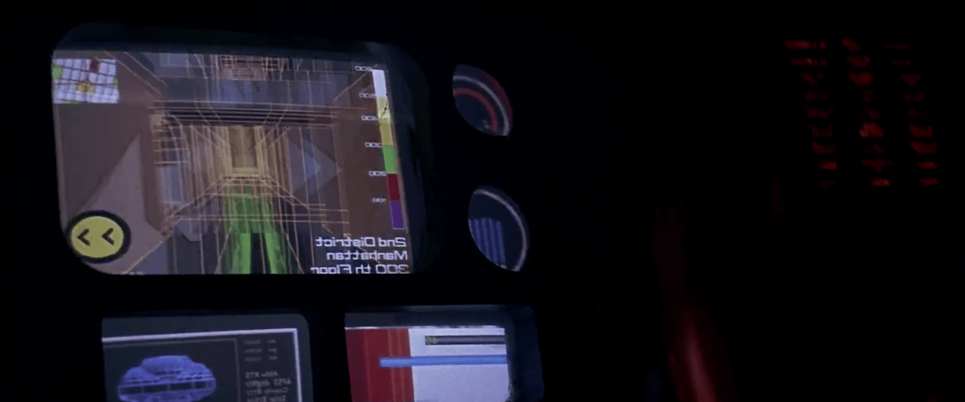
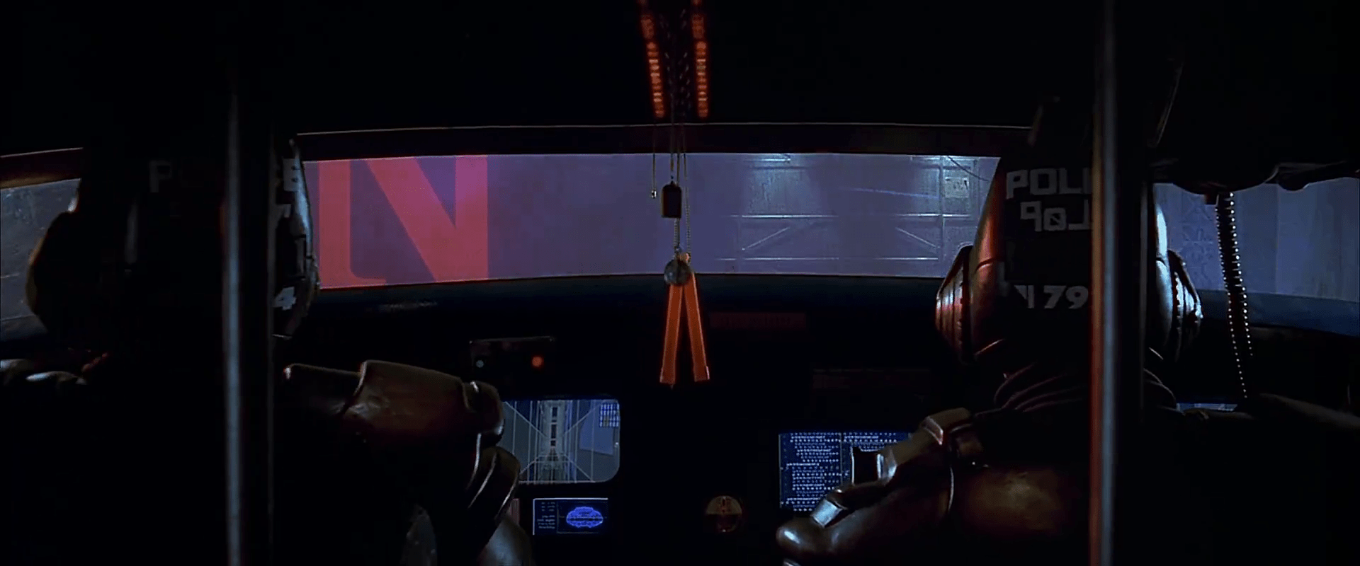
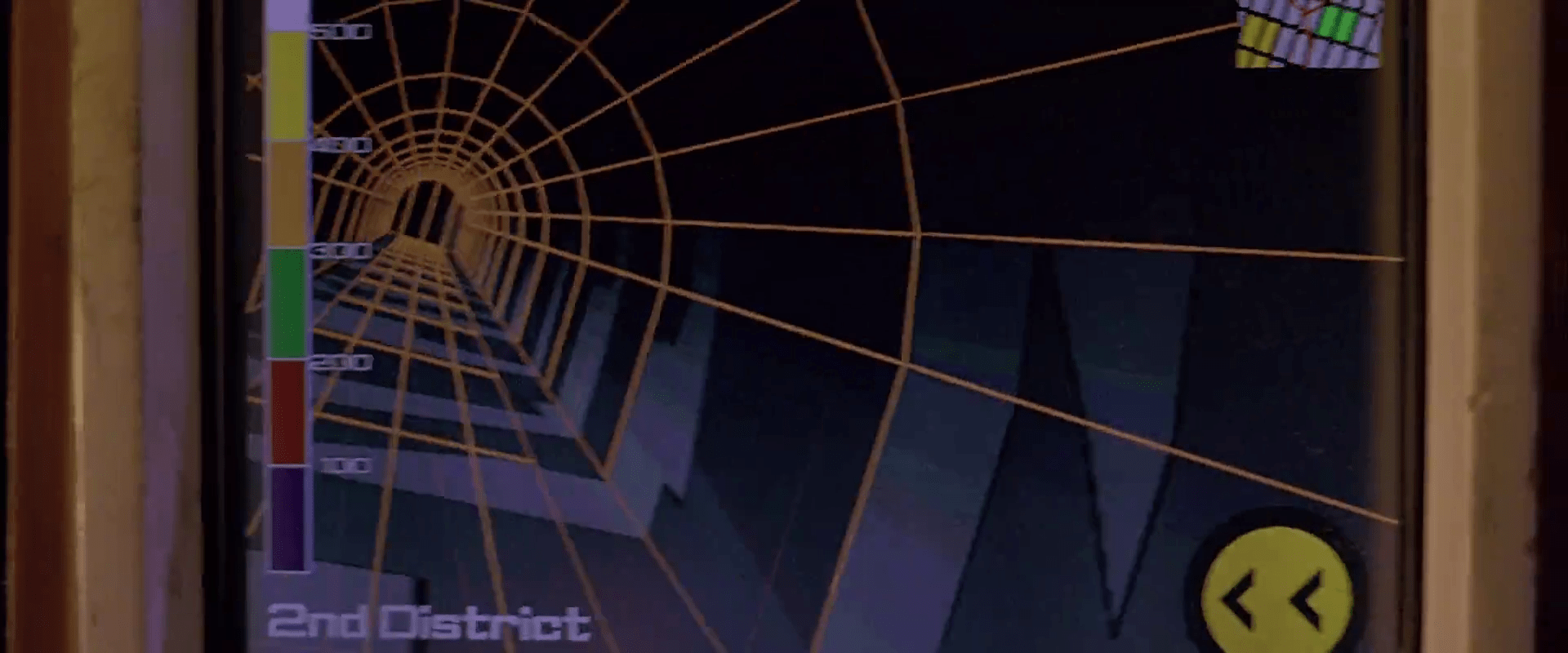
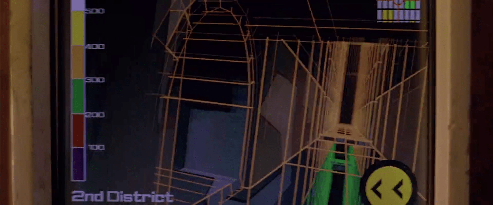
The last category of WCP in the survey is seen in Mission to Mars, and it’s a full-color monitor on the forearm.

Mission to Mars

M2Mars-242

This is problematic for general use and fine for this particular application. These are scientists conducting a near-future trip to Mars, and so having access to rich data is quite important. They’re not facing dangerous Borg-like things, so they don’t need to worry about the light. I’d be a bit worried about the giant buttons that stick out on every edge that seem to be begging to be bumped. Also I question whether those particular buttons and that particular screen layout are wise choices, but that’s for the formal M2M review. A touchscreen might be possible. You might think that would be easy to accidentally activate, but not if it could only be activated by the fingertips in the exosuit’s gloves.

Wearableness

This isn’t an exhaustive list of every wearable control panel from the survey, but a fair enough recounting to point out some things about them as wearable objects.

  • The forearm is a fitting place for controls and information. Wristwatches have taken advantage of this for…some time. 😛
  • Socially, it’s kind of awkward to have an array of buttons on your clothing. Unless it’s an exosuit, in which case knock yourself out.
  • If you’re meant to be sneaking around, lit buttons are counterindicated. As are extruded switch surfaces that can be glancingly activated.
  • The fitness of the inputs and outputs depend on the particular application, but don’t drop the understandability (read: labels) simply for the sake of fashion. (I’m looking at you, Roddenberry.)

Precrime forearm-comm

MinRep-068

Though most everyone in the audience left Minority Report with the precrime scrubber interface burned into their minds (see Chapter 5 of the book for more on that interface), the film was loaded with lots of other interfaces to consider, not the least of which were the wearable devices.

Precrime forearm devices

These devices are worn when Anderton is in his field uniform while on duty, and are built into the material across the left forearm. On the anterior side just at the wrist is a microphone for communications with dispatch and other officers. By simply raising that side of his forearm near his mouth, Anderton opens the channel for communication. (See the image above.)

MinRep-080

There is also a basic circular display in the middle of the posterior left forearm that displays a countdown for the current mission: The time remaining before the crime that was predicted to occur should take place. The text is large white characters against a dark background. Although the translucency provides some visual challenge to the noisy background of the watch (what is that in there, a Joule heating coil?), the jump-cut transitions of the seconds ticking by commands the user’s visual attention.

On the anterior forearm there are two visual output devices: one rectangular perpetrator information (and general display?) and one amber-colored circular one we never see up close. In the beginning of the film Anderton has a man pinned to the ground and scans his eyes with a handheld Eyedentiscan device. Through retinal biometrics, the pre-offender’s identity is confirmed and sent to the rectangular display, where Anderton can confirm that the man is a citizen named Howard Marks.

Wearable analysis

Checking these devices against the criteria established in the combadge writeup, it fares well. This is partially because it builds on a century of product evolution for the wristwatch.

It is sartorial, bearing displays that lay flat against the skin connected to soft parts that hold them in place.

They are social, being in a location other people are used to seeing similar technology.

It is easy to access and use for being along the forearm. Placing different kinds of information at different spots of the body means the officer can count on body memory to access particular data, e.g. Perp info is anterior middle forearm. That saves him the cognitive load of managing modes on the device.

The display size for this rectangle is smallish considering the amount of data being displayed, but being on the forearm means that Anderton can adjust its apparent size by bringing it closer or farther from his face. (Though we see no evidence of this in the film, it would be cool if the amount of information changed based on distance-to-the-observer’s face. Writing that distanceFromFace() algorithm might be tricky though.)

There might be some question about accidental activation, since Anderton could be shooting the breeze with his buddies while scratching his nose and mistakenly send a dirty joke to a dispatcher, but this seems like an unlikely and uncommon enough occurrence to simply not worry about it.

Using voice as the input is cinegenic, but especially in his line of work a subvocalization input would keep him more quiet—and therefore safer— in the field. Still, voice inputs are fast and intuitive, making for fairly apposite I/O. Ideally he might have some haptic augmentation of the countdown, and audio augmentation of the info so Anderton wouldn’t have to pull his arm and attention away from the perpetrator, but as long as the information is glanceable and Anderton is merely confirming data (rather than new information), recognition is a fast enough cognitive process that this isn’t too much of a problem.

All in all, not bad for a “throwaway” wearable technology.

Dispatch

LOGANS_RUN_map_520

At dispatch for the central computer, Sandmen monitor a large screen that displays a wireframe plan of the city, including architectural detail and even plants, all color coded using saturated reds, greens, and blues. When a Sandman has accepted the case of a runner, he appears as a yellow dot on the screen. The runner appears as a red dot. Weapons fire can even be seen as a bright flash of blue. The red dots of terminated runners fades from view.

Using the small screens and unlabeled arrays of red and yellow lit buttons situated on an angled panel in front of them, the seated Sandman can send a call out to catch runners, listen to any spoken communications, and respond with text and images.

LogansRun094

*UXsigh* What are we going to do with this thing? With an artificial intelligence literally steps behind them, why rely on a slow bunch of humans at all for answering questions and transmitting data? It might be better to just let the Sandmen do what they’re good at, and let the AI handle what it’s good at.

But OK, if it’s really that limited of an Übercomputer and can only focus on whatever is occupying it at the moment, at least make the controls usable by people. Let’s do the hard work of reducing the total number of controls, so they can be clustered all within easy reach rather than spread out so you have to move around just to operate them all. Or use your feet or whatever. Differentiate the controls so they are easy to tell apart by sight and touch rather than this undifferentiated mess. Let’s take out a paint pen and actually label the buttons. Do…do something.

LogansRun095

This display could use some rethinking as well. It’s nice that it’s overhead, so that dispatch can be thinking about field strategy rather than ground tactics. But if that’s the case, it could use some design help and some strategic information. How about downplaying the saturation on the things that don’t matter that much, like walls and plants? Then the Sandmen can focus more on the interplay of the Runner and his assailants. Next you could augment the display with information about the runner, and perhaps a best-guess prediction of where they’re likely to run, maybe the health of individuals, or the amount of ammunitition they have.

Which makes me realize that more than anything, this screen could use the hand of a real-time strategy game user interface designer, because that’s what they’re doing. The Sandmen are playing a deadly, deadly video game right here in this room, and they’re using a crappy interface to try and win it.

Virtual 3D Scanner

GitS-3Dscanner-001

Visualization

The film opens as a camera moves through an abstract, screen-green 3D projection of a cityscape. A police dispatch voice says,

“To all patrolling air units. A 208 is in progress in the C-13 district of Newport City. The airspace over this area will be closed. Repeat:…”

The camera floats to focus on two white triangles, which become two numbers, 267 and 268. The thuck-thuck sounds of a helicopter rotor appear in the background. The camera continues to drop below the numbers, but turns and points back up at them. When the view abruptly shifts to the real world, we see that 267 and 268 represent two police helicopters on patrol.

GitS-3Dscanner-008

Color

The roads on the map of the city are a slightly yellower green, and the buildings are a brighter and more saturated green. Having all of the colors on the display be so similar certainly sets a mood for the visualization, but it doesn’t do a lot for its readability. Working with broader color harmonies would help a reader distinguish the elements and scan for particular things.

colorharmonies

Perspective

The perspective of the projection is quite exaggerated. This serves partly as a modal cue to let the audience know that it’s not looking at some sort of emerald city, but also hinders readability. The buildings are tall enough to obscure information behind them, and the extreme perspective makes it hard to understand their comparative heights or their relation to the helicopters, which is the erstwhile point of the screen.

perspectives

There are two ways to access and control this display. The first is direct brain access. The second is by a screen and keyboard.

Brain Access

Kusanagi and other cyborgs can jack in to the network and access this display. The jacks are in the back of their neck and as with most brain interfaces, there is no indication about what they’re doing with their thoughts to control the display. She also uses this jack interface to take control of the intercept van and drive it to the destination indicated on the map.

During this sequence the visual display is slightly different, removing any 3D information so that the route can be unobscured. This makes sense for wayfinding tasks, though 3D might help with a first-person navigation tasks.

GitS-3Dscanner-010

Screen and keyboard access

While Kusanagi is piloting an intercept van, she is in contact with a Section 9 control center. Though the 3D visualization might have been disregarded up to this point as a film conceit, here see that it is the actual visualization seen by people in the diegesis. The information workers at Section 9 Control communicate with agents in the field through headsets, type onto specialized keyboards, and watch a screen that displays the visualization.

GitS-3Dscanner-036

Their use is again a different mode of the visualization. The information workers are using it to locate the garbage truck. The first screens they see show a large globe with a white graticule and an overlay reading “Global Positioning System Ver 3.27sp.” Dots of different sizes are positioned around the globe. Triangles then appear along with an overlay listing latitude, longitude, and altitude. Three other options appear in the lower-right, “Hunting, Navigation, and Auto.” The “Hunting” option is highlighted with a translucent kelley green rectangle.

After a few seconds the system switches to focus on the large yellow triangle as it moves along screen-green roads. Important features of the road, like “Gate 13” are labeled in a white, rare serif font, floating above the road, in 3D but mostly facing the user, casting a shadow on the road below. The projected path of the truck is drawn in a pea green. A kelley green rectangle bears the legend “Game 121 mile/h / Hunter->00:05:22 ->Game.” The speed indicator changes over time, and the time indicator counts down. As the intercept van approaches the garbage truck, the screen displays an all-caps label in the lower-left corner reading, somewhat cryptically, “FULL COURSE CAUTION !!!”

The most usable mode

Despite the unfamiliar language and unclear labeling, this “Hunter” mode looks to be the most functional. The color is better, replacing the green background with a black one to create a clearer foreground and background for better focus. No 3D buildings are shown, and the camera angle is similar to a real-time-strategy angle of around 30 degrees from the ground, with a mild perspective that hints at the 3D but doesn’t distort. Otherwise the 3D information of the roads’ relationship to other roads is shown with shape and shadow. No 3D buildings are shown, letting the user keep her focus on the target and the path of intercept.

GitS-3Dscanner-035

Nucleolab Progress Indicator

FifthE-nucleolab-009

As the nucleolab is reconstructing Leeloo, the screen on the control panel provides update, detailing the process. For the most part this update is a wireframe version of what everyone can see with their eyes.

FifthE-nucleolab-029

FifthE-nucleolab-015

The only time it describes something we can’t see with our own eyes is when Leeloo’s skin is being “baked” by an ultraviolet light under a metal cover. Of course we know this is a narrative device to heighten the power of the big reveal, but it’s also an opportunity for the interface to actually do something useful. It has a green countdown clock, and visualizes something that’s hidden from view.

FifthE-nucleolab-020

As far as a progress indicator goes, it’s mostly useful. Mactilburgh presumably knows roughly how long things take and even the order of operations. All he needs is confirmation that his system is doing what it’s supposed to be, and the absence of an error is enough for him. The timer helps, too, since he’s like a kid waiting for an Easy Bake Oven…of science.

But Munro doesn’t know what the heck is going on. Sure he knows some of the basics of biology. There’s going to be a skeleton, some muscle, some nerves. But beyond that, he’s got a job to do, and that’s to take this thing out the minute it goes pear-shaped. So he needs to know: Is everything going OK? Should I pop the top on a tall boy of Big Red Button? It might be that the interface has some kind of Dire Warning mode for when things go off the rails, but that doesn’t help during the good times. Giving Munro some small indicator that things are going well would remove any ambiguity and set him at ease.

An argument could be made that you don’t want Munro at ease, but a false positive might kill Leeloo and risk the world. A false negative (or a late negative) just risks her escape. Which happens anyway. Fortunately for us.

FifthE-nucleolab-024

NucleoLab Display

FifthE-nucleolab-002

The scientist Mactilburgh reconstructs Leeloo from a bit of her remains in his “nucleolab.” We see a few interfaces here.

FifthE-nucleolab-003

We never see Mactilburgh interact with the controls on this display: Potentiometers, dials with circular LED readout rings, glowing toggle buttons, and unlit buttons labeled “OFF” and “ESC.” There’s not much to grasp onto for analysis. These are just “sciencey” set of physical controls. The display is a bit of similar scienciness, meant to vaguely convey that Leeloo is a higher-order being, but beyond that, incomprehensible. Interestingly, the Mondoshawan DNA shows not just a more detailed graphic, but adds color to convey an additional level of complexity.

FifthE-nucleolab-004

An odd bit: In the lower right hand corner of the screen you can see the words “FAMILIAL HYPERCHOL TEROLEMIA.” Looking up this term reveals the genetic condition Familial Hypercholesterolemia. It’s only missing the “ES.” What’s this label doing here? This could be the area on the DNA chain where the markers appear for this predisposition to high cholesterol, but wouldn’t you expect that to take up 5000 times less room on a DNA strand of a perfect being, not the same percentage? Also it kind of takes the winds out of the sails of Mactilburgh’s breathless claim that she’s perfect. Anyway it’s a warning lesson for sci-fi interface designers: Watch where you pull your sciencey words from. If it’s a real thing, ask whether the meaning runs counter to your purposes or not.

Taxi navigation

FifthE-attackdetection-001

The taxi has a screen on the passenger’s side dashboard that faces the driver. This display does two things. First, it warns the driver when the taxi is about to be attacked. Secondly, it helps him navigate the complexities of New York circa 2163.

Warning system

After Korben decides to help Leeloo escape the police, they send a squadron of cop cars to apprehend them. And by apprehend I mean blow to smithereens. The moment Korben’s taxi is in sights, they don’t try to detain or disable the vehicle, but to blast it to bits with bullets and more bullets. It seems this is a common enough thing to have happen that Korben’s on-board computer can detect it in advance and provide a big, flashing, noisemaking warning to this effect.

FifthE-attackdetection-008

In many cases I object to the Big Label, but not here. In fact, for such a life-threatening issue, more of the taxi’s interface should highlight the seriousness. My life’s in danger? Go full red alert, car. Change the lights to crimson. Dim non-essential things. You’ve got an “automatic” button there. Does that include evasive maneuvering? If so, make that thing opt-out rather than opt-in. Help a brother out.

Navigation aid

At other times during the chase scene, Korben can glance at the screen to see a wireframe of the local surroundings. This interface has a lot of problems.

1. This would work much, much more safely and efficiently for Korben if it was a heads-up display on the windshield. Let’s shrink that feedback loop. Every time a driver glances down he risks a crash and in this case, Korben risks the entire world. If HUD tech isn’t a part of the diegesis, audio cues might be some small help that don’t require him to take his eyes of the “road.”

2. How does the wireframe style help? It’s future-y of course, but it adds a lot of noise to what he’s got to process. He doesn’t need to understand tesselations of surfaces. He needs to understand the shapes and velocities of things around him so he can lose the tail.

FifthE-attackdetection-006

(Exercise for the reader: Provide a solid diegetic explanation for why this screen appeared in the film flipped horizontally.)

FifthE-attackdetection-010

3. There’s some missing information. If the onboard computer can do some real-time calculations and make a recommendation on the best next step, why not do it? We see above that the police have the same information that Korben does. So even better might be information on what the tail is likely to do so Korben can do the opposite. Or maneuvers that Korben can execute that the cop car can’t. If it’s possible to show places he should definitely not go, like dead ends or right into the path, say, of a firing squad of police cars, that would be useful to know, too.

FifthE-attackdetection-002

FifthE-attackdetection-004

4. What are those icons in the lower right meant to do? They’re not suggestions as they appear after Korben performs his maneuvers, and sometimes appear along with warnings instead of maneuvers.

Even if they are suggestions, what are they directions to? His original destination? He didn’t have one. Some new destination? When did he provide it? Simple, goal-aware directions to safety? Whatever the information, these icons add a lot cognitive weight and visual work. Surely there’s some more direct way to provide cues, like being superimposed on the 3D so he can see the information rather than read and interpret it.

If they’re something else other than suggestions, they’re just noise. In a pursuit scenario, you’d want to strip that stuff out of the interface.

FifthE-attackdetection-003

5. What is that color gradient on the left meant to tell him? All the walls in this corridor are 350…what? The screen shot above hints that it represents simple height from the ground, but the 2D map has these colors as well, and height cues wouldn’t make sense there. If it is height, this information might help Korben quickly build a 3D mental map of the information he’s seeing. But using arbitrary colors forces him to remember what each color means. Better would be to use something with a natural order to it like the visible spectrum or black-body spectrum. Or, since people already have lots of experience with monocular distance cues and lighting from above, maybe a simple rendering as if the shapes were sunlit would be fastest to process. Taking advantage of any of these perceptual faculties would let him build a 3D model quickly so he can focus on what he’s going to do with the information.

Side note: Density might actually make a great deal more sense to the readout, knowing that Korben has a penchant for ramming his taxi through things. If this was the information being conveyed, varying degrees of transparency might have served him better to know what he can smash through safely, and even what to expect on the other side.

6. Having the 2D map helps a bit to understand the current level of the city from a top-down view. Having it be small in the upper right is a sound placement, since that’s a less-important subset of the information he really needs. It has some color coding but as mentioned above it doesn’t seem to relate to what’s colored in the 3D portion, which could make for an interpretation disaster. In any case, Korben shouldn’t have to read this information in the tiny map. It’s a mode, a distraction. While he’s navigating the alleys and tunnels of the city, he’s thinking in a kind of 3D node-graph. Respect that kind of thinking with a HUD that puts information on the “edges” of the graph, i.e., the holes in the surfaces around him that he’s looking at. That’s his locus of attention. That’s where he’s thinking. Augment that.

So, you know…bad

Fortunately, given that the interface has so many problems, Korben only really glances at this once during the chase, and that’s at the warning sound. But if the younger Korben was meant to use this at all, there’s a lot of work to make this useful rather than dangerous.

Four a day

An electronic quit smoking device displaying refill options, a countdown timer, and various indicators.

After Korben’s alarm clock starts the music and lights the lights, it also drops his daily allotment of cigarettes into place inside vertical glass tubes in a small dispensary mounted on the wall. Each tube has a purple number printed across the top, reinforcing the limit. A robotic voice tells reminds him to only have “four. a. day.”

fifthelement-4aday

The dispensary is loaded with warnings to get him to quit. Across the top we read 4™ REFILLS. Just below that is a white imperative, QUIT SMOKING. To the right another legend reinforces the principles spoken aloud, 4™ A DAY. A legend across the bottom, written in glittery red capitals reminds him that, TO QUIT IS MY GOAL. Behind the glass tubes is something like a Surgeon General’s warning about the dangers of smoking.

On the right is a small LCD panel with a mysterious readout at the top of 1:::1…1..1, a counter in the middle reading 00:04 (it looks like just after midnight in military time, but we know from his alarm clock it’s just after 02:00), and a temperature readout that confirms the temperature that the clock displays, 27.5° C. Below this panel is a small set of four buttons: two horizontal ones that sandwich two triangular ones pointing in opposite directions. Korben presses the lowest button to pick up the first cigarette, and the #1 cylinder of glass slides up. A smaller “vase” of glass holds the cigarette upright for Korben to grab.

A shirtless man talking on a phone while pointing at a control panel on the wall.

The LCD panel

The top readout is a mystery, and the middle might be a counter of number of cigarettes remaining for the day or in the refill, but why it’s in 24-hour notation is another mystery. The temperature doesn’t make much sense here. Better might be the variable information that the addicted smoker really wants: How soon until I can get my next fix. A clock showing that time would be useful, and give the smoker something to fixate on instead of the cravings. A countdown clock might be information that the smoker wants, but it would focus his attention on the device rather than on his willpower.

To quit is my goal

Really, it’s beyond the scope of this blog post to try and state the authoritative psychology of quitting smoking, but it does seem like this device accomplishes one common strategy well, which is reminding smokers of their goal. There it is, in glittery red, in a first-person voice.

But it doesn’t do everything well. Another strategy to quit is for smokers to have reminders of the negative consequences of continuing to smoke, and the device only kind of does this with the warning label. The fact that it’s behind the glass tubes is nice since to get at the cigarettes the smoker wants, he is faced with that text. But, it’s only text, and easy to simply not read. The fact that the cylindrical glass distorts the text makes willful ignoring even easier, since it hinders readability. Better would be a visceral, instantly-recognizable image, like Australia mandated on their cigarette packaging in 2011. The disturbing nature of these images would be enhanced by the cylinder’s distortions.

Cigarette warning packaging highlighting the effects of smoking, including blindness, mouth and throat cancer, and the dangers of secondhand smoke to children.

On the other hand, one strategy is to eliminate the triggers that remind a smoker about cigarettes, and this dispensary does exactly the opposite. By being prominently displayed on the wall, being associated with waking up, and having the word “smoking” appear in high-contrast capital letters at eye level, it pretty much acts as a trigger to remind Korben about smoking. Better might be a hideaway dispensary, similar to his bed, refrigerator, or shower in the apartment, which hide themselves away when not in use.

Surgeon General’s Warning

The other problem is habituation. After repeated exposure to this device on a daily basis, Korben will begin to disregard the signal. A more persuasive system would change, such that the consequences and goals are kept fresh on Korben’s mind. To make sure it hits home at the right time, I would get rid of the extraneous buttons and have one “time-release” button, that requires him to press and hold it for a few seconds to get at the cigarette. During this enforced moment of boredom, the device can flash a new message and dissuasive image, giving Korben a moment to consider this and whether he really wants to keep pressing the button for his cigarette. The LCD panel would need to display these instructions first, and then switch to showing the time at which the next cigarette will be available.

A device displaying the message 'SMOKING CAUSES BLINDNESS' with a digital screen indicating daily goals beside a series of tubes visible in the front.

Mission Briefing

Once the Prometheus crew has been fully revived from their hypersleep, they gather in a large gymnasium to learn the details of their mission from a prerecorded volumetric projection. To initiate the display, David taps the surface of a small tablet-sized handheld device six times, and looks up. A prerecorded VP of Peter Weyland appears and introduces the scientists Shaw and Holloway.

This display does not appear to be interactive. Weyland does mention and gesture toward Shaw and Holloway in the audience, but they could have easily been in assigned seats.

Cue Rubik’s Space Cube

After his introduction, Holloway places an object on the floor that looks like a silver Rubik’s Cube with a depressed black button in the center-top square.

Prometheus-055

He presses a middle-edge button on the top, and the cube glows and sings a note. Then a glowing-yellow “person” icon appears, glowing, at the place he touched, confirming his identity and that it’s ready to go.

He then presses an adjacent corner button. Another glowing-yellow icon appears underneath his thumb, this one a triangle-within-a-triangle, and a small projection grows from the side. Finally, by pressing the black button, all of the squares on top open by hinged lids, and the portable projection begins. A row of 7 (or 8?) “blue-box” style volumetric projections appear, showing their 3D contents with continuous, slight rotations.

Gestural control of the display

After describing the contents of each of the boxes, he taps the air towards either end of the row (there is a sparkle-sound to confirm the gesture) and he brings his middle fingers together like a prayer position. In response, the boxes slide to a center as a stack.

He then twists his hands in opposite directions, keeping the fingerpads of his middle fingers in contact. As he does this, the stack merges.

Prometheus-070

Then a forefinger tap summons an overlay that highlights a star pattern on the first plate. A middle finger swipe to the left moves the plate and its overlay off to the left. The next plate automatically highlights its star pattern, and he swipes it away. Next, with no apparent interaction, the plate dissolves in a top-down disintegration-wind effect, leaving only the VP spheres that illustrate the star pattern. These grow larger.

Halloway taps the topmost of these spheres, and the VP zooms through intersteller space to reveal an indistinct celestial sphere. He then taps the air again (nothing in particular is beneath his finger) and the display zooms to a star. Another tap zooms to a VP of LV-223.

Prometheus_VP-0030

Prometheus_VP-0031

After a beat of about 9 seconds, the presentation ends, and the VP of LV-223 collapses back into its floor cube.

Evaluating the gestures

In Chapter 5 of Make It So we list the seven pidgin gestures that Hollywood has evolved. The gestures seen in the Mission Briefing confirm two of these: Push to Move and Point to Select, but otherwise they seem idiosyncratic, not matching other gestures seen in the survey.

That said, the gestures seem sensible. On tapping the “bookends” of the blue boxes, Holloway’s finger pads come to represent the extents of the selection, so bringing them together is a reasonable gesture to indicate stacking. The twist gesture seems to lock the boxes in place, to break the connection between them and his fingertips. This twist gesture turns his hand like a key in a lock, so has a physical analogue.

It’s confusing that a tap would perform four different actions (highlight star patterns in the blue boxes, zoom to the celestial sphere, zoom to star, zoom to LV-223) but there is no indication that this is a platform for manipulating VPs as much as it is a presentation software. With this in mind he could arbitrarily assign any gesture to simply “advance the slide.”