After fleeing the Yakuza in the hotel, Johnny arrives in the Free City of Newark, and has to go through immigration control. This process appears to be entirely automated, starting with an electronic passport reader.
After that there is a security scanner, which is reminiscent of HAL from the film 2001: A Space Odyssey.
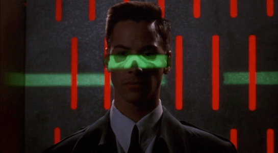
The green light runs over Johnny from top to bottom.
Looking at the picture, we can see that this green light is somehow making Johnny’s skeleton visible. It would be possible, by having an X-ray imaging system running at the same time and then re-projecting the X-ray image back onto the body, but why? Since there don’t appear to be any actual human beings on duty, I can only suggest that it is meant to look intimidating and impressive to encourage obedience. In the film Johnny appears to be alone and cannot see this himself, but it would be much more common for there to be multiple passengers, so each could watch the others being scanned.
There is also a screen showing another scan, a blurry body image, and text appearing on the right side. A voice repeats the text content. For the first time we see a blue background, the most common color for futuristic film interfaces.
The scanner detects Johnny’s implant, but whatever secrecy measures are present cause the system to decide that it is a registered dyslexia aid. The popup alert below includes the registration issuer and a domain name, so perhaps this is online verification over the Internet. Presumably Johnny can see this screen himself, if he cares.
The voiceover helpfully informs Johnny that there is “synaptic seepage”, and he should seek medical attention within 24 hours. This shows quite high level decision making by the system and an offer of assistance. Johnny says “thanks” in reply, an anthropomorphic response to this seemingly intelligent machine.
However, there seems to be a more detailed explanation in smaller text on the right of the display, and this isn’t announced. It’s not clear in this scene whether Johnny can see this display or not, but even if he could it would be difficult to read. Perhaps this is a legacy system from the days when airport security had actual staff.
Next
At this point Johnny leaves the airport, riding in a taxi from the airport. It is a good time for the first review of a group of related interfaces, which will be the next series of posts.
Biff(2015) pays for his taxi ride to the McFly household with his thumbprint. When the ride ends, a synthesized voice gives the price one-seven-four-point-five-zero. The taxi driver presents him with a book-sized device with the price at the top on a red 7-segment LED display. Biff presses his thumb on a reader at the bottom that glows white as it scans. When the payment is verified, the thumbprint reader and the price go dark as a sound plays like a register.
For due diligence, let me restate: multimodal biometric or multifactor authentication is more secure.
To get Jennifer into her home, the police take her to the front door of her home. They place her thumb on a small circular reader by the door. Radial LEDs circle underneath her thumb for a moment as it reads. Then a red light above the reader turns off and a green light turns on. The door unlocks and a synthesized voice says, Welcome home, Jennifer!
Similarly to the Thumbdentity, a multifactor authentication would be much more secure. The McFly family is struggling, so you might expect them to have substandard technology, but that the police are using something similar casts that in doubt.
When officers Foley and Reese find the sleeping Jennifer, they thumbprint her on a wireless handheld device, and Officer Foley looks up the young girls information. Looking at the screen she retrieves Jennifer(2015)’s address and age.
Thumbprint is a fine unimodal authenticator, but much better is multimodal biometric or multifactor authenticator to be certain of identity.
In the last post we went over the Iron HUD components. There is a great deal to say about the interactions and interface, but let’s just take a moment to recount everything that the HUD does over the Iron Man movies and The Avengers. Keep in mind that just as there are many iterations of the suit, there can be many iterations of the HUD, but since it’s largely display software controlled by JARVIS, the functions can very easily move between exosuits.
Gauges
Along the bottom of the HUD are some small gauges, which, though they change iconography across the properties, are consistently present.
For the most part they persist as tiny icons and thereby hard to read, but when the suit reboots in a high-altitude freefall, we get to see giant versions of them, and can read that they are:
Tony can, at a glance or request, summon more detail for any of the gauges.
Even different visualizations of similar information.
Object Recognition
In the 1st-person view we see that the HUD has a separate map in the lower-left, and object recognition/awareness,
In the 2nd-person view, we see even more layers of information about the identified objects, floating closer to tony’s point of view.
Situational
Most of the HUD functions we see, though, are situational, brought up for Tony’s attention when JARVIS believes they are needed, or when Tony requests them. Following are screenshots that illustrate a moment when the situational function appeared.
Iron Man
Iron Man 2
Iron Man 3
The Avengers
Some of these illustrate why I argue that JARVIS is the superhero, and Tony just the onboard manager, but rather than reverse engineering any particular function, for this post it is enough to document them and note that only the optical zoom seems to be an interactive function. This raises questions of how he initiated the mode and how he escapes the mode, but since we don’t see the mechanisms of control, it’s entirely arguable that JARVIS is just being his usual helpful self again.
On each of the sleep pods in which the Odyssey crew sleep, there is a display for monitoring the health of the sleeper. It includes some biometric charts, measurements, a body location indicator, and a countdown timer. This post focuses on that timer.
To show the remaining time of until waking Julia, the pod’s display prompts a countdown that shows hours, minutes and seconds. It shows in red the final seconds while also beeping for every second. It pops-up over the monitoring interface.
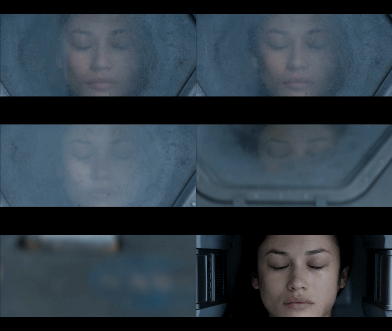
Julia’s timer reaches 0:00:01.
The thing with pop-ups
We all know how it goes with pop-ups—pop-ups are bad and you should feel bad for using them. Well, in this case it could actually be not that bad.
The viewer
Although the sleep pod display’s main function is to show biometric data of the sleeper, the system prompts a popup to show the remaining time until the sleeper wakes up. And while the display has some degree of redundancy to show the data—i.e. heart rate in graphics and numbers— the design of the countdown brings two downsides for the viewer.
Position: it’s placed right in the middle of the screen.
Size: it’s roughly a quarter of the whole size of the display
Between the two, it partially covers both the pulse graphics and the numbers, which can be vital, i.e. life threatening—information of use to the viewer.
The sleeper
At the same time the display has another user, the sleeper. Since she can’t get back or respond in any way, this display is her only way of communication. As such, the device ought to react at least as well as a person would. So while normally a pop-up should only be used to show important data that the user really must know, this case is different. The pop up is not blindly blocking information, it’s reflecting the user’s priorities at that moment. And it’s for this reason that the timer bears that much visual importance on the screen.
But the display is also a touchscreen, which you can tell from the buttons in the timer. So in case the viewer really needs to see the entire display, it would require putting the timer in a separate mode. But that would require him switch back and forth between modes to get all the data.
When the countdown finishes, the pod slides open. Julia slowly begins to recover consciousness, open her eyes and sits to take a look around the outside.
Rome wasn’t built in 99 hours.
The countdown timer shows the amount of hours, minutes and seconds until the sleeper wakes, counting backwards. We just get to see the timer —and hear it beeping— only when the sleep time is ending, so it’s likely a feature to notify any close witness that the pod is about to open.
But what if the sleeper’s biometrics start to get bad? Well, the timer does leave enough room on the screen to leave the bulk of the biometrics data. The device also has a warning for when the sleeper is in CRITICAL condition, but we don’t get to see any in-between modes. It could be helpful if the timer offered some sound cue when the sleeper has some minor issue as well, even if it isn’t as bad. Even something as simple as changing the tone of the beep could do the trick.
Did you notice that the timer has two digits to display hours? That means it can display 99 hours of remaining time. That’s a long time. I’m guessing that the display doesn’t show the countdown with that much time in advance. But in that case, when does it show the timer? If the timer looks to give a hint when a sleeper is about to wake up, you don’t really need to know the amount of hours left. A few minutes’ advance notice is enough.
Kind-of setting the timer.
Although the crew of the Odyssey could probably handle the delta sleep from the onboard computer, the display also offers some functions to control that time. It has three buttons that control the timer:
a START button
a RESET button
a CLEAR button
The timer has two small half-circles both at the top and bottom of the clock. There is a play button. The timer needs to have a way to enter a given duration, and from the mapping of those symbols I’m guessing they could work as adding and subtracting buttons —you know, press the top button to add an hour, press the bottom button to reduce an hour. But at the same time the buttons don’t have any labels to convey that—they lack either a plus symbol on the top or a minus symbol on the bottom. For what it’s worth, the only label they offer is the time magnitude of any pair of digits—hours, minutes and seconds—on the circles at the bottom. So yeah, I’m close to calling these fuidgets.
The text buttons need some consideration as well. The first two are pretty straightforward if we envision the scenario where the clock timer can be set to any given time. In that case START will start the clock and RESET will put it back to zero, as with any common timer. The odd bit is that there is still a START button while the clock is ticking. In many common timers that same button has two modes that switch according to the state of the timer: starting it when it’s paused and pausing it when it it’s playing. But the missing pause mode or button could have a purpose, perhaps waking the sleeper requires a gradual biological process that can’t be stop once it has began.
There are other problems with the third one, the CLEAR button. Although the label is somewhat misleading, the button probably acts as a way to close the pop-up of the countdown, removing it from the screen. But the real issue is what happens after that. If the user press CLEAR and the pop-up closes, there is no way of knowing if the timer keeps running in the background or if it resets back to zero. This is a major problem.
Anyhow, even if the timer did run in the background it doesn’t have much of a point in this case. I mean, there was no one around to check on Julia while she was in sleep.
A little ramble on Industrial Design
Another interesting aspect of the design of the pods is the way they open. Instead of opening or sliding the cover to one side, as more common doors and hatches, the cover of the pods is divided in the middle like a double-leaf bascule drawbridge. These covers on the pod have a hinge both at the top and bottom, so they turn outside and up of the pod when opening.
Jack releases Julia from the sleep pod.
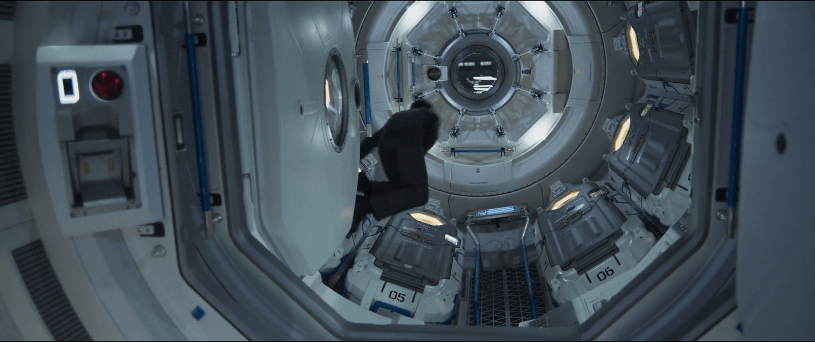
Although it may seem like an overly complicated design, it really shows its advantages when you set it in context. On the Odyssey the sleep pods are placed side by side, alongside the walls of a tube like compartment. There, the area around the center has hatches that lead to other compartments.
Within a space of those characteristics, a cover that opens or slides to the side would bring some problems. As the cover slides, when opening a pod you would be blocking the one next to it. To improve that, you could have a cover that opens up from the top or the bottom. With that you could have more than one pod closing and opening at the same time, but it also comes with drawbacks. Given the length of the pods those doors will probably cover much of the transit area around the compartments of the ship, becoming an obstacle for the movement of the crew.
This is a solution for both problems. The divided doors give plenty of space for the crew to pass through, and as the doors open up they also give room to opening or closing the pods next to each other at the same time.
Forgive me, as I am but a humble interaction designer (i.e., neither a professional visual designer nor video editor) but here’s my shot at a redesigned DuoMento, taking into account everything I’d noted in the review.
There’s only one click for Carl to initiate this test.
To decrease the risk of a false positive, this interface draws from a large category of concrete, visual and visceral concepts to be sent telepathically, and displays them visually.
It contrasts Carl’s brainwave frequencies (smooth and controlled) with Johnny’s (spiky and chaotic).
It reads both the brain of the sender and the receiver for some crude images from their visual cortex. (It would be better at this stage to have the actors wear some glowing attachment near a crown to show how this information was being read.)
These changes are the sort that even in passing would help tell a more convincing narrative by being more believable, and even illustrating how not-psychic Johnny really is.
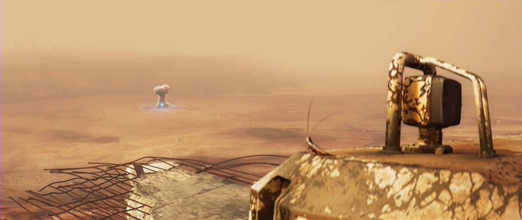
For personal security during her expeditions on Earth, Eve is equipped with a powerful energy weapon in her right arm. Her gun has a variable power setting, and is shown firing blasts between “Melt that small rock” and “Mushroom Cloud visible from several miles away”
After each shot, the weapon is shown charging up before it is ready to fire again. This status is displayed by three small yellow lights on the exterior, as well as a low-audible charging whine. Smaller blasts appear to use less energy than large blasts, since the recharge cycle is shorter or longer depending on the damage caused.
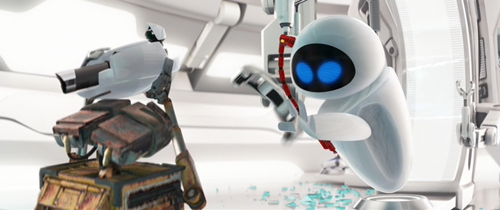
On the Axiom, Eve’s weapon is removed during her service check-up and tested separately from her other systems. It is shown recharging without firing, implying an internal safety or energy shunt in case the weapon needs to be discharged without firing.
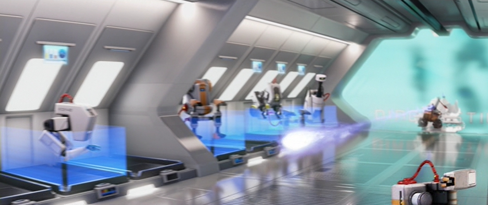
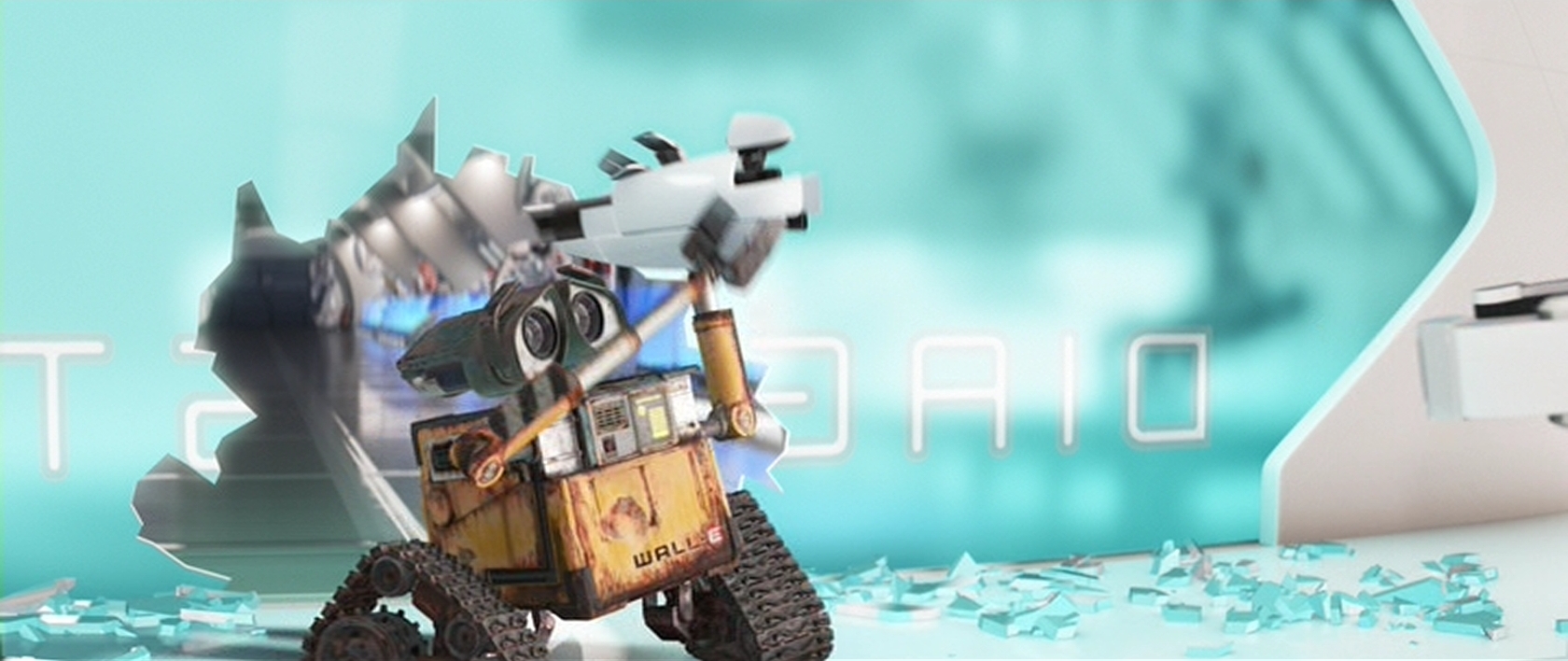
While detached, Wall-E manages to grab the gun away from the maintenance equipment. Through an unseen switch, Wall-E then accidentally fires the charged weapon. This shot destroys the systems keeping the broken robots in the Axiom’s repair ward secured and restrained.
Awesome but Irresponsible
I am assuming here that BNL has a serious need for a weapon of Eve’s strength. Good reasons for this are:
They have no idea what possible threats may still lurk on Earth (a possible radioactive wasteland), or
They are worried about looters, or
They are protecting their investment in Eve from any residual civilization that may see a giant dropship (See the ARV) as a threat.
In any of those cases, Eve would have to defend herself until more Eve units or the ARV could arrive as backup.
Given that the need exists, the weapon should protect Eve and the Axiom. It fails to do this because of its flawed activation (firing when it wasn’t intended). The accidental firing scheme is an anti-pattern that shouldn’t be allowed into the design.
The only lucky part about Wall-E’s mistake is that he doesn’t manage to completely destroy the entire repair ward. Eve’s gun is shown having the power to do just that, but Wall-E fires the weapon on a lower power setting than full blast. Whatever the reason for the accidental shot, Wall-E should never have been able to fire the weapon in that situation.
First, Wall-E was holding the gun awkwardly. It was designed to be attached at Eve’s shoulder and float via a technology we haven’t invented yet. From other screens shown, there were no physical buttons or connection points. This means that the button Wall-E hits to fire the gun is either pressure sensitive or location sensitive. Either way, Wall-E was handling the weapon unsafely, and it should not have fired.
Second, the gun is nowhere near (relatively speaking) Eve when Wall-E fires. She had no control over it, shown by her very cautious approach and “wait a minute” gestures to Wall-E. Since it was not connected to her or the Axiom, the weapon should not be active.
Third, they were in the “repair ward”, which implies that the ship knows that anything inside that area may be broken and do something wildly unpredictable. We see broken styling machines going haywire, tennis ball servers firing non-stop, and an umbrella that opens involuntarily. Any robot that could be dangerous to the Axiom was locked in a space where they couldn’t do harm. Everything was safely locked down except Eve’s gun. The repair ward was too sensitive an area to allow the weapon to be active.
In short:
Unsafe handling
Unauthorized user
Extremely sensitive area
Any one of those three should have kept Eve’s gun from firing.
Automatic Safeties
Eve’s gun should have been locked down the moment she arrived on the Axiom through the gun’s location aware internal safeties, and exterior signals broadcast by the Axiom. Barring that, the gun should have locked itself down and discharged safely the moment it was disconnected from either Eve or the maintenance equipment.
A Possible Backup?
There is a rationale for having a free-form weapon like this: as a backup system for human crew accompanying an Eve probe during an expedition. In a situation where the Eve pod was damaged, or when humans had to take control, the gun would be detachable and wielded by a senior officer.
Still, given that it can create mushroom clouds, it feels grossly irresponsible.
In a “fallback” mode, a simple digital totem (such as biometrics or an RFID chip) could tie the human wielder to the weapon, and make sure that the gun was used only by authorized personnel. (Notably Wall-E is not an authorized wielder.) By tying the safety trigger to the person using the weapon, or to a specific action like the physical safeties on today’s firearms, the gun would prevent someone who is untrained in its operation from using it.
If something this powerful is required for exploration and protection, it should protect its user in all reasonable situations. While we can expect Eve to understand the danger and capabilities of her weapon, we cannot assume the same of anyone else who might come into contact with it. Physical safeties, removal of easy to press external buttons, and proper handling would protect everyone involved in the Axiom exploration team.
Sandmen surrender any physical objects recovered from the bodies of runners to the Übercomputer for evaluation via a strange device I’m calling The Evidence Tray.
As a Sandman enters the large interrogation chamber, a transparent cylinder lowers from the ceiling. At the top of this cylinder an arm continuously rotates bearing four pin lights. A chrome cone sits in the center of the base. The Sandman can access the interior of the cylinder through a large oblong opening in the side the top of which is just taller than Sandmen (who seem to be a near-uniform height).
The Sandman puts any evidence he has found into the bottom of this cylinder. (What if the evidence was too large to fit? What if the critical evidence is not physical, or ephemeral? But I digress.) In response to his placing the objects, lights on the rotating arm illuminate, scanning them. The voice of the Übercomputer prompts the Sandman to “identify,” a request that is repeated on a large screen mounted on the wall in view through the transparent backing of the Evidence Tray.
The Sandman identifies himself by placing his palm on a cone in the cylinder’s center, positioning his lifeclock in the small indention in its tip. The base section of the cylinder illuminates, and after a pause, the voice and screen confirm that his identity has been “affirmed.” Logan removes his hand, and in a flash of blue light the objects in the tray disappear. The film gives no clue as to whether the objects are teleported somewhere or disintegrated into thin air.
Objections
There are of course the usual objections to the authentication. The lifeclock check is really a biometric check, something that Logan “is” (since he can’t remove the lifeclock) and—per the principles of multifactor authentication—should need to provide an additional factor, such as something he has (like a key) and something he knows (like a password).
There’s another objection there to the fact that the authentication requires that his hand be put into a teleport/distingration chamber. Perhaps narratively this shows the audence the insane levels of trust citizens have in their Nanny Program, but for the real world let’s just say it’s best that you don’t require police to submit to a Flash Gordon Wood Beast just to hand over exhibit A.
There’s a nice touch to the transparent walls allowing him to see the computer screen through it, to get the visual confirmation of what he’s hearing. But I suspect the curved surface also adds a bit of distortion to his view that doesn’t help readability. So the industrial design aspects of the interface sort of even out. Unless I’m missing something. Any industrial designers want to weigh in?
A final objection is the unnecessarily vast architecture that is part of the workflow. Why this giant room with a thin cylinder in the middle of it? Sure there are narrative reasons for it (welcome to this digital heart of darkness) but it seems like something that Sandmen would be doing routinely, and this giant ritual just makes a creepy, big deal about it.
Better
Better might be a wide, waist-high cubby off to the side of their offices, whatever those are, with a wide tray and computer screen. Sandmen could drop the evidence into the tray and place their hands into an authenticator outside the tray, initiating the scan. This would save them the awkward time of waiting for the computer to order them to authenticate, and tightly couple the objects with their identity. The improved semiotics say, “I, Logan, found these and am surrendering them to you.” Then if the computer needed to speak more about it, it could summon them to an interlocution room, or something with a similarly awkward 70s name.
Not everyone is comfortable giving over to the flimsy promise of Carrousel [sic]. Some citizens run, and Sandmen find and terminate these cultural heretics.
Sandmen carry a device with them that has many different uses. It goes unnamed in the movie, so let’s just call it the SandPhone. It is a thick black rectangle about 20cm at its long edge, about the size of a very large cell phone. Near the earpiece on one broad side is a small screen for displaying text and images. Below that is a white line. The lower half of this face is metallic grill that covers a microphone. On the left edge is a momentary button that allows talking. Just above this is a small red button. When not in use, the device is holstered on the sandman’s belt.
The SandPhone lets the Sandman receive information through a display that can show both image and text. The Sandman sends back information and requests by voice in a CB radio metaphor.
Notifications
The first time we see the device is when Logan and Francis are attending Carrousel. Somehow, on his belt it catches his attention. With the crowd too loud for sound, and no evidence it’s light, my bet’s on haptics. Realizing he’s got a message, he picks it up, presses the edge button and the screen displays two lines of text:
RUNNER: GREAT HALL ENTRANCE WEST.
He then puts the device to his face as we would a cell phone and shouts, “Affirmative!” as loud as he can.
Perp wayfinding
Running with the device outside the Great Hall, Logan uses the SandPhone as a detector. By holding it flat out in front of him he hears a rhythmic pulse. Turning it this way and that, he listens for the change in pitch. It rises when he is pointing towards the targeted runner.
Bio identification
When he and Francis have terminated the runner, he snaps the device off his belt, and pressing the edge button, he reports back to dispatch, “Runner terminated, 0.31. Ready for cleanup.” Then by placing the device near the head of the dead runner, the device displays on the screen the last photographic image of him on file. Since the face on the SandPhone screen does not match the face he sees before him, Logan lifts the device to his face and, holding the edge button, requests an identity check of dispatch. Instantly he pulls the device away from his face to show the text:
IDENT. AFFIRM NEW YOU #483 FACE CHANGE.
Send backup
Much later in the film we see Logan alert dispatch to the location of the underground hideout by reaching down to the holstered device and pressing the white line button on its face. Its screen pulses green, and his position is highlight on the runner board (see below) at dispatch. Minutes later the location is raided by Sandmen.
Analysis
The first thing to note is that this is pretty close to a modern smart phone. He receives images and text messages, can talk to dispatch, and it has a biometric capability for identifying citizens. It’s tempting to paint this as visionary, but keep in mind that the first mobile phone was demonstrated in 1973, three years earlier, so it’s likely that the film makers were riffing off of the demo technology they’d heard about or maybe even seen in person.
We evaluate an interface’s design by how well it helps its user achieves his goals. (Even if those goals are anethma. That’s how we judge an interface.) In this case, the SandPhone helps Logan get the information he needs, when he needs it, across multiple channels. It doesn’t distract him with other functions. It’s context aware and doesn’t apparently have battery issues.
There are improvements of course.
We should make sure his hands are free by making the information available as an augmented reality display instead of a handheld device. This would also give him the information privately rather than display it for anyone (notably members of the resistance) to see it. Wayfinding would be more sensible as an overlay to his vision through this device.
Some surface tweaks might also be made, such as giving him a means of text input so he wouldn’t have to shout above the roar of Carrousel. Some silent means of input would help for when he needs to provide silent input as well. First I thought optical inputs might be ideal, given the augmented reality, but we don’t want his eyes distracted like that, even for the duration of glances. Instead some other gestural input—perhaps a face twitch or subvocal input—that lets him keep the rest of his body tense and ready for action.
Citizen biometrics should be a background fact, given the penopticon of Dome City. The information would come to him when he gets his assignement. But turn those same biometrics around on Logan, and his body could request reinforcements before he even thought to do so manually. When his heart rate elevates and galvanic skin response lowers, dispatch would know something was up, and route backup immediately.
A strategic interaction designer would even ask why he has to chase runners at all, when predictive algorithms could guess which citizens were likely to run and take action to forestall their rebellion. But then we’re into Minority Report, and this needs to stay Logan’s Run.