Author Archives: Christopher Noessel
Stardrive
First off, let me apologize for the terrible flashing that is this next interface.
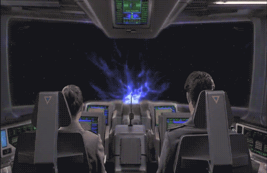
After "designing a course to Jupiter" using STARNAV, Barcalow presses something that initiates the warp drive.
He speaks along with a broadcast voice to countdown, "Star drive in…5…4…ready…steady…GO!"

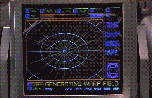
The next screen shows a polar grid labeled GENERATING WARP FIELD. Circular rings shrink towards the center of the grid. Text along the right reads TACHYON CAPTURE, FIELD INGH DISTORT, GRAVITIC FEEDBACK, and ENERGY LEVELS. Bits of the fuidgitry from the STARNAV screens are occluded by a progress bar and a string of unchanging numbers: 0045 4535 7752 0659 2958 6456 6469 2934.
The first part of this display makes sense. It’s providing feedback to the navigator that it’s progressing in a task, i.e. generating the warp field. The animated circles provide some glanceable confirmation that things are progressing smoothly, and the implied concentration of power in a single point tells that whatever it’s building to, it’s gonna be big. Of course we can probably do without the numbers and tabs since they don’t change and it’s not really a touch screen. It would also be good to monitor whatever metrics we should be watching to know if things are safe or trending dangerously, maybe with sparklines, like a medical monitoring interface. Perhaps though that’s the sort of screen better suited to engineering. After all, Barcalow and Ibanez are just navigating and piloting here, respectively.

Then the progress bar suddenly turns purple, then the whole purple grid flashes multiple colors as we hear rapid electronic beeping (amongst a swell of extra-diegetic orchestra brass). Finally, a white circle grows from the center outward to fill the screen as the ship passes into Star Drive.
At first the white screen might seem like a waste, since this is when the navigator’s job really begins, as they go careening through space hurtling towards potentially life-threatening obstacles. But that white background can provide a clear background for a radar view (or Starship Trooper equivalent), a canvas for him to scan for any threats that radar are picking up beyond the field of vision afforded by the viewport. So the "wasted" space isn’t a problem at all.


The flashes are a bit of a problem. What’s it doing that for? Is it trying to put them into an epileptic seizure just before engaging in potentially deadly activity? Or is a seizure the only way to survive the perils of Stardrive? It’s unclear and dubious that there’s any good reason. Interaction designers are rarely in the business of putting users into a grand mal.
The color and values are also problematic. Why the candy colors? Does the orange flash mean something different than the purple flash? Even if you got rid of all the circus themed colors, there’s still a blinding amount of white on the screen once warp is engaged. That canvas would work a lot better as a black background with white blips to avoid eye fatigue, especially over long spans of time.

Glossary: Dunsels, Nurnies, Greebles, Gundans, and Fuidgets
No I am not randomly typing on the screen. I’m taking a pause from the Starship Troopers review to establish some much-needed vocabulary. Oftimes in science fiction, details are added to things for the sake of feeling more real, but that don’t actually do anything and, more importantly to our interests in scifinterfaces, aren’t even guided by a design philosophy. They’re the equivalent of “bullshit” in the H.G. Frankfurt sense. They don’t care about the diegetic truth of themselves, they only care about their effect.
Collectively, I call these things dunsels. But don’t thank me. Thank the midshipmen in the Star Trek TOS universe.
Dunsels appear in three major places in sci-fi.
The surface of objects: Nurnies and greebles
When they appear on spacecraft or futuristic architecture, they’re called greebles or, interchangably, nurnies. These terms come to us from the folks at ILM, who coined the term while developing the style for Star Wars.
I think I’d also apply these terms to props as well, that get covered by details that may not do anything or have much design logic behind them. That means weapons and gadgets, too.


The walls: Gundans
When this suface detailing is applied to sets, it’s called gundans. This after the Star Trek TOS pipes that got labeled “GNDN,” for “goes nowhere, does nothing.” Hat tip to Berm Lee for pointing me to this term.

Interfaces? Fuidgets
Not surprisingly, we need to have a word for the same sort of thing in screen interfaces, and I’ve never heard a word to describe them. (If a competitor’s already out there, speak up in the comments.) So after some nerdy social media talk amongst my Chief Nerds and Word People, my friend Magnus Torstensson of Unsworn Industries (and long time supporter of the scifiinterfaces project) suggested combining Mark Coleran‘s acronym “FUI” for “fictional user interfaces” and “widgets” to produce fuidgets, which is pronounced FWIDG-its. I love it. I’ll high-five you when I get to Malmö in November for Oredev, Magnus.

This neologism appropriately sounds as awkward as “nurnies,” “greebles,” and “gundans,” and simultaneously conveys their abstract, fantasy, digital nature. It’s a tough thing to wrap into a single word and I’m in awe that my Swedish friend beat me to it. 🙂
Using “fuidgets”
The spirit of apologetics (which is, perhaps, the core of this project) asks that you don’t dismiss details as H.G.Bullshit. You try as hard as you can to find sense in them. That way we don’t get caught up in a spiral of second-guessing an author’s intent, and moreover, that’s where some of the niftiest insights of this sort of analysis come from. But try though we might, sometimes there is just no explaining odd details that litter sci-fi displays, surfaces, and gadgets, other than to admit that they mean nothing and are there only to give a sense of truthiness. So, now we have that word. Fuidgets. You saw it in Monday’s posts, and I’m sure you’re going to see it again.
Starnav

To travel to Jupiter, navigator Zander must engage the Star Drive, a faster than light travel mechanism. Sadly, we only see the output screens and not his input mechanism.
Captain Deladier tells Ibanez, "Steady as she goes, Number 2. Prepare for warp."
She dutifully replies, "Yes m’am."
Deladier turns to Barcalow and tells him, "Number 1, design for Jupiter orbit."
In response, he turns to his interface. We hear some soft bleeping as he does something off screen, and then we see his display. It’s a plan view of the Solar system with orbits of the planets described with blue circles. A slow-blink yellow legend at the top reads DESIGNATING INTRASYSTEM ORBITAL, with a purple highlight ring around Earth. As he accesses "STARNAV" (below) the display zooms slowly in to frame just Jupiter and Earth.

STARNAV
As the zoom starts, a small box in the lower right hand corner displays a still image of Mars with a label LOCAL PRESET. In the lower left hand corner text reads STARNAV-0031 / ATLAS, MARS. After a moment these disappear replaced with STARNAV-3490 / ATLAS, NEPTUNE, STARNAV-149.58 / ATLAS URANUS, STARNAV-498.48 / ATLAS, SATURN, and finally STARNAV-4910.43 / ATLAS JUPITER. The Jupiter information blinks furiously for a bit confirming a selection just as the zoom completes, and DESIGNATING INTRASYSTEM ORBIT is replaced with the simpler legend COURSE. Jupiter has a yellow/orange ring focus in on it as part of the confirmation.


Some things that may be obvious, but ought to be said:
- How about "Destination" instead of "Local preset"? The latter is an implementation model. The former matches the navigator’s goals.
- Serial options are a waste here. Why force him to move through each one, read it to see if that’s the right one, and then move on? Wouldn’t an eight-part selection menu be much, much faster?
- The serial presentation is made worse in that the list is in some arbitrary order. It’s not alphabetical: MNUSJ? It’s not distance-order either. He starts at 4, he jumps to 8, 7, and 6 before reaching 5, which is Jupiter. Better for most default navigation purposes would be distance order. Sure, that would have meant only one stop between Earth and Jupiter. If you really needed more stops for the time, start at Mercury.
- What are those numbers after "STARNAV-"? It’s not planet size, since Uranus and Neptune should be similar, as should Saturn and Jupiter. And it’s not distance, since Jupiter has the largest number but is not the fathest out. Of course it could be some arbitrary file number, but it’s really unclear why the navigator would need to know this when using the screen. If a number had to be there, perhaps a ranking like Sol-V Best would be to get rid of any information that didn’t help him with the microinteraction.
- How about showing the course when the system has determined the course?
- NUI would be better. When he looks at that first screen, he should be able to touch Jupiter or its orbit ring.
- Agentive would be best. For instance, if the system monitors the conversation on the bridge, when it heard "design for Jupiter," it could prepare that course, and let the navigator confirm it.


Sneakily agentive?
Regular readers of my writing know that agentive tech is a favorite of mine, but in this case there is some clue that this is actually what happened. Note that the zoom to frame Earth and Jupiter happens at the same time as he’s selecting Jupiter. How did it know ahead of time that he wanted Jupiter? He hadn’t selected it yet. How did it know to go and frame these two planets? Should he select first and this zoom happen afterward? Did it actually listen to Deladier and start heading there anyway?
No.
It would be prescient if this throwaway interface was some secret agentive thing, but sadly, given that the rest of the interfaces in the film are ofttimes goofy, powered controls, it’s quite likely that the cause and effect were mashed together to save time.
STARNAV fuigetry
Though I can’t quite make sense of them (and they don’t change in the sequence), for the sake of completeness, I should list the tabs that fill the top and bottom of the screen, in case its meaning becomes clear later. Along the top they have green tab strokes, and read from left to right POS, ROLL, LINE, NOR, PIVOT, LAY. Tabs at the bottom have orange and purple strokes and read SCAN M, PLACE, ANALYZE, PREF, DIAG-1 on the first row. The second row reads SERIAL [fitting -Ed.], CHART, DECODE, OVER-M, and DIAG-2.
Spinning Pizza Interface
As soon as the Rodger Young clears the dock, the interfaces before Ibanez and Barclow change to…well, this.

I’m pretty good at apologetics, but what this is and how this does anything useful, I just…I’m at a loss. Is this supposed to be the active sweep of a radar dish? Some indication of the flywheel engine? Or the position of that spinning column on the bridge? How are any of these things worth distracting a pilot with a giant yellow spinning pizza?
Little boxes on the interface

After recklessly undocking we see Ibanez using an interface of…an indeterminate nature.
Through the front viewport Ibanez can see the cables and some small portion of the docking station. That’s not enough for her backup maneuver. To help her with that, she uses the display in front of her…or at least I think she does.

The display is a yellow wireframe box that moves “backwards” as the vessel moves backwards. It’s almost as if the screen displayed a giant wireframe airduct through which they moved. That might be useful for understanding the vessel’s movement when visual data is scarce, such as navigating in empty space with nothing but distant stars for reckoning. But here she has more than enough visual cues to understand the motion of the ship: If the massive space dock was not enough, there’s that giant moon thing just beyond. So I think understanding the vessel’s basic motion in space isn’t priority while undocking. More important is to help her understand the position of collision threats, and I cannot explain how this interface does that in any but the feeblest of ways.
If you watch the motion of the screen, it stays perfectly still even as you can see the vessel moving and turning. (In that animated gif I steadied the camera motion.) So What’s it describing? The ideal maneuver? Why doesn’t it show her a visual signal of how well she’s doing against that goal? (Video games have nailed this. The “driving line” in Gran Turismo 6 comes to mind.)

If it’s not helping her avoid collisions, the high-contrast motion of the “airduct” is a great deal of visual distraction for very little payoff. That wouldn’t be interaction so much as a neurological distraction from the task at hand. So I even have to dispense with my usual New Criticism stance of accepting it as if it was perfect. Because if this was the intention of the interface, it would be encouraging disaster.

The ship does have some environmental sensors, since when it is 5 meters from the “object,” i.e. the dock, a voiceover states this fact to everyone in the bridge. Note that it’s not panicked, even though that’s relatively like being a peach-skin away from a hull breach of bajillions of credits of damage. No, the voice just says it, like it was remarking about a penny it happened to see on the sidewalk. “Three meters from object,” is said with the same dispassion moments later, even though that’s a loss of 40% of the prior distance. “Clear” is spoken with the same dispassion, even though it should be saying, “Court Martial in process…” Even the tiny little rill of an “alarm” that plays under the scene sounds more like your sister hasn’t responded to her Radio Shack alarm clock in the next room rather than—as it should be—a throbbing alert.

Since the interface does not help her, actively distracts her, and underplays the severity of the danger, is there any apology for this?
1. Better: A viewscreen
Starship Troopers happened before the popularization of augmented reality, so we can forgive the film for not adopting that technology, even though it might have been useful. AR might have been a lot for the film to explain to a 1997 audience. But the movie was made long after the popularization of the viewscreen forward display in Star Trek. Of course it’s embracing a unique aesthetic, but focusing on utility: Replace the glass in front of her with a similar viewscreen, and you can even virtually shift her view to the back of the Rodger Young. If she is distracted by the “feeling” of the thrusters, perhaps a second screen behind her will let her swivel around to pilot “backwards.” With this viewscreen she’s got some (virtual) visual information about collision threats coming her way. Plus, you could augment that view with precise proximity warnings, and yes, if you want, air duct animations showing the ideal path (similar to what they did in Alien).
2. VP
The viewscreen solution still puts some burden on her as a pilot to translate 2D information on the viewscreen to 3D reality. Sure, that’s often the job of a pilot, but can we make that part of the job easier? Note that Starship Troopers was also created after the popularization of volumetric projections in Star Wars, so that might have been a candidate, too, with some third person display nearby that showed her the 3D information in an augmented way that is fast and easy for her to interpret.
3. Autopilot or docking tug-drones
Yes, this scene is about her character, but if you were designing for the real world, this is a maneuver that an agentive interface can handle. Let the autopilot handle it, or adorable little “tug-boat” drones.

Reckless undocking
After logging in to her station, Ibanez shares a bit of flirty dialog with mushroom-quaffed Zander Barcalow, and Captain Deladier says, “All right, Ibanez. Take her out.” Ibanez grasps the yoke, pulls back, and the ship begins to pull back from the docking station while still attached by two massive cables. Daladier and Barcalow keep silent but watch as the cables grow dangerously taut. At the last minute Ibanez flips a toggle switch on her panel from 0 to 1 and the cables release.


There’s a lot of wrong in just this sequence. I mean, I get narratively what’s happening here: Check her out, she’s a badass maverick (we’re meant to think). But, come on…
- Where is the wisdom of letting a Pilot Trainee take the helm on her first time ever aboard a vessel? OK. Sorry. This is an interface blog. Ignore that one.
- The 1 and 0 symbols are International Electrotechnical Commission 60417 standards for on and off, respectively. How is the cable’s detachment caused by something turning on? If it was magnetic, shouldn’t you turn the magnetism off to release the cables?
- Why use the symbols for ON and OFF for an infrequent, specific task? Shouldn’t this be reserved for a kill switch or power to the station or something major? Or shouldn’t it bear a label reading “Power Cable Magnets” or something to make it more intelligible?
- Why is there no safety mechanism for this switch? A cover? A two-person rule? A timed activation? It’s fairly consequential. The countersink doesn’t feel like it’s enough.
- Where is the warning klaxon to alert everyone to this potentially disastrous situation?
- Why isn’t she dishonorably discharged the moment she started to maneuver the ship while it was still attached to the dock? Oh, shit. Sorry. Interfaces. Right. Interfaces.
Welcome aboard, ensign

As far as Carmen is concerned, the shuttle is small fries. Her real interest is in piloting a big ship, like the Rodger Young.
On her first time at the helm as Pilot Trainee, she enters the bridge, reports for duty, and takes the number 2 chair. As she does, she reaches out to one of two panels and flips two green toggle switches simultaneously down, and immediately says, “Identify.”
In response her display screen (a cathode ray tube, guys, complete with bowed-glass surface!)—which had been reading STATION STANDBY in alternating red and yellow capitals—very quickly flashes the legend VOICE IDENTITY CONFIRMED in white letters before displaying a waveform with the label ANALYZING VOICEPRINT, ostensibly of her voice input. Then, having confirmed her identiy, it displays her IDENTIFICATION RECORD, including her name, portrait, mission status, current assignment, and a shouty all-caps red-letter welcome message at the bottom: WELCOME ABOARD ENSIGN. There are tables of tubles along the bottom and top of these screens but they’re unreadable in my copy.


She then reaches to the panel of physical controls again, and flips a red toggle switch before pressing two out of a 4×4 grid of yellow-orange momentary buttons. She sits back in her seat, and turns to see the ridiculously-quaffed Zander in the adjacent chair. Plot ensues.
Some challenges with this setup.
Input
It looks like those vertical panels of unlabeled switches and buttons are all she’s got for input. Not the most ergonomic, if she’s expected to be entering data for any length of time or under any duress.

Output
Having the display in front of her makes a great deal of sense, since most of the things she’s dealing with as either a pilot or navigator are not just out the front viewport.

Workflow
The workflow for authentication is a little strange, and mismatched for the screens we see.
A toggle switch might make sense if it’s meaning was “I am present.” But we can imagine lots of other ways the system might sense that she is present passively, and not require her to flip the switch manually.
Why would it analyze the voiceprint after the voice identity was confirmed? It would have made more sense to have the first screen prompt her to provide a voice print, like “Provide voiceprint” with some visual confirmation that it’s currently recording and sensitive to her voice. Then when she finishes speaking the sample, then the next can say Analyzing voiceprint with the recorded waveform, and the final screen can read Voice identity confirmed, before moving on. I can’t readily apologize for the way it’s structured now. Fortunately it zips by so that most folks will just get it.
The waveform
That waveform, by the way, is not for the word “identify.”. I opened the screen cap, isolated the “waveform”, tweaked it in Photoshop for levels, and expanded it.

I ran this image through the demo of a program called PhotoSounder. What played from my speakers was more like astronomy recordings than a voice. Admittedly, it’s audio interpreted from a very low-rez version of the waveform, but seriously, more data is not going to help resolve that audio spookiness into human language.
Props to the interface designers for NOT showing the waveform of sounds in the Rodger Young’s database. It would be explanatory, of course, to immediately see the freshly recorded one being compared against the one in the database. But it would not be very secure. A malefactor would just be able to screen cap or photograph the database version, interpret the waveform like I did for the sound above, and play it back for the system for a perfect match.
Multifactor authentication
Additional props to whoever specced the password button presses after the login. She might be setting a view she wants to see, but I prefer it to mean the system is using multifactor authentication. She’s providing a password. Sure, it’s a weak one—2 hexadecimal characters—but it’s better than nothing, and would even help with the hacking I described in the above section.

The welcome message
Finally, the welcome message feels a little out of place. Is this the only place she encounters the computer system? The literal sense of “welcome aboard” is to welcome someone aboard, which would be most appropriate only when they, you know, come aboard, which surely was some time ago. Carmen at least had to drop her stuff off in quarters. It’s also used by individuals who have been aboard welcoming newcomers the first time they greet them. But that anthropomorphizes this interface, which through this interaction and the several we’ll see next, would be dangerously overpromising.
Rodger Young Bridge Doors

I have a special interest in sci-fi doors, so, for completeness in the database, I’m going to document what’s we see with the security doors of the Rodger Young, which is not much.

To access the bridge, Carmen walks through a short corridor, with large, plate-metal doors at either end. As she approaches each, they slide up over the course of about a second, making a grinding sound as they rise, and a heavy puff of air when they are safely locked open. (If they’re automatic, why don’t they close behind her?) The lower half-meter of each door is emblazoned with safety stripes.

Carmen appears to do nothing special to authenticate with the doors. That either means that there is no authentication, or that it’s a sophisticated passive authentication that works as she approaches. I suggested just such a passive authentication for the Prometheus escape pod. The main difference in what I recommended there and what we see here is that both Carmen and the audience could use some sort of feedback that this is happening. A simple glowing point with projection rays towards her eyes or something, and even a soft beep upon confirmation.

The only other time we see the door in action is after Carmen’s newly plotted course "discovers" the asteroid en route to Earth. It’s a Code Red situation, and the door doesn’t seem to behave any differently, even admitting about half a dozen people in at a time, so we have to presume that this is one those "dumb" doors.

Shuttle Yoke

Our first scene with Ibanez in training shows her piloting a shuttle to her ship. We don’t see much of the instrument panel or any footpedals, but the interaction with the yoke is pretty clear. She sits in the pilot seat, flicks a couple of switches on an overhead panel, and then gives the yoke a hard yank back to ignite the engines and take off. The reactions from the other characters tell us that she’s meant to be something of an aggressive pilot.

The shuttle exits the flight deck and we get a glimpse of the instrument panel. It has a screen, displaying moving gradients, and a bank of unlabeled buttons. Ibanez never looks at these. She flies visually by the viewport. As she approaches the Rodger Young, we see her holding the yoke close to her, and rolling it to the right as the shuttle arcs near the giant spaceship, and then into a “hallway” within its scaffolded hull. She doesn’t move the yoke very much at all to pitch it 90 degrees up and back out to space again.

Problems
There’s not a lot of information in this short scene, but enough to talk about. It’s a simple powered interface, with Ibanez operating a yoke that’s kind-of like a plane’s yoke. She banks the yoke to bank the shuttle. She rolls the yoke to roll the shuttle. There’s a bit of confusion about what the back-and-forth (ventral) controls do. On the flight deck it ignites thrust, but in space it seems to mean pitch (more like what we’d expect.) Yokes are problematic conceptually (for reasons being discussed here) but let’s go with it as a given for now.
First, where’s the safety measures on the flight deck? There is no clearance zone behind the shuttle and that thing is spitting blue fire, right at head level. You’d expect her to check her equivalent of the rear-view mirrors and key some warning klaxxons on the flight deck. Unless that fire is somehow harmless.
While we’re at it, where are the safety measures for the shuttle while in space? She’s clearly freaking the other pilots out with reckless piloting. Sure, they’re new and she’s a “maverick” but you’d expect it to alert her visibly and audibly if she’s undertaking maneuvers that are risky to the shuttle and the giant warship. So fine, the shuttle doesn’t have some gigantic and expensive equipment needed for this. But later in the movie we see that the Rodger Young has a collision alert function. (See below.) Why isn’t she contacted by someone assigned to security aboard the Rodger Young when she first approaches the ship in a reckless way?

This is not aboard the shuttle.
And finally, there’s the control. It’s risky to use yoke-jerk for initiating thrust if the same motion means something else in flight. If the pilot needs a sudden boost of power, having them strain leaning forward or backward risks their messing with other variables and pointless repositioning for the pilot. Sure, it might be a mode where this only works when docked, but as we all know, modes are problematic at best and to be avoided. And then there’s the fact that the yoke’s sensitivity to pitch is nearly a force gauge, but to roll requires around 45 degrees. Shouldn’t these be at least the same order of magnitude?
It’s so unreal that it breaks the scene. The eyes of the actor and the camera do some work to keep us distracted, but it’s still there, like a bug hiding under the sand of Klendathu.