Pilot’s controls (in a spaceship) are one of the categories of “things” that remained on the editing room floor of Make It So when we realized we had about 50% too much material before publishing. I’m about to discuss such pilot’s controls as part of the review of Starship Troopers, and I realized that I’ll first need to to establish the core issues in a way that will be useful for discussions of pilot’s controls from other movies and TV shows. So in this post I’ll describe the key issues independent of any particular movie.
A big shout out to commenters Phil (no last name given) and Clayton Beese for helping point me towards some great resources and doing some great thinking around this topic originally with the Mondoshawan spaceship in The Fifth Element review.
So let’s dive in. What’s at issue when designing controls for piloting a spaceship?

First: Spaceships are not (cars|planes|submarines|helicopters|Big Wheels…)
One thing to be careful about is mistaking a spacecraft for similar-but-not-the-same Terran vehicles. Most of us have driven a car, and so have these mental models with us. But a car moves across 2(.1?) dimensions. The well-matured controls for piloting roadcraft have optimized for those dimensions. You basically get a steering wheel for your hands to specify change-of-direction on the driving plane, and controls for speed.
Planes or even helicopters seem like they might be a closer fit, moving as they do more fully across a third dimension, but they’re not right either. For one thing, those vehicles are constantly dealing with air resistance and gravity. They also rely on constant thrust to stay aloft. Those facts alone distinguish them from spacecraft.
These familiar models (cars and planes) are made worse since so many sci-fi piloting interfaces are based on them, putting yokes in the hands of the pilots, and they only fit for plane-like tasks. A spaceship is a different thing, piloted in a different environment with different rules, making it a different task.

Maneuvering in space
Space is upless and downless, except as a point relates to other things, like other spacecraft, ecliptic planes, or planets. That means that a spacecraft may need to be angled in fully 3-dimensional ways in order to orient it to the needs of the moment. (Note that you can learn more about flight dynamics and attitude control on Wikipedia, but it is sorely lacking in details about the interfaces.)
Orientation
By convention, rotation is broken out along the cartesian coordinates.
- X: Tipping the nose of the craft up or down is called pitch.
- Y: Moving the nose left or right around a vertical axis, like turning your head left and right, is called yaw.
- Z: Tilting the left or right around an axis that runs from the front of the plane to the back is called roll.

In addition to angle, since you’re not relying on thrust to stay aloft, and you’ve already got thrusters everywhere for arbitrary rotation, the ship can move (or translate, to use the language of geometry) in any direction without changing orientation.
Translation
Translation is also broken out along cartesian coordinates.
- X: Moving to the left or right, like strafing in the FPS sense. In Cartesian systems, this axis is called the abscissa.
- Y: Moving up or down. This axis is called the ordinate.
- Z: Moving forward or backward. This axis is less frequently named, but is called the applicate.

Thrust
I’ll make a nod to the fact that thrust also works differently in space when traveling over long distances between planets. Spacecraft don’t need continuous thrust to keep moving along the same vector, so it makes sense that the “gas pedal” would be different in these kinds of situations. But then, looking into it, you run into a theory of constant-thrust or constant–acceleration travel, and bam, suddenly you’re into astrodynamics and equations peppered with sigmas, and you’re in way over my head. It’s probably best to presume that the thrust controls are set-point rather than throttle, meaning the pilot is specifying a desired speed rather than the amount of thrust, and some smart algorithm is handling all the rest.
Given these tasks of rotation, translation, and thrust, when evaluating pilot’s controls, we first have to ask how it is the pilot goes about specifying these things. But even that answer isn’t simple. Because you need to determine with what kind of interface agency it is built.

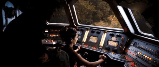
Max was a fully sentient AI who helped David pilot.
Interface Agency
If you’re not familiar with my categories of agency in technology, I’ll cover them briefly here. I’ll be publishing them in an upcoming book with Rosenfeld Media, which you can read there if you want to know more. In short, you can think of interfaces as having four categories of agency.
- Manual: In which the technology shapes the (strictly) physical forces the user applies to it, like a pencil. Such interfaces optimize for good ergonomics.
- Powered: In which the user is manipulating a powered system to do work, like a typewriter. Such interfaces optimize for good feedback.
- Assistive: In which the system can offer low-level feedback, like a spell checker. Such interfaces optimize for good flow, in the Csikszentmihalyi sense.
- Agentive: In which the system can pursue primitive goals on behalf of the user, like software that could help you construct a letter. This would be categorized as “weak” artificial intelligence, and specifically not the sentience of “strong” AI. Such interfaces optimize for good conversation.
So what would these categories mean for piloting controls? Manual controls might not really exist since humans can’t travel in space without powered systems. Powered controls would be much like early real-world spacecraft. Assistive controls would be might provide collision warnings or basic help with plotting a course. Agentive controls would allow a pilot to specify the destination and timing, and it would handle things until it encountered a situation that it couldn’t handle. Of course this being sci-fi, these interfaces can pass beyond the singularity to full, sentient artificial intelligence, like HAL.
Understanding the agency helps contextualize the rest of the interface.

Inputs
How does the pilot provide input, how does she control the spaceship? With her hands? Partially with her feet? Via a yoke, buttons on a panel, gestural control of a volumetric projection, or talking to a computer?
If manual, we’ll want to look at the ergonomics, affordances, and mappings.
Even agentive controls need to gracefully degrade to assistive and powered interfaces for dire circumstances, so we’d expect to see physical controls of some sorts. But these interfaces would additionally need some way to specify more abstract variables like goals, preferences, and constraints.
Consolidation
Because of the predominance of the yoke interface trope, a major consideration is how consolidated the controls are. Is there a single control that the pilot uses? Or multiple? What variables does each control? If the apparent interface can’t seem to handle all of orientation, translation, and thrust, how does the pilot control those? Are there separate controls for precision maneuvering and speed maneuvering (for, say, evasive maneuvers, dog fights, or dodging asteroids)?
The yoke is popular since it’s familiar to audiences. They see it and instantly know that that’s the pilot’s seat. But as a control for that pilot to do their job, it’s pretty poor. Note that it provides only two variables. In a plane, this means the following: Turn it clockwise or counterclockwise to indicate roll, and push it forward or pull it back for pitch. You’ll also notice that while roll is mapped really well to the input (you roll the yoke), the pitch is less so (you don’t pitch the yoke).
So when we see a yoke for piloting a spaceship, we must acknowledge that a) it’s missing an axis of rotation that spacecraft need, i.e. yaw. b) it’s presuming only one type of translation, which is forward. That leaves us looking about the cockpit for clues about how the pilot might accomplish these other kinds of maneuvers.

Output
How does the pilot know that her inputs have registered with the ship? How can she see the effects or the consequences of her choices? How does an assistive interface help her identify problems and opportunities? How does as agentive or even AI interface engage the pilot asking for goals, constraints, and exceptions? I have the sense that Human perception is optimized for a mostly-two-dimensional plane with a predator’s eyes-forward gaze. How does the interface help the pilot expand her perception fully to 360° and three dimensions, to the distances relevant for space, and to see the invisible landscape of gravity, radiation, and interstellar material?
Narrative POV
An additional issue is that of narrative POV. (Readers of the book will recall this concept is came up in the Gestural Interfaces chapter.) All real-world vehicles work from a first-person perspective. That is, the pilot faces the direction of travel and steers the vehicle almost as if it was their own body.
But if you’ve ever played a racing game, you’ll recognize that there’s another possible perspective. It’s called the third-person perspective, and it’s where the camera sits up above the vehicle, slightly back. It’s less immediate than first person, but provides greater context. It’s quite popular with gamers in racing games, being rated twice as popular in one informal poll from escapist magazine. What POV is the pilot’s display? Which one would be of greater use?

The consequent criteria
I think these are all the issues. This is new thinking for me, so I’ll leave it up a bit for others to comment or correct. If I’ve nailed them, then for any future piloting controls in the future, these are the lenses through which we’ll look and begin our evaluation:
- Agency [ manual | powered | assistive | agentive | AI ]
- Inputs
- Affordance
- Ergonomics
- Mappings
- orientation
- translation
- thrust
- consolidations
- Outputs (especially Narrative POV)
This checklist won’t magically give us insight into the piloting interface, but will be a great place to start, and a way to compare apples to apples between these interfaces.