All of the movies nominated for other awards were presented for an Audience Choice award. Across social media, the readership was invited to vote for their favorite, and the results tallied. The winner of the Audience Choice award for 2020 is Avengers: Endgame.
Avengers: Endgame
Avengers: Endgame is an indie feelgood about a group of friends who go rock hunting together. Just kidding, of course. Endgame is the biggest box-office movie of all time, earning 2.67 billion dollars worldwide and bringing to climax 11 years of filmmaking in the Marvel Cinematic Universe. The story happens after Infinity War, where Thanos did “the snap” that disintegrated half of all life in the universe. Endgame sees the remaining Avengers build a time travel device in order to “undo” the snap, and along the way resolve some longstanding personal arcs.
Interfaces don’t get as much screen time as they have in preceding films, but the ones we do see are lovely. They include some elegant gestural interfaces, like when Thor snaps a gag onto Loki’s mouth, or the Iron Gauntlet that automagically reconfigures itself to fit Hulk’s massive fist. The interfaces even craft emotional beats, as when Thor successfully reclaims Mjolnir from the past. No really, I sniffed.
One of the most subtle feats of the film is how it builds on the groundwork laid in the preceding 21 movies. It doesn’t need to take pains to explain the heads-up display that smoothly guides Avengers as they freefall through the quantum sponge, because the audience will almost certainly have seen the Iron HUD before.
Endgame’s interfaces help tell the story of heroes using every tool at their disposal to defeat one of the MCU’s worst, most Malthusian villains.
These movies’ interfaces blow us away with wonderful visuals and the richness of their future vision. They engross us in the story world by being spectacular. The nominees for Best Narrative are Alita: Battle Angel, Avengers: Endgame, and Captive State.
The winner of the Best Narrative award for 2020 is Captive State.
Captive State
After an alien occupation, most of humanity falls in line with the oppressors. But not everyone. Captive State tells the story of a resistance movement bent on freeing humanity and saving the earth from ruthless alien capitalists.
The interfaces in the movie show how “the Legislature” (as the aliens are called) and their human lackeys manage to keep humanity oppressed with drones and tracking “bugs”, as well as the scrappy resistance fighters’ tools for striking back.
This thriller is full of twists and surprises, and its interface designs are compelling and terrifyingly believable, earning its nomination for a Fritz award.
These movies’ interfaces adhere to solid HCI principles and believable interactions. They engage us in the story world by being convincing. The nominees for Best Believable are Ad Astra, High Life, and X-Men: Dark Phoenix.
The winner of the Best Believable award for 2020 is Ad Astra.
Ad Astra
Sometime in the near future, Roy McBridge heads to Mars to find his father and see if he is responsible for immense electrical surges that have been damaging the earth. His journey is troubled by murderous moon pirates, frenzied space baboons, Roy’s unexpected emotions, and the aforementioned surges.
Much of the technology is incidental yet still quite convincing and usable. His bedside news alarm, the various briefing slates, and interplanetary message pads. There are a lot of translucent screens throughout, but that’s a grandfathered trope by now.
By the time Roy reunites with his father and then returns to earth, he and the audience have been through the wringer. The technology is not the point of the story, but it helps tell that story in a very well-done way.
I have wanted to do this for about 6 years. I began imagining it as a thing on an actual stage with physical awards and a sponsor and an academy of hundreds. But things kept getting in the way of the big-production version, (as you can tell by, you know, the lack of any awards from 2014 until now). So in 2019, I thought about what the minimum-delightful version might be, and I’m happy that this was the trick that finally worked.
And tonight’s the night. Alongside the 92nd Academy Awards happening in the Dolby Theatre, in Los Angeles, California, I’ll be announcing five awards. For my RSS subscribers (about half of you), I’ll make a short post for each award that will wind up in your readers, a little less than an hour apart each. For those who follow social media notifications to the site, notifications are timed to go out just after the posts are released. Finally, the final results will be documented as a page that will be part of the persistent navigation on the site.
To kick off the “evening,” I’m first giving an honorary and posthumous award to Fritz Lang.
Honorary Award
The Fritz award is named for him, since he was was the first filmmaker to put realistic interfaces in a sci-fi film, specifically his 1927 film Metropolis. (It was the first film I officially reviewed on the blog.) Lang was grappling with the larger role of technology in society, and his interfaces are wonderfully evocative and illustrative. Naming the awards after him honors his pioneering spirit and craft. Plus there’s a fun irony of “being on the fritz” being slang for broken technology. Just look at the wonder of this horrible “human router” interface from the film.
You can find full length films of Metropolis online, such as this high res copy posted by YouTube user Pedro Campos Miranda.
The Fritzes award honors the best interfaces in a full-length motion picture in the past year. Interfaces play a special (and for my money, under-appreciated) role in our movie-going experience, and are a craft all their own that does not otherwise receive focused recognition.
In this first year, awards will be given for Best Believable, Best Narrative, Audience Choice, and Best Interfaces (overall.) A group of critics and creators were consulted to watch the nominated films, compare their merits, and cast votes. Thanks to everyone who helped to get things to this point.
The form to cast your vote for Audience Choice is at the bottom of this post.
On 09 FEB 2020, scifiinterfaces.com is announcing awards for interfaces in a 2019 science fiction feature film. An “Audience Choice” will also be announced, and determined by the results of the poll, below. What is your selection? You should see the movies in full, but you can see reminder videos and summaries for each of the nominees, below.
Ad Astra
Sometime in the near future, Roy McBridge heads to Mars to find his father and see if he is responsible for immense electrical surges that have been damaging the earth. His journey is troubled by murderous moon pirates, frenzied space baboons, Roy’s unexpected emotions, and the aforementioned surges.
Alita: Battle Angel
The year is 2563. After doctor Ido revives a mysterious cyborg girl from a junkyard, she discovers he is a bounty hunter for evil rogue cyborgs and wants to be one. After she finds a new superpowered body, she is able to save her friend Hugo by turning him into a cyborg, too. With his new abilities, he tries to scale a cable to the forbidden floating city Zalem, but dies. The movie concludes with Alita committing herself to vengeance.
Avengers: Endgame
Avengers: Endgame is an indie feelgood about a group of friends who go rock hunting together. Just kidding, of course. Endgame is the biggest box-office movie of all time, earning 2.67 billion USD worldwide and bringing to climax 11 years of filmmaking in the Marvel Cinematic Universe. The story happens after Infinity War, where Thanos performed “the snap” that disintegrated half of all life in the universe. Endgame sees the remaining Avengers build a time travel device in order to “undo” the snap, defeat Thanos, and along the way resolve some longstanding personal arcs.
Captive State
After an alien occupation, most of humanity falls in line with the oppressors. But not everyone. Captive State tells the story of a resistance movement bent on freeing humanity and saving the earth from ruthless alien capitalists.
High Life
High Life is certainly the most unusual film among the nominees. Convicts in the far future are sentenced to find a new energy source traveling into a black hole. On route to their certain death, sex is forbidden, but they find release in a Holodeck-style masturbatorium called The Box. Meanwhile, there are power struggles and murders and intense sexual situations.
I am Mother
A robot raises a child from embryo to young woman in a mysterious underground facility. As the human explores more of her world, she learns dark truths about the facility, her life, and the robot she’s come to know as Mother.
Men in Black: International
The Men in Black franchise got new life in 2019 with the release of Men in Black: International. In it a young woman named Molly charms her way into the MIB, only to join Agent H on a mission to forestall an invasion by the hideous but beautiful race called the Hive. On the way, they uncover a mole in the organization while Molly helps H overcome a dark event from his past.
Spider-Man: Far from Home
In the second 2019 nominee movie from the MCU, Peter Parker fails to have a normal summer studying abroad in Europe. He witnesses what he thinks are elemental monsters wreaking havoc on popular tourist cities, and a new superhero named Mysterio fighting them. Over the course of the film, Parker and his Scoobys discover the terrible truth before defeating and exposing the real bad guy. In the end, Parker learns to accept Tony Stark’s legacy, and then has his secret identity rudely outed.
X-Men Dark Phoenix
Superhero movies are not known for their restraint. Dark Phoenix starts with our mutant team rushing into space to, oh, you know, rescue some astronauts, and Jean Gray absorbing a “mysterious space force” in order to save the day. Over the movie, she finds her psychic and telekinetic powers amplified, but ultimately out of her control. She is hunted by the U.S. military, an alien race called the D’Bari, a Magneto gang, and even her own team, to no avail.
Of those movies, which do you think had the best over all interfaces? Cast your vote below. To avoid flagrant ballot stuffing, you must have a google account and be logged in to that account to cast your vote.
Voting will be open until 01 FEB 2020, 23:59 PST.
Please share this post on your social media to get the vote out! Thanks!
This year scifiinterfaces is going to try something new: Giving out awards for the best interfaces in a movie in the prior calendar year. The timing will roughly correspond to the timing of the Oscars.
It’s going to be an “alpha” release version, mind you, since I don’t have a sponsor lined up, and you always have stuff to figure out the first time you try a massive project, and it’s hard to rally collaborators around a new thing. So, the “award” will be virtual, even though the honor is real. Also everything will happen via this blog and social media rather than any live stage event or anything like that. I have tried to do this on a larger scale in the past, but each time something stood in the way. Wish me luck.
The idea here is to reward and encourage excellence and maybe help readers discover what awesomeness is happening in sci-fi interfaces, without going into the full-scale, scene-by-scene critique that normally occupies this blog. The Oscars give awards for “Achievement in production design,” but this often entails much more than the very specific craft of sci-fi interfaces, which is the focus of this project.
On the name
The award will be called the Fritz, in honor of Fritz Lang, who was the first filmmaker to put realistic interfaces in a sci-fi film, specifically his 1927 film Metropolis. Lang was grappling with the larger role of technology in society, and his interfaces are wonderfully evocative and illustrative. Naming the awards after him honors his pioneering spirit and craft.
4 Awards
Sci-fi films have to answer to many masters, and rather than just give one award, I’m going to go with 4. Two of these will respect films that err towards either believability or spectacle—I believe there is often a wicked tradeoff between the two. The main award will honor films that manage that extraordinary challenge of accomplishing both. The fourth award is a viewer’s choice, where I share all the nominees and ask readers (like you) which they think is the best.
Best interfaces (overall)
Best narrative
Best believable
Audience Choice
Perhaps in the future there will be other categories, like for shorts, student work, or television serials. But for now just these four are going to tax the resources of your lone hobbyist blogger, here. Especially as I try to keep up regular reviews.
I will have the help of a few other judges. (I’m still chatting with them now to see if they want to be named. The Academy stays anonymous, so maybe these judges, should, too?) Winners will be announced the week of 09 Feb 2020.
What gets considered?
Focusing efforts on a narrower category of media helps the task be manageable, which is important since a new program cannot rely on submissions from others. I have loosely followed the Academy’s guidelines for eligibility for feature-length films (over 40 minutes), with the exception that I included feature-length films released on streaming media as well, such as those produced by Amazon and Netflix, which never saw theatrical release.
These guidelines gave the judges a list of 27 candidates to consider, and the following are the final nominees, presented in their category in alphabetical order. Keep in mind that the nominees were elected for the quality of the interfaces in the context of the film, but with specific disconsideration for other aspects of the work. In other words, a film could be panned for nearly any other reason, but its interfaces just marvelous, and it could wind up a nominee.
If you’re the sort who likes to see all the nominees in a category to justify your outrage at the results, get to watching. You have a few weeks to see or re-see these before results are shared.
Stay tuned to scifiinterfaces.com here or on twitter for more, including when and where to vote for Viewer’s Choice.
I knew I was going to piss off some fans of Blade Runner when I called the Voight-Kampff machine shit. I stand by it, but some of the discussion led me to realize I should make some of the implicit guiding principles of my approach to critique (and which lead me to call it shit) explicit. This is that.
OMG I’ve always wanted to read art critique theory on a sci-fi blog!
I’m going to drop this into the “About this site” page on the blog, but because a majority of my readers subscribe via RSS (Hi, you) and would not see that link, I’ll also copy the content to a post.
Short answer, I’m here for constructive criticism. That is, to ask of interfaces in sci-fi movies and television shows, “Is this the best form for its purpose?” followed by “If not, what is a better form, and why?” All for the 8 reasons I’ve outlined before:
Build skepticism.
Farm for good ideas.
Use their bad ideas.
Avoid their mistakes.
Practice design critique.
Build literacy.
Mine its blind spots.
Think big.
It’s made quite complicated because…
These are speculative technologies depicted in fictious tales.
The people making the art being reviewed may not have studied or even be interested in design for the real world.
The concepts of users and goals in this domain are complex: diegetic users with goals, actors using props, extradiegetic users of the film as engaging entertainment, sci-fi interface designers trying to balance believability with spectacle and narrative function, other sci-fi interface designers looking at other work in their field, writers of sci-fi trying to make a point, and designers of real-world technologies examining the design. All of these are “users” with different goals of use.
Narratively, an interface can serve multiple purposes: conveying plot points, telling us something about the character using it or the organization that made it, set dressing to convey science-y-ness, or even comedy.
Makers of sci-fi interfaces are often constrained with limited resources, paradigms of their time, conflicting directives, and intense pressures.
It is a fait accompli that these speculative technologies “work” in the way the script needs them to. They are not subject to ordinary forces of usability.
Often times actors are “interacting” with blank technologies on set, and interfaces painted on afterward in post to fit the actor’s motions.
The semiotics are multilayered, increasingly self-referential, and span the whole supergenre.
Most of the time the audience “reads” the interfaces in real-time for their narrative purpose rather than “seeing” them and contemplating their intricacies, the way I do on this blog. (Humans are surprisingly adept at knowing when to read a thing as “for the audience” and “for the characters” and rolling with the appropriate interpretation. We just “get” Tony’s Iron HUD, even though it is an impossible thing.)
Many of the films I review were made in a time when “pausing” was not even possible, so the artists could reasonably expect for details to zip by unnoticed.
But honestly, that complexity is why I find it an engaging place to be working. If it was simple, it might be boring.
Those few paragraphs might be enough of an explanation, except I have invoked “New Criticism” several times on the blog and in conversations, which bears some additional detail.
So, a longer-form answer follows.
When I was studying art history in undergraduate, we talked not just about art, but about how we talk about art, and as you might imagine, formal critique is a rich and high-minded topic. Turns out there are entire competing schools of thought, most of which end in “ism,” about what are good and useful ways to critique. Now, I wouldn’t consider myself exactly literate in critical theory. At most I have exposure to its key concepts as part of an undergrad minor, and then nearly a decade of putting it into practice here. It’s possible I’m only half-remembering what it is, and I’m missing out on key trends in modern critical theories. But the principles I’m going to attribute to it are sound, and I’ll stand by them even if I’m misattributing the source.
Here goes.
For hundreds of years prior to the mid-20th century, critique of art and literature was largely about examining the artists’ intent, circumstance, technique, and position within the artist’s body of work, as well as its contribution to the school of expression with which it was associated. It was largely about examining things from the artist’s perspective.
Historical critique: Where does this work sit in relation to Picasso’s blue period, and how did that inspire his later work or other artists?
But New Criticism rejects nearly all of this, instead looking at a thing from the perspective of a receiver [reader|watcher|hearer] of it. The work is the thing that is closely examined, not the artist nor their context. New Criticism seeks to ask what does the thing mean to us, as an audience, now?
New Criticism: What on earth could this deconstructed face mean?
Let’s look at these two approaches with an example from sci-fi.
In the literally-explosive last act of Alien, Ellen Ripley wants to set the Nostromo to self-destruct to destroy the titular xenomorph, while she and Jonesy the cat take the escape pod to cuddly safety. To start the self-destruct sequence, Ripley must use a labyrinthine interface, part of which is a push button interface with some arcane labels, including “lingha,” “yoni,” and “agaric fly.” How should we critique this?
The historical critique would examine the person who made it, how they made it, and what constraints they were working under. In this case, we would find (via the Alien Explorations blog) that the designer, Simon Deering, was reading the philosopher/occultist Helena Blavatsky’s book The Secret Doctrine, and in a pinch decided to use weird phrases from her book to fill out the “extra,” non-plot-critical buttons on the panel.
Do I need to mention this was Photoshopped? This was totally Photoshopped.
Great. We now have an answer to who made it and why. And…so what? It’s an interesting bit for trivia night or to trot out at your next cocktail party, but almost worthless for practitioners hoping to improve their craft.
(Almost worthless: The story could help sharpen one’s sense of skepticism, i.e. that just because these interfaces are cool doesn’t mean they are good models for real world design, but that’s the only takeaway I can think of.)
(And maybe a fine, semi-random way to discover new works of Russian occultism, but again, useless for design practice.)
(See, it’s complicated.)
The tag line for this very blog
Historicism is not a bad approach. Dave Addey has made quite an entertaining book and blog out of just this sort of examination. It’s even where I learned the Deering trivia in the first place. It’s just that while it’s entertaining, I don’t find this approach useful.
Better, the New Criticism argument goes, is to disregard the maker and their circumstance. Better is to try and find a diegetic reason the thing might be the way it is. Prioritize critique of the art over the artist. Sometimes this is easy. Other times you have to add a rule or idea to the diegesis to have it make sense, an act I call backworlding. Sometimes you can push through the surface of what appears broken to realize it might actually be brilliant, an act of apologetics (borrowing the term from religious philosophy). Now, staying in the diegesis, even with these techniques, isn’t always possible. Trying to connect “LINGHA” to self-destruct on the Nostromo would be a credibility-breaking stretch. But this deliberate first rejection of artist’s context and focus on the internal consistency is the “close reading” for which New Criticism is known.
The next step I take after a close reading is to make the critique useful to the reader. Sometimes that’s suggesting a design that better achieves the purposes of the work. (I did this with the Voight-Kampff machine. I did it with the Logan’s RunCircuit. How well I did is open to…critique.) Other usefulnesses are contrasting the design to known best practices or dark patterns in the field. Sometimes it’s acknowledging that the sci-fi interface is a great idea, and formalizing a new best practice—or Alexandrian pattern—around it. Sometimes it’s connecting the thing to other real world designs that share similar issues.
I consider real-world designers my primary audience, partly because having done this kind of design (and hey, even won some awards for it) for decades, I can claim some authority in the space.
I do know that another component of my readership are the writers and makers of sci-fi interfaces. I count some of them as friends (Hi, you). So ideally, when I suggest a new design, I try to have it both work as a real-world model and meeting the needs of the narrative. That’s not always possible, but I try. Sometimes that’s even a script rewrite. I have much less authority here, since I‘ve not yet done it professionally. <hangs shingle/> But yes, I try to consider those needs, too.
What this all means is that I will reject some common complaints about my reviews:
But, it’s art. (Yes, I know. That does not exempt it from critique.)
The [original book|novelization|toy|wiki|expanded universe] says differently. (Don’t care. I’m not reviewing those.)
The designer didn’t have this [technology|paradigm|editing capability] at the time of creation. (Not useful to us today.)
The designer couldn’t have imagined you’d be looking at it this closely. (Not my concern.)
Maybe the aliens have some extra sense or capability that we don’t, and that is why it works for them. (Not useful for real-world design, at least, because we don’t live in a world with these actual, sentient aliens. We almost always design for people, and so frame the critique in light of that.)
But there might be a diegetic reason it’s bad. Often times there are plausible backworlding reasons why a thing might be bad (no time, no expertise, no resources on hand) but we can’t learn anything from that, so if there’s another interpretation that helps us learn, I’ll tend toward that.
This is mean. (I never attack the designer, and just address the design. If you’re looking for pure fawning, I’m just not your guy.)
But this was pretty good, for its time. (That’s a historical read.)
But it’s soooooo cool. (I offer skeptical critique and entertainment. There are plenty of other places to go to soak in spectacle and just be inspired.)
Shhh. Just let people enjoy things. (This blog is opt-in. If you just want to enjoy these things without critical evaluation, press command-K and go elsewhere. I understand there are some charming cat videos hereabouts.)
With due respect: No. Not in this case.
Lastly, note that all of this is a general stance I take, not a set of laws to which I pedantically adhere. Sometimes an interface or speculative technology is so broken or so unusual that this approach just doesn’t work, and I have to take another tack. I’m OK with that.
I know this is long and screedy, but should help explain where I’m coming from, and whether this blog is for you. I hope it helps.
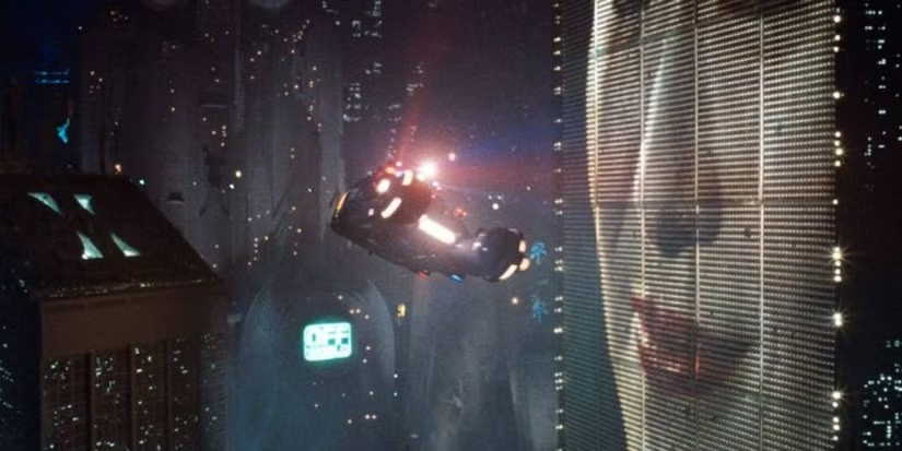
Distinguishing replicants from humans is a tricky business. Since they are indistinguishable biologically, it requires an empathy test, during which the subject hears empathy-eliciting scenarios and watched carefully for telltale signs such as, “capillary dilation—the so-called blush response…fluctuation of the pupil…involuntary dilation of the iris.” To aid the blade runner in this examination, they use a portable machine called the Voight-Kampff machine, named, presumably, for its inventors.
The device is the size of a thick laptop computer, and rests flat on the table between the blade runner and subject. When the blade runner prepares the machine for the test, they turn it on, and a small adjustable armature rises from the machine, the end of which is an intricate piece of hardware, housing a powerful camera, glowing red.
The blade runner trains this camera on one of the subject’s eyes. Then, while reading from the playbook book of scenarios, they keep watch on a large monitor, which shows an magnified image of the subject’s eye. (Ostensibly, anyway. More on this below.) A small bellows on the subject’s side of the machine raises and lowers. On the blade runner’s side of the machine, a row of lights reflect the volume of the subject’s speech. Three square, white buttons sit to the right of the main monitor. In Leon’s test we see Holden press the leftmost of the three, and the iris in the monitor becomes brighter, illuminated from some unseen light source. The purpose of the other two square buttons is unknown. Two smaller monochrome monitors sit to the left of the main monitor, showing moving but otherwise inscrutable forms of information.
In theory, the system allows the blade runner to more easily watch for the minute telltale changes in the eye and blush response, while keeping a comfortable social distance from the subject. Substandard responses reveal a lack of empathy and thereby a high probability that the subject is a replicant. Simple! But on review, it’s shit. I know this is going to upset fans, so let me enumerate the reasons, and then propose a better solution.
-2. Wouldn’t a genetic test make more sense?
If the replicants are genetically engineered for short lives, wouldn’t a genetic test make more sense? Take a drop of blood and look for markers of incredibly short telomeres or something.
-1. Wouldn’t an fMRI make more sense?
An fMRI would reveal empathic responses in the inferior frontal gyrus, or cognitive responses in the ventromedial prefrontal gyrus. (The brain structures responsible for these responses.) Certinaly more expensive, but more certain.
0. Wouldn’t a metal detector make more sense?
If you are testing employees to detect which ones are the murdery ones and which ones aren’t, you might want to test whether they are bringing a tool of murder with them. Because once they’re found out, they might want to murder you. This scene should be rewritten such that Leon leaps across the desk and strangles Holden, IMHO. It would make him, and other blade runners, seem much more feral and unpredictable.
(OK, those aren’t interface issues but seriously wtf. Onward.)
1. Labels, people
Controls needs labels. Especially when the buttons have no natural affordance and the costs of experimentation to discover the function are high. Remembering the functions of unlabeled controls adds to the cognitive load for a user who should be focusing on the person across the table. At least an illuminated button helps signal the state, so that, at least, is something.
2. It should be less intimidating
The physical design is quite intimidating: The way it puts a barrier in between the blade runner and subject. The fact that all the displays point away from the subject. The weird intricacy of the camera, its ominous HAL-like red glow. Regular readers may note that the eyepiece is red-on-black and pointy. That is to say, it is aposematic. That is to say, it looks evil. That is to say, intimidating.
I’m no emotion-scientist, but I’m pretty sure that if you’re testing for empathy, you don’t want to complicate things by introducing intimidation into the equation. Yes, yes, yes, the machine works by making the subject feel like they have to defend themselves from the accusations in the ethical dilemmas, but that stress should come from the content, not the machine.
2a. Holden should be less intimidating and not tip his hand
While we’re on this point, let me add that Holden should be less intimidating, too. When Holden tells Leon that a tortoise and a turtle are the same thing, (Narrator: They aren’t) he happens to glance down at the machine. At that moment, Leon says, “I’ve never seen a turtle,” a light shines on the pupil and the iris contracts. Holden sees this and then gets all “ok, replicant” and becomes hostile toward Leon.
In case it needs saying: If you are trying to tell whether the person across from you is a murderous replicant, and you suddenly think the answer is yes, you do not tip your hand and let them know what you know. Because they will no longer have a reason to hide their murderyness. Because they will murder you, and then escape, to murder again. That’s like, blade runner 101, HOLDEN.
3. It should display history
The glance moment points out another flaw in the interface. Holden happens to be looking down at the machine at that moment. If he wasn’t paying attention, he would have missed the signal. The machine needs to display the interview over time, and draw his attention to troublesome moments. That way, when his attention returns to the machine, he can see that something important happened, even if it’s not happening now, and tell at a glance what the thing was.
4. It should track the subject’s eyes
Holden asks Leon to stay very still. But people are bound to involuntarily move as their attention drifts to the content of the empathy dilemmas. Are we going to add noncompliance-guilt to the list of emotional complications? Use visual recognition algorithms and high-resolution cameras to just track the subject’s eyes no matter how they shift in their seat.
5. Really? A bellows?
The bellows doesn’t make much sense either. I don’t believe it could, at the distance it sits from the subject, help detect “capillary dilation” or “ophthalmological measurements”. But it’s certainly creepy and Terry Gilliam-esque. It adds to the pointless intimidation.
6. It should show the actual subject’s eye
The eye color that appears on the monitor (hazel) matches neither Leon’s (a striking blue) or Rachel’s (a rich brown). Hat tip to Typeset in the Future for this observation. His is a great review.
7. It should visualize things in ways that make it easy to detect differences in key measurements
Even if the inky, dancing black blob is meant to convey some sort of information, the shape is too organic for anyone to make meaningful readings from it. Like seriously, what is this meant to convey?
The spectrograph to the left looks a little more convincing, but it still requires the blade runner to do all the work of recognizing when things are out of expected ranges.
8. The machine should, you know, help them
The machine asks its blade runner to do a lot of work to use it. This is visual work and memory work and even work estimating when things are out of norms. But this is all something the machine could help them with. Fortunately, this is a tractable problem, using the mighty powers of logic and design.
Pupillary diameter
People are notoriously bad at estimating the sizes of things by sight. Computers, however, are good at it. Help the blade runner by providing a measurement of the thing they are watching for: pupillary diameter. (n.b. The script speaks of both iris constriction and pupillary diameter, but these are the same thing.) Keep it convincing and looking cool by having this be an overlay on the live video of the subject’s eye.
So now there’s some precision to work with. But as noted above, we don’t want to burden the user’s memory with having to remember stuff, and we don’t want them to just be glued to the screen, hoping they don’t miss something important. People are terrible at vigilance tasks. Computers are great at them. The machine should track and display the information from the whole session.
Note that the display illustrates radius, but displays diameter. That buys some efficiencies in the final interface.
Now, with the data-over-time, the user can glance to see what’s been happening and a precise comparison of that measurement over time. But, tracking in detail, we quickly run out of screen real estate. So let’s break the display into increments with differing scales.
There may be more useful increments, but microseconds and seconds feel pretty convincing, with the leftmost column compressing gradually over time to show everything from the beginning of the interview. Now the user has a whole picture to look at. But this still burdens them into noticing when these measurements are out of normal human ranges. So, let’s plot the threshold, and note when measurements fall outside of that. In this case, it feels right that replicants display less that normal pupillary dilation, so it’s a lower-boundary threshold. The interface should highlight when the measurement dips below this.
Blush
I think that covers everything for the pupillary diameter. The other measurement mentioned in the dialogue is capillary dilation of the face, or the “so-called blush response.” As we did for pupillary diameter, let’s also show a measurement of the subject’s skin temperature over time as a line chart. (You might think skin color is a more natural measurement, but for replicants with a darker skin tone than our two pasty examples Leon and Rachel, temperature via infrared is a more reliable metric.) For visual interest, let’s show thumbnails from the video. We can augment the image with degree-of-blush. Reduce the image to high contrast grayscale, use visual recognition to isolate the face, and then provide an overlay to the face that illustrates the degree of blush.
But again, we’re not just looking for blush changes. No, we’re looking for blush compared to human norms for the test. It would look different if we were looking for more blushing in our subject than humans, but since the replicants are less empathetic than humans, we would want to compare and highlight measurements below a threshold. In the thumbnails, the background can be colored to show the median for expected norms, to make comparisons to the face easy. (Shown in the drawing to the right, below.) If the face looks too pale compared to the norm, that’s an indication that we might be looking at a replicant. Or a psychopath.
So now we have solid displays that help the blade runner detect pupillary diameter and blush over time. But it’s not that any diameter changes or blushing is bad. The idea is to detect whether the subject has less of a reaction than norms to what the blade runner is saying. The display should be annotating what the blade runner has said at each moment in time. And since human psychology is a complex thing, it should also track video of the blade runner’s expressions as well, since, as we see above, not all blade runners are able to maintain a poker face. HOLDEN.
Anyway, we can use the same thumbnail display of the face, without augmentation. Below that we can display the waveform (because they look cool), and speech-to-text the words that are being spoken. To ensure that the blade runner’s administration of the text is not unduly influencing the results, let’s add an overlay to the ideal intonation targets. Despite evidence in the film, let’s presume Holden is a trained professional, and he does not stray from those targets, so let’s skip designing the highlight and recourse-for-infraction for now.
Finally, since they’re working from a structured script, we can provide a “chapter” marker at the bottom for easy reference later.
Now we can put it all together, and it looks like this. One last thing we can do to help the blade runner is to highlight when all the signals indicate replicant-ness at once. This signal can’t be too much, or replicants being tested would know from the light on the blade runner’s face when their jig is up, and try to flee. Or murder. HOLDEN.
For this comp, I added a gray overlay to the column where pupillary and blush responses both indicated trouble. A visual designer would find some more elegant treatment.
If we were redesigning this from scratch, we could specify a wide display to accomodate this width. But if we are trying to squeeze this display into the existing prop from the movie, here’s how we could do it.
Note the added labels for the white squares. I picked some labels that would make sense in the context. “Calibrate” and “record” should be obvious. The idea behind “mark” is an easy button for the blade runner to press when they see something that looks weird, like when doctors manually annotate cardiograph output.
Lying to Leon
There’s one more thing we can add to the machine that would help out, and that’s a display for the subject. Recall the machine is meant to test for replicant-ness, which happens to equate to murdery-ness. A positive result from the machine needs to be handled carefully so what happens to Holden in the movie doesn’t happen. I mentioned making the positive-overlay subtle above, but we can also make a placebo display on the subject’s side of the interface.
The visual hierarchy of this should make the subject feel like its purpose is to help them, but the real purpose is to make them think that everything’s fine. Given the script, I’d say a teleprompt of the empathy dilemma should take up the majority of this display. Oh, they think, this is to help me understand what’s being said, like a closed caption. Below the teleprompt, at a much smaller scale, a bar at the bottom is the real point.
On the left of this bar, a live waveform of the audio in the room helps the subject know that the machine is testing things live. In the middle, we can put one of those bouncy fuiget displays that clutters so many sci-fi interfaces. It’s there to be inscrutable, but convince the subject that the machine is really sophisticated. (Hey, a diegetic fuiget!) Lastly—and this is the important part—An area shows that everything is “within range.” This tells the subject that they can be at ease. This is good for the human subject, because they know they’re innocent. And if it’s a replicant subject, this false comfort protects the blade runner from sudden murder. This test might flicker or change occasionally to something ambiguous like “at range,” to convey that it is responding to real world input, but it would never change to something incriminating.
This way, once the blade runner has the data to confirm that the subject is a replicant, they can continue to the end of the module as if everything was normal, thank the replicant for their time, and let them leave the room believing they passed the test. Then the results can be sent to the precinct and authorizations returned so retirement can be planned with the added benefit of the element of surprise.
OK
Look, I’m sad about this, too. The Voight-Kampff machine is cool. It fits very well within the art direction of the Blade Runner universe. This coolness burned the machine into my memory when I saw this film the first dozen times, but despite that, it just doesn’t stand up to inspection. It’s not hopeless, but does need a lot of thinkwork and design to make it really fit to task, and convincing to us in the audience.
Whew. So we all waited on tenterhooks through November to see if somehow Tyrell Corporation would be founded, develop and commercialize general AI, and then advance robot evolution into the NEXUS phase, all while in the background space travel was perfected, Off-world colonies and asteroid mining established, global warming somehow drenched Los Angeles in permanent rain and flares, and flying cars appear on the market. None of that happened. At least not publicly. So, with Blade Runner squarely part of the paleofuture past, let’s grab our neon-tube umbrellas and head into the rain to check out this classic that features some interesting technologies and some interesting AI.
Release date: 25 Jun 1982
The punctuation-challenged crawl for the film:
“Early in the 21st Century, THE TYRELL CORPORATION advanced Robot evolution into the NEXUS phase—a being virtually identical to a human—known as a Replicant. [sic] The NEXUS 6 Replicants were superior in strength and agility, and at least equal in intelligence, to the genetic engineers who created them. Replicants were used Off-world as slave labor, in the hazardous exploration and colonisation of other planets. After a bloody mutiny by a NEXUS 6 combat team in an Off-world colony, Replicants were declared illegal on Earth—under penalty of death. Special police squads—BLADE RUNNER UNITS—had orders to shoot to kill, upon detection, any trespassing Replicants.
“This was not called execution. It was called retirement.”
Four murderous replicants make their way to Earth, to try and find a way to extend their genetically-shortened life spans. The Blade Runner named Deckard is coerced by his ex-superior Bryant and detective Gaff out of retirement and into finding and “retiring” these replicants.
Deckard meets Dr. Tyrell to interview him, and at Tyrell’s request tests Rachel on a Voight-Kampff machine, which is designed to help blade runners tell replicants from people. Deckard and Rachel learn that she is a replicant. Then with Gaff, he follows clues to the apartment of one exposed replicant, Leon, where he finds a synthetic snake scale in the bathtub and a set of photographs in a drawer. Using a sophisticated image inspection tool in his home, he scans one of the photos taken in Leon’s apartment, until he finds the reflection of a face. He prints the image to take with him.
He takes the snake scale to someone with an electron microscope who is able to read the micrometer-scale “maker’s serial number” there. He visits the maker, a person named “the Egyptian,” who tells Deckard he sold the snake to Taffey Lewis. Deckard visits Taffey’s bar, where he sees Zhora, another of the wanted replicants, perform a stage act with a snake. She matches the picture he holds. He heads backstage to talk to her in her dressing room, posing as a representative of the “American Federation of Variety Artists, Confidential Committee on Moral Abuses.” When she finishes pretending to prepare for her next act, she attacks him and flees. He chases and retires her. Leon happens to witness the killing, and attacks Deckard. Leon has the upper hand but Deckard is saved when Rachel appears from the crowd and shoots Leon in the head. They return to his apartment. They totally make out.
Meanwhile, Roy has learned of a Tyrell employee named Sebastian who does genetic design. On orders, Pris befriends Sebastian and dupes him into letting her into his apartment. She then lets Roy in. Sebastian figures out that they are replicants, but confesses he cannot help them directly. Roy intimidates Sebastian into arranging a meeting between him and Dr. Tyrell. At the meeting, Tyrell says there is nothing that can be done. In fury, Roy kills Tyrell and Sebastian.
The police investigating the scene contact Deckard with Sebastian’s address. Deckard heads there, where he finds, fights, and retires Pris. Roy is there, too, but proves too tough for Deckard to retire. Roy could kill Deckard but instead opts to die peacefully, even poetically. Witnessing this act of grace, Deckard comes to appreciate the “humanity” of the replicants, and returns home to elope with Rachel.
P.S. This series uses “The Final Cut” edit of the movie, so I don’t have to hear that wretchedly-scripted voiceover from the theatrical release. If you can, I recommend seeing that version.
Way back in the halcyon days of 2015 I was asked by Phil Martin and Jordan of Speculative Futures SF to make a presentation for one their early meetings. I immediately thought of one of the chapters that I had wanted to write for Make It So: Interaction Design Lessons from Sci-Fi, but had been cut for space reasons, and that is: How is evil (in sci-fi interfaces) designed? There were some sub-questions in the outline that went something like this.
What does evil look like?
Are there any recurring patterns we can see?
What are those patterns?
Why would they be the way they are?
What would we do with this information?
I made that presentation. It went well, I must say. Then I forgot about it until Nikolas Badminton of Dark Futures invited me to participate in his first-ever San Francisco edition of that meetup in November of 2019. In hindsight, maybe I should have done a reading from one of my short stories that detail dark (or very, very dark) futures, but instead, I dusted off this 45 minute presentation and cut it down to 15 minutes. That also went well I daresay. But I figure it’s time to put these thoughts into some more formal place for a wider audience. And here we are.
Nah, they’re cool!
Wait…Evil?
That’s a loaded term, I hear you say, because you’re smart, skeptical, loathe bandying about such dehumanizing terms lightly, and relish in nuance. And you’re right. If you were to ask this question outside of the domain of fiction, you’d run up against lots of problems. Most notably that—as Socrates said through Plato in the Meno Dialogues—by the time someone commits something that most people would call “evil,” they have gone through the mental gymnastics to convince themselves that whatever they’re doing is not evil. A handy example menu of such lies-to-self follows.
It’s horrible but necessary.
They deserve it.
The sky god is on my side.
It is not my decision.
I am helpless to stop myself.
The victim is subhuman.
It’s not really that bad.
I and my tribe are exceptional and not subject to norms of ethics.
There is no quid pro quo.
And so, we must conclude, since nobody thinks they’re evil, and most people design for themselves, no one in the real world designs for evil.
Oh well?
But, the good news we are not outside the domain of fiction, we’re soaking in it! And in fiction, there are definitely characters and organizations who are meant to be—and be read by the audience as—evil, as the bad guys. The Empire. The First Order. Zorg! The Alliance! Norsefire! All evil, and all meant to be umabiguously so.
from V for Vendetta.
And while alien biology, costume, set, and prop design all enable creators to signal evil, this blog is about interfaces. So we’ll be looking at eeeevil interfaces.
What we find
Note that in earlier cinema and television, technology was less art directed and less branded than it is today. Even into the 1970s, art direction seemed to be trying to signal the sci-fi-ness of interfaces rather than the character of the organizations that produced them. Kubrick expertly signaled HAL’s psychopathy in 1969’s 2001: A Space Odyssey, and by the early 1980s more and more films had begun to follow suit not just with evil AI, but with interfaces created and used by evil organizations. Nowadays I’d be surprised to find an interface in sci-if that didn’t signal the character of its user or the source organization.
Evil interfaces, circa Buck Rogers (1939).
Note that some evil interfaces don’t adhere to the pattern. They don’t in and of themselves signal evil, even if someone is using them to commit evil acts. Physical controls, especially, are most often bound by functional and ergonomic considerations rather than style, where digital interfaces are much less so.
Many of the interfaces fall into two patterns. One is the visual appearance. The other is a recurrent shape. More about each follows.
1. High-contrast, high-saturation, bold elements
Evil has little filigree. Elements are high-contrast and bold with sharp edges. The colors are highly saturated, very often against black. The colors vary, but the palette is primarily red-on-black, green-on-black, and blue-on-black.
Mostly red-on-black
The overwhelming majority of evil technologies are blood-red on black. This pattern appears across the technologies of evil, whether screen, costume, sets, or props.
I just stopped uploading examples for space reasons.
Red-on-black accounts for maybe 3/4 of the examples I gathered.
Sometimes a sickly green
Less than a quarter focus on a sickly or unnatural green.
Occasionally calculating blue
A handful of examples are a cold-and-calculating blue on black.
A note of caution: While evil is most often red-on-black, red does not, in and of itself, denote evil. It is a common color to see for urgency warnings in sci-if. See the tag for big red label examples.
Not evil, just urgent.
2. Also, evil is pointy
Evil also has a lot of acute angles in its interfaces. Spikes, arrows, and spurs appear frequently. In a word, evil is often pointy.
Why would this be?
Where would this pattern of high-saturation, high-constrast, pointy, mostly red-on-black come from?
Now, usually, I try and run numbers, do due diligence to look for counter-evidence, scope checks, and statistical significance. But this post is going to be less research and more reason. I’m interested if anyone else wants to run or share a more academically grounded study.
I can’t imagine that these patterns in sci-fi are arbitrary. While a great number of shows may be camping on tropes that were established in shows that came before them, the tropes would not have survived if they didn’t tap some ground truth. And there are universal ground truths to work with.
My favorite example of this is the takete-maluma effect from phonosemantics, first tested by Wolfgang Köhler in 1929. Given the two images below, and the two names “maluma” and “takete”, 95–98% of people would rather assign the name “takete” to the spiky shape on the left, and “maluma” to the curvy shape on the right. This effect has been tested in 1947 and again in 2001, with slightly different names but similar results, across cultures and continents.
What this tells us is that there are human universals in the interpretation of forms.
I believe these universals come from nature. So if we turn to nature, where do we see this kind of high-contrast, high-saturation patterning? There is a place. To explain it, we have to dip a bit into evolution.
Aposematics: Signaling theory
Evolution, in the absence of heavy reproductive pressures, will experiment with forms, often as a result of sexual selection. If through this experimentation a species develops conspicuousness, and the members are tasty and defenseless, that trait will be devoured right out of the gene pool by predators. So conspicuousness in tasty and defenseless species is generally selected against. Inconspicuousness and camouflage are selected for.
Would not last long outside of a pig disco.
But if the species is unpalatable, like a ladybug, or aggressive, like a wolverine, or with strong defenses, like a wasp, the naïve predator learns quickly that the conspicuous signal is to be avoided. The signal means Don’t Fuck with Me. After a few experiences, the predator will learn to steer clear of the signal. Even if the defense kills the attacker (and the lesson lost to the grave), other attackers may learn in their stead, or evolution will favor creatures with an instinct to avoid the signal.
In short, a conspicuous signal that survives becomes a reinforcing advertisement in its ecosystem. This is called aposematic signaling.
There are many interesting mimicry tactics you should check out (for no other reason that they can explain things like Dolores Umbridge) but for our purposes, it is enough to know that danger has a pattern in nature, and it tends toward, you guessed it, bold, high-contrast, high saturation patterns, including spikes.
Looking at the color palette in nature’s examples, though, we see many saturated colors, including lots of yellows. We don’t see yellow predominant in sci-fi evil interfaces. So why is sci-fi human evil red & black? Here I go out on a limb without even the benefit of an evolutionary theory, but I think it’s simply blood and night.
Not blood, just cherry glazing.
When we see blood on a human outside of menstruation and childbirth, it means some violence or sickness has happened to them. (And childbirth is pretty violent.) So, blood red is often a signal of danger.
And we are a diurnal species, optimized for daylight, and maladapted for night. Darkness is low-information, and with nocturnal predators around, high-risk. Black is another signal for danger.
And spikes? Spikes are just physics. Thorns and claws tell us this shape means pointy, puncturing danger.
So I believe the design of evil in sci-fi interfaces (and really, sci-fi shows generally) looks the way it does because of aposematics, because of these patterns that are familiar to us from our experience of the world. We should expect most of evil to embody these same patterns.
What do designers do with this?
So if I’m right, it bears asking, What we do with this? (Recall that the “tag line” for this project is “Stop watching sci-fi. Start using it.”) I think it’s a big start to simply be aware of these patterns. Once you are, you can use it, for products and services whose brand promise includes the anti-social, tough-guy message Don’t Fuck with Me.
Or, conversely, if you are hoping to create an impression of goodness, safety, and nurturance, avoid these patterns. Choose different palettes, roundness, and softness.
What should people not do with this?
As a last note, it’s important not to overgeneralize this. While a lot of evil, like, say, Nazis, utilize aposematic signals directly, some will adopt mimicry patterns to appear safe, welcoming, and friendly. Some evil will wear beige slacks and carry tiki torches. Others will surround themselves with in-group signals, like wrapping themselves in the flag, to make you think they’re a-OK. Still others will hang fuzzy-wuzzy kitty-witty pictures all over their office.
Is there a better example in sci-fi? @me.
Do not be fooled. Evil is as evil does, and signaling in sci-fi is a narrative convenience. Treat the surface of things as a signal to consider, subordinate to a person—or a group’s—actual behavior.