An Interview with Christopher Kieffer and Coplin Le Bleu

Chris Kieffer and Copin Le Bleu ran across my interview with Shaun Yue, and since they had done the interfaces for The Cabin in the Woods, contacted me eager to share their story as well. Since Cabin has the highest-rated interfaces in the Make It So survey so far, I was very glad to have the chance to talk with them as well. So in honor of the one-year anniversary of the film’s release…

CITW_FSS02

What brief did you receive? How did you interface with (director) Drew Goddard?

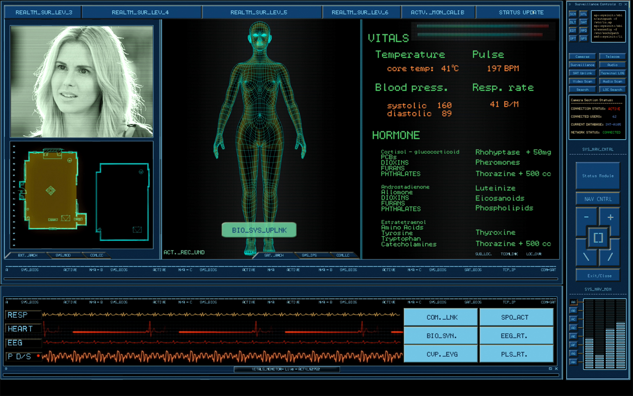
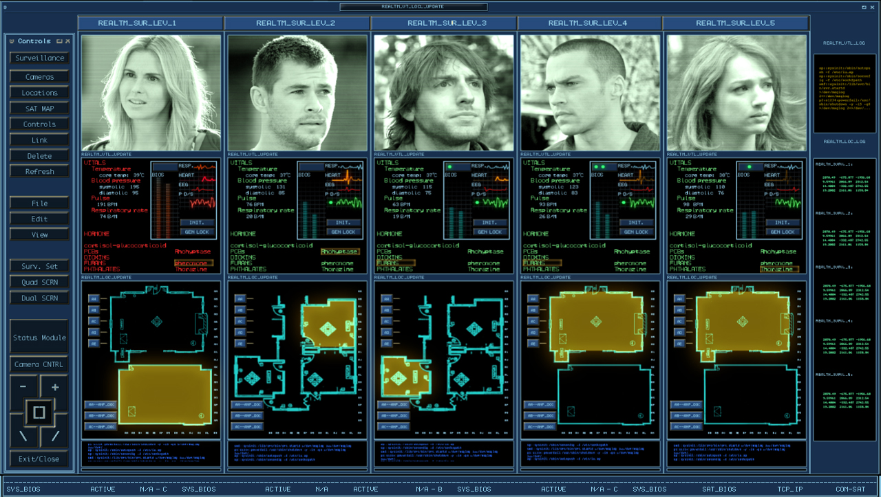
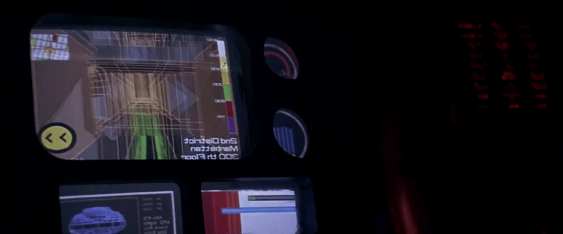
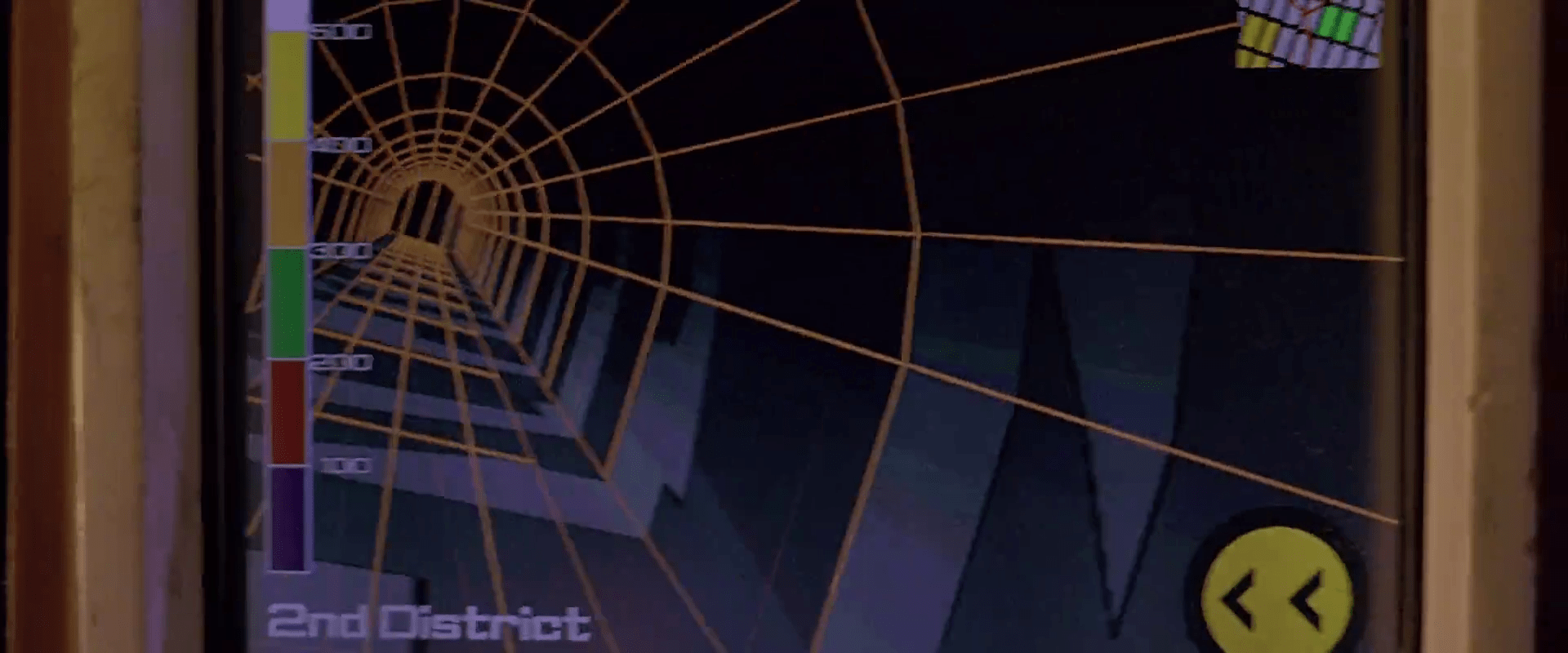
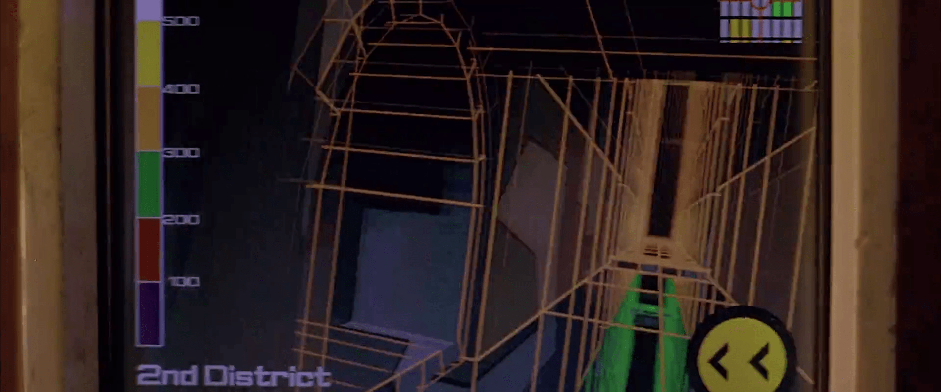
COPLIN: The one thing I really remember was that the control room needed to have an older feel to it, like it had been set up years ago but still functional… a kind of a low tech mechanical feel with high tech functions. I remember referencing photos of security/surveillance control rooms that you would see in a prison guard station. I didn’t communicate with Drew directly. All notes got were filtered down from the on set playback operator and supervisor.

CHRIS: When we started this project, design notes from Drew were given to our on-set playback supervisor Mike Sanchez in Canada, to relay to us here in the U.S. The notes said the control room is to look like its been there for a long, long time. As if they built this room with state of the art equipment years ago, but over time they have made some upgrades but kept the old stuff that still works there. So you could have a modern computer running software right next to an old light up panel with switches on it that work together. 

CINW_SS01

Tell me how you went about creating the interfaces for The Cabin the Woods? How did you handle the remote collaboration between you two?

COPLIN: I started designing the interface with the idea that it was an older system set up, that might have looked high tech in it’s prime but had "weathered" a little bit.  So I tried to add a lot of terminal and DOS style elements that would imply a lower, underlining level of programing.  I also felt it needed to have a utilitarian and mechanical feel to the design as it would be controlling and monitoring the different parts of the house.  Chris and I were in the same office, although we were balancing multiple projects together at that time.

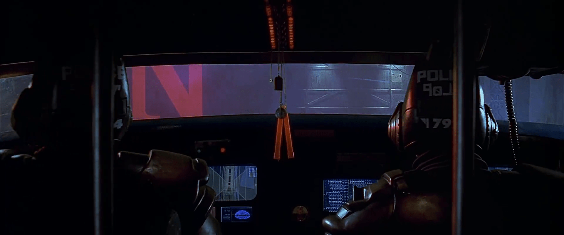
CHRIS: Coplin started the initial design on the interface, but we had a few variations of interfaces to make. I started designing different parts of the system like the video surveillance setup and background screens that included video oscilloscopes, code screens, door keypads, and a lot of surveillance on different monitors. The remote aspect came into play when things needed to get approved or changed. We would send the files to Mike in Canada for Drew to look at, and if changes were needed he would send us drew’s notes. So there was a delay sometimes in getting things approved which made it harder to get things made in such a short time. 

CITW_FSS05

Were there any great ideas that didn’t make it to screen? What would you go back and redo given the opportunity?

COPLIN: Looking back on this project, there were a lot of ideas that I’m glad did not make the film. After reading the review on your blog (a very humbling and at times embarrassing experience), there are plenty of changes I would’ve made.  One in particular is the idea of making the deaths on the "kill" screen less noticeable as that information would be less important for their mission.  There’s not usually a lot of time to spend on the details.  My first requirement is to tell the story point efficiently and effectively as I can.  I would have liked to have had more time think about the details of the designs.

CHRIS: Yes, at one point we talked about having a monster select screen that showed all the monsters and their stats. That would have been fun to make but we were early in production and they hadn’t picked/designed all the monsters yet, so that was never finished. After I finish any project I learn so much and always look back and say I could have done this or that, but there’s never enough time.

CINW_SS02

What are your backgrounds? Are you interface designers or SFX artists by training?

COPLIN: I have a Bachelor of Arts degree in TV/Film Production from the University of New Orleans.  After college I became a self-taught motion graphics artist.

CHRIS: I have a BS in visual Communications, and an AS in Graphic Design. I started in print, designing packaging, advertising, and product design. I really liked animating graphics much more than print and so went in that direction instead. 

CITW_FSS04

What were the biggest challenges working on the film?

COPLIN: Time, as in all productions, seems to be one of the biggest challenges, as well as not physically being on set.  I find being on set helps me with designing the functionality of the screens, to see how they will be set up in their environment and how the surrounding set pieces interact with them.  Also it was very challenging for me to display a lot of "nondescript" information to make the screens look busy without tying that graphic to what ever pertinent plot point might be going on at the time.

CHRIS: I agree with Coplin on this one. We only had a couple of days to design and animate all the screens for the main control set. That includes making changes on the fly. It does make it hard not being there, not being able to see the actual set and see how something looks on a monitor and being able to adjust it. Then we have the “make it bigger, and red or green” problems. This is when we have to make some text on the screen very large and red if bad and green if good. We try very hard to avoid things like that but sometimes it’s out of our control. They need to get a specific point across to the audience quickly, and even though your computer wouldn’t say something like "Access Denied" in RED 72pt FONT, some of these just might.

CINW_SS03

What interfaces are you most proud of in the film? (And, of course, why?)

COPLIN: I guess I’m most proud of the "Penta-Vitals" aka "Marking the deaths" screens.  They’re dense and busy but I feel like you could easily at a glance tell who was where and how they were feeling. 

CHRIS: I actually liked making the older electronic equipment screens. The oscilloscope, waveform monitors, were a challenge to make look real. I found making the older tech screens look real was a lot harder than I thought. The look and feel they had on those tube monitors is almost impossible to match on an LCD or plasma, but some we made for tube monitors.

What’s your favorite sci-fi interface that someone else designed?

COPLIN: Of course I’m a really big fan of Mark Coleran‘s work and the stuff that Ash Thorp, David Lewandowski, Jayse Hansen, and Bradley G Munkowitz do (to name a few).  Anytime I see anything from those guys my mouth drops and I want to crawl into a hole.  One of my favorite sci-fi interfaces is from Moon, It’s fun, clean and memorable.

CHRIS: I like a lot of interfaces I see in films and tv shows, but off the top of my head I really like the look and movement of Ash Thorps recent work on Total Recall

CITW_FSS01

In your opinion, what makes a great sci-fi interface designer?

COPLIN: I think what makes a great sci-fi interface designer is someone who can artistically tell the story and creatively display pertinent information in a clear and concise manner.  Someone who can put themselves in the characters shoes and imagine what that character would want to see on the screen.

CHRIS: I agree, a designer should find a way to solve a problem or create a user interface that is fast and relevant to the story while making it artistically appealing to look at.

CITW_FSS03

What’s next for you?

COPLIN: I’m hoping to continue creating interactive motion graphics for on-set video playback and post production.

CHRIS: To continue working on interface design and animation for films and tv shows. Im starting on a new project right now designing a 3d Holographic navigational control system, and some HUDs for some space suits.


Images Copyright Lionsgate

Nucleolab Kill Switch

FifthE-nucleolab-005

General Munro isn’t sure what’s going to come out of the other end of Mactilburgh’s process. He’s never seen a Mondoshawan and doesn’t know if they can be trusted. Fortunately for his sense of panic, there’s a built in kill switch on the control panel facing the nucleolab chamber. To activate the switch, he slips his multipass into a slot. While this card is in the slot, a small red LED lights, and the Big Red Button is active.

FifthE-nucleolab-007

The interface is simple to read, which is nice. The button conveys a bit of its importance through its size and color. The order of operations is well laid out for a Western user: left to right, in the order of reading.

FifthE-nucleolab-008

Three improvements

There are lots of questions about the security strategy, though. Single-factor authentication is too easy to thwart. Couldn’t someone just take his multipass and use it? How does the system know it’s really Munro? Better would be multifactor authentication, requiring both this token and either a knowledge token like a password, or an inheritance factor. Maybe it could require Munro to place his other hand on a handprint reader before the button activates.

Another problem is that the signal that this button is active is too tiny: that little red LED that’s associated with the slot rather than the button. If this is an undoable action, you’d hope that the input would convey the sense of risk. Maybe have the button glow, or surround it with a glowing red ring (think the Krell warning system)?

If it really is a kill switch, i.e. would kill the subject, a nice safeguard against accidental activation would be a press-and-hold button, requiring Munro to hold it down for a few seconds while a warning klaxon sounds. This would give Munro the opportunity to change his mind or move his hand if he’d placed it accidentally. If it triggers something nonlethal, like an incapacitating sticky foam, then no such delay is necessary.

Mondoshawan Thrusters

Mondoengines

If you haven’t been following it, there’s been some great discussion in the comments about my critique of the Mondoshawan flight interface. Clayton and Phil raised some great points and the discussion necessitates understanding the apparent capabilities of the actuators, i.e. thrusters. So here are some images for reference.

FifthE-Mondoshawan-engines002

The capabilities may be fairly limited. The only evidence we have that the thrusters move at all are from early in the film. When the ship has to fight the gravity of a planet, they splay out like the ribs of an umbrella. Otherwise, in space we never see them move.

What’s worse is that the actual maneuverability of the ship seems minimal. When the ship is attacked by Mangalores, it doesn’t even turn to try and evade.

Most of the time interaction designers don’t have the opportunity to redesign actuators, only controls and displays. If we presume that the Mondoshawan thrusters can only splay from the ship’s axis, how would this change the fit of the controls?

NucleoLab Display

FifthE-nucleolab-002

The scientist Mactilburgh reconstructs Leeloo from a bit of her remains in his “nucleolab.” We see a few interfaces here.

FifthE-nucleolab-003

We never see Mactilburgh interact with the controls on this display: Potentiometers, dials with circular LED readout rings, glowing toggle buttons, and unlit buttons labeled “OFF” and “ESC.” There’s not much to grasp onto for analysis. These are just “sciencey” set of physical controls. The display is a bit of similar scienciness, meant to vaguely convey that Leeloo is a higher-order being, but beyond that, incomprehensible. Interestingly, the Mondoshawan DNA shows not just a more detailed graphic, but adds color to convey an additional level of complexity.

FifthE-nucleolab-004

An odd bit: In the lower right hand corner of the screen you can see the words “FAMILIAL HYPERCHOL TEROLEMIA.” Looking up this term reveals the genetic condition Familial Hypercholesterolemia. It’s only missing the “ES.” What’s this label doing here? This could be the area on the DNA chain where the markers appear for this predisposition to high cholesterol, but wouldn’t you expect that to take up 5000 times less room on a DNA strand of a perfect being, not the same percentage? Also it kind of takes the winds out of the sails of Mactilburgh’s breathless claim that she’s perfect. Anyway it’s a warning lesson for sci-fi interface designers: Watch where you pull your sciencey words from. If it’s a real thing, ask whether the meaning runs counter to your purposes or not.

Mondoshawan piloting

Mondoshawn_piloting

The Mondoshawan pilot grasps two handles. Each handle moves in a transverse plane (parallel to the floor), being attached to a base by two flat hinges. We only see this interface for a few seconds, but it seems very poorly mapped.

Here on Earth, a pilot primarily needs to specify pitch, roll, and thrust. She supplies this input through a control yoke and a throttle. Each action is clearly differentiated. Pitch is specified by pushing or pulling the yoke. Roll is specified by rolling the yoke like a steering wheel. Thrust is specified by pushing or pulling the throttle. It’s really rare that a pilot wanting to lift the plane will accidentally turn the yoke to the right.

But look at the Mondoshawan inputs. They can specify four basic variables, i.e., an X and a Z for each hand. Try as I might, I can’t elegantly make that fit the act of flying well. (Pipe up if I’m not seeing something obvious.) Even if roll, pitch, and thrust was each assigned to an axis arbitrarily, the pilot would end up having to use the same motion on different hands for different variables, and there would be one “extra” axis. Of course there are two other Mondoshawans visible in the ship, and perhaps between them they’re managing that third axis of control somehow. With training and their “200,000 DNA memo groups,” the Mondoshawans could probably manage it, but it would spell trouble for us poor humans with our measly 40 and need for more direct mapping and control differentiation.

fifthelement-079

Taxi navigation

FifthE-attackdetection-001

The taxi has a screen on the passenger’s side dashboard that faces the driver. This display does two things. First, it warns the driver when the taxi is about to be attacked. Secondly, it helps him navigate the complexities of New York circa 2163.

Warning system

After Korben decides to help Leeloo escape the police, they send a squadron of cop cars to apprehend them. And by apprehend I mean blow to smithereens. The moment Korben’s taxi is in sights, they don’t try to detain or disable the vehicle, but to blast it to bits with bullets and more bullets. It seems this is a common enough thing to have happen that Korben’s on-board computer can detect it in advance and provide a big, flashing, noisemaking warning to this effect.

FifthE-attackdetection-008

In many cases I object to the Big Label, but not here. In fact, for such a life-threatening issue, more of the taxi’s interface should highlight the seriousness. My life’s in danger? Go full red alert, car. Change the lights to crimson. Dim non-essential things. You’ve got an “automatic” button there. Does that include evasive maneuvering? If so, make that thing opt-out rather than opt-in. Help a brother out.

Navigation aid

At other times during the chase scene, Korben can glance at the screen to see a wireframe of the local surroundings. This interface has a lot of problems.

1. This would work much, much more safely and efficiently for Korben if it was a heads-up display on the windshield. Let’s shrink that feedback loop. Every time a driver glances down he risks a crash and in this case, Korben risks the entire world. If HUD tech isn’t a part of the diegesis, audio cues might be some small help that don’t require him to take his eyes of the “road.”

2. How does the wireframe style help? It’s future-y of course, but it adds a lot of noise to what he’s got to process. He doesn’t need to understand tesselations of surfaces. He needs to understand the shapes and velocities of things around him so he can lose the tail.

FifthE-attackdetection-006

(Exercise for the reader: Provide a solid diegetic explanation for why this screen appeared in the film flipped horizontally.)

FifthE-attackdetection-010

3. There’s some missing information. If the onboard computer can do some real-time calculations and make a recommendation on the best next step, why not do it? We see above that the police have the same information that Korben does. So even better might be information on what the tail is likely to do so Korben can do the opposite. Or maneuvers that Korben can execute that the cop car can’t. If it’s possible to show places he should definitely not go, like dead ends or right into the path, say, of a firing squad of police cars, that would be useful to know, too.

FifthE-attackdetection-002

FifthE-attackdetection-004

4. What are those icons in the lower right meant to do? They’re not suggestions as they appear after Korben performs his maneuvers, and sometimes appear along with warnings instead of maneuvers.

Even if they are suggestions, what are they directions to? His original destination? He didn’t have one. Some new destination? When did he provide it? Simple, goal-aware directions to safety? Whatever the information, these icons add a lot cognitive weight and visual work. Surely there’s some more direct way to provide cues, like being superimposed on the 3D so he can see the information rather than read and interpret it.

If they’re something else other than suggestions, they’re just noise. In a pursuit scenario, you’d want to strip that stuff out of the interface.

FifthE-attackdetection-003

5. What is that color gradient on the left meant to tell him? All the walls in this corridor are 350…what? The screen shot above hints that it represents simple height from the ground, but the 2D map has these colors as well, and height cues wouldn’t make sense there. If it is height, this information might help Korben quickly build a 3D mental map of the information he’s seeing. But using arbitrary colors forces him to remember what each color means. Better would be to use something with a natural order to it like the visible spectrum or black-body spectrum. Or, since people already have lots of experience with monocular distance cues and lighting from above, maybe a simple rendering as if the shapes were sunlit would be fastest to process. Taking advantage of any of these perceptual faculties would let him build a 3D model quickly so he can focus on what he’s going to do with the information.

Side note: Density might actually make a great deal more sense to the readout, knowing that Korben has a penchant for ramming his taxi through things. If this was the information being conveyed, varying degrees of transparency might have served him better to know what he can smash through safely, and even what to expect on the other side.

6. Having the 2D map helps a bit to understand the current level of the city from a top-down view. Having it be small in the upper right is a sound placement, since that’s a less-important subset of the information he really needs. It has some color coding but as mentioned above it doesn’t seem to relate to what’s colored in the 3D portion, which could make for an interpretation disaster. In any case, Korben shouldn’t have to read this information in the tiny map. It’s a mode, a distraction. While he’s navigating the alleys and tunnels of the city, he’s thinking in a kind of 3D node-graph. Respect that kind of thinking with a HUD that puts information on the “edges” of the graph, i.e., the holes in the surfaces around him that he’s looking at. That’s his locus of attention. That’s where he’s thinking. Augment that.

So, you know…bad

Fortunately, given that the interface has so many problems, Korben only really glances at this once during the chase, and that’s at the warning sound. But if the younger Korben was meant to use this at all, there’s a lot of work to make this useful rather than dangerous.

Taxi shield

FifthE-taxishield-004

The taxi panel has one weak moment. When Korben has the taxi in hiding from the police, he wants to lower the taxi shield to check on Leeloo. To lower the shield, he presses on the “DOCKING LOCK” button on the panel, which doesn’t quite make sense. We saw this button used earlier to actually do what it says. Why does its function change now?

FifthE-taxishield-001

FifthE-taxishield-002

FifthE-taxishield-003

It might be that the button has two modes, i.e. in a garage it anchors the vehicle and elsewhere it lowers the shield. Modal buttons aren’t great. What if Korben is in the garage and needs to lower the shield? Just say no to modal buttons. If the functions can be operated independently, they should have separate buttons.

Additionally, if it’s going to have to be modal and have a secondary function, it should be labeled as such. Even if the shield was aftermarket, the installing mechanic could have taken a sharpie to the button to note which of the dozens of buttons on the dashboard is the one that activates it. Mechanics, you now have no excuse.

Of course leaving behind my New Criticism stance on authorial intent, it’s entirely possible that Willis just pressed the wrong button, or that the prop he was faced with on set didn’t have a button that worked, and he just picked one at hand. But I like Willis, and I like not having to second guess film makers, so I’m going to cut him some slack for this detail that most probably, nobody but me ever noticed. Until, you know, now.

The daffy bastard

FifthE-taxilicense-001

When Korben gets in his taxi and sits down, it recognizes this and in a female version of the hazy synthesized voice heard in the 4 a day cigarette dispenser, prompts him to “Please enter your license.” Korben fits his license into a small horizontal slot mounted in the ceiling of the cab, just above the driver’s seat near the windshield. He slams it in. It verifies that he’s authorized and starts the cab, including lighting the taxi light up top. It tells him, “Welcome on board, Mr. Dallas. Fuel level 10.”

Korben steers with an X-shaped control yoke. We never see his feet, so don’t know if he has any foot pedals. He has a throttle that maps like a boat throttle: push forward to increase thrust.

In the central dashboard he has an underlit panel of toggle buttons. Each button has a single function, which is printed on its surface.

Main controls: Docking lock, Automatic, Emergency power, Power. Light controls: Auxiliary lights, Parking lights, Smog lights, Main lights. Alerts: Power level low, Power failure, Light failure, Environment warning

FifthE-taxilicense-007

Two small panels to his left provide him a similar array of “comfort controls”, “taxi controls”, and “main panel one.” A more free-form keyboard sits beneath a vertical grayscale monitor, crammed full of unreadable text and, occasionally, annoyingly, blinking.

FifthE-taxilicense-006

The buttons across these panels are completely labeled, lit for easy reading in the dim cabin light, clustered in meaningful groups, and nicely positioned so that Korben can utilize his spatial memory to map the functions. But they are also labeled in all capital letters and aren’t much differentiated beyond that, which might require Korben to take his eyes off the road to target a particular one, which could increase the odds of an accident. Better inputs using physical controls would have more physical differentiation so he could find them with just one hand, labeling that was easier to read at a glance, and the most common controls right on the yoke near his fingers.

In the scene, Korben reaches to the center panel and presses “power.” The voice confirms that he’s using “Propulsion 2-X-4,” (whatever that means.) Then Korben presses “Docking lock,” which releases the mechanical hold on the taxi.

The voice reminds him sternly that he has five points left on his license, and as the garage door opens, to “Have a nice day.” Lights on either side of the garage door shine green, signaling to him that the skyway is clear. But on pulling out, they turn red just as a car passes and Korben has to slam on the brakes.

Of course the humor comes from how these interfaces aren’t entirely helpful, and the green lights shouldn’t tell him the same information he can see with his own eyes. It should be doing a bit of calculation to signal if it’s clear for the next several seconds so he can safely pull out. But of course doing that right would ruin the joke. Maybe we’re meant to understand that Korben just can’t afford any but the crappiest versions of technology.

FifthE-taxilicense-013

Later, when Leeloo does her daring cliff dive from the side of a building and crashes through the roof of his cab, Korben struggles to maintain control of it and get the hell out of the way of oncoming traffic. During the chaos, the computerized voice tells him, “You’ve just had an accident.” Korben sardonically shouts, “Yes! I know I just had an accident, you daffy bastard.” It continues adding unhelpfully, “You have one point left on your license.” Of course the fun is how annoying the taxi is, but let’s just be explicit: the cab should wait until it senses that Korben has regained control before burdening his attention with this information, and possibly making it worse.

FifthE-taxilicense-019

When Korben risks it all to help Leeloo, the speaker cover near where his license is lodged glows bright red as it says, “One point has been removed from your license…” Korben, furious and with zero points left on his license and nothing to lose, rips the device off his ceiling to shut the daffy bastard up.

FifthE-taxilicense-020