Surface Scan

fifthelement-025

Later in the scene General Staedert orders a “thermonucleatic imaging.” The planet swallows it up. Then Staedert orders an “upfront loading of a 120-ZR missile” and in response to the order, the planet takes a preparatory defensive stance, armoring up like a pillbug. The scanner screens reflect this with a monitoring display.

fifthelement-026

In contrast to the prior screen for the Gravity (?) Scan, these screens make some sense. They show:

  • A moving pattern on the surface of a sphere slowing down
  • clear Big Label indications when those variables hit an important threshold, which is in this case 0
  • A summary assessment, “ZERO SURFACE ACTIVITY”
  • A key on the left identifying what the colors and patterns mean
  • Some sciency scatter plots on the right

The majority of these would directly help someone monitoring the planet for its key variables.

fifthelement-027

Though these are useful, it would be even more useful if the system would help track these variables not just when they hit a threshold, but how they are trending. Waveforms like the type used in medical monitoring of the “MOVEMENT LOCK,” “DYNAMIC FLOW,” and “DATA S C A T” might help the operator see a bit into the future rather than respond after the fact.

Gravity (?) Scan

FifthE-UFT001

The first bit of human technology we see belongs to the Federation of Territories, as a spaceship engages the planet-sized object that is the Ultimate Evil. The interfaces are the screen-based systems that bridge crew use to scan the object and report back to General Staedert so he can make tactical decisions.

FifthE-UFT006

We see very few input mechanisms and very little interaction with the system. The screen includes a large image on the right hand side of the display and smaller detailed bits of information on the left. Inputs include

  • Rows of backlit modal pushbuttons adjacent to red LEDs
  • A few red 7-segment displays
  • An underlit trackball
  • A keyboard
  • An analog, underlit, grease-pencil plotting board.
    (Nine Inch Nails fans may be pleased to find that initialism written near the top.)

The operator of the first of these screens touches one of the pushbuttons to no results. He then scrolls the trackball downward, which scrolls the green text in the middle-left part of the screen as the graphics in the main section resolve from wireframes to photographic renderings of three stars, three planets, and the evil planet in the foreground, in blue.

FifthE-UFT008 FifthE-UFT014 FifthE-UFT010

The main challenge with the system is what the heck is being visualized? Professor Pacoli says in the beginning of the film that, “When the three planets are in eclipse, the black hole, like a door, is open.” This must refer to an unusual, trinary star system. But if that’s the case, the perspective is all wrong on screen.

Plus, the main sphere in the foreground is the evil planet, but it is resolved to a blue-tinted circle before the evil planet actually appears. So is it a measure of gravity and event horizons of the “black hole?” Then why are the others photo-real?

Where is the big red gas giant planet that the ship is currently orbiting? And where is the ship? As we know from racing game interfaces and first-person shooters, having an avatar representation of yourself is useful for orientation, and that’s missing.

And finally, why does the operator need to memorize what “Code 487” is? That places a burden on his memory that would be better used for other, more human-value things. This is something of a throw-away interface, meant only to show the high-tech nature of the Federated Territories and for an alternate view for the movie’s editor to show, but even still it presents a lot of problems.

Name That Intro Planetscape

vlcsnap-2013-03-18-23h06m00s207

While sitting down to rewatch The Fifth Element with friends last night, I realized that the Intro Planetscape is one of the most common sci-fi tropes that I can think of (even if it has little to do with interfaces.)

That realization in turn made me want to make a Name That Intro Planetscape online quiz. I’d love some help. Do you have a favorite planetscape that appears in the first minutes of a sci-fi film? Tweet a screen cap of it with in the formula:

Hey @MakeItSoTweets, check out this #introplanetscape from the first few minutes of MOVIENAME.

Oh, be sure and attach the high-resolution screen cap, since that’s, you know, the point. When I get about 20 of them I’ll post a page with them all in a quiz format and credit the first people to provide particular ones. Nerd fame?? 3. Profit!

The Fifth Element: Overview

Release Date: 7 May 1997, France

Title card for 'The Fifth Element' with a cosmic background featuring stars and space.

In 1914 an alien race called the Mondoshawan visit a pyramid in Egypt to retrieve and secure four sacred stones, which are part of a weapon to defeat Ultimate Evil. Jump forward to the year 2263, when the Ultimate Evil has formed again and comes to threaten the Earth, partly through coercion of an evil corporatist named Zorg, who is ordered to capture the stones and thereby disable the weapon. A Mondoshawan spaceship coming to help Earth crashes, killing all aboard. Federation scientists use some of the remains to reconstruct one of the aliens, to discover that it is a strikingly powerful and beautiful woman named Leeloo. She escapes the facility to crash into the taxi of Korben Dallas. At her request, he takes her to a priest named Cornelius who belongs to a sect that serves the Mondoshawans. Cornelius recognizes that she is a prophesized “promised one.” Leeloo tells the priest the whereabouts of the four stones.

Dallas accepts an undercover job from the Federation and flies with Leeloo to a vacation spaceship liner called Fhloston Paradise. There he defeats an uprising of Mangalore aliens and unlocks a mystery to find the four sacred stones in the abdomen of the Diva Plavalaguna. Zorg arrives to lay a bomb, attempt to destroy Leeloo, and steal the stones, but fails at all three, dying instead from a Mangalore bomb. Dallas and Leeloo escape back to Earth, where they discover how to use the stones and activate the Ultimate Weapon that destroys Ultimate Evil in the nick of time.

A glowing portal with vibrant colors emitting light, showing a figure appearing to be suspended or emerging from the center.

IMDB: https://www.imdb.com/title/tt0119116/Currently streaming on:

Chat follow-up: SFX glitz

The live chat of the O’Reilly webinar that Christopher delivered on 27 February 2013 had some great questions, but not all of them made it out of the chat room and onto the air. I’m taking a short break from the release of the sci-fi survey to answer some of those questions.

Q: Joseph Lockett asks: Isn’t there a problem in that sci-fi interfaces almost always obey the interests of drama or SFX “glitz”, rather than actually having to produce fool-proof practicality in day-to-day operations?

Firefly_E01_027

A: Not a problem but the point! For three reasons:

  • Sci-fi influences audience’s expectations, and the audience are your users. Their expectations partly drive demand, but we shouldn’t let sci-fi dictate real-world design. We need to be deliberate about understanding them so we don’t simply mimic them and replicate the good with the bad.
  • Sci-fi interface designers are rarely trained interaction designers, and so we get an outsider’s view of what makes for a cool interface. Since they’re not beholden to users, physics, or even actual technology, their imaginations can run much more wild than ours. We can use their work like an elaborate brainstorm.
  • Even when they get it wrong, they get some things right, and we can work out to find out what it is. In fact, if you’ll look for the examples of “apologetics” in the book, you’ll see it’s where sci-fi interfaces break that we can get some of the biggest insight. (A handy page listing is in the index under “apologetics, design lessons from.” I also give a presentation on the subject that includes examples that weren’t included in the book.)

Flash Gordon-002

SW4-043

Chat follow-up: Ultimate Weapon Against Evil & Constraints

The live chat of the O’Reilly webinar that Christopher delivered on 18 April 2013 had some great questions, but not all of them made it out of the chat room and onto the air. I’m taking a short break from the release of the sci-fi survey to answer some of those questions.

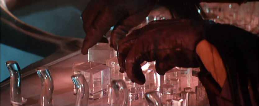
Q: Dennis Ward asks: There’s a gaff in The Fifth Element scene referenced—Corbin Dallas places one of the stones upsidedown relative to the other three. Is that a constraint issue?

5E-up

Yes and no.

Yes, if the stones could be placed on their pedestals in the wrong way. You wouldn’t want to design the weapon such that that were possible. As we saw, seconds count, and the stakes are pretty high. (c.f. Ultimate Evil.) Constraints, as Don Norman defined them in The Design of Everyday Things, would be one way to fix that. For example, you could widen one end of the stones so they were too large to fit in the pedestal the wrong way.

But (and here’s the “no”) it turns out that in The Ultimate Weapon Against Evil, the stones work whichever way they’re inserted. Take a look at the scene and though the stones aren’t all oriented the same way, i.e. pattern- or smooth-side up, they all work. (There is a third possibility, that orientation does matter, but they just got lucky in orienting them correctly. The odds of getting this right the first time is just over 6%, so we can discount this.)

5E-down

This is a superior design solution since it eliminates the need for the user to worry about orientation. Let’s call the pattern Make Orientation a Non-Issue.

But wait, we’re not done. We shouldn’t disregard the fact that you perceived it as a gaff. The design of the object signaled to you that there was an orientation that mattered. So yes, let’s keep the stones the same basic shape such that orientation is a non-issue, but one small improvement would be to have the visual design match the interaction design: The patterns should be symmetrical, perhaps completely covering each long side of the stones. That way, anyone wondering how they fit the pedestals wouldn’t falsely perceive that there is an orientation issue when there really isn’t one.

Thanks for this question, by the way. The Fifth Element is one of the first I reviewed for the Make It So survey since it’s one of my favorite sci-fi movies of all time. It makes me want to post that one next. I’ve got other plans, though, so perhaps after that. 🙂

UPDATE ————————————–

Since writing this post, I’ve done deeper analysis on this topic. See the Pilot episode of Sci Fi University for an even better and more thorough answer to this question.

Chat follow-up: Humanoid robots

The live chat of the O’Reilly webinar that Christopher delivered on 18 April 2013 had some great questions, but not all of them made it out of the chat room and onto the air. I’m taking a short break from the release of the sci-fi survey to answer some of those questions.

Q: Adrian Warman asks: Humanoid robots (android) are not as efficient mechanically, yet we ‘prefer’ them (C3PO v. R2D2?) Will our preferences always override efficiency?

SW4-001

A: I think it depends on the context of use. Humans are good at humans. So, when robots have social functions, it’s best that they appear humanoid, while avoiding the Uncanny Valley (or see page 183 in the book for more). They should stick to the Canny Rise, to coin a term. When they need to do other, non-social things for us, like build cars, or vaccuum our floors, or mine for rare earths in asteroid belts, they should be fit to task.

Giving credit where credit is due, this is exactly the case with the Star Wars robots. C-3PO’s a protocol droid, for “human-cyborg relations” and R2-D2 is ostensibly an astromech maintenance droid. Their appearances match their functions.

Report Card: Barbarella

Barbarella-Report-Card

Jean Claude Forest wrote his Barbarella strips for V-Magazine, he meant them to be sexy, camp, and perhaps a little tongue-in-cheek. Réalisme was not much on his mind. When the strip made the transition to the big screen, it kept these sensibilities firmly in place. The technology was fittingly just a collection of narrative devices, based loosely on 1960s technology paradigms and a handful of extant sci-fi tropes.

Sci: D- (1 of 4)
How believable are the interfaces given the science of the day?

Most of the technology in Barbarella are based on popular sci-fi narrative shortcuts: False gravity, free-floating video telephony, teleportation, force fields, and yes, focused-energy weapons. These are tropes, and lots of shows throw that caution to the wind, but you should not think of this as hard sci-fi by any stretch of the imagination. The only reason this just didn’t fail out is Alphy’s artificial intelligence, though a poor cousin to HAL (2001 premiered that same year), is a prescient voice-interface to a limited agentive system that fulfills its social role.

Fi: B (3 of 4)
How well do the interfaces inform the narrative of the story?

The Positronic Ray is of course the MacGuffin of the whole adventure, so technology plays a pretty pivotal role. And in the cases where the tech moves the story along, it does it cleanly and clearly, highlighting the causes and effects that let know that the heroine is alternately controlling her ship, out of batteries for her weapon, or trapped with no apparent means of escape.

Interfaces: c (2 of 4)
How well do the interfaces equip the characters to achieve their goals?

Barbarella is ultimately a mixed bag for its interfaces. Sure, you have Alphy, feeding her, keeping her company, and even managing the communications tech in the background all pretty seamlesly. The shagpile cockpit is even a surprisingly solid bit of industrial design for error recovery.

There’s a bunch of other stuff that is fine, but could stand some improvements, like the portable brainwave detector and the Queen’s display controls.

And then Durand-Durand’s Positronic Ray and the Queen’s Bed Chamber Door interface were bad enough to take me out of the movie and wonder what on Tau Ceti were they thinking. They were so bad that it countered any awesomeness the filmmakers had accidentally stumbled upon.

Final Grade C (6 of 12), MATINEE

Sure, see it for the lovely camp value, space titillation, and to see how agentive technology should work. But don’t expect much other interface inspiration.

Related lessons from the book

  • Both the Dildano’s map and the Queen’s Door should tighten their feedback loops (page 20).
  • Barbarella still talks in stupid compterese when speaking with the fully conversational Alphy. She should follow human social conventions, too (page 123.)
  • Alphy avoided the uncanny valley (page 184) through disembodiment.
  • Durand-Durand failed to give Barbarella a safeword (page 303.)

New lessons

  • It’s probably a trope of its own, but Durand-Durand should provide himself Just Enough Control.
  • The gravity controls could have used a scenario to Put it in Context.
  • Both the portable brainwave detector and the energy box beg for Haptify Secrets.

IMDB: https://www.imdb.com/title/tt0062711/Currently streaming on:

The Positronic Ray

Barbarella-136

To combat the Resistance uprising, Durand-Durand unleashes his dread Positronic Ray. To control it, he approaches a high backed chair and touches a spot on the back. The curved tip of the chair extends upwards a bit allowing him to sit down. As soon as he sits, the tip retracts to rest just above his head and the video panel slides close to him. The ray itself is mounted on a two-axis swivel just behind him, with the barrel pointing out of a horizontal window.

The interface consists of a complex array of transparent knobs mounted on a glowing flat panel, set beneath a large rectangular video screen. While he is using the weapon, we see his hands twiddling some of the shapes clockwise and counterclockwise.

Barbarella-139

The chair interface seems fine, if technically unnecessary, giving the gunner a small ritual feeling of power. The weapons interface, on the other hand, is a disaster. It has around 50 visible controls, none labeled for what they control or their extents, none have the slightest ergonomic consideration, and few are differentiated from the others in shape or placement. Also they’re all transparent, so add a lot of visual noise to the difficultly of use.

From his video screen we can tell that there are only a number of things to control: target (coupled to the camera), beam size (coupled to the camera zoom), and a trigger. Control for these simple variables could be accomplished with a joystick for targeting, a thumb button for triggering, and a slider at his left hand for zoom/beam size. Three controls which Durand-Durand could really think of as two.

Additionally, the screen only shows him what he’s currently focused on, failing to grant any of the field awareness that he’d need to keep the enemy at bay. Ultimately it’s a weapons interface that only a pacifist could love. Admittedly, he’s a mad engineer, and not a mad interaction designer, so maybe it’s just his insanity that explains this fiddly spread of extraneous controls with poor mapping and myopic feedback.

I’d love to credit this bad interface with saving the people of the city of SoGo, but unfortunately if its destruction hadn’t come from the Positronic Ray, it would have come from being swallowed by the Mathmos. Ultimately, they were doomed.

SoGo, destroyed