Hydro-rig Monitoring

image00

As a part of their morning routine, Jack makes the rounds in his Bubbleship to provide a visual confirmation that the hydro-rigs are operating properly. In order to send the hydro-rig coordinates to the Bubbleship, Vika:

  1. Holds with two fingers on the hydro-rig symbol on the left-hand side panel of the TETVision feed
  2. A summary of coordinates is displayed around the touchpoint (hydro-rig symbol)
  3. Drags the data up to the Bubbleship symbol on the side panel

Inconsistent interactions

When Vika sends the drone coordinates, she interacts directly with the map and uses only one finger. Why is the interaction for sending hydro-rig coordinates different than the interaction for sending drone coordinates?

image01

Perhaps Vika uses a different interaction here because she is sending the coordinates for all three rigs at the same time. However, since the three rigs are all in the same general location, that doesn’t really seem necessary.

It would be better to maintain a consistent interaction for the same function—in this case sending coordinates. This would leave the side panel with a more consistent interaction for uploading larger amounts of data to the TET, which will be covered in a separate post.

image02

The hydro-rig status feed on the left of the desk display is broken up into two sections. The main section consists of a diagram showing the resource collection status for each rig. The lower section of the feed indicates the grid position of each rig along with some additional data elements that are too blurry to make out.

Don’t forget the main objective

After the scavs take out one of the hydro-rigs in a gigantic show of fireworks, there is no noticeable change in the hydro-rig status feed. Where is the alert messaging stating that one of the rigs is offline? At the very least there should be an alert message similar to the red offline messaging displayed on the drone status feed. However, the screen appears to be unchanging throughout the film.

The main objective of Jack and Vika’s team is to keep the rigs safe. That’s why they are on earth and that is why the desktop with all of its fabulous capabilities was created. Don’t forget the main purpose of the design.

image03

At least there is a modest indication of a greyed-out symbol on the TETVision feed that indicates the rig is down—albeit very modest. There is not much of a clear visual distinction between the online and offline rigs. The colors are so similar, that a person who is colorblind may not even notice the difference.

image04

Made using tools at http://www.etre.com/tools/colourblindsimulator/

In this case, it’s likely that the TET selected teams who met fitness prerequisites, but it’s a good reminder for those of us doing real-world design for the general population: Don’t forget about accessibility in design. Following accessibility standards in design ensures that as many people as possible are able to use the interface.

Consistency is key

Overall, the system mostly does what it is supposed to do, but doesn’t seem to have been as well thought out or as consistent in design as the other systems in the film. Consistency should be maintained unless there’s a damned good reason not to, whether it’s with interactions or UI messaging.

Users tend to be more comfortable and confident when working with an interface that has consistent patterns. If a user expects a gesture or command to behave a certain way and it does, this consistency in design provides a more efficient workflow by enabling users to confidently interact with technology, without having to remember arcane details about what does what when.

Drone Status Feed

Oblivion-Desktop-Overview-002
Oblivion-Desktop-DroneMonitor-001


As Vika is looking at the radar and verifying visuals on the dispatched drones with Jack, the symbols for drones 166 and 172 begin flashing red. An alert begins sounding, indicating that the two drones are down.

Oblivion-Desktop-DroneCoordinates

Vika wants to send Jack to drone 166 first. To do this she sends Jack the drone coordinates by pressing and holding the drone symbol for 166 at which time data coordinates are displayed. She then drags the data coordinates with one finger to the Bubbleship symbol and releases. The coordinates immediately display on Jack’s HUD as a target area showing the direction he needs to go.

Simple interactions

Overall, the sequence of interactions for this type of situation is pretty simple and well thought out. Sending coordinates is as simple as:

  1. Tap and hold on the symbol of the target (in this case the drone) using one finger
  2. A summary of coordinates data is displayed around the touchpoint (drone symbol)
  3. Drag data over to the symbol of the receiver (in this case the Bubbleship)

Then on Jack’s side, the position of the coordinates target on his HUD adjusts as he flies toward the drone. Can’t really get much simpler than that.

However…

When Vika initially powers up the desktop, the drone status feed already shows drones 166 and 172 down. This is fine, except the alert sound and blinking icons on the TETVision don’t occur until Jack has already reached the hydro-rigs. This is quite a significant time lag between the drone status feed and the TETVision feed. It would be understandable if there was a slight delay in the alert sound upon startup. An immediate alert sound would likely mean there is something wrong with the TETVision system itself. That said, the TETVision drone icons should at the very least already be blinking red on load.

Monitoring drone 166

Oblivion-Desktop-DroneMonitor-005

As Jack is repairing drone 166, Vika watches the drone status feed on her desktop. The drone status feed is a dedicated screen to the right of the TETVision feed.

Oblivion-Desktop-DroneMonitor-000

It is divided into two main sections, the drone diagnostic matrix to the left and the drone deployment table to the right.

The dispatched drone table lists all drones currently working the security perimeter and lists an overview of information including drone ID, a diagram and operational status. The drone diagnostic matrix shows data such as fuel status and drone positioning along the perimeter as well as a larger detailed diagram of the selected drone.

Oblivion-Desktop-DroneMonitor

By looking at the live diagnostics diagram, Vika is able to immediately tell Jack that the central core is off alignment. As soon as Jack finishes repairing the central core, the diagram updates that the core is back in alignment and an alert sound pings.

How does the feed know which drone to focus on?

Since there is no direct interaction with this monitor shown in the film, it is assumed to be an informational display. So, how does the feed know which drone to focus on for diagnostics?

One possibility could be that Jack transmits data from the ground through his mobile drone programmer handset, which is covered in another post. However, a great opportunity for an example of agentive tech would be that when Vika sends the drone coordinates to the Bubbleship, the drone status feed automatically focuses on that one for diagnostics.

Clear messaging in real-time…almost

Overall, the messaging for drone status feed is clear and simple. As seen in the drone deployment table, the dataset for operational drones includes the drone ID number and a rotating view of the drone schematic. If the drone is down, the ID number fades and the drone schematic is replaced with a flashing red message stating that the drone is offline. Yet, when the drone is repaired, the display immediately updates to show that everything is operational again.

This is one of the basic fundamentals of good user interface design. Don’t let the UI get in the way and distract the user.

Keep it simple.

Vika’s Desktop

Oblivion-Desktop-Overview

As Jack begins his preflight check in the Bubbleship, Vika touches the center of the glass surface to power up the desktop that keeps her in contact with Sally on the TET and allows her to assist and monitor Jack as he repairs the drones on the ground.

The interface components

Oblivion-Desktop-Overview-000

The desktop is broken up into five main screens. The central screen is the TETVision map, which is a radar map used for communications, and monitors the Bubbleship, drones, and scav activity.

To the left of the TETVision map is a Hydro-rig status feed that keeps Vika informed of the water collection progress. Then on the right of the map is the drone status feed, which provides drone vital statistics, deployment and fuel status.

Oblivion-Desktop-Overview-000b

The upright section of the desktop contains two screens. The top screen is the TET system status feed, which monitors the TET’s orbit, and communications status. The second screen monitors the weather systems and wind velocity vectors, which would have an affect on the Bubbleship and drone flight safety.

Quick power-up

Powering on the desktop is virtually instantaneous and is as simple as touching the center of the table. One possible explanation for the speed is that the desktop goes into sleep mode and is in an always-on state. There are a couple of scenes in the film when the TET is able to access the desktop remotely that would support this assumption.

A possible method of power-down would be to tap and hold for a determined period of time. Sadly, there is no film footage that shows Vika shutting down the system.

Multiple versus single user

Oblivion-Desktop-Overview-003

The scale of this desktop is a bit large for a single user who needs to access life-saving information quickly. The display size and setup in the film is generally used for collaborative space so that multiple people can comfortably view and manipulate the data at the same time.

This large scale causes Vika to constantly lean over the table to see information for various reasons including glare, reach and angle of the displays. This could be stressful on the body when interacting with the desktop over long periods of time each day.

A better solution

Vika is only shown interacting with the TETVision map and not with any of the other feeds. If the map is the only screen that is interactive, a more ergonomic setup could be utilized to minimize glare and reach. This would allow Vika to see the vital information at a glance and still enable her to comfortably interact with the TETVision map.

Oblivion-Desktop-Overview-Ergonomics

Don’t forget the user’s needs

Overall, Vika’s desktop is a beautiful piece of technology that performs its function very well. However, in a real-world situation, it is important to remember that Vika will be using this equipment for possibly long periods of time and needs quick access to vital information. Having to roll back and forth between screens during an emergency situation could mean the difference between life and death for Jack while out in the field.

The Bubbleship Cockpit

image01

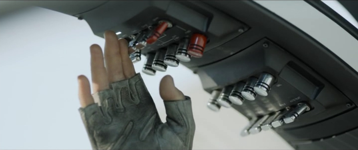
Jack’s main vehicle in the post-war Earth is the Bubbleship craft. It is a two seat combination of helicopter and light jet. The center joystick controls most flight controls, while a left-hand throttle takes the place of a helicopter’s thrust selector. A series of switches above Jack’s seat provide basic power and start-up commands to the Bubbleship’s systems.

image05

Jack first provides voice authentication to the Bubbleship (the same code used to confirm his identity to the Drones), then he moves to activate the switches above his head.

image06

The switches are large, all move the same direction for startup, and are labeled. Two of the controls are color coded red, and Jack switches the red control last. We never see the round knobs in use. They could be circuit breakers for the major systems. All are positioned nicely to prevent accidental use. Overall, it is setup almost exactly like a modern-day helicopter, with two distinct additions: Cockpit-wide HUD, and Swivel Controls. While not technical, the cockpit also has a little Elvis bobblehead—whose name is Bob—that keeps Jack company.

image02

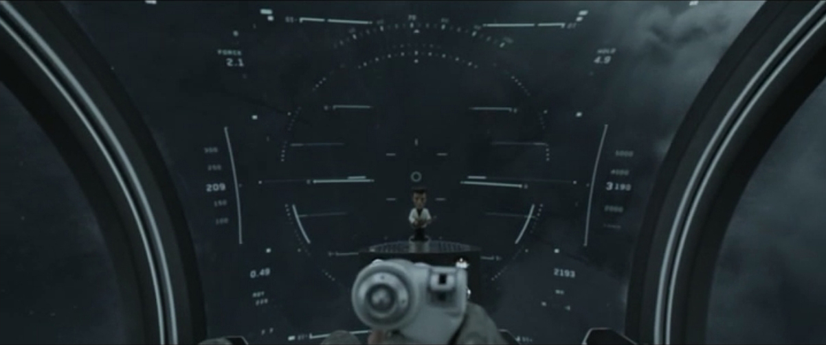
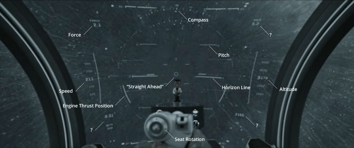
The main HUD provides standard information that Jack needs to pilot, even in zero visibility. It displays thrust output of his engines, an artificial horizon, altitude, and other indicators (shown in the above image and labeled in the image below).

image04

The HUD is displayed on the front glass, and is tied to the Bubbleship’s main power. When the power goes out, the HUD goes out. It is not wired to a separate backup circuit. Fortunately, Jack has a physical gimbal that remains operational even when the power is out.

image03

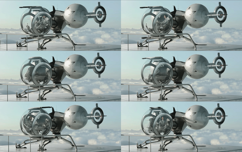
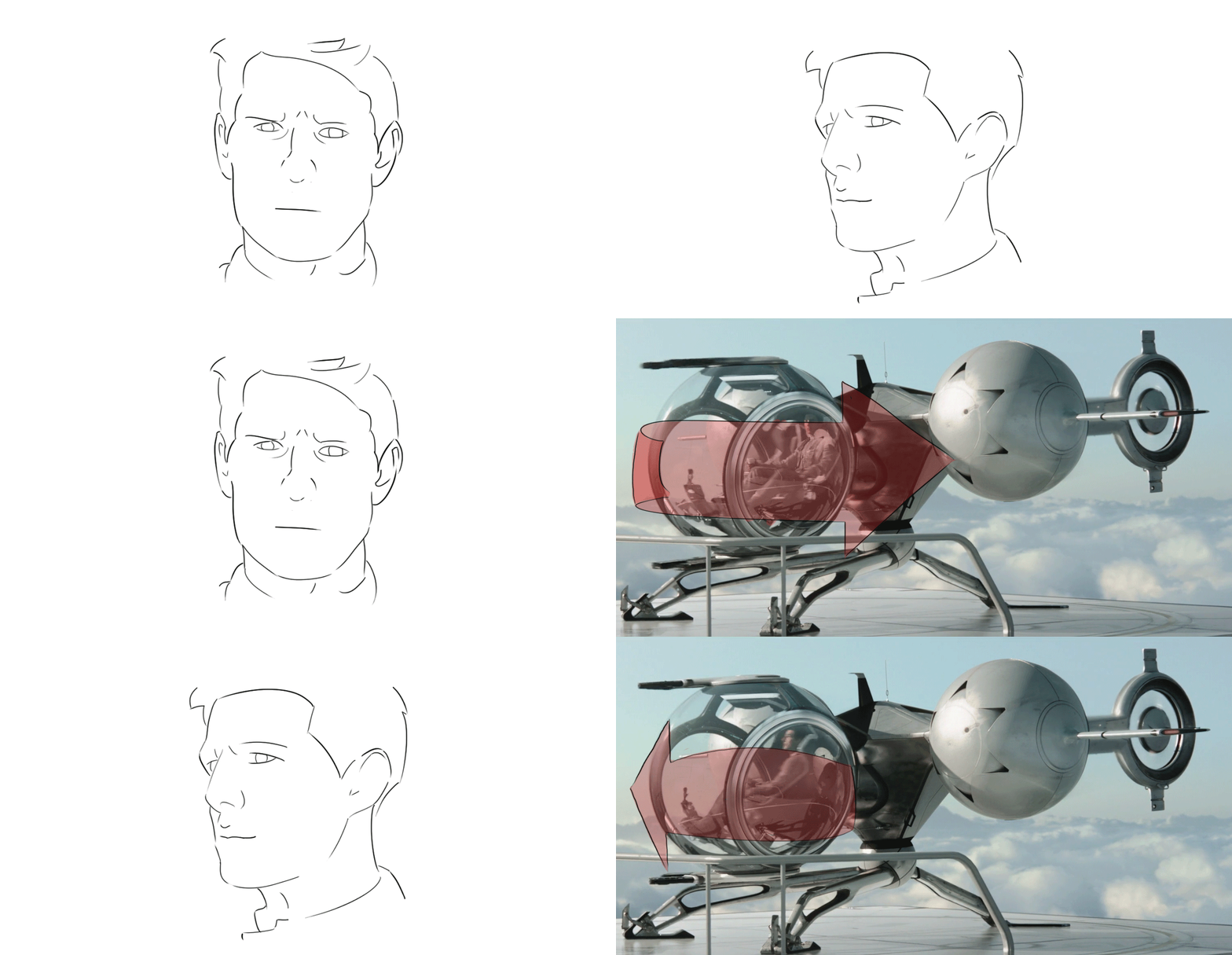
Another major addition is the swivel seating. Using a dedicated control on his joystick, Jack can move his seat around to get a better view as he is flying, without redirecting the Bubbleship in that direction.

image07

It is not clear based on the evidence shown whether Jack has set seat positions (one click per a certain degree of rotation), or whether he is able to hold down the control and rotate the seat based on the click duration. Jack is very familiar with this interface and piloting scheme. Even in an emergency situation when the Bubbleship’s power goes out and he loses control, Jack does not panic and goes through his emergency checklist. We see later that the Bubbleship does have an eject system (a large red handle in the top of the command pod), that detaches the entire passenger compartment and deploys a parachute. Jack decides that he does not need this rescue system and can pilot his way to safety.

Click-to-swivel

We see that Jack is often the only person in the Bubbleship, and that he often uses the seat swivel to get a better view of what he needs to survey. Piloting is a high-concentration activity, with a large amount of muscle memory training. A pilot can be expected to know how his (or her) craft will react to specific inputs at specific times. Moving around the seat allows Jack a better view of his surroundings, but could interrupt the muscle memory he uses for his daily piloting and emergency maneuvering. Given the muscle memory requirement, Jack is probably able to control the swivel based on a number of clicks, not a duration. Specific swivel points has several advantages:

  • The pilot can memorize control relationships for each swivel spot
  • Jack can click the position he wants, then forget about that control while he continues piloting
  • Less cognitive load to learn and operate
  • Automatic Swivel

Click-to-swivel has advantages, but it is not the most advantageous control scheme for the level of technology shown. We know that Jack has destinations in mind when he is traveling, or Vika has given him a waypoint. We also know that the Drones have a low level intelligence capable of free flight and complicated maneuvers. Jack could easily activate an autopilot mode (straight and level, emergency maneuvers, return to base, go to the secret cabin), then he could ‘free swivel’. This free swivel movement would be based on his eyes and head movement, with the seat merely following where Jack wants to look. Otherwise, the Bubbleship could follow his head movements for regular flight inputs, augmented by the control stick inputs.

image00

The Bubbleship would need some intelligence then to know the difference between when Jack actually wants to go somewhere, and when he is merely looking at his dashboard. Artificial intelligence is a given here. A good method would be focus tracking. When the Bubbleship tracks Jack’s focal point, it would know whether he’s looking at a spot on the horizon, or whether he’s looking at a point inside the cockpit. It would also be an effective way to focus the Bubbleship’s weapons pod for convergence—the guns would always meet at the point Jack was focused on, instead of firing wildly based on his joystick inputs.

Highly Refined

Modern day flight controls are highly refined tools with a well practiced group of users and a solid history of training programs. It makes sense to pull from this history when designing for a new flight machine, especially when its controls map so well to modern day equipment. The largest improvements can come from automation, especially when there is a solidly tested machine intelligence able to augment pilot intentions (see: the Drone, to be published later). By taking away the monotonous tasks from the pilot, and allowing them to focus on the difficult decisions, a machine can make the pilot’s life easier and safer.

Breakfast Sand Table

A woman in a modern kitchen holding a piece of food while looking at a countertop, with a man in a black shirt leaning on the counter beside her, both engaged in conversation.

While eating breakfast, Vika views the overnight surveillance via a touchscreen interface that is inset into the top of a white table.

Which touch tech?

Anyone interested in the touch technology should take note: Vika places her coffee cup and breakfast plate directly on the surface, which indicates that it utilizes capacitive touch technology with a glass top. Placing dishes on a resistive touchscreen, which is made of layers of plastic and glass would have interfered with the interactions and would be less durable as a tabletop.

Jack joins her at the table and leans on the surface with his hand and later with his forearm, which supports the idea that the area surrounding the viewport is not touch-enabled. If it were, it would need to incorporate palm-rejection technology in order for his arm to not interfere with Vika’s interactions.

The interface components

Oblivion-Desktop-Sandtable-001

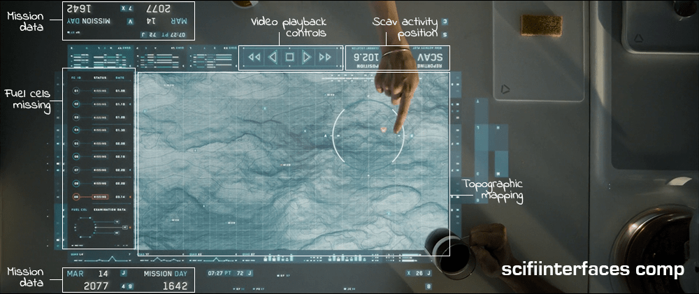
The main viewing area is a hybrid of satellite imagery and topographic mapping, surrounded in the interface by surveillance data and video playback controls. A message next to the video playback controls reports the current location of the scav activity.

To the left of the map is a list of fuel cells that have been stolen by the scavs along with the dates they went missing. The last one on the list is flashing red to draw their attention—a new one has gone missing.

Some elements, such as the current date and number of days into the mission face out at the top and the bottom to allow both Vika and Jack to view the data from either side.

A hand points at a futuristic digital map displayed on a transparent screen, showing a detailed terrain with lines and contours, alongside various mission data indicators and a date label.

The interface is responsive to touch gestures. Vika circles an area on the map and the icon indicating unusual activity turns red. She taps the icon and a video feed begins playing. Jack zooms in on the video feed by using a five-finger multi-touch “spread” gesture.

Why is the vital information facing Jack when Vika is the one using the interface?

It’s interesting to note that the the most vital information such as the list of missing drones, video playback and the topographic shaded relief are seen from Jack’s view. This causes Vika to have to process the information and videos upside-down—even though the playback controls face her.

This can be particularly problematic with the topographic shaded relief. Shaded relief simulates the shadow cast by the sun on the surface. Viewing this relief upside-down can cause a perception illusion that results in confusion on what is a crater and what is a hill.

Better: Lenticular display

A better solution would be to utilize a lenticular interactive display. Lenticular displays are made by placing a transparent film containing tiny ridges over an image that is made up of two or more images sectioned into bands and displayed in alternating lines. The ridges in the film cause the eye to focus on one set of lines in order to come out with a cohesive image.

Then, as in the illustration below, Vika would only see the view illustrated by the white lines and Jack would only see the view illustrated by the black lines.

Diagram illustrating the concept of lenticular film and interlaced images with labeled sections showcasing different views.

Utilizing a lenticular display would solve the issue of the shaded relief perception illusion and allow Jack and Vika to each read the information and watch the video from their own perspective at the same time.

The thing that gets a little tricky about utilizing a lenticular display for this solution is the fact that it is a touch screen. The elements that are being interacted with need to be in the same position for both Jack and Vika in order for the computer to know what is being manipulated. This can be solved by flipping the individual elements such as the shaded relief on the topography and the activity icons, words, etc., while keeping them in the same location on the interface.

Smart video recording and playback

So, how did the TET know where to start the video recording and playback? Given that the other interfaces in the film have the capability to detect motion, it is likely that the video recording was automatically triggered by the scavs when they moved in to attack the drone.

Unfortunately, there is no screentime granted to the use of the actual video playback controls, but assuming they are as smart as the rest of the interfaces in the film, it is safe to expect these controls to be more useful than simply sequencing through the scenes. The interface would probably allow Vika to scrub through a grid of thumbnails to quickly find any scenes of interest.

Why circle and tap to play?

The activity alert icon on the map was static white until Vika circled an area surrounding it. Only then did it start flashing red. Other interfaces on Vika’s main desktop provide immediate feedback with an audible alert and a flashing red symbol. Why would this one require the extra effort of circling the area? It would seem simpler to flash red from the beginning and allow Vika to immediately tap on the symbol for video playback.

It is possible that she is circling the area that she wants the TET feed to focus on, but if the TET has the capability to detect the activity to begin with, it should automatically know where to focus.

Another possibility is that she is used to getting multiple alerts every morning and the circle gesture could be for playing all of the surveillance videos at the same time instead of having to tap on each one to play. If that is the case, then she may be using the circle gesture through muscle memory since people tend to use repetitive gestures without thinking about it even if there is a simpler gesture available. If a gesture isn’t used very often, users tend to forget about it.

Overall, this is a nice system that effectively allows Jack and Vika to get a quick overview of the events of the previous night and gives them a heads-up as to what is in store for them that day.

COURSE OPTION ANALYSIS

vlcsnap-2014-12-11-00h47m31s85

When Ibanez and Barcalow enter the atmosphere in the escape pod, we see a brief, shaky glimpse of the COURSE OPTION ANALYSIS interface. In the screen grab below, you can see it has a large, yellow, all-caps label at the top. The middle shows the TERRAIN PROFILE. This consists of a real-time, topography map as a grid of screen-green dots that produce a shaded relief map.

STARSHIP_TROOPERS_landing_trim

On the right is a column of text that includes:

  • The title, i.e., TERRAIN PROFILE
  • The location data: Planet P, Scylla Charybdis (which I don’t think is mentioned in the film, but a fun detail. Is this the star system?)
  • Coordinates in 3D: XCOORD, YCOORD, and ELEVATION. (Sadly these don’t appear to change, despite the implied precision of 5 decimal places)
  • Three unknown variables: NOMINAL, R DIST, HAZARD Q (these also don’t change)

The lowest part of the block reads that the SITE ASSESSMENT (at 74.28%, which—does it need to be said at this point—also does not change.)

Two inscrutable green blobs extend out past the left and bottom white line that borders this box. (Seriously what the glob are these meant to be?)

At the bottom is SCAN M and PLACE wrapped in the same purple “NV” wrappers seen throughout the Federation spaceship interfaces. At the bottom is an array of inscrutable numbers in white.

Since that animated gif is a little crazy to stare at, have this serene, still screen cap to reference for the remainder of the article.

vlcsnap-2014-12-11-00h47m37s145


Design

Three things to note in the analysis.

1. Yes, fuigetry

I’ll declare everything on the bottom to be filler unless someone out there can pull some apologetics to make sense of it. But even if an array of numbers was ever meant to be helpful, an emergency landing sequence does not appear to be the time. If it needs to be said, emergency interfaces should include only the information needed to manage the crisis.

2. The visual style of the topography

I have before blasted the floating pollen displays of Prometheus for not describing the topography well, but the escape pod display works while using similar pointillist tactics. Why does this work when the floating pollen does not? First, note that the points here are in a grid. This makes the relationship of adjacent points easy to understand. The randomness of the Promethean displays confounds this. Second, note the angle of the “light” in the scene, which appears to come from the horizon directly ahead of the ship. This creates a strong shaded relief effect, a tried and true method of conveying the shape of a terrain.

3. How does this interface even help?
Let’s get this out of the way: What’s Ibanez’ goal here? To land the pod safely. Agreed? Agreed.

Certainly the terrain view is helpful to understand the terrain in the flight path, especially in low visibility. But similar to the prior interface in this pod, there is no signal to indicate how the ship’s position and path relate to it. Are these hills kilometers below (not a problem) or meters (take some real care there, Ibanez.) This interface should have some indication of the pod. (Show me me.)

Additionally, if any of the peaks pose threats, she can avoid them tactically, but adjusting long before they’re a problem will probably help more than veering once she’s right upon them. Best is to show the optimal path, and highlight any threats that would explain the path. Doing so in color (presuming pilots who can see it) would make the information instantly recognizable.

Finally the big label quantifies a “site assessment,” which seems to relay some important information about the landing location. Presumably pilots know what this number represents (process indicator? structural integrity? deviation from an ideal landing strip? danger from bugs?) but putting it here does not help her. So what? If this is a warning, why doesn’t it look like one? Or is there another landing site that she can get to with a better assessment? Why isn’t it helping her find that by default? If this is the best site, why bother her with the number at all? Or the label at all? She can’t do anything with this information, and it takes up a majority of the screen. Better is just to get that noise off the screen along with all the fuigetry. Replace it with a marker for where the ideal landing site is, its distance, and update it live if her path makes that original site no longer viable.

landing_comp

Of course it must be said that this would work better as a HUD which would avoid splitting her attention from the viewport, but HUDs or augmented reality aren’t really a thing in the diegesis.

Narratively

The next scene shows them crashing through the side of a mountain, so despite this more helpful design, better for the scene might be to design a warning mode that reads SAFE SITE: NOT FOUND. SEARCHING… and let that blink manically while real-time, failing site assessments blink all over the terrain map. Then the next scene makes much more sense as they skip off a hill and into a mountain.

Plotting Course

StarshipT_PlottingCourse01

While on “third watch” on the bridge, Barcalow brings Ibanez a cup of coffee and they hang out a bit. Looking at the screen, he notes that “something’s wrong.” He reaches down and presses a button, and a screen appears with the label PLOTTING COURSE. A small yellow circle zeroes in on their spot in space, labeled in green as CURRENT POSITION (with “galactic” XYZ coordinates listed beneath). Then a yellow circle zeroes in on their destination, labeled in blue as TARGET DESTINATION. (With fuigetry from her earlier interfaces lining the top and bottom.) Each dot becomes two squares that slide into place on a side-by-side comparison screen with an efficiency analysis below.

Ibanez explains that she replotted the course, it being “more efficient this way.” To check it he walks to a different computer, which we’ll discuss in the next post. Even though this little interaction takes place over a few seconds, already there are things that need to be discussed before we move on.

StarshipT_PlottingCourse02

Why wasn’t he notified?

Barcalow only finds out about the change to the course by coming to the bridge and observing something on a screen there. Any system that knows its user (and recall that Ibanez had to log in to her station) should know and respect the authority chain of its users. With only three weeks of experience at the helm, it seems more likely that Ibanez should have had to submit a plan for consideration rather than being able to just grabbing the wheel while everyone else is asleep. Seems like a hijacking waiting to happen. More sensibly, Barcalow should have come onto the bridge with the coffee saying, “I saw you submitted a new course. That’s a pretty bold move, ensign. Want to show it to me over a cup of this here space jo?” Then we’d get the idea that there’s an actual chain of authority in this military.

Even if Ibanez has the authority to alter the course without approval, her superior officer (at least) should be notified of the change immediately, so he could be aware and check up on it if he needed to.

Why is this information on a tiny screen?

Everyone on the bridge should be aware of the same basic bits of information. It’s one of the main reasons you get people clustered together in a bridge or a mission control center in the first place. Shouldn’t this be some of that basic information? If so, why is it only appearing on a tiny screen that Barcalow happens to glance at because he’s trying to woo Ibanez? Do they always have to hire womanizing superior officers? Better is a shared information source like Star Trek’s viewscreens where some glanceable mission information—like progress against course—can be seen by everyone.

StarshipT_PlottingCourse03

Cartesian coordinate system

I do want to credit the interface designer for including 3D coordinates. Sci-fi can fall into the trap of treating spaceships as if they were seagoing vessels floating on a 2 dimensional surface like the sea. Props for acknowledging that the ship is moving through three dimensions. And Cartesian coordinates are nice in that anyone who has completed remedial geometry will be familiar with Descartes’ coordinate system. (Though I doubt that Cartesian Coordinates would be the actal system being used in space. It’s much more likely to be something like the International Celestial Reference System or even sweet-looking Keplerian graphs.) But narratively, showing 3D coordinates is a step in the right direction. But we can do René one better for both the audience and the navigators.

Show don’t tell

Other interfaces on the bridge already showed us that the system is capable of displaying 3D information. On this screen, it would be better to show the plotted course and the point at which the ship is along it.

Of course space travel is likely to be incredibly boring with long stretches of straight-line travel through vast swaths of emptiness. But this is sci-fi, so let’s presume that its path includes gravity assist fly-bys of stars. That gives the display useful markers for orientation and something for Barcalow to look at to realize how the course has changed. Then when he needs to compare, he presses the left arrow key and can see the old path overlaid in a new color in the display, letting him (and us the audience) see the change in course rather than be told about it. Numbers can overlay this display to provide exact details, but it would augment the immediate understanding offered by the 3D.

Dispatch

LOGANS_RUN_map_520

At dispatch for the central computer, Sandmen monitor a large screen that displays a wireframe plan of the city, including architectural detail and even plants, all color coded using saturated reds, greens, and blues. When a Sandman has accepted the case of a runner, he appears as a yellow dot on the screen. The runner appears as a red dot. Weapons fire can even be seen as a bright flash of blue. The red dots of terminated runners fades from view.

Using the small screens and unlabeled arrays of red and yellow lit buttons situated on an angled panel in front of them, the seated Sandman can send a call out to catch runners, listen to any spoken communications, and respond with text and images.

LogansRun094

*UXsigh* What are we going to do with this thing? With an artificial intelligence literally steps behind them, why rely on a slow bunch of humans at all for answering questions and transmitting data? It might be better to just let the Sandmen do what they’re good at, and let the AI handle what it’s good at.

But OK, if it’s really that limited of an Übercomputer and can only focus on whatever is occupying it at the moment, at least make the controls usable by people. Let’s do the hard work of reducing the total number of controls, so they can be clustered all within easy reach rather than spread out so you have to move around just to operate them all. Or use your feet or whatever. Differentiate the controls so they are easy to tell apart by sight and touch rather than this undifferentiated mess. Let’s take out a paint pen and actually label the buttons. Do…do something.

LogansRun095

This display could use some rethinking as well. It’s nice that it’s overhead, so that dispatch can be thinking about field strategy rather than ground tactics. But if that’s the case, it could use some design help and some strategic information. How about downplaying the saturation on the things that don’t matter that much, like walls and plants? Then the Sandmen can focus more on the interplay of the Runner and his assailants. Next you could augment the display with information about the runner, and perhaps a best-guess prediction of where they’re likely to run, maybe the health of individuals, or the amount of ammunitition they have.

Which makes me realize that more than anything, this screen could use the hand of a real-time strategy game user interface designer, because that’s what they’re doing. The Sandmen are playing a deadly, deadly video game right here in this room, and they’re using a crappy interface to try and win it.

Virtual 3D Scanner

GitS-3Dscanner-001

Visualization

The film opens as a camera moves through an abstract, screen-green 3D projection of a cityscape. A police dispatch voice says,

“To all patrolling air units. A 208 is in progress in the C-13 district of Newport City. The airspace over this area will be closed. Repeat:…”

The camera floats to focus on two white triangles, which become two numbers, 267 and 268. The thuck-thuck sounds of a helicopter rotor appear in the background. The camera continues to drop below the numbers, but turns and points back up at them. When the view abruptly shifts to the real world, we see that 267 and 268 represent two police helicopters on patrol.

GitS-3Dscanner-008

Color

The roads on the map of the city are a slightly yellower green, and the buildings are a brighter and more saturated green. Having all of the colors on the display be so similar certainly sets a mood for the visualization, but it doesn’t do a lot for its readability. Working with broader color harmonies would help a reader distinguish the elements and scan for particular things.

colorharmonies

Perspective

The perspective of the projection is quite exaggerated. This serves partly as a modal cue to let the audience know that it’s not looking at some sort of emerald city, but also hinders readability. The buildings are tall enough to obscure information behind them, and the extreme perspective makes it hard to understand their comparative heights or their relation to the helicopters, which is the erstwhile point of the screen.

perspectives

There are two ways to access and control this display. The first is direct brain access. The second is by a screen and keyboard.

Brain Access

Kusanagi and other cyborgs can jack in to the network and access this display. The jacks are in the back of their neck and as with most brain interfaces, there is no indication about what they’re doing with their thoughts to control the display. She also uses this jack interface to take control of the intercept van and drive it to the destination indicated on the map.

During this sequence the visual display is slightly different, removing any 3D information so that the route can be unobscured. This makes sense for wayfinding tasks, though 3D might help with a first-person navigation tasks.

GitS-3Dscanner-010

Screen and keyboard access

While Kusanagi is piloting an intercept van, she is in contact with a Section 9 control center. Though the 3D visualization might have been disregarded up to this point as a film conceit, here see that it is the actual visualization seen by people in the diegesis. The information workers at Section 9 Control communicate with agents in the field through headsets, type onto specialized keyboards, and watch a screen that displays the visualization.

GitS-3Dscanner-036

Their use is again a different mode of the visualization. The information workers are using it to locate the garbage truck. The first screens they see show a large globe with a white graticule and an overlay reading “Global Positioning System Ver 3.27sp.” Dots of different sizes are positioned around the globe. Triangles then appear along with an overlay listing latitude, longitude, and altitude. Three other options appear in the lower-right, “Hunting, Navigation, and Auto.” The “Hunting” option is highlighted with a translucent kelley green rectangle.

After a few seconds the system switches to focus on the large yellow triangle as it moves along screen-green roads. Important features of the road, like “Gate 13” are labeled in a white, rare serif font, floating above the road, in 3D but mostly facing the user, casting a shadow on the road below. The projected path of the truck is drawn in a pea green. A kelley green rectangle bears the legend “Game 121 mile/h / Hunter->00:05:22 ->Game.” The speed indicator changes over time, and the time indicator counts down. As the intercept van approaches the garbage truck, the screen displays an all-caps label in the lower-left corner reading, somewhat cryptically, “FULL COURSE CAUTION !!!”

The most usable mode

Despite the unfamiliar language and unclear labeling, this “Hunter” mode looks to be the most functional. The color is better, replacing the green background with a black one to create a clearer foreground and background for better focus. No 3D buildings are shown, and the camera angle is similar to a real-time-strategy angle of around 30 degrees from the ground, with a mild perspective that hints at the 3D but doesn’t distort. Otherwise the 3D information of the roads’ relationship to other roads is shown with shape and shadow. No 3D buildings are shown, letting the user keep her focus on the target and the path of intercept.

GitS-3Dscanner-035

Resistance Chutes

Barbarella-079

In order to conduct its subversions, the Resistance has a set of secret pneumatic chutes throughout SoGo. To monitor them, they have a map of the city with the chutes drawn as lines and places within the city illuminated with small lights.

The purpose of the lights is a bit vague, since just before Barbarella leaves Resistance Headquarters, Dildano glances at the map to see a red dot flashing at the very top. Gesturing at the light he remarks, “The time is right. The Queen is in her Chamber of Dreams.” But we know from the end of the film that the Queen’s Dream Chamber is on the lowest level of the city, close to Mathmos. (It would seem the Resistance has some severe information gathering issues.) So is each location able to change color to represent prominent individuals? What if two prominent people are in the same place? How does Dildano indicate which prominent person he wishes to track? We never see these controls, and per the axiom of providing inputs near outputs, we would want them to be somewhere around here.

We do get to see one interface in action, though. The chutes themselves are controlled by a set of rather rickety knife switches with large handles. A Resistance member throws one of the switches to initiate suction in a particular tube. (Fans of Futurama should note some similarities to the public transportation system in New New York.)

Barbarella-081

One the switch is thrown, a traveler extends his or her arms upwards, and then the tube handles the rest. The exits is ungraceful, tumbling travelers onto the floor in conspicuous places somewhere in SoGo.

Barbarella-096