First off, let me apologize for the terrible flashing that is this next interface.
After "designing a course to Jupiter" using STARNAV, Barcalow presses something that initiates the warp drive.
He speaks along with a broadcast voice to countdown, "Star drive in…5…4…ready…steady…GO!"

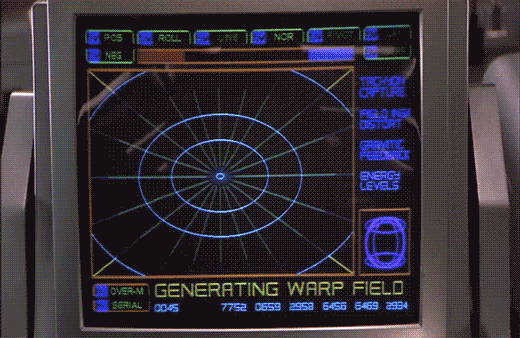
The next screen shows a polar grid labeled GENERATING WARP FIELD. Circular rings shrink towards the center of the grid. Text along the right reads TACHYON CAPTURE, FIELD INGH DISTORT, GRAVITIC FEEDBACK, and ENERGY LEVELS. Bits of the fuidgitry from the STARNAV screens are occluded by a progress bar and a string of unchanging numbers: 0045 4535 7752 0659 2958 6456 6469 2934.
The first part of this display makes sense. It’s providing feedback to the navigator that it’s progressing in a task, i.e. generating the warp field. The animated circles provide some glanceable confirmation that things are progressing smoothly, and the implied concentration of power in a single point tells that whatever it’s building to, it’s gonna be big. Of course we can probably do without the numbers and tabs since they don’t change and it’s not really a touch screen. It would also be good to monitor whatever metrics we should be watching to know if things are safe or trending dangerously, maybe with sparklines, like a medical monitoring interface. Perhaps though that’s the sort of screen better suited to engineering. After all, Barcalow and Ibanez are just navigating and piloting here, respectively.

Then the progress bar suddenly turns purple, then the whole purple grid flashes multiple colors as we hear rapid electronic beeping (amongst a swell of extra-diegetic orchestra brass). Finally, a white circle grows from the center outward to fill the screen as the ship passes into Star Drive.
At first the white screen might seem like a waste, since this is when the navigator’s job really begins, as they go careening through space hurtling towards potentially life-threatening obstacles. But that white background can provide a clear background for a radar view (or Starship Trooper equivalent), a canvas for him to scan for any threats that radar are picking up beyond the field of vision afforded by the viewport. So the "wasted" space isn’t a problem at all.


The flashes are a bit of a problem. What’s it doing that for? Is it trying to put them into an epileptic seizure just before engaging in potentially deadly activity? Or is a seizure the only way to survive the perils of Stardrive? It’s unclear and dubious that there’s any good reason. Interaction designers are rarely in the business of putting users into a grand mal.
The color and values are also problematic. Why the candy colors? Does the orange flash mean something different than the purple flash? Even if you got rid of all the circus themed colors, there’s still a blinding amount of white on the screen once warp is engaged. That canvas would work a lot better as a black background with white blips to avoid eye fatigue, especially over long spans of time.

Discover more from Sci-fi interfaces
Subscribe to get the latest posts sent to your email.
From the .gif that just got posted, I wonder if the screen is being used here as an alert mechanism. If the Stardrive is dangerous, or simply doesn’t require any human input while it’s active, then the screen could be indicating the start and end of the ‘warp’ function.
I would be curious if the first white circle starts when the ship begins its jump, and the second white circle would indicate when the jump is finished. Since we see the pilots not doing anything while the jump is happening, they may be waiting for a signal that it’s safe to put their hands back on the controls.
From the interfaces so far though, I’m getting the impression that the government doesn’t care too much about individual safety.
Sensors don’t work whilst in StarDrive so the graphic signifies a sensual whiteout.
A good guess. Are there diegetic cues to this being the case?
Pingback: Report Card: Starship Troopers | Sci-fi interfaces