In other posts we compared the human and alien VPs of Prometheus. They were visually distinct from each other, with the alien “glowing pollen” displays being unique to this movie.
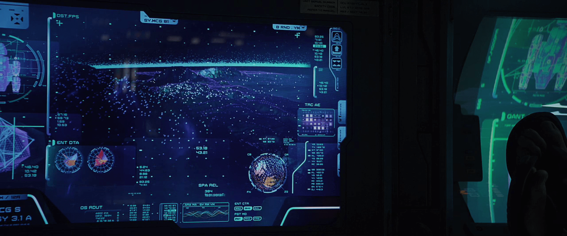
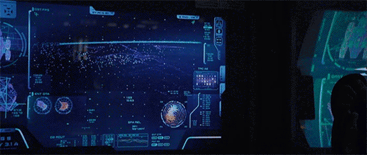
There is a style of human display in Prometheus that looks similar to the pollen. Since the users of these displays don’t perceive these points in 3D, it’s more precise to call it a floating-pixel style. These floating-pixel displays appear in three places.
- David’s Neurovisor for peering into the dreams of the hypersleeping Shaw. (Note this may be 3D for him.)
- The landing-sequence topography displays
- The science lab scanner, used on the alien head


There is no diegetic reason offered in the movie for the appearance of an alien 3D display technology in human 2D systems. When I started to try and explain it, it quickly drifted away from interaction design and into fan theory, so I have left it as an exercise for the reader. But there remains a question about the utility of this style.
Poor cues for understanding 3D
Floating, glowing points are certainly novel to our survey as a way to describe 3D shapes for users. And in the case of the alien pollen, it makes some sense. Seeing these in the world, our binocular vision would help us understand the relationships of each point as well as the gestalt, like walking around a Christmas tree at night.
But in 2D, simple points are not ideal for understanding 3D surfaces. Especially when the pixels are all the same apparent size. We normally use the small bits of scale to help us understand an object’s relative distance from us. Though the shape can be kind-of inferred through motion, it still creates a great deal of visual noise. It also hurts when the points are too far apart. It doesn’t give us a gestalt sense of surface.
I couldn’t find any scientific studies of the readability of this style, this is my personal take on it. But we also can look to the real world, namely to the history of maps, where cartographers have wrestled with similar problems to show topography. Centuries of their trial-and-error have resulted in four primary techniques for describing 3D shapes on a 2D surface: hachures, contour lines, hypsometric tints, and shaded relief.

These styles utilize lines, shades, and colors to describe topography, and notably not points. Even modern 3D modeling software uses tessellated wireframes instead of floating points as a lightweight rendering technique. To my knowledge, only geographic information systems display anything similar, and that’s only when the user wants to see actual data points.
These anecdotal bits of evidence combine with my observations of these interfaces in Prometheus to convince me that while it’s stylistically unique (and therefore useful to the filmmakers), it’s seriously suboptimal for real-world adoption.
Discover more from Sci-fi interfaces
Subscribe to get the latest posts sent to your email.
Pingback: Table Scanner | Make it So
Pingback: Report Card: Prometheus | Make it So
Pingback: COURSE OPTION ANALYSIS | Sci-fi interfaces
Bit late to the party here, but I’d assumed the topographic view in the landing sequence WAS displaying actual data points as they came in: that the computer was actively building up a picture of the landscape and feeding it in real time to the pilot. We can see in the gif that the data points rapidly increase in number: perhaps at a certain density the computer would be confident enough to switch to a wireframe display of the landscape?
I think that’s a great idea. What I would hope to see you would be a confidence rating somewhere on the display helping the pilot know how soon a better rendering would be available, to tell whether he needed to make his decision with the lo-res info or not.
Just wanted to comment in, love this blog series.
We use 3d point models such as those portrayed here extensively in 3d scanning and modelling where a site survey is produced from a laser scanner that generates maybe 600 million points from various positions. The models we work with end up looking extremely similar to those used here (except we get actual coloured points rather than a single unifying colour). I think a comparison to this type of technology is fairer than from a purely cartographic point of view as they seem to be scanning volumetrically rather than just top down surface projections. There’s even an implication that the Prometheus uses some kind of scattersshot scanning approach from the way points appear almost at random when the crewmember says terrain data us “reading up”. The scanning orb “pups” heavily imply this too from their red sweeping laser beam. This then makes their displays understandable as a kind of voxel based imaging since its extremely difficult to accurately triangulate these surfaces accurately without problems and is computationally very expensive. The point approach also allows internal structures to be visible without having to do very expensive alpha blending and sorting of data. It can be a confusing mess at first but all of our designers get used to it within a few days and are happy navigating structures etc.
Interesting. You’re saying that it hints at an unprocessed point-data display, and that people can grow quickly used to these. I can’t argue the latter as I haven’t dealt with this personally, but I believe you. Are there any studies which compare the utility of each? For the internal logic of the movie though, if they have fully realized general artificial intelligence, though (as they do) they have the processing power available to move beyond raw data. That, and the fact that the aliens have the same style of display (with no in-world explanation) tell me this was an art direction choice rather than a nod to likely technological futures.