So the basic distributions (prior posts in the series) are fascinating themselves, but what brought us to this study is how those counts correlate. And while you could correlate any of these attributes (gender, embodiment, subservience, etc.) against any other, what follows is a measure of the correlation of gender to the other attributes.
In case you are not familiar with correlations, here’s the sci-fi interfaces “correlations 101”.
Ratios of values
Let’s say you have a group of 100 people, and you know their sex (simplified as male and female for this explanation) and their eye color (simplified again to green, blue, or brown). Let’s also say there’s a perfectly even ratio of attributes. Half are male and half are female. One-third of people have green, another third have blue, and the last third have brown eyes.

Correlations across attributes
The question of correlation goes something like this: When we meet a female in this group, what are the odds her eyes are brown?
In a perfect distribution of sex and eye color, you might expect ⅓ of women to have green eyes, ⅓ of women to have blue eyes, and ⅓ to have brown eyes. After all, ⅓ of (this imaginary) population does, and women are half of that, so, logically, ⅓ of them should have brown eyes. That would mean that for any of these females, the odds should be around 33% that their eyes are brown.

But if, looking at the data, you actually found that ⅔ of women had blue eyes and ⅓ of the women had green eyes, you would have a very imperfect distribution, and you would rightly wonder what was going on. Why do the guys have all the brown eyes? Is blue-eyed-ness somehow connected to being female? This would point at something weird going on, bearing further inquiry. What’s Up with Dudes Having all the Brown Eyes? Thank you for coming to my TED talk.

So that’s a basic explanation. Of course we don’t really care about eye color. But if you substitute eye color for, say, wealth, you can see why we might care about looking at correlations. If the top 33% of earners were all dudes, we’d try and suss out why the gross wealth inequality.

Now, circles and wedges make for easy pedagogical shapes, but they’re not that great for understanding the data, especially when it gets more complicated, say, with our 11 categories of sci-fi AI gender presentation. So instead of circular diagrams, instead I’ll use bar charts to show how far off from perfect each attribute is. In the case of the perfect distribution, the bars would be at zero, as on the lower left in the image above. It would be a very boring bar chart.
But in the case of the weird dudes-brown and ladies-blue scenario on the lower right, the bar charts for blue and brown would be correspondingly as far from zero as the chart will allow. The green attribute, since it was perfectly distributed in that example, still sits at zero. You’ll note though that if you added up all the blue values in the chart, they would sum to zero. The same for brown and green bars. If you cared to do a check of the data, this is one way you could check to see if it was valid.
Of course real world data rarely, if ever, looks this extreme and clean. It’s usually more nuanced, and needs careful reading. In the example below, females are overweighted for blue eyes and males overweighted for the other two. That bar chart would look like this.

Note that it’s important to read the scale on the left. We’re no longer looking at a 100-percent bars. The female-blue overweighting is only 16.67 percent. That would be significant, but not as significant as if it was peaked out at 100. So be sure and read the scales.
My method
NOTE: If you’re not interested in the soundness of the methods, the rest of this post is going to be boring. But I need to lay out my methods to make sure I’m not doing my math wrong (if I was, we’d have to reconsider all the conclusions). I’ll also use as plain spoken language as I can in case you want to follow along. The good news is, it’s pretty simple math.
If we were working with floating-point values, then we might be able to do some fancy math called a Pearson correlation to measure correlations. I did this as part of the Untold AI study. But each of our variables in the Gendered AI study are categorical, more like eye color than weight. So I had to go about looking at correlations in a different way.
- First I looked at simple counts for all combinations of attribute pairs. For example: There are 2 biologically female very good AI characters, and 3 biologically male very evil characters,…
- Then I looked at the percentage of each value in its attribute. 7% of characters are very good, for example. 10% of characters are biologically female.
- I performed a simple multiplication of the percentages of each value to understand what a perfect distribution would be for those value pairs. Given that 7% are very good and 10% are biologically female, if very goodness and biological femaleness were perfectly distributed, we would expect .7% of all characters to be very good and biologically female.
- I then multiplied that times the number of characters in the survey, and came up with the number of characters we would expect to see with those two values. Given 327 characters, and an expected .7%, we would expect to see 2.289 characters in the survey with this combination. (Characters can’t have fractional attributes in my method, but I don’t round until the end.)
- Next I subtracted the perfect distribution number from the actual number to come up with variance. A negative means we see less than we would expect. A positive means we see more than we expect.
- I then translated those variance units to a percentage of the total number of characters. This lets us compare apples to apples across attribute pairs, regardless of size.
- Finally I created some conditional formatting that showed the lowest number across the correlations as the darkest red, the highest number across the set as darkest green, zero as white, and everything in between on a scale between those three values. This allows us to look and at a glance see bias as color on a table. It’s not gorgeous infographics, but it is dense, effective data presentation.
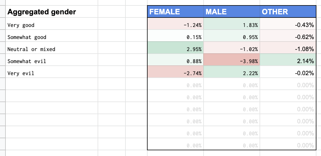
In some cases it pays to compare the data as oversimplified binary gender counts (male, female, and other) and so you will find an aggregated table on the correlation page, that looks like this.
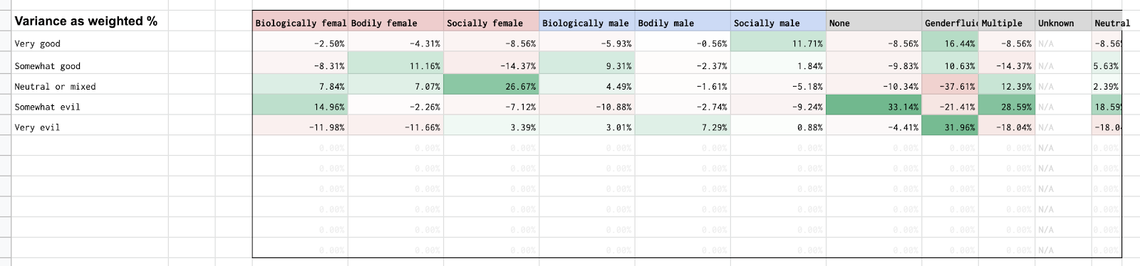
But of course there are detailed bias tables. They look like this.
Those can be hard to read, so in the posts, I instead present that data in the bar chart format that I showed way up at the top of this post.

This method is long, and tedious to recount, so rather than going through the chain for each correlation, I’ll just be showing tables when the comparison is interesting, showcasing the bar charts, and then talking about the results. You can see the whole chain, step by step, in the live Google sheet, right down to individual cell formulas. If you’re a data nerd, anyway.

Also, if you’re browsing the live sheet, you’ll see little black triangles in the upper right corner of some of the cells. These are “Notes” in the Google Sheet that show the exact examples. They take some processing, and so take a second or two to appear after you’ve changed the dropdown at the top.
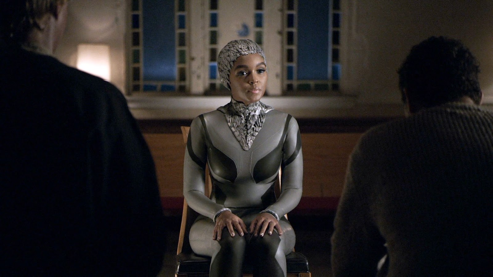
So, for instance, if you wanted to know what examples were tagged as both “architectural” embodiment and “socially female” a rollover would reveal there are two: The city computer from Logan’s Run, and Deep Thought (pictured above). If there is not a note attached to a cell, that means there are no examples.
Data science people righty want to know if the bias we see can be attributed to all that random noise that happens in real life. One way to test for that is something called a Chi Square Test. Those tests are at the bottom of the sheet. If the results aren’t statistically significant, the results could be dismissed. But, per the results of these Chi Square tests, the correlation studies can not wholly be dismissed as noise.
So that’s a lot, but it was necessary set-up. On to the correlations themselves!
Discover more from Sci-fi interfaces
Subscribe to get the latest posts sent to your email.
Pingback: Inteligência artificial e gênero na ficção científica - AI+ NEWS