


To provide the Victim Cards to the Robot Asesino, Orlak inserts it into an open slot in the robot’s chest, which then illuminates, confirming that the instructions have been received.

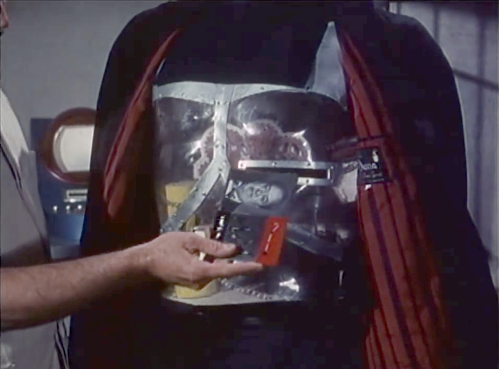
There is, I must admit, a sort of lovely, morbid poetry to a cardiogram being inserted into a slot where the robot heart would be to give the robot instructions to end the beating of the human heart described in the cardiogram. And we don’t see a lot of poetry in sci-fi interface designs. So, props for that.
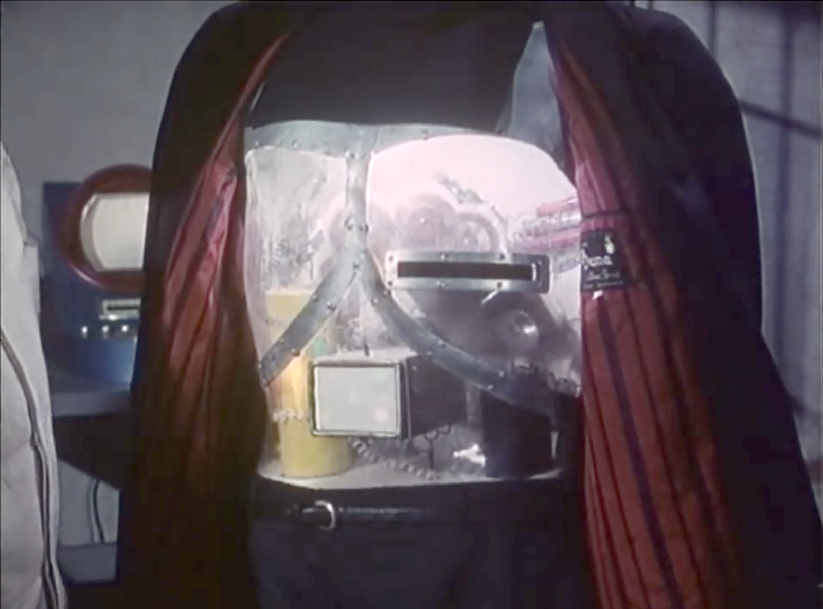
The illumination is a nice bit of feedback, but I think it could convey the information in more useful and cinegenic ways.
In this new scenario…
- Orlak has the robot pull back its coat
- The chamfered slot is illuminated, signaling “card goes here.”
- As Orlak inserts the target card, the slot light dims as the chest-cavity light brightens, signaling “I have the card.”
- After a moment, the chest-cavity light turns blood red, signaling confirmation of the victim and the new dastardly mission.
When the robot returns to Orlak after completing a mission, the red light would dim as the slot light illuminates again, signaling that it is ready for its next mission.
These changes improve the interface by first drawing the user’s locus of attention exactly where it needs to go, and then distinguishing the internal system states as they happen. It would also work for the audience, who understands by association that red means danger.
The shape of the slot is pretty good for its base usability. It has clear affordances with its placement, orientation, and metallic lining. There’s plenty of room to insert the target card. It might benefit from a fillet or chamfer for the slot, to help avoid accidentally crumpling the paper cards when they are aimed poorly.


In addition to the tactical questions of illumination and shape of the slot, I have a few strategic questions.
- There is no authorization in evidence. Can just anyone specify a target? Why doesn’t Gaby use her luchadora powers to Spin-A-Roonie a target card with Orlak’s face on it and let the robot save the day? Maybe the robot has a whitelist of heartbeats, and would fight to resist anyone else, but that’s just me making stuff up.
- Also I’m not sure why the card stays in the robot. That leaves a discoverable paper trail of its crimes, perfect for a Scooby to hand over to the federales. Maybe the robot has some incinerator or shredder inside? If not, it would be better from Orlak’s perspective to design it as an insert-and-hold slot, which would in turn require a redesign of the card to have some obvious spot to hold it, and a bump-in on the slot to make way for fingers. Then he could remove the incriminating evidence and destroy it himself and not worry whether the robot’s paper shredder was working or not.


- Another problem is that, since the robot doesn’t talk, it would be difficult to find out who its current target is at any given time. Since anyone can supply a target, Orlak can’t just rely on his memory to be certain. If the card was going to stay inside, it would be better to have it displayed so it’s easy to check.
- How would Orlak cancel a target?
- It is unclear how Orlak specifies whether the target is to be kidnapped or killed even though some are kidnapped and some are killed.
- It’s also unclear about how Orlak might rescind or change an order once given.
- It is also unclear how the assassin finds its target. Does it have internal maps with addresses? Or does it have unbelievably good hearing that can listen to every sound nearby, isolate the particular heartbeat in question, and just head in that direction, destroying any walls it encounters? Or can it reasonably navigate human cities and interiors to maintain its disguise? Because that would be some amazing technology for 1969. This last is admittedly not an interface question, but a backworlding question for believability.
So there’s a lot missing from the interface.
It’s the robot assassin designer’s job to not just tick a box to tell themselves that they have provided feedback, but to push through the scenarios of use to understand in detail how to convey to the evil scientist what’s happening with his murderous intent.